It’s that time of year again. Spring is in the air, pre-season training is underway, and a new MLS season is almost upon us. Which also means new kit drops. We looked at the 2021 MLS kits released so far for another iteration of The Good, The Bad, and The Ugly.
One year removed from the polarizing MLS x adidas 25th anniversary kit fashion show, we have much more reason to be optimistic about the league’s jerseys. For starters, not all teams have the iconic adidas EQT template this year. But while we’ve seen some great kit releases so far, the plain white shirt problem still exists, and apparently won’t be going away anytime soon.
So without further ado, it’s time to heap praise on the MLS kits we’ll hopefully be wearing to barbecues this summer, while we console the fan bases whose teams just can’t seem to get their shirts right.
The Good
LA Galaxy “Community” (Away)
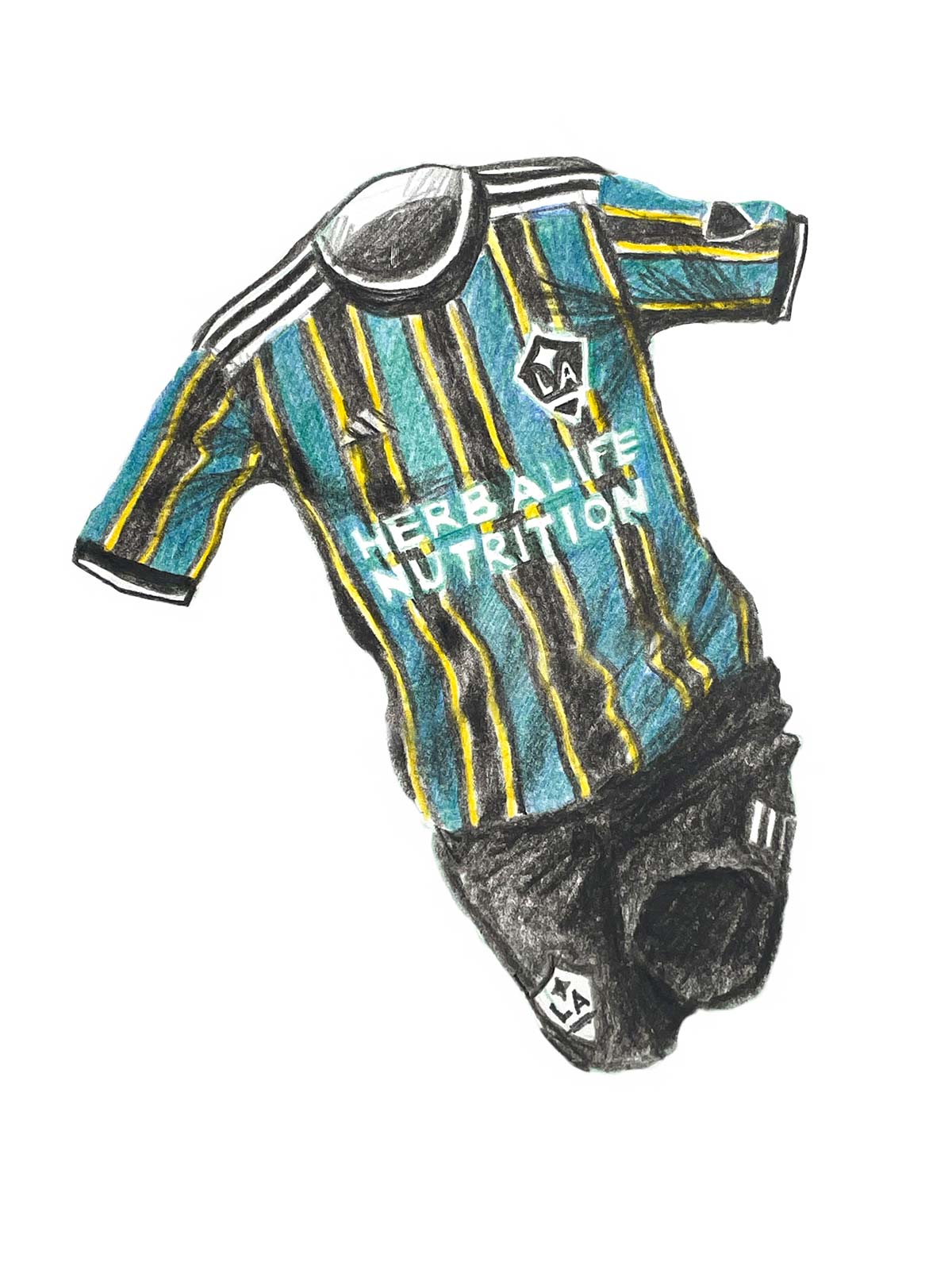
We start off with the crème de la crème, LA Galaxy’s new away jersey, dubbed the “Community” kit. Featuring black, tech green, and team collegiate gold vertical stripes, the shirt pays homage to the club’s legendary 1996 kit. The retro styling probably has Galaxy fans reminiscing about club legend Cobi Jones celebrating goals at the Rose Bowl. Honestly, it’s the wildest kit MLS and adidas have done in years. And to top things off, we get a black and white club crest to better fit in with the color scheme.
Philadelphia Union “By|U” (Away)
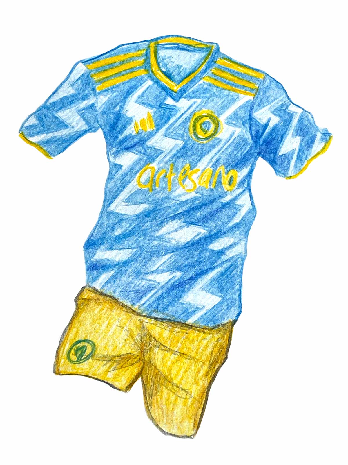
Next up, Philadelphia Union’s new away kit, called “By|U,” is truly one of a kind. Designed by a group of fans called the Union Creators’ Collective, the kit features a light blue colorway inspired by the flags of the Delaware Valley, and a wavy lightning pattern. Bright yellow trim along the sleeves and collar and in the club crest and sponsor logo complement the pattern well. All in all, it’s a fitting tribute to Benjamin Franklin’s kite experiment as well as a nod to the club’s tenacious, energetic playing style.
FC Cincinnati “Dynamic” (Home)
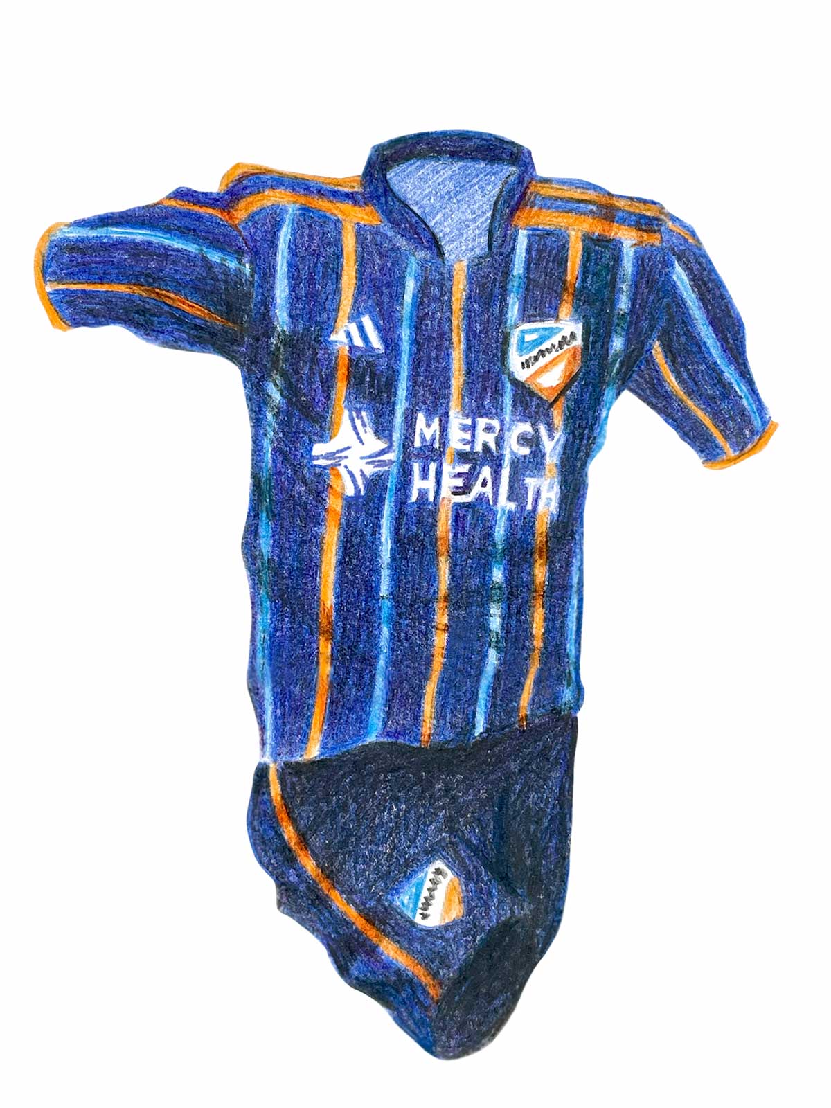
What pairs well with a brand new stadium? A sleek new kit inspired by the club’s shiny new home of course. The “Dynamic” kit is primarily navy blue in color, with orange and royal blue pinstripes, meant to pay tribute to the LED fins on the West End Stadium exterior which will light up the Cincinnati skyline. It’s FC Cincinnati’s first banger since joining MLS. While the overall design isn’t exactly original, the color palette makes this shirt aesthetically pleasing. Finally, a kit worthy of representing the club and its passionate fans.
FC Dallas “Community” (Away)
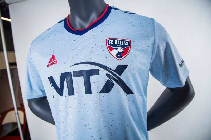
Another “Community” kit, FC Dallas’s new away shirt features a powder blue colorway with a red and blue accent pattern. The powder blue is a nod to NASL club Dallas Tornado, founded by Lamar Hunt, whose family owns FC Dallas. The red and blue accents represent the club’s primary colors as well as the Texas state flag. Maybe we’re just suffering from PTSD caused by MLS’ usually Hanes-like away kit designs, but we’re digging this clean, simple kit. It’s a vibe.
The Bad
Inter Miami “La Palma” (Away)
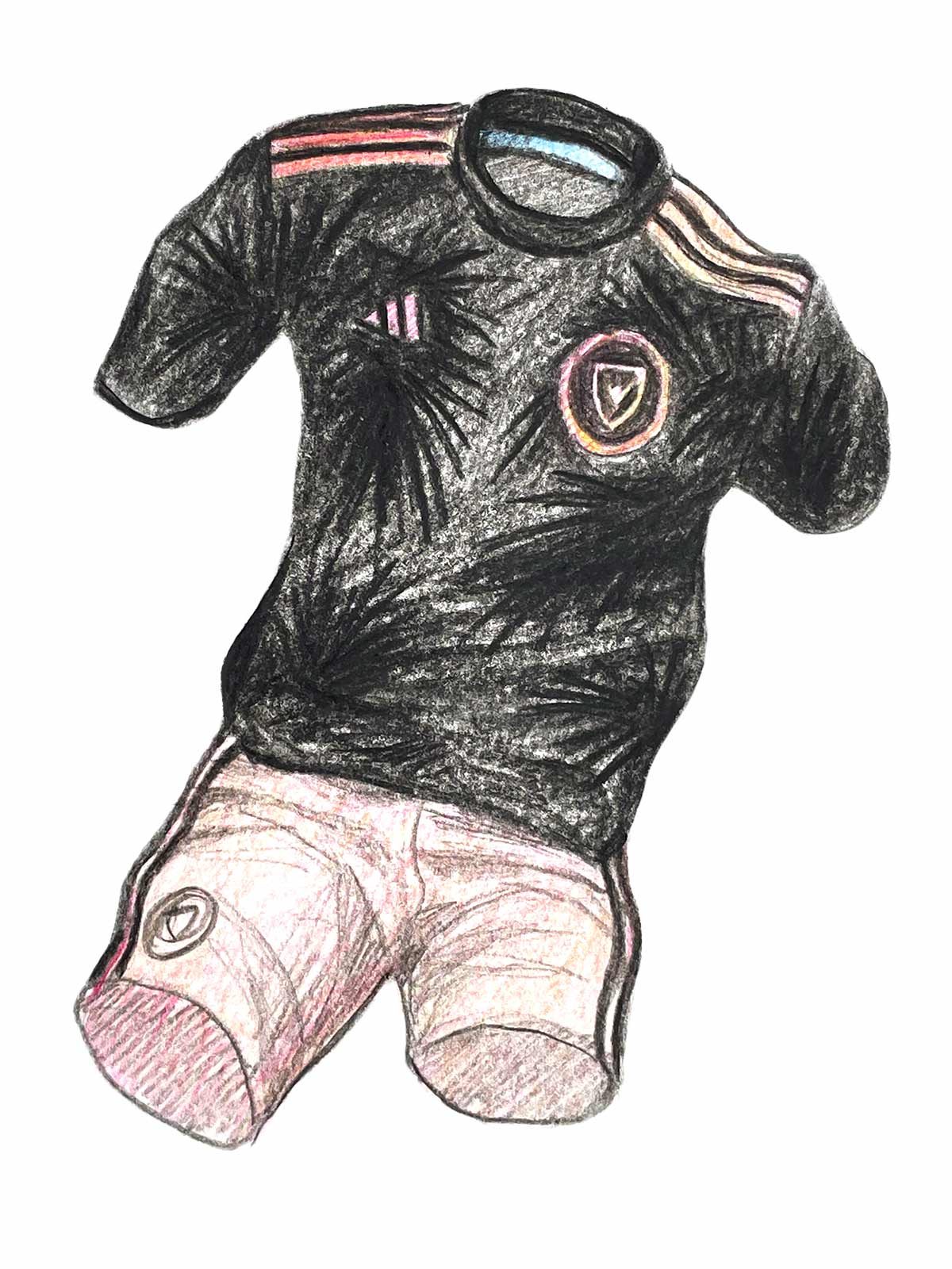
Inter Miami’s new away kit, dubbed “La Palma,” just isn’t it. We’re only two years in, but it’s becoming clear the club is afraid to unleash the vibrant pink in its color scheme. It doesn’t have to be as loud as a Forward Madison kit. It can be more understated like a Palermo kit, but at least do something with it. It’s a problem when the Miami Heat can better incorporate pink into their uniforms when it’s not even one of their main colors. Outline the subtle palm pattern with neon pink here and we have a classic.
Portland Timbers Home
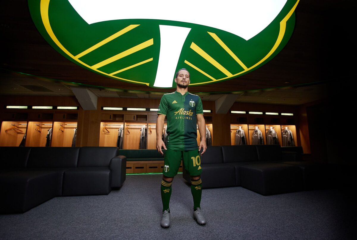
Props to Portland Timbers for not naming their kit like everyone else seemed to do. Keep Portland Weird. A modern take on the club’s inaugural MLS kit from 2011 as well as a continuation of last year’s shirt, this kit has a half-and-half design featuring a solid dark green and forest green colorway. While the old-school collar with the button is fantastic, the chevrons running down the middle of the torso look awkward. If we had to pick a name for this kit, unfortunately it’d be the Frankenstein Kit because it looks stitched together.
Chicago Fire “Lakefront” (Home)
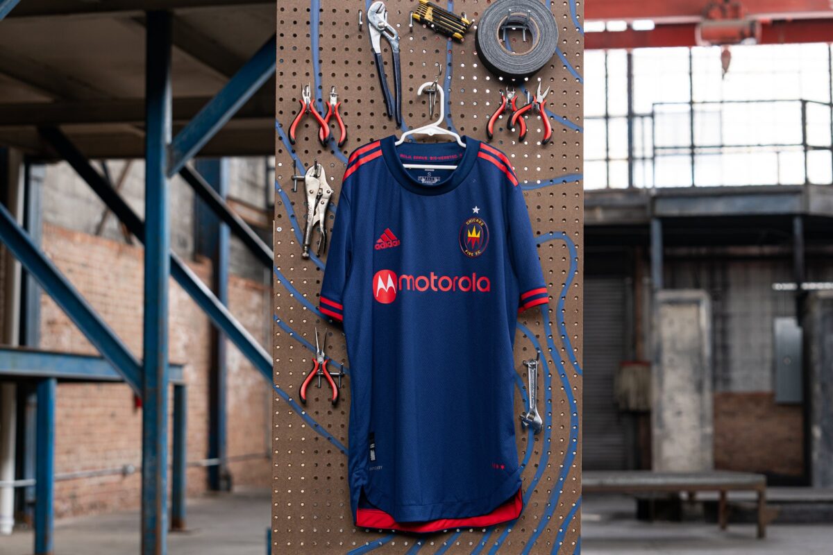
There’s nothing super awful about Chicago Fire’s new home kit, which is Lakefront-themed along with the club’s away kit. But it’s rather bland. San Jose Earthquakes’ “First Star” home kit, Houston Dynamo’s home, and Minnesota United’s “River” away also fall in this category. Chicago Fire should take a page from newly formed NISA club Chicago House AC and NWSL club Chicago Red Stars in terms of branding and connecting to the city.
The Ugly
New England Revolution “Community” (Away)
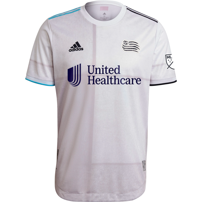
The amount of “Community” this year is exhausting. At this point it’s just diluting the meaning. New England Revolution’s away kit is supposedly inspired by the block work of American Revolution-era forts. It also pays homage to the club’s dedicated supporters’ sections, called The Fort. Honestly though, it looks like it pays homage to gray nothingness. Not even the black and white club crest can save this kit.
Columbus Crew SC’s “Inaugural Stadium” home kit, DC United’s “Marble” away kit, New York Red Bulls’ “1Beat” home kit, and Real Salt Lake’s new supporter-inspired away kit also fall in this category.
Austin FC “Legends” (Away)
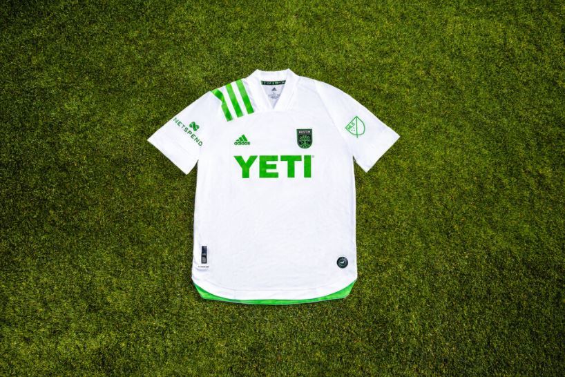
While Austin FC have a slick crest and their new home kit is decent, this new away kit is plain old boring. The white shirt with bright “verde” green accents on the shoulder is called the “Legends” kit and celebrates the club’s early supporters’ group Austin Anthem. In reality, it’s a retread of last season’s MLS 25th anniversary kits. It’s not the ugliest inaugural away kit of all-time, but this just feels like an afterthought by adidas. Certainly not worth the $165 price tag.
Atlanta United “BLVCK” (Home)
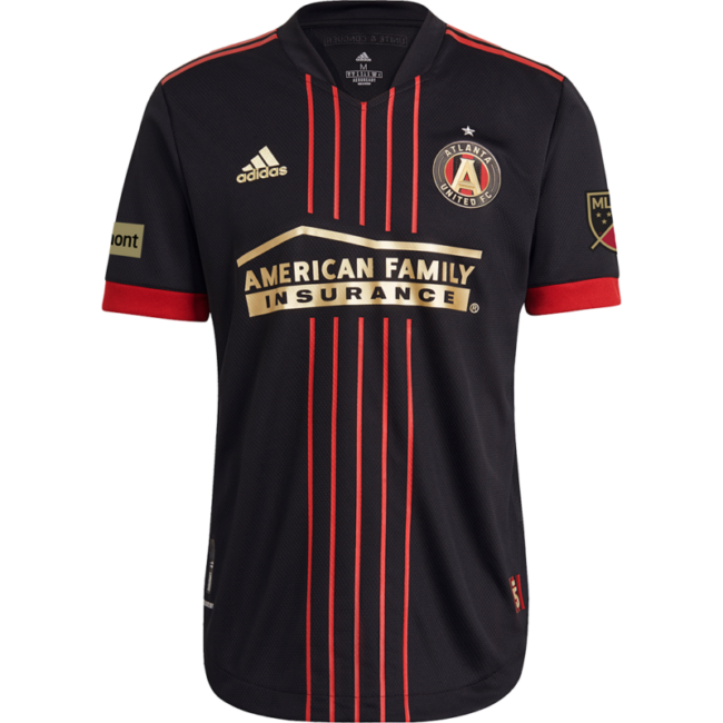
Atlanta United’s new home jersey, dubbed the “BLVCK” kit, celebrates the club’s fifth year in MLS. However, it’s the first dud United has produced since joining the league. Featuring a solid black colorway, the five small vertical red stripes in the middle of the torso represent the club’s pillars: Unity, Excellence, Community, Determination, and Innovation, while also celebrating each year it has been in the league. Red trim on the sleeves and on top of the shoulders completes the look. It’s not awful, but the kit’s just…underwhelming. Especially considering how classic-looking the club’s home kits have become in just four seasons.
Kit illustrations by Tom Probert for Homekit. Order iconic ’90s kit illustrations or custom commissions via their official website.
What 2021 MLS kits did you love or find ugly? Or maybe you disagree with us on one highlighted? Let us know in the comments below.


