
European soccer may still be wrapping up this season’s continental competitions, but a new one is rapidly approaching. While that may mean a renewed hope to capture an elusive title for most, for us it means new jerseys. We’ve scoured through every 2020-21 kit release so far for another edition of The Good, The Bad, and The Ugly.
The slew of 2020-21 kits simply shows which clubs are getting it and which aren’t. Overall, however, we’re loving the trend towards fewer templates and the focus on casual wear-friendly jerseys. While there were many hits this year there were also many misses, leaving us with some tough choices to make in terms of what to highlight.
With pre-season matches already around the corner, we scoured the kit releases from the five big European leagues to find the best and worst drops so far.
The Good
AS Roma Home and Away
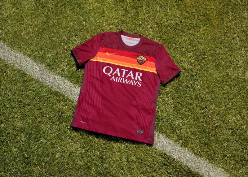
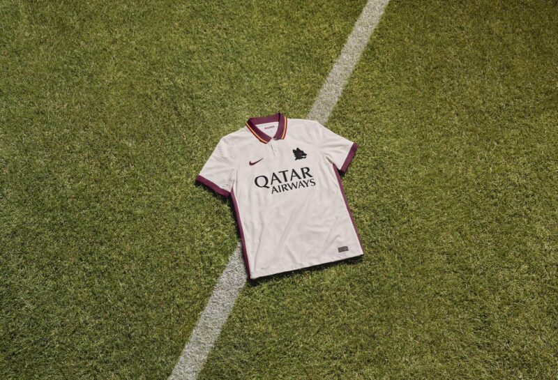
Italian trendsetters Roma recently announced the end of their relationship with manufacturing giant Nike, leaving us disappointed. But at least they went out with a bang on their last collab, producing two of the year’s sauciest kits. Always leave them wanting more.
Their home kit is an homage to the club’s famous 1979-80 kit, which featured their classic maroon base with shades of orange and yellow in horizontal stripes around the collar and sleeve cuffs. For the modern take, designers moved the shaded stripes down on the chest of the shirt. They also get bonus points for continuing the shaded stripes on the back of the kit at the same height.
Just when we thought it couldn’t get any better, Roma went and dropped their away kit. One of the most buttery articles of clothing ever made, the shirt is also a shout to the early ’80s. The pale ivory colorway is drool worthy, but the real gem here is the Lupetto badge on the left chest. To top it off, the kit has an old school maroon collar with two buttons below it.
Ajax Away
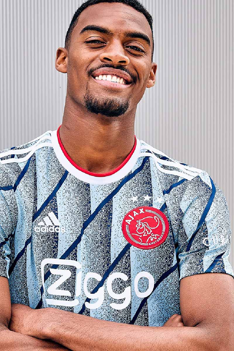
Not all templates are bad, and Dutch giants Ajax prove this with their latest away kit. Seriously, it’s so spectacular we had to include it even though it’s outside of the big five European leagues. The kit, made by leading manufacturer adidas, contains a mix of shades of blue with a modern interpretation of graphic patterns last seen in the ’80s and ’90s. The icy blue color is a whole vibe. If only adidas could lean into the nostalgia and create bangers like this when making the MLS kits.
Manchester City Away
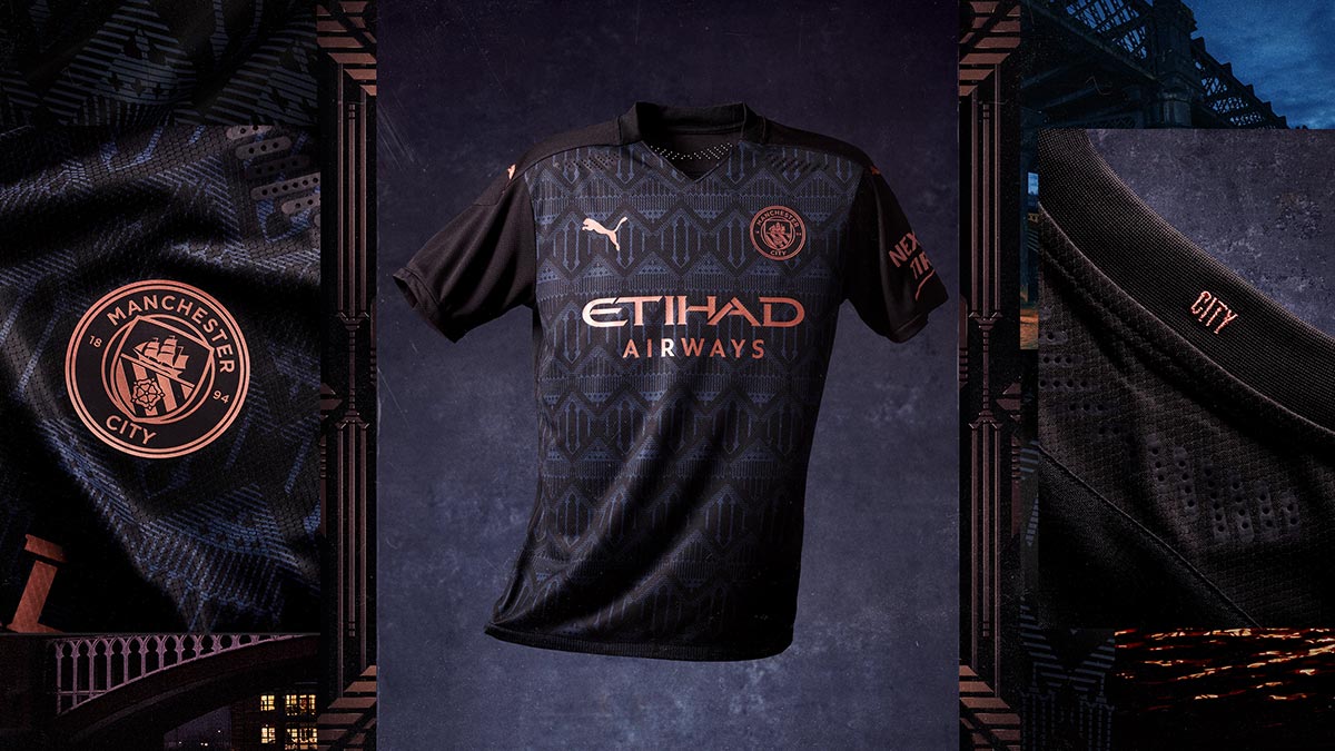
Since PUMA took over as Manchester City’s kit supplier last season, it’s fair to say the club’s kits have been underwhelming if not lackluster. But City’s new away kit should at least make up for some of PUMA’s initial missteps. A predominantly black kit, the shirt’s design draws inspiration from Manchester’s architecture, specifically buildings found in the Castlefield and Bridgewater canal area. The club crest, PUMA logo, and sponsor logo are all dipped in rose gold, which contrasts nicely with the shirt’s dark denim accents.
Inter Milan Home
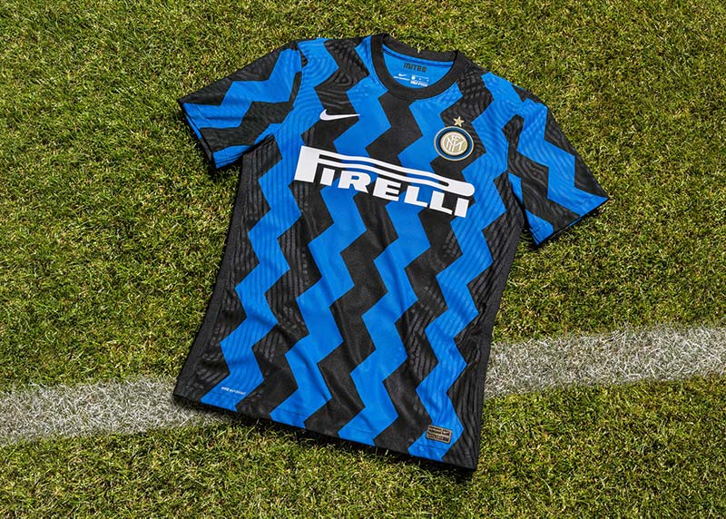
Like AS Roma, Inter Milan are another Italian superpower who have a high hit rate on their kit releases. This year is no different, with the club dropping a series of bold designs calling on the club’s and city’s illustrious history.
With Inter Milan’s new home kit, Nike continues to challenge the club’s traditional vertical stripe identity. While it hasn’t always worked out in the past, and Inter’s home kit is one of the most classic in European soccer, we love this year’s attempt. Inspired by the pioneering work of Milanese designers in the ’80s, the zigzag stripes are a key element of post-modernist design and also evoke the image of the slithering Biscione, the historic symbol of Milan.
Marseille Away
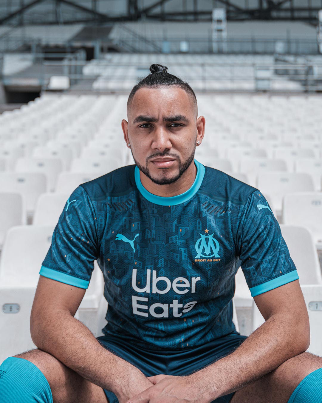
Potentially the most divisive kit of the good category, Marseille’s new away kit is a deserving entry. Made by PUMA, the shirt is a solid navy blue with a lighter blue collar and sleeve cuffs. The unique, intriguing aspect of this kit is the all-over graphic print, which is a stylized illustration showing the city of Marseille. Upon closer inspection, there appears to be yellow lights in some of the building windows scattered around the print too. We’ve never seen a kit with this style of graphic print on it, and we think it works. Very bold move.
Lower League Bonus: Red Star FC Home
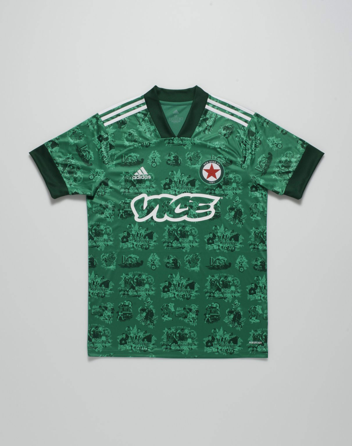
This kit is too fire to ignore, so we created a new special category for it. Red Star FC in Paris might play in the third division, but it’s one of the most historic (and drippiest) clubs in all of France. As a testament to the club’s style and taste, adidas gave Red Star free rein to create their own kit (the only club with such privilege in the country), and they didn’t disappoint.
Their home kit, which is solid green, features a bespoke illustration made by the Acid FC collective in a “Toile de Jouy” style. The graphic print is mainly inspired by the antique flea market next to their stadium. It also, however, displays moments from the club’s and France’s history from the late 19th century to present.
The Bad
Hertha BSC Away
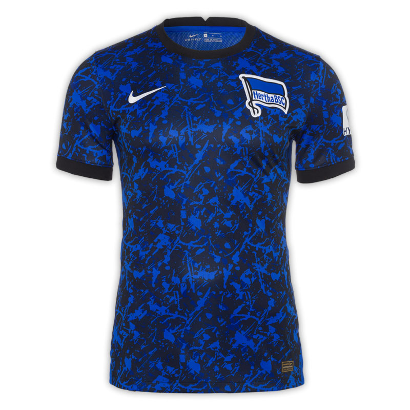
Nike risked it all with Hertha BSC’s new away kits, but they fell just short. The kit’s blue and black all-over color splash pattern is certainly loud, but is it too loud? The colors are very vibrant and mesh together well, but the overall pattern more closely resembles that of a training top rather than a kit. On the bright side, if you ever wanted to go paint balling in this shirt, you could probably get away without washing it afterword.
Bayern Munich Third
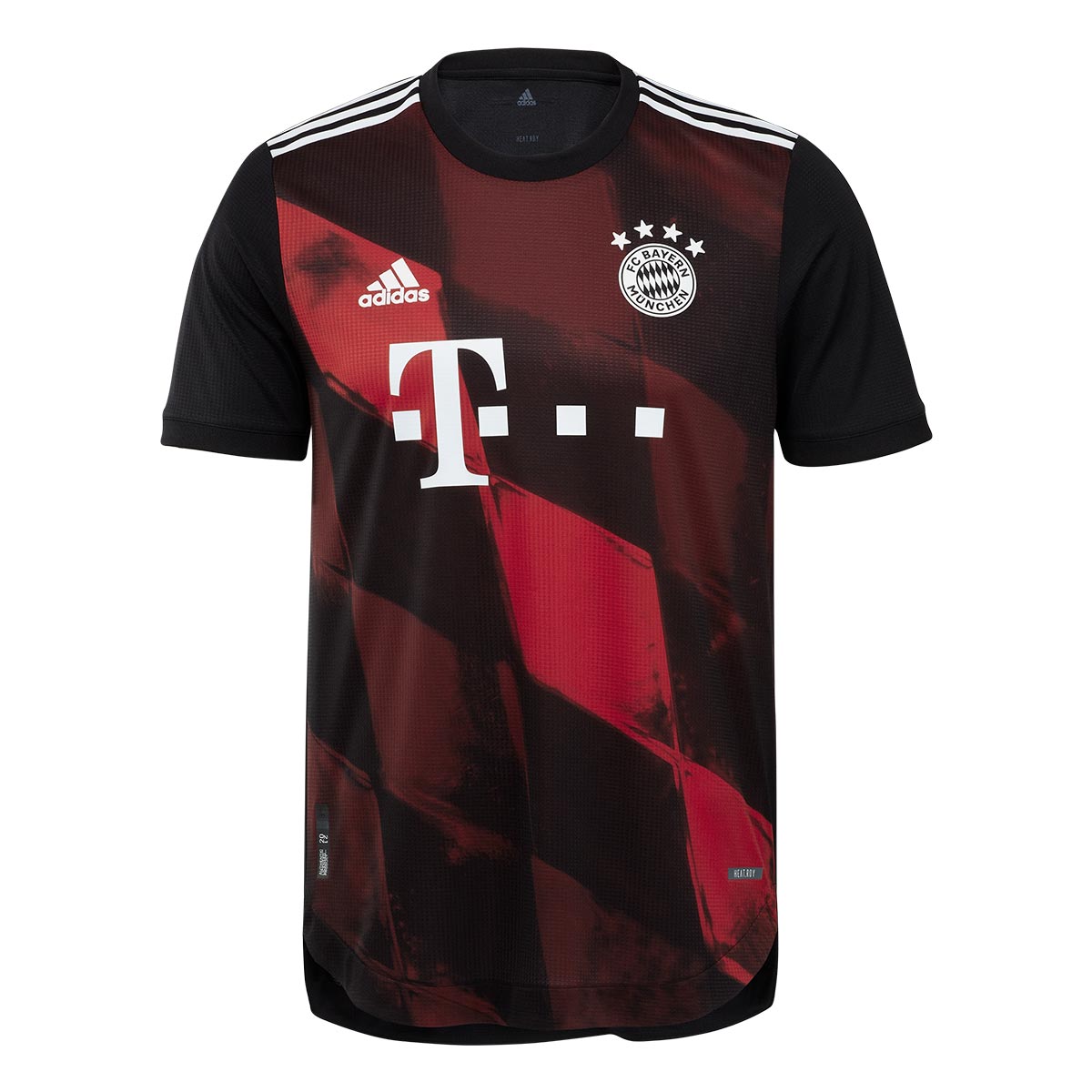
Bayern Munich’s third kit is one of the more interesting to drop this cycle. In a rare example of life imitating art, adidas apparently looked to FIFA 18 for inspiration on this one. The print across the shirt’s chest appears to be a superimposed version of the club’s crest, and it looks pretty familiar to a special digital-only fourth kit made for the video game franchise two years ago. While we dig the concept, the execution leaves us wanting more. The monochrome white club crest is a nice touch though.
Inter Milan Away
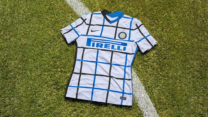
Nike might’ve hit the mark on Inter Milan’s home and rumored third kits this year, but their away design is a miss in our eyes. The kit is predominantly white, with an alternating black and blue grid design inspired by the iconic “Memphis Milano” designs of the ’80’s. Everything about the kit alternates, from the black Nike swoosh and the blue sponsor logo to the half black, half blue collar. The grid design is a great concept and an out-of-the-box idea, but it is too reminiscent of colorful graphing paper. Once again though, bonus points for having the design on the back of the kit too.
Manchester United Home
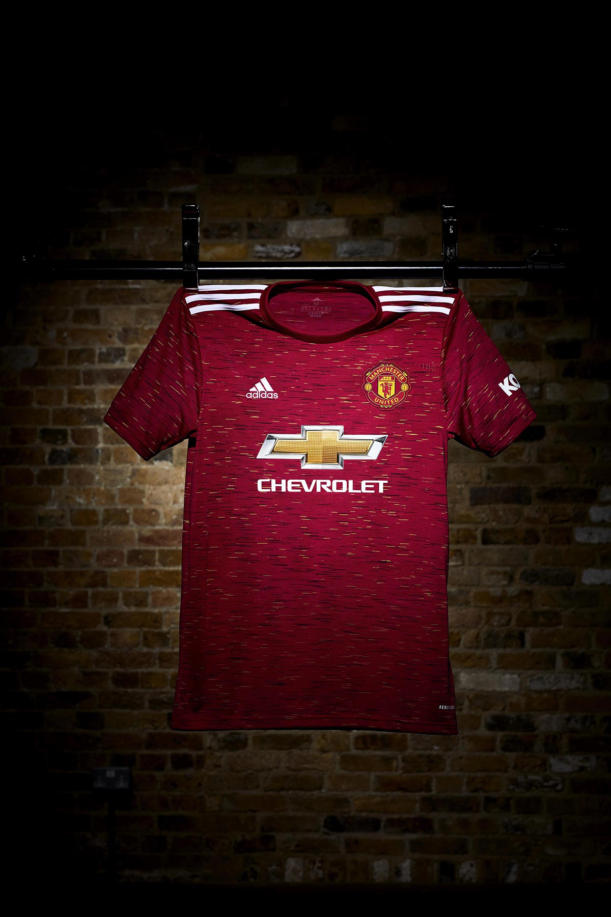
There’s a few reasons I’m not a fan of the new Manchester United home kit, made by adidas. While you can applaud the club’s effort to provide a fresh take on a classic kit, the black-and-yellow horizontal stripe graphic doesn’t hit the mark it should. The subtle design is meant to reflect the intricacies of the yarn-stitched iconic club crest on the shirt. A cool concept, but it looks more like a training top than a proper home kit. Not to mention that pattern is eerily reminiscent of the fabric on a bus or train seat.
Stuttgart Away
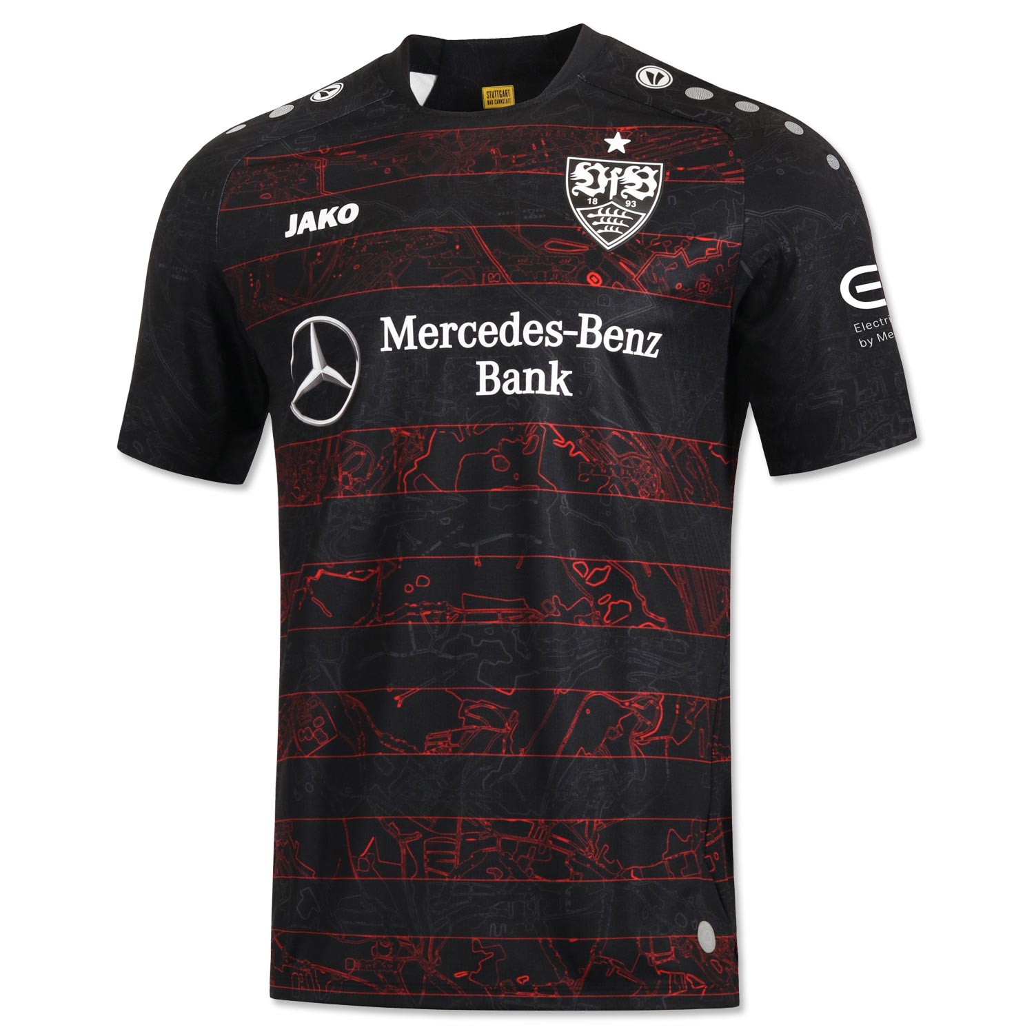
Stuttgart’s new away kit, made by German manufacturer Jako, taps into a fun trend we’ve noticed. The black kit, which takes design cues from the club’s 1997-98 away kits, features an all-over pattern showing the Stuttgart city map, with the club’s stadium under the crest. Our issue with this kit is the almost translucent red horizontal stripes, which ruin the aesthetic. On the spectrum of Schalke’s away kit to Lorient’s third kit, it trends closer to the latter unfortunately.
The Ugly
Manchester City Home
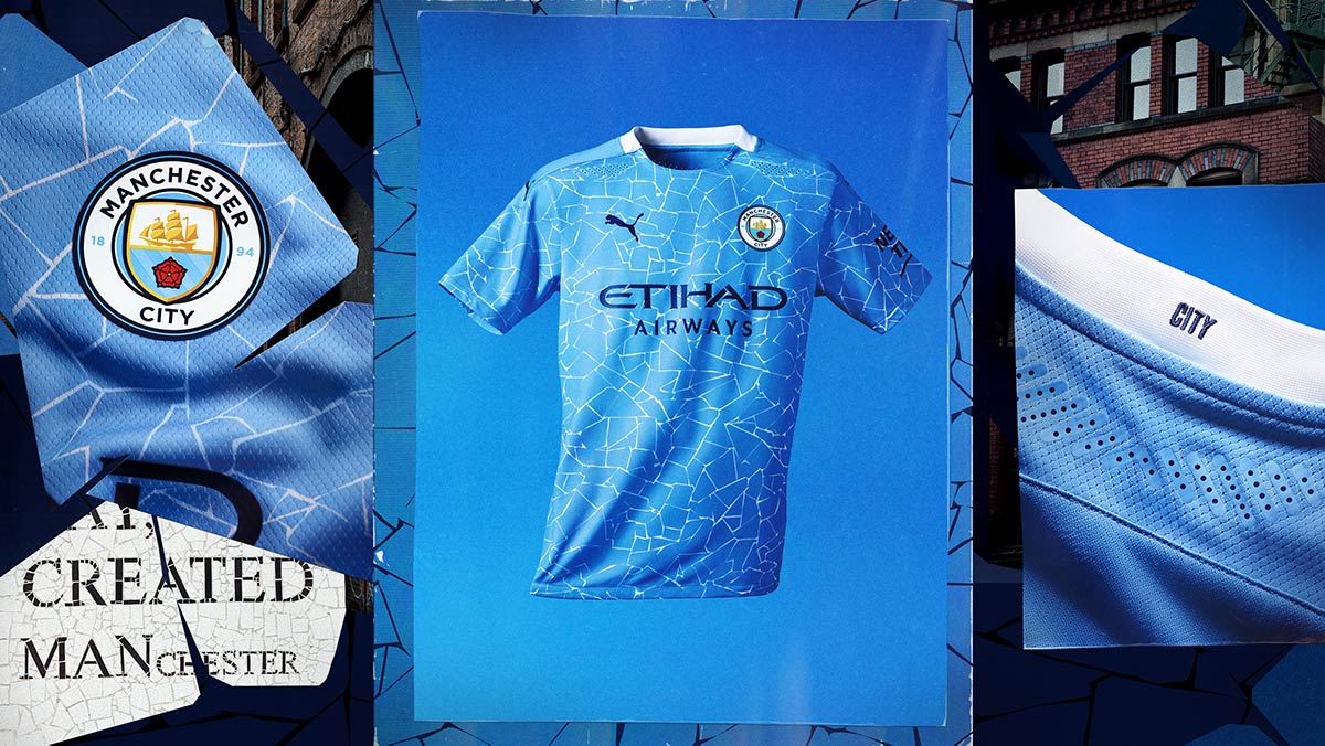
As mentioned earlier, we think it’s fair to say PUMA’s relationship with Manchester City is off to a bit of a rocky start. While City’s new away kit is stylish AF, their new home kit is an absolute dumpster fire. The kit, which is a predominantly sky blue color, has a supposedly subtle white pattern inspired by the mosaics found in Manchester’s Northern Quarter. We love the club’s attempt to pay homage to their city, but this just isn’t it fam. It also loses points for not having the mosaic pattern on the back of the shirt.
Borussia Dortmund Home
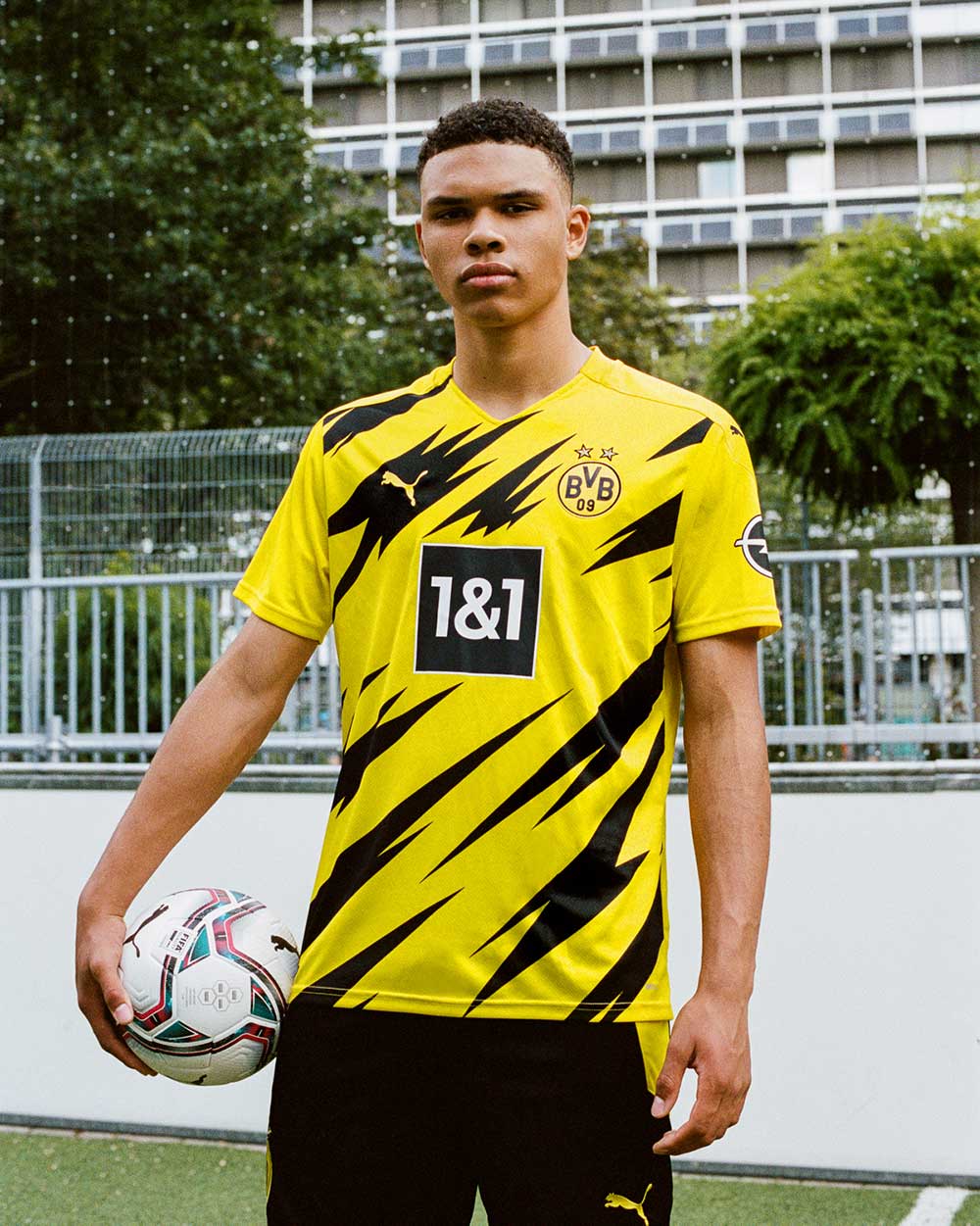
While Dortmund’s rumored away kit has some promise, their home kit is a complete mess. Similar to Manchester United’s home shirt, we appreciate the attempt to give us a new take on a classic look, but this is just straight awful. The kit is plain yellow, with a black partial graphic print all over the torso which is inspired by the Westfalenhalle metro station near the club’s stadium. Unfortunately, it ended up looking like a collab between Dortmund and Pokemon that should be dubbed the Pikachu kit.
Valencia Third

Third kits are strange territory for us, because they’re either super fire or completely unnecessary depending on the design and inspiration behind it. Valencia’s new third kit unfortunately falls in the latter category. The kit, also made by PUMA, is predominantly light blue and features a unique design inspired by Spanish painter Joaquin Sorolla. The result is a kit which looks like a fabric softener sheet. The monochrome blue club crest is the only redeeming quality here.
What’s your favorite 2020-21 kit? Let us know in the comments below.


