With Euro 2020 (2021?) delayed until next summer and the new club season starting soon, the world’s kit manufacturers finally dropped the last of the Euro kits. We pored over all the latest releases for another edition of The Good, The Bad, and The Ugly.
Believe it or not, the Euros are just around the corner, with UEFA confirming that the tournament will be held next summer. Arguably the most contentious continental competition out there, we’re more than ready for kick off. But we’re also excited for the game within the game. Yes, it’s about winning on the pitch, but it’s also about winning the fashion game off of it too.
With most of the Euro 2020 kits already released, we take a look at the best and worst offerings.
The Good
Italy Home
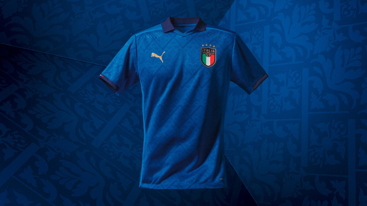
Continuing the renaissance theme found in their third and away kits, Italy’s new home shirt is also absolutely gorgeous. Judging by all three of the new Azzurri strips, kit manufacturer PUMA is undergoing a bit of a renaissance too. The shirt is a crisp, clean blue and features a mosaic-inspired graphic print. The old school collar and the sleeve cuffs are navy blue, with the colors of the Italian flag appearing on the sleeve cuffs. All three kits are on our wish list, but this one has a special place in our hearts.
France Home
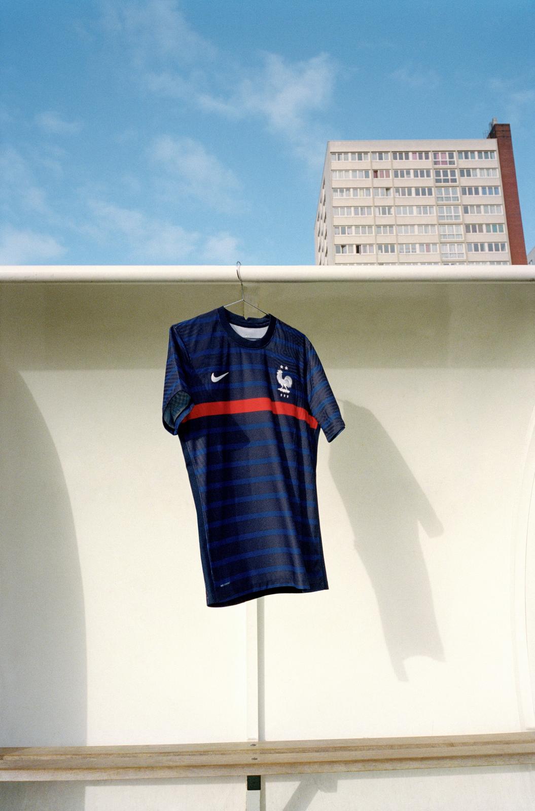
Over the last few cycles the French drip is unparalleled, and it continues here. Their new home kit is predominantly navy blue, but the real beauty here is how well the horizontal thin royal blue stripes mesh with the shirt’s main color. A single red stripe runs across the kit’s chest, an homage to the iconic France ’98 World Cup shirt, which were themselves a tribute to their ’84 Euro kits. An homage to an homage? Dub this one the Inception kit.
Germany Home
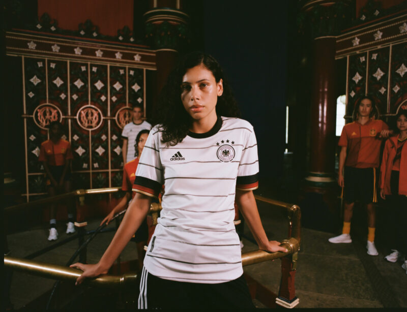
Germany’s new home kit is also a banger, so we can’t leave kit manufacturing giant adidas out of the conversation either. The shirt is a classic white, with black horizontal stripes adorning the torso and sleeves. It might be a small detail, but the stripes have a brushstroke aesthetic. Topping it off, the sleeve cuffs feature the colors of the German flag. No homages, no complex graphic prints, this kit is a minimalist’s delight.
Finland Home
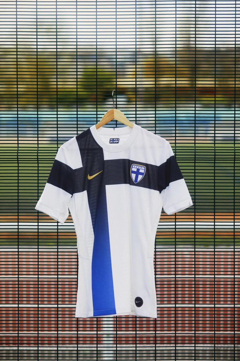
While Finland isn’t exactly a traditional European footballing power, we love what Nike did for their new Euro 2020 home kits. The shirt is mainly white, but what makes it special is the superimposed Nordic cross that fades from midnight navy to royal blue. The Nike Swoosh is gold too, matching the gold outline on Finland’s crest. Smaller countries deserve some kit love too every now and then.
The Bad
Germany Away
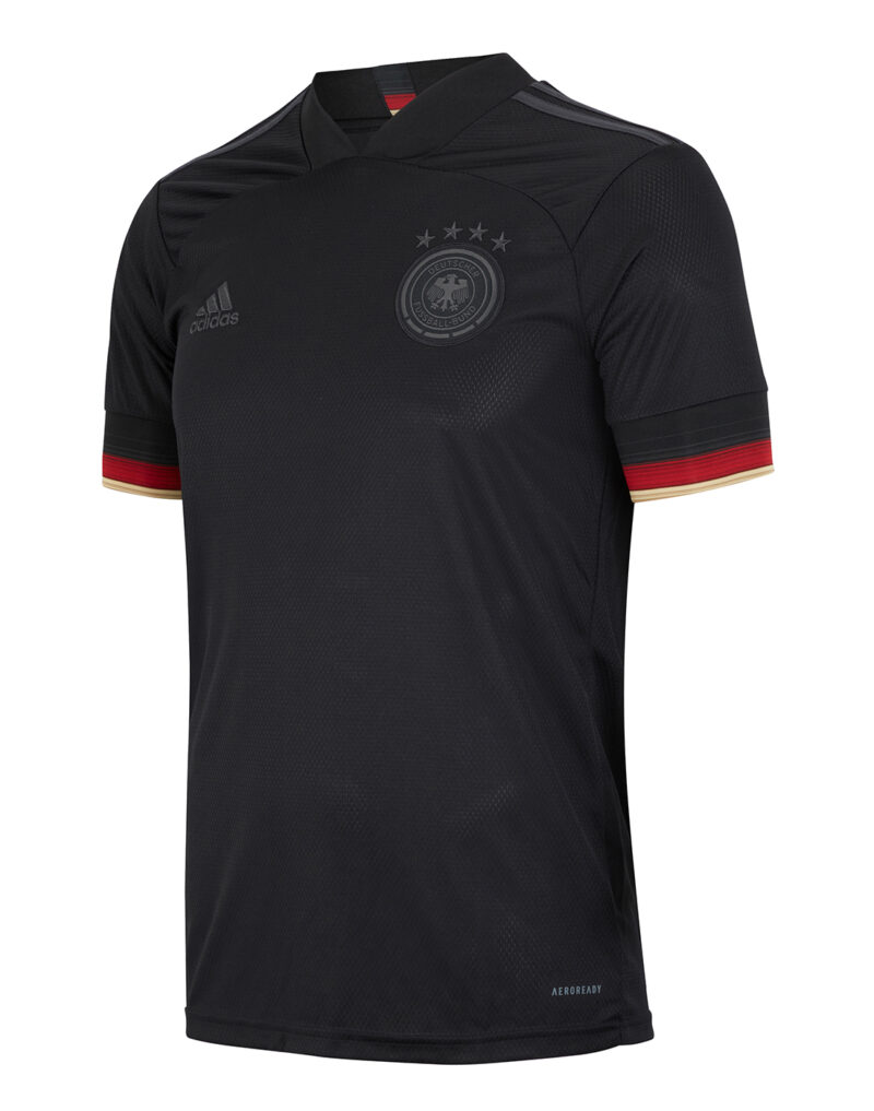
adidas nailed Germany’s new home kit, but their new away offering leaves us wanting a little bit more. Set in a carbon black color scheme, we’re all in on the monochromatic adidas logo and Germany crest. And we also dig the colors of the German flag on the sleeve cuffs. But what keeps us from falling in love with this kit is the collar and the stitching pattern on the chest. It reminds us of the MLS 25th anniversary kits released earlier this year, which were…not great to say the least.
Netherlands Home
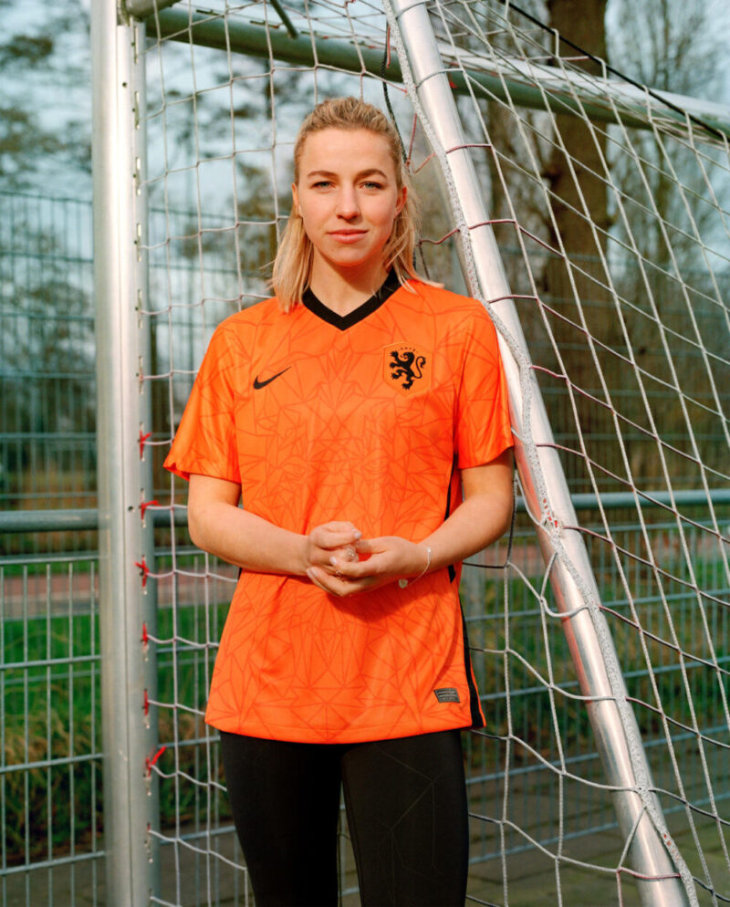
The Netherlands’ new home kit continues the lovely orange and black color combo from their 2018 World Cup shirts, but it has a big overall twist. The Dutch crest features a lion from the Netherlands coat of arms, and that lion spans the entirety of the kit in the form of a graphic print. Kudos to Nike for trying something out of the box here, but it does end up looking eerily similar to the graphic pattern on Manchester City’s new home kit, which isn’t exactly the most aesthetically pleasing in our eyes.
Ukraine Home
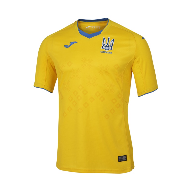
Ukraine’s new home kit, made by Joma, is traditional in the best way. Rather than trying to reinvent the wheel, the kit features Ukraine’s classic yellow and blue color combo. The shirt is yellow and the collar, Joma logo, and the edges of the sleeve cuffs are blue. The center of the torso has a subtle graphic print on it inspired by Ukranian embroidery traditions. The problem? It’s nearly invisible. If the graphic print was blue, this kit would be a hit, but unfortunately the execution is slightly off.
The Ugly
Portugal Away
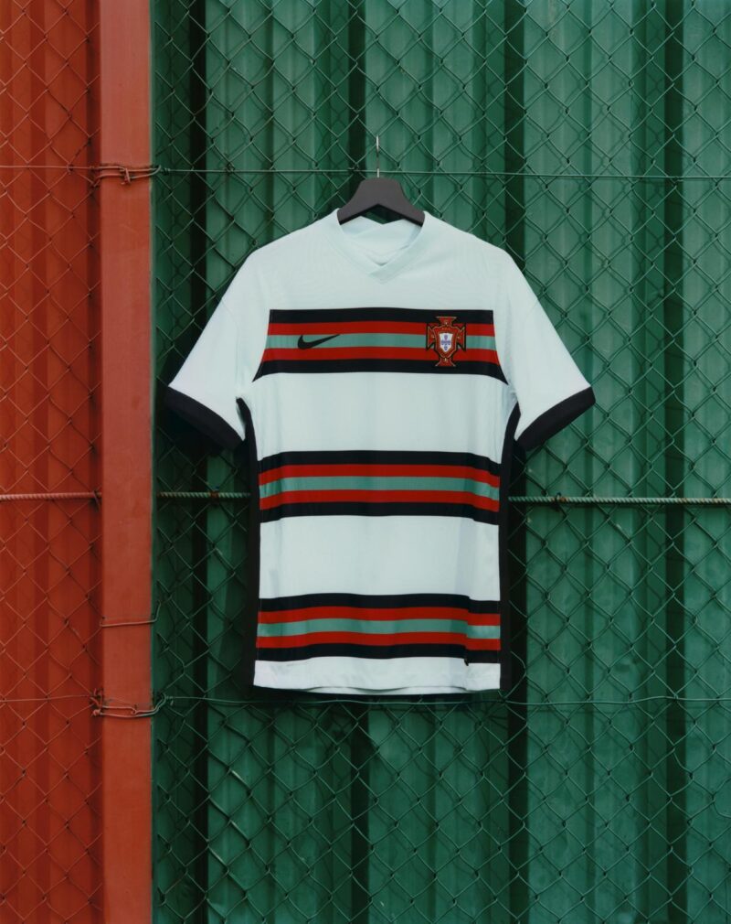
Supposedly Portugal’s new away kit is roughly inspired by their classic 2016 away, but it looks more like it takes cues from an ugly holiday sweater party. The light teal main color is nice but the stripes across the chest are downright atrocious. If the kit only had one set of stripes, it would be better. But in its current form, this kit is unforgivable. Yikes. This is a complete miss by Nike.
Belgium Home

adidas was very heavy handed with the brushstroke aesthetic on this one. Simply put, Belgium’s new home kit is a straight eye sore. The shirt, which is mainly red, features two brushstroked black sashes to go along with inexplicable red brushstrokes. Some of them appear to be in front of the black sashes in some areas, and behind them in other areas. The only saving grace is the black and yellow color combo on the collar and sleeve cuffs. Getting rid of the red brushstrokes would be a massive improvement.
Switzerland Home
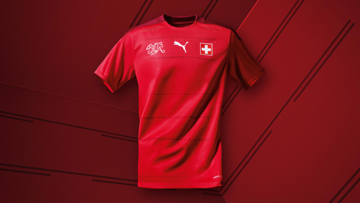
As fire as those Italy kits are, PUMA really mailed in the new Switzerland home kit. The shirt is mainly red, with the crew neck collar and the sleeve panels dark red. But what makes this kit truly egregious is the horizontal stripe design down the torso. While there’s an overall clean look to the kit, there’s really no purpose to the stripes. PUMA perhaps just decided to slap it on there and call it a day. We all understand what it’s like to be working on a project at 4:59 p.m. and wanting to get off work on time, but this is inexcusable.
What are your favorite Euro 2020 kits? Let us know in the comments below.


Could not be more wrong about Germany. That is slick and fresh. I don’t see the problem with the stitching, but I can understand the business about the collar. I’ll be looking forward to purchasing one.
To each their own! Change the stitching and collar and I think it’s a great kit worth buying.
North Macedonia’s jersey rules.
Never count North Macedonia out, Germany sure learned that the hard way haha.