


Putting a slight twist on some of the most recognizable football crests from across the world, Dan Norris has become an engineer of heraldry. In our latest edition of Art of the Game, we catch up with the London-based designer to discuss his infatuation with crests, and why you shouldn’t call them logos.
It all comes from a curiosity about life. Football is a big part of us, and living closely to your club is certainly something you get addicted to. The first and most obvious connection with your team most likely comes from the colors, the stadium, and perhaps most of all, the badge. This element symbolizes the main essence of your club. The herald that expresses what you have felt throughout your fandom — love and joy, tears and deceptions.
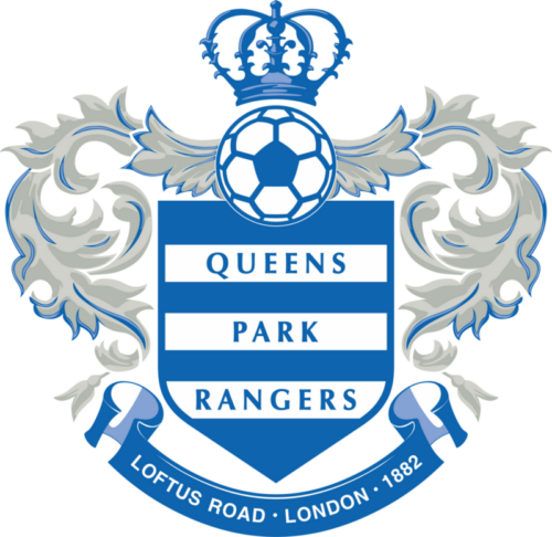
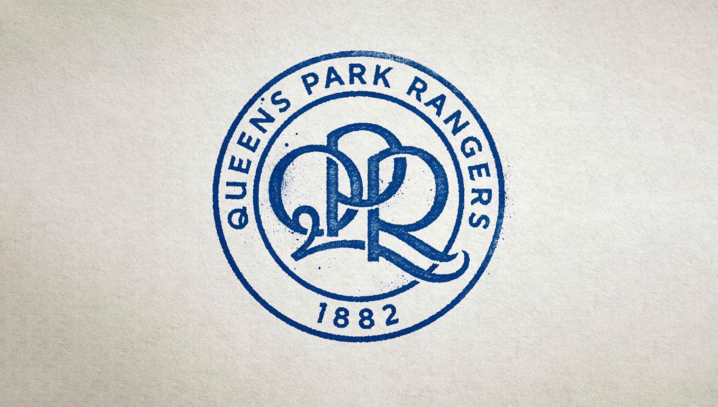
That’s what Norris has felt his whole life, especially suffering when his club, Queens Park Rangers, imposed a non-representative badge breaking with tradition in 2008. A club is always about the people, and Norris wasn’t alone in his despair over the new crest. With his help, QPR found a new set of designs and let their fans select which one they should go with.
It’s unbelievable the responsibility to redefine the icon that represents you and your people. While it may seem inconsequential, a club’s badge is of paramount importance. Good designs stand the test of time and become synonymous with the club’s undying spirit.
This interview is a journey through the identity of the game — a reason why people get a football crest tattooed on their bodies.
“Storyteller for the eye, purveyor of visual hooks,” is how this London-based artist describes his work. For me, he is a heraldry engineer.
Urban Pitch: What’s your background as an illustrator?
Dan Norris: I’m a graphic designer and image maker working in London. Being an ’80s kid with a great love of pop culture, films and football imbued my formative years. I have spent recent years creating alternative film posters both officially and unofficially until recently turning my attention to the rich world of football iconography. I enjoy the challenge of visual storytelling, aiming to produce work that grabs the attention and lives in the memory.
When did you first start paying attention to and analyzing football crests?
Pretty early in my life, I realized the impact of a shirt and badge design. As a QPR supporter I recall their mid-to-late ’80s shirt being a thing of beauty. It stood out in a sea of red and blue due to its distinctive hoops, and I’m sure my friends who supported bigger and more successful clubs were still envious of my QPR home shirt. I used to practice drawing the calligraphic letters of the intertwined QPR badge, and it definitely was an inspiration in my formative years.
How did you realize that you liked football’s iconography? Any special one that you would like to mention?
Other than the QPR badge and shirt, the 1990 World Cup is the first I can properly remember — and still is my favorite. The design of the mascot and the beautiful England shirt and tracksuit were amazing, though my favorite shirt goes to Cameroon and its epic oversized badge.
What was a moment that you said to yourself, “I want to re-imagine this crest”?
That moment was when my club QPR drastically redesigned the badge without fan consultation. The club has a genuinely fascinating visual history. Their identity has had many manifestations over the years — too many. But the previous redesign was a massive misstep. The new badge was unnecessarily complicated and a poorly considered redesign. A faux heraldic design is laden with clichéd elements that had little meaning to the club’s heritage. Past identities have been built on a central monogram of the initials QPR. Fortunately, the club changed owners, and with that, the opportunity was available to change the badge again.
I approached the club with designs that took a step back to the classic badge from the ’80s to build on our strong graphic foundations allowing us to develop an iconic crest that was built on a truth that really connected with the supporters. Working with the club and fellow designer Dan Bowyer we created lots of versions of the QPR badge as part of the redesign process. The supporters were involved from the start with a selection put to a fans vote. The launch was a massive success because the club worked with the supporters from the beginning — something clubs are now doing more often.
Which elements do you like the most on a football badge?
The badge needs to work as a whole. It’s hard to pick specific design elements as they need to all work together to tell the story. So maybe that’s the essential element of a badge — the club’s “story.” A club’s badge is a medal of honor and they belong to the supporters as much if not more so than the clubs themselves. Each club’s badge is a direct link back into their history, telling stories of where they’ve come from and where they want to go and I find this visual storytelling fascinating.
I was hoping you could explain to me the difference for you, in a football context, between logo and crest.
A crest is part of a heraldic coat of arms, however, in the world of football it has become the norm for the complete image used to officially represent a club to be known as its crest, or sometimes its badge, or logo. To many they are interchangeable, but to me the word logo feels too corporate and lacks the gravitas of a badge or crest.
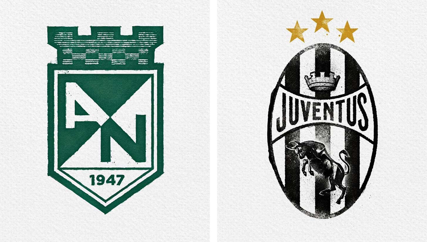
What do you think about the new Juventus redesign? Do you consider it as a “logo”?
It’s a tricky one because I admire brave design but I think the new design was a misstep. When reinterpreting a badge, it is essential to start from a place of truth, laying the foundations of the new design on the solid structures of the club’s heritage and visual DNA.
Juventus, like most clubs, have a rich history of design iterations to draw inspiration from. Sometimes, a previous badge iteration holds a visual quirk that makes it distinctive and worth exploring. Further often in a redesign, clubs have watered down the elements that make them more distinctive and I try to bring back that element of personality that is unique to them.
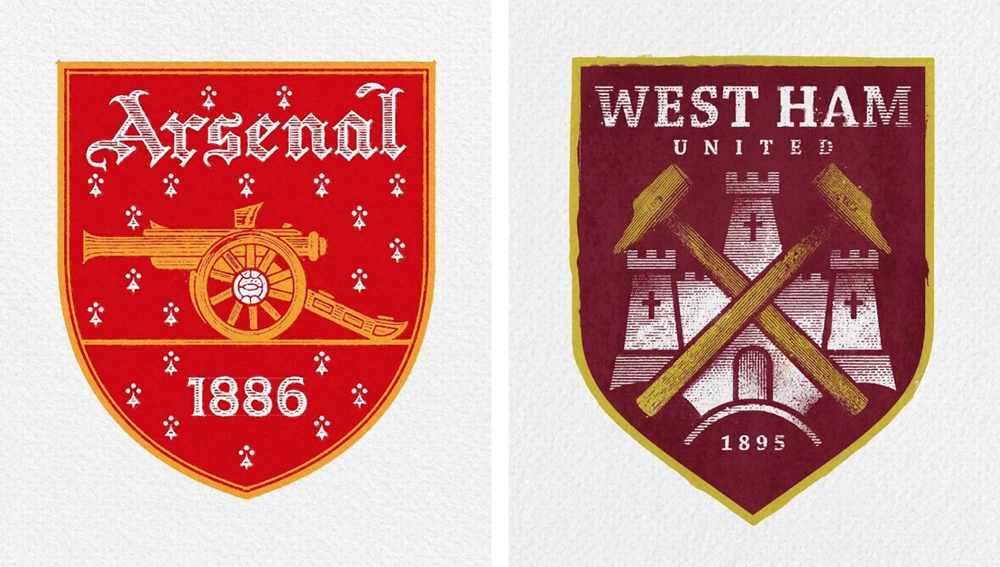
The Arsenal badge is another example of this where the latest iteration of the badge has lost its majesty and feels almost like a TOMY toy version of what went before. The new design was created at a time when the visual trend was for that simplified rounded style, but I much prefer it when a redesign retains a level of gravitas. Aston Villa’s new badge — especially the engraving by Christopher Wormell— is an excellent example of building on the club’s heritage while layering in craftsmanship and authenticity.
What does a football badge mean to you?
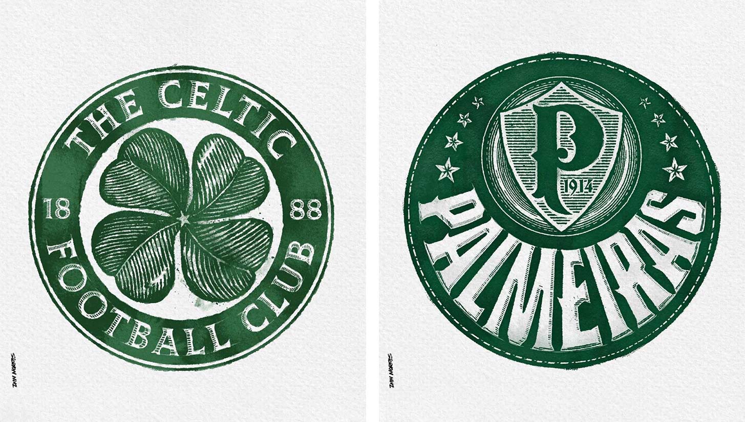
This football badge project was kickstarted by 36daysoftype, a community page on Instagram that sets a yearly challenge inviting designers, illustrators, and visual artists to share their view on the letters and numbers of the alphabet. So I decided to take part with the theme of football typography — setting myself the challenge of redesigning a different badge every day in alphabetical order from Arsenal to Zenit Saint Petersburg. After a few days, I realized what a monumental task I’d undertaken.
However, it was also the most enjoyable personal project as I got to know all these clubs by rummaging through their visual archive online and then having the brief to create my version of each. Once I completed the set, including 11 numbers from famous Premier League players’ shirts, I decided to carry on the project by completing a redesign of each club that had featured in the Premier League since its formation in 1992 — but without the challenge of doing one a day. It has become a regular weekly routine to re-imagine a badge. I find it almost meditative, and definitely the most enjoyable design work of my career.

Where would you like to see your work in the future?
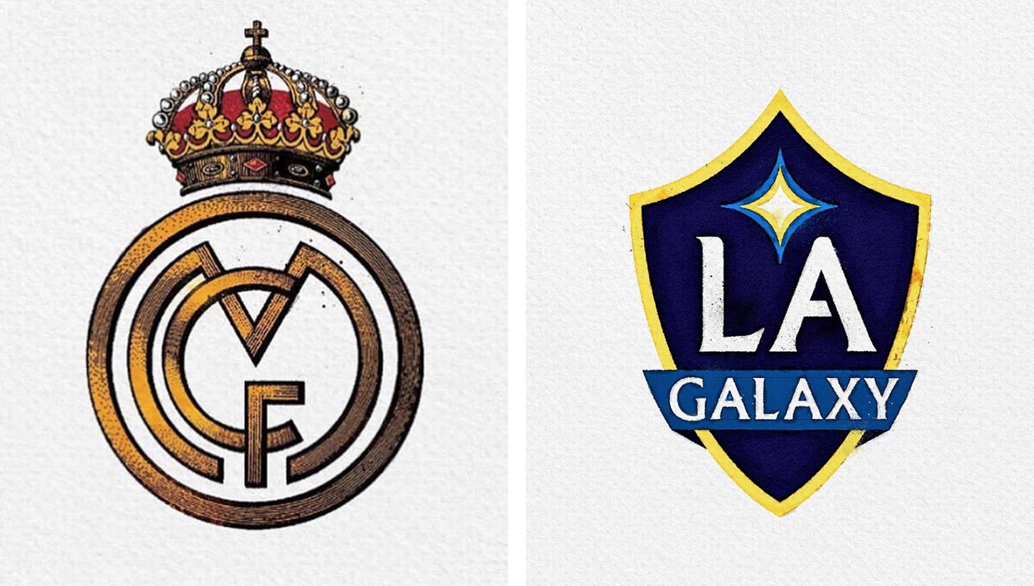
I’ve had the dream job of designing the badge of my club and have a few projects in the pipeline for smaller clubs and possibly the United States. I’d love to do more official work with clubs — to supply them with alternative versions for club shop merch. I’m hoping to progress this shortly so watch this space.
Be sure to follow Dan Norris on Instagram to stay up to date with his latest designs. You can buy his prints, stickers, apparel, and more via his online shop.


