
Recently unveiled, Italy’s new crest is emblematic of a design trend both in and outside of soccer — a shift towards bland, repeatable logos with little personality.
Italian clubs have often been considered to be at the forefront of soccer related design, especially in recent years. Napoli’s kits are supplied by Armani, AC Milan recently secured a partnership with OFF-WHITE, Nike and Inter have had a historic run, and who could forget what Venezia FC has done over the past few seasons.
This also extends to the Italian national team, as the Azzurri donned Armani suits during the 2020 EUROs, and presumably would have done something similar at the 2022 World Cup, had they qualified. When it comes to everything from cars to fashion, “Italian” is a modifier that usually increases an item’s prestige, if not its price tag as well.
However, it’s clear that there is now an exception to the rule in the form of the new Italian national team crest, which looks like it’s straight out of an Adobe Illustrator tutorial video. This is not only particularly disappointing because of the country’s aforementioned connection with the aesthetically pleasing, but also because the Italian crest has long been a paragon of design.
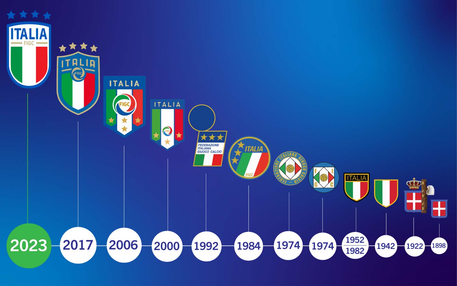
My favorites have to be their three crest styles between 1974-2000. They all look like super car badges, and each brings a different flavor of Italian seasoning. I mean that 1974-1983 badge? Perfect.
The 1984 and 1992 badges in particular are just straight moped-and-espresso design philosophy. The type is in italics — everything is slanted to express motion, it’s all rectangles and circles, but arranged in off-center and interesting ways. It knew how to risk without being offensive, and to follow rules of design without becoming templated.
Then 2000-2016 was the pennant shape phase which was alright, but ultimately nothing to write home about.
Honestly the 2017 crest is barely worth mentioning. Just a bland three-pronged badge with stars above it. And the same could be said about the recent iteration as well. The main issue with them both is their inoffensive natures. Sure they technically follow all the principles of design, but when talking about a football crest it should really be so much more.
There should always be a defining feature or factor which sets your crest apart from others. Or to maintain a certain look for long enough it becomes synonymous with your brand. Italy’s national team recently has been able to do neither. Creating two remarkably bland, yet somewhat different crests. Neither one distinguishing themselves amongst the pack of recent crest designs.
It’s emblematic of an ongoing trend in logo design that’s not just limited to football clubs. In all industries, we’ve seen a shift to rebrand to a more generic, easily repeatable logo that often lacks personality. Custom typeface has been replaced by your run-of-the-mill sans serif, and any edge or depth has been flattened out. Not even Italy is immune to the great logo homogenization.


