They’re made for a great cause, and look good enough on their own, but the 2021 MLS Primeblue kits represent an ongoing problem throughout the league’s recent history: repetitive, homogenous jersey templates.
If we’ve said it once we’ve said it a thousand times. Templates aren’t bad. Some of the best kits ever made were products of templates, and they’ve only become more essential as the demand for football shirts has grown.
There’s of course a flip side to that, however. Templates are repetitive by nature, which leads to them becoming stale easily, and makes for a low margin of error design wise. For this reason, they’ve become frowned up on by many kit enthusiasts, and nowhere more so than in MLS.
It’s not that MLS’ templates are worse than any other league out there. In fact, last year’s EQT template the league used for its 25th anniversary looks great. The problem is that other leagues have multiple kit suppliers across their clubs, and MLS has one league-wide supplier in adidas. So while the same template here and there can be spread out and less noticeable elsewhere, in MLS there’s nowhere to hide.
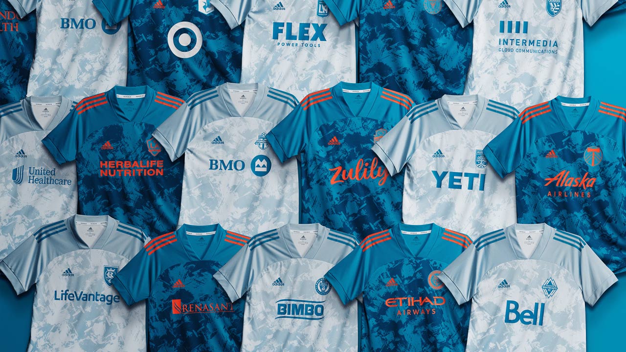
The biggest critique surrounding the 25th anniversary EQT template was how repetitive it was, with each club getting its own version of the retro-inspired design. MLS and adidas seemed to hear that criticism ahead of this season, and gave us a more refreshing palette of kits across the league. However, the league unveiled its new Primeblue kits made with Parley ocean plastic last week, and it looks like it has reverted back to its old ways.
All 27 clubs received one template in one of two different colorways, making for a homogenous lineup that brings another meaning to uniform. Even the marketing video promoting the kits’ release shows how repetitive they are, with the different club crests overlaid upon the same adidas Condivo template backdrop.
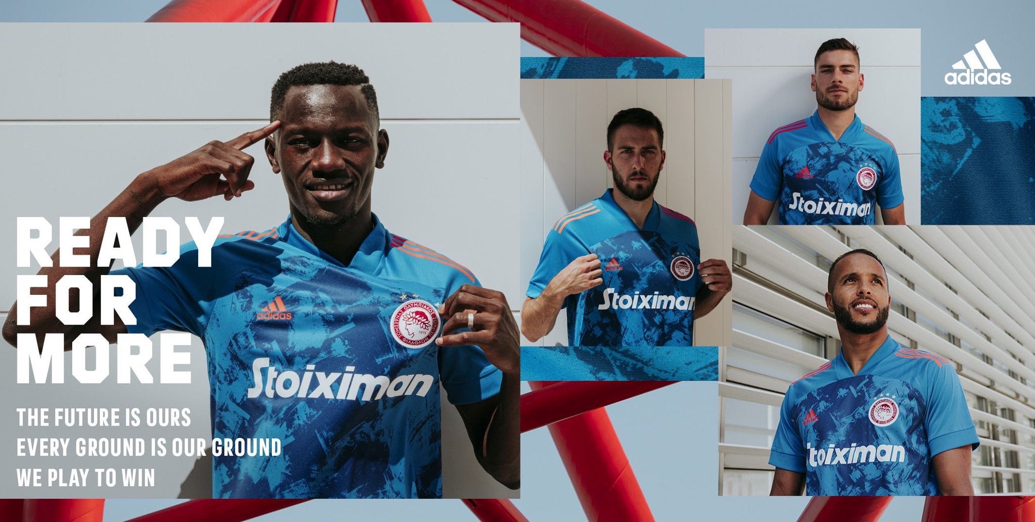
To make things worse, the blue kit is nearly identical to Olympiacos’ away kit from this season. Did adidas think we wouldn’t notice? Did they put this assignment off to the last minute and rush to turn something in? All probably unanswerable questions.
Like the EQT from 2020, the Condivo template looks good enough on its own, but when applied to the entire league it’s lazy and disappointing. It’s understandable to put the Parley jerseys in an overarching theme to separate them from the regular 2021 MLS kits, but essentially copying and pasting each club’s crest and sponsor onto the same shirt is the absolute most bare minimum thing that you could do. An ocean theme to this collection with three different templates or patterns would’ve easily spiced things up, while also being easier to execute than 27 separate bespoke designs.
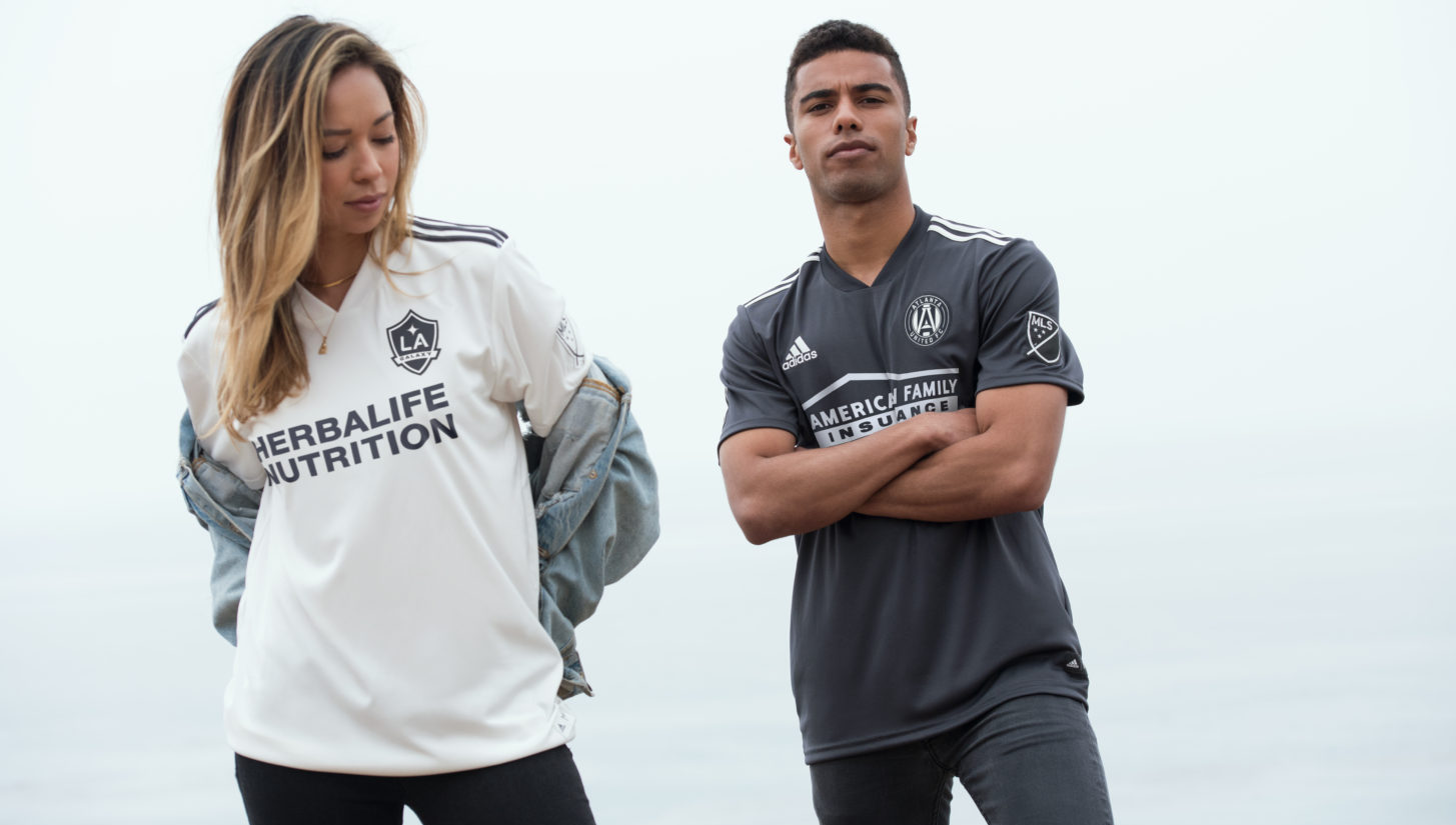
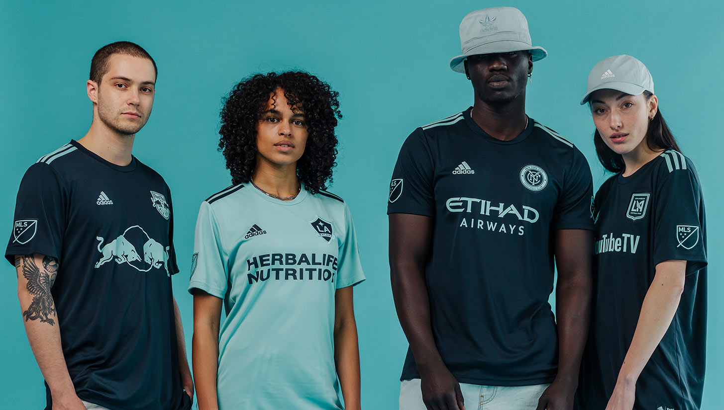
The Parley special edition jerseys first came to MLS in 2017, with only four clubs wearing them in matches over Earth Day weekend. In 2018 and 2019, the partnership expanded to include every MLS club, and while it might’ve been passable to use the same design throughout the league in those installments, it’s time for the partnership to evolve yet again. As mentioned before, templates easily become stale, and the 2021 Parley kits certainly have a cardboard vibe to them.
I’m not asking the league and adidas for much here — one tiny step up from what’s become the status quo would very much please me, and ostensibly many other MLS fans. If we take a look across at the NWSL, who also has a league-wide sponsor in Nike, we can see how a single-brand league doesn’t have to look so identical. NWSL clubs have more free reign to design their own shirts, whereas in MLS it seems like there isn’t as much flexibility.
The league now has over 25 years of history to play with, and despite its flaws, has experienced a good amount of success. But whether it’s bland kits or rebrand fails, the disconnect between the league and its fans has never been more apparent. Putting more effort into kit design seems like an easy enough fix, and for adidas, a brand that has spent millions of dollars on campaigns promoting creativity, this should be a no brainer.


