The 2010s have seen an array of beautiful kits, many of which have received their due celebration. But not all have been so lucky. We enlist the help of four kit enthusiasts to revisit some of the decade’s most underrated jerseys as well as the evolution of kits over the past 10 years.
The 2018 Nigeria. The 2015-16 pink Juventus (AKA the Drake kit). Anything from France and Nike. These are the kits we’ll forever remember from this decade, and rightfully so. But aside from these giants of design, there have been plenty of other shirts that deserve the same amount of praise, however for whatever reason never received it.
We like to think of ourselves as a champion for the underdog, and in that sense we wanted to finally shed the spotlight on some of these overlooked kits before we head into a new decade. To properly do so, we reached out to a group of kit fanatics that could highlight the jerseys that many have criminally slept on.
Justin Salhani
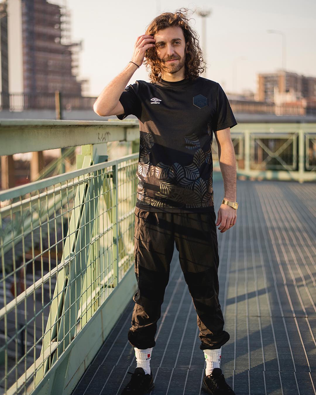
Journalist, creative, and sauce distributor, Justin Salhani is a man of many talents. In addition to founding Guerrilla FC, he’s been featured in numerous publications including The Athletic, Los Angeles Times, and Washington Post. He’s been more or less the mastermind behind some of our favorite kits from the past few years, from the entire Guerrilla FC line to Providence City FC’s “Ocean State of Mind.”
The most underrated kits of the 2010s:
Justin Salhani: I have four that I think have been strong for different reasons. They could’ve been big, but to see why they weren’t we have to look at why kits like the Nigeria or some of France’s have hit so strong, and these kits never had that opportunity.
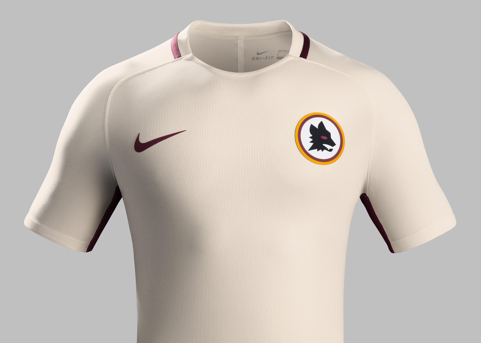
The first is Roma’s away from 2016, the white one with the throwback logo for the club’s 90th anniversary. The logo is really striking yet simple and plain. What we do at Guerrilla is a lot of design-heavy stuff. We started right around the time that kit dropped, and it was like hey, maybe we should do something simple because that one really hits.

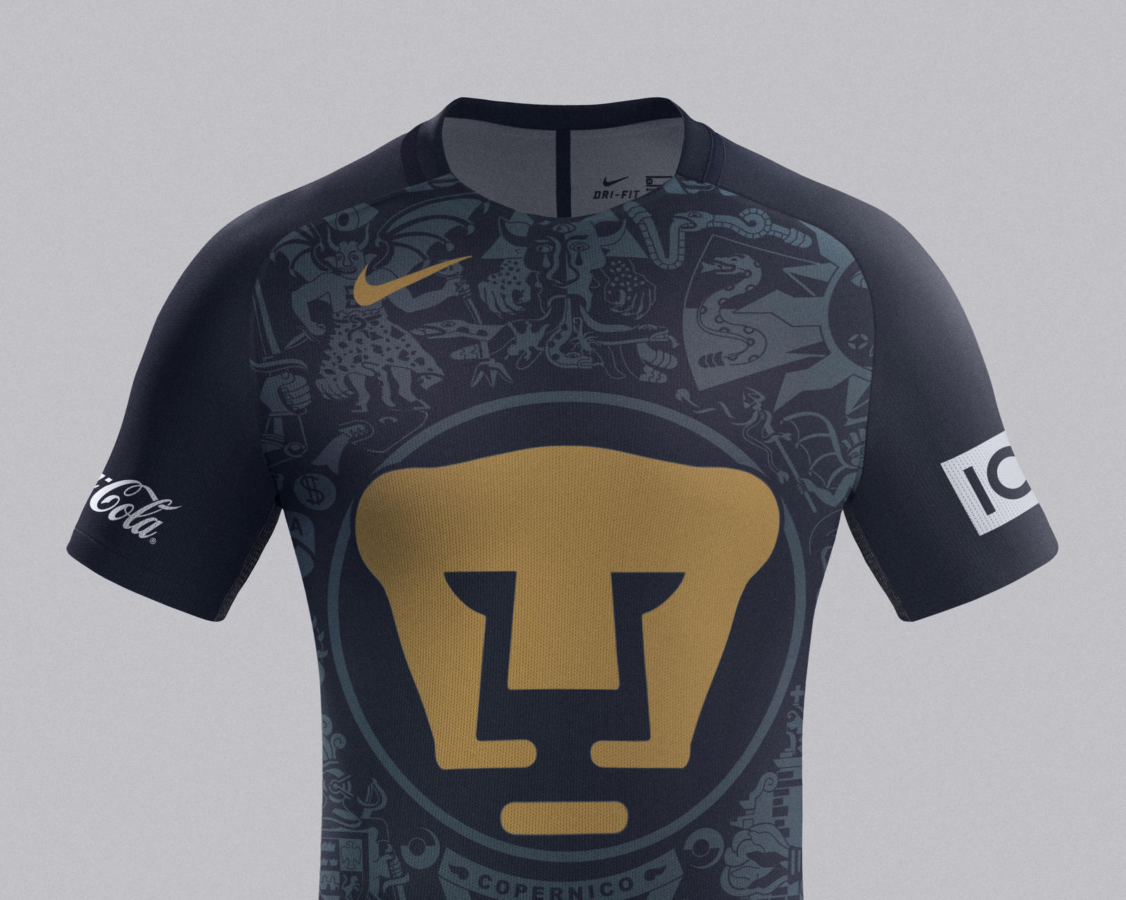
I also like the Corinthians special Ayrton Senna edition from 2018. I really like kits that can incorporate gold in some capacity. But maybe my favorite, both home and away, is from UNAM in 2016. They’ve had great kits the entire decade, I think that logo really speaks. But adding that sublimated design behind is a really nice touch.
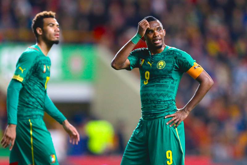
One more that I like is the 2014 World Cup home kit from Cameroon and PUMA. For me this is a really iconic kit and we have a lot of guys who have spent time in Africa. Whenever we have pickups or futsal this is one of the kits you’ll see quite often. It’s been a big influence on us.
Why it’s too early to put the “iconic” label on most kits from this decade:
In terms of the past 10 years, it’s still really early. We’re lacking some icons yet because we haven’t really had the distance that we have had with the ’90s. Even with the early 2000s, we’re not quite there yet to where we can look fondly back on those shirts.
Another aspect is that professional football has shifted to dropping three-plus kits every year. Part of what makes a kit great is having seen it worn through a particular period. If we talk about that Barca team at the turn of the decade, Arsenal from their invincible run, the Milan teams of the late ’80s, ’90s, and even the mid-2000s, you have an emotional connection with the design of each kit. When you’re changing every season, especially with three per year, it’s harder to associate great memories with an iconic kit.
On the retro influence that has been so prevalent in 2019:
It’s one thing to fall back on history, it’s another to snaggle ideas. If we keep reaching back, eventually we run out of ideas. We need to try some new things and take some risks. When it’s so apparent and so blatant that there’s an algorithm behind kit design I think it loses something. People still want to be surprised and impressed.
It’s been really great to see football kits blow up in popular culture in recent years. I think we’re at a point where it’s gone pretty mainstream and there are a lot of people who want to profit off of this. That’s not necessarily a negative thing, that’s just how it goes in capitalism sometimes. When we’re in that phase, things kind of get watered down, and my hope is that a lot of creators try to keep things authentic and keep trying to do things for the creativity. Work with brands, do what you have to do, make some money if that’s your prerogative. But let’s also make sure that we’re respecting the culture and doing creative stuff.
His favorite Guerrilla FC release:
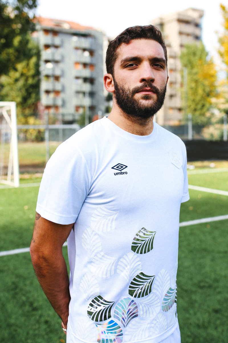
The one that I’m still impressed with whenever I look at it is the 2018 home kit with Umbro. With the pattern and color scheme, we kind of saw a burst of this sort of style after that. I’m not vain enough to think that everyone copied us, but when we were in the design phase of doing that I had never seen anything like it.
Follow Justin on Instagram and Twitter, and learn more about Guerrilla FC via their website.
Phil Delves
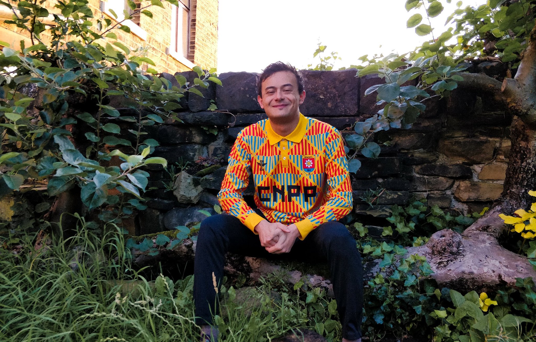
One of the more prominent members of the football kit community, Phil Delves has penned articles for Pog Mo Goal magazine as well as the Football Shirt Collective and Footy.com blogs. Few are as dedicated to writing (and tweeting) about kits as much as Delves, and his passion for shirts is only equaled by his knowledge for them.
The most underrated kit of the 2010s:
As I’ve looked back over the last 10 years, the success that we’re having this year and last year is testament to the fact that in just a few years we’ve grown from a place where kits, broadly speaking, weren’t that interesting.
Certainly the middle of the decade wasn’t necessarily a great time for shirts, but what’s been cool as I’ve looked back is that you can see the building blocks that have led to the success of recent years.
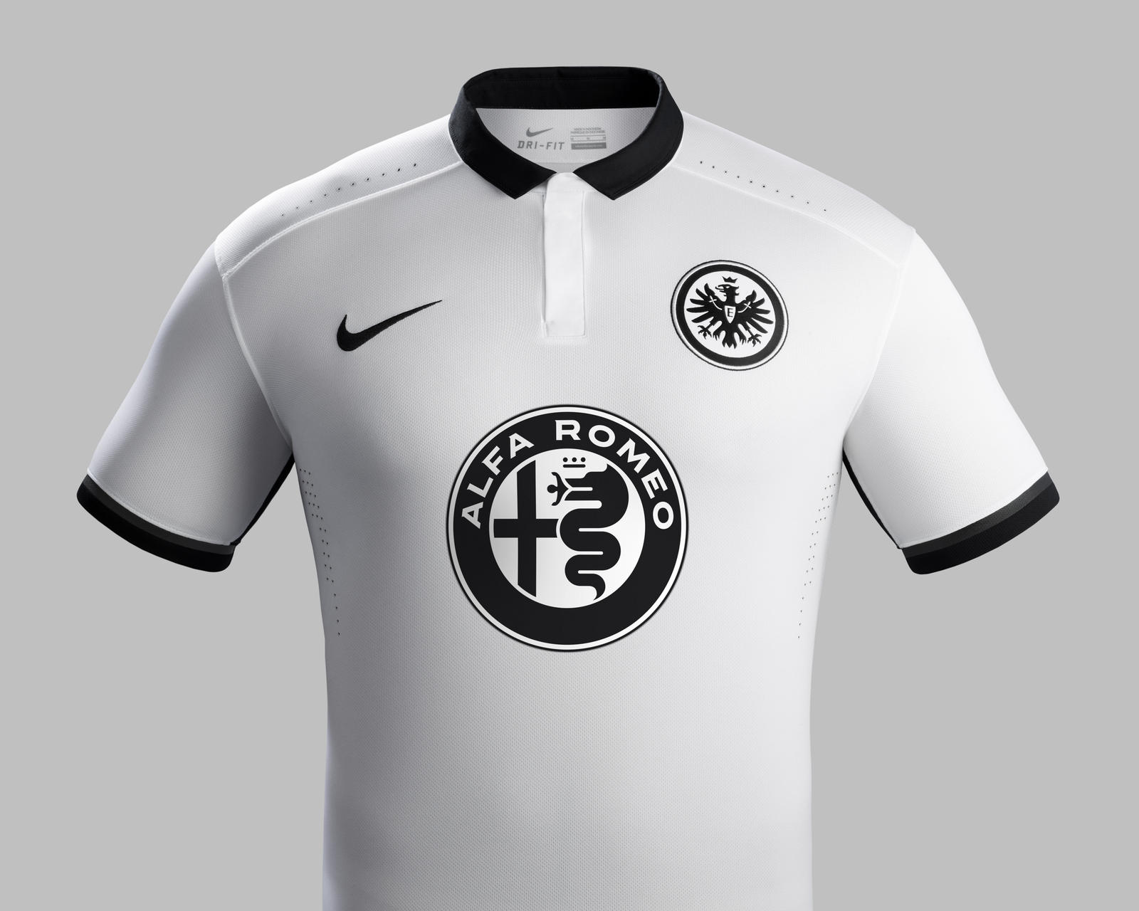
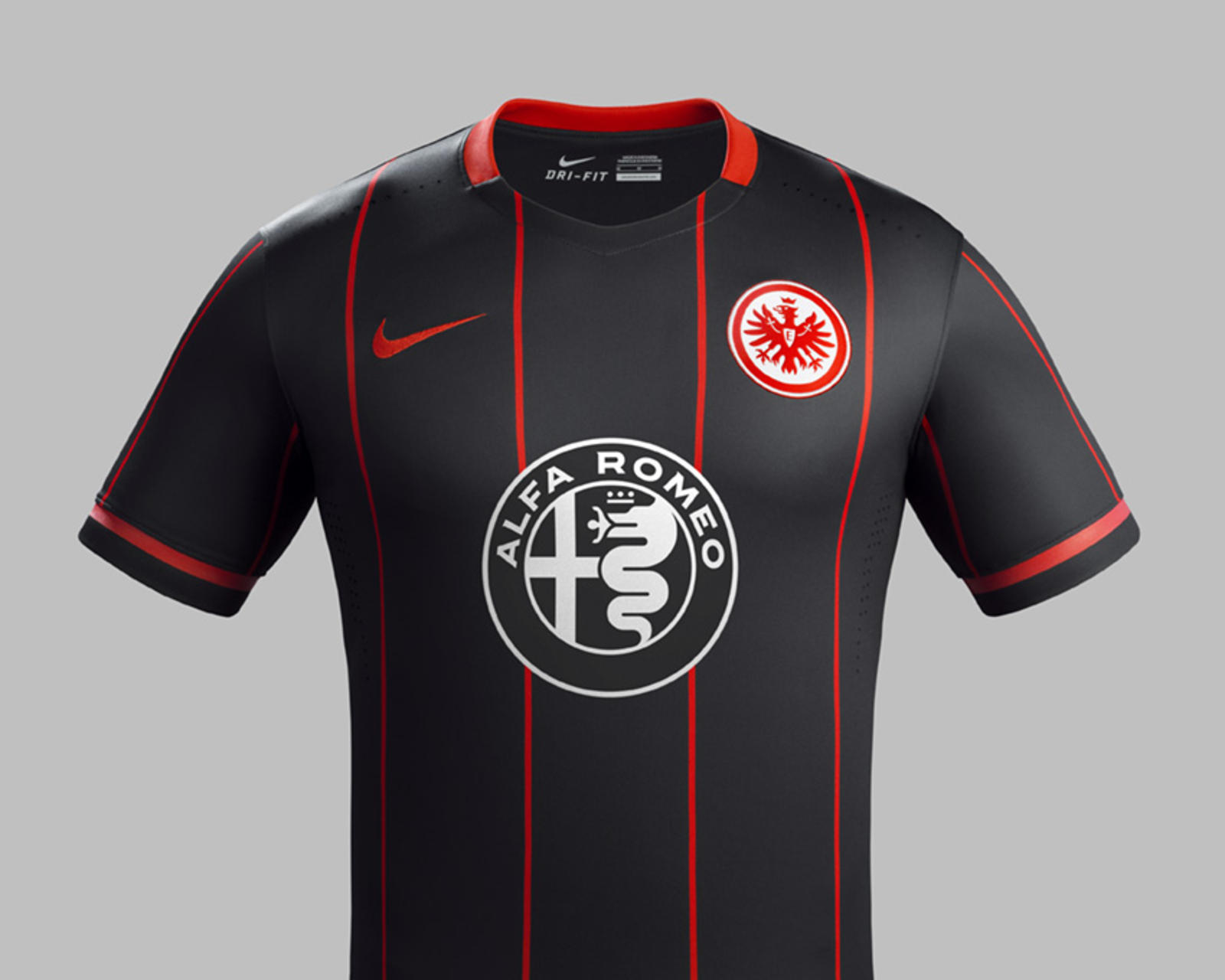
For underrated kits, there were a few from Nike that stood out between 2015 and 2016, a time where kits weren’t great. If you look at the kits at EURO 2016, a lot of people would say that was one of the worst tournaments for kits. But looking outside of that, there are a couple worth mentioning.
First, I have to talk about Eintracht Frankfurt. Their kits in 2015 are really good, their away in particular. Given what was happening at the time, which was essentially a lot of the same template, it’s nice to see hints of what Nike is doing a lot better now.
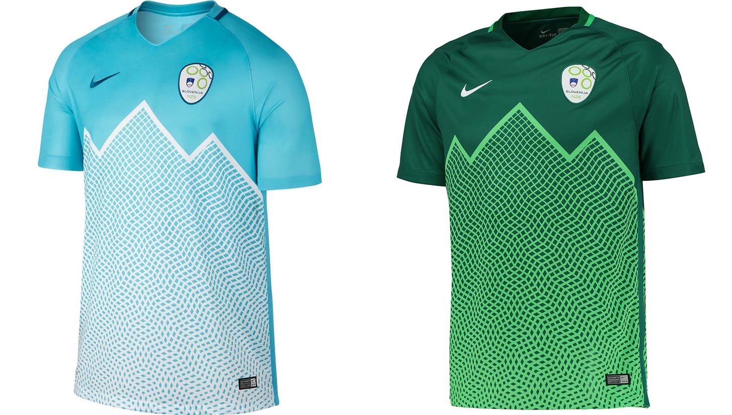
Similarly, in 2016, the kits from Slovenia were great. Slovenia is one of those nations that gets overlooked because they’re not often at major tournaments. You’ve got this unique pattern, which is very Slovenian. Slovenia often do those mountain-inspired graphics. The colors are really well chosen, I love the graphic, and it’s the kind of kit that you’d expect to see this year. Had Slovenia been at EURO 2016, we probably would’ve seen more of the kit.
On the rise of kit popularity over the decade:
Kits didn’t always have this reputation, they were seen by a lot of people as something only kids would wear. What’s really helped in this last decade is the collaborative nature of it all.
You look at the PSG x Jordan and Juventus x Palace this year — even something like Arsenal’s return to adidas. They’ve put a lot of emphasis in returning to what they’ve done in the ’90s. And it’s not just the bruised banana kit that recently released, but the whole lifestyle collection around it too.
A lot of people are cynically looking at it as brands trying to get as much money as possible, and of course money talks. But I think as a result, it means that now kits get a lot more attention. And smaller teams that aren’t at the top tier of the brand are getting unique designs.
There’s a team in London called Hackney Wick, and they’re way down in the divisions, yet some of the top Nike designers are working with them. I think it’s great to see stories like that and it’d be great to see more of that in the next decade. Yeah you’re going to have the big PSG x Jordan and Juve x Palace deals, but I think more than that it’s those smaller collaborations that I’m excited about.
On which club/national team had the best kit run of the decade:
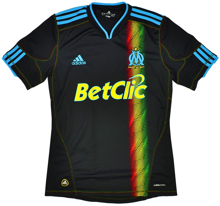
At the start of the decade, I really liked Marseille. Ligue 1 in general had some really great kits. From a creativity perspective Marseille had an outrageous run from the late aughts to the early ’10s. I just think it’s so fun to look back on those kits now. Pretty much every year there was something really interesting from adidas. Again, not all of them aesthetically pleasing, but I think they were really good from a kit design perspective. Other than that, national teams like Slovenia and Japan have been really good. Japan’s World Cup kit last year was one of my favorite releases of the decade.
The best release of 2019:
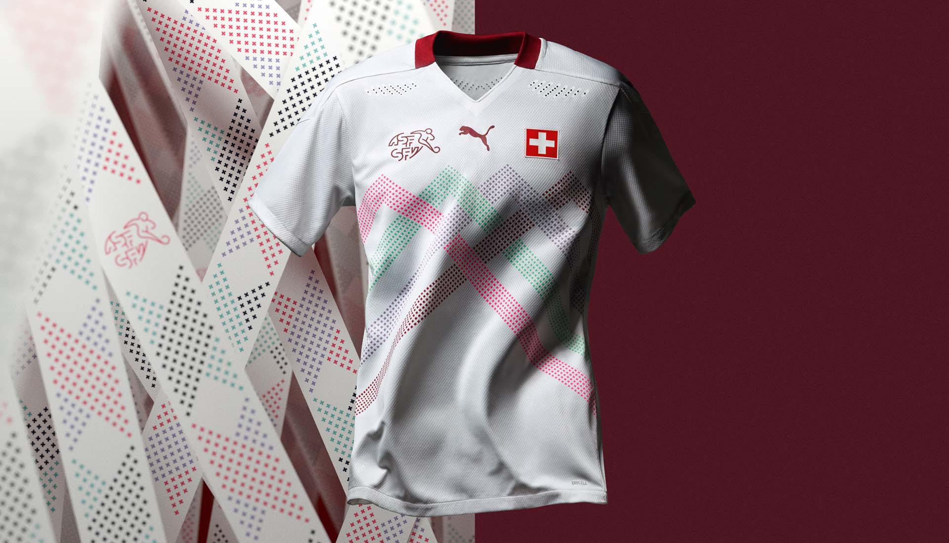
As a bit of an underrated shout, I really like the new Switzerland away shirt. This is a design from PUMA, and I’m really excited about them. I think next year they’re going to be one of the best manufacturers, and this is after a couple of so-so years.
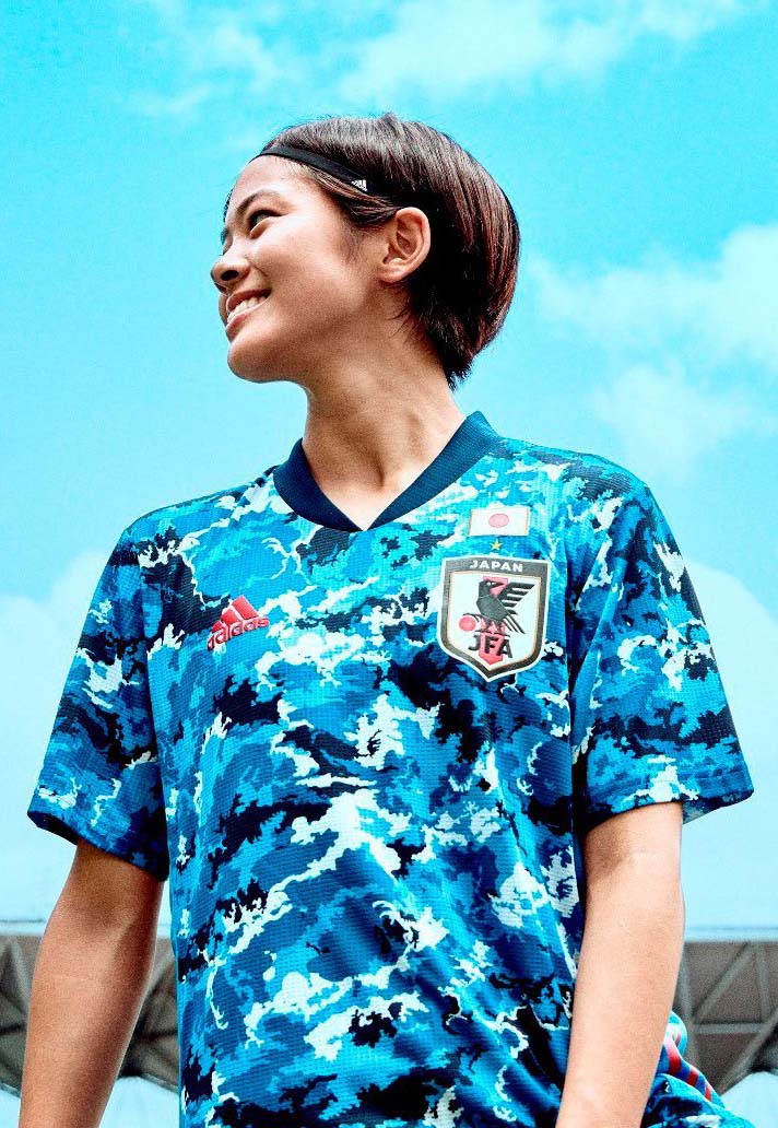
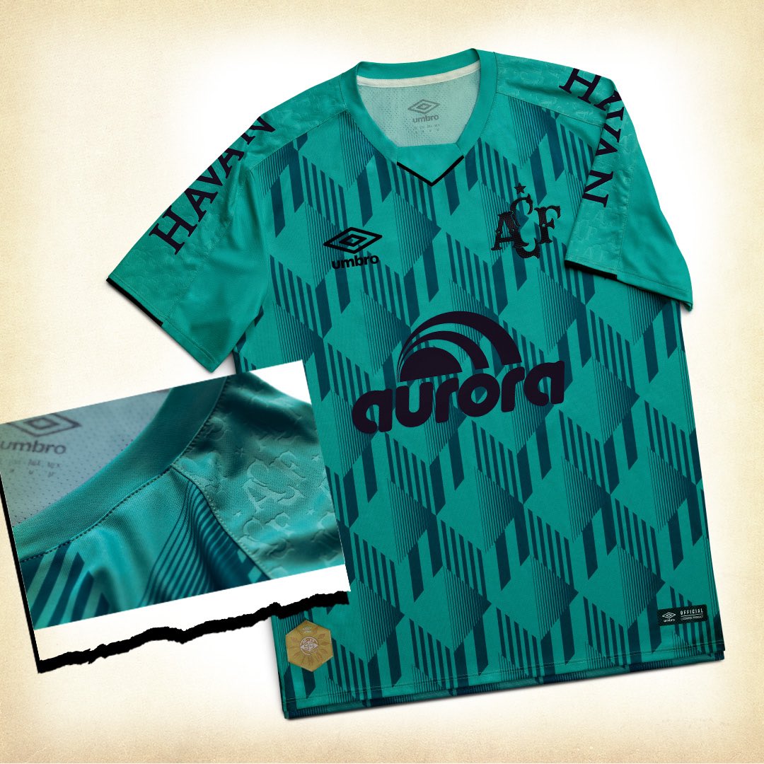
The Japan kit is lovely as well. I haven’t quite been 100 percent sold on adidas this year, but there’s some really good stuff from them, there always is. I also really like Umbro’s work in Brazil, they’ve had some lovely third kits. Chapecoense’s third kit is gorgeous. It’s an old pattern in a very nice teal color. Absolutely gorgeous kit.
Follow Phil on Instagram and Twitter, and check out his work for Footy.com here.
Luke Taylor

As the head of The Culture Division, Luke Taylor is constantly reading, writing, and photographing the beautiful game. In addition to stories highlighting global football culture, his site has an ongoing series that celebrates some of the most memorable late ’90s kits of all time.
The most underrated kit of the 2010s:
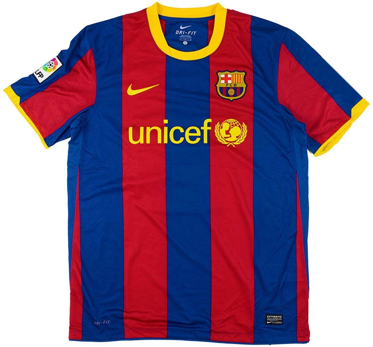
Luke Taylor: In terms of the best of the decade that I don’t see talked about enough, the 2010-11 Barcelona home kit stands out because it is so beautiful. You see the same teams hyped always such as UNAM and PSG, and Barcelona is a team that is normally in that bracket both on and off the pitch. But this one for me gets overlooked too much when discussing kits.
The best part of the kit is the combination of both its aesthetic and the context around it. That Guardiola team was by far my favorite to watch. I was fascinated by them. Mesmerized.
Messi, Villa, Pedro, Xavi, Iniesta, Busquets — wonderful. And in the kit, they played and won my favorite-ever Champions League match when they dismantled Man United at Wembley. Maybe it’s just a nostalgia thing for me that I am so attached to this shirt. But even so, the aesthetic is also wonderful. Evenly sized red and blue stripes, iconic of Barcelona, matched with neat yellow trimmings and decent typography on the back. It’s great.
Also, I just want to give a shoutout to the Inter Milan home kit of that season, as well as the never worn or released black China away shirt of 2018 because they also deserve more.
On which club/national team had the best kit run of the decade:
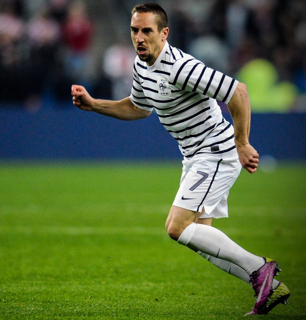
Over the last decade, we have seen some teams with consistently wonderful kits. I’d probably shoutout France as a nation having some great kits over the years.
On the retro influence that has been so prevalent in 2019:
My take on the retro influence is a mixed one. While seeing the nostalgia is great, when does enough become enough? I’m all for bringing in nostalgic aspects. This plays on the supporter’s emotions and opens up the debate for whether or not it is just a money-making scheme over anything else. I wrote a bit on the recycling of ’90s nostalgia and the complexities of it.
I’d want to see the creation of more unique kits without the constant regurgitation of retro themes and for the kit industry to start creating its own iconic kits more and more rather than relying on the designs from the past. Alongside this, I’d urge all kit manufacturers to look to concept/graphic designers for work because the concept kit scene is stacked with incredible designs by wonderful artists that could truly blow the kit industry to a new level.
Follow Luke on Instagram and Twitter, and check out his stories on The Culture Division.
Raymond An
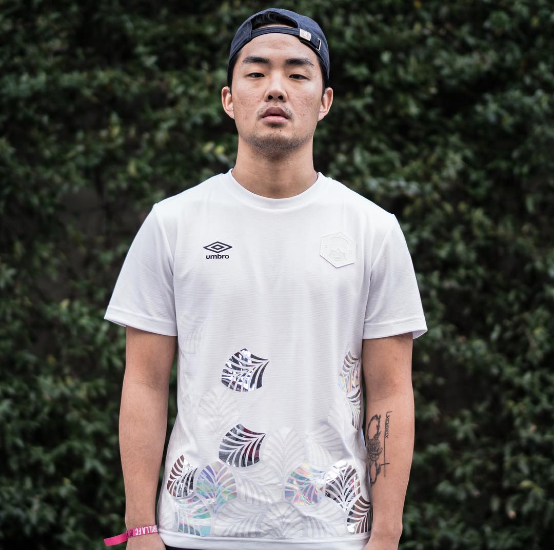
Raymond An lives and breathes football kits. In addition to running RAYSBEACHCLUB, his own online store dedicated to some of the top football-inspired streetwear labels in the world, he’s created two incredible flags out of football kits, and also has one of the sturdiest kit closets in the game.
The creative director for Guerrilla FC, An alongside Salhani has contributed to some of the dopest lifestyle kit and apparel releases we’ve seen.
The most underrated kit of the 2010s:
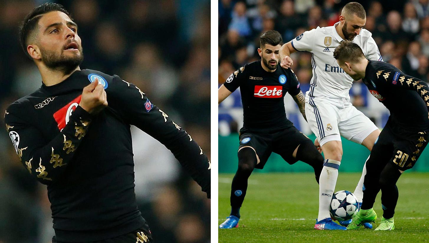
Raymond An: The 2016-2017 Napoli Kappa third kit. Black and gold. First, it’s Kappa. One of the brands that already has a huge place in the history of football kits, but has also hit mainstream success in the past 3-4 years targeting non-football fans worldwide. My favorite part of the kit is the colorway and how crispy the Kappa logos are integrated on the sleeves.
On which club/national team had the best kit run of the decade:
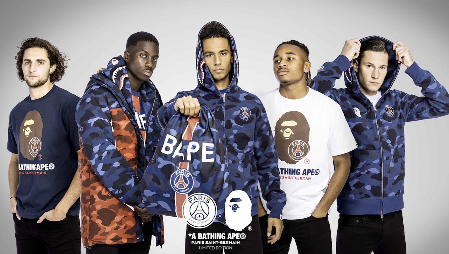
From the past decade, I think PSG had the best run of kits on a consistent basis. Who can forget the all-black kit with pink lettering? Their most recent collabs with BAPE and Jordan? The 2017-18 yellow kit also worn by J. Cole in Bas’ “Tribe” music video?
On the retro influence that has been so prevalent in 2019:
I like the retro influence touch, but I hope this season was the last one of clubs being heavily influenced by it. I’d hope the big brands like Nike and adidas are daring enough to dig into their creative minds to create new designs.
What he’d like the next decade of kits to look like:
I think it would be cool to see more collabs between brands that have nothing to do with football, and also special kits to be worn for European competitions.
His favorite kit he’s carried in his store:
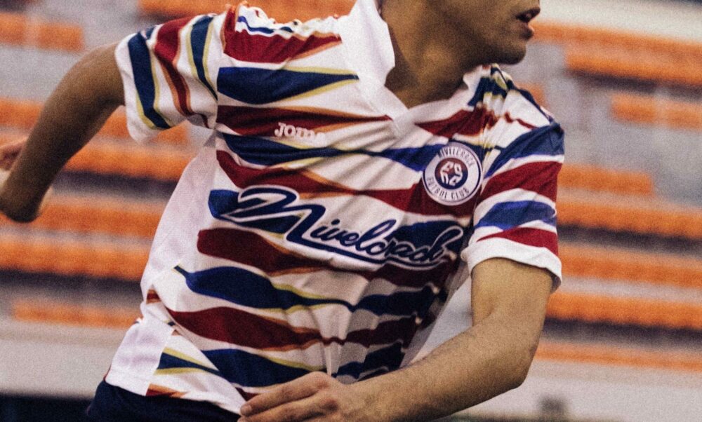
I enjoyed and had the pleasure of stocking NASA kits from The Concept Club, and Nivelcrack’s Tigre Coreano kits in my store.
Follow Raymond on Instagram and Twitter, and check out RAYSBEACHCLUB’s online store.
Interviews edited for clarity and brevity.


