
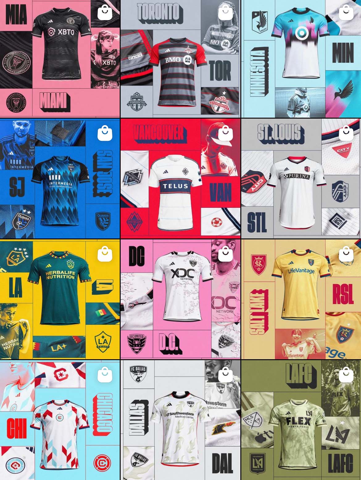
The latest edition of The Good, The Bad, and The Ugly covers the 2023 MLS kits, which as always, are a mixed bag of bangers and busts.
If there was one thing clear heading into the 2023 MLS season, it was that the league was turning a corner. Everyone (perhaps rightfully so) was clamoring over the Apple TV deal, whether it be the 10 figures it commanded or the broadcast quality and new content, but another symptom of MLS’s growth went a little more under the radar — the kit rollout.
Unlike previous years, where teams seemed to release their new kits for the season at their own volition, there was a concerted effort from the league to coordinate all 2023 kit releases.
The result was significant. The league actually felt organized. Professional even. Uniform (no pun intended) graphics on social media made the MLS official Instagram page look like a fancy presentation deck.
Even better, a lot of the kits were pretty damn good, to the point where narrowing down the five best for this list was much more difficult than it was in years past. But it wouldn’t be an MLS season without duds either. No one can bat 1.000, and even with the amount of hits amongst 2023 MLS kits, there were a fair share of misses as well.
Let’s break down the good, bad, and ugly of the bunch.
The Good
Chicago Fire: “A Kit for All”
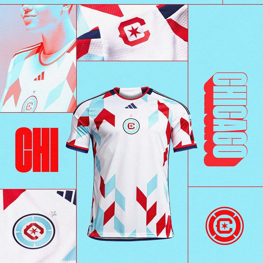
When executed properly, a centered crest can take a football shirt from average to savage. Such is the case with Chicago Fire’s “A Kit for All” 2023 jersey, which puts the club’s recently revamped crest front and center for all to see.
One of the few MLS rebrands to work (although it took a massive disaster to get it right the second time around), using the Chicago flag colors was a fantastic choice, as it makes for some fashionable jersey options. Powder blue is a cheat code.
The chevron pattern by itself is just OK, but when paired with the colorway and center crest, we get a pretty fantastic kit.
LA Galaxy: “The LA Kit”
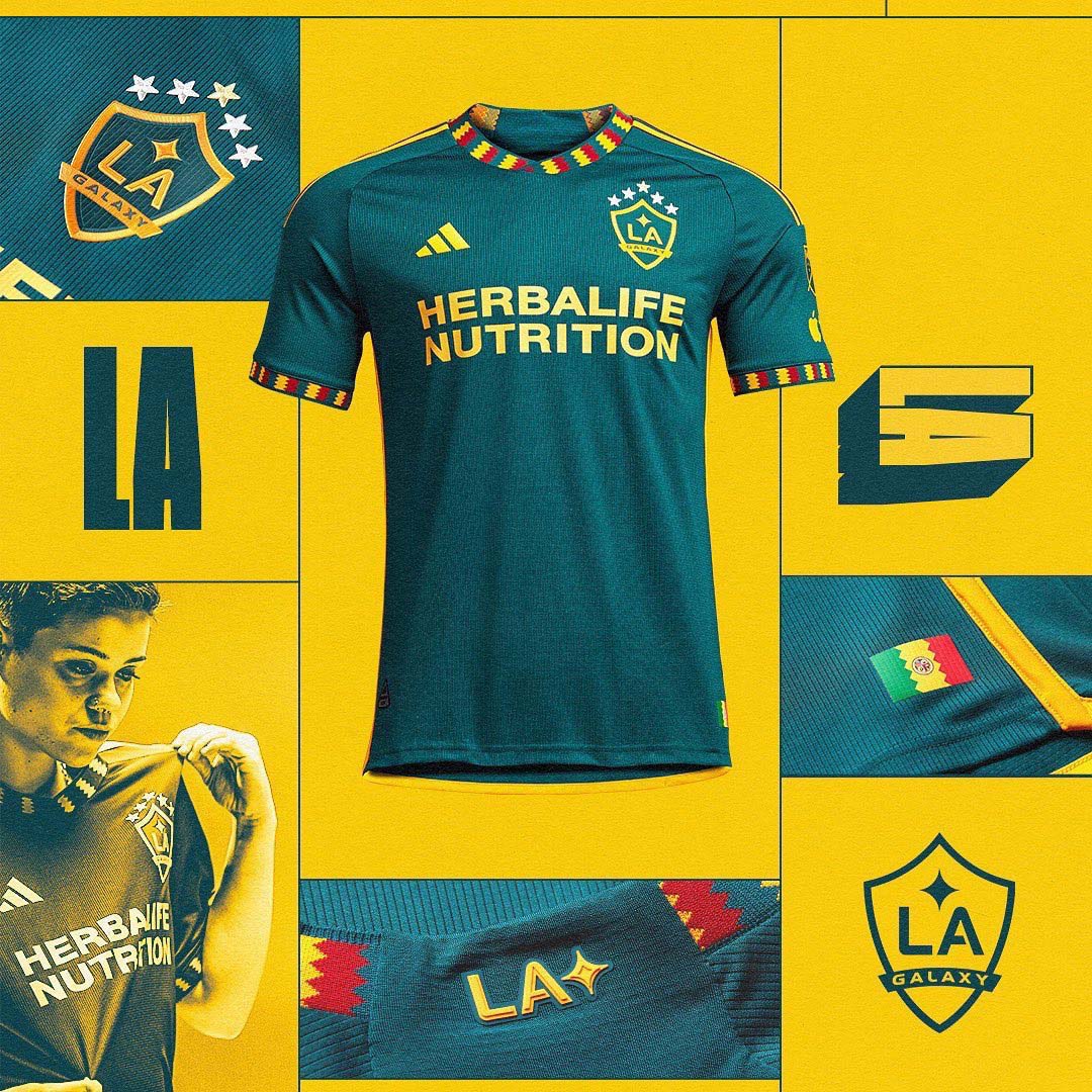
In addition to being the league’s most prestigious club, the LA Galaxy also have the distinction of having some of the best kits in MLS history. The 2023 “LA Kit” is yet another entry to the Galaxy Kit Hall of Fame.
What’s even more impressive about this shirt is that it’s replacing what was arguably the best kit in MLS over the past two years. The away shirt from the 2021 and 2022 seasons, inspired by retro Galaxy kits, was a favorite amongst fans and collectors alike. However, “The LA Kit” fills in those shoes more than capably, and it might even be better than its predecessor.
NY Red Bulls: “Daniel Patrick”
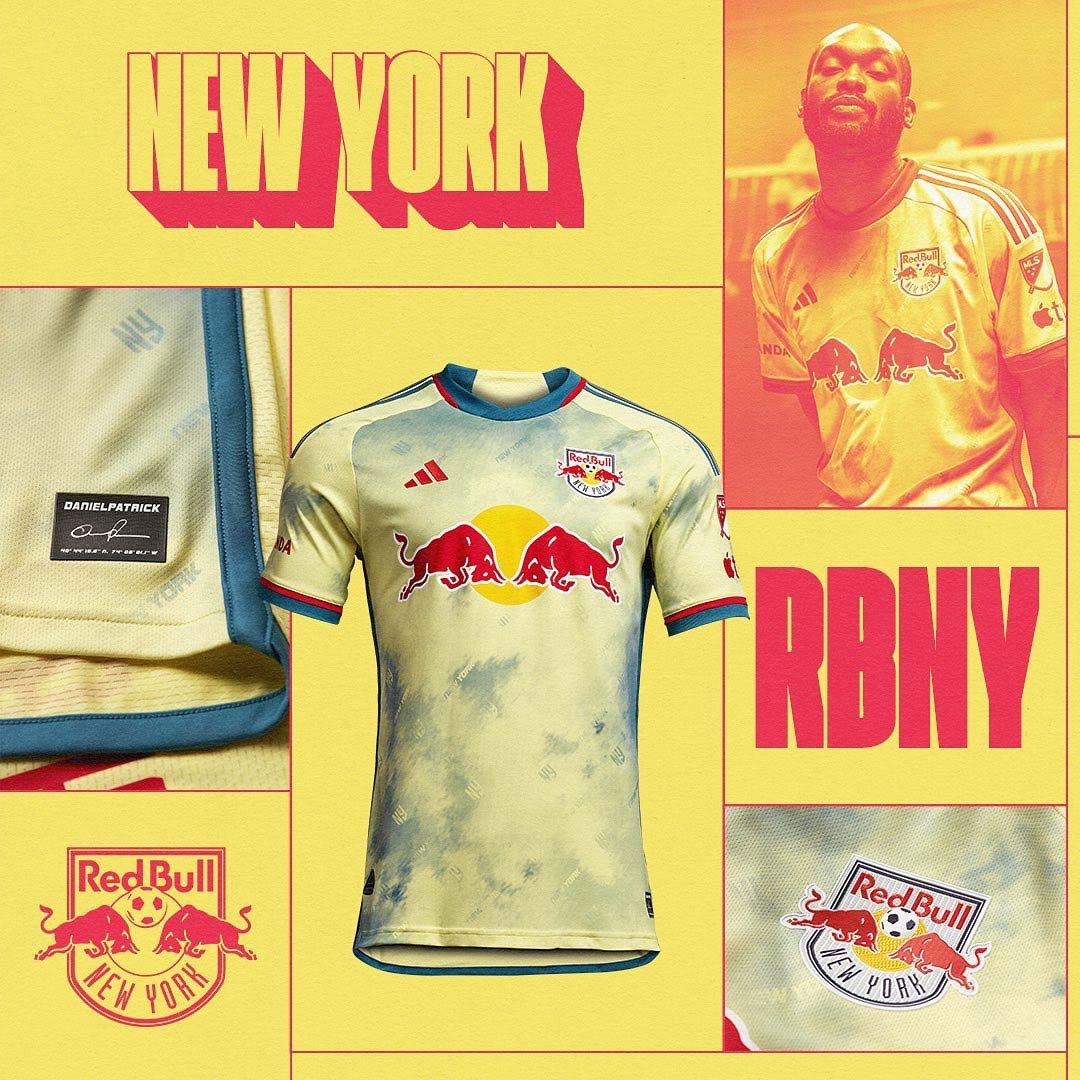
Yes, we’ve seen plenty of tie-dye kits in the past, but that doesn’t make the 2023 New York Red Bulls away strip any less fun to look at. The club teamed up with streetwear designer Daniel Patrick to create a shirt with a unique color palette and sweet details.
While it may not work together on paper, the cream, slate blue, and red pop while also playing surprisingly well with the normally gaudy Red Bull sponsor logo across the shirt’s chest.
Seattle Sounders: “Bruce Lee”
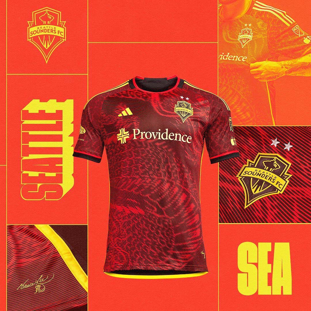
When initial leaks of a potential dragon-inspired kit for the Seattle Sounders surfaced earlier this year, I was nervous. Sure, when executed correctly, we’ve seen a dragon motif work — most notably with Real Madrid and Yohji Yamamoto — but if adidas and the Sounders missed the mark, the results were potentially disastrous. When coming up with an out-of-the-box design, you run the risk of looking like a bargain bin or bootleg shirt when done incorrectly.
Thankfully, the Sounders’ “Bruce Lee” shirt did not disappoint. Like the Galaxy’s “LA Kit,” it was replacing one of the best kits in MLS over the past few years. The purple Jimi Hendrix shirt was just about as perfect as you could get, but Seattle followed it up with a fitting tribute to another legendary figure with close ties to the city, Bruce Lee.
Lee’s first martial arts studios were in Seattle, and he met his wife, Linda Lee, there as well. His grave site in Lake View Cemetery in Capitol Hill is a tourist attraction to this day.
The red base with dragon-inspired graphics across the body and bright yellow accents are certainly a departure from Sounders kits in years past, but it’s a breath of fresh air instead of a jolting turn.
Orlando City SC: “The Wall”
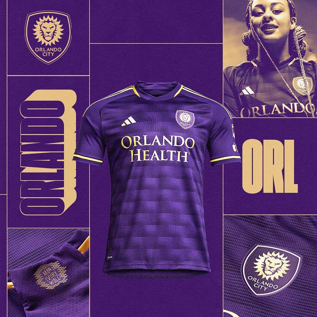
I love a good purple kit, and Orlando City’s “The Wall” home shirt is definitely one of them. While not particularly intricate, it blends the club’s regal color scheme perfectly, with the gold accents giving the perfect amount of contrast to the primary purple backdrop.
Paired with the “Sunshine State” away kit, and Orlando sneakily has some of the best jerseys in MLS.
The Bad
LAFC: “Smokescreen”
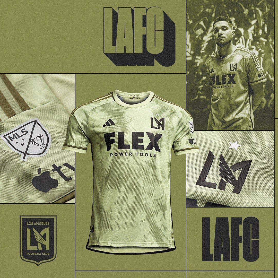
As a reminder, the “bad” section doesn’t necessarily mean the shirt is terrible, but rather that it’s disappointing in either concept execution or in comparison to its predecessor.
LAFC’s “Smokescreen” shirt is in the former category. Using a “tent green” base is a bold choice, one that I actually think would work in the proper circumstances. Paired with a hazy pattern that pays tribute to the LAFC 3252’s notorious smoke displays on matchdays, and you have an intriguing combination.
However, the shirt misses the mark in overall execution. The body pattern is a bit too haphazardly placed, and almost looks like it could be a templated teamwear design. However, I will say that I am a fan of the “un-shielded” LAFC crest, especially with the snazzy new star above it. This could’ve been a great shirt, but in the end, it’s just OK.
St. Louis City: “Spirit”
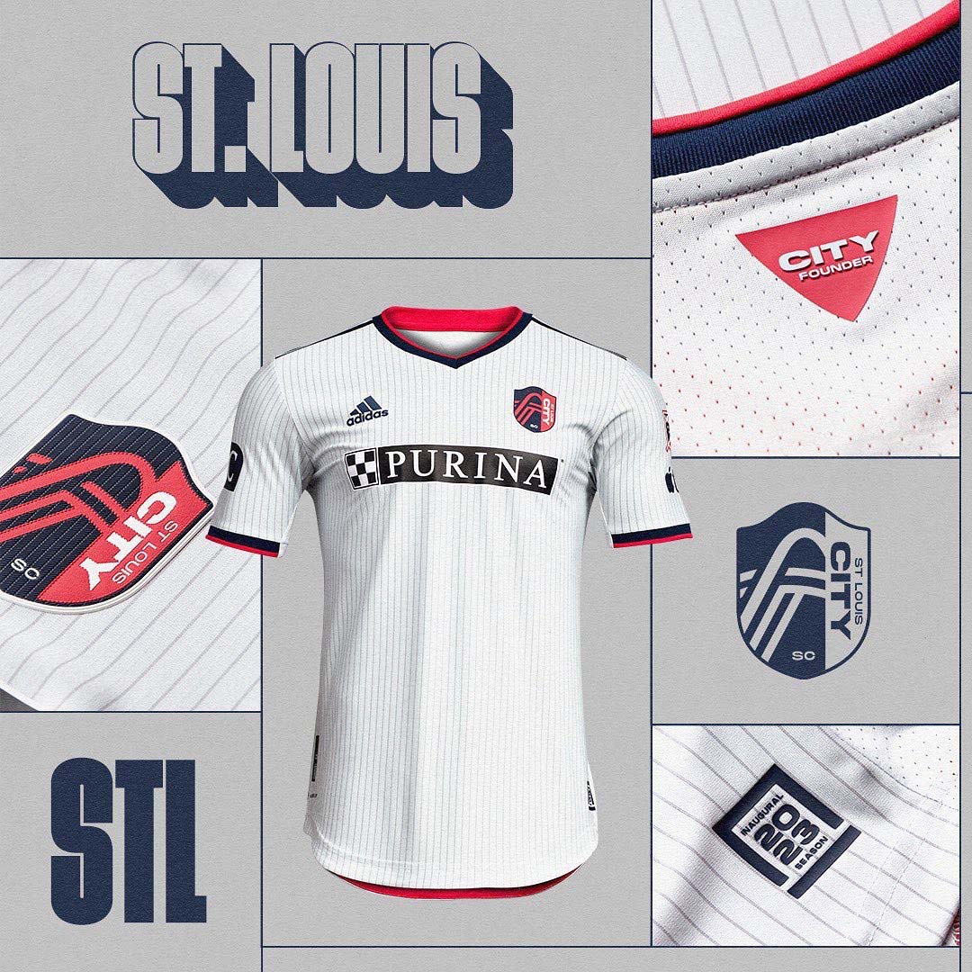
Pinstriped kits are criminally underused in soccer, but unless you’re the New York Yankees, the design element isn’t enough to stand out on its own. Such is the case with the “Spirit” kits from fledgling MLS franchise St. Louis City.
Having to follow the pretty solid home shirts that were unveiled in 2022 might have played against this kit, but it’s still too plain to make an impact, especially considering it’s the club’s inaugural away jersey.
Real Salt Lake: “Beehive State”
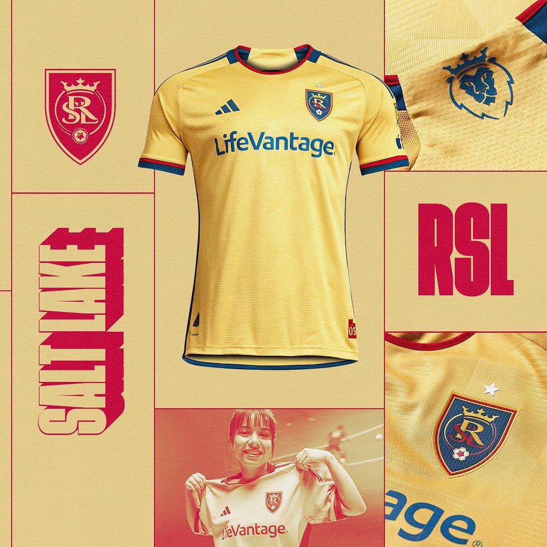
Again, this is a rather plain shirt that doesn’t move the needle in any direction for me. I don’t mind a simple jersey, but there needs to be more than a subtle sublimated pattern over a solid background. The best simple kits nail the details, and there aren’t enough here to put it over the top.
The particular shade of gold on this kit works, as does the connection to Utah’s state nickname. I just would’ve liked to see some details on the sleeve cuffs or neckline that would play into the theme even more.
Vancouver Whitecaps: “Bloodlines”
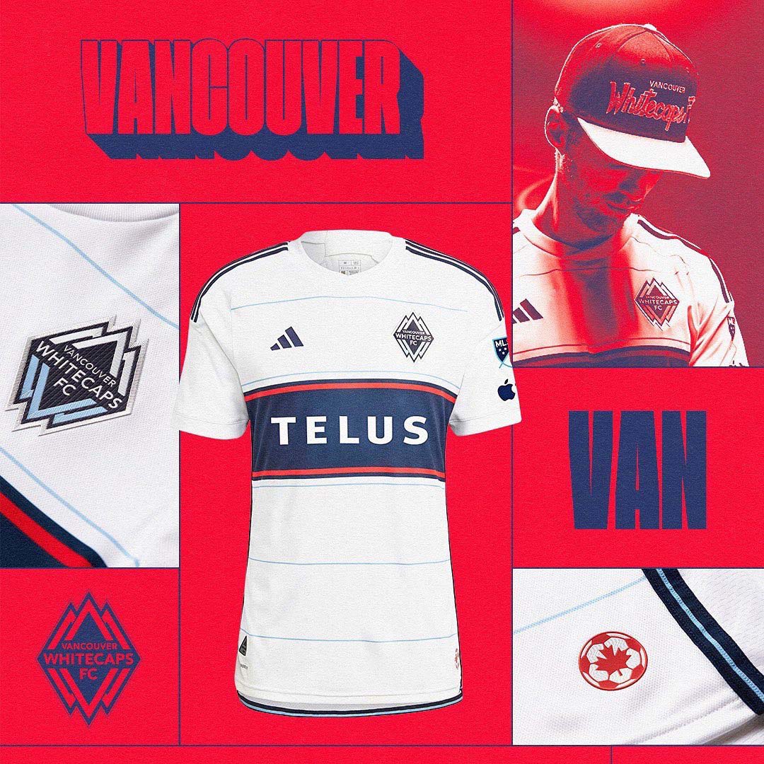
At first glance, this shirt is OK. But when you consider the previous Whitecaps home shirt, it’s massively disappointing. Vancouver’s 2022 kits were among the best in the league, and they were simplicity executed perfectly. Add in some retro details that connect to the club’s history and both the home and away shirts from last year were instant hits.
However, small changes like a red stripe going across the iconic hoop and plain sleeve/neck cuffs take away all the charm from last year’s home kit. A new sponsor with awkwardly-sized font doesn’t help its cause either.
The Ugly
Austin FC: “La Voz de Austin”
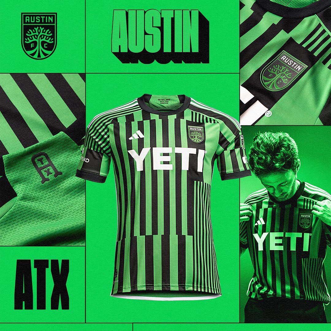
Glitchy patterns rarely work on football shirts, and Austin FC’s “La Voz de Austin” home kit for 2023 is no exception. Moving away from the simple stripes from the club’s inaugural home strip, Austin and adidas looked to spice things up while maintaining the initial feel of its predecessor.
But like a bad movie sequel, it neither captures the magic of the first shirt nor adds much new to the story. Plus, we’ve already seen a similar design (which worked equally as poorly) with Barcelona in 2021-22.
Toronto FC: “Club”
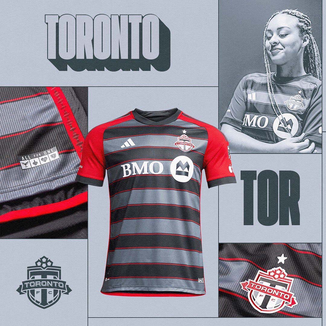
If you were looking to buy an overpriced ugly holiday sweater way too early in the year, Toronto FC has got you covered. This is a very questionable design from a club with a pretty solid kit history. It’s doing too much and not enough at the same time. The striped body clashes horrifically with the bright red sleeves, and the red stripe accents look off-measured.
With a few tweaks — grey or black sleeves and even red stripe accents to name a few — and this might be a tidy and inoffensive option. But instead we get what looks like a first draft of an amateur concept kit design.
FC Dallas: “Burn Baby Burn”
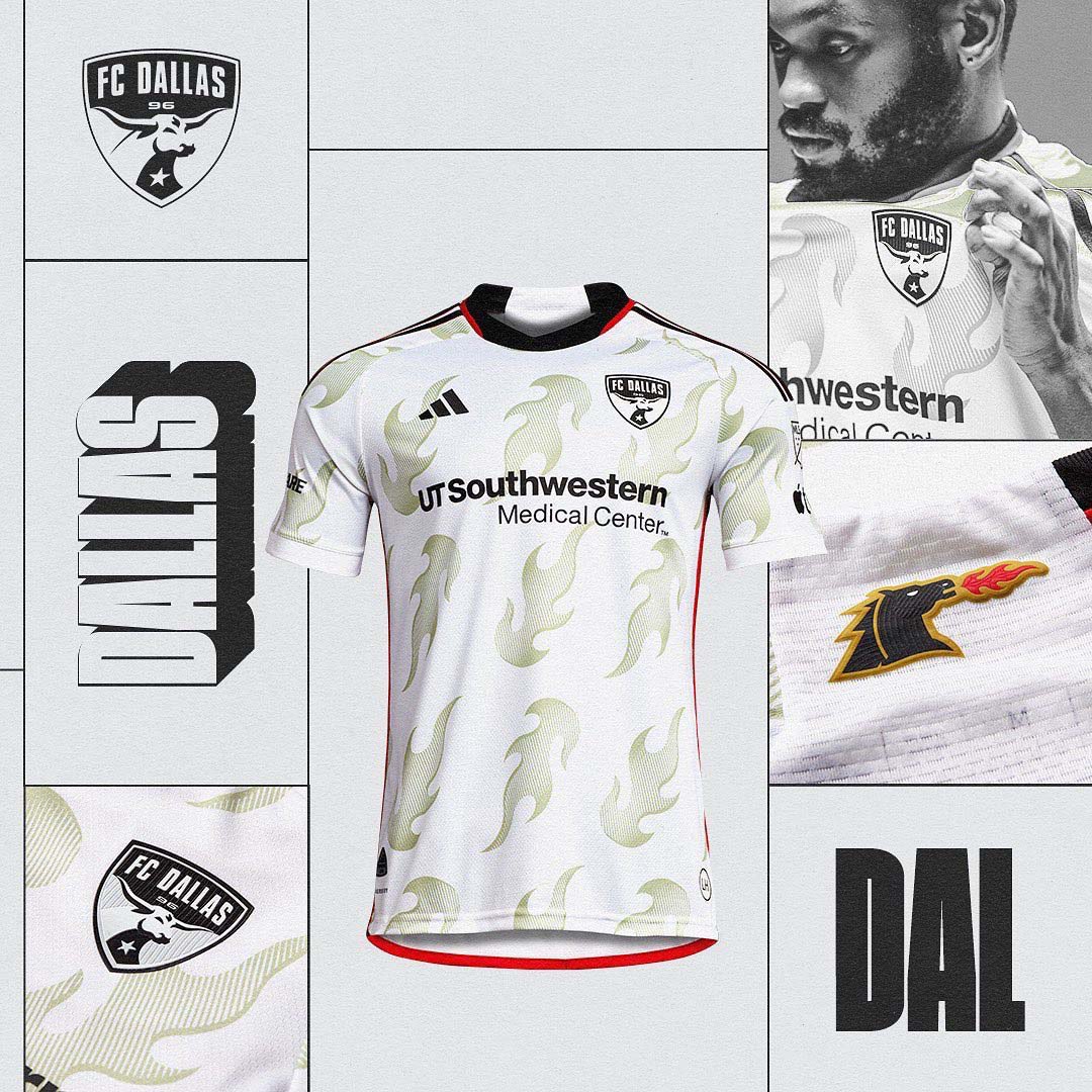
Going for a retro inspired design is about as safe as you could play, but FC Dallas somehow bottled the finish with their 2023 “Burn Baby Burn” kits. While the flame pattern that pays tribute to the Dallas Burn days might look pretty good on a camp collar button down shirt, they look incredibly juvenile and out of place on a football kit.
OG Burn fans might be delighted with these, but for everyone else, it’s an attack on the eyes.


