
With a totally new set of jerseys for the first time in league history, we take a look at all of the 2024 NWSL kits, giving each a grade.
We love new kit season. New drops and designs only add to the excitement and anticipation that comes with a new year, and the NWSL finally put together a coherent rollout for their new 2024 kits.
Previously, teams would sporadically release their new kits prior to the season’s kickoff, which made for a staggered and uncoordinated feel. And while we get something similar prior to the start of the European football calendar, that’s more understandable as there are multiple kit manufacturers that supply top European teams. With a league-wide Nike sponsorship, it seemed like the NWSL was missing out on an opportunity to do one coordinated kit drop.
The separated kit drops were mostly due to the fact that individual clubs were tasked with creating their kit designs in-house. In 2024, the design responsibility shifted to Nike, which is why we’re seeing a total kit refresh along with a singular jersey rollout like adidas has done with MLS kits.
While the Swoosh has successfully executed drops like this in the NBA and WNBA, this one feels a little…underwhelming. A lot of it has to do with the designs themselves, which are pretty repetitive and in some cases, downright uninspired.
Whereas adidas and MLS have been able to create an almost bespoke kit design for every team, Nike and the NWSL have opted for a more templated approach. In addition to a primary kit that features a more intricate design or pattern, each club received a secondary kit that followed the same template: A plain gradient. While some gradient color patterns worked better than others, it was a bit of a lackluster and over-simple design approach that feels like it was turned in at the last minute.
However, it’s important to note where the NWSL is at in its stage of development. Just a few years ago, we saw a similar heavily templated set of MLS kits (much worse than these, it should be said), only for the league to steadily improve year over year since 2020.
Plus, there are still a few absolute heaters in the mix, and we have to appreciate the effort that the league is putting into organizing its kit release. While the designs in some cases leave a bit more to be wanted, it’s a major step forward for the NWSL to have its own kit rollout. Progress doesn’t come all at once, and this year’s kit drops are a net positive for the growing league.
But enough talk. Let’s dive into the kits. As we’ve done for the past three seasons, let’s grade each of the new 2024 NWSL kits.
Angel City FC
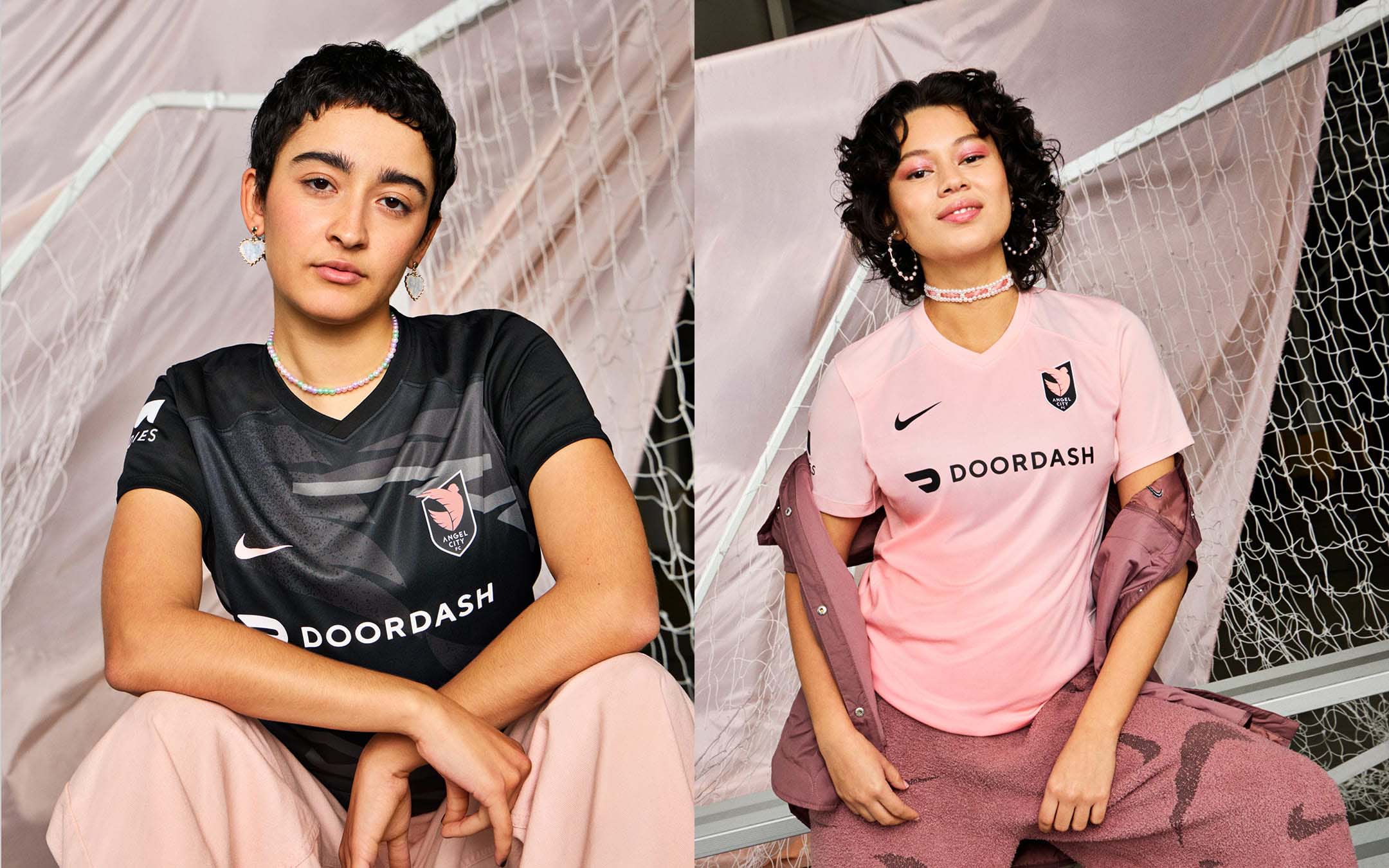
Primary: C+
Secondary: C+
Despite its short history, Angel City FC has had some of the most memorable NWSL kits of all time (we’ll pretend last year’s away kit never happened).
With the bar set pretty high, the new set of kits, while largely inoffensive, don’t quite hit the mark. Playing on a “Moonlight” and “Sol” theme for its primary and secondary kits, respectively, we get a contrasting set of jerseys that highlight the club’s main colors.
On the primary “Moonlight” kit, the wings of the Angel City crest are imprinted throughout the body as a pattern. It’s not a bad design cue, but it feels like a step down from the beautiful art deco-inspired “Dawn” kit that it is replacing.
The “Sol” secondary kit is in the same gradient template as the rest of the league, and while the shade of pink is fantastic, it’s a bit too plain. The lack of details on the shirt make it look like a warm-up kit, and it definitely would’ve benefited from a subtle touch or two on the sleeve and neck cuffs, or even on the jock tag like we’ll see later on down the list.
Bay FC

Primary: F
Secondary: F
If I were a Bay FC fan, I would be mortified at what Nike has done to the club’s inaugural kits. As if the incredibly underwhelming primary kit that was unveiled a few weeks ago wasn’t plain enough, Bay FC gets an equally (if not more) austere secondary shirt that’s draped in an eye-popping charcoal gray.
Unless it’s a metaphor for the soul-sucking blandness that tech culture seems to revel in, then I’m completely out on this kit.
Chicago Red Stars
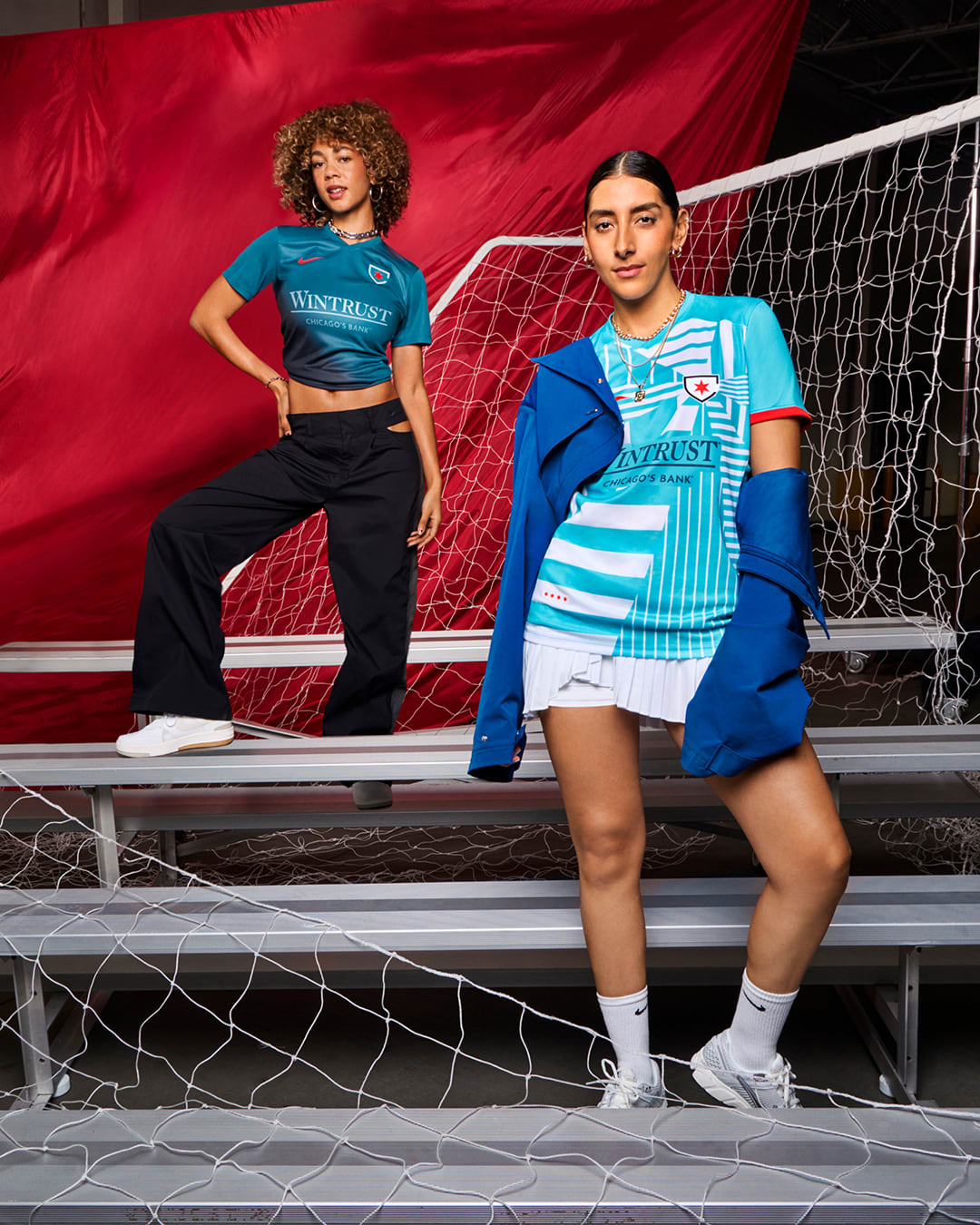
Primary: C+
Secondary: C+
Like Angel City, the Chicago Red Stars have a pretty storied kit history. A fantastic crest and color pattern gives the club an advantage, which ironically hurt the team’s grade when it comes to this year’s kits.
In a vacuum, the 2024 Red Stars kits look pretty solid. Nice even. But with the context of previous designs, especially last year’s stunning “Foundation” kit, they’re bang on average.
The primary kit opts for a glitchy geometric pattern seen before with clubs like FC Barcelona and Manchester United. I’m typically not a fan of patterns like this, which remind me of the ungodly strobe lights often seen in haunted houses and nightclubs (for my money, they might as well be the same thing). That could be a personal bias, but either way it somewhat works and Chicago could’ve done way worse than this.
The gradient on the secondary kit is actually quite nice, and is one of the better secondary shirts across the league.
Houston Dash
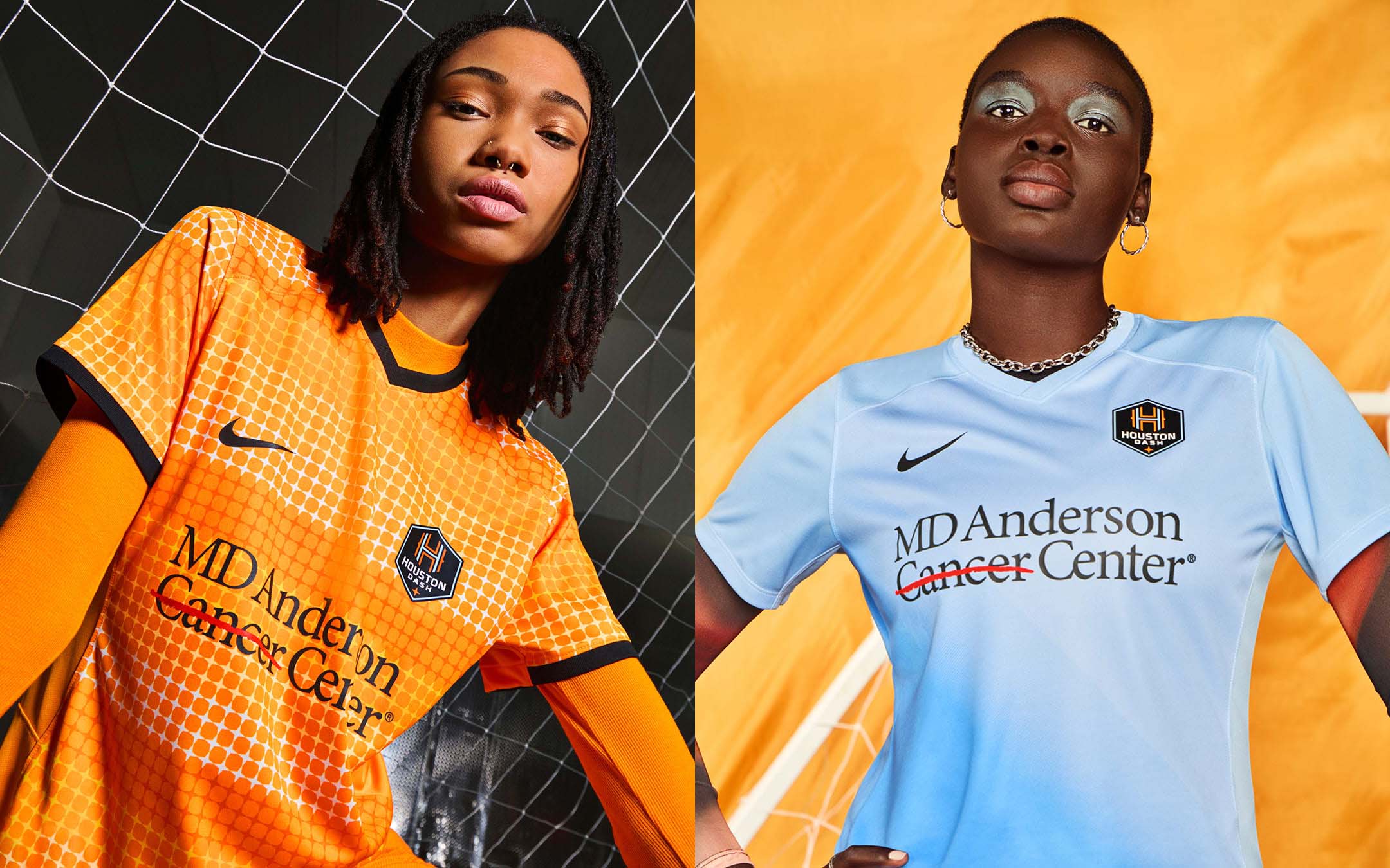
Primary: C-
Secondary: C
Houston’s primary kit features the club’s trademark orange with a pattern inspired by the quasar-esque star on its crest. The star is probably my favorite part of the Dash’s recently redesigned logo, but the way it’s executed as a pattern doesn’t quite work.
Simply cutting and pasting the star repeatedly makes for a grid that’s a little confusing and disorienting to look at. Playing with the size and placement of the stars could’ve made for a better and more interesting option here.
The powder blue secondary kit is an improvement to the primary, but a couple pops of orange or other details would’ve taken this kit to another stratosphere.
Kansas City Current
Primary: B-
Secondary: C+
If you want to go simple on a kit design, the details have to be on point. Probably my biggest critique on the NWSL jerseys as a whole would be a distinct lack of interesting details. However, both of Kansas City’s 2024 kits have enough details on them to put them amongst the best in the league.
On the primary, the teal accents on the side of the body and sleeve cuffs really makes the red pop, and a subtle sash pattern adds depth. The secondary kit, while not as successful as its counterpart, still does nicely to fade from white to teal, which looks even better when paired with the teal shorts on the full kit.
Gotham FC
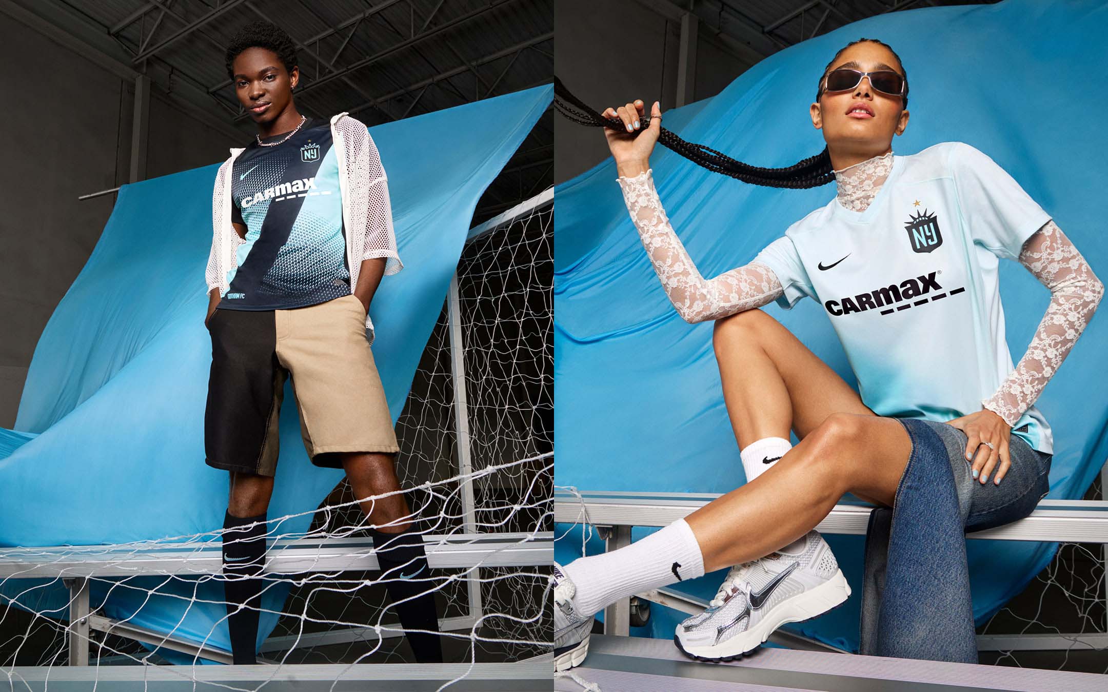
Primary: B+
Secondary: C+
The NWSL reigning champs were blessed with a pair of solid kits for 2024, which judging by the club’s offseason, should be a massive year.
Gotham’s primary shirt features a sash design with sky blue accents over a black base, which is never a bad color combination. The gradient secondary kit is pretty similar to Kansas City’s, although that’s not necessarily a bad thing. The newly-added star to the crest doesn’t hurt either.
North Carolina Courage
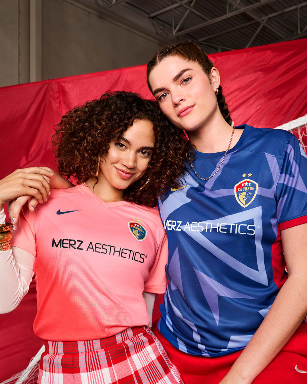
Primary: C-
Secondary: C+
I don’t mind the North Carolina Courage’s primary kit on its own at all, but it gets docked multiple grades because it looks like a scrapped OL Reign design when the club re-branded back to its former logo.
The pink gradient on the secondary kit is pretty stunning, however, and along with Angel City and San Diego, we have a pretty formidable rose-hued trio on our hands.
Orlando Pride
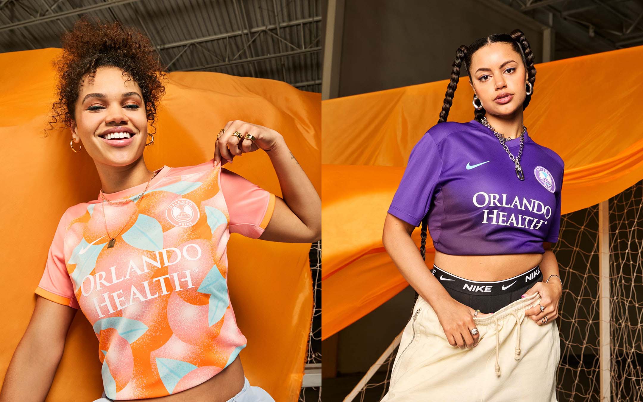
Primary: A
Secondary: C-
Arguably the best kit out of the bunch, the citrus-inspired primary kit from Orlando Pride is an instant hit. The design is so good that it doesn’t even matter that it strays away from the club’s colors. It’s a wild pattern and color scheme that might not work in theory, but certainly does in execution.
The purple gradient “Phoenix” secondary isn’t bad, but like many others on this list, suffers from an apparent lack of details.
Portland Thorns
Primary: F
Secondary: F
Here’s a design tip for sports teams — if your logo features an undefeated color scheme, you should probably employ it on your uniforms.
For some inexplicable reason, the Portland Thorns decided to inject their kits and crest with a jolt of neon yellow, like it’s 2014 again and volt is the most coveted color on the market. Just three years ago, the Thorns had the best kits in the league, yet every new shirt since has been pretty disappointing. However, this set might be the worst out of the bunch, and makes me long for the gaudy tattoo-inspired away shirt from last season.
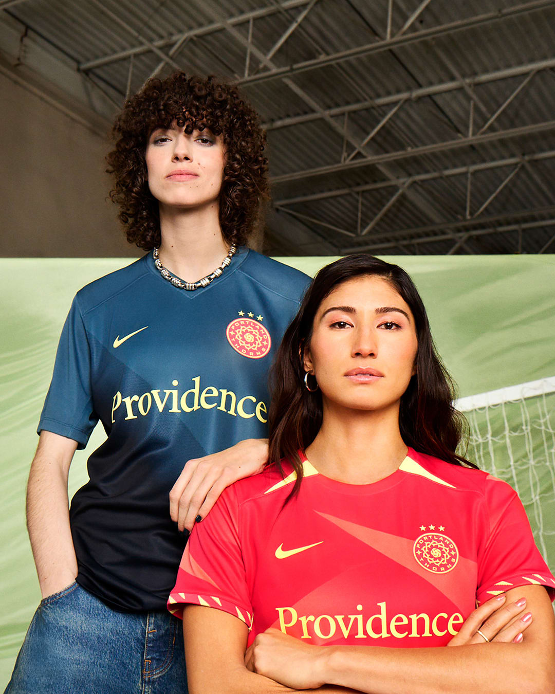
Racing Louisville
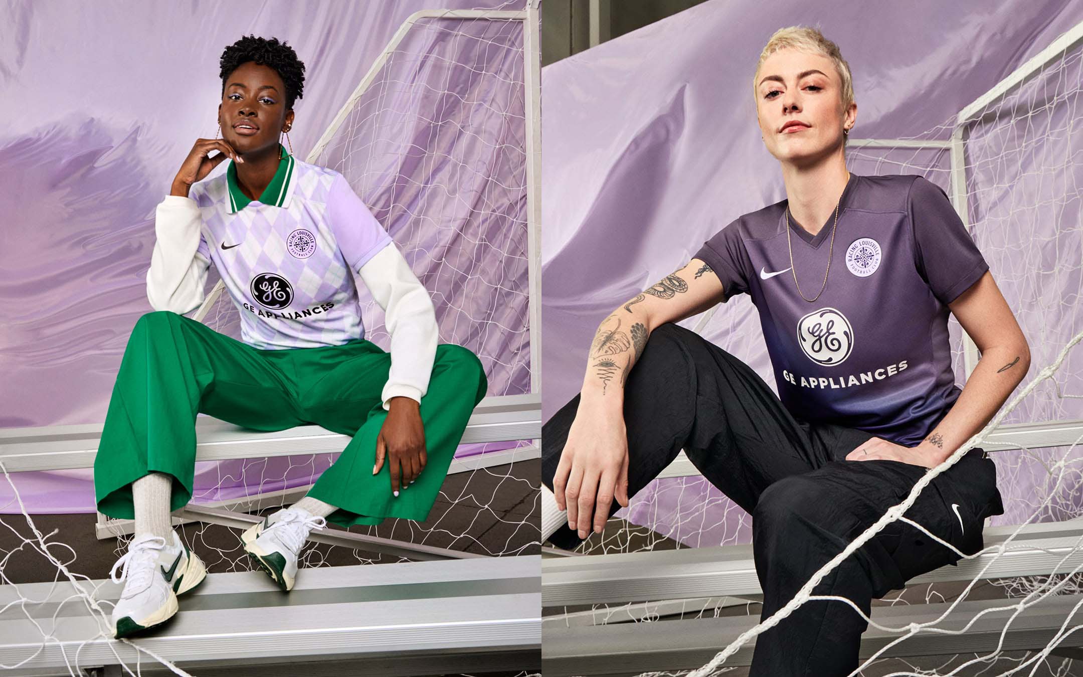
Primary: A-
Secondary: B+
No team has a better full set of kits than Racing Louisville in 2024. A club with a pretty stellar kit history in its own right, both sets of new shirts fit right into the team’s historic closet. The argyle design on the primary kit is particularly nice, and gets bonus points for the hints of mint green and the pattern continuing on to the back.
The purple gradient on the secondary shirt gets higher marks than Orlando because of the shade of purple it employs. It’s the perfect complement to the primary kit, and rounds out my favorite set in the league.
San Diego Wave
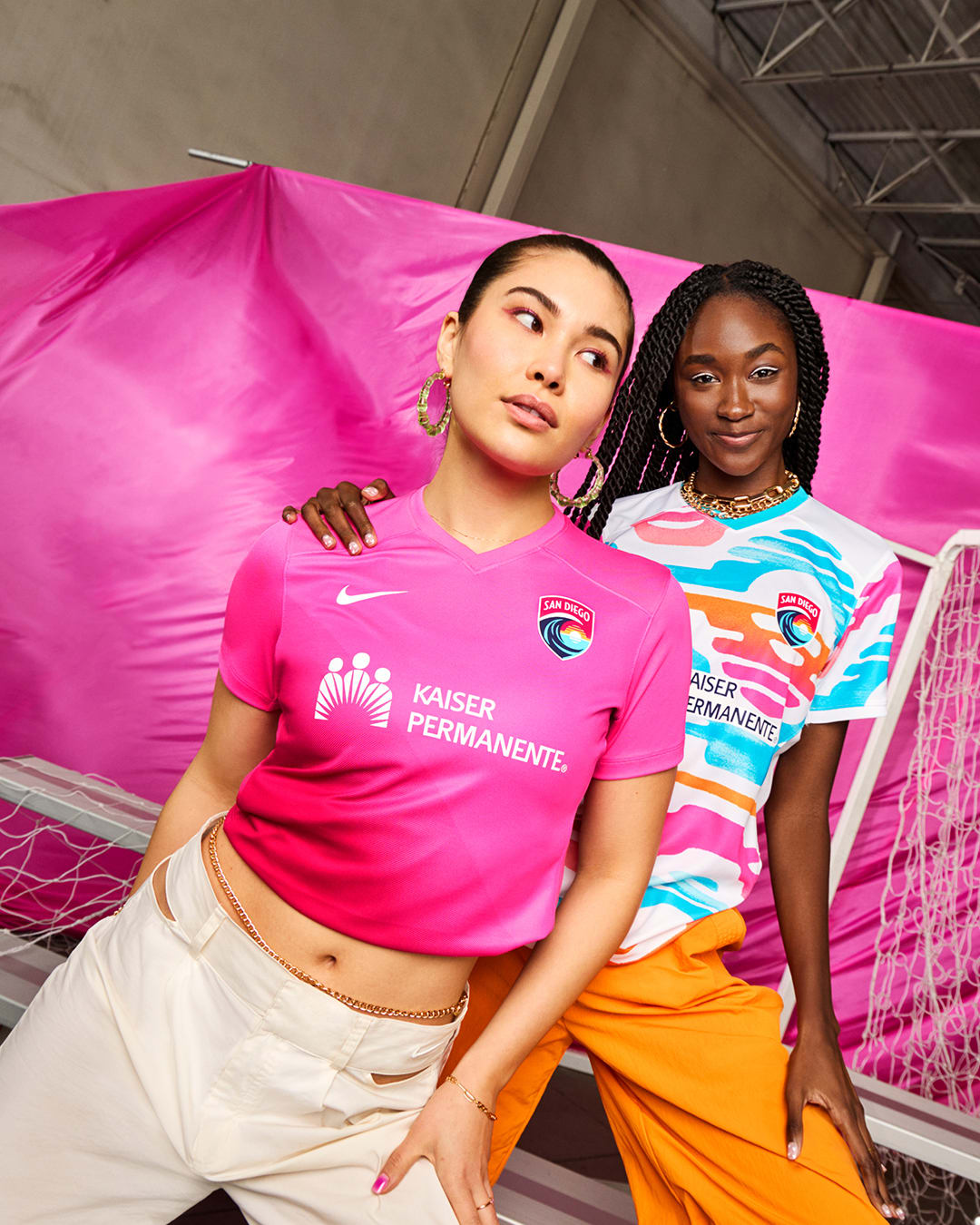
Primary: B+
Secondary: C+
Many had the Wave’s primary shirt pegged as the best in NWSL this year, and while it certainly is eye-catching, I don’t know if the repetitive sunset pattern fully works. Throughout San Diego’s two-season history, the story with its kits has been the same: Awesome crest, boring kit.
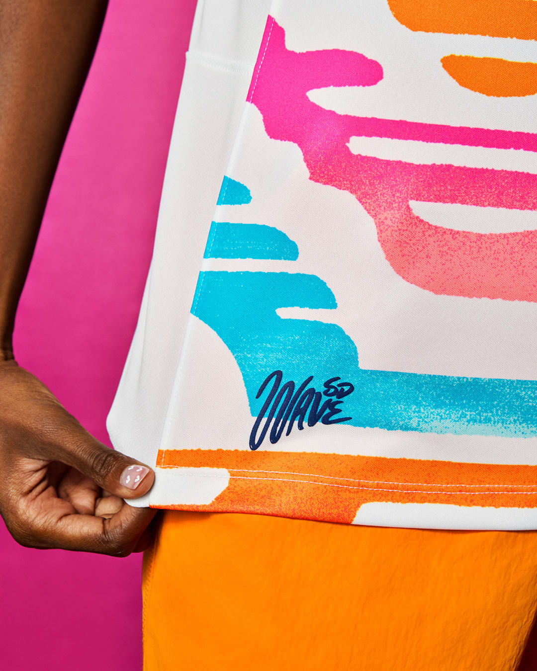
Both the primary and secondary shirts erase that narrative, as you can hardly call the bright designs on each shirt monotonous. And while the heaps of praise onto the primary shirt is understandable, I think it benefits from a disappointing history of Wave kits, and a largely subdued set of other NWSL kits. However, one extremely cool detail on the primary kit is the “SD Wave” jock tag, which I would’ve loved to see more teams employ.
Seattle Reign
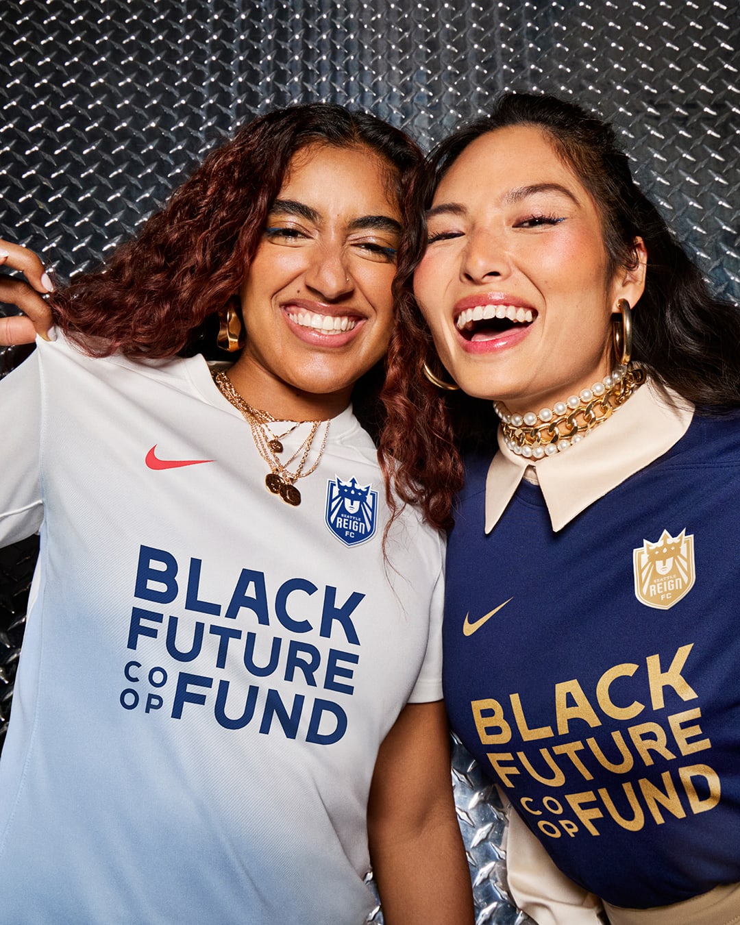
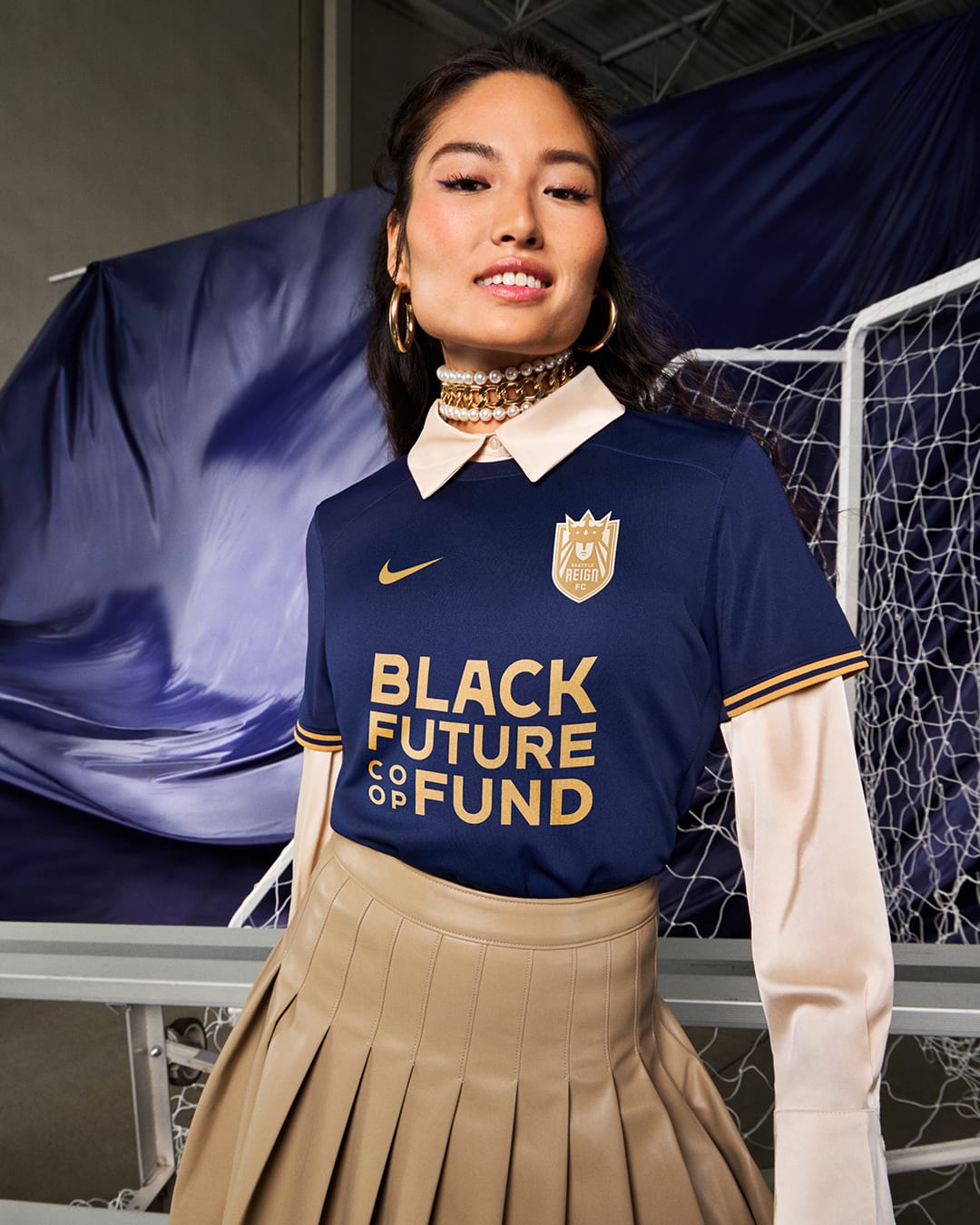
Primary: A
Secondary: C
Seattle’s primary kit is how you execute a simple shirt design. Fantastic colors, pops of detail, and a solid crest. It’s up there with Orlando’s primary as the best in the league, and the more I look at it, the more I’m tempted to say it’s clear of its citrus adversary. It’s certainly a solid start to the re-brand.
The secondary shirt is similar to Gotham and Kansas City’s, but the navy blue fade doesn’t quite pop as much as the others.
Utah Royals
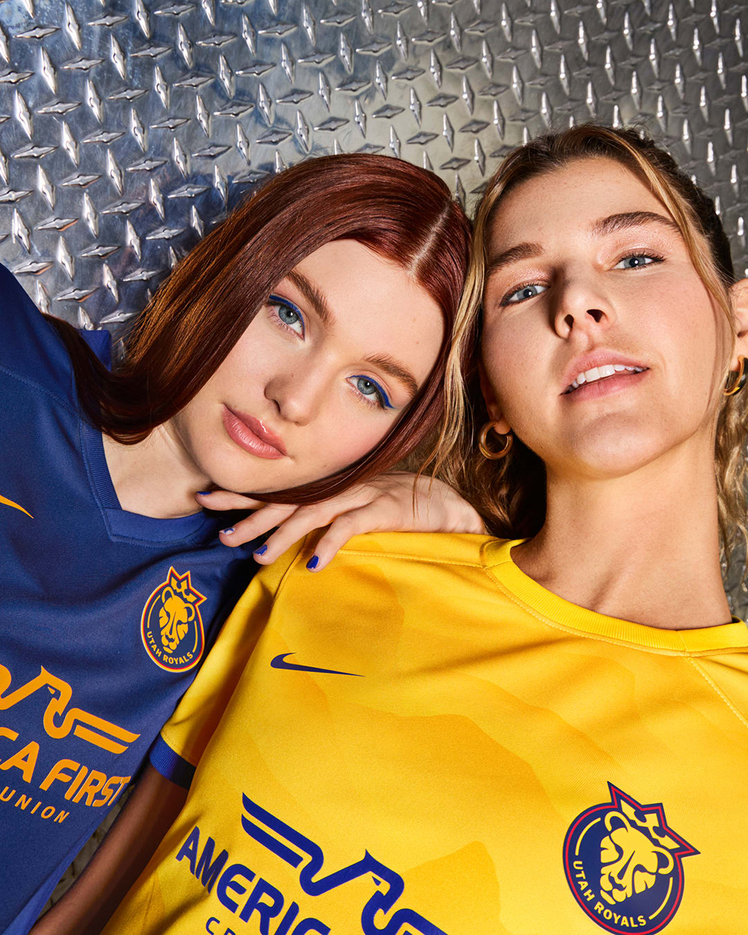
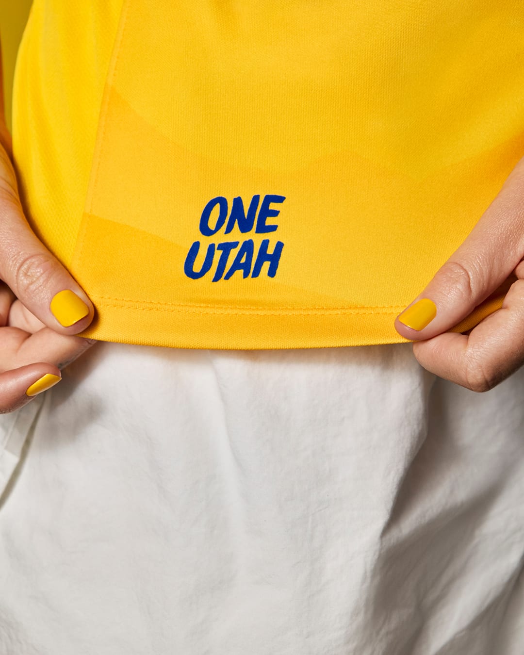
Primary: C-
Secondary: D
Utah joins Bay FC as a newcomer that gets a lackluster set of kits. Maybe Nike’s thought process here was that the new clubs need to earn their stripes? Literally — as both Bay and Utah have some pretty plain shirts across the board. At least the primary kit got a jock tag treatment, which boosts its grade up a bit.
Washington Spirit
Primary: C-
Secondary: B-
The rumor around Washington Spirit this time last year was that the club was undergoing a rebrand, but if it truly is, then we’ll have to wait until next year to see it in action.
The alternating stripe pattern on the primary kit is a rehashed design from Nike, and while not bad, it certainly isn’t good. However, the highlighter yellow secondary kit is a nice pop of color, and is one of the best secondary gradient designs across the league.
Where Portland was shy with its use of volt, Washington goes all in. It’s a perfect kit for Trinity Rodman, fitting both her play style and personality.


