One of the most striking NWSL kits of the year, we get an in-depth look behind the Chicago Red Stars’ new 2023 home kit.
“You wake up in Chicago, pull back the curtain, and you KNOW where you are. You could be nowhere else. You are in a big, brash, muscular, broad shouldered motherfuckin’ city.”
These canonical words from Anthony Bourdain may very well sum up the essence of The Windy City. I can’t speak to it, as I’ve never had the privilege of visiting save for a brief layover stop at O’Hare, but if Bourdain says it, it must be true.
If I were to take a guess, part of what makes Chicago so brash and unpretentious would have to be its notorious harsh winter. It’s something I — a lifelong resident of Los Angeles, perhaps the pretentious capital of the world — could never understand.
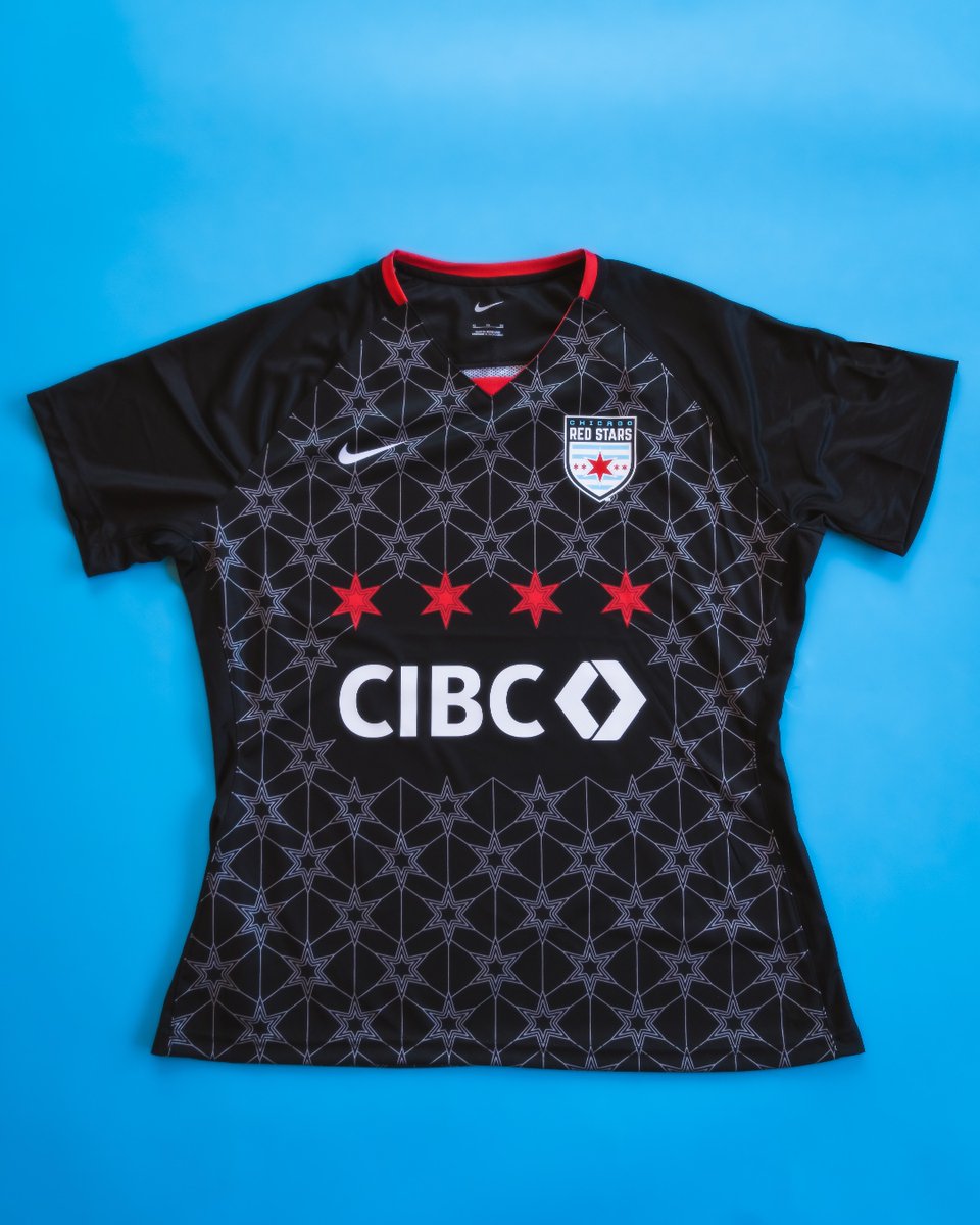
Further reinforcing my hypothesis is the 2023 Chicago Red Stars “Foundation” home kit, a stunning black shirt which could easily be defined by the same above descriptors from Bourdain. It’s inspired by the Chicago winter, with a simple yet effective snowflake pattern serving as its main design element.
But perhaps the most impressive part of the Red Stars’ new kit? It was designed by a self-described amateur graphic designer.
Jackie Le is a data analyst by day, freelance graphic designer by night. Based in Phoenix — ironically the hottest state capital in the country based on average high temperature — Le has been a Red Stars fan since 2016 and has created graphics for the club since 2019, but no project can compare to her most recent.
View this post on Instagram
In the fall of 2022, the Red Stars reached out to Le with their biggest request yet — designing their upcoming home kit for the 2023 season. If that sounds like short notice, it’s because it is.
Most kits usually have at least a one-year concept-to-final-product lifespan, with many starting two or more years ahead of their release dates. So for the club to come to Le only months before it needed a design showed a tremendous amount of faith in her.
“Not to be too cliche, but we knew that we needed someone who was gonna be able to come in in the midst of transition and be able to help us lay a strong foundation for this year,” said Red Stars Director of Marketing and Communications Rachel Parrish. “Knowing Jackie’s familiarity with this space and the Red Stars, we felt confident in her.”
The transition Parrish refers to includes the sale of owner Arnim Whisler’s stake in the club, along with the board of directors’ vote to remove him as chairman last October as a result of the Yates report which detailed the abuse and misconduct present across the entire NWSL.
According to Parrish, the club would normally start working on kit design much sooner, but the change within the organization shuffled the team’s to-do list. However, working on the design in house gave them the flexibility to work with tighter timelines.
In a period of flux, the Red Stars were in need of a positive visual change, one that would usher the club into a new era. In steps Le.
Despite it being her first foray into jersey design, Le was able to submit a concept that resembled the final product within a few weeks. It only took her two drafts to create what would eventually be the snowflake pattern.
Then came the waiting game.
“It was very nerve-wracking,” Le said. “We submitted back in autumn, but it didn’t get released until mid-March. So that was a long time to wait. A part of me was like, ‘Did something happen?’ Maybe they’re gonna go back on the design and go to a Nike template or something. You never know until you see it in front of your eyes. But the moment they dropped it, all credits to them for that amazing photoshoot. That was super cool.”
Replacing last year’s “Momentum” kit, the aptly titled “Foundation” jersey sets the building blocks for the Red Stars’ future while paying tribute to the city they call home. It’s simple enough to be dressed up or down, with details striking enough to stand out and keep it from being too plain — a trend we’ve unfortunately seen spread across the NWSL this season.
Throughout their existence, the Red Stars have become known for putting a concerted effort into their jersey designs and rollouts. In addition, they make sure to focus on special traits of Chicago in their design elements. The “Momentum” shirt from last year was an homage to the city’s iconic “L” train system, and previous installments showcased Chicago’s neighborhoods along with its flag.
But other than the winter theme, the club gave Le free creative reign. She worked closely with club co-owner and advisory board co-chair Colleen Mares on the creative direction of the jersey, and the result is one of the best kits across the league.
“This was kind of a surprise to me that it all went so well,” Le said. “It was kind of a stroke of luck that my second attempt at it is what excited the front office the most and ended up working out so well and being so well received.”
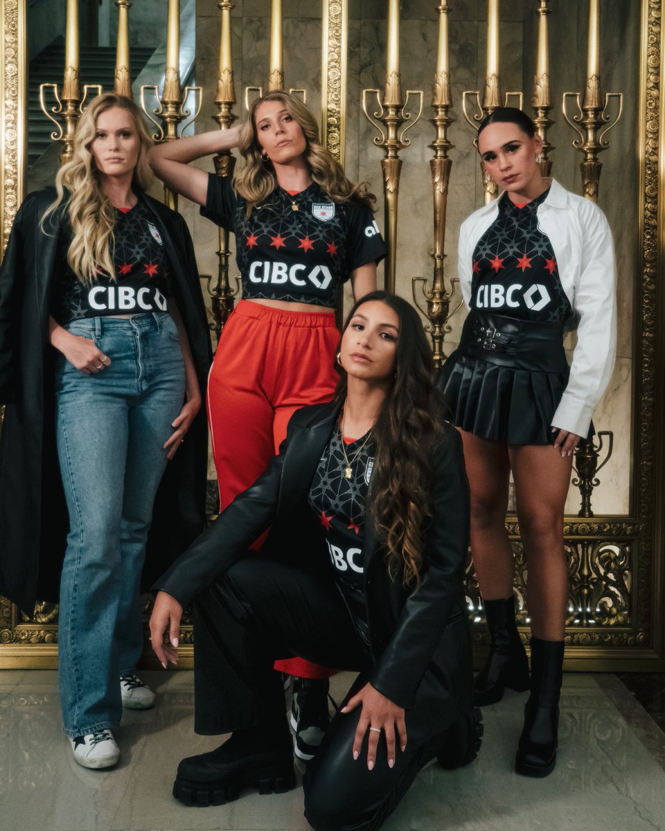
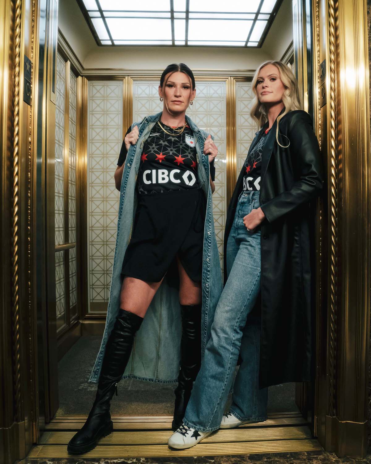
Once the design was completed, the club knew it had to unveil it in a non-generic manner. Instead of a basic studio shoot, the Red Stars opted for a fashion-forward photoshoot on location in downtown Chicago.
We’ve seen many NWSL clubs opt for this in recent years, perhaps most memorably NJ/NY Gotham FC’s DUMBO shoot in 2021, which was shot by then-club goalkeeper DiDi Haracic.
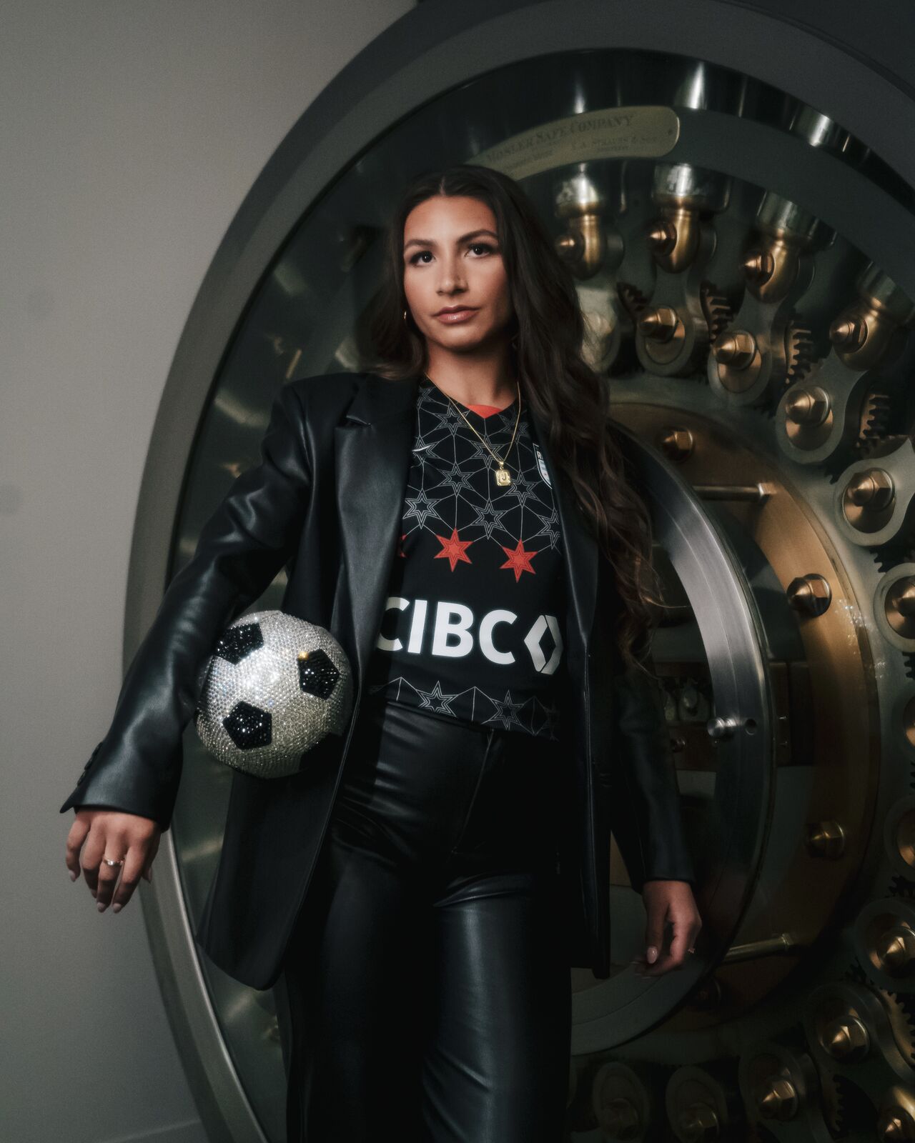
The Red Stars were able to subtly tie in their front of jersey sponsor into the shoot as well, using the CIBC office in Chicago as its backdrop. It’s a touch that isn’t too on-the-head, which is refreshing in an age of spon-con overflow.
Club photography manager Gretchen Schneider came up with the creative brief of the shoot — a combination of the street fashion of Chicago and the grit of the Red Stars. A stylist used a mix of clothes from players’ closets and pieces sourced from local boutiques to give each look a personal touch in addition to showcasing the versatility of the jersey.
The final product was everything the Red Stars hoped it would be.
“Once we saw the photos, it completely translated exactly into what [we wanted] it to, which is: it’s a new Red Stars,” Parrish said. “We’re entering a new era, but we’re still building those foundational blocks. You can expect to see this from us, but we’re not scared or running away from where we’ve been because that’s built us to this point.”
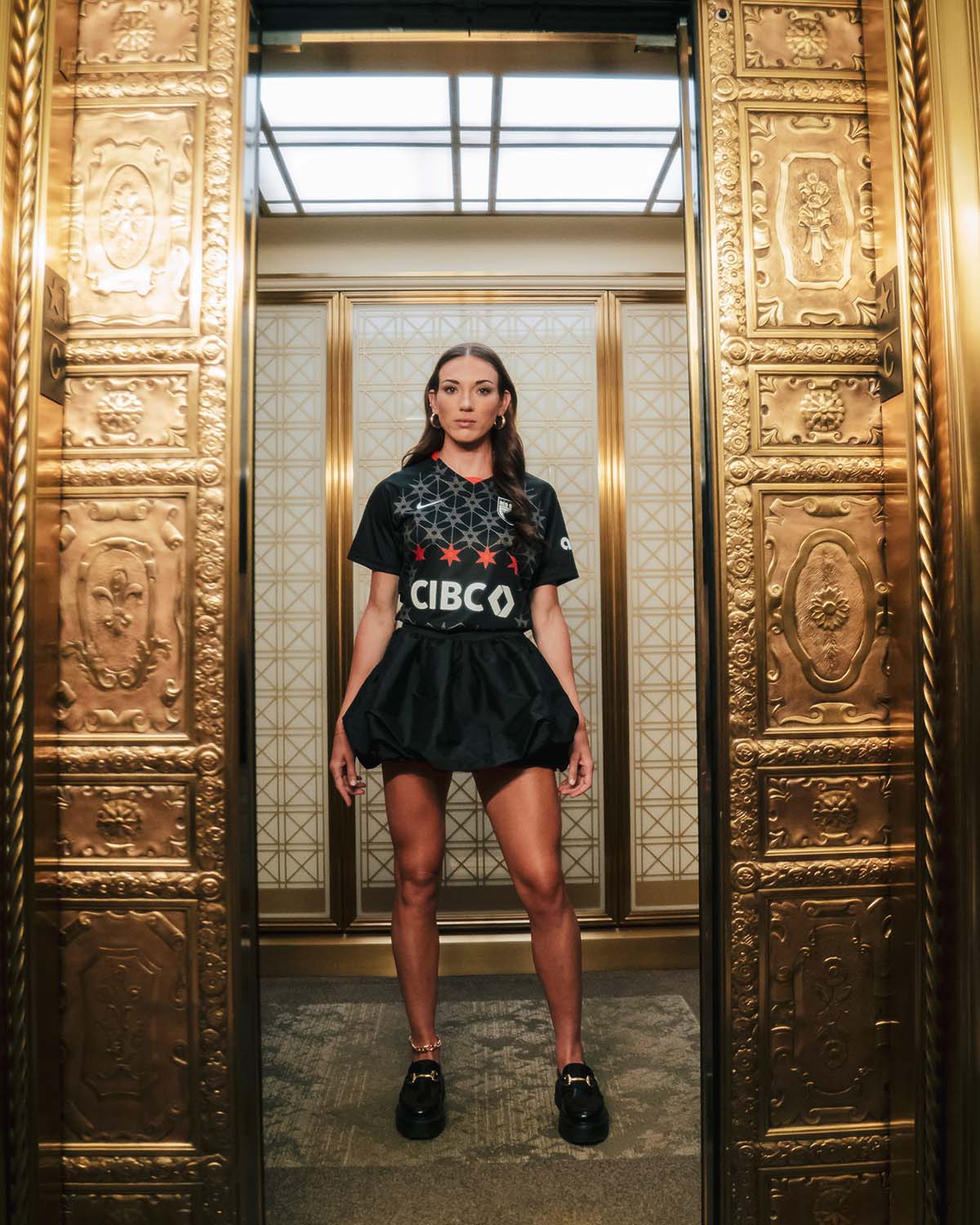
The “Foundation” kit is also significant in that it will be the final jersey designed by Red Stars in-house designers. Beginning in 2024, Nike will take over design duties across the NWSL, a bittersweet move that brings more legitimacy to the league while simultaneously taking away from the personal details that come with an in-house design.
According to Parrish, the club has already met with Nike for preliminary concept ideas for the 2024 kit, and the transition has been quite collaborative.
“It’s a change, because this is something that has been near and dear to so many different clubs, especially the Red Stars because the kit reveal is something we’ve always held very close to our hearts,” Parrish said.
“I think it’s going to be awesome for us to see how we can take our collective creativity and put it in a big powerhouse like Nike and be able to see what we can [come up with] from there. I can tell you that our 2024 designs that we’re looking at already are chef’s kiss.”
As for Le, she won’t be shying away from any future design opportunities following her rousing debut.
“I call myself a wannabe graphic designer,” Le said. “I attempt Photoshop. Another opportunity would be super cool, although I’d be sweating my way through the entire thing.”
Speaking for myself, I think it’s time to remove “wannabe” and “amateur” from Le’s graphic design vocabulary.


