There’s nothing like a well executed, out-of-the-box third kit. We take a look at a handful of fantastic designs that would be more than warmly received if they were to re-release in 2022.
Far too often, third kits are criminally underrated. They tend to be launched later than the home and the away shirts, which diminishes their anticipation, and they aren’t worn as often on the pitch, which reduces their visibility.
The unpredictable nature of such kits allow designers to spread their wings while creating them, which has led to some of the whackiest creations in the past. While some embrace the idiosyncrasy of third kits, many do not.
We decided that to pay homage to such strips by suggesting five retro kits that are deserving of a comeback.
Liverpool 2000-01
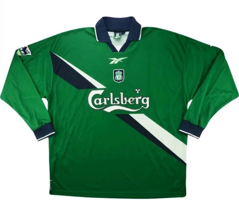
While they’ve done it several times in the past, Liverpool has rarely ever rocked green better than this. The striking color paired with the navy cuffs, collar, and sash work wonderfully together.
The patterns on the shirt may not be everyone’s cup of tea, but eccentric design is what separates third kits from the rest, and here, the design team at Reebok hit the nail on the head.
Get the local lads such as Trent Alexander-Arnold and Curtis Jones to lead the release for this kit, because when a shirt was worn during the days of Michael Owen and Emile Heskey wreaking havoc, that right there is Liverpool heritage.
Real Madrid 1998-99
Real Madrid’s 1998-99 season is one for the history books. While the club didn’t lift any of the Champions League, La Liga, or Copa Del Rey trophies, we can still make that claim because all three of their kits from that campaign were nothing short of tremendous.
The home and away shirts are often spotted worn by retro kit aficionados, but the third kit has agonizingly slipped under the radar. That is precisely why it demands a comeback.
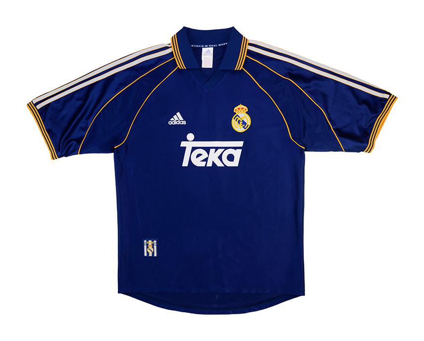
Notice the variety of ways in which the white and gold elements have been incorporated onto the shirt.
At first glance, you may simply consider the three white stripes going down both shoulders as a mere adidas staple. But look closer and the gold outlining them is a subtle, but astute touch that makes the kit instantly stand out. Further down on the sleeve, stemming right from the gold-laden collar, gold piping brings a sense of continuity that binds this imaginative kit together.
Speaking of the collar, isn’t that just a thing of beauty? Adorned by three gold stripes once again, the color has been utilized excellently to catch the eye when most needed.
Imagine Karim Benzema, who has been crowned by most as the best player in the world, wearing this strip. I rest my case.
Manchester United 1995-96
It’s perturbing how Manchester United claimed the Premier League title sporting this very shirt on the final day of the season, and yet this kit has rarely every been hailed in the decades ever since its launch. A glimpse at this striking release is enough to emphasize how incredible it would be for this strip to be reworked and released in 2022.
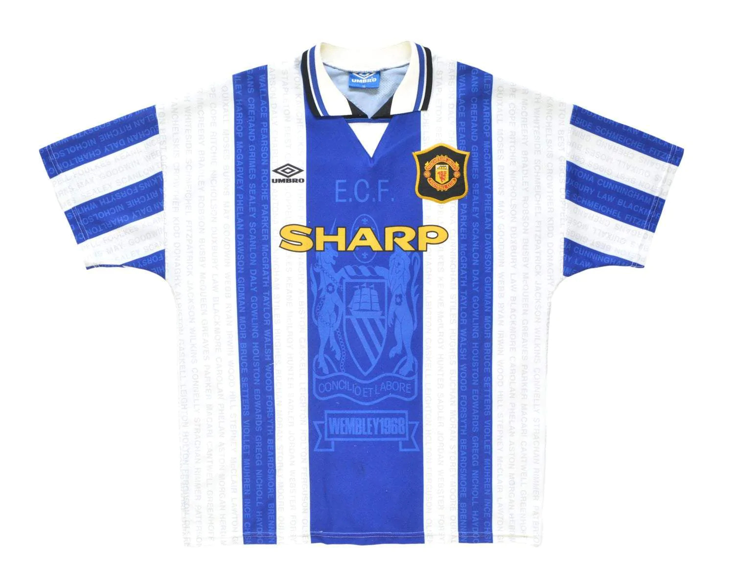
While United have launched blue kits in the past, the incorporation of white is a rare touch that instantly sets it apart from the rest.
Another interesting feature is how the stripes have been incorporated in this shirt. While it is standard procedure for most such shirts to add a whole host of stripes, the great minds behind the scenes of the design process went for merely two on either side.
However, it looks anything but incomplete as the thick blue lining in the center covers significant area of the jersey, which makes for a fetching design.
Similarly, a distinct approach can be seen in play across the sleeves as well. Striped sleeves are an infrequent sight, but when they make for such a tasteful look, one wonders why other designers are yet to fully embrace the idea.
The symbol in the center of the shirt is an homage to one of the many key symbols of Manchester, which has been in place since 1842.
While a classy tribute to the city itself is on display here, the same can be said for the club as well, as the “Wembley 1968” message harkens back to the side’s European Cup final triumph against Benfica. Zoom into the shirt and you can see names of several United legends from different eras, from George Best to Peter Schmeichel.
It goes without saying that this kit is a looker, but the insistence of highlighting the city and the club’s history are initiatives that give this shirt a real sense of identity.
AC Milan 1996-97
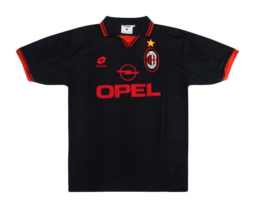
As a club, AC Milan have a habit of dropping at least one gem of a shirt every season. The red and black color combination is undefeated, and being in Milan, style plays a big factor.
But if there’s a strip that is cold hard evidence of how under-appreciated third kits truly are, you’re looking at it. The signature color combination has seen a role reversal with this strip but unsurprisingly enough, it still made for a sumptuous release back in ’96.
Black kits tend to be hits in most cases, especially when the secondary color, red in this case, is incorporated in the right places to highlight various elements of the shirt.
Starting with the sponsor logos themselves, the design team smashed it out of the park by integrating all in red. There’s perhaps not a better way of illuminating the contrast between two colors and is a route that is too often unexplored, perhaps for corporate reasons. While Opel and Lotto’s logos would have looked tidy in white, the decision to opt for red takes them above and beyond.
The icing on the cake is an embossed zigzag pattern on the shirt itself, which adds to why the hype behind this kit should be so very real.
Barcelona 2002-03
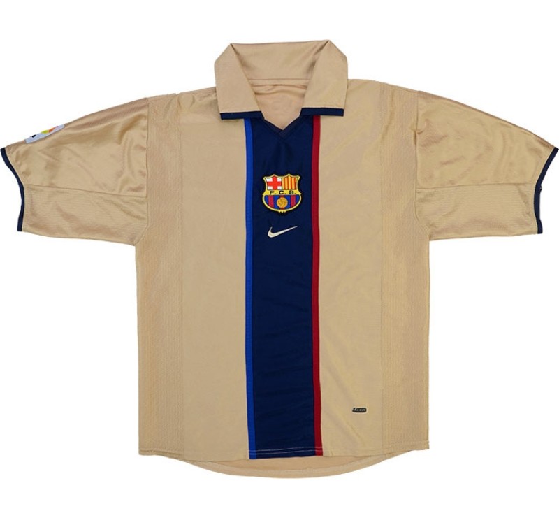
This shirt is track two of Kanye West’s My Beautiful Dark Twisted Fantasy, which is a roundabout way of calling it “Gorgeous.” It’s an obvious starting point when a kit looks like such a work of art.
Labelling this strip as underrated would be a white lie, as images of Ronaldo Nazário running riot while donning this piece of clobber have stood the test of time, yet it is puzzling how Barcelona have not re-released this in years gone by.
Keeping that in mind, there’s so much to appreciate about the subtle brilliance about this kit.
One could slap the Blaugrana badge onto that mellow shade of gold and you could have yourself an instant winner. But instead, the designers at Nike were hell bent on birthing a classic.
On the subject of the color itself, it’s intriguing how the brains behind this jersey opted for a subtler shade of gold in comparison to Real Madrid, who went for a flashier version. When basing a kit around either tone, it’s next to impossible to outdo Barcelona’s choice here.
But perhaps the most impressive facet of this shirt is the sumptuous design right in the center. Divided by a pair of parallel lines that represent the club’s blue and red colors, this is an incredible stunning addition.
Any such innovations that represent the club’s heritage whilst adding an authenticity to the shirt can elevate a kit to another level, which is precisely what is on show here. The trend of crests being sewn right in the middle of kits has made a comeback and is a design choice that will never be outdated.
With Xavi’s side yet to launch their third kit, what could be a better occasion to do so than to commemorate the 20th anniversary of one of the club’s greatest ever shirts? Plus, the rapid sales that would surely result from a re-release could help the club’s reported dire financial situation.
Bringing the legends that rocked this strip during the 2002-03 season such as Ronaldo, Andres Iniesta, and Carles Puyol alongside the members of the new school such as Pedri, Gavi, and Ronald Araujo in a kit launch would make for an instant classic.
Follow the aforementioned marketing strategy and modernize this very kit, please and thank you.

