
We’re all for unique and out-of-the-box shirts. But sometimes, kit designers go too far…
The rise of the replica kit hasn’t shown any signs of slowing since the concept was first introduced to the football-going public in the 1970s. Admiral Sportswear, kings of football club apparel at the time, signed deals with Leeds United and the England national team firstly, and then the likes of West Ham, Tottenham Hotspur, Leyton Orient, Norwich City, and Leicester City followed.
Commercial possibilities weren’t quite as plentiful as they are now in terms of shirt sponsorship, which didn’t truly arrive until the early 1980s, and clubs rarely changed their kit design.
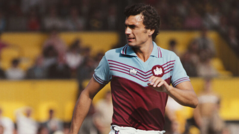
By way of example, West Ham wore their famous “chevron” kit for the first time in a 4-2 loss to Anderlecht in the 1976 European Winners’ Cup final. They were still using it in 1980, along with an all-white away ensemble.
Four years using the same design is simply unheard of today.
From those austere beginnings, changing home and away kits every two seasons became the norm, and in the mid-1990s, the concept of a third kit or shirt would be introduced.
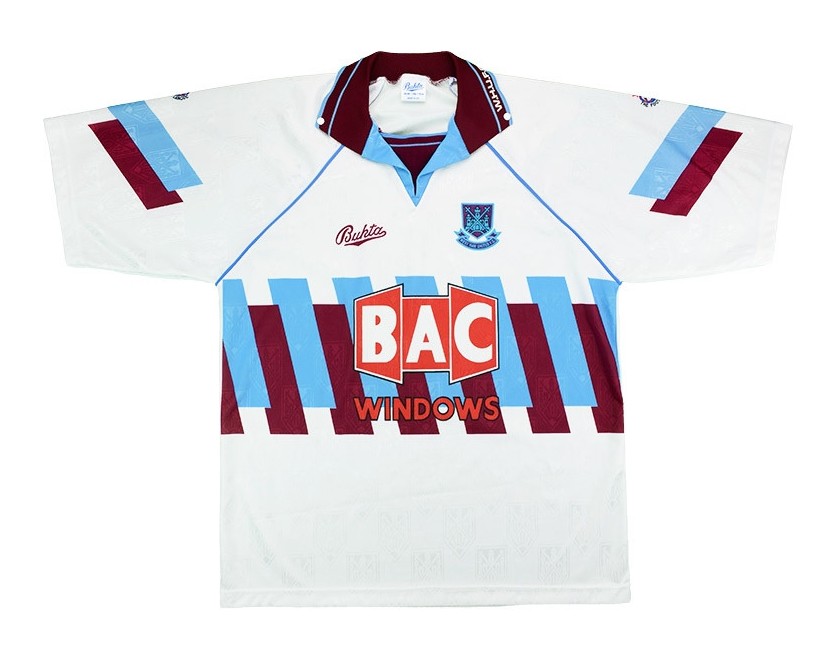
West Ham, again, by way of example, would wear their 1992 third shirt just the once — against Aston Villa, but that didn’t stop the club shop from selling out of it.
Fast forward to the modern era, and up to four new kits every season isn’t unheard of. For shirt collectors it’s manna from heaven, and for the working-class families with a child or two who must have the latest style variant, it becomes a very expensive business indeed.
Of course, with so many changes, kit designers occasionally go rogue and produce something so different from what’s gone before that it’s hard to believe it ever passed go.
Take Nike for example. Long-standing partners with FC Barcelona, the American giant has produced some iconic kits over the years for the blaugranes.
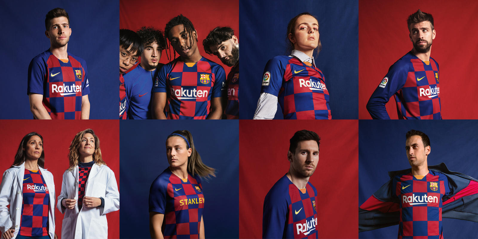
The centenary home shirt and the 2011 Champions League final-winning shirt are instant classics. Not so much the ghastly “checkerboard” shirt from the 2019-20 season.
Though there’s only so much that can be done with vertical stripes without repeating a design every few years, with clubs such as Barça, who have unbelievable history attached to their shirts, sometimes, less is more.
The corporate dollar isn’t always welcomed, especially when kits are such a departure from what’s gone before. By all means experiment with colors and other historical design cues for alternate kits, but home shirts need to remain, by and large, what supporters know, love, and want.
Another footballing giant, Manchester United, who in turn currently use adidas as their kit supplier, have never really deviated too much away from their simple, deep red shirt. It is their signature, known the world over.
To attempt anything avant-garde with what has been synonymous with the club for decades would be sacrilegious to say the least.
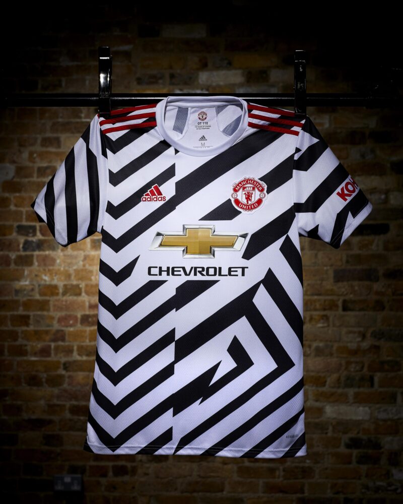
Notwithstanding the earlier comment on experimentation with change kits, one has to question whether the design team was having a bad trip when it came up with this year’s “Zebra” third shirt.
Clearly, there is no apparent relevance to the club, and perhaps if it were just the shirt that made supporters look like a travel advert for the Serengeti, they could just about get away with it. Shorts and socks of the same design? A bridge too far that.
Of course, both Barça and United are by no means alone in allowing their kit designers free reign nowadays.
The list of worst-ever kits, subjective in any event, would be far too long to list here, but there are three more that are going to make the Urban Pitch hall of shame for this article.
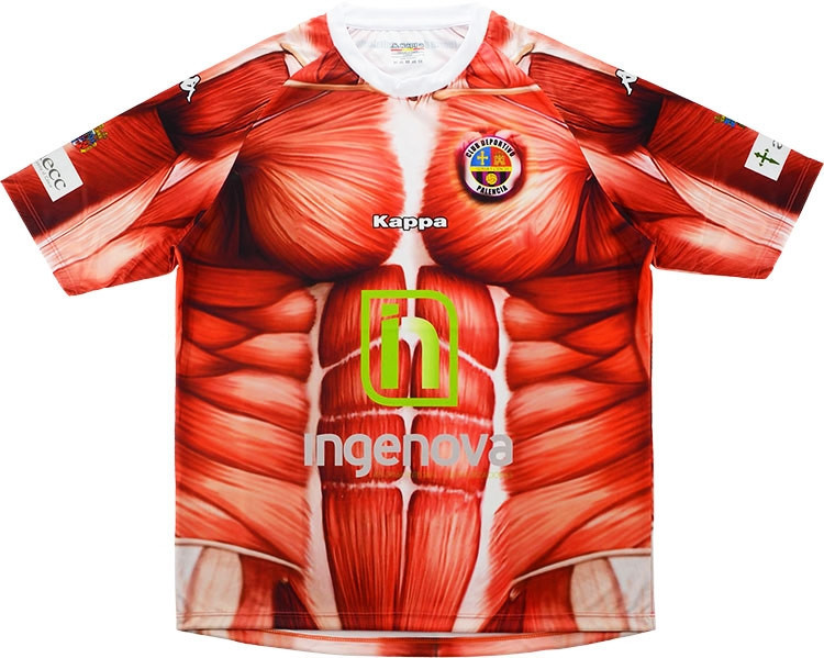
Spanish third-tier side, CD Palencia Balompié, took some beating with their 2016 effort. Imagine sitting around the boardroom table and being presented with a shirt and shorts by the Kappa representative with the notion that both were supposed to represent the human anatomy…
Apparently, the story behind the kit, which was produced for the playoffs that season, was that the players would “give their skin” in order to get promoted. Frankly, we would imagine they’d have given their right arm not to wear it.
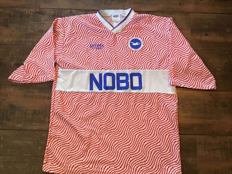
Brighton and Hove Albion’s 1989 away shirt will give you a headache every time you look at it. The bright pink wavy lines heading off in all directions are less a feast for the eyes, more an assault on the senses.
Only a thick white stripe complete with sponsor across the chest goes some way to breaking up the noise of this monstrosity.
When one considers the wonderful simplicity of the Seagulls’ home offering at the time, both made by Sports Express, it’s like chalk and cheese. The two are just not complementary in any way, shape, or form.
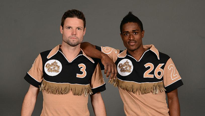
Any rogue’s gallery isn’t complete without an entry from the Caribous of Colorado. To date, they’re the only side to have ever worn a kit with tassels.
A brown, tan, white, and black ensemble and a badge of a caribou with a football stuck in its antlers would surely have failed the taste test on its own, but to adorn the front and the back with leather tassels — that opposing players tugged at to bring players down — was absolutely a step too far.
It may not have been the designer, Medalist-Sand Knit’s first rodeo, but it was almost certainly their last.


