
It’s that time again. Buckle up for the best and worst kits from the 2023-24 season!
Football across the globe is back in full swing, and on the heels of the first international break of the year, we felt it was a great time to drop our kit update.
Footy fashion continues to evolve, and that means we’ve seen some potential trailblazers in addition to the barn fires. So with every top flight club now boasting their full suite of kits, here are the best, the worst, and everything in between.
The Good
AS Roma Home

In a landscape of bombastic designs and over the top color combinations, there remains so much beauty in simplicity. When this kit initially dropped, Roma still didn’t have a shirt sponsor, which made for a design that was basic in the best way possible. Yet when they added the callback to ancient Rome’s SPQR phrase across the chest, the kit hit even harder. The logo, the color, the details — everything works.
Inter Miami Away
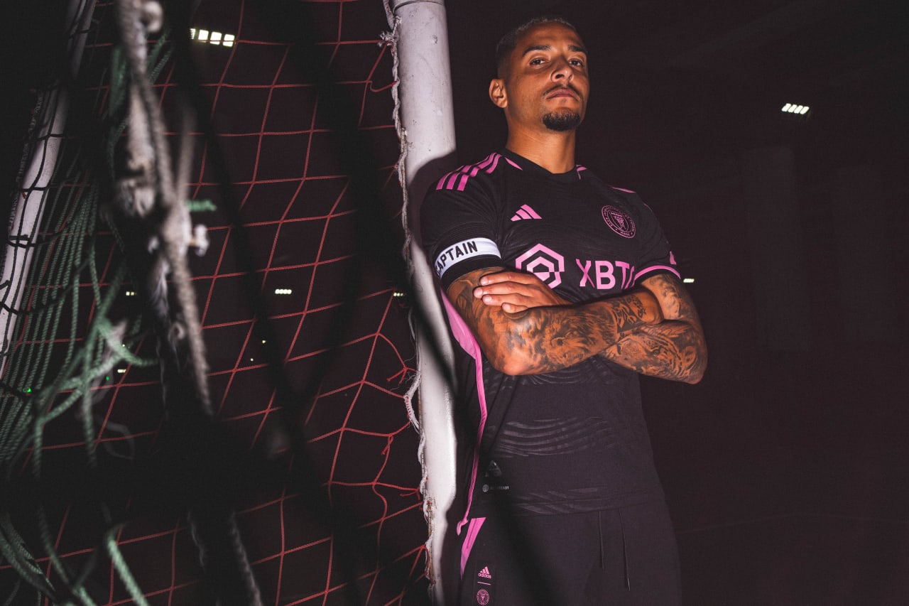
We usually dedicate a story like this to MLS alone, since their kits drop earlier in the year, but Inter Miami’s away kit recently came back into the spotlight for some inexplicable reason. While the club was shy with implementing pink in its kits over the first few years of its existence, Miami finally bit the bullet and fully committed to its main color in 2023. Pink is a great color for football kits, always has been. Using the striking shade to accentuate the all black away kit is a safe choice, but one that has given ideal results. The main sponsor doesn’t detract from the kit and the black base has lovely textures and faint details that put the cherry on top of a really smart football shirt.
Lyon Home

The theme of good kits being simple and smart continues. The blue and red stripe through the badge down the chest paired with the gold on the sponsor and the shoulders; zero complaints here.
Arsenal Home

Red and white is a color combination used by many football teams for their kits, but Arsenal’s this year is probably the best you’ll see. What puts this a step above the rest is the subtle gold trim, which would’ve been a poetic design choice had the Gunners not bottled their Premier League lead last season. The zig-zag design on the base of the shirt does wonders to tie everything together as well for the North London club.
Benfica Away
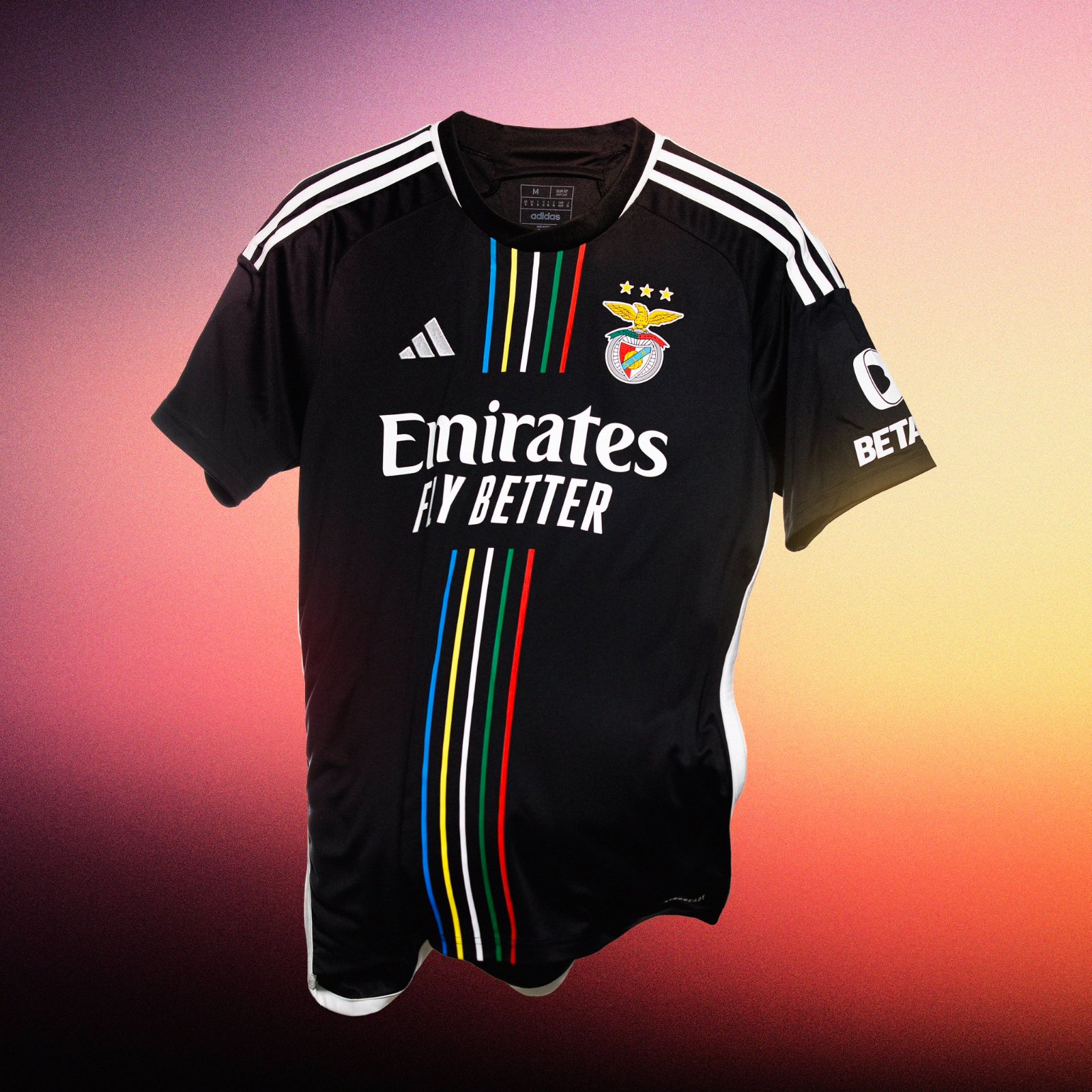
This is what you get when a thoughtful idea meets a smart design. Each of the five colored stripes down the middle of the kit represents a continent, symbolizing Benfica’s global impact and making this the perfect way to celebrate their 120th anniversary.
The Bad
Bayern Munich Home

It’s not necessarily an ugly design, it’s just not very Bayern. It is always commendable when a team looks to break away from the norm and bravely explore something fresh, and kits are a great way to do that. However, instead of feeling like a bold leap into new territory, this kit feels sort of like a bland sidestep.
Fiorentina Away
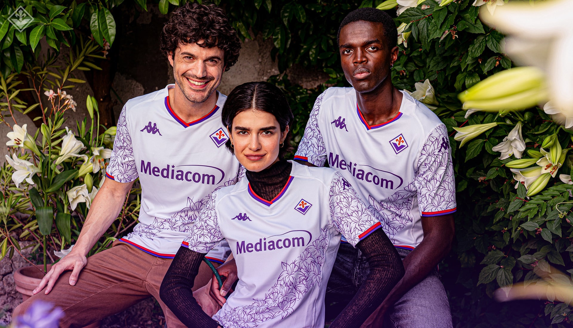
Something doesn’t feel right about putting this in the Bad category. Fiorentina have made a bold attempt at something beautiful and I don’t exactly hate it. The floral choice was a good one, but the execution could have been much better. It’s not necessarily bad, but it leaves us wanting more.
AC Milan Home
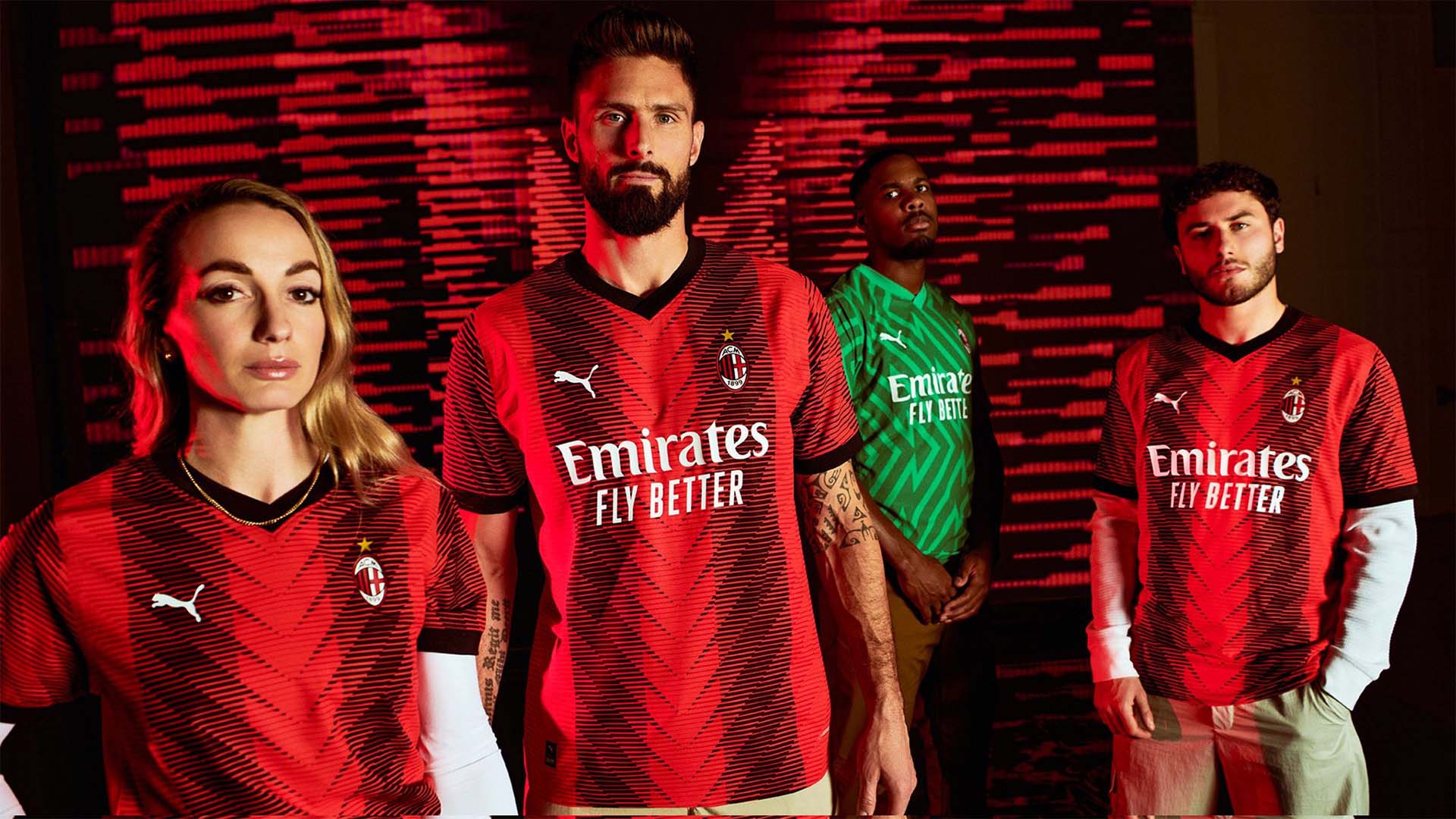
The red and black stripes are arguably the most iconic colorway for a football team in the world. Trying to find ways to modernize and innovate this look is always going to be a tough task, so I can sympathize with the AC Milan design team. This kit just doesn’t feel right. The design looks like it’s trying to be way too edgy and in the end falls wide of the mark. We all know the old adage, if it ain’t broke…
Borussia Dortmund Home
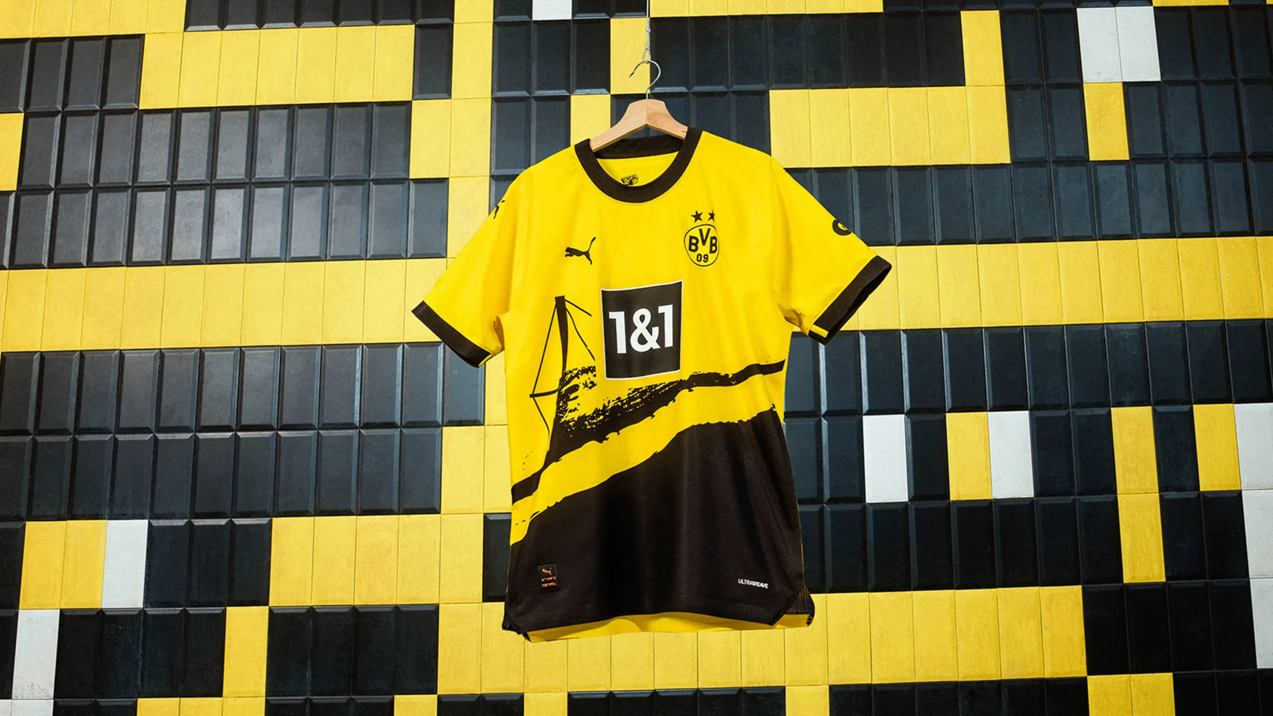
Paying tribute to one of the best stadiums in the world is a smart decision for a kit, but at least put a bit more thought into it. Dortmund’s home kit boasts the iconic yellow and then a drastic black shift etched on the bottom half. You can make out the stadium but that’s the only positive I can draw here.
The Ugly
Arsenal Away
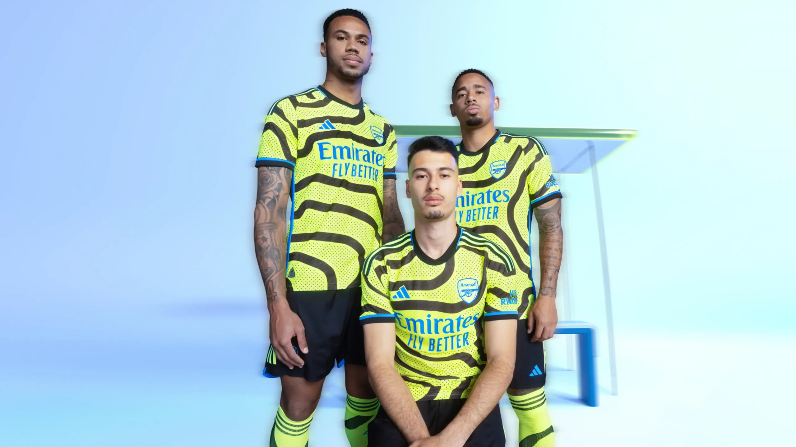
A traffic director engulfed in snakes? That’s the vibe and it’s a curious choice. Neon kits very rarely work and this is no exception.
Juventus Home
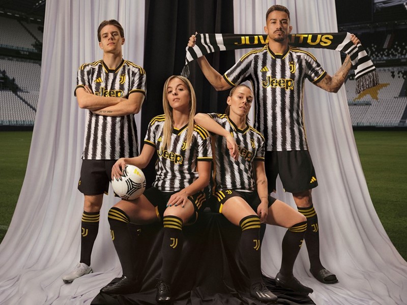
Similar to Milan, the Old Lady have tried something modern to spice up an iconic template. Unlike Milan, this kit is just plain awful. The animalistic and chaotic style on the stripes is an intriguing choice but one that bears little fruit.
Fulham Third

I know I said pink has always been good for kits, but bright pink in this instance was not the move. Not sure what the thinking was behind this choice but it seems out of left field, as Fulham tend to be very traditional in their kit design. There is no real redeeming factor either, the black outlines just serve to direct more attention to that overbearing pink. It’s a no from me.
Newcastle Away
This kit, as much as the Newcastle hierarchy will deny it, just screams “tribute to Saudi Arabia.” Honestly we could’ve let that slide too, but the kit leaves a lot to be desired. The erratic design and the sponsor combine to leave a sour taste in your mouth.
Barnsley Home
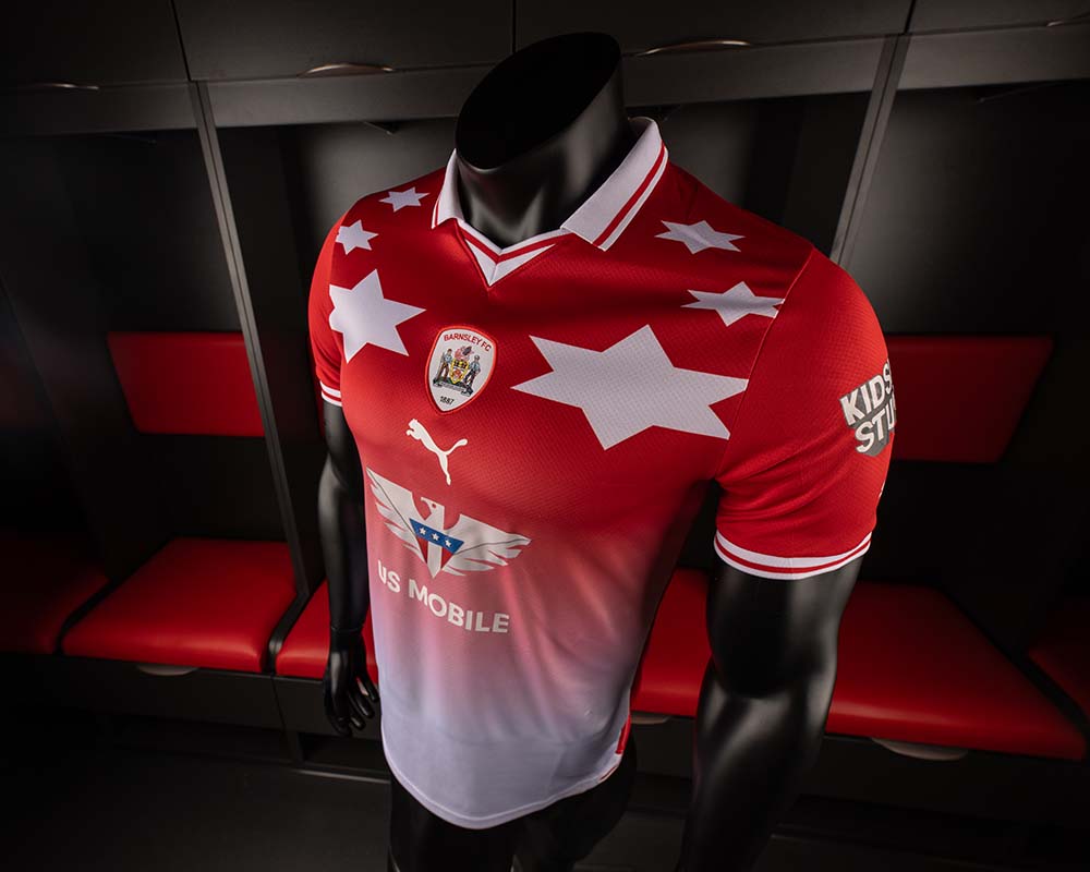
If you’re looking for the worst kit of the year, you found it. The Barnsley home kit is a throwback tribute to a popular ’90s kit, but the League One side could’ve done so much better here. Not much else to say but commiserations to the Barnsley faithful.


