
We’ve covered a fair share of banger 2021-22 kits — but what about the ones that slipped through the cracks?
As the 2021-22 European football season is set to come to an end, it’s easy to hark back to the best kit releases across one of the most dramatic campaigns in recent memory (or some of the leaks for next year’s drops). Shirts like those from Venezia, Arsenal, and Ajax rightfully garnered rave reviews amongst fans and collectors alike, but there were also a few other gems that for whatever reason went under the radar.
Before they become outdated once the 2022-23 kits have been unveiled, let’s take a look back at some of the most slept on shirts from the 2021-22 season.
5. Real Betis Home
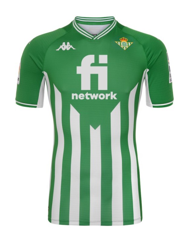
Real Betis made headlines after their Copa Del Rey Final victory as the Spanish side ended its 17-year trophy drought. However, the same couldn’t be said for the club’s unique home kit that remains slept on.
Perhaps one of the reasons why the La Liga side’s home kit went under the radar is due to the fact that the last thing the designers did when cooking up this drop is be risk-averse. Welcome features include the unorthodox striped design, which only covers the bottom half of the shirt, as well as the classy v-neck that’s adorned by a stunning white outline that makes it stand out, as it matches tastefully with the stripes as well.
And it is a positive to see Kappa take a different direction by not plastering the sleeves of the kit with their logo, and instead just placing one on either side. Sometimes less is more.
Watching Joaquin roll back the years in this flamboyant drop was the definition of futbol heritage.
4. Lyon Away
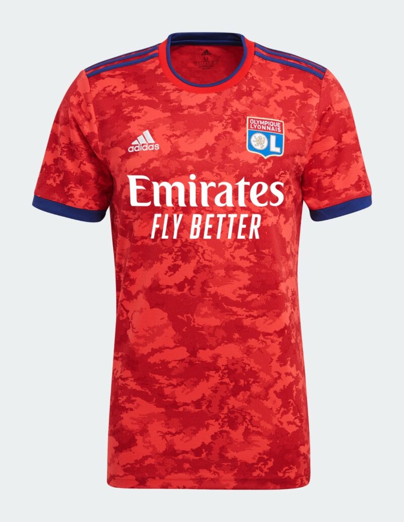
Lyon had not just one, but a pair of heralded kits this season. The French side’s third kit was indisputably one of the best releases of the year and understandably, it was copped left, right and center straight after it dropped. Additionally, their home strip was appreciated for its elegant design, because that simply was one of the cleanest drops out there.
In the midst of the hype surrounding these shirts, the away kit barely got a mention. And while this release may seem slightly out there as most away shirts are, it’s the subtle details that make this drop worth talking about.
For starters, adidas capitalized on the rare instance in which Lyon have agreed to sport a red away shirt, with the addition of an eye-catching graphic that has been visible in several of the German brand’s Condivo 21 releases. An apt comparison can be made to Leicester City’s home kit as well, which features a similar camouflage pattern across the front as well as the sleeves of the shirt, although a different neckline.
Aside from the dominance of the darker red shade of red, the utilization of the cobalt blue adds a much-needed contrast to the shirt. The Three Stripes have rarely looked better, with this shade of blue really bringing out the recognizable adidas staple in fine fashion. The same can be said for the crew-neck collar, which is given that extra sauce due to the blue piping — a minuscule, yet essential touch to the shirt.
The use of blue in the sleeve cuffs as well is not only easy on the eye, but a brilliant template on the wide array of ways in which a secondary color can be used. With adidas’ mountain logo as well as the Fly Emirates logo being showcased in white, the designers’ attention to detail is what makes Lyon’s away strip a winner above anything else.
Rocking this on a summer’s day while watching Rayyan Cherki in action sounds like a plan.
3. Brighton & Hove Albion Home
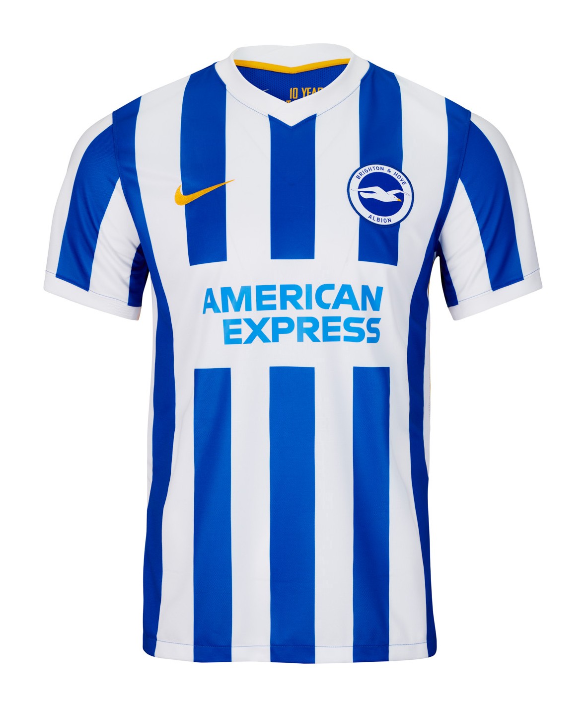
While Brighton are often lauded for being one of the most watchable sides in the Premier League, their home kit failed to receive the same level of appreciation. This Seagulls’ release is perhaps one of the best examples of how getting the simple details right is the key to creating an excellent home shirt.
For instance, one of the major reasons why this drop was already an upgrade from the home kit worn during the 2020-21 campaign is the use of traditional stripes in lieu of last year’s pinstripes.
As opposed to dropping yet another all-blue shirt, Nike used the stripes to terrific effect, as the contrast between the white and the blue makes for a pristine shirt.
Another nice touch is the celebration of the completion of Brighton’s decade at the Amex Stadium, with the text inside the collar reading “10 Years at the Amex.” In general, football fans hold their team’s home kit to the highest regard as it represents the club worldwide, and for the designers to ensure that the shirt holds sentimental value with the addition of such a message is a reason why the release was a hit amongst the Brighton fanbase.
The sight of Marc Cucurella and Tariq Lamptey bombing down the flanks while rocking this kit was one to behold all season.
2. Leeds United Third

Third kit bias may actually be a conspiracy theory worth digging into. Worn more sparingly on the pitch and often containing non-traditional designs, third kits rarely get the adulation they deserve.
Leeds United’s gorgeous drop suffered similar consequences, as it was rarely mentioned amongst one of Europe’s best drops at the start of the campaign.
Credit to the designers at adidas for turning a new page in the club’s history by fearlessly picking a striking lilac shade for the kit, a color that has never been affiliated with the Whites’ jerseys in the past. Another fearless aspect behind this kit’s design is how the Leeds badge has seen a transformation, with the traditional yellow and blue colors replaced for navy blue and white.
In addition, we get sublime navy accents in the adidas logo and the front sponsor. adidas’ Condivo 21 template once again makes for a sensational collar, which matches sumptuously with the shoulder stripes.
It is key to hail the design team in high esteem for taking such risks, as every club’s fanbase tends to be extremely sentimental about details that may seem minor to most. To be willing to take such bold calls and execute them to perfection is praiseworthy to say the least. If you reckon I’m being hyperbolic, rewatch the Paris Saint-Germain supporters’ impassioned protests in opposition of their home kit at the start of the ongoing campaign, due to the absence of the Hechter Stripe.
Whether it stems from Leeds United not being the footballing behemoth they once were or the aforementioned third kit bias, it’s safe to say that this release was criminally underrated.
1. SSC Bari Goalkeeper

Look, it’s not a crime that a goalkeeper kit released by Serie C side SSC Bari didn’t break the internet. But it will be if you continue to sleep on this shirt after reading this.
We get an instant Kappa classic with this release. The Italian sportswear brand took the age-old cliché about the need for goalkeepers to be crazy and ran with it by conjuring up a delightfully outlandish kit.
For starters, the shirt features a running octopus theme, which is not only a sight to behold but is also a nod to the city of Bari that is known for being completely Adriatic. As a result, the standout turquoise color also feeds into this homage by being akin to the sea that surrounds the city.
Aside from the unavoidable outrageousness of this shirt, other clubs that aim to represent their roots should take a leaf out of Leo Colacicco’s book, the designer behind this glorious creation, for paying an uninhibited ode to Bari.
The designers didn’t just stop there, as they also highlighted the club’s historic past by choosing to use Bari’s old badge from the ’90s, which merely featured a black and red cockerel’s head, as opposed to the modern version. The Italian side’s supporters would surely welcome this throwback as it takes them back to better days.
Every inclusion has clearly been made with precision, as the badge matches with the black Kappa logo, because Colacicco refused to miss with this drop right here.
The flared collar is as retro as you can imagine, with the words, ‘La Bari’ in place, which was the club’s name before a change was introduced in the ’70s. This is the outrageous retro goalkeeper kit you’ve always wanted to cop and it’s virtually perfect and clearly due its flowers.


