On the cusp of another NWSL season, we take a look at every team’s kits and give them a grade, as is customary around this time of year.
Over the last few years, NWSL kits have been a mixed bag. We’ve seen some instant classics — Portland Thorns 2020, Racing Louisville 2021, and Angel City FC 2022 — in addition to straight up duds.
This year proves no different. A common theme seen in 2023 as teams sporadically rolled out their new kits (petition to have a coordinated release like we saw in MLS) is playing it safe. As you’ll see in the list below, a lot of the new releases have swapped out brash and bold designs for more plain and subdued ones. And while it occasionally worked, for the most part, the change was for the worse.
It’s time for our annual NWSL kit report card.
Angel City FC
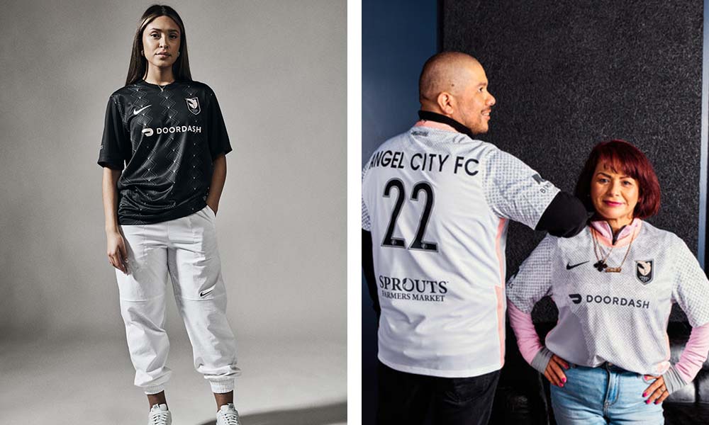
Home (same as last year): A
Away (new for 2023): C
After taking the league by storm with some of the best kits in all of soccer last year, the pressure was on for Angel City FC to follow it up with another banger. Unfortunately, the club hit somewhat of a sophomore slump with the release of its 2023 “Represent” away jersey.
ACFC substituted the flashes of pink from last year’s stellar “Daylight” kit for a mostly gray palette that features an overlay of a map of Los Angeles. The design itself isn’t bad, it’s just too bland for a club whose color scheme begs for something flashy. However, a nice touch to this kit is the shoulder patches the club has made available for fans to add a personal touch to their jersey.
Chicago Red Stars

Home (new for 2023): A
Away (same as last year): B
It’s not a stretch at all to say that Chicago has the best kits in the league. Playing on the revamped away kit from last year, the Red Stars introduced an absolutely stunning black home kit for 2023.
The sleek design is incredibly fashion forward, as displayed by the shoot the club put on for the official release. Most importantly, however, it replaces the cartoonish camo “Momentum” home kit from last year that narrowly missed the mark. Mallory Swanson is gonna steal some souls in this kit.
Gotham FC

Home (new for 2023): A
Away (same as last year): B+
As a byproduct of the announcement that the NWSL was coming to FIFA 23, we got a sneak preview at the new Gotham FC home kit.
Since their rebrand in 2021, Gotham has had some of the better jerseys in the league, but this is their most ambitious design yet. With a lightning bolt pattern reminiscent of ’90s Arsenal classics, the retro-inspired design is certainly eye-catching, and a refreshing big swing in a league that has increasingly played things safe when it comes to kit design this season.
Houston Dash

Home (new for 2023): C-
Away (same as last year): B
Unlike Gotham, Houston’s recent rebrand has given us a slew of mid kits, especially in the home department. I was a fan of last year’s “City of Futbol” away kit based on the city’s flag, but it seems as if the home shirt, no matter what slight design adjustments are made, looks the same from iteration to iteration.
The “Estrella” kit for 2023 is just that. Another bright orange shirt with black accents. With such a strong and unique color palette, the Dash have an opportunity to create some absolute heat, but this is more of the same old, same old.
Another demerit against this shirt is that the crest looks to be sublimated rather than being sewn or applied on. In addition to feeling less premium, it comes off as a corner-cutting effort and a lack of attention to detail. Sublimated crests are fine for a Sunday league team, but for a professional club charging $120 for a kit? Come on.
KC Current
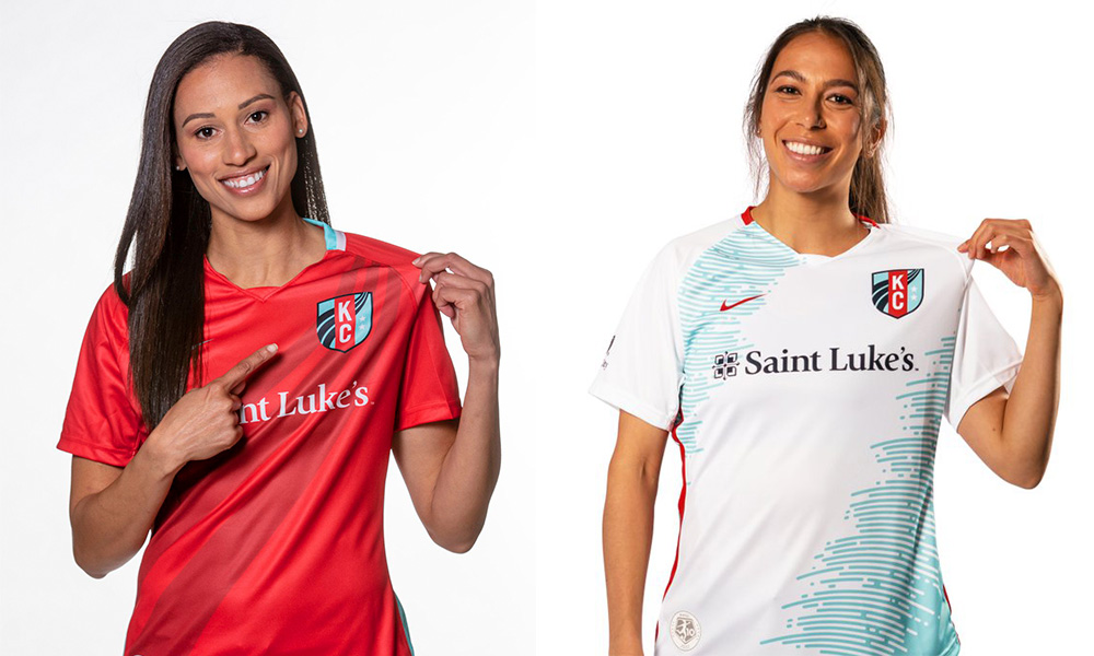
Home (same as last year): C
Away (same as last year): B-
I was a little harsh on Kansas City’s kits in last year’s kit grading. And as the club looks to be retaining their jersey lineup from 2022, it’s only right that I adjust their marks. From an on-pitch perspective, a revamped club could be one of the most dangerous in the league. Maybe KC is saving their new jersey designs to accommodate a star above its crest?
North Carolina Courage
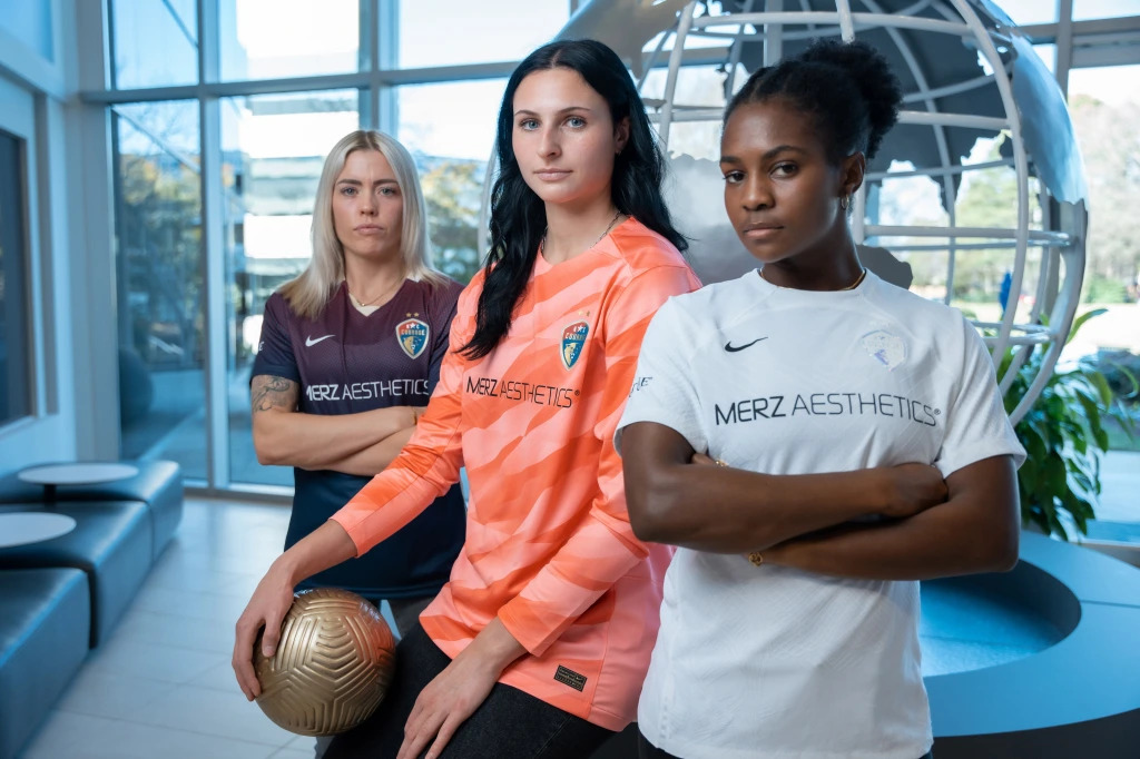
Home (same as last year): B+
Away (new for 2023): C
If a club opts to go for a plain white shirt, then it has to make sure the details are on point. With a pretty sweet iridescent badge, the Courage definitely tried to elevate the plain design, but unfortunately it isn’t quite enough. A subtle sleeve pattern or some kind of overlay that continues to play on the iridescent theme would have taken this kit to another level.
OL Reign
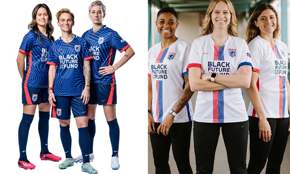
Home (new for 2023): B
Away (same as last year): A-
At first glance, you might not realize that the Reign brought in a new kit design for 2023. It almost looks like it could’ve been one of the rejected designs for last year’s home kit that they just rolled over to this year.
That being said, it’s a pretty solid design. It’s actually pretty hard to execute a “glitch” pattern like this effectively, and paired with last year’s away kit, it gives the Reign one of the best kit combos in the league.
Orlando Pride

Home (new for 2023): C+
Away (same as last year, with new shorts): A-
I have been on the record saying that I am a sucker for a purple shirt. And while there is really nothing wrong with Orlando’s 2023 home kit, the departure from the stellar “Ad Astra” kits from the past two seasons definitely hurt its cause.
It continues the theme of going for an inoffensive design across the NWSL. Sure it’s fine, but it probably won’t be memorable.
Orlando is retaining the lunar-themed away kits from 2022, but a nice touch is a change in shorts color from white to black, a move made to give confidence to its players no matter where they are on the menstrual cycle. Other teams across the league have claimed to follow suit, but it should be noted that Orlando was the first to do so.
Portland Thorns

Home (same as last year): F
Away (new for 2023): F
Upon its leak, the Portland Thorns 2023 away kit had everyone talking. Certainly one of the most polarizing kits released in recent memory, the tattoo-inspired design is something I’ve never seen before on a kit. But that doesn’t make it a good thing.
The Thorns are now proud owners of two kits with bad tattoos. As if last year’s barbed wire bicep tat home kits weren’t bad enough, the club now has a gaudy, American traditional tattoo right across its chest. It’s ironic 2013 hipster meets MMA instructor. I said it last year and I’ll say it again, Sophia Smith deserves better.
Racing Louisville

Home (new for 2023): A-
Away (same as last year): B-
They haven’t been in the league long, but Racing Louisville has been one of the most stylish clubs in NWSL history. The new 2023 home kit had some big shoes to fill, but the houndstooth pattern does well to stand out independently from its predecessor.
The mint accents and connection to the Kentucky Derby are perfect touches, and it is the perfect example of great execution on a smart concept.
San Diego Wave
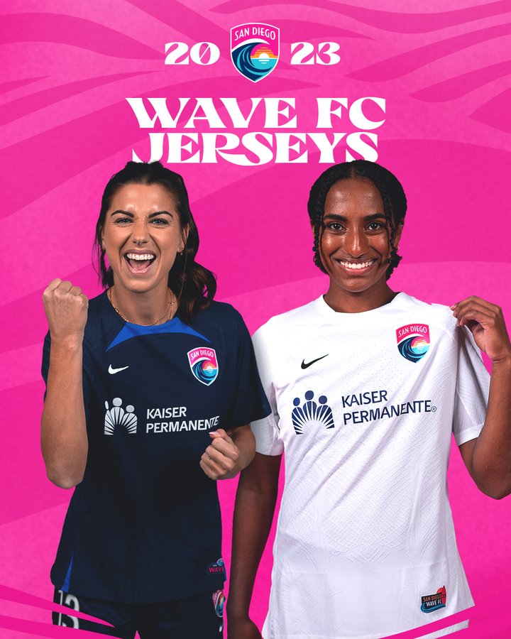
Home (new for 2023): F
Away (new for 2023): F
Siri, show me the most basic kits you could think of. I get that the Wave have made it their mission to be as business-oriented as possible, but can someone tell them they can have a little fun too?
Their 2023 lineup gives them the distinction of having the worst kits in the NWSL. While Portland also shares the double-F title, their kits at least have some semblance of personality, and they at least tried something with their kit design. These two plain template shirts scream youth club that needed last-minute jerseys for an impromptu tournament. Sickening.
Washington Spirit
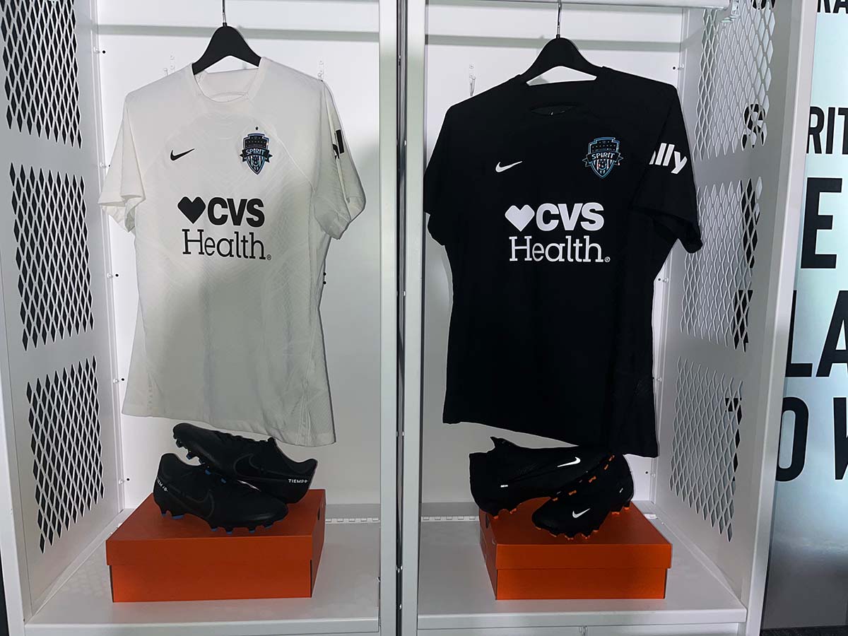
Home (new for 2023): B
Away (new for 2023): C
You’ve got to respect the Washington Spirit for trying to get out in front of these plain designs, basically saying these were a stopgap while the club works on a rebrand. That being said, they aren’t that bad. Especially the blacked-out home kit, whose iridescent badge takes a page from the Courage playbook albeit done better, as it suits an all black shirt better than an all white.
We could even be getting a new team name along with the rebrand, so we’ll see what’s in store for the 2021 league champs.


