
With the Challenge Cup heading into a chaotic finish and the regular season quickly approaching, it’s only right that we take a look at all of the released 2022 NWSL Kits (so far).
There are a myriad of storylines we could be focused on heading into the 2022 NWSL season. Will the league be able to secure a TV rights deal that it deserves? How will the two new expansion franchises fair? Who will be this year’s breakout star a la Caprice Dydasco in 2021?
All are worthy avenues to go down, but here at Urban Pitch, we like to concern ourselves with one that may seem a bit more trivial, yet is equally as important — kits.
If you’ve followed us for a while, this will be no surprise. Last year, we graded all of the NWSL Challenge Cup kits, which were by and large pretty stellar. However, we might’ve jumped the gun on that review, as several clubs introduced new jerseys ahead of the 2021 regular season. So we learned our lesson and bided our time, and with the 2022 campaign set to kick off this weekend, we figured now was the right time to release our annual grading of the NWSL kits.
However, there are still a few clubs who we’re still waiting on. Expansion side San Diego Wave still hasn’t announced anything, and KC Current have yet to show their hand about what they want to do with their new crest. Racing Louisville is releasing its new away shirts this week, while NJ/NY Gotham FC is rolling with the same kits as last year.
With that in mind, we’ve broken down the categories into three sections: The New Kits, the Kit Repeaters, and the Unknowns. Let’s get to grading.
(Note: 2021 NWSL kits that we didn’t get to review in last year’s kit grading are included in the ‘New Kits’ category.)
The New Kits
Angel City FC
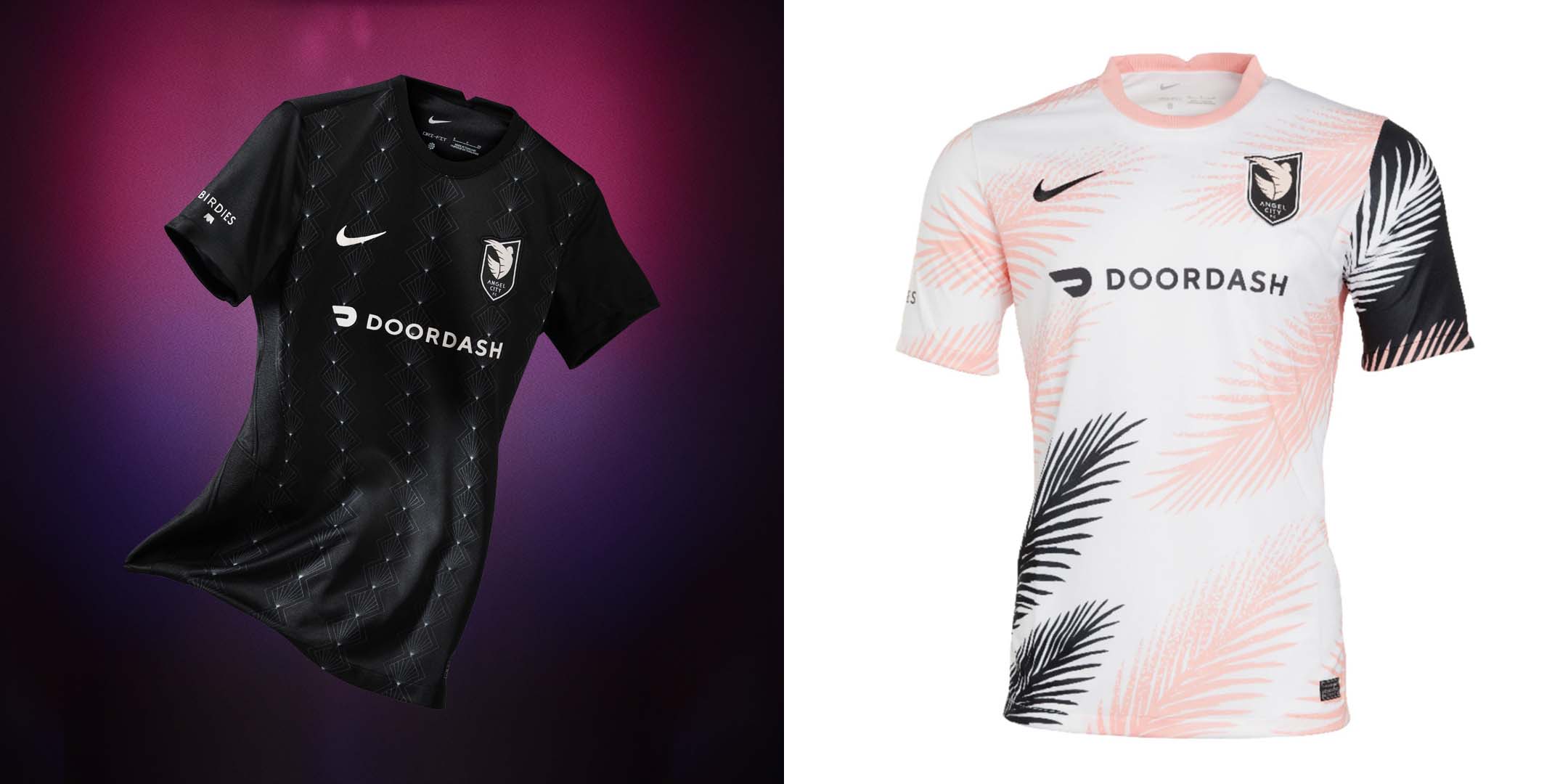
Heading into its inaugural season, Angel City FC made it an imperative to focus on its off-pitch brand just as much as its on-pitch product. From its consortium of investors to its efforts to become involved in the community, things have been a success so far. But if the club really wanted to solidify its brand, it needed to get its kits right. And it did.
Starting with the “Inaugural” home kit, Angel City and designer Matthew Wolff took a page from LAFC (who Wolff also worked with) to include art deco-inspired design cues over a clean black backdrop. The result was a solid design, but if you were like me, you were waiting for the away shirt, which would surely incorporate Angel City’s signature Sol Rosa color.
However, there was still a little doubt surrounding the execution of the Sol Rosa kit, as clubs like Inter Miami have been fumbling the bag over the use of their brilliant color schemes for years. And with the simplicity of the home kit, there was the possibility that Angel City would opt for the same approach on their away kit, shutting the door on endless possibilities for something great.
Thank the heavens that they didn’t. Where the home kit is good, the “Daylight” away is phenomenal. While it does have a white base, it’s anything but plain, with Sol Rosa and black palm frond graphics and inverted sleeve colors. For all of the expectations behind the Angel City FC kits, the club hit the mark spectacularly.
Home: A
Away: A+
Chicago Red Stars
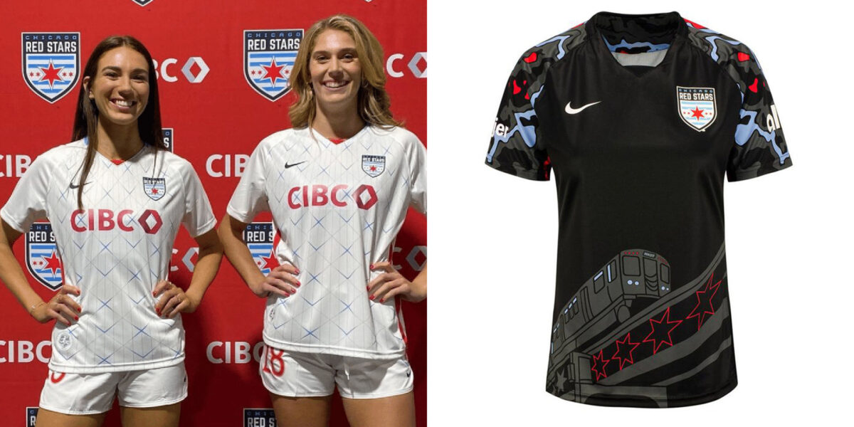
The Chicago Red Stars recently gave us a sneak peek of their 2022 away kits on their Instagram — only the club didn’t leave much unsaid in the preview. We got a full look at the club’s new kit, complete with a new sponsor, in the “sneak peek,” and it’s just OK. Dubbed the “Skyscraper” kit, it ostensibly draws from the city’s iconic skyline that features massive marvels of architecture. For a club whose kits have been stellar in the past, I’d like to have seen a little more from the reigning league runners-up. However, I’m leaving room to change my mind upon seeing more detailed photos.
Chicago also revealed a new “Momentum” home kit last year after our Challenge Cup kit review, which features the city’s “L” train and camo-like designs on the sleeve. While I was initially turned off by the cartoonish look of the shirt, it’s definitely grown on me since the initial release.
Home: B
Away: C+
Houston Dash

After undergoing a pretty decent rebrand last year, the Houston Dash unveiled a new “City of Futbol” kit ahead of the 2022 season. It replaces last season’s “Luv Ya Dash” away shirt, which may or may not have perpetuated the “space race” against the Orlando Pride.
The “City of Futbol” away kit takes inspiration from Houston’s flag, while also maintaining the club’s powder blue away shirts, which is never a bad theme to have.
As for the home shirt, we’re presumably going to get the same orange from last year, which is safe yet unspectacular.
Away: B
Home (last year’s grade): C
North Carolina Courage
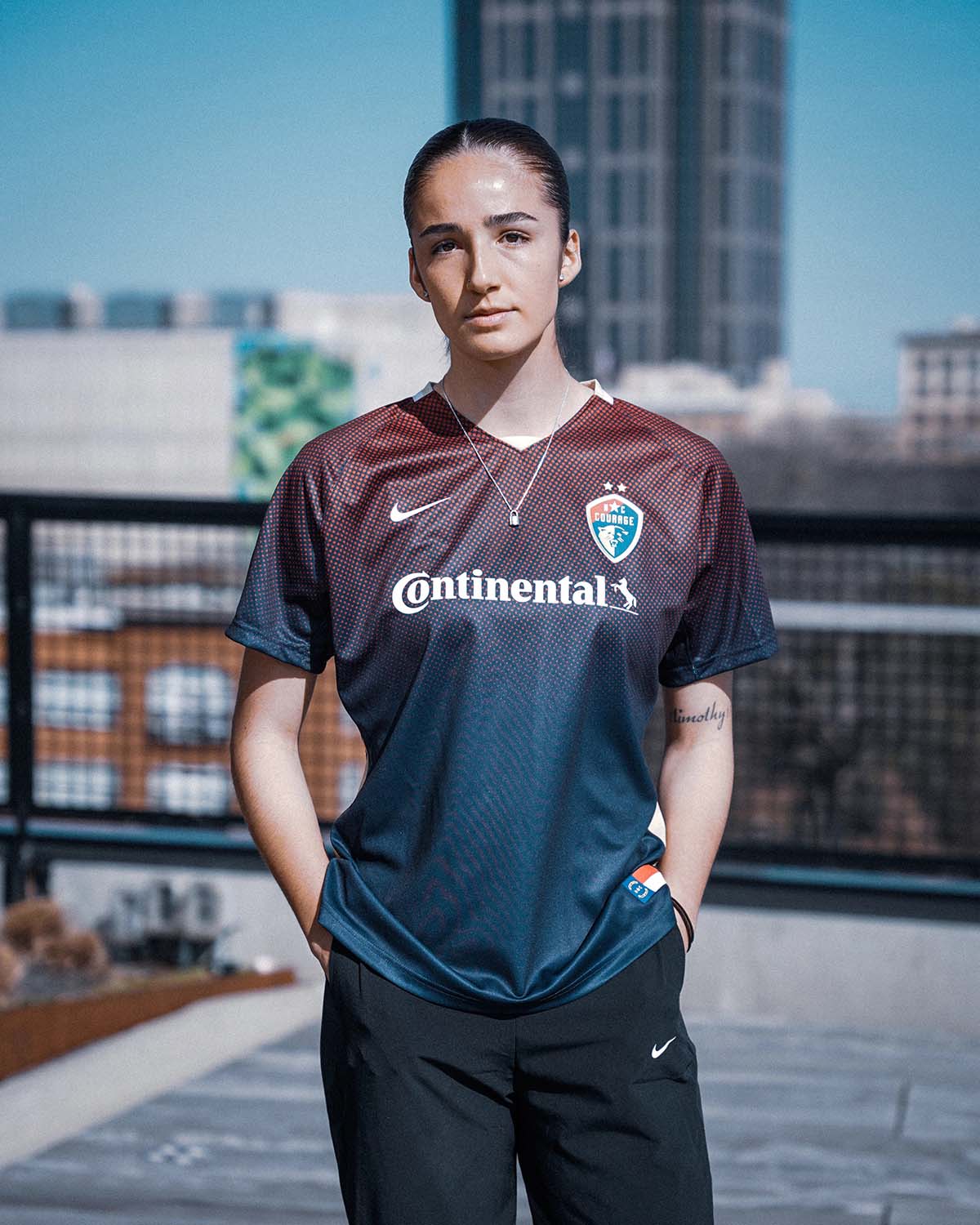
Long one of the league’s premier clubs, the North Carolina Courage have also become well known for their boring kits. However, that’s been changing of late, beginning with last year’s “Mountains to Sea” concept which paid tribute to the state’s landscapes. It looks like the club will retain the “Mountain” away kit from last year, and it introduced a new gradient home kit along with a fashion-forward photoshoot ahead of the 2022 season.
The gradient is said to mimic “the sunsets frequently seen over the pine trees at WakeMed Soccer park, home of the Courage.” I’m not sure if I’m buying that, but the jerseys definitely look nice.
Home: B+
Away (last year’s rating): B
OL Reign
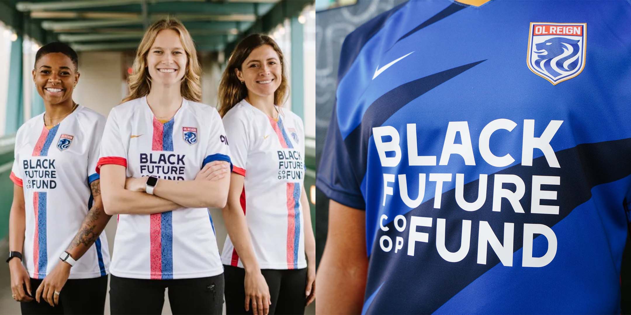
Stepping up their kit game by a mile, OL Reign finally have a set of non-bland jerseys. Revealed earlier this year, the “Honor” away kit celebrates the club’s 10-year anniversary. Going down the middle is a red and blue stripe with names of players who have donned a Reign jersey since the club’s first season in 2013. A nice touch is the alternating sleeve cuff colors, which mimic the club’s parent company, Lyon, in style.
The club will retain its “Hope” home kit from last year, but we didn’t get a chance to review it as it was revealed just after our Challenge Cup grading story. A bright blue base with jagged graphics definitely spices up what was just a plain blue shirt that any club team could get from Nike, so we’re glad the Reign are finally taking their kits seriously.
Home: B
Away: A-
Orlando Pride
After last year’s “Ad Astra” release, the Pride have doubled down on their spacey vibes with 2022’s “Luna” away kit. Picking up on some of the themes of the stellar CityiD goalkeeper kit the club released last year, the “Astronaut White” and “Moon Grey” accented shirt has plenty of dope details without going too far over the top.
Away: A-
Home (last year’s grade): A
Portland Thorns
The only truly disappointing offering amongst the 2022 NWSL kits comes from the Portland Thorns. This is especially upsetting since the club previously had some of the best kits in all of soccer over the past two seasons.
Instead of building off of that success, we get a pair of ultra plain, amateur-esque designs that do nothing for me. It should be a crime to put Sophia Smith in that barbed wire bicep tattoo design that is the home kit. Disgusting.
Home: F
Away: D
Washington Spirit
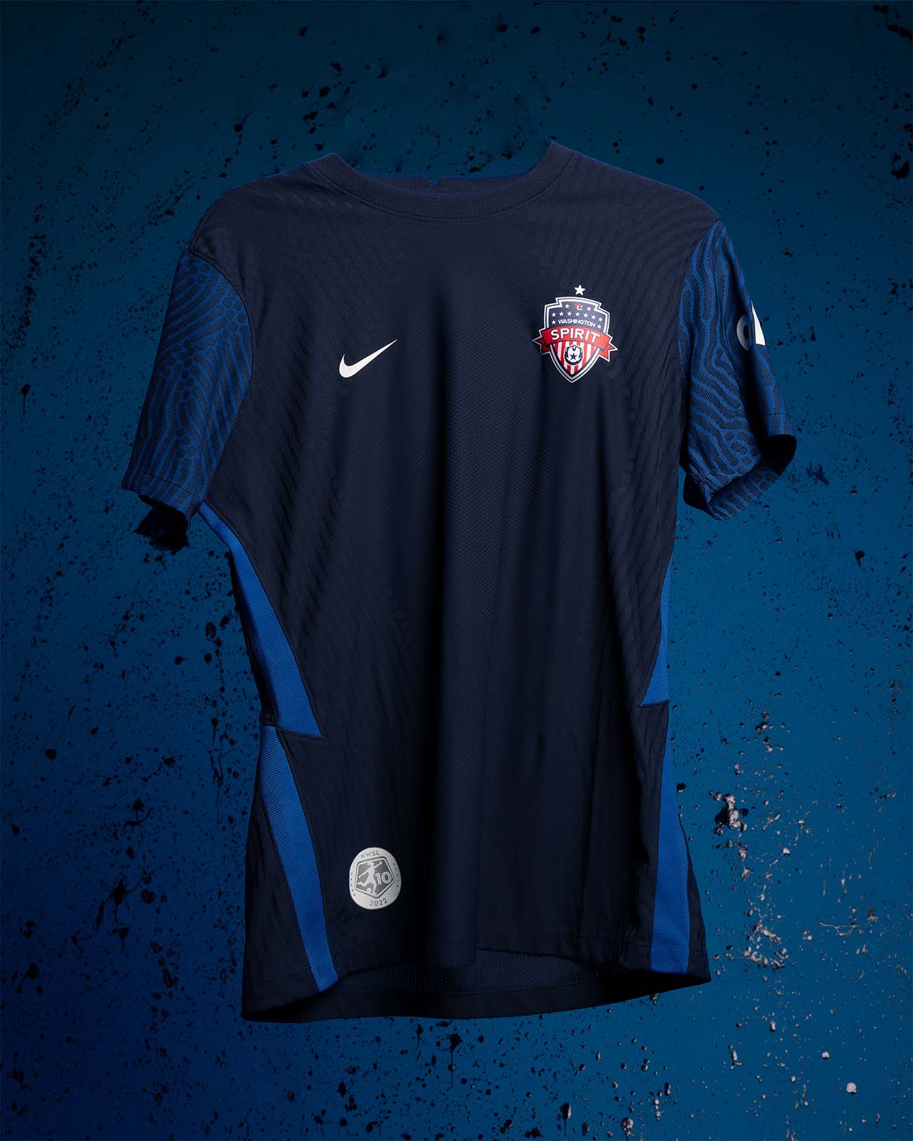
OK I lied. The Washington Spirit’s 10-year anniversary home kit for 2022 is incredibly disappointing as well. It’s basically a generic Nike shirt with a crest and locker patch ironed onto it. And what’s even more disappointing is that the Spirit probably have the highest-frequency vibes in the league. An attack spearheaded by Trinity Rodman, Ashley Sanchez, and Ashley Hatch deserves much better than this.
The away kit from last year is basically a plain white shirt as well, giving Portland a run for the worst jerseys in the league.
Home: D
Away: F
*Updates*
KC Current
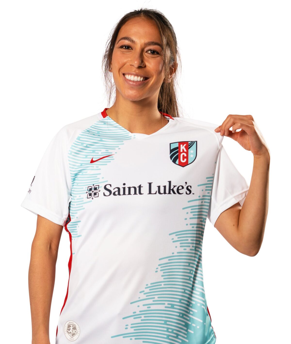
Getting a new crest and name in the offseason (along with a crop of new talent on the pitch), KC Current have used pretty much the same jerseys as last year with a new badge throughout the Challenge Cup. However, the club recently unveiled a new away shirt, creatively called the “Teal” jersey. It’s certainly a step above the plain whites the club was rocking with last year, but the mere hint of the teal design features leaves me wanting more. For now, we can assume that the Current will continue using the red home shirts, which are pretty basic to say the least.
Home: D
Away: C+
Racing Louisville
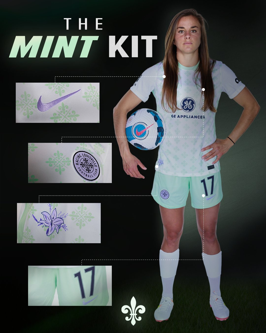
Like Angel City FC, Racing Louisville got the Matthew Wolff treatment for its inaugural season, and its kits were our favorite in the league last year. While the club will retain the floral home shirt, it dropped a new “Mint” away kit this week. The shirt design retains last year’s fleur-de-lis pattern, only this time in a metallic mint green (shout out to all of the My Cousin Vinny heads out there) instead of lavender.
I like the idea, and mint green is always a nice color to go for with a kit. But the shade doesn’t contrast enough on the white backdrop, and it can only be appreciated from up close. However, the mint shorts are a great touch.
Away: B-
Home: A+ (last year’s grade)
Kit Repeaters
NJ/NY Gotham FC
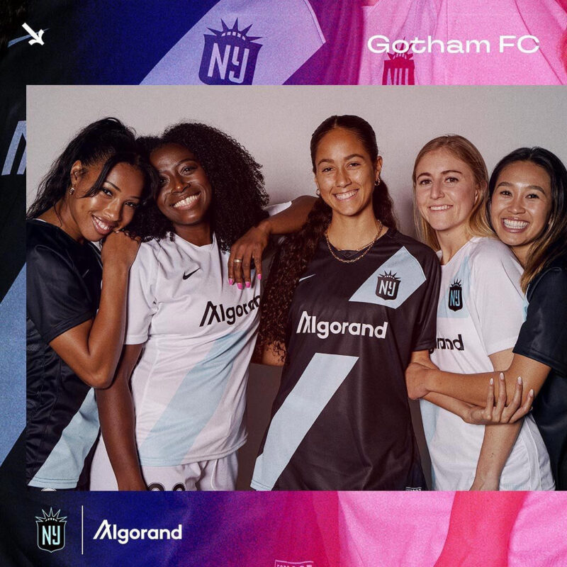
After last year’s fantastic rebrand and kit rollout, you can’t blame NJ/NY Gotham FC for staying the course in 2022. However, we do get a new sponsor for this season, so technically we are getting a new look.
2021 Grades: Home: A, Away: B+
The Unknowns
San Diego Wave
With one of the best crests in the league, there’s a lot of expectations behind what the San Diego Wave will be wearing in 2022. Their Challenge Cup kits are pretty plain, but that shouldn’t be an indicator of what’s to come from the fledgling club. The optimist in me thinks we’re going to get something fantastic from San Diego, and I’m praying the club isn’t too shy to utilize the pink and orange accents in its crest.


