The 2021 NWSL Challenge Cup kicked off over the weekend, so naturally we graded every kit set to take the pitch this season.
At this point it’s not even a lukewarm take to say that the NWSL has been churning out some of the best kits in the country over the past few years. The league has certainly blown MLS out of the water, and save for a handful of USL and semi-pro clubs, there really haven’t been any close domestic competitors.
This year is no different. Growth has been a constant theme for the NWSL over the past year, so it shouldn’t come as a surprise that the 2021 slew of jerseys have been excellent pretty much across the board. Like MLS, the NWSL has a league-wide kit sponsor, but while adidas has been lackluster and repetitive on the men’s side, Nike has done a fabulous job in creating memorable designs that stand out from one another.
Sure MLS and adidas took a step up this year, and you could argue that NWSL having fewer teams makes it easier to create original looks, but that doesn’t change the fact that when you compare the best that each league has to offer in recent years, NWSL usually comes out on top.
The NWSL Challenge Cup kicked off over the weekend, which gave us the chance to see the kits in action on the pitch, and we graded every club’s home and away shirt for the 2021 season.
Clubs Using the Same Kits
Before we get into the new drops, some clubs opted to keep their 2020 jerseys for at least the Challenge Cup, so we’ll quickly go through those first. We’ll still hold out hope for these clubs to unveil new strips before the NWSL season officially kicks off in May.
Portland Thorns
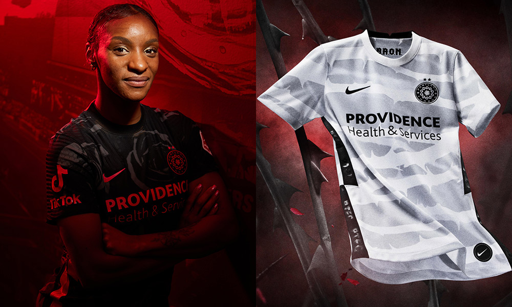
Home: A+
Away: A+
It’s easy to imagine why the Portland Thorns didn’t go for a new set this year, as their 2020 kits are about as close to perfect as you can get. The only new addition for 2021 (not counting Crystal Dunn) is a Tik Tok sleeve sponsor, but besides that the Thorns are sticking with their beautiful 2020 jerseys.
Chicago Red Stars
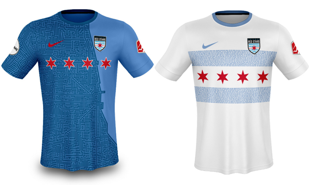
Home: A
Away: A
Another stellar 2020 set, the Red Stars decided to run it back with last year’s kits for the Challenge Cup. The “Elevate” home shirt actually dates back to 2019, but why fix something when you don’t have to, because it isn’t broken? That’s how the saying goes, right?
OL Reign
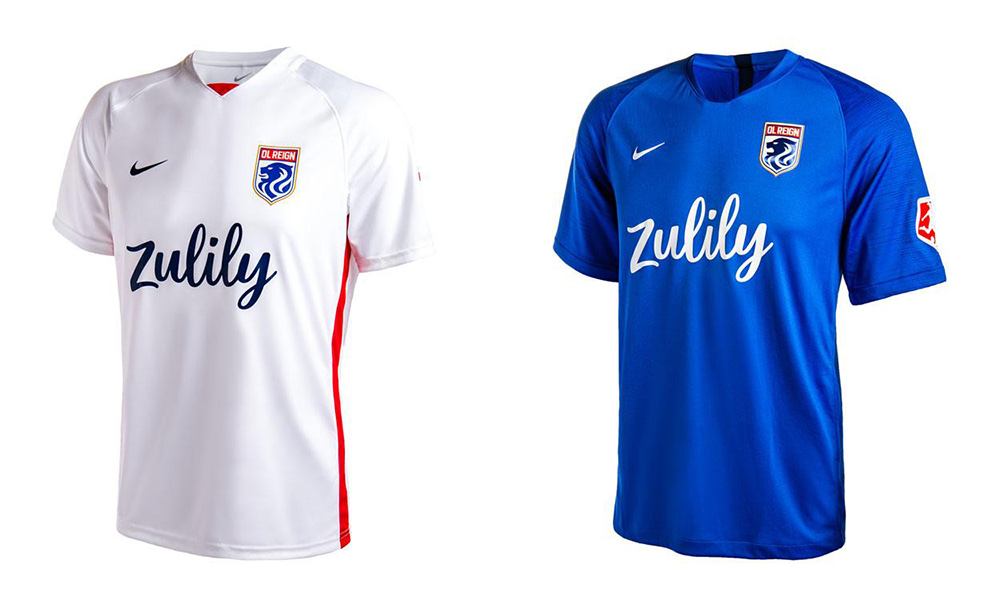
Home: F
Away: D
Probably the plainest NWSL jerseys in 2020, it’s a shame we didn’t get something new from OL Reign this year. Although, parent club Olympique Lyon’s 2021 kits were pretty lackluster as well, so maybe it’s for the best.
Washington Spirit

Home: C+
Away: F
Ahead of the 2020 season, the Spirit introduced a passable, yet forgettable home shirt, while choosing to keep their away shirt — basically a white tee with a crest and sponsor on it — the same from 2019. We could be due for a new set before the official NWSL season starts, but the way things currently stand, the Spirit’s jerseys are average at best.
New 2021 NWSL Kits
Finally. The run up to the Challenge Cup kickoff was exciting if not overwhelming, as it seemed like we were getting a new kit drop every other day. Perhaps in the future, we can get coordinated all-at-once reveal similar to how Nike and the WNBA successfully unveiled their 2021 jerseys. But for now, let’s take a look at the best and worst new NWSL kits.
Racing Louisville
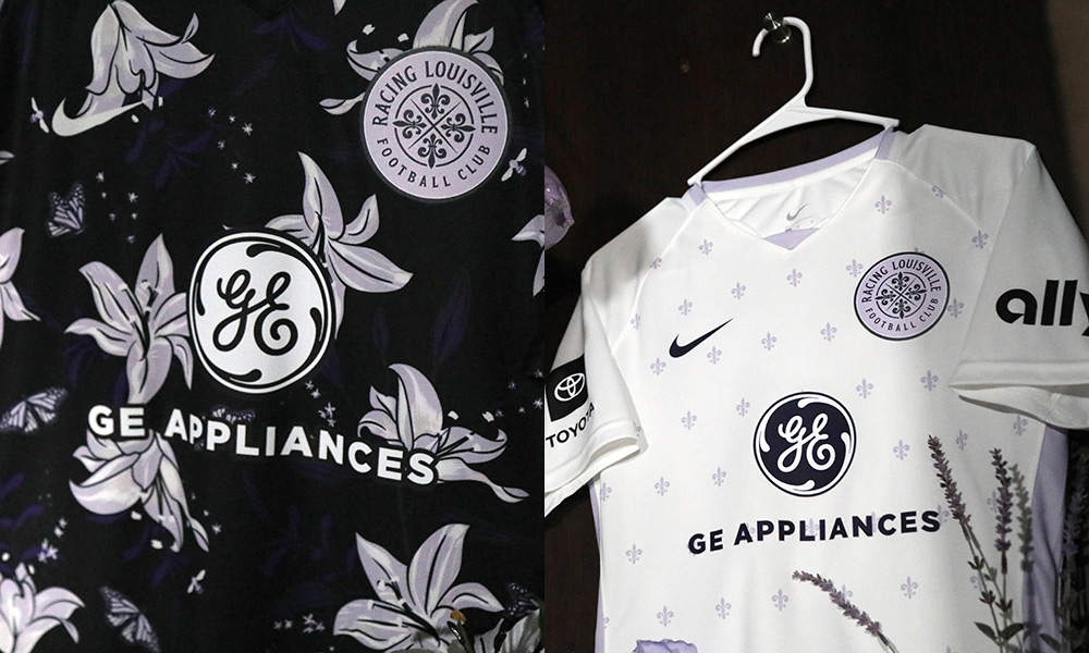
Home: A+
Away: A+
This is just spectacular. I already had high expectations for the Racing Louisville kits, but these somehow exceed them. (Disclaimer: I’m a sucker for a purple kit.)
Starting with the home, we have a “midnight violet” primary color with a flora and fauna theme. The white lilies are a play on the fleur-de-lis (which literally translates to “lily flower”) in the club’s logo, and the butterflies and bees are a tribute to the great Muhammad Ali, a Louisville native. It’s a great concept that easily could’ve been overdone, and while the design is quite intricate, it doesn’t feel too busy and is instantly in the conversation for jersey of the year.
The white away is more traditional and subdued, and serves as a palate cleanser to the dazzling home. A fleur-de-lis pattern with a white and lavender colorway makes for a simple yet pleasing jersey and a perfect complement to its home counterpart.
Orlando Pride

Home: A
CityiD Goalkeeper: A+
Away: B+
Because just a jersey isn’t enough, it’s become common practice for clubs to tell or create a story through their kits. Few have gone to the lengths that Orlando Pride have with their 2021 home kit, however.
Honoring Florida’s long aeronautical history, the club actually sent its “Ad Astra” home kit into outer space, presumably making it the first soccer jersey to exit Earth’s atmosphere. But theatrics aside, the shirt itself is stunning. A black-to-purple ombre gradient featuring stars further plays into the outer space theme, and the club also did a full photoshoot at the Kennedy Space Center located just outside Orlando.
In addition, the club introduced its CityiD program, which features custom graphics and patches built around player personas, to its women’s side. We featured the stellar customized Orlando City jerseys released last year, and we’re grateful that the club has extended “Moniker” kits to the Pride. The first CityiD jersey we get is a “Moon” goalkeeper kit for Ashlyn Harris. An all-white shirt with stunning details made this the cherry on top of what was already a wonderfully executed kit launch.
The Pride will be playing their away matches in last year’s “Plume” shirt, which does a great job of avoiding the “Hey There Delilah” syndrome many other plain white tees jerseys succumb to.
Houston Dash
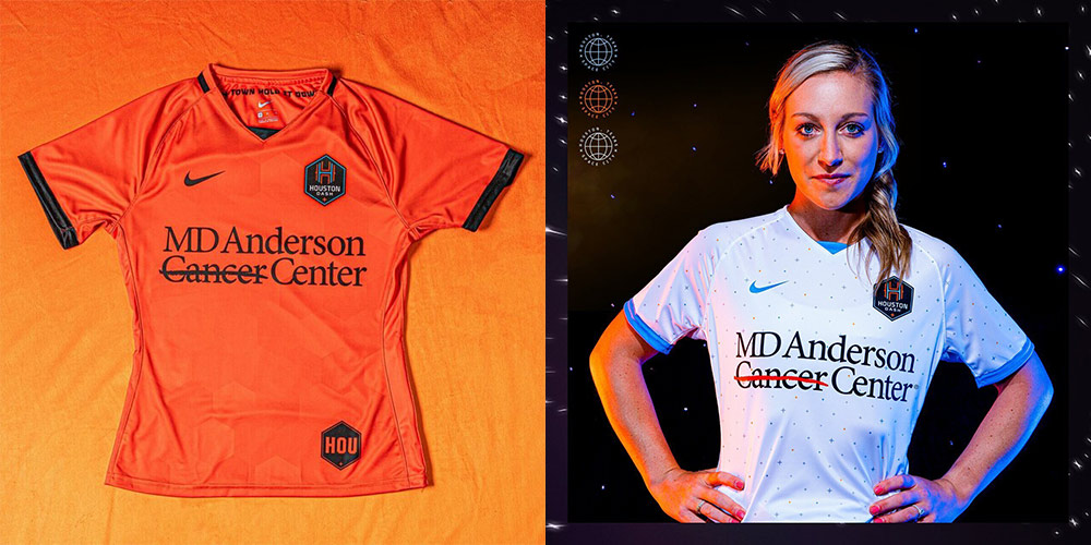
Home: C
Away: B
The reigning Challenge Cup champs had a lot to celebrate in the offseason, including a pretty solid rebrand. Incorporating the “Space City Blue” separates the club from its MLS affiliate, and adds a unique contrast to the “Wildcatter Orange” that has been part of the club since its inception.
However, the Houston Dash’s 2021 kits leave a bit more to be desired. The home kit is essentially a Nike version of the Dynamo shirt, which is neither offensive nor memorable.
The “Luv Ya Dash” away shirt, however, takes things up a notch, continuing Orlando Pride’s space theme by honoring Houston’s connection to aeronautics as well. The Dash didn’t send this shirt into space, but they did gift it to NASA Chief of Exploration Planning Nujoud Merancy, who is a Dash fan as well. I wish the club would’ve leaned into the powder blue a little more, but the quasar all-over pattern adds a nice touch to a pretty solid shirt.
NJ/NY Gotham FC
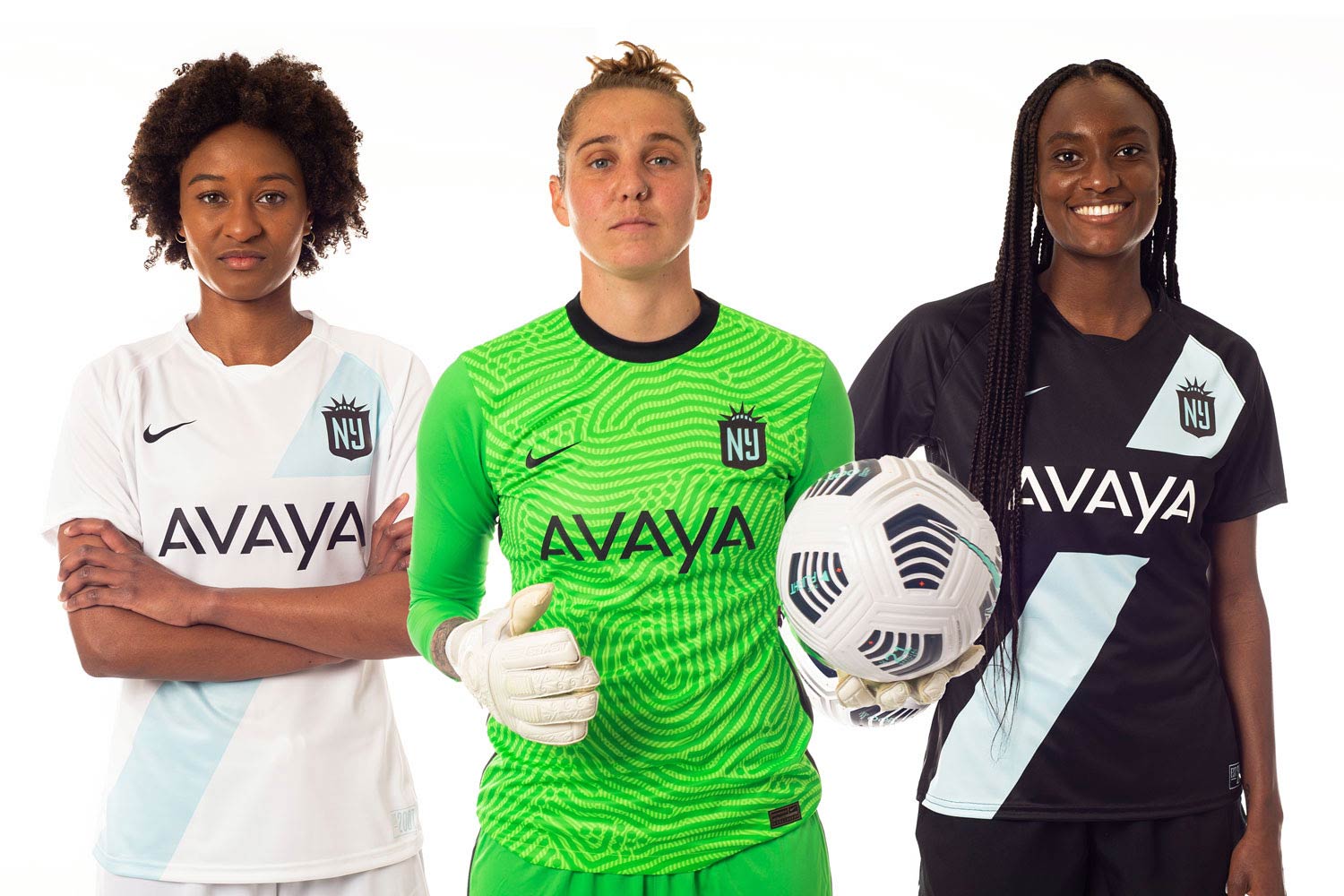
Home: A
Away: B+
Like Racing Louisville, NJ/NY Gotham FC got the Matthew Wolff rebrand treatment in the offseason, and it sent seismic waves through the soccer community when it announced its new name. As an aftershock, we got a pair of stellar jerseys to boot.
The club initially teased that it would be entering the #nwslspacerace similar to Orlando Pride and Houston Dash, but instead it gave us its “Colossal” kit, which nevertheless didn’t disappoint. The kit itself is pretty simple and uses classic design cues, but what sets it apart is the color palette and a great crest. Like with purple, you can rarely go wrong with powder blue, and the sash across the chest represents the Hudson River that separates New York and New Jersey.
The Gotham FC away kit is pretty much the same but in white, and the contrast with the powder blue doesn’t work as well as it does with the black. However, it’s a nitpick at worst, and is still a wonderful shirt.
North Carolina Courage
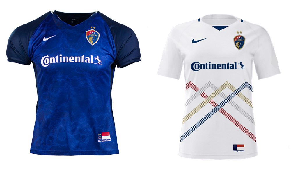
Home: C+
Away: B
One of the premier NWSL franchises, the North Carolina Courage have typically gone with more plain kits in past seasons, a trend they looked to spurn in 2021. The “Mountains to Sea” concept is a great idea, honoring the diverse landscape the club’s home state has to offer — from the Appalachian mountains to the Atlantic coastline.
The home kit’s deep azure blue and water pattern represents the ocean, while the overlapping chevrons on the away kit represent the mountains, similar to the highly celebrated Slovenia national team jerseys from 2016. All in all, these are definitely an improvement upon past Courage kits, but there’s something missing from each that’s keeping them out of the upper echelon of NWSL jerseys.
Kansas City
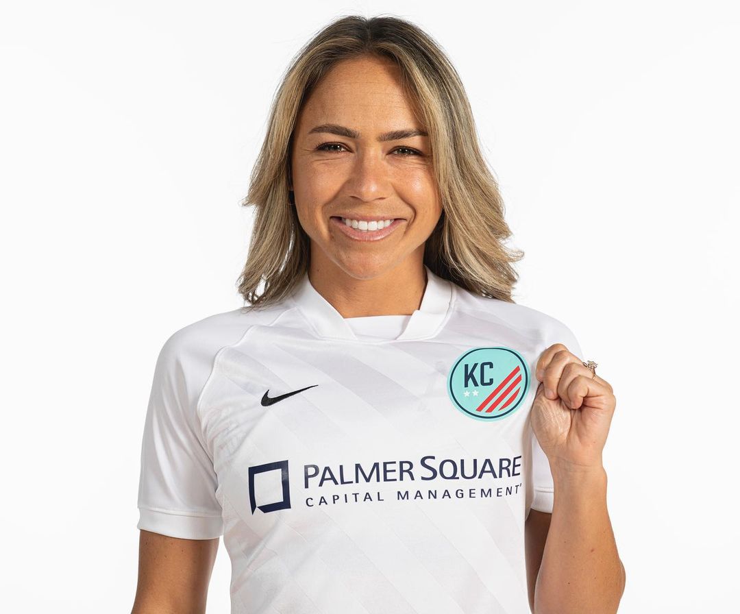
Home: C-
There wasn’t much time for Kansas City to prepare for the 2021 season, so I’m grading its jerseys on a curve. The club announced it would relocate from Utah only in December, making for a tight turnaround to create a crest, branding, and hire new staff.
The crest certainly has a placeholder feel, and we can only hope the club has a more long term solution in the works. As for the jersey itself, it’s plagued by the aforementioned plain white tee syndrome. However, the neckline is noteworthy, even if it’s the only thing the shirt has working for itself. It’s not the worst start imaginable, and with a pretty solid color scheme, things can only go up from here.
What’s your favorite 2021 NWSL kit? Let us know in the comments below.


Looks like the article could do with an update now that the new OL Reign jerseys have been announced!
Yes! The blue away is definitely a step up from last year.