A new football season has brought us stars in new places, new storylines, and best of all, new kits. While the best uniforms usually don’t need any updating, it is always exciting to see the new designs rolled out ahead of each season — both good and bad. With that in mind, we take a look at the best and worst kits that were unveiled for the 2017-18 season.
Adidas
We start with Adidas, because the biggest always goes first. Responsible for what many agree to be the greatest kit of all time, Adidas has consistently been the go-to kit supplier for some of the world’s biggest and most recognizable franchises, such as Real Madrid, Bayern Munich, and AC Milan.
In addition, Adidas has recently poached Manchester United and Juventus from Nike, swiping them both after the 2014-15 season.
THE BEST: Manchester United, Away
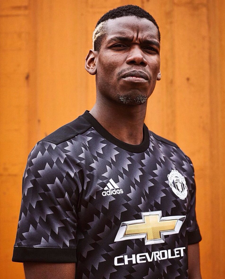
The pattern on Manchester United’s newest away kit is an updated version of the club’s iconic away kits from 1990-92. The Man U faithful loved them, and all other fans loved to hate them. This version of the memorable jersey should be no different.
THE WORST: Real Madrid, Third
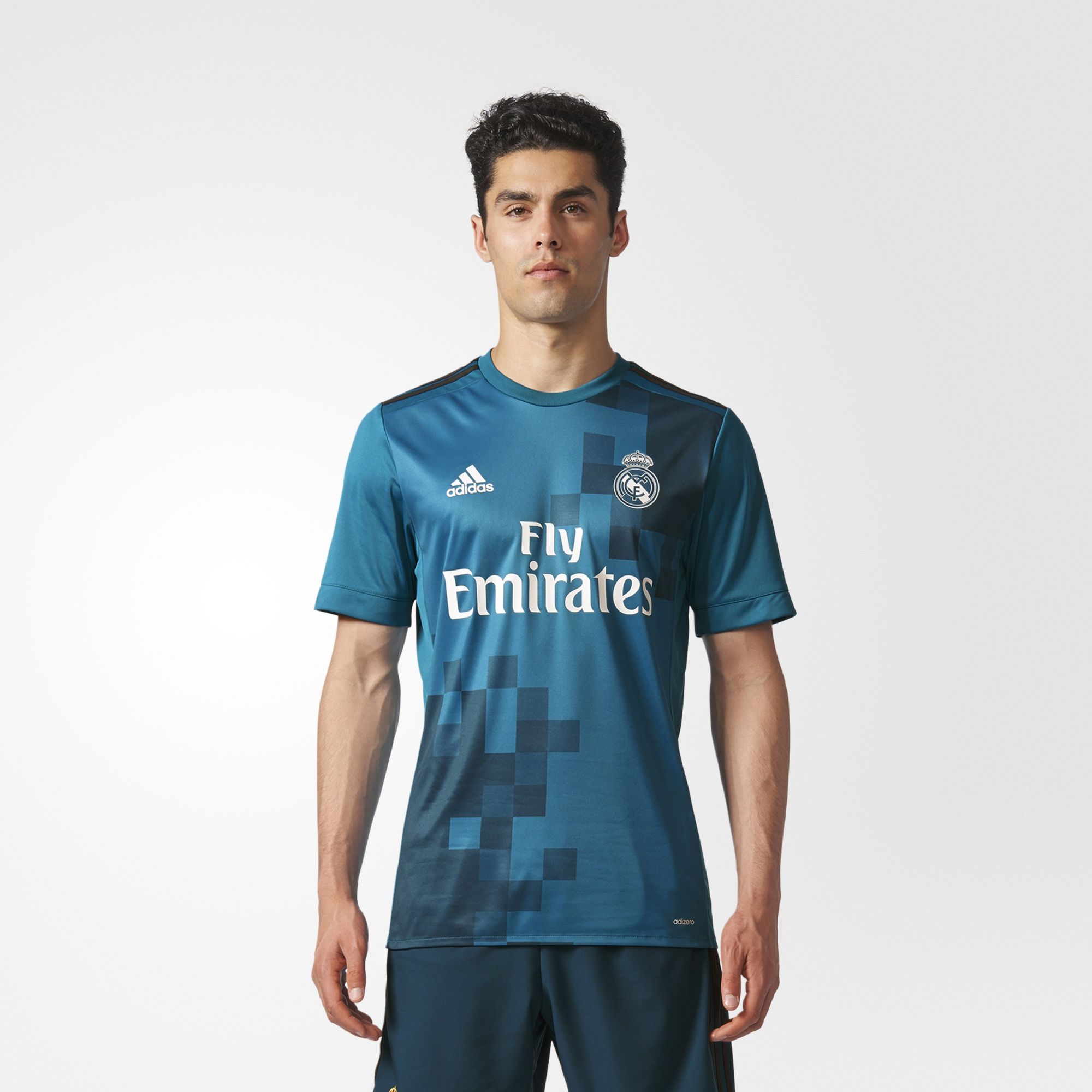
Third kits can be difficult to design at times, and Real Madrid’s latest third kit serves as empirical proof. There’s very little inspiration in the design, with a fairly basic color scheme with certain pixelated areas that are darker. *Yawn*
Nike
While it doesn’t have the same amount of classics under its belt as archrival Adidas, Nike has had some successful releases in recent years, such as the 2005-06 Arsenal or the 2009-10 Barcelona kits.
Although it is the kit provider of popular clubs like Chelsea, Tottenham, and Paris Saint-Germain, Nike still trails Adidas, which according to Nielsen has been the top kit supplier since 1996, in terms of overall sales. However, that doesn’t mean that there aren’t some fresh jerseys that don a swoosh.
THE BEST: Club America, Home
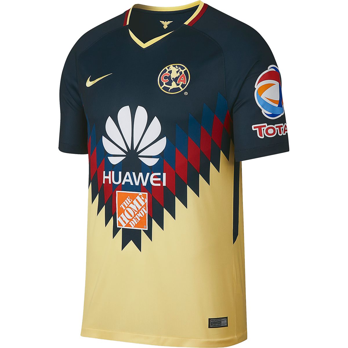
Yet another throwback-inspired kit that does the original justice, Club America’s 2017-18 home uniform pays homage to its colorful kits worn back in 1995. Although Nike has toned the color scheme down a bit in order to fit its jersey template, the result is still a clean-looking kit that fans should be proud to wear.
THE WORST: Inter Milan, Home
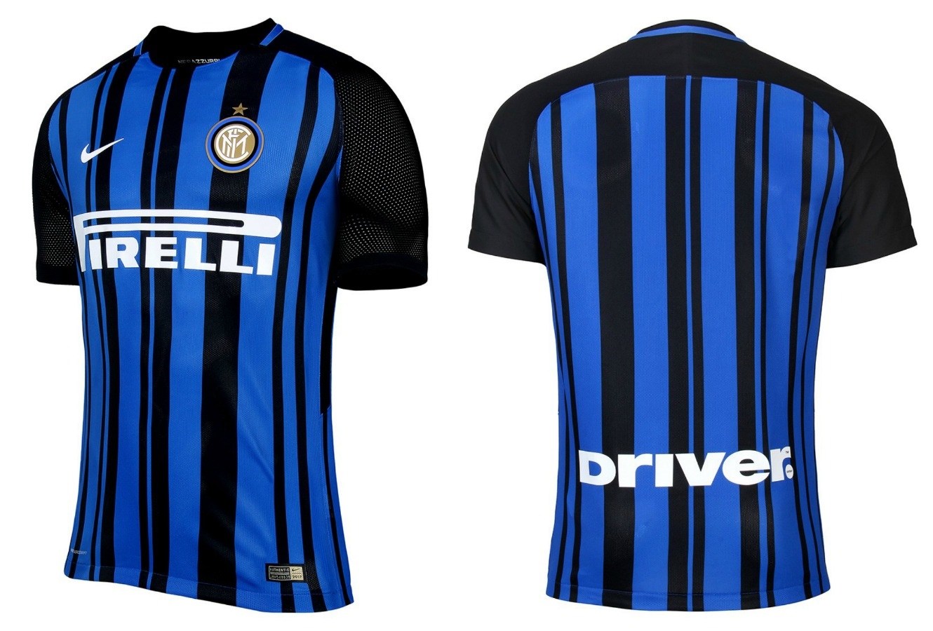
Nike made a bold attempt to move away from Inter Milan’s traditional solid vertical stripes here, but it ended up looking like someone put a printer-ink test paper on a jersey. Or they didn’t clean their scanner before sending over a design for a solid blue jersey. Either way, it’s a solid pass for us on these.
Puma
Earlier this year, Puma executed the world’s largest-ever kit launch, which saw 23 new away and third kits released over seven time zones. While the “Step Out” release event produced some slick-looking kits for teams like Arsenal, Chivas, and Borussia Dortmund, none of them were quite Puma’s best, proving that most of the time, quality beats quantity.
THE BEST: Borussia Dortmund, Home
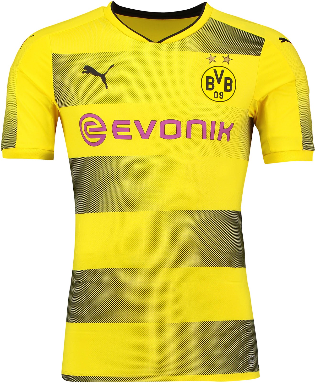
Borussia Dortmund’s home kits are a thing of beauty every season, and this year is no different. Rather than using a solid yellow like in previous years, Puma added gradient black stripes that really stand out.
THE WORST: Borussia Dortmund, Third
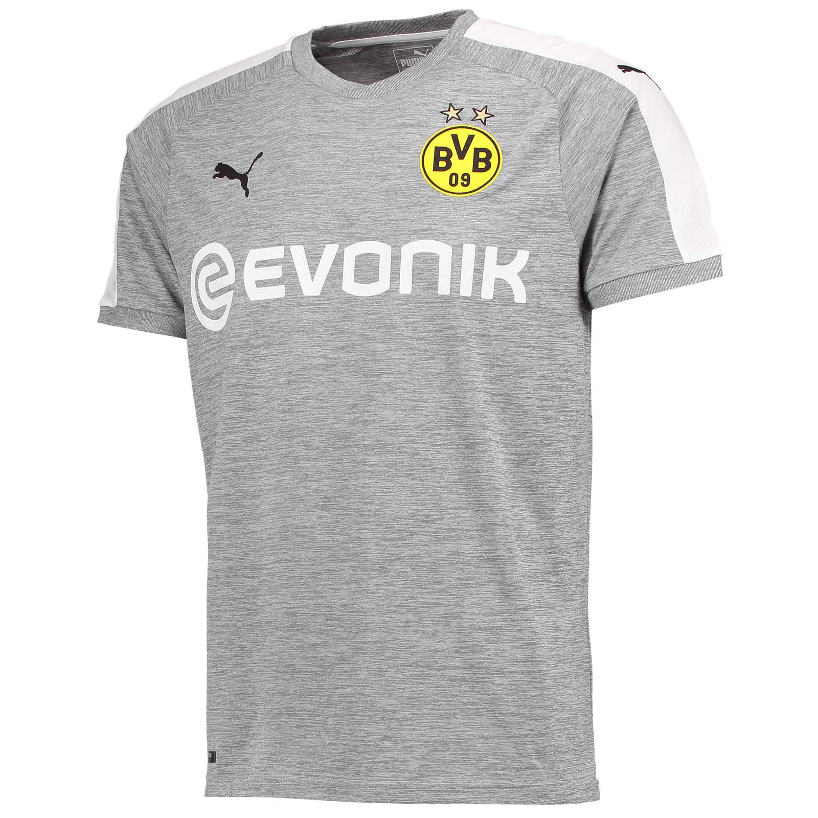
Puma giveth, and Puma taketh away. While a lot of effort and detail went into Borussia Dortmund’s home kit this season, its third kit leaves a lot to be desired. It looks like a workout shirt but in jersey form.
Kappa
While it may not be a household name like the aforementioned brands, Italy-based Kappa has dropped some absolute classics in the past, most notably worn by the ’85 Juventus squad.
Today, Kappa is the official outfitter of Brazil’s Campeonato Paulista, home to teams like Santos, which once saw legends Neymar and Pele play on its hallowed grounds.
THE BEST: Sassuolo, Away
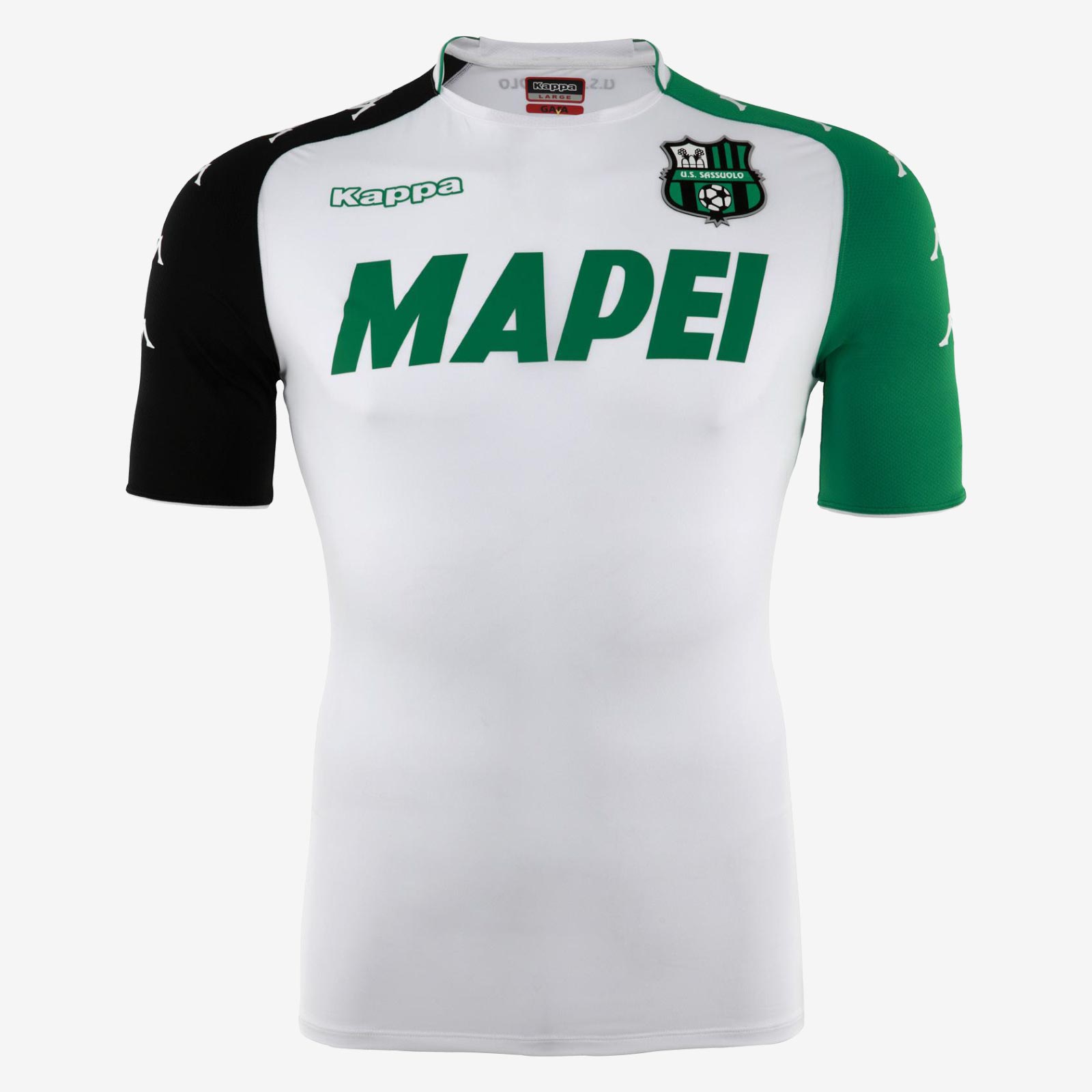
Sassuolo, a small Italian team nicknamed the neroverdi (black and green), stayed true to its colors in its newest away kit. While the basic white design isn’t necessarily eye-catching, the black and green sleeves provide a nice balance.
THE WORST: Torino, Third
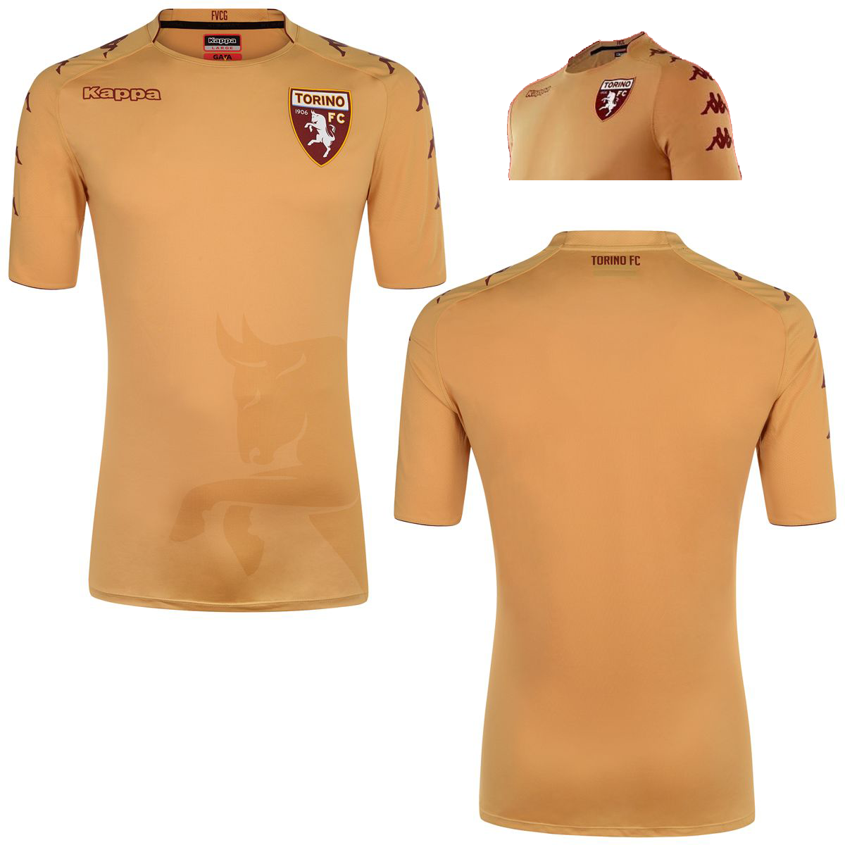
Did someone order a human skin colored jersey by accident? Yikes. The only redeemable quality of Torino’s third kit is the Kappa logo on the sleeves, but then again, that comes standard on every Kappa jersey…
Joma
Although known for its high-performance indoor shoes, Joma does supply kits as well, and its client list extends to top-tier teams like Swansea City of the EPL, RCD Espanyol of La Liga, and Toulouse FC of France’s Ligue 1.
THE BEST: Sampdoria, Third
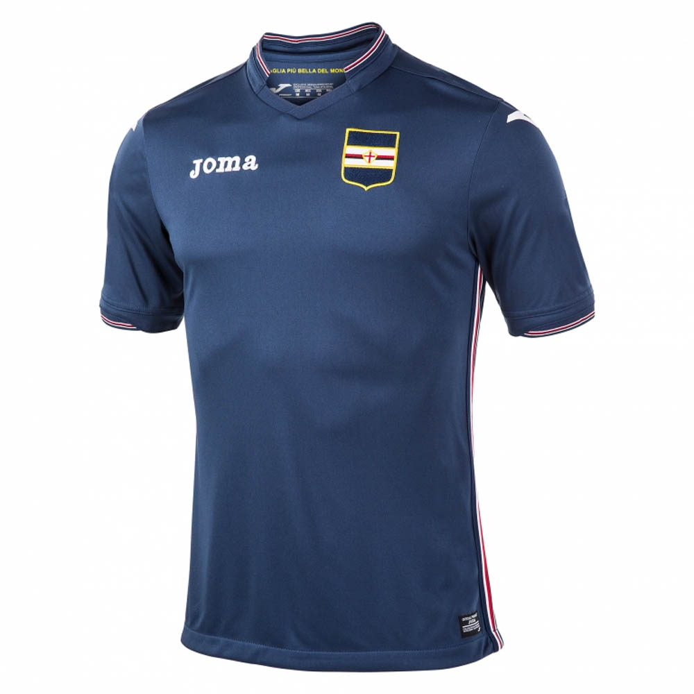
This is what every third kit aspires to be. In a simple navy that serves as a subtle change from the club’s royal blue, along with an appearance from its stylish alternate logo, there really isn’t much to hate about this kit.
THE WORST: RCD Espanyol, Third
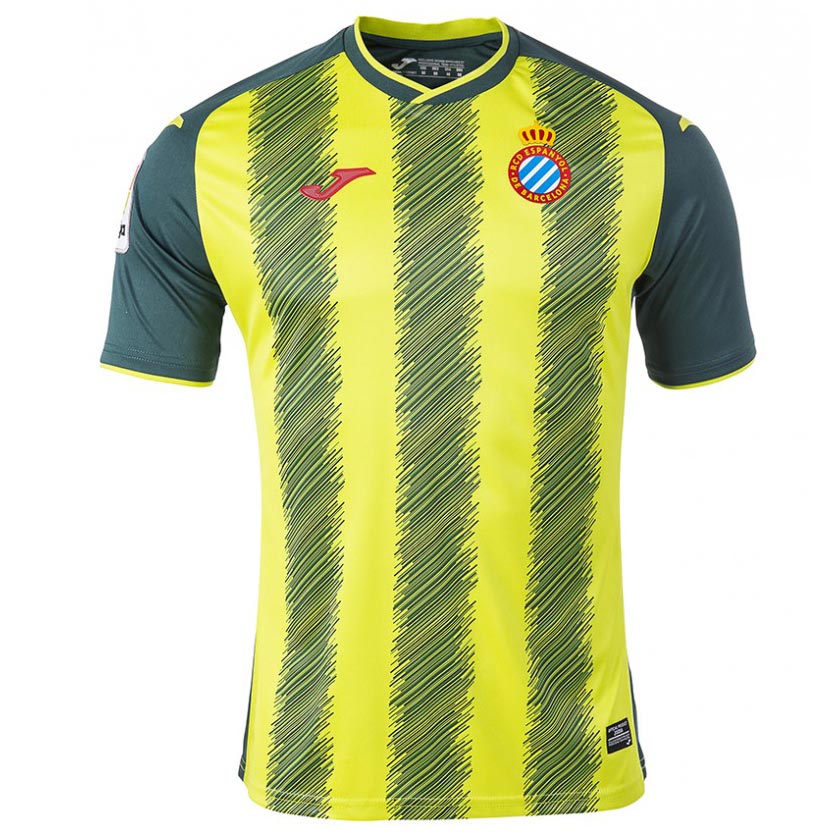
While the color scheme of RCD Espanyol’s third kit is tolerable, the vertical lines made out of smaller diagonal lines are just bad. It looks like a child came up with the design for this jersey. Joma might need to head back to the drawing board with this one.
Under Armour
While Under Armour might not necessarily be the first football brand you think of, the Baltimore-based company supplies several teams across the globe, including the EPL’s Southampton and Aston Villa, among others.
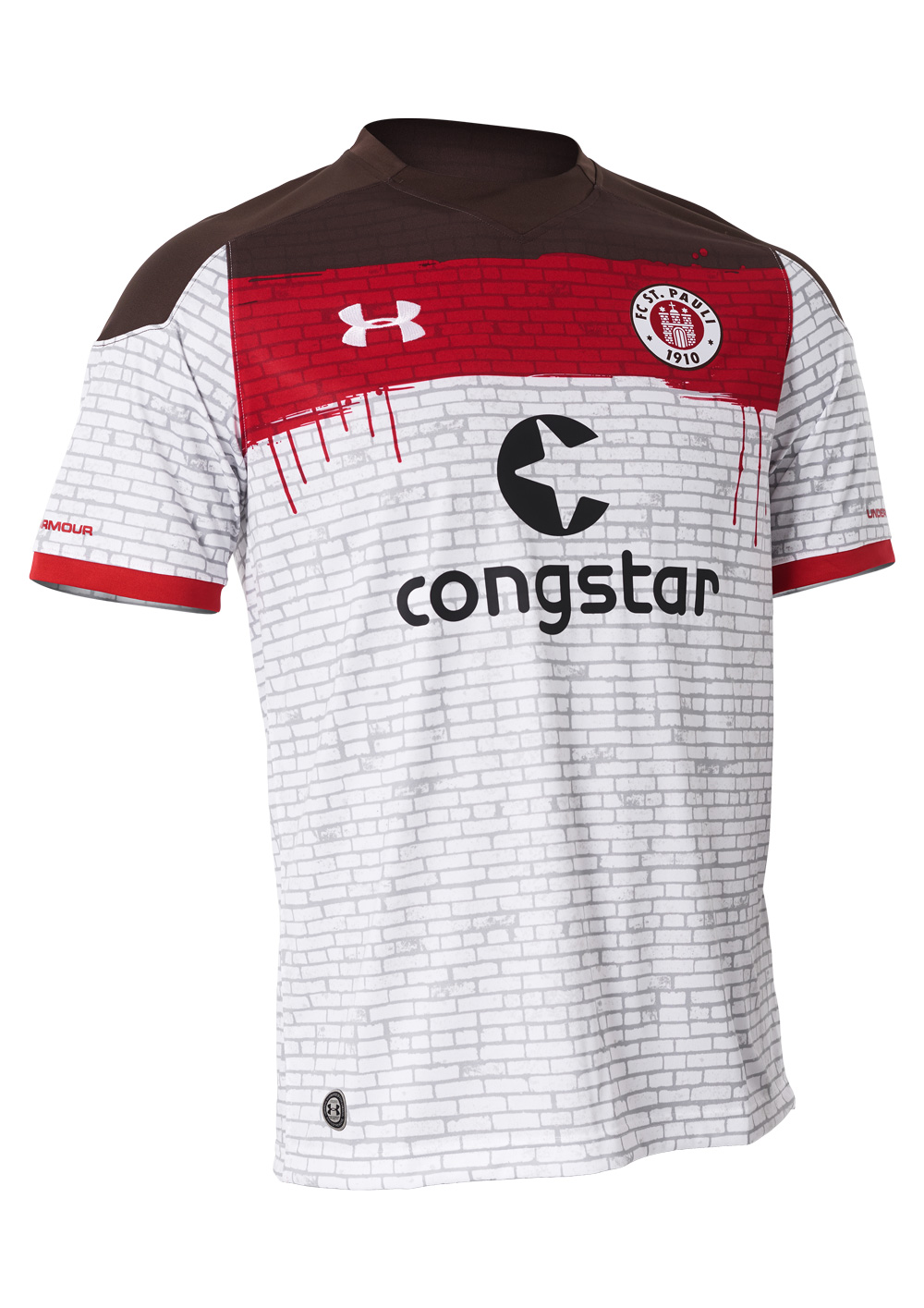
THE BEST: St. Pauli, Away
Playing in the second division of Germany’s Bundesliga, FC St. Pauli is one of the most socially conscious clubs in the world, and was the first German club to establish a set of fundamental principles in which the club was run, many of them going beyond football.
It’s only fitting that a club unique as St. Pauli receive an equally unique kit. With bricks representing the club’s Millerntor Stadium, you’d be hard pressed to find a similar uniform anywhere else.
THE WORST: Southampton, Home
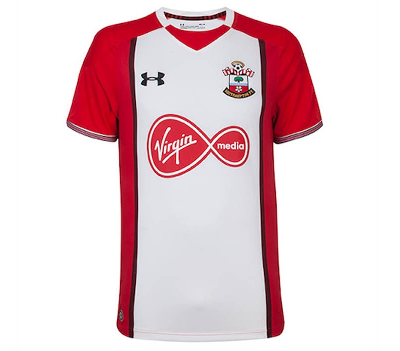
While you can’t really go wrong with a simple red and white jersey, Under Armour somehow finds a way to do so here. Something about the vertical red lines and multi-colored front just throw everything off with this particular jersey. While the majority of Under Armour’s kits were pretty solid (no pun intended), this one stands out for the wrong reasons.


