
The debate over which football club has the best jersey design is hotly contested throughout the world. But what about kit sponsors? Making up a big chunk of each kit, the sponsor certainly plays a large role in how the uniform looks. From bonafide classics to wild and bizarre logos, we examine just what makes kit sponsors good or bad.
If you’re a Spurs fan, we hope you like life insurance. Tottenham’s profitable partnership with AIA, started back in 2014, has been extended for eight more years — a nearly $400 million deal in exchange for prime real estate underneath the Tottenham crest. With such a haul (the third-richest in the Prem) Spurs will have a bit of transfer market freedom to try to improve on this year’s so-close-yet-so-far Champions League campaign. But as the money dwindles, it’s the pan-Asian life insurance group’s bold logo that will remain. For the better part of the next decade, every tearful exit from the Champions League and every trophy-lifting moment will be proudly branded with three letters — AIA.

We’ve grown accustomed to jersey sponsors, but we forget that we’re putty in their hands. A single inky signature from a random exec could mean a career-long sentence to terrible kits that we’ll be obligated to not only dole out for, but wear on matchdays for years to come. Don’t believe a sponsor would do such a thing? Think again. But not every logo on a jersey is a detriment (AIA gets it right in our eyes) — here are the design considerations that make the corporate takeover of our beautiful game (and the beautiful kits with it) a bit more palatable.
Match the Colors

Unless the stars align, one party is going to have to compromise on their colors. Spoiler alert: it should never be the team. Paul Pogba got crucified for having blue highlights in his hair during the spring Manchester derby in 2018 (despite playing for blue-clad France a week before) — color is far too important to a club and their supporters to compromise on the literal fabric that defines these allegiances.

So when a sponsor has a clashing tone or simply a rival’s shade of blue, it should flex to accommodate the team’s palate. This doesn’t mean completely changing the look of the brand — a little black and white beats the heck out of whatever Southampton has been forced to do this year.
Who’s doing it well: Man City, Everton, Roma
Who’s not: Manchester United, Southampton, Napoli
Remove the Logos

Sorry Chevy, but it doesn’t make sense to add even more iconography to a jersey. Kits already have club badges, manufacturer logos, and general design to contend with. Adding another element that has nothing to do with the rest of the look is distracting and confusing. And these logos don’t even do the job on their own — every single Premier League team this year with a mark on their kit also includes the name of the company.

Lose the logo and you lose a bit of brand recognition, sure. But let’s let the name live alone. It creates the necessary associations without distracting (too much) from the other mandatory graphic elements of the fit.
Who’s doing it well: Real Madrid (and any Emirates-sponsored club), West Ham, Brighton
Who’s not: Manchester United, Wolves, Norwich (along with most of the Prem)
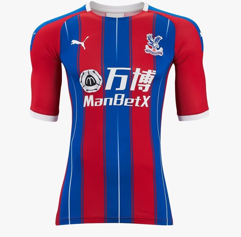
Consider the Sponsor
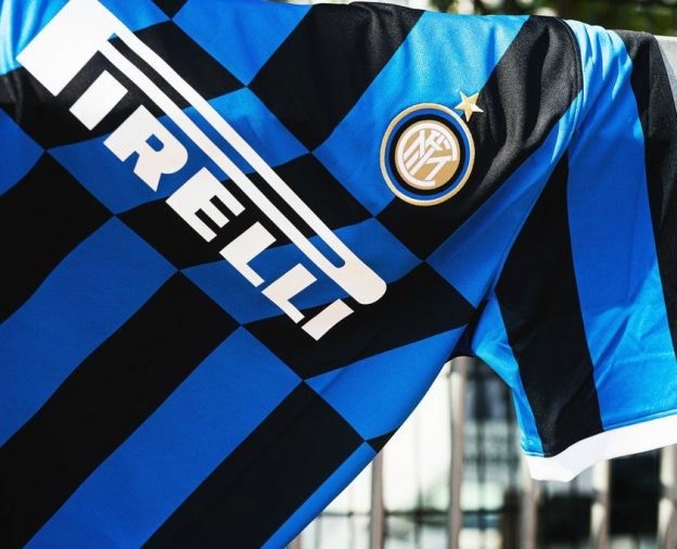
It’s too depressing to imagine building a kit entirely around the the company that’s endorsing it, but the ones that really shine clearly keep in mind that they have to have something foreign live on the front. This could mean breaking (or making) stripes to frame the sponsor, or adapting the sponsor to incorporate the jersey design. Ideally everything is considered before the artists put pen to paper, and it’s usually easy to spot the teams that spent some time trying to make that logo or endorsement feel a part of the overall look.
Who’s doing it well: Inter Milan, West Ham, Watford
Who’s not: Schalke 04, Newcastle, Crystal Palace
We never forget the crest on the front, nor the names on the back. But deep down, in all of our different footballing memories, we see the money behind the game printed front and center. And although it’s usually a commercial matter, a few clubs have proven that a kit sponsor can be a supporting element of even the most legendary uniforms.
Let us know in the comments which kits have the most aesthetic (or ugliest) sponsors.


")

