With the precision of an architect and creative freedom of an illustrator, Andre Chioté boldly melds two separate yet related fields together in his work. We speak to the Portuguese talent in our latest edition of Art of the Game, which highlights some of the brightest artists in the world of football.
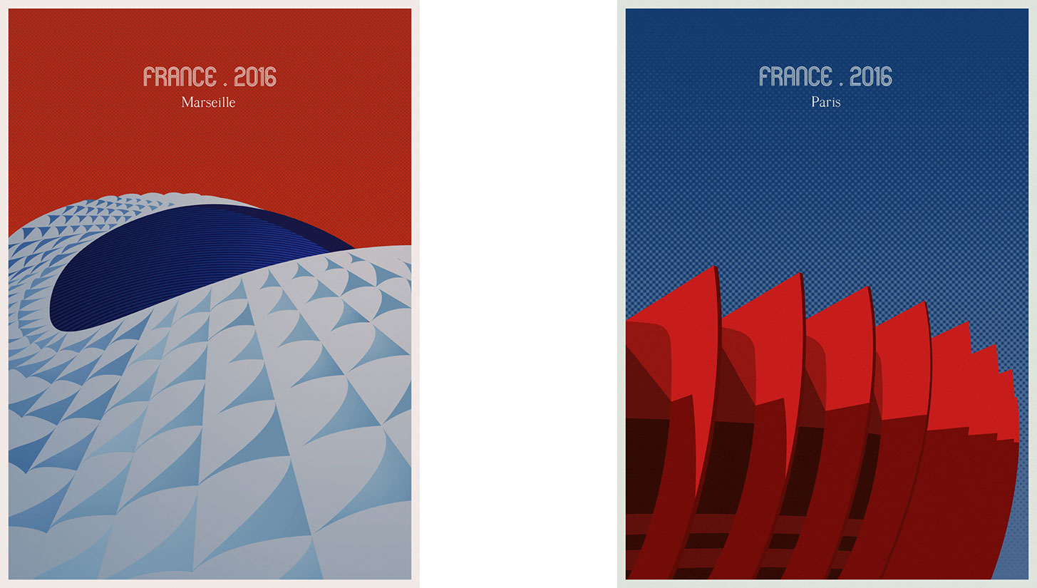
Andre Chioté has combined his passions for football and architecture to create some of the most brilliant illustrations you’ll find. The Porto, Portugal-based artist/architect focuses most of his illustration work on famous religious or communal gathering spaces like churches, museums, and football stadiums. His vibrant portraits of the world’s most famous sporting venues strip the stadiums down to their most iconic design features, such as Stade Velodrome’s dramatic curved roof or the Beijing Bird’s Nest, whose roost-like intertwining steel beams form its outer shell.
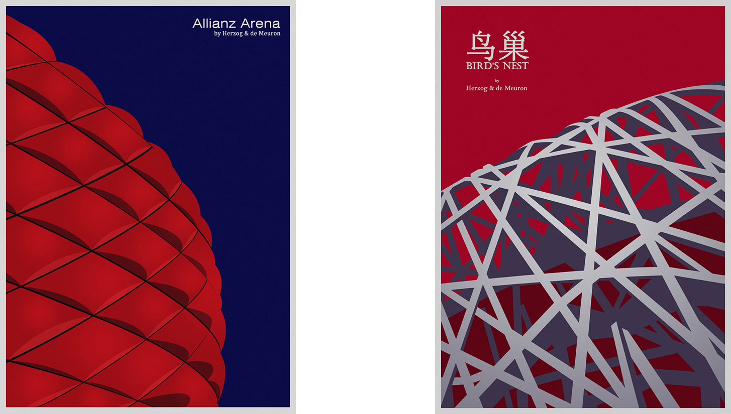
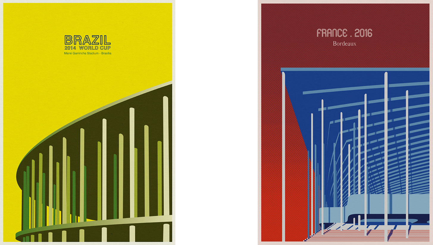
The artist’s simplistic yet unmistakable works elicit memories from some of the most thrilling tournaments in recent memory — most notably the 2014 Brazil World Cup and 2016 EURO Cup in France.
Drawing inspiration from around the globe, Chioté adapts his colorful sensibilities to capture the essence of the stadiums we love with the precision and creativity that only an architect could provide. We sat down with him to discuss his process, origins, and some of his favorite stadiums from around the world.
Urban Pitch: Let’s start at the beginning. Where did you grow up, and how did you get interested in architecture?
Andre Chioté: My childhood was divided between two small towns in Portugal. I was born in Chaves, in the north of Portugal, near Spain. I lived there until I was 5 when I moved to Póvoa de Varzim, near Porto, where I spent all my youth. Between bicycle races and soccer games in the middle of the street, drawing was always there. At school, drawing, mathematics, and geometry took me to architecture. I’ve drawn as long as I can remember.
I studied architecture at FAUP, Porto’s university of architecture. My studies taught me a distinctive way to see the world. As an architect I’ve worked through the years in several different kinds of projects. My days are busy designing new buildings. However, the rest of my time is dedicated to looking around at reality, trying to represent my personal vision in different ways: painting, drawing, and photography.
I began doing illustrations as a freelancer six years ago. Somehow this exercise of illustration awakened me to the ability of synthesis, removing all those secondary and disposable elements of the building. Ultimately I found out that this exercise works in both directions — from the architect to the illustrator and the other way around.
Did you play football growing up? If so, what kind of player were you, and where did you play?
Since I was a child until today, my position has always been that of the opportunistic finisher – right place at the right time.
If you had to choose between football and architecture, what are you going with and why?
Definitely architecture. I can live without a ball but without drawing — it will be difficult.
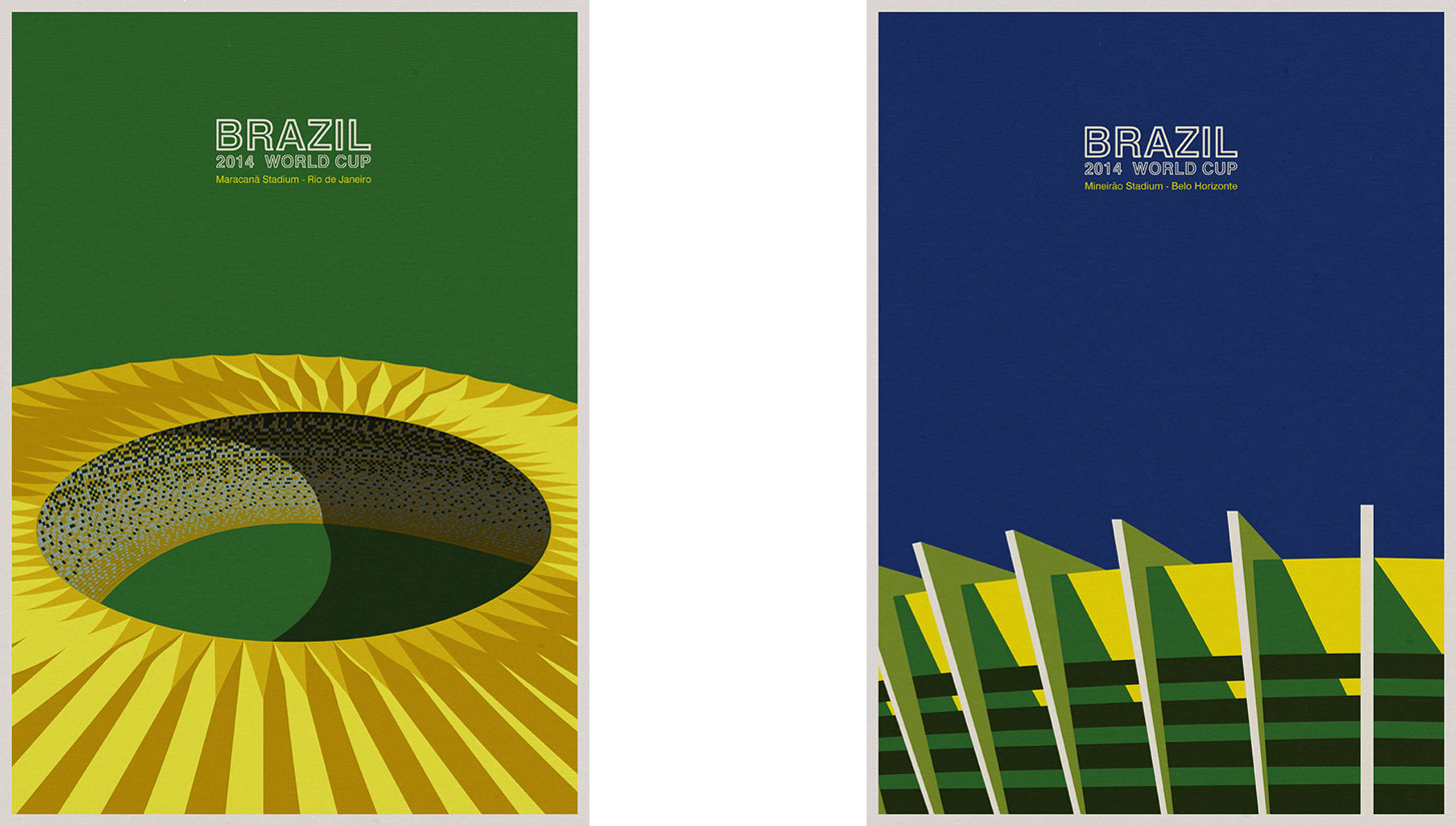
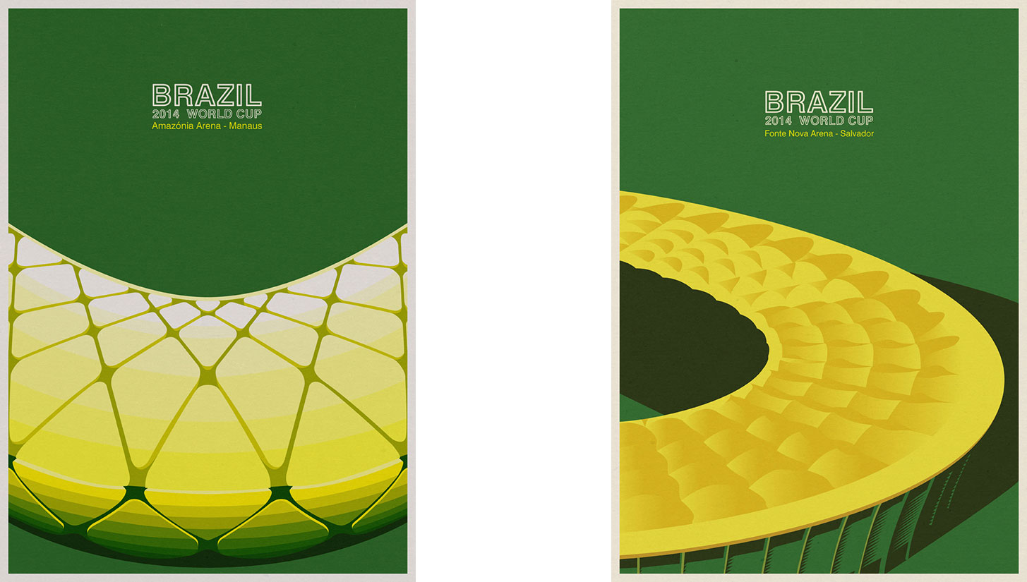
What does your creative process look like, and how would you describe your design style? Do you travel to some of the places you illustrate?
Approaching architecture as an icon I’ve developed an illustration concept in which the aim was to illustrate buildings. To develop my illustrations, first I do research about the building I’d like to illustrate. I use photographs from the internet, books, and magazines. After that research I began to know what details or views are most recognizable. Also, I use my architect’s intuition and vision to use views and details of buildings that are already [established] in the collective memory of the history of modern and contemporary architecture.
I think that as an architect, the vision I have about the buildings and the knowledge about the best iconic details to communicate makes the difference. After, I sketch a little bit to find [the best] composition. Sometimes I work with the color palette of the building itself and sometimes I choose a symbolic palette of colors that conceptually can work fine to communicate an iconic image of one building. My style? Maybe minimalist, trying to produce a strong image with a few elements, I think.
You live in Porto — what is it like living in such a beautiful city known for its vivid colors, architecture, and natural landscape?
I have lived in Porto for 12 years and I have witnessed the transformation of the city from regional to international. And despite the less positive side associated with tourism and gentrification of the city, Porto is today a much more interesting city. Due to its small size, it manages to offer the best that small and large cities have — neighborhood scale and cosmopolitanism.
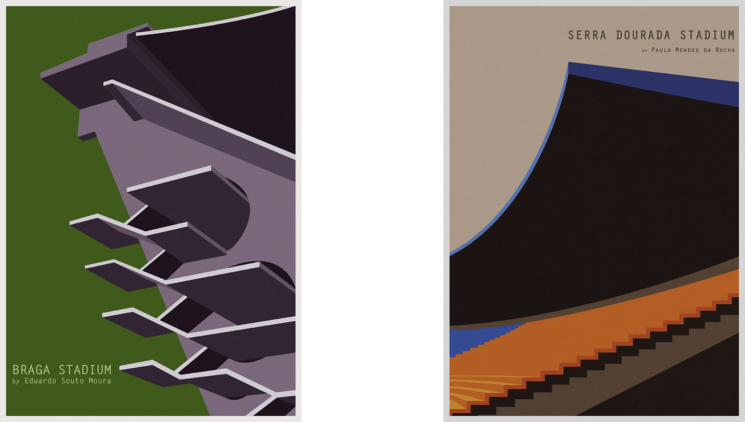
What is the best stadium you’ve been to in terms of atmosphere? Which one is the most impressive architectural feat?
Of those I had the opportunity to visit without a doubt the most interesting architecturally is the Braga Stadium designed by the Portuguese architect Eduardo Souto Moura. They say that because there is no continuous circular stand — there are two separate stands facing each other — the environment and the atmosphere created is not so involving. But my sensibility is more visual. The criticism is that the arrangement makes the wave impossible — this is true, but it does allow for a game of songs between opponents in two different stands.
Be sure to follow Andre Chioté on Instagram to stay up to date with his latest work. You can purchase his prints online here. Check out the rest of our Art of the Game series to learn more about some of the best artists and illustrators in the world of football.
Interview edited for clarity and brevity.


