
With the 2022-23 English Premier League season under way, we take a look at some of the best kits from clubs outside of the top six.
Far too often, it is the Premier League’s “Big Six” that garner all the attention. From massive signings to intra-team drama, the majority of EPL coverage is centered around these major clubs. The same goes for kits. Brands will often give their bigger clubs more bespoke kit designs, and as such these are typically the most talked about shirts when it comes to kit drop season. This does not do any favors to the best of the rest, whose home, away, and third kit releases go criminally under the radar.
With the 2022-23 season kicking off over the weekend, we’re here to change exactly that by picking our top five non-Big Six kits.
Everton Home

Simplicity can often be overlooked as a crucial aspect in designing kits, as it can be potentially misconstrued as basic. But when simplicity is done right, there’s no topping it. And Everton’s new home kit can certainly attest to this theory.
Appreciating round-neck collars will be a running theme throughout this piece, and the one on Everton’s 2022-23 home shirt looks fetching to put it modestly. The white collar is as elegant as it can get, and the dash of blue is a knockout touch.
The staple Hummel chevrons on either shoulder go hand-in-hand with the blue base, as the latter color takes precedence in the kit as a whole.
It’s also a surprise that Hummel chose not to highlight the sleeves. In several 2022-23 home kits, illuminated and/or broader sleeve cuffs has been a common theme. But as mentioned right at the top, Everton’s aim seems to be prioritizing simplicity over flash and we’re here for it.
Zoom in to spot the geometric pattern splattered all across the shirt.
This is arguably the standout element of this kit. While it has not necessarily been placed to make a statement, it does extremely well in adding a hint of detail, which is essential to simple kit designs. The pattern has been inspired by Prince Rupert’s Tower, which is at the heart of the club crest. The symbol of the tower can also be seen at the back of the shirt.
If Everton can improve on the disappointment of last season and play as well as they look, the fans will be all smiles from day one.
Brighton & Hove Albion Away

With the unprecedented heatwave ongoing in the United Kingdom, it was only right that Brighton & Hove Albion dropped this kit.
Full marks to Nike for allowing the Seagulls to enter uncharted territory by designing one of the most unique kits in their history. The bright crimson kit is akin to the current merciless sun in the UK, but separates itself by becoming a headline grabber for all the right reasons.
Away kits and thinking out of the box are joined by the hip. While sometimes certain experiments are nothing short of shambolic, the crimson test is worthy of acclaim.
The color works gloriously in tandem with black, which has astutely been put to use in various elements of the shirt. Firstly, the tiny stripes placed across the body of the shirt ensure that the bright crimson is not too overbearing.
However, it does not take away from the shine of the striking color, which is why the Swoosh and American Express sponsor logo do not look out of place in black.
To sum things up, this summer-ready release is everything Brighton fans would have been hoping for from their latest away kit, and Nike delivered in emphatic fashion.
Southampton Home

It isn’t a wild take to suggest that Southampton’s ’80s-inspired home kit ahead of the 2022-23 Premier League season is right up there amongst the very best releases so far — mostly because this right here is the blueprint for designing a home strip.
Moving away from the striped design from last season, the Saints have made subtle, yet instrumental changes that make for vast improvements.
One of said alterations can be seen in the collar. Hummel has chosen a more understated round-neck collar instead of the V-neck design from last year. Dominated by the black color which already makes for a sleek look, the red outline catches the eye without trying too hard.
In fact, Southampton’s three primary colors in red, white, and black have been given their time to shine as a part of different elements on the shirt.
For instance, the red takes center stage right at the heart of the kit’s single stripe design. However, like with the collar, a black outline gives this design a tidy finish. Not only is the design itself easy on the eye, but it emphasizes a far more imaginative approach than simply plastering the shirt with red and white stripes.
The decision to place the club crest right in the center is a trend that has come back in full force, and is always a hit when any side embraces one of the best facets of retro kits.
To top it all off, the geometric patterns not only make for a distinct look, but take inspiration from the stanchions at St. Mary’s that pays homage to the club’s history.
Bournemouth Home
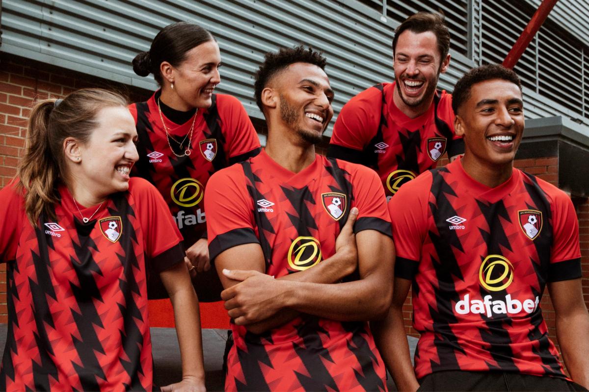
Just going by how fans tend not to gravitate towards flashy home kits, there was a possibility that this offering from Bournemouth could have been a grave error. But things in theory and practice are worlds apart, and the Cherries have marked their return to the English top flight in style.
First things first, let’s talk about the zig-zag pattern across the shirt, which uniquely highlights the shade of black that’s a vital part of Bournemouth’s heritage. Style is one thing, but any club’s attempt to remind the fans about what the side is about at its core will never be outdated.
Umbro has taken another distinct approach to design the sleeve cuffs. A major chunk of the sleeve has been utilized akin to a captain’s armband on either side. While unorthodox, it goes a long way in highlighting the sleeve itself and is perhaps a route left far too unexplored by way too many designers.
A similar bold addition has been taken to design what is a winner of a collar. The V-neck is a lot thicker than usual, much like the sleeve cuffs, but the goal remains to make a statement.
The running theme of fearlessness in creating this kit is what stands out the most. While this may still not be every Bournemouth fan’s cup of tea, it could go on and become a cult classic over time.
Leeds United Home
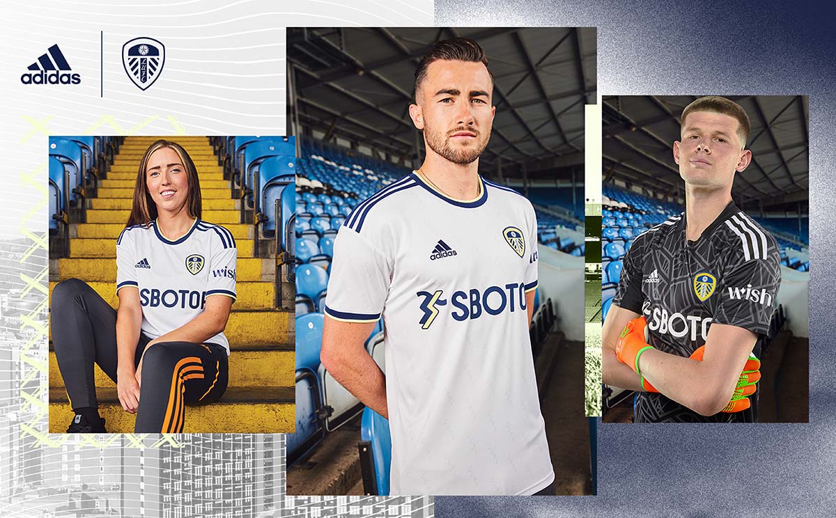
As home kits go, it’s a tall task to outdo this belter of a release by Leeds United. Much like in the case of the Southampton shirt, the design team have hit the nail right on the head with their execution of the collar.
Round-neck collars are instant wins, and especially when the club’s primary colors are represented in such fine fashion. The navy blue and yellow share the stage here, and make for a sublime look. The sleekness of the blue coupled with the boldness of the yellow instantly draw the viewer’s attention.
The same formula has been utilized to highlight the sleeve cuffs and once again, the color combination is nothing but a smash hit.
Also, with the fluorescent yellow being rather loud, it is intriguing to notice how adidas chose to merely use it to highlight certain understated elements rather than making it a star of the show. Less is more and especially when designing a home strip, as fans would rather have the whacky experiments reserved for the away and third kits.
With Leeds’ exciting batch of brand-new signings such as Tyler Adams, Brenden Aaronson, Darko Gyabi, and Marc Roca set to make a habit of donning this kit while playing Jesse Marsch’s fearless brand of football, you can only be envious of those sat at Elland Road week in and week out.


