
With the season set to begin this weekend, we recap the beautiful, hideous, and near miss 2022 MLS kits in the latest edition of The Good, The Bad, and The Ugly.
There are few better times of the year than kit drop season. In Europe, the shirt solstice comes to us in the late summer, sending much of social media abuzz with hot takes and questionable commentary alike.
However, here in the United States we’re graced with an earlier equinox — first with MLS in the winter, then NWSL in the spring. Sure, we’re excited for the respective leagues’ upcoming seasons, but the kit drops have us particularly giddy.
Last week, MLS clubs unveiled their new kits for the 2022 season, and upon first glance it’s clear that the league and league-wide sponsor adidas heard the complaints from previous years. Monotonous templates had become de rigueur across MLS for years, with many away kits simply being a plain white shirt with a badge and sponsor.
One look at the 2022 set of MLS kits reveals that this trend is more or less on hiatus, and as evident by the amount of kits in our Good section compared to the Bad and Ugly ones (six in Good, three in both Bad and Ugly), the Three Stripes understood the assignment this year more so than in any previous one.
It took the brand a while to get it right, perhaps because it operates in such an ahead-of-time calendar — rumor has it that adidas already has its MLS designs ready up to two years in advance. And while we can certainly appreciate the more bespoke efforts from the German manufacturer, there are still a few designs that could use a redo. Let’s take a look at the best, near misses, and downright hideous 2022 MLS kits.
The Good
Atlanta United “Forest”
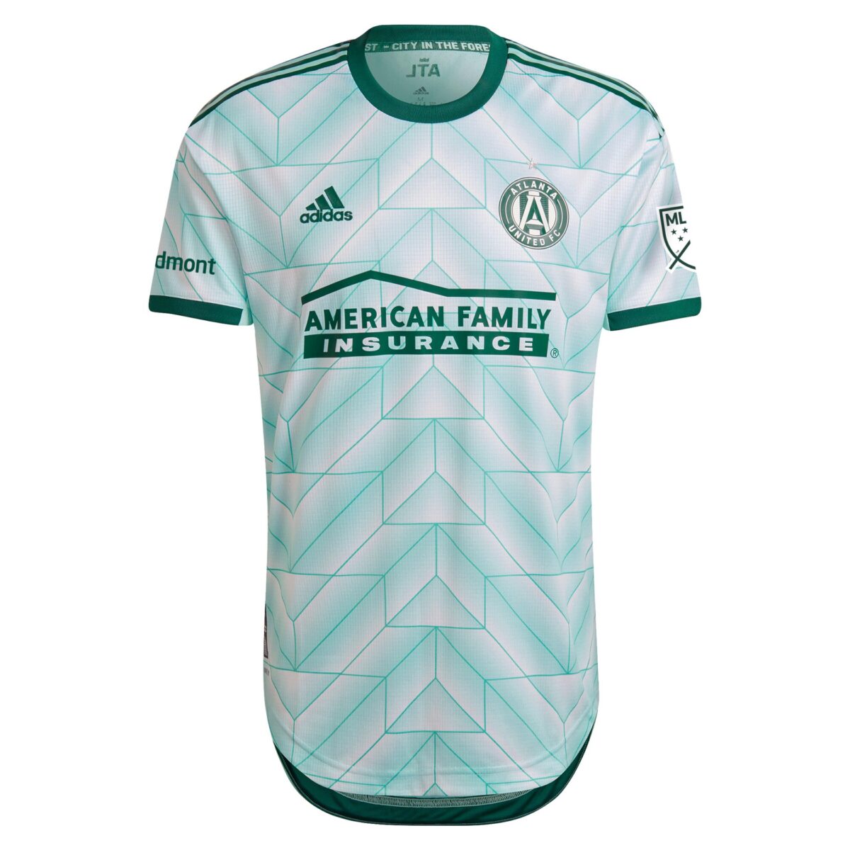
One of the most iconic patterns in football shirt history adorns Atlanta United’s “Forest” kit, and by itself it would’ve made for a beautiful shirt worthy of any “Best Of” list. However, the adidas template from the 1988 EURO tournament has also been slightly tweaked to become reminiscent of the arboreal landscape that dominates Atlanta, which is also known as “The City in the Forest.” 10/10 concept, 10/10 execution.
Charlotte FC “Newly Minted”
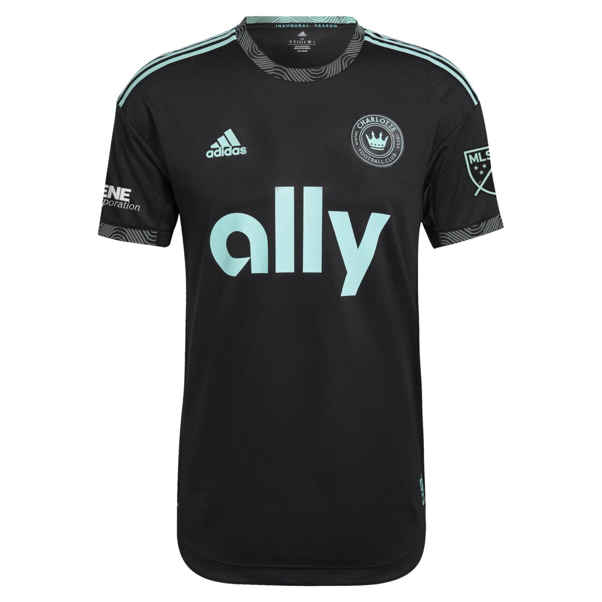
After unveiling a decent home kit that might’ve played things a bit too safe, Charlotte FC’s “Newly Minted” away shirt is a fresh, intrepid design that proves you can do simple without being boring. Playing with an undefeated color scheme that pays homage to the city’s “Mint City” moniker, everything about this kit — from the neck and sleeve trim patterns to the incorporation of the sponsor — hits the mark.
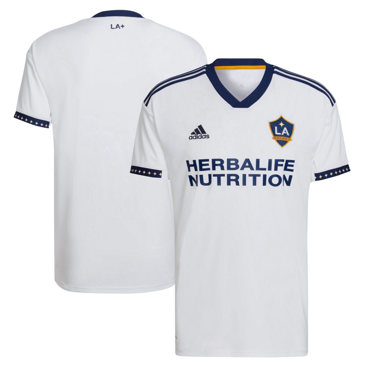
LA Galaxy “City of Dreams”
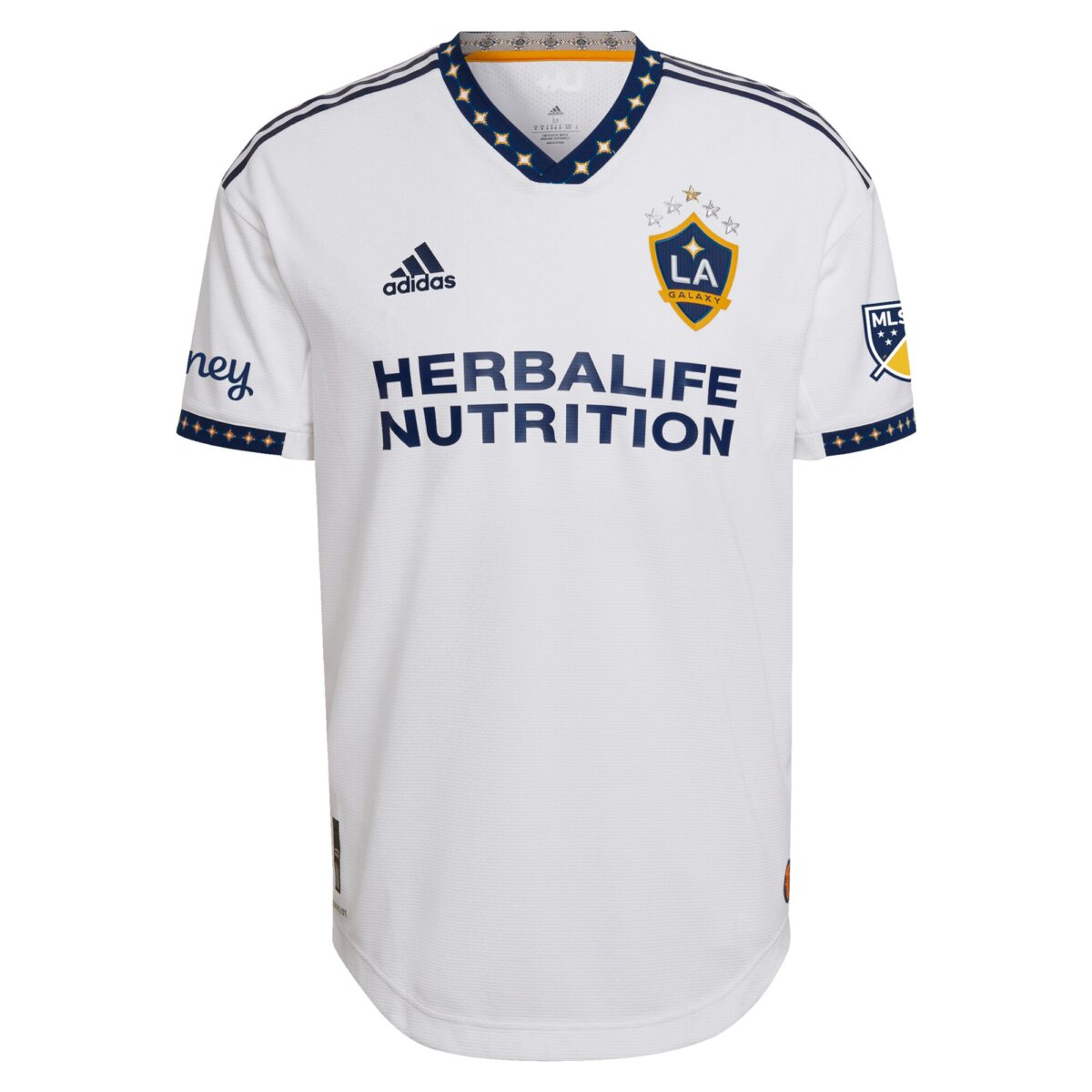
At first glance, I was quick to dismiss this as another MLS kit that suffered from “white tee” syndrome. But the more I’ve seen it, the more it’s grown on me. The quasar patterns on the sleeve and neck cuffs are such a nice touch, and the retirement (at least for now) of the trademark LA Galaxy sash is a welcome change.
However, this kit, along with several others that have neck trim designs, makes the differences between the player edition and fan replica shirts all too evident. The “authentic” versions have designs on both the neck and shoulder trims, while the “replica” versions only have them on the sleeves. I understand it’s probably a material issue, with the cheaper replica neck trims unable to be printed on, but at $90, it’s still a hefty price for an inferior product.
Orlando City “Sunshine”
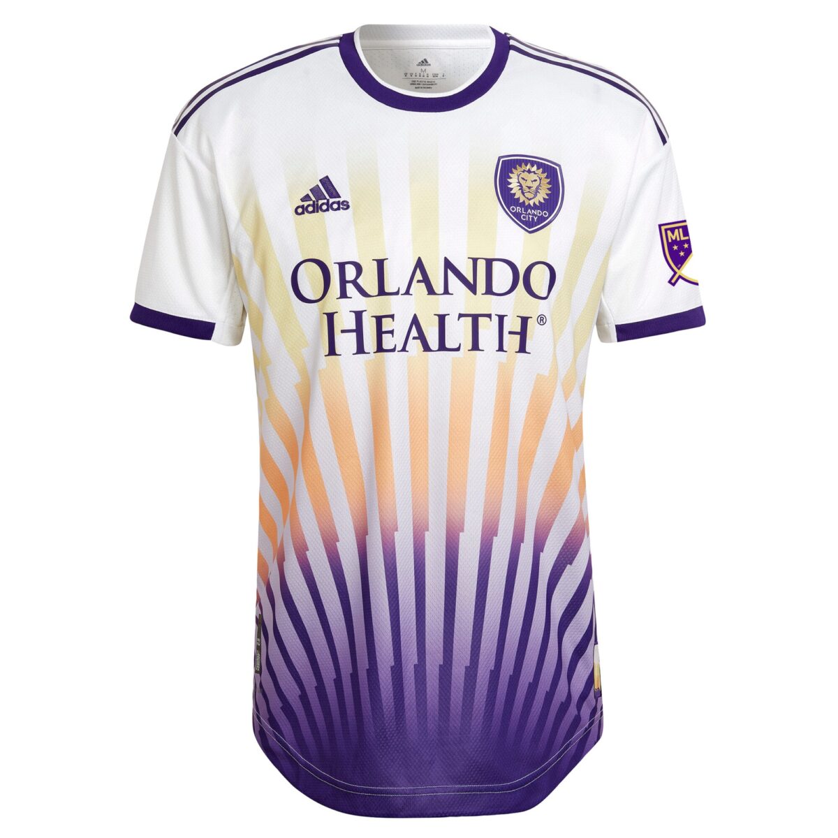
Whereas the beauty of the Galaxy’s new home shirt lies in its simplicity, Orlando City SC’s lies in its absolute chaos. This is an example of what happens when you swing big and hit (you’ll see some misses down below). OCSC and its sister club Orlando Pride have also done some incredible work through their “Moniker” series, and we can only hope that this dazzling shirt will get that bespoke treatment as well.
Portland Timbers “Heritage Rose”
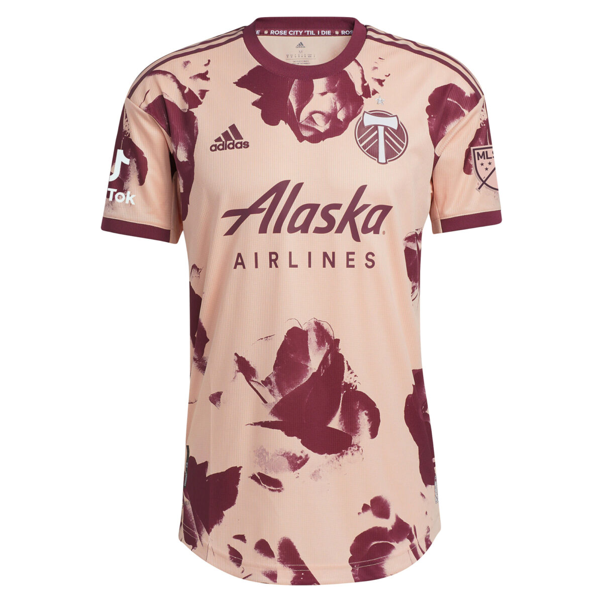
This kit is everything the league has been missing out on over the past few years. A bold and daring design, brazen color choice, and unapologetically out-of-the-box execution makes the Portland Timbers’ “Heritage Rose” kit an instant classic. Sure, the NWSL’s Thorns may have done the rose theme before (and arguably better), but why compare the two when we can just appreciate their respective greatness?
Vancouver Whitecaps “The Hoop x This City”
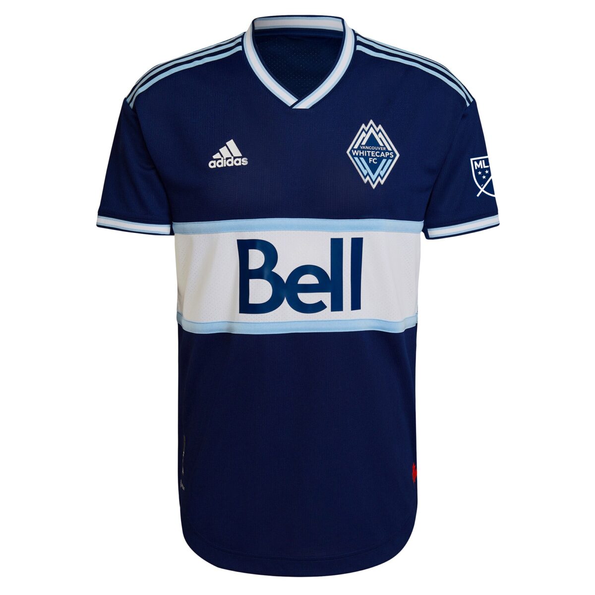
Pure class. Vancouver’s hooped shirts go all the way back to the original NASL days, and the best thing the MLS club ever did (just ahead of signing Alphonso Davies) was bring the classic design back in 2019. While the design is a bit repetitive when put next to the home shirt with the same hoop, it’s also empirical evidence towards the old adage, “You can’t ever have too much of a good thing.”
The Bad
LAFC “5-Year Anniversary”
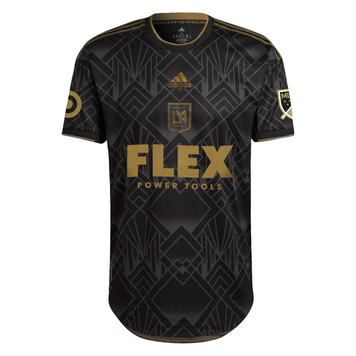
An all-over pattern based on art deco design, paired with a centered crest. If you described the LAFC 2022 home kit in writing, it certainly sounds tantalizing. However, the execution misses the mark. If you’re going to center the crest, it needs to be a prominent feature of the kit. Classic examples are the current Nigeria home shirt, as well as Ajax and Arsenal kits of years past. The centered LAFC crest here is too small, and is overshadowed by the adidas logo on top of it. Additionally, the art deco pattern is a bit too overt, and paired with the sponsor it makes things incredibly busy. Perhaps an embossed pattern like that seen in the Colorado Rapids’ “Club” jersey would be a better option here.
Inter Miami CF “Heart Beat”
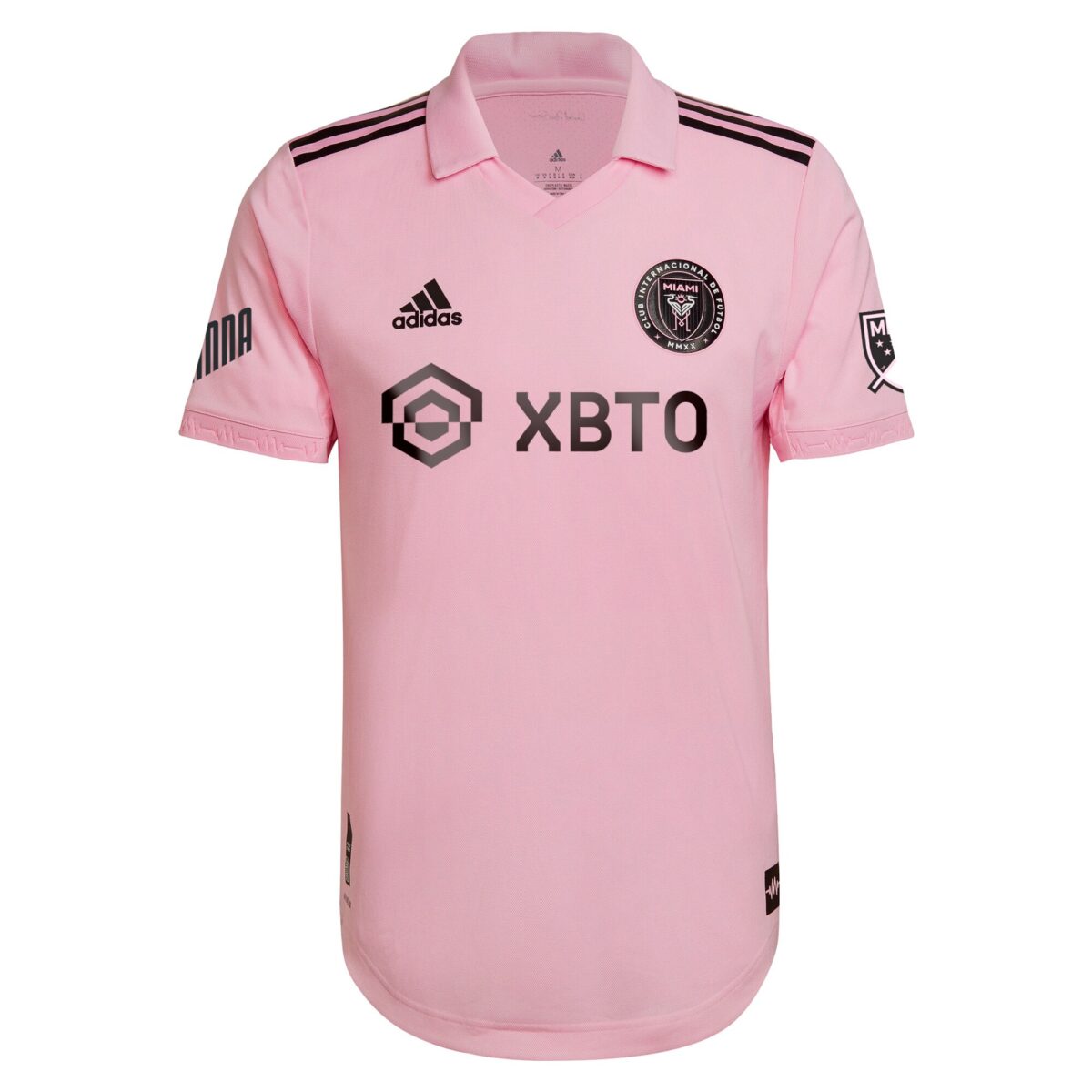
“IT’S PINK.” The not-so cryptic Instagram teaser from Inter Miami CF last December had many hyped to see the club’s 2022 jersey after years of begging for a pink kit. With one of the best crests and color schemes in MLS, Inter Miami’s jersey history had been contrastingly disappointing, with mostly plain offerings for both its home and away shirts. The promise of a pink kit in 2022 brought an answer to the prayers of many fans and kit collectors alike. However, the balloon of hope was quickly popped when it was revealed that the long-awaited pink shirt would be more of the same — a plain, patternless shirt with a crest and a logo.
There are some nice touches to this shirt — the collar and heartbeat imaging on the sleeve cuffs to name a few — but ultimately, this kit is emblematic of what Inter Miami has been in its short existence in the league. Lots of sizzle, but no steak.
Real Salt Lake “Believe”
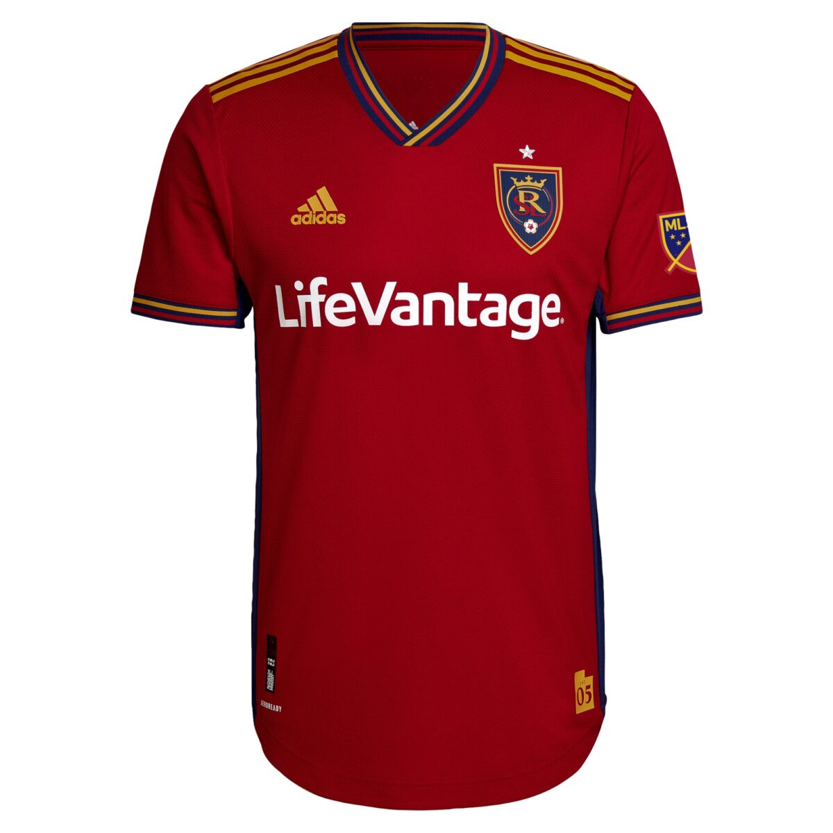
There’s really nothing that offensive about the Real Salt Lake “Believe” kit. The shade of red is striking, and works well with the striped elements on the neck and sleeve cuffs. However, RSL’s crest has too long plagued the eyes of fans across the league. If there was ever one club that was in need of the ubiquitous MLS rebrand treatment, it’s Real Salt Lake. Get that soccer ball out of here.
The Ugly
NYCFC “Volt”
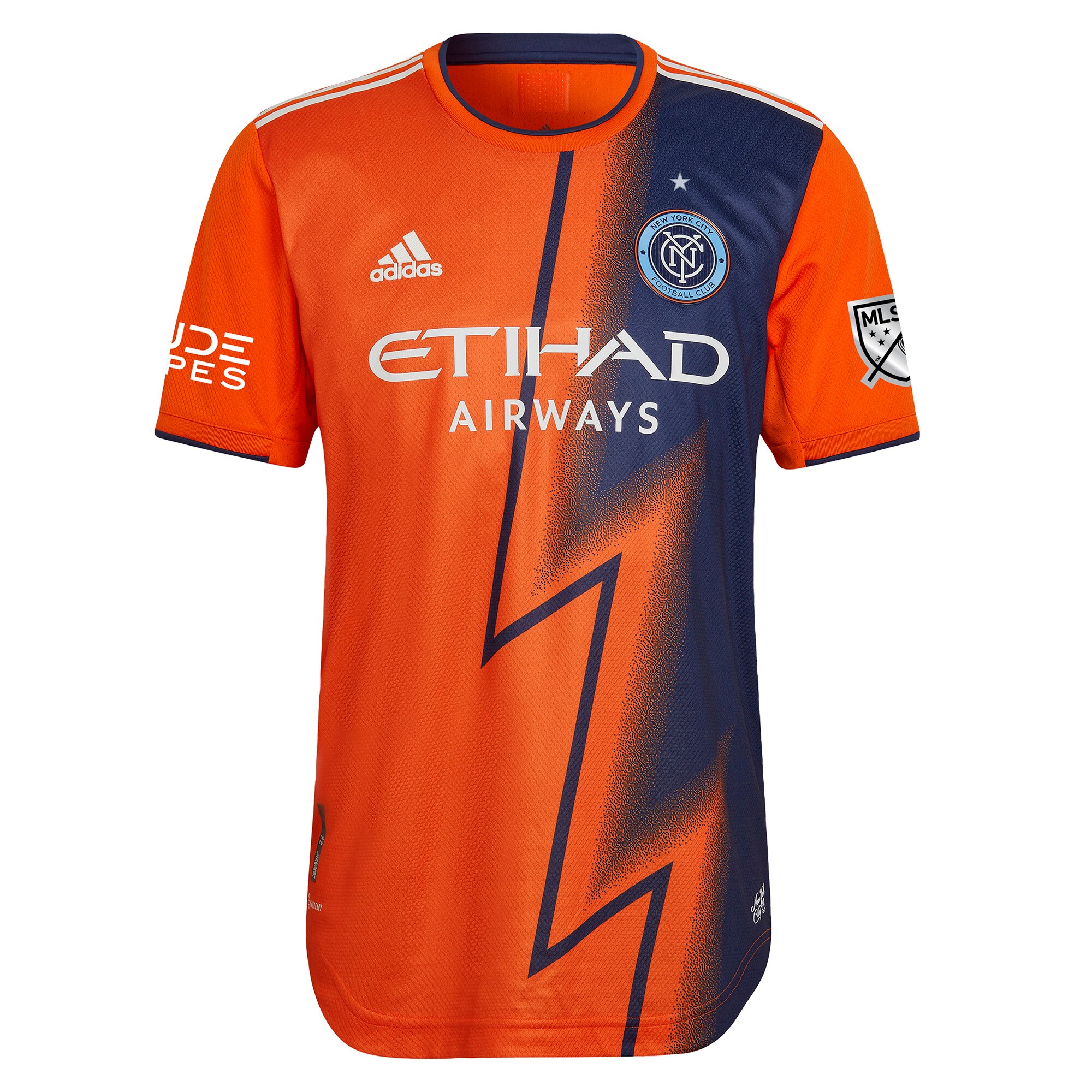
I can always appreciate an attempt to do something new. I’d much rather see a club swing big and miss than play it safe. But — in the case of NYCFC, the reigning MLS champs, this is a particularly big whiff. Normally, failing on a risky design would get you in the “Bad” section of this list, which at least would earn some praise, but this is garish, verging on hideous. I’ve always loved the orange accent in the club’s logo, but it should always remain just that — an accent. At least the club’s home kits are among the best in the league.
San Jose Earthquakes “The Creator”
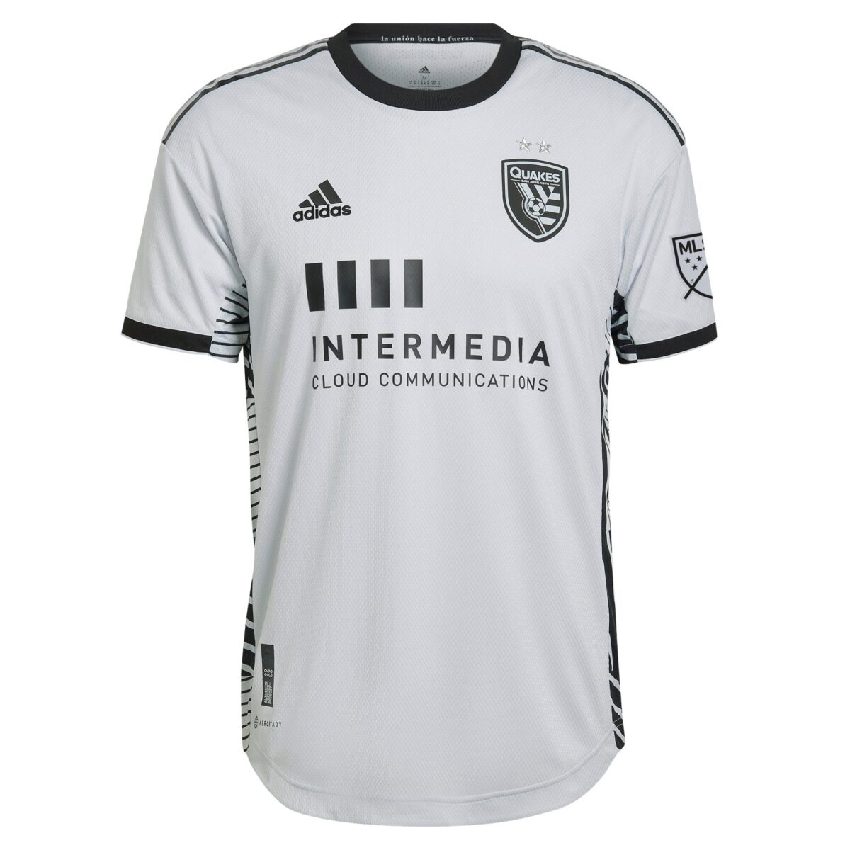
It’s a bit ironic that the kit entitled “The Creator” is the plainest jersey in the league this year. Like Real Salt Lake, San Jose is in dire need of a rebrand, and a slew of consecutive lackluster kits surely hasn’t helped the club’s cause.
Toronto FC “Community”
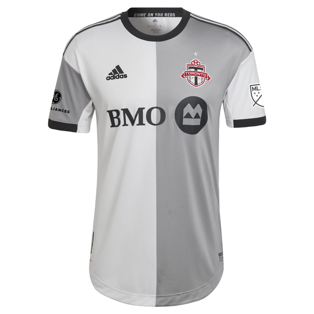
Along with San Jose’s “The Creator” kit, Toronto FC’s “Community” shirt is unfortunately plain and devoid of any hint of the club’s colors. It looks unfinished, like a first draft that needs further revision. The half-and-half design, while seemingly thrown on at the last minute, is the only thing keeping it from being this year’s worst MLS kit.


