Set to kick off this weekend in Philadelphia, the 2023 Icarus Cup is doing things big. We take a look at what to expect at the massive tournament, and the best of the 80-plus original designs that will be featured throughout the entire event.
Take it from us — hosting an event is no simple task. Over the years, we’ve put together everything from watch parties, activations, and full-blown tournaments, and it was never a simple and straightforward process. But what our friends over at Icarus Football are doing…well, it’s something else.
Last year, we featured the brand’s second annual Icarus Cup, which saw 70 amateur teams from across the country competing in what was the largest iteration of the tournament to date. This year, Icarus is proving that there’s still room to get a little higher in the sky.
For the 2023 Icarus Cup, the brand is doing things even bigger — not just in the amount of teams across the open, mixed, and women’s/non binary divisions (80), but also in the off-pitch entertainment as well. In addition to a beer garden for much-needed post match hydration, Icarus is bringing live music, stand-up comedy, and more to this year’s tournament.
But what’s perhaps the most ambitious addition to the 2023 cup are the kit designs. As a brand that prides itself on originality and shirts that stand out from the crowd, Icarus is creating 86 original kits for the participating teams. This is a major workload increase from last year, where they created eight original designs in 10 different colorways for teams to choose from (which, for the record, were still great).
Making things more exciting, Icarus reached out to some well-known shirt designers to create some stunning kits, including Matthew Wolff of 2018 Nigeria fame, Floor Wesseling from Blood In, Blood Out, and popular kit pundit and nascent designer Phil Delves, who won Red Star FC’s fan design competition in 2022.
Icarus also has partnered up with well known names in the soccer-verse for kit sponsors, including Mundial Magazine, Le Ballon, Wavy Footy, DARBY Magazine, and, oh yeah, Urban Pitch.
Just as we did last year, let’s take a look at some of our favorite shirt designs from the tournament, which is set to kick off at Drexel University’s Vidas Athletic Complex this Friday, July 7.
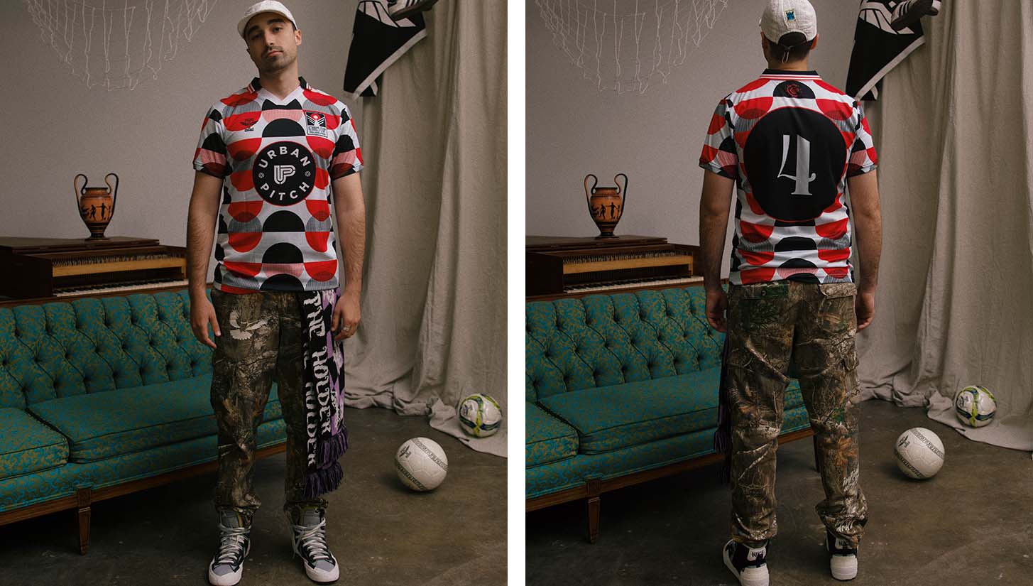
But first of course, we had to show off ours as well. We’re huge fans of the ’70s-inspired design, and the number set goes perfectly with the Urban Pitch logo on the front. Can’t go wrong with a black/red colorway either.
The Kits
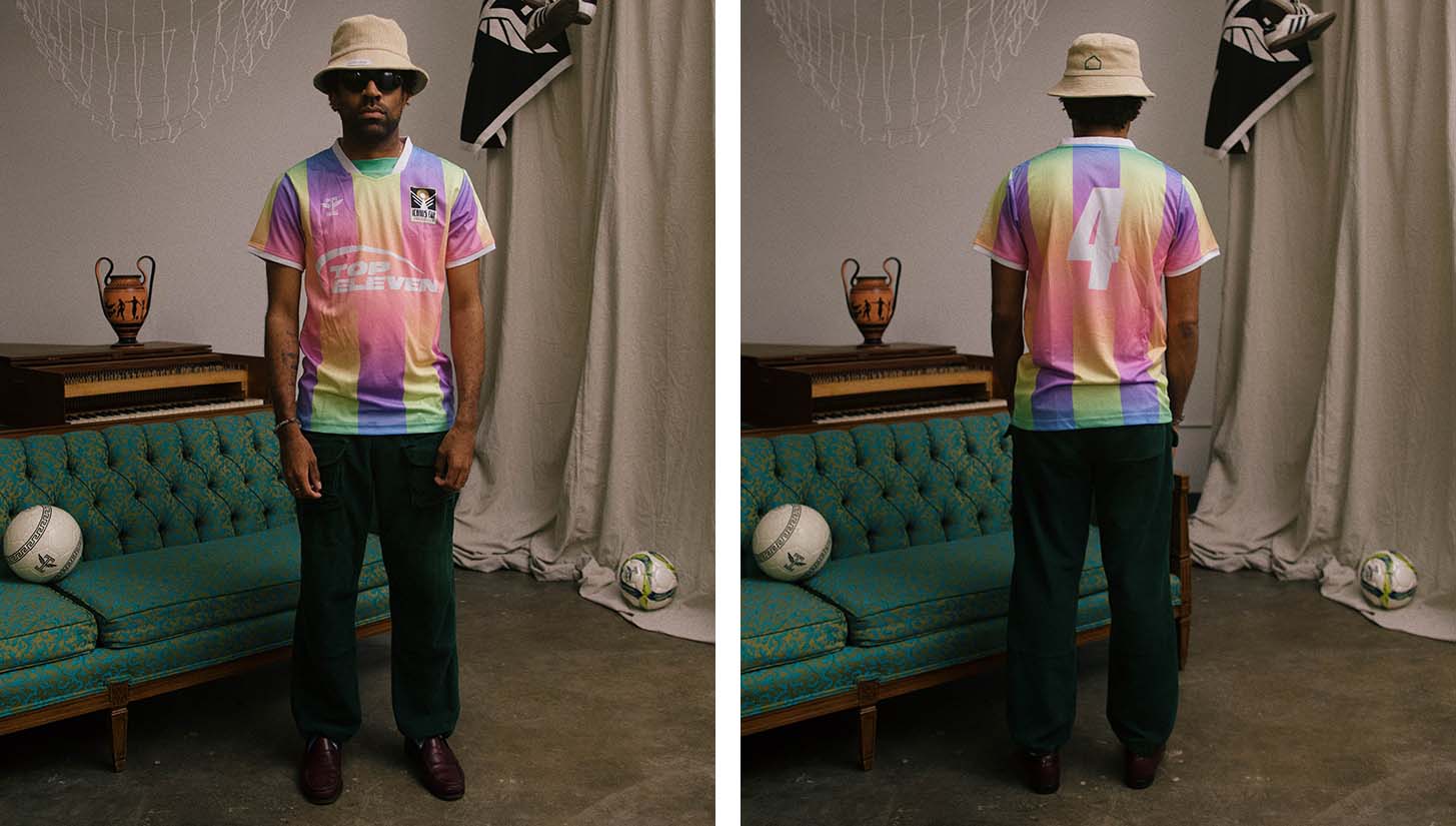
For someone like Wolff, who has worked on massive projects with some of the biggest names in the game, he could’ve easily mailed in some previous design that hit the cutting room floor. That doesn’t appear to be the case with this gradient beauty — and if it is, that might even be more impressive. The Top Eleven-sponsored shirt features a pastel color palette that may not go well together on paper, but in execution makes for a beautiful spectrum that’s a feast for the eyes.
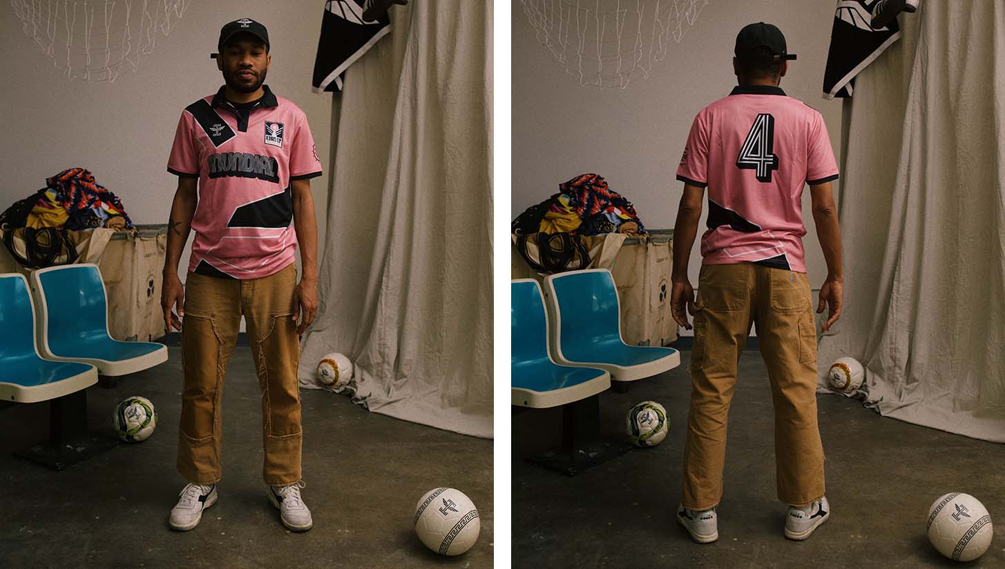
Instantly recalling images of iconic pink kits from the past — Juventus, Palermo, and for the truly cultured, Forward Madison, to name a few — this kit design was an instant favorite. Pair that with the Mundial sponsor and number set and you get what could very well be the best design out of the bunch.
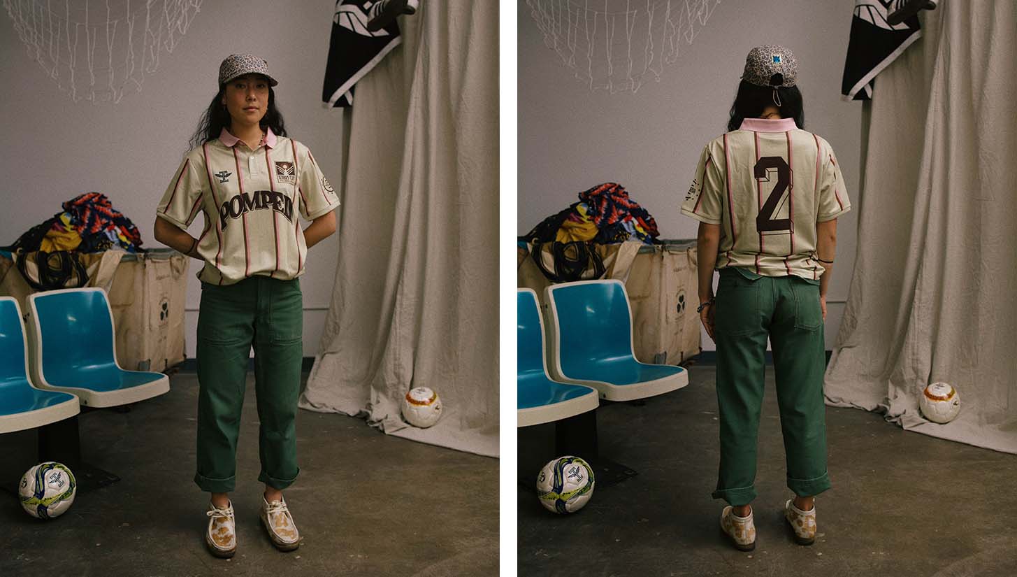
While having not nearly as much pink as the Mundial kit, the subtle touch of rose hues in this design are sublime. It partners perfectly with the cream base and brown accents of the rest of the kit, and a classic number set puts the final touch on a shirt that displays the brilliance of simplicity.
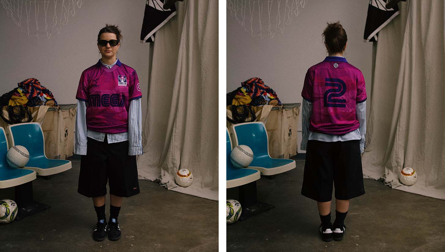
The “Mega” logo on this design of course instantly transports us to the iconic ’90s Arsenal-Sega partnership, which gave us some of the most memorable kits of all time. Pure nostalgia on its own may be too saccharine for most palates, but the fantastic design of the rest of the jersey, including a shade of magenta you’ll rarely see on a kit, balances everything out and is enough to make it stand out on its own, nostalgia be damned.
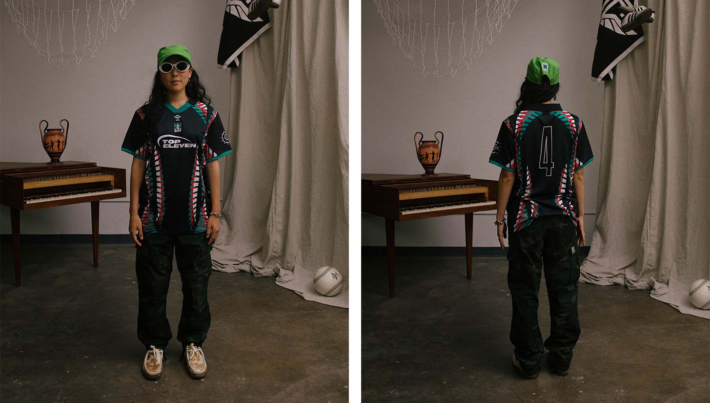
Another Top Eleven-sponsored kit, this design is truly out-of-the-box, and would look just as in place at a motocross rally as it does in a 7v7 tournament. It’s an aggressive design choice that works, and the color scheme accentuates all of its best qualities.
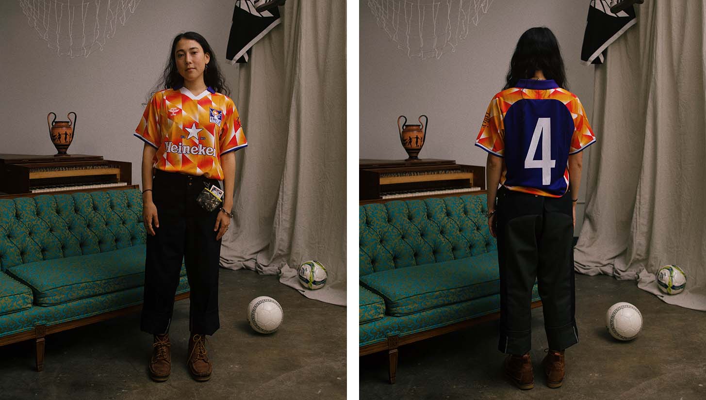
In a jersey landscape where “retro-inspired” is quickly becoming overdone, this shirt manages to keep things fresh while also maintaining a ’90s aesthetic. The bright orange on the shirt’s front contrasts the blocked-off navy perfectly, and you can never go wrong with a beer sponsor, much less Heineken.
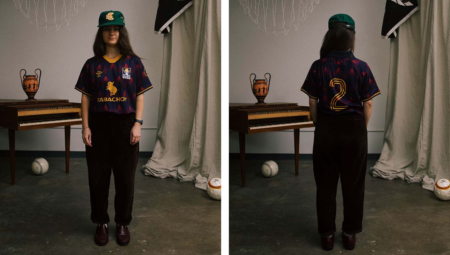
If there’s one thing that stands out across all of the Icarus Cup kit designs, it’s the color palettes. We get deep hues of navy, burgundy, and ochre on this shirt, which pairs nicely with the sponsor logo from Philadelphia Filipino eatery Tabachoy. Pinoy gang represent.
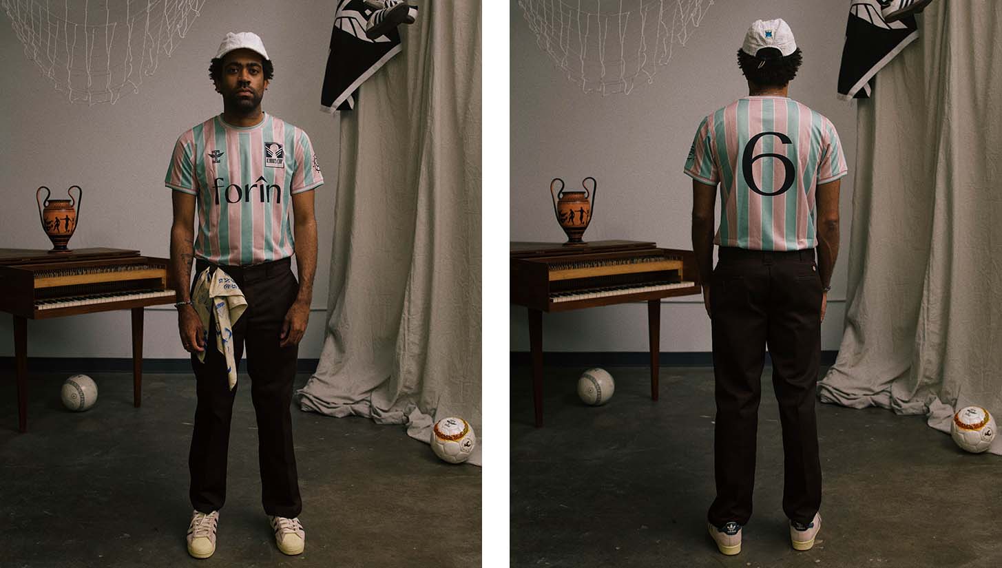
There’s nothing like a simple kit done right. Sometimes, all you need are a few stripes, a unique color scheme, and an interesting number set and you’re golden. That’s the case with this kit sponsored by Philly-based Forîn Cafe.
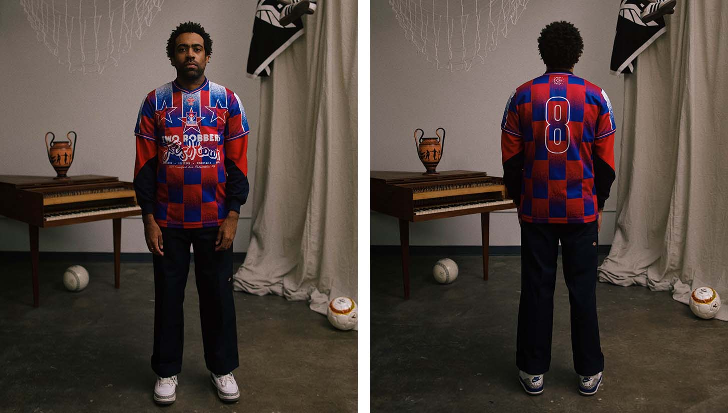
You put this shirt on and “Dipset Anthem” automatically plays out of the nearest speaker. Whether inspired by the album artwork of the Diplomats’ Diplomatic Immunity or not, this is a eye-popping design that blends two elements seen on some of the game’s most iconic kits — stripes and checks.
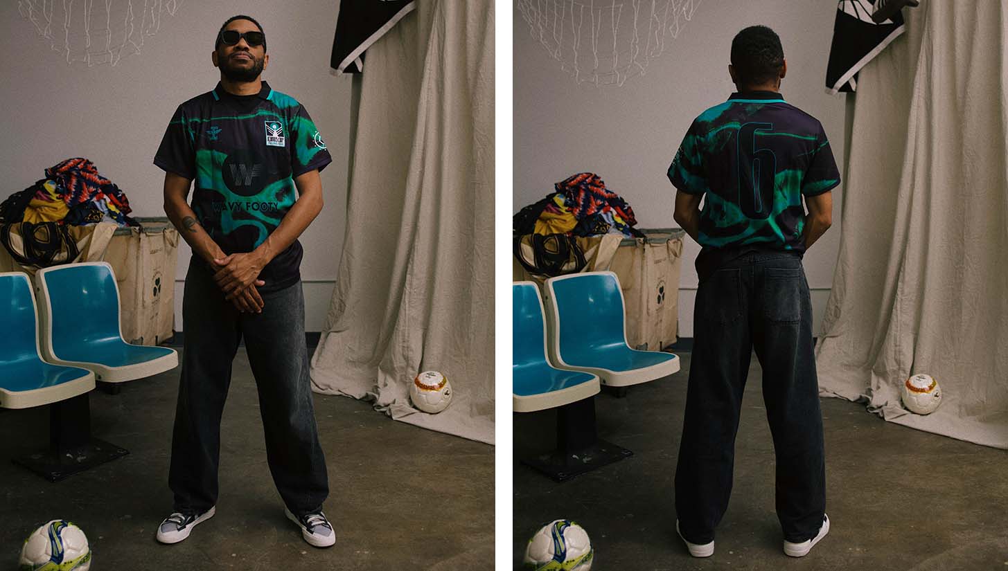
I won’t lie, I was a little jealous when I saw that our friends at Wavy Footy were getting this fantastic design. Something straight out of The Matrix, this was instantly one of my favorites from the bunch.
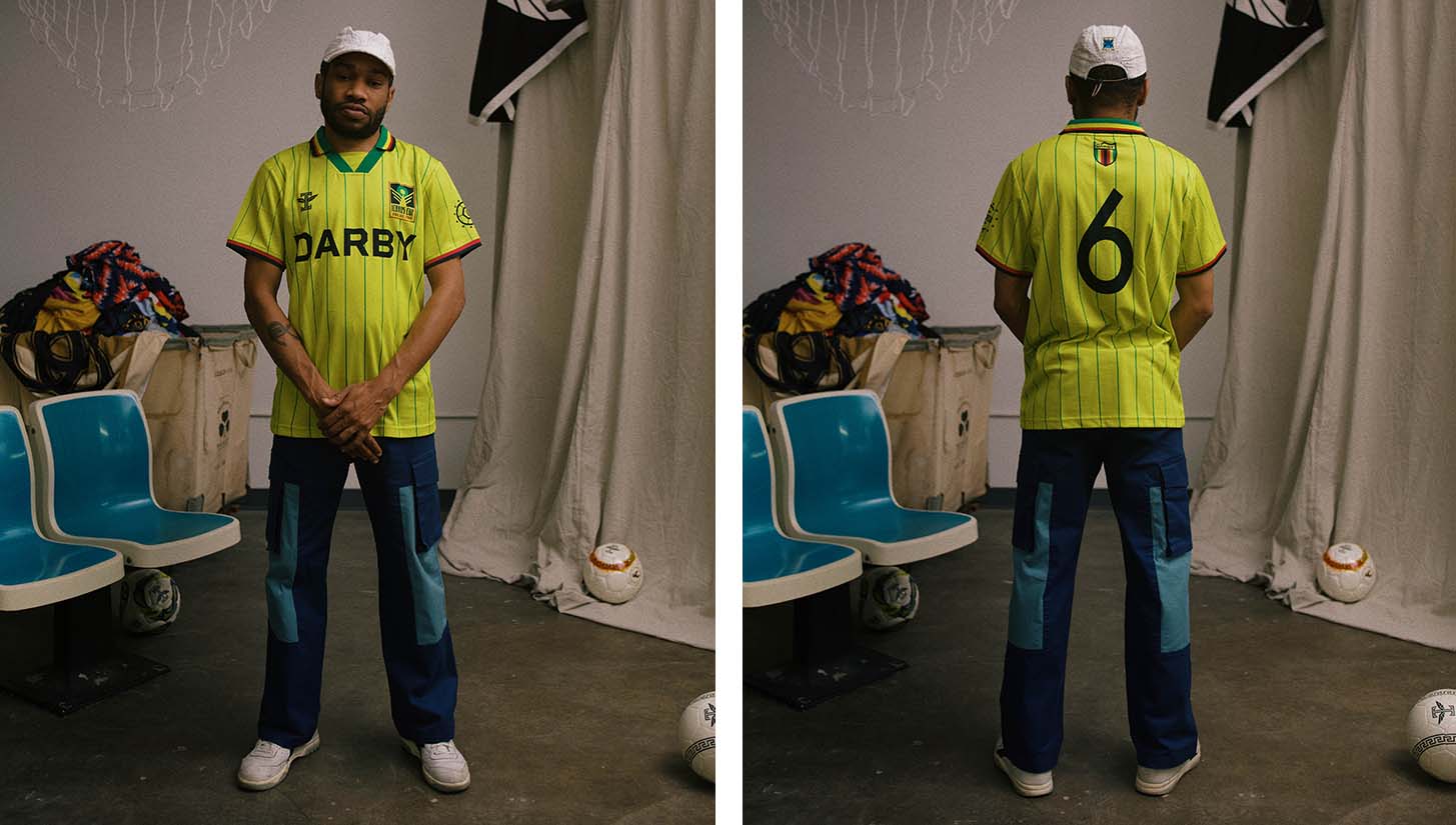
A lot of Zimbabwean vibes for this DARBY Magazine-sponsored shirt. From the tri-color collar to the pinstripes, there really isn’t much to dislike about this jersey. A real belter.
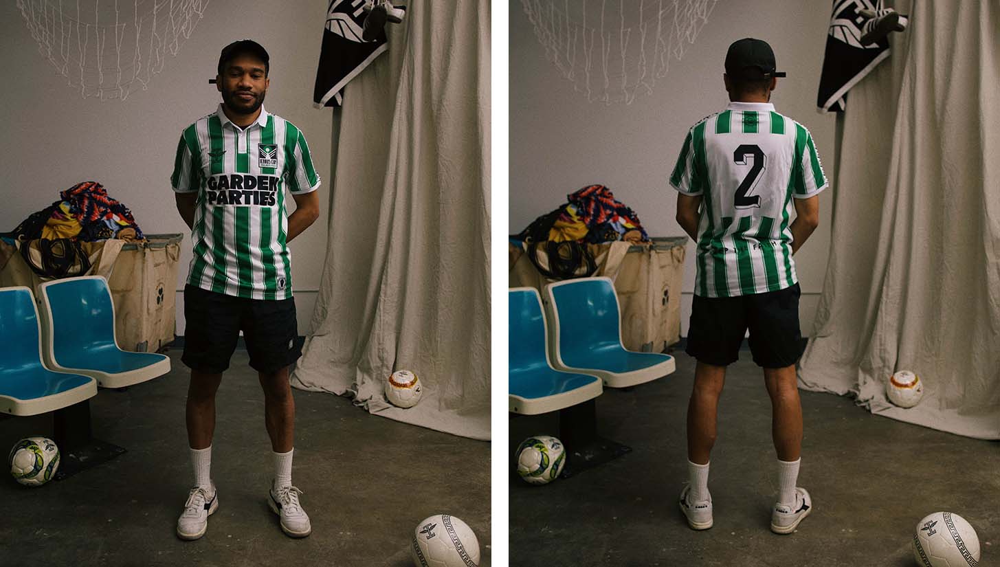
There is nothing truly groundbreaking about this shirt. It wouldn’t look out of place in any soccer-related function, and it features traditional design elements that we’ve seen before. But there’s no need to reinvent the wheel. If you look good, you look good. Of all the shirts on this list, this is the most “classic.”
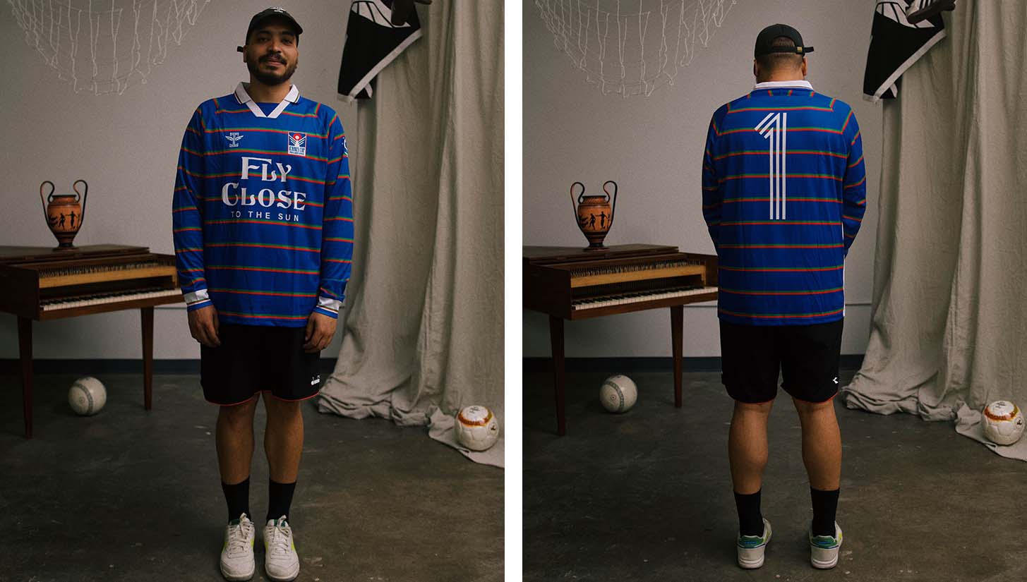
I’m a sucker for a long sleeve kit, and this one hits just about every mark on my checklist. Half-and-half collar, a stand-out design without getting too gaudy, and fantastic details from the sleeve cuffs to the number set. Check, check, check.
Photography by @hitaliqe for Icarus Football.


