
The 2024 MLS kits rolled out last week in anticipation of a new season, and we go through some of the best and worst designs out of the bunch.
It’s one of the best times of the year for football fans when their team rolls out the fresh new kit they’ll adorn for the next season. With the MLS season kicking off this week, we’ve now seen every team’s new threads for 2024. Minor spoiler alert: A lot of them are sensational.
So in true Urban Pitch fashion, here are the good, the bad, and the ugly.
The Good
Columbus Crew
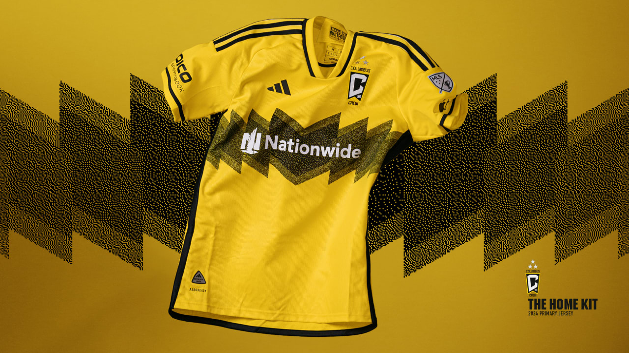
This was a polarizing design, with many across social media channels comparing it to the iconic Charlie Brown shirt (very understandably so), but it definitely works for the reigning MLS champs.
A huge factor in how good a kit looks in the modern era is how well it can incorporate the main sponsor on the front. In most cases, it’s extremely difficult with how massive some can be, but the Crew pulled it off really well.
The black and yellow is cold and the jagged element across the chest does well to balance the look. A 10/10 execution.
LAFC
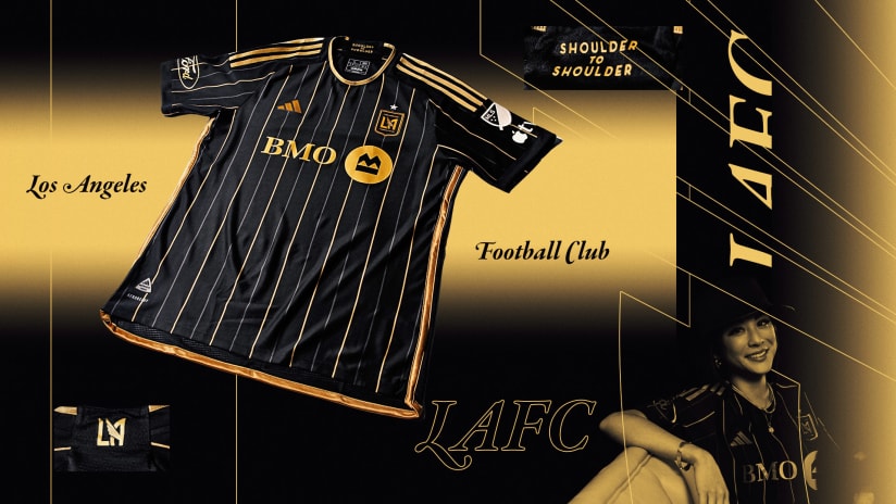
Put simply, black and gold is a cheat code. It’s a combo that’s so hard to mess up because it’s just so darn appealing to the eye. So to go and pair that color scheme with another cheat code of design, the pinstripe, and LAFC was never going to fail.
It’s flat-out gorgeous, and the latest in a line of kits that look just as good on the pitch as off it.
Austin FC
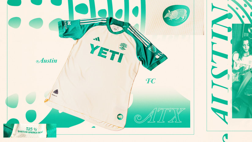
Another instance of simplicity done right. Off-white as a base of the new Austin FC kit was a smart choice to pair with the soft green on the logos and sleeves. The sponsor also helps in that it’s not overly complex, and it somewhat ties the whole kit together.
Portland Timbers
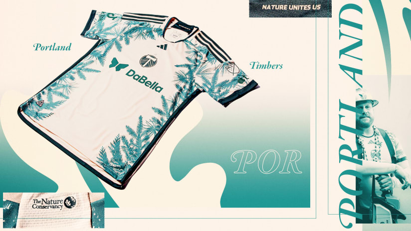
A super interesting kit, and one that I think gives validation to the efforts of a club to go against the grain. Right up the alley with the Timbers theme, “Nature Unites Us,” and their drive to continually champion sustainability, the greenery that runs from the sleeves right down the sides is a great thematic representation. While it’s very deliberate, the color lands well on the base of the kit, and the centered Timbers logo is the cherry on top.
Minnesota United
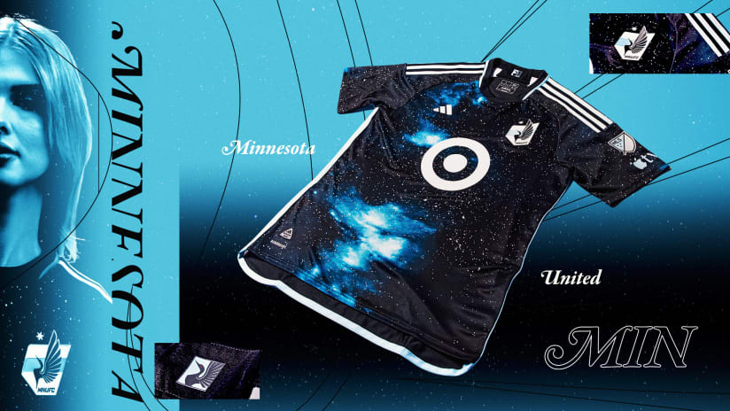
*Cue Interstellar score.*
Minnesota United might not have a star above its crest yet, but the club could take home the title for best MLS kit this season with this design. A galactic star-strewn pattern with bursts of blue throughout the body, this is the most unique design across the league this year, and another installment to Minnesota’s *ahem* stellar kit history.
Charlotte FC
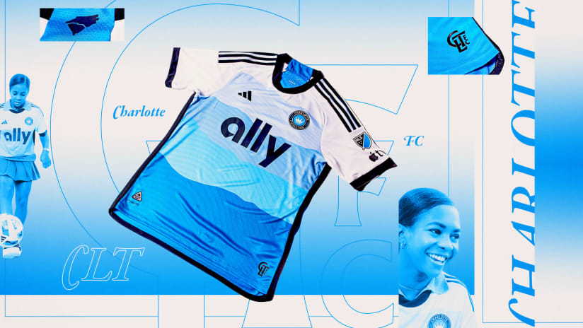
Made to represent both North and South Carolina, Charlotte FC’s “Carolina” kit is a simple yet captivating shirt. Inspired by the natural beauty that has become synonymous with the region, Charlotte FC drapes its new home kit in various shades of the infamous Carolina blue, along with a dash of white across the shoulders. The result is pretty fantastic, and concrete evidence that you don’t need to have a wild design to have a great kit.
The Bad
Atlanta United
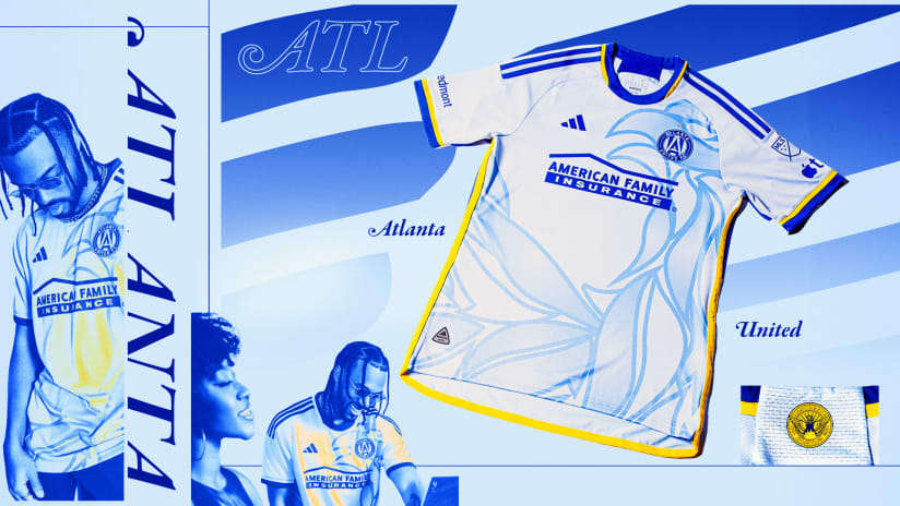
This one pains me. Sky blue on kits is proper football heritage, and I want so badly to like this kit. Even the yellow trim gives a really good balance to the main color, which makes the underwhelming overall design even more disappointing.
The phoenix graphic across the body of Atlanta United’s “Resurgens” shirt doesn’t work, and takes away from the pleasing color palette. As much as it pains me to say, this one definitely loses more than a few points. It’s not a terrible kit but it could’ve been so much better.
New England Revolution
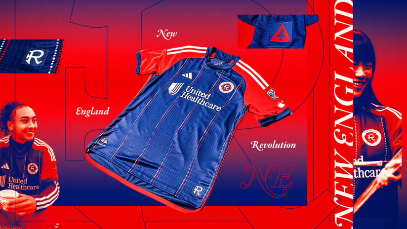
Something about the drastic contrast of the navy with the bright red throws this one off. The Revolution tried to pull it together with the striped dots down the length of the kit which is a decent idea in principle, but one that misses the mark. It’s certainly not the worst kit of the year, but if you stare at it for too long it might become an eyesore.
The Ugly
Colorado Rapids

Colorado came out with its “One Flag” kit, with the theme being support of the next generation of players. While that’s a difficult theme to encapsulate in a shirt’s design, I struggle to grasp the thoughts behind this drop.
The classic burgundy and blue is a predictable base, but the checkered layer was a strange choice. They went for a bit of originality with how the design bends and flows to match how it looks worn, but the result gives off an erratic feel. The light blue trim on the shoulders and sleeves does little to distract from a puzzling kit overall.
FC Dallas
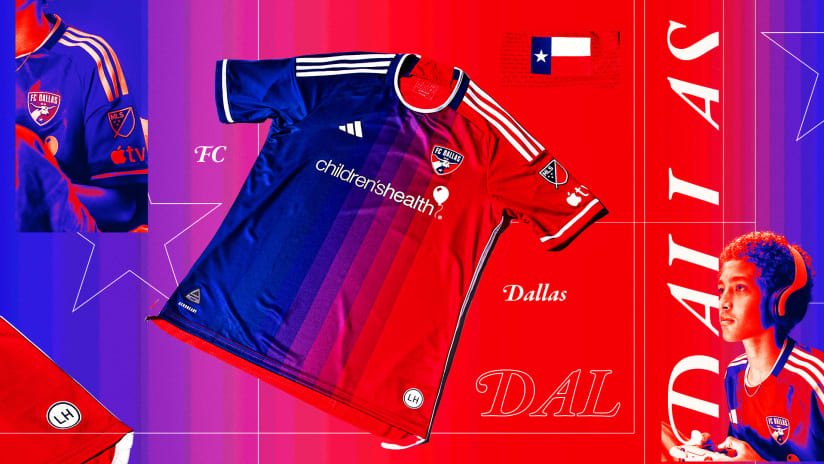
In a tribute to its original name the Dallas Burn, FC Dallas brought out its “Afterburner” kit, which features a gradient design that has the blue and red of the Dallas logo blend into each other with vertical block stripes down the middle. The issue lies with those stripes and the fact that the finished product ends up giving major Crayola vibes. As much as I look for a redeeming factor here, there’s none to be found.
Real Salt Lake
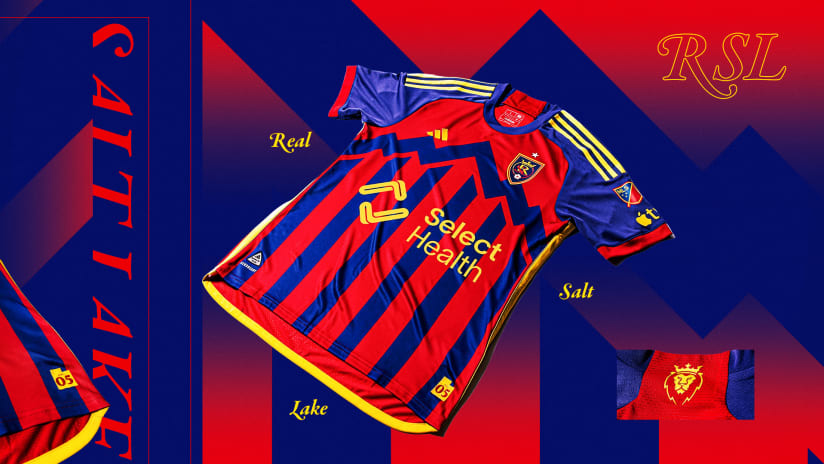
The state of Utah is unanimous with mountains, so it should come as no surprise then, that Real Salt Lake went for a mountain theme on its primary kit for this season.
The surprise comes in how awful this kit came out. In large parts, it just feels like a design thrown together with very little thought and the jarring contrast in colors does not help. The sponsor is in the same yellow trim that falls around the shirt, but you barely even notice it over the loudness of the zigzag blue across the chest. If you want to know the worst 2024 MLS kit, look no further.


RSL kit is fire