With three of the five major European leagues starting today, it feels a bit like the first day of the new school year. And like everybody else, we’re ready to judge all the first day fits and deem them fresh or foul. We’ve scoured through every 2021-22 kit release so far for another edition of The Good, The Bad, and The Ugly.
There’s one thing that’s clear when perusing this year’s kit drops — kit designers aren’t messing around anymore. We’re not sure if they’ve tapped into some sort of algorithm, but there’s way more hits than misses than in previous years. They’ve further distorted the line between sport and casual fashion. Even the misses are admirable this time around because they’re the products of designers taking creative risks.
Without further ado, let’s check out the best and worst kit drops of the 2021-22 season so far.
The Good
Venezia FC Home
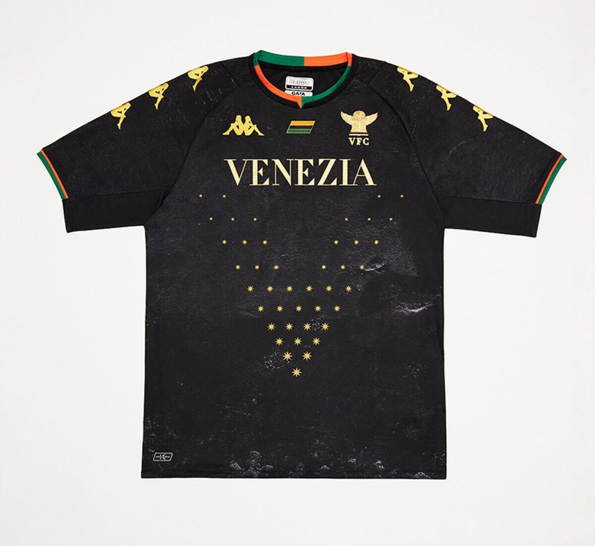
This is the crème de la crème. Venezia’s popularity skyrocketed earlier this summer with their promotion to Serie A and the American signings they made. But they’ve always been an underground favorite of kit collectors. This off season though, Venezia swapped Nike for Kappa as kit manufacturer. Don’t worry, they’re still working in collaboration with New York City-based creative agency Fly Nowhere. And just as the club moved up a division, so did their kit game. Yeah, Venezia is still on top of the kit fashion world.
Kappa’s first offering, the club’s new home kit, is predominantly black, with orange and green neck and sleeve trims. In order to spice things up, the shirt’s torso features a printed trompe l’oeil Venetian wall texture inspired by the the city’s architecture. To complete the look, gold stars from the Basilica di San Marco make a “V” pattern. And keeping with recent tradition, “Venezia” appears on the chest where a traditional ad sponsor would usually go.
While this kit sold out instantly, keep an eye out for a restock soon. And make sure to order a size up because Kappa tends to look unflattering on those of us who don’t have the chiseled body of a professional athlete.
Forward Madison FC Alternate
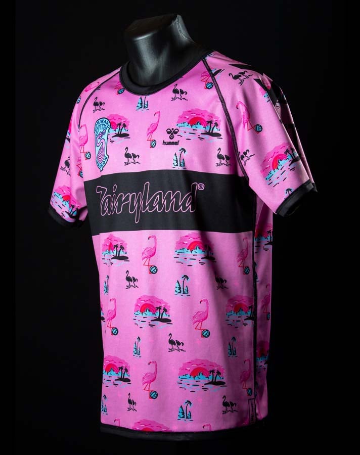
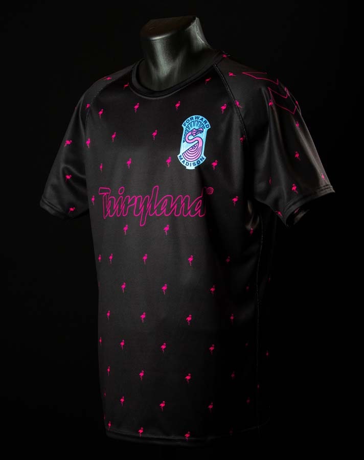
At this point, we just always keep a spot open for Forward Madison in this category. This year, they’ve really outdone themselves though. What’s better than a fire kit? How about TWO fire kits in one? The wacky USL League One club did just that with their new “Beach/Club” kit, which is fully reversible. It’s a truly proper heir to the club’s alternate kit throne following last year’s “Drip” kit.
The “Club” side of the kit features a repeating hot pink flamingo pattern over a jet black color. It’s basically their 2019 alternate goalkeeper kit, but offered in a vibrant new colorway. The “Beach” side of the kit is pink and features hand-drawn art of the Madison skyline, pink flamingos balancing on soccer balls, and smaller navy flamingos. Cop your kit now because it’s pretty much BOGO.
Hull City FC Away
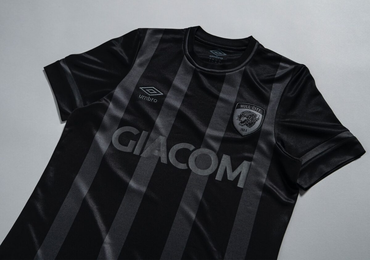
Most people are over blackout kits, and for good reason. Last year it felt like manufacturers flooded the market with them. But we just can’t get enough of Hull City’s new away kit. They’re playing in the EFL Championship this year, but their kit goes toe-to-toe with the best of them. Umbro really outdid themselves on this one, continuing their recent brand renaissance.
The kit features a tone-on-tone front stripe with a woven black crest, a stylized crew neckline, embroidered diamond, a bespoke back neck sign-off with ‘Tigers’ lettering, and a dropped hem with a side vent detail. Everything about this kit is on point, it’s just so sleek and clean. While Hull City announced the kit in early July, the club hasn’t released it to the public just yet.
Leicester City FC Away
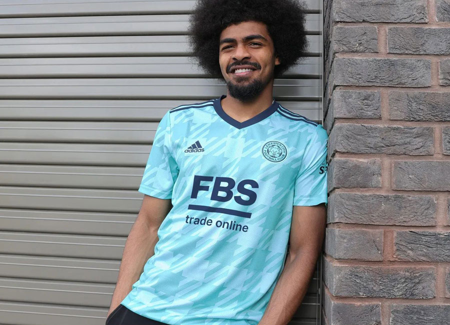
Maybe we just really miss Inter Milan’s beautiful 2019 away kit, but we’re vibing with Leicester City’s new away shirt. There’s something about that mint color that’s just so buttery. adidas nailed this design, letting the fantastic colorway shine while leaving the rest of the kit understated.
A distinctive checkered pattern on the torso compliments the mint color, while small details like the duochrome crest and navy v-neck are *chef’s kiss* perfect. Like they’ve done with many of their new jerseys, shoes, and apparel, adidas made the kit with recycled materials too. Grab this soon-to-be classic on the club’s online shop.
Manchester United Away
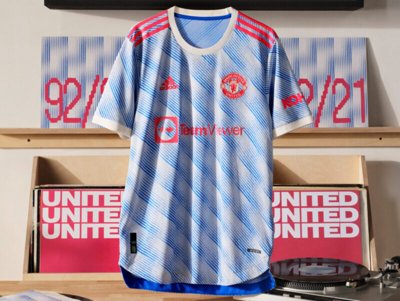
Another year, another spectacular Manchester United kit. This year’s away shirt, inspired by the club’s iconic look between 1991 and 1993, is mainly cloud white, with a wavy throwback-style pattern that fades in and out. Most notably, a new sponsor in TeamViewer replaces the garish and gigantic Chevrolet emblem that seemingly took up 75% of the shirt’s front.
Who said retro-inspired is played out? The new kit is currently available for purchase in the club’s online store.
FC Barcelona Away
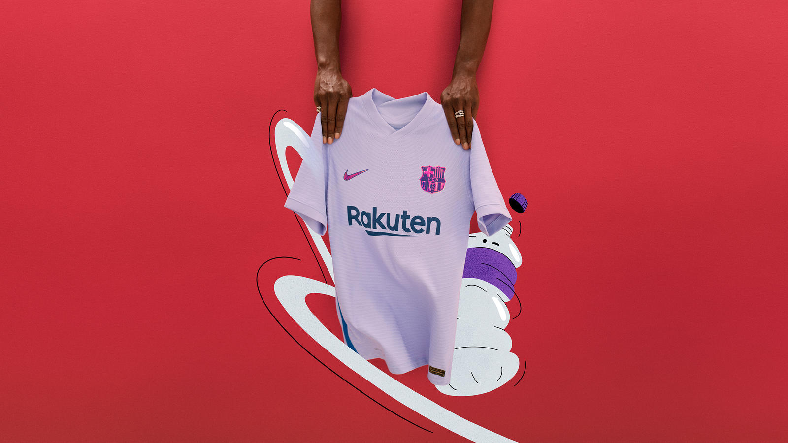
Barcelona’s new away kit is beautiful, and also represents a good cause. A unique look for the club, the kit is purple and features an iridescent club crest and Nike Swoosh. With the kit, Barcelona wants to send a message in favor of diversity and women empowerment. The mauve purple color represents the fight for gender equality.
The club also put ‘Together Stronger’ in the Spanish female and male verbal forms on the kit. Time will tell if they can back up their talk, but it’s a nice gesture. The only shame here is we won’t get to see Lionel Messi rocking this kit. Get it via the club’s online store.
Sassuolo Third
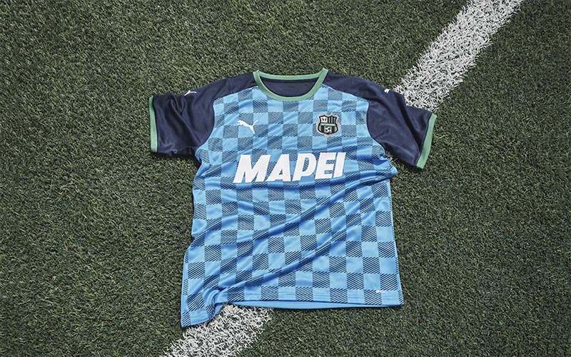
Another small Serie A side, Sassuolo deserves their place on this list. They actually debuted their new third kits during the final league match last season. The torso of the kit is electric blue and features a modern jacquard pattern. PUMA killed this one. Cop it in the club’s online shop.
Bayern Munich Away
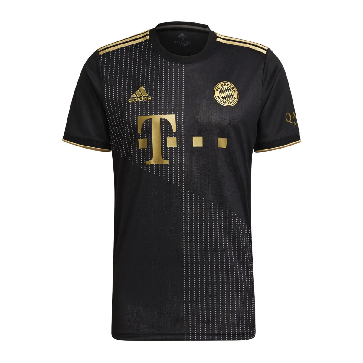
Similar to blackout kits, it felt like there was a black and gold colorway craze in the past few years. But like Hull City’s away kit, we love this new Bayern Munich away shirt. The black and gold makeup is tastefully done, especially with the gold crest.
A dotted lozenge pattern also appears on the front of the kit. While it might seem simple, credit to adidas for pulling it off. Available now in the club’s online store.
Arsenal Third
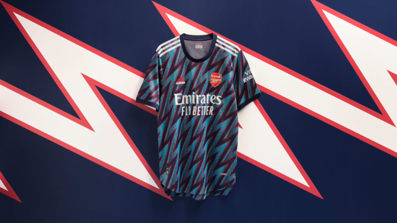
Look good, play good. At least that’s what Arsenal fans must be hoping for after seeing the North London club’s new third kit. adidas pulled out all the stops on this one, creating an homage to the club’s iconic blue lightning away kits in the ‘90s. The kit features a turquoise bolt pattern with an alternating navy bolt pattern outlined in red. Arsenal fans might be perpetually depressed with the state of their club these days, but at least they’ll look good. Grab this banger from the club’s online shop.
The Bad
Manchester City Away
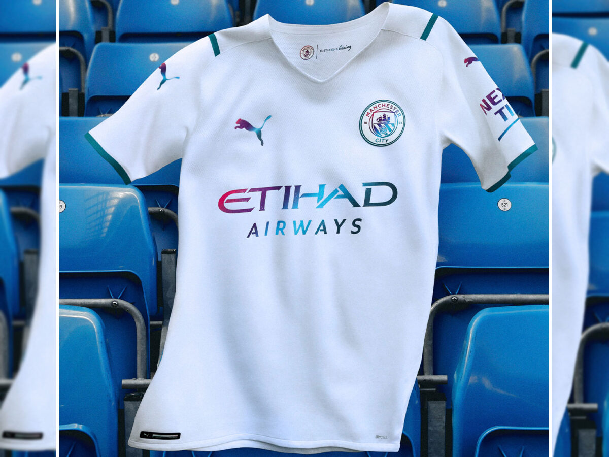
While Barcelona’s new away kit is a great example of an iridescent design, Manchester City’s isn’t. But kudos to them for the effort here, their execution was just slightly off. Debuted in the Community Shield match against Leicester City, the kit is mainly white, but also features gradient details that combine teal, purple, and pink. According to Manchester City, the club’s global clean water initiative inspired the color gradient, but that feels a bit like image washing. On top of that, the look just doesn’t feel like Manchester City.
Bayern Munich Home
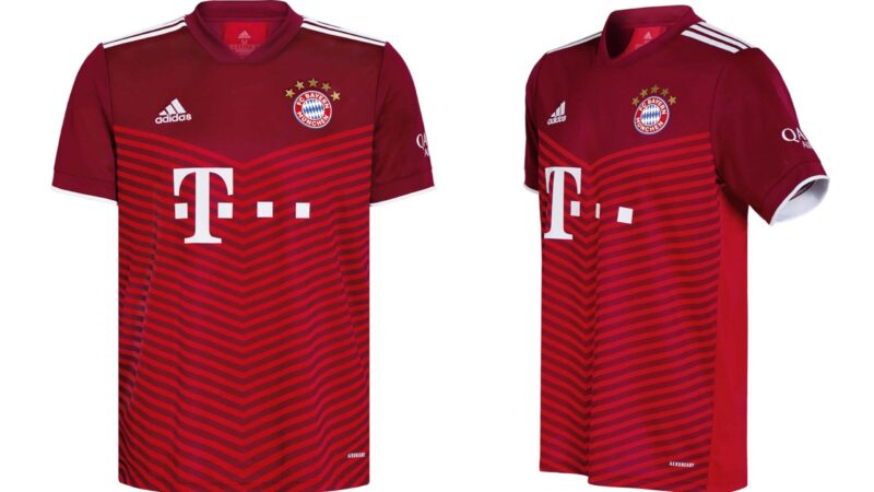
At first glance there’s nothing super awful about Bayern Munich’s new home kit. For the club’s fans, the big draw is probably the addition of a fifth star above the crest. But for us filthy casuals, the basic chevron pattern just isn’t doing it. It’s fine, but it looks kind of like a golf polo or a dad shirt. It’s not the worst kit in the world, but it’s boring for a club of Bayern Munich’s stature, especially in comparison to their away kit.
Borussia Monchengladbach Away
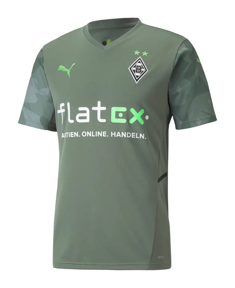
Borussia’s new away kit, made by PUMA, is a near miss. The sage green color is fine, but the pattern on the sleeves isn’t. It looks more like a camo pattern than the “futuristic” one the club describes it as. And Borussia fans just need to ask LAFC fans to see how well that one went. We do commend PUMA’s decision to make the kit using 100% recycled polyester though. And we do love the sage green color, which is rather unique in the kit space.
Greuther Furth Home
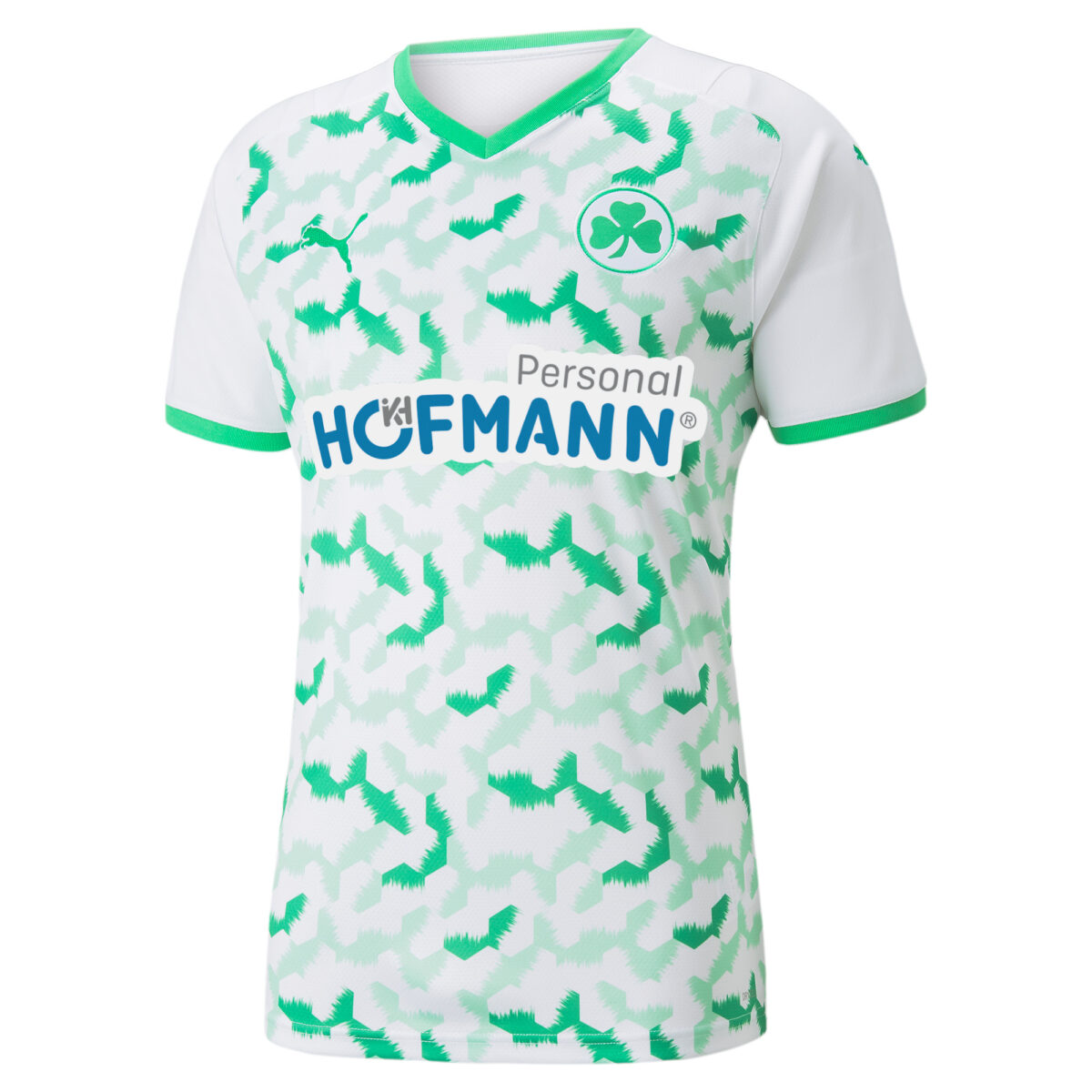
Bespoke kits are usually always fire, but Greuther Furth’s new home kit proves to be the exception to the rule. Points to PUMA for taking the creative risk, but it clearly backfired here. Called “Hexacamo,” the green bespoke pattern covers the front and lower back of the shirt. While we dig that, the pattern itself is a bit random and disorienting. Hard pass. Again great concept, but poor execution.
Real Madrid Away
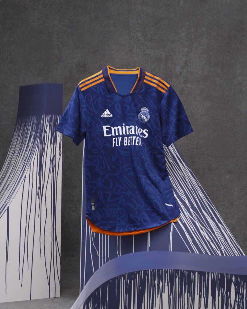
Upon first glance there’s nothing discernibly wrong with Real Madrid’s 2021-22 away kit, but the troubles begin when we look closer. The kit has a blue, orange, and white color palette, and features an all-over graffiti pattern inspired by the Madrid street art scene. While the club might’ve been going for something akin to Borussia Dortmund’s 2020 away kit, the result is much closer to that Steve Buscemi “How do you do, fellow kids?” GIF. In the sage words of Kunu brilliantly played by Paul Rudd in Forgetting Sarah Marshall — do less.
The Ugly
FC Barcelona Home
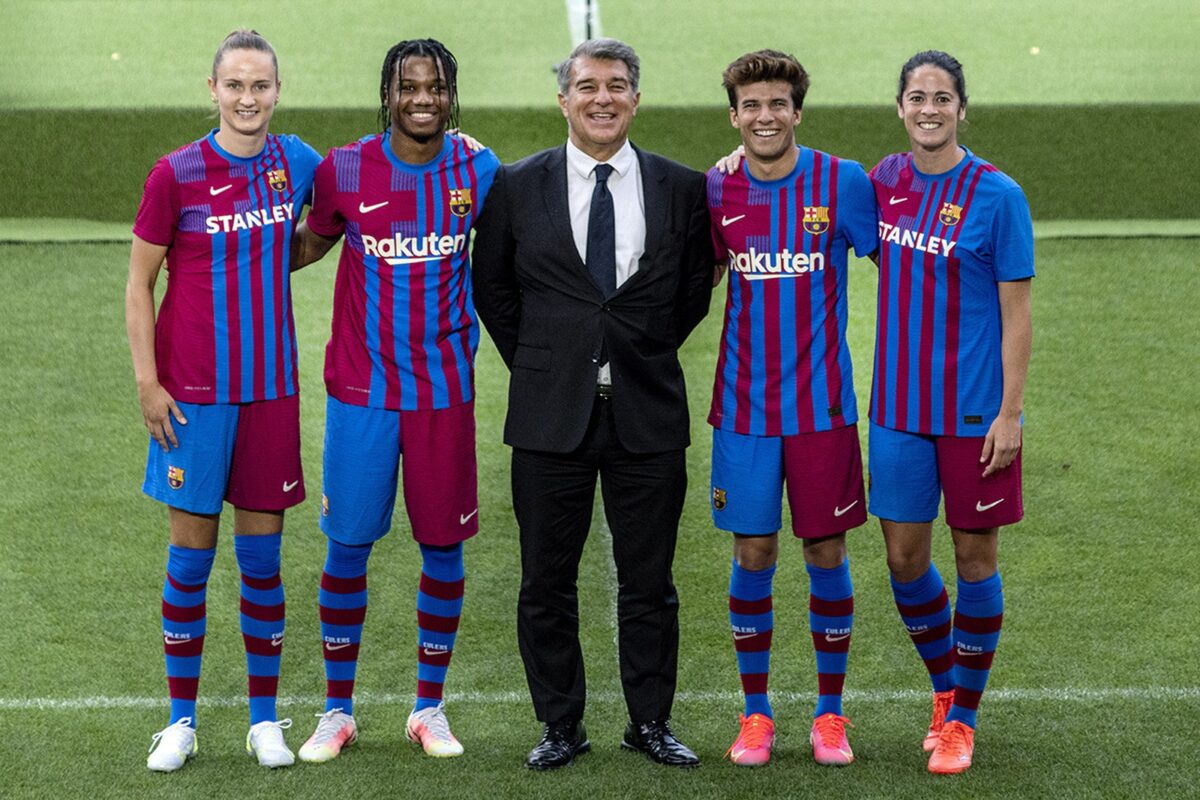
Nike really swung for the fences with Barcelona’s new home kit. We generally like the idea of using a club’s crest as inspiration for the kit design. But there’s a lot going on in Barca’s iconic emblem, which results in a busy kit here lacking a cohesive design. It looks almost stitched together. And somehow it looks even worse with the accompanying shorts.
Chelsea Away
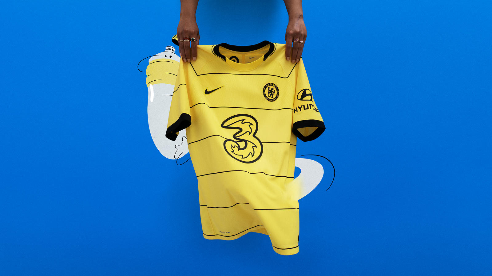
Ever want to dress like the Notes App on your phone? Well, Nike has us covered with Chelsea’s new away kit. The kit is yellow, with pencil thin black horizontal stripes on the torso and sleeves. On the one hand, it works quite well with our back-to-school analogy from earlier. On the other hand, it’s a tragic kit. Best case scenario, it’s great for those who want to dress up as a bumble bee on Halloween.
Inter Milan Home
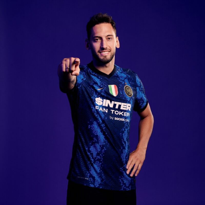
This might be my hottest take to date, but I’m not feeling Inter Milan’s new home kit. Like at all. Maybe I just miss Pirelli as the sponsor, but the design isn’t exactly mind-blowing. The kit has a blue, black, and gold color palette, and swaps Inter’s traditional home kit vertical stripe design for a snakeskin one. The refreshing approach to the club’s traditional kit is cool, but this one looks like a sequined costume. It belongs in Blades of Glory.
Venezia FC Away
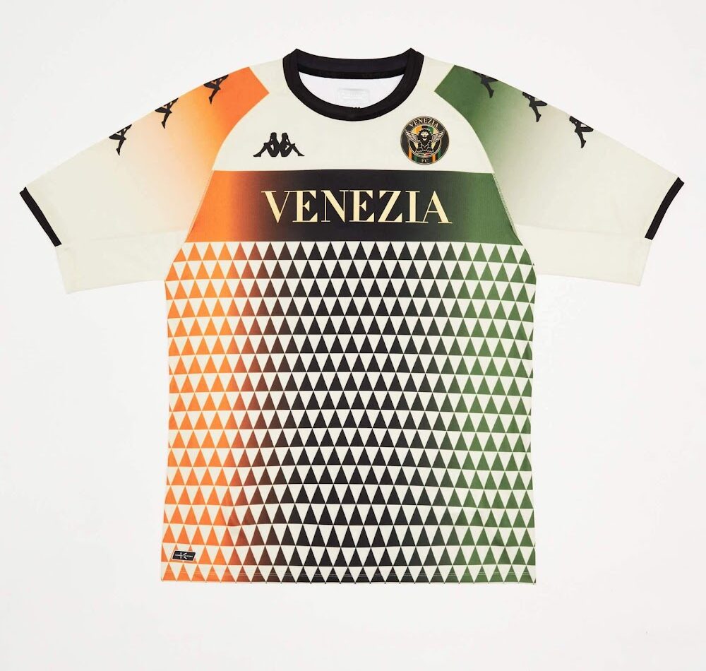
Venezia flew too close to the sun on this one, there’s no other way to put it. While the club’s home kit had the perfect mix between high and casual fashion, this one’s just too much. The kit is mainly a cream color, and there’s a black triangle design covering most of the torso. A gradient including the club’s two main colors, green and orange, completes the look. We’ve never seen the black triangle design on a kit before, but that doesn’t necessarily make it a good thing. Back to the drawing board.
What’s your favorite 2021-22 kit? Let us know in the comments below.


