New kit season in North American soccer continues. This time, we take a look at some of the most eye-catching jerseys across the USL’s divisions, for both better and worse.
With the 2024 USL season kicking off this week, we’ve seen teams roll out their new jerseys for the year. And while the more sporadic reveals aren’t as organized as the coordinated drops in other American leagues like MLS and the NWSL, the multitude of kit suppliers across the league makes for an intriguing variety of designs, much more so than the USL’s counterparts.
We scoured through the releases across all of the league’s divisions and rounded up the most eye catching drops, for better and worse.
Oakland Roots Home and Away
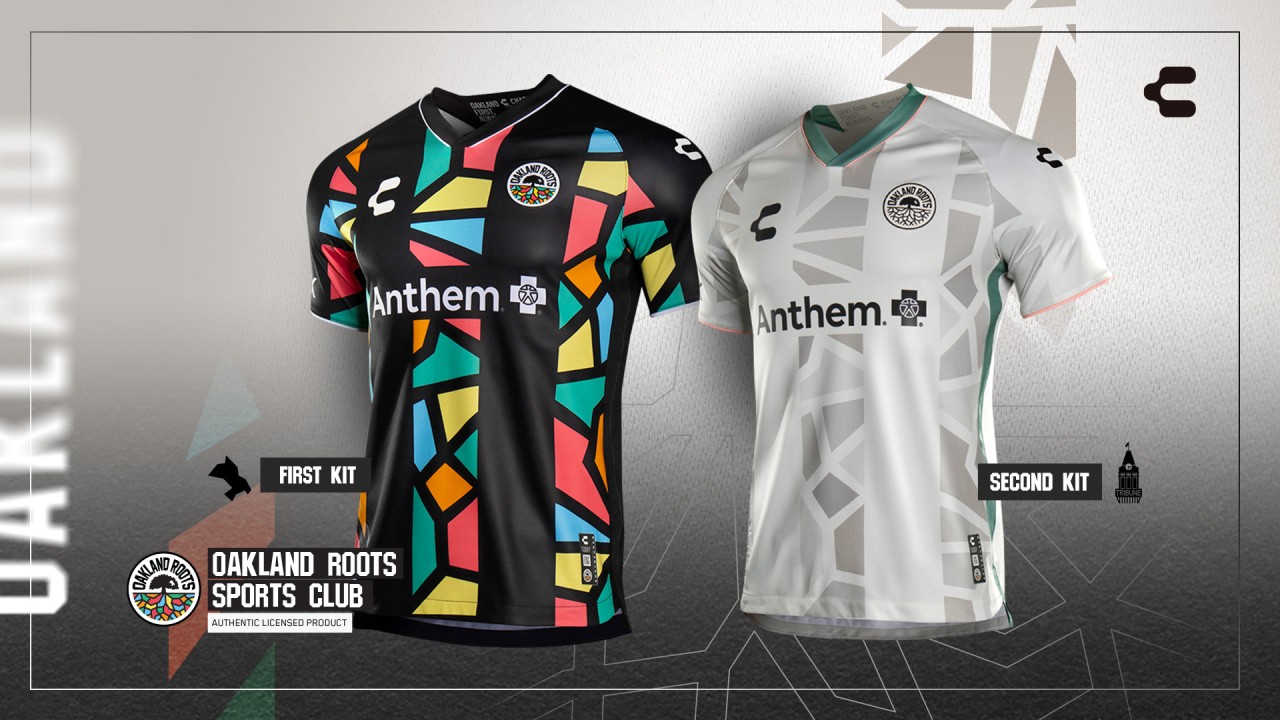
Since joining the league in 2020, the Oakland Roots have been one of the most vibrant clubs in the USL Championship, from their fans to their kits. Both of this year’s releases with new supplier CHARLY were instant additions to my shopping list.
I love that this year’s iteration of the Roots’ kits uses the same design for home and away, with the color schemes providing the variation. Add in the symbolism of the mosaic pattern, and you have a kit that will dazzle on and off the pitch.
Forward Madison “Rhythm of the Lakes”
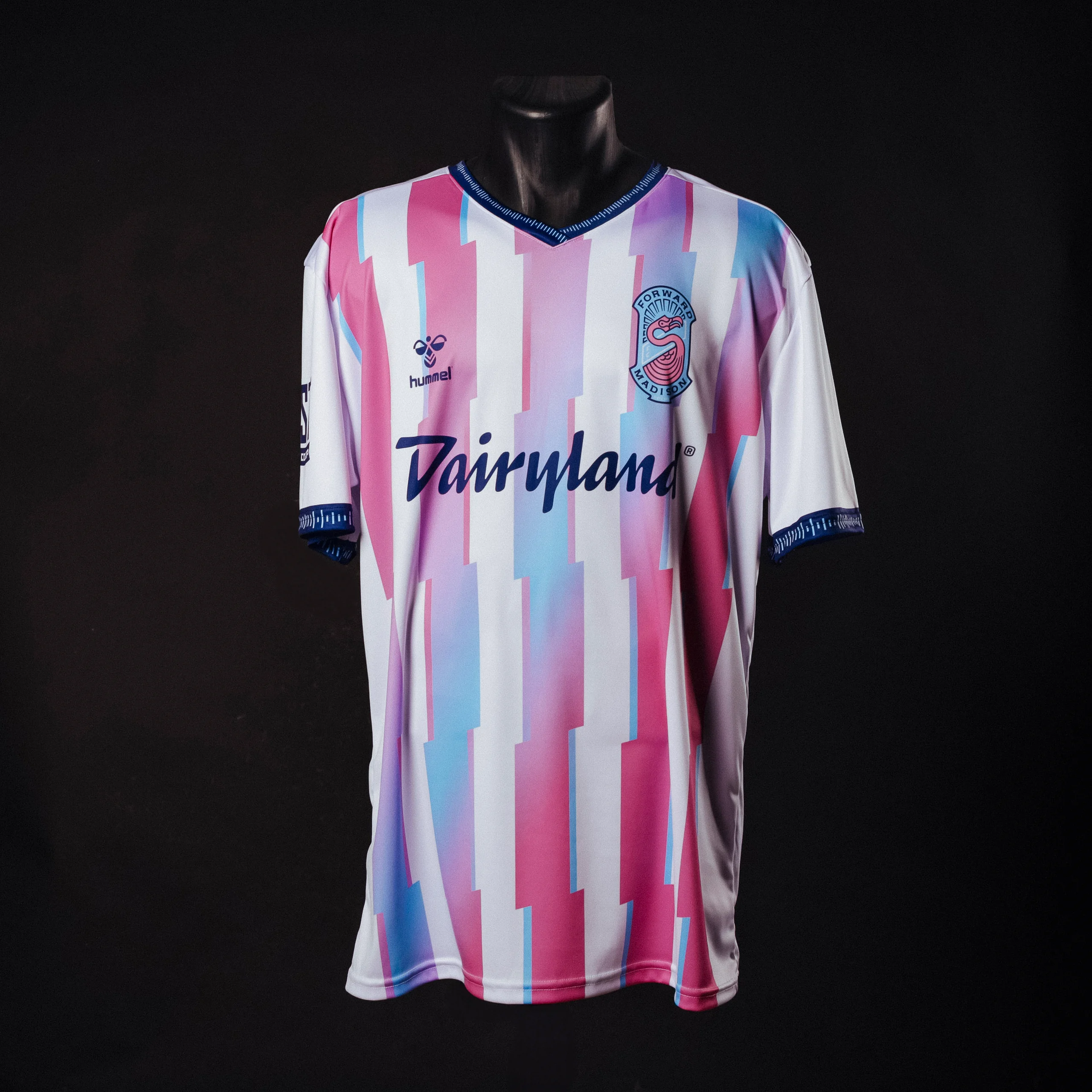
Forward Madison has done it again. Year after year, the club brings out aesthetically pleasing kits that are fun and creative while still being within the realm of its historical brand image. This kit has it all without going over the top, and as a bonus was designed in collaboration with the team’s supporters’ group, The Flock.
The arm and neck cuffs have a soundwave pattern to signify the rhythm of the five lakes in Madison, in addition to a beautiful pastel color scheme that is soothing yet energetic. It’s drops like these that have made Forward Madison one of the most compelling clubs in all of American soccer.
Miami FC Third
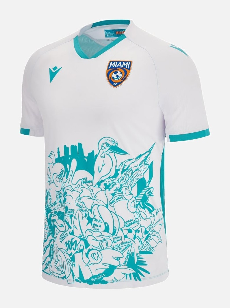
Miami FC arguably has the hardest job of any team in the USL when it comes to marketing itself. After all, the team is competing for attention against the one and only Lionel Messi. While I’m not sure they’ll be able to wrestle away any of the shine from Inter Miami, Miami FC’s kits certainly win over their MLS neighbors.
All three of the club’s shirts are true to Miami and provide some added personality to a city with already so much flair to begin with. My personal favorite of the three is the third kit (which has been carried over from the 2023 season), as it features some pretty vicious-looking birds.
Pittsburgh Riverhounds SC Home and Away
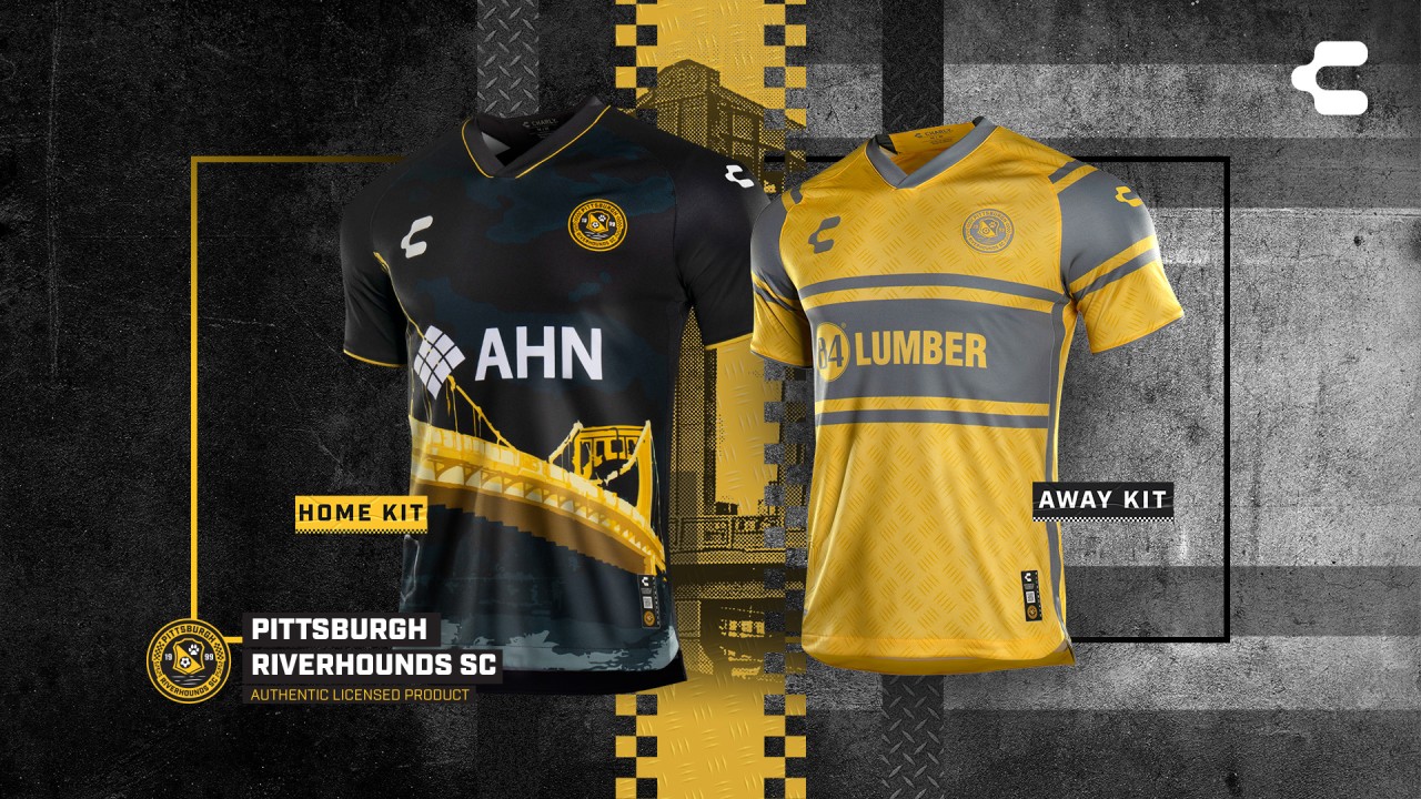
The Pittsburgh Riverhounds went with two drastically different jersey designs for their home and away kits. While I am not a huge fan of the lack of continuity between the two, both are quite interesting when looked at individually. For the home kit, the Riverhounds went the route of showing the outline of a city landmark, in this case, one of the city’s many historic bridges. It is unique to Pittsburgh, while doing it their way with the 8-bit inspired bridge rendering.
For the away kit, they went for something on the complete opposite side of the spectrum: retro-inspired hoops and a steel pattern that gives the two-toned jersey a pop of texture. While not necessarily the most cohesive set of jerseys in the league, both kits are nonetheless solid.
Sacramento Republic Away
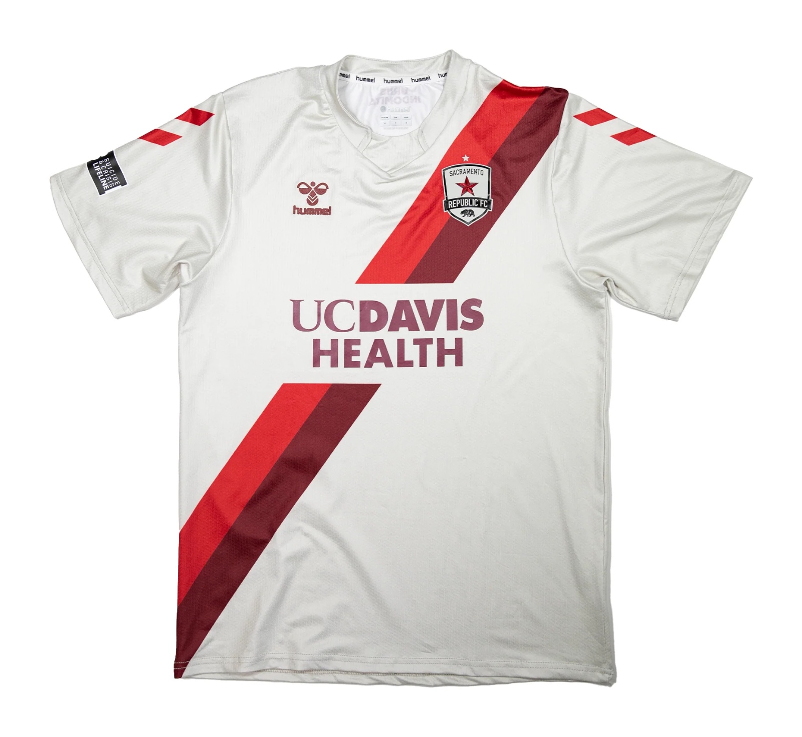
I’ve always been a huge fan of sash-style jerseys, and the color scheme on Sacramento Republic’s away kit absolutely hits the spot. I also like that the sash isn’t continuous, with the sponsor logo interrupting it instead of being placed over it in a garish fashion. This is a great example of a kit being beautiful without being overly complicated.
Loudoun United Home and Away
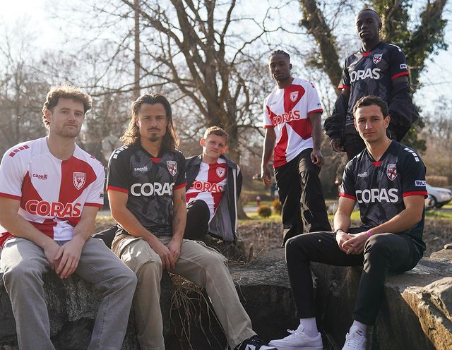
Loudoun United hasn’t exactly had the most sparkling history in terms of kit design, but this first year with Capelli is pointing them in the right direction. Capelli decided to take advantage of the club’s strong color scheme and create two kits that bring varying energies to their fashion portfolio. The home kit is bright and energetic, and it feels like the team will play attacking football for 90 minutes based purely on how whimsical the kit feels.
Their away kit is dark, moody, and will certainly photograph well, as the pattern is just vivid enough that it will contrast well when playing under floodlights.
Overall, it is a very strong showing from Capelli in its first year as a jersey supplier for the Virginia club.
Charlotte Independence Away
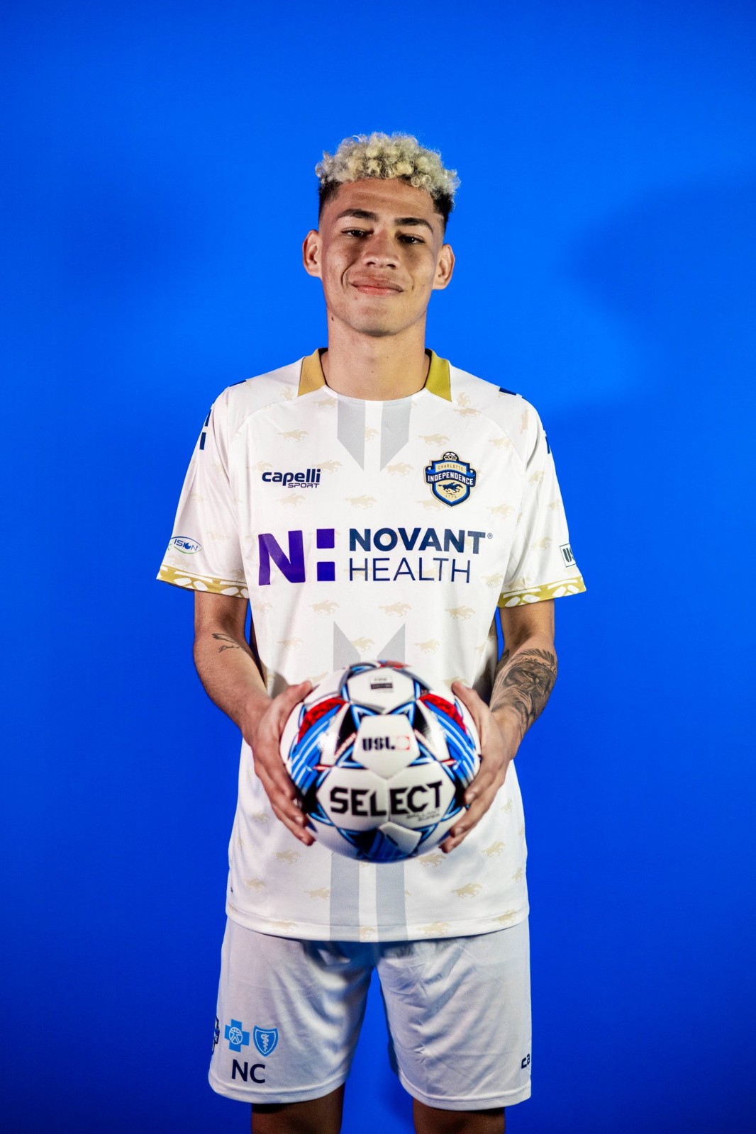
From afar, Charlotte Independence’s away kit seems quite simple. There is nothing outlandish or intriguing, but if you look closely, you can see the faint shadow of horse racers dotting the jersey, giving it a slight off-white appearance. Subtle accents and details like these are what make many kits wearable off of the pitch, almost like a tie with a pattern that is only noticeable up close. It adds extra flair to your outfit while not being overtly flashy.
Greenville Triumph GK
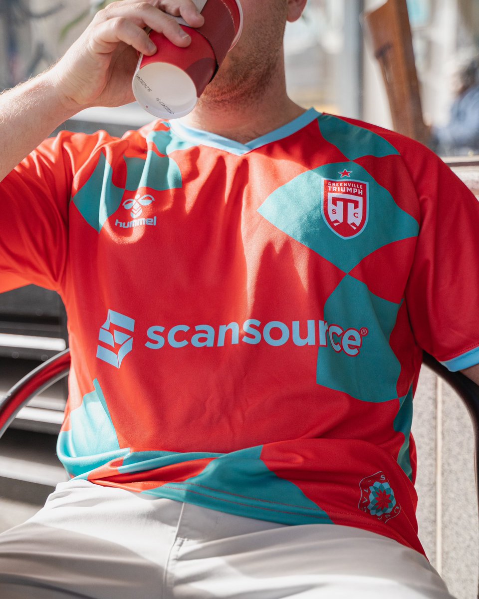
I’ll be honest. I don’t really know if these kits are “Poinsettia Red,” but I love that Greenville Triumph decided to give their goalkeepers a kit that isn’t from the same catalogue that high school teams choose from. This kit also reminds me a lot of the Miami FC Away kit, but thankfully, Greenville play in USL League 1, so there won’t be any kit clashes between the two clubs in the near future. Bonus points to the Triumph for making these available for purchase, as most clubs typically don’t sell them.
Charleston Battery Home
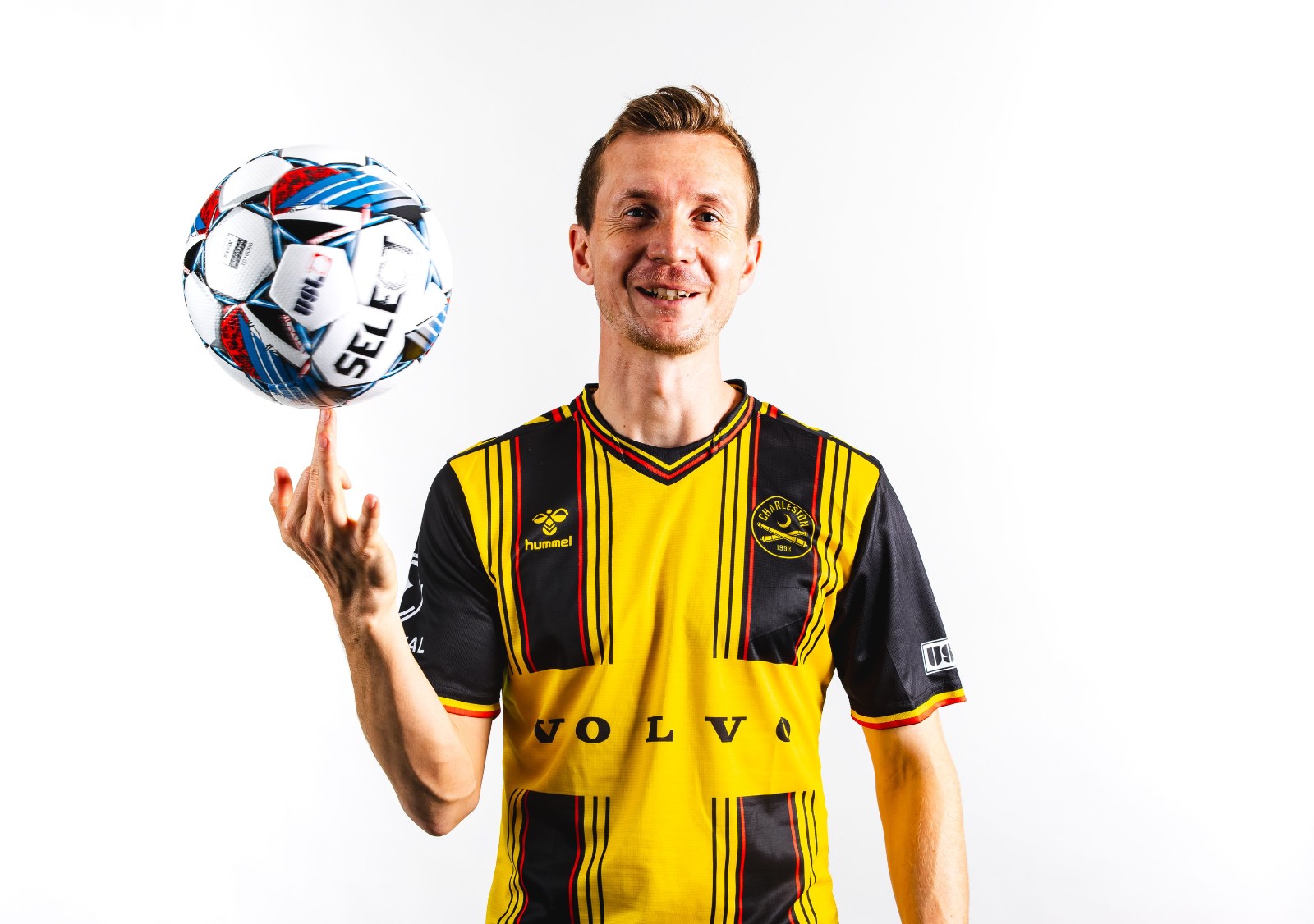
There is something special about a yellow, black, and red kit. They feel intense, sharp and ready for action. I also love how the Charleston Battery are sponsored by Volvo, which is one of the few recognizable sponsors at the USL level. Another nice detail on these kits is the accents on the sleeve cuffs. Clearly, this was a well thought out kit, and the designers deserve praise.
Tampa Bay Rowdies
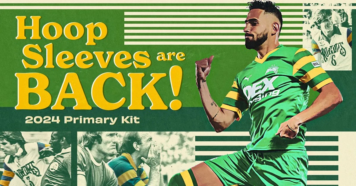
I love hoops on jerseys; I just can’t help myself. These hoops, however, are a bit more unique, and I am still deciding how I feel about them. On one hand, the color scheme could be a bit garish for some, yet it gives off a refreshing vintage feel that recalls images of the Tampa Bay Rowdies’ roots in the NASL. Fittingly, the club used a retro-style graphic when releasing the jersey, and it firmly pushed me into liking the kit, even if I wouldn’t personally wear it.
New Mexico United
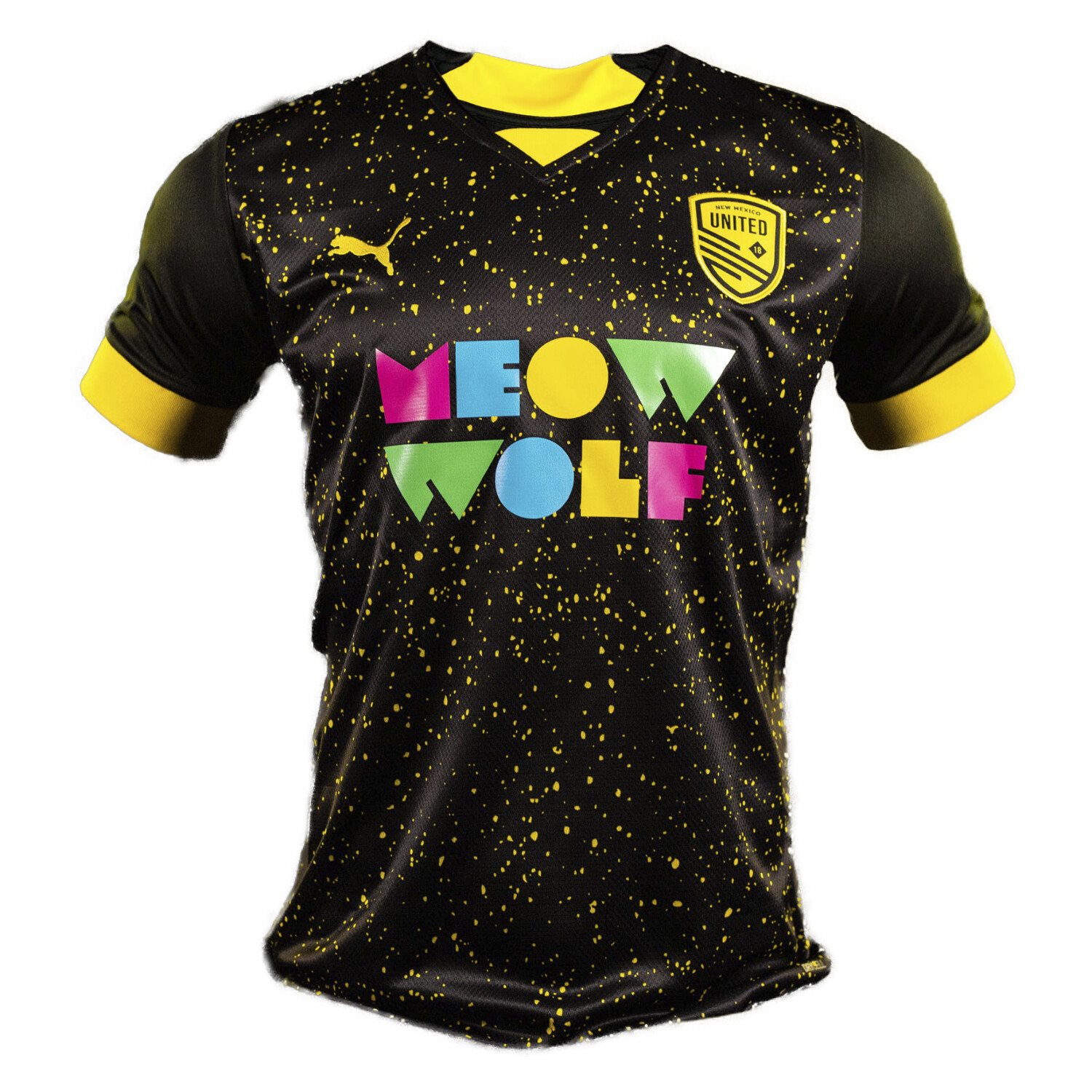
The majority of the kits on this list have been good, if not great. New Mexico United’s home kit, on the other hand, is not so lucky. The design feels like something that a tech startup would make as swag for their company softball team. The club’s work with art collective Meow Wolf has been commendable, but this particular design just doesn’t work. This kit had the potential to be good, but it feels like they added a bit too much of one ingredient, and that made the whole recipe fall apart.


