As we gear up for the final push of the season for Europe’s top leagues, we take a look back at some of the most overlooked and underrated kits from 2022-23.
There’s always regular hype throughout the season around a set number of kits. That’s normal. A consistent outpour of love for them can be heard during each game. But what about the kits that sort of take a step back into the shadows and don’t receive the love they actually warrant? With a whole host of underrated kits from the 2022-23 campaign, we give the 10 most deserving their flowers.
Vermont Green FC Third
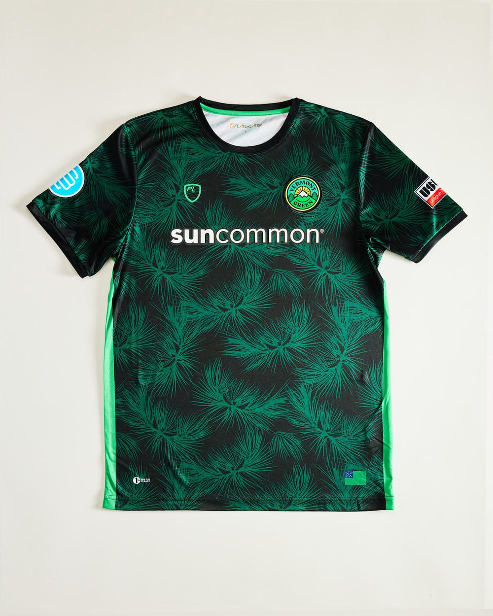
A pine needle phenomenon is what I’m describing this kit as. It features a pine needle pattern all-over print in a striking green colorway. The shirt was designed by Matt Wolff, the graphic designer who co-founded Vermont Green FC that is also behind iconic kits like the 2018 Nigeria. Vermont Green has been a very interesting club to watch grow since their founding not so long ago, and this kit adds to its high-level brand image.
Palermo Third
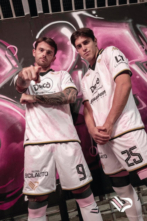
Currently sitting in Serie B, Palermo are known for their playing-in-pink approach to calcio. Each of their kits have a big pink influence, and their third kit from the 2022-23 season is no different. A more subtle, classy touch to the kit, this shirt features a white base with a faint pink floral pattern throughout. The kit was designed in collaboration with street artist TVBoy and takes massive inspiration from the Patroness of Palermo, Santa Rosalia.
Vesta Calcio Home
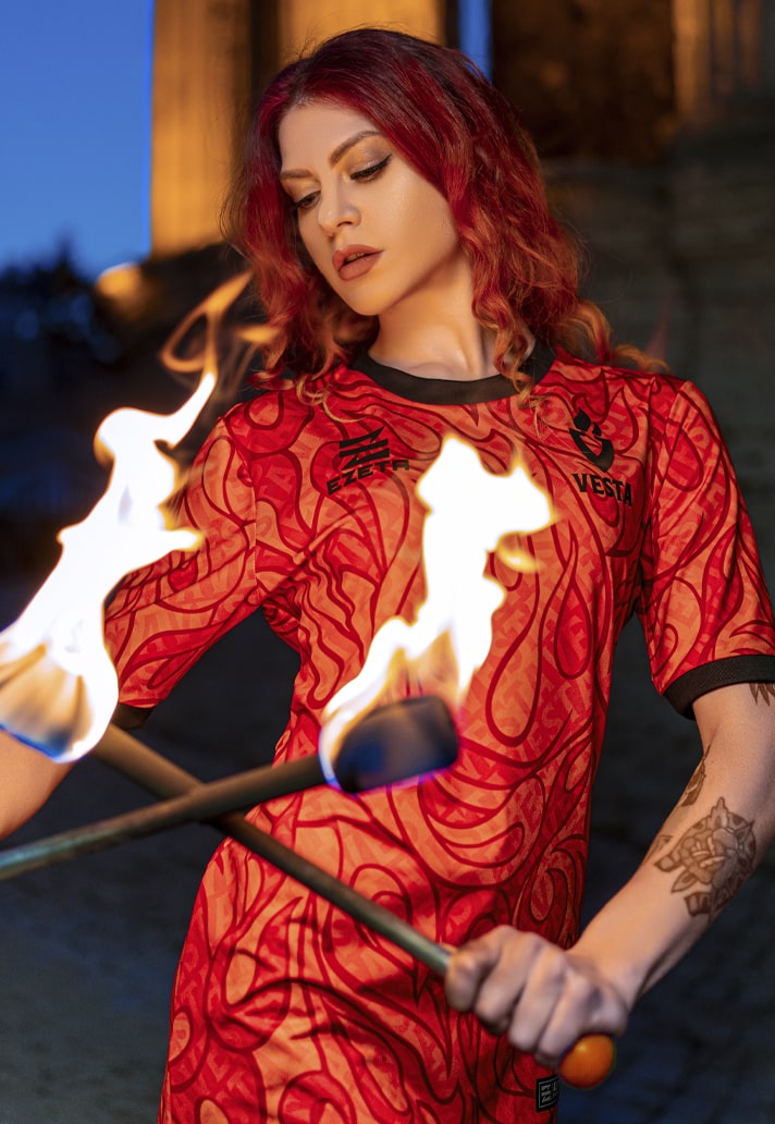
There’s probably a reason that this kit is underrated, and that’s because Vesta Calcio is an amateur side that currently plays in the first division of the Lazio League in Rome. But the kit itself is deserving of much higher stature. They take their name from the Goddess Vesta, whose task was to keep the flame burning, hence the all-over flame design of this shirt. A bold look but one that pays off.
Club America Home

Club America are known for having nice kits, so it may come as a surprise that they’re included in a list of underrated ones. But this year’s kit from the Mexican club has gone a little understated and it’s mainly due to the lack of boldness seen in previous years. But it’s still a fantastic shirt. A nice citrus yellow base, with royal blue accents, moving away from the usual big colors we see from the club crest which are usually emblazoned right across the shirt.
Inter Milan Away
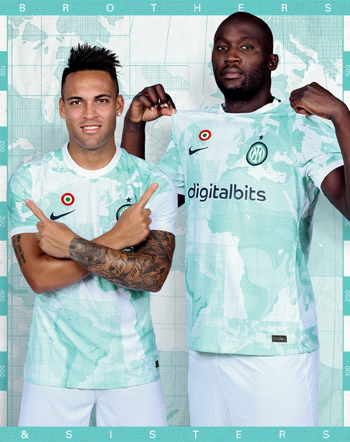
This one is just a lovely kit. Simple as that. It features a map of the world, showcasing Inter’s ever growing global presence, in an aqua and white colorway. This kit won’t win awards for being the best in the business, but it should still be recognized as a pretty solid offering. Plus, it looks even better when worn on the pitch.
Como Home
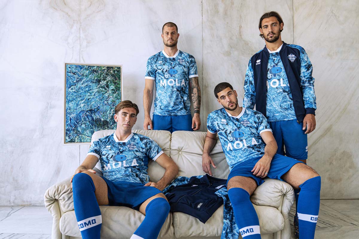
Errea is a vastly understated brand in the kit manufacturing space, and for this Serie B side, they have truly stepped up to the mark. Como are kitted out in a trio of nice kits for this campaign, but their home shirt reigns supreme. It pays homage to the waters Como find themselves perched over with an all-over wave-style print combined with white accents.
Monaco Third
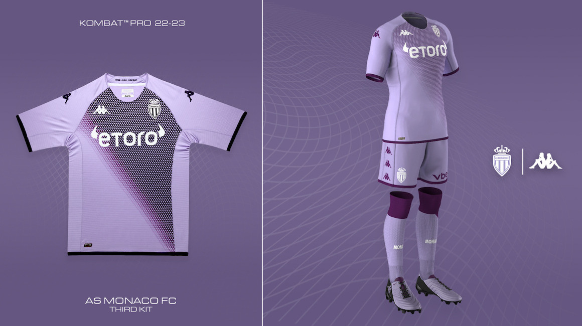
Now I can see why a purple number might not be one for many people. But this Monaco kit is wonderful work from Kappa. The pattern across the shirt depicts the diamonds of the principality combined with thin diagonals, which have been the club’s symbol over the last 60 years. This pattern is modern and elegantly showcased on the shirt. And it’s the first time Monaco have worn purple in their history, so it’s always nice to see something new.
AS Roma Third
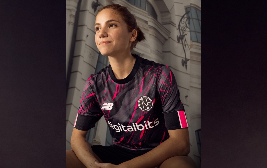
I’m mainly including this shirt in this list due to the crest. It’s special. A great welcome back to the iconic ASR emblem, which sits upon a striking black and pink patterned base. The pattern is wild, featuring an interweaving of shapes which pays homage to the link the club has to the wolf. But the showstopper is definitely that crest. A striking and possible final offering from New Balance, as the club is in the midst of a tenuous move to adidas for next year.
Atletico Madrid Third
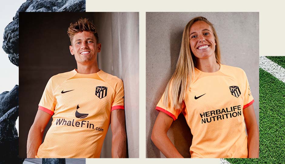
I’ve seen a lot of talk about Atleti’s home kit but never really the third. To be honest, I never knew this kit existed until I started compiling this list. The design features a lovely orange base with no flashy patterns and red cuffs on the sleeves, which all come together as a tribute to the famed strawberry trees of Madrid. There’s actually a little bear and tree motif in the inside collar as well, for that little extra detail.
Idrottsföreningen Brommapojkarna Special Edition
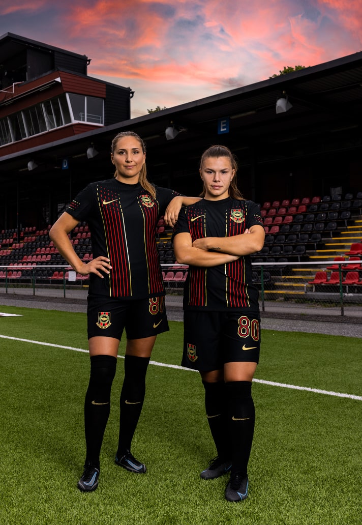
Idrottsföreningen Brommapojkarna, or BP for short, are a Swedish side and Europe’s biggest club with over 4,000 players. They revealed this special edition shirt in partnership with Nike to celebrate 80 years since their founding. The club is admired for its inclusive approach and dedication to the game. Ninety-five percent of its players are in the youth ranks and one-fourth are female, making it also the biggest female club in Europe too. So it’s only right a team this special gets a kit to match.

