After releasing their 13th (yes, 13th) kit of the season earlier this month, we look back and rank all of the 2021-22 Napoli kits.
Football kits have long held an important place in the sport’s culture, especially in recent years. As the football shirt has become more popular amongst fans and lucrative amongst clubs, it’s no surprise that we’ve seen an increase in releases and unique designs over the past half decade.
However, there’s one club that has gone all out in an effort to get ahead of the curve — both for better and for worse. In a world where clubs can release up to five kits a year, SSC Napoli scoffed, for they knew they could do better. Along with new kit supplier EA7, the sportswear branch of legendary Italian label Emporio Armani, Napoli has released an eye-popping 13 kits this season. You read that right, a whole teenager.
Napoli has a history of fantastic kits, from the iconic Mars-sponsored years in the late ’80s made famous by one Diego Maradona, to more recent classics in the 21st century. The EA7 signing ahead of this season made a big splash. Now with Georgio Armani behind the designs, the expectations for the new kit era at the Serie A side were sky high. When the club announced the partnership, it promised some of the proceeds would be used to give back to the community.
The results are a bit lackluster, with some fans upset at the quantity over quality approach the club has taken with its kits this year. Many would think that three banger shirts would trump 13 hit-or-miss ones any day.
View this post on Instagram
Four of the 13 kits pay tribute to Maradona, and feature a pattern designed by native Neapolitan artist Giuseppe Klain that depicts a Maradona portrait over a swirl pattern resembling a fingerprint. Some may think that four whole kits dedicated to the star might be a cash grab. But the kits are being sold in limited quantities (three of them are already sold out), which shows that the club isn’t seeking mass production.
Other designs come in The Partenopei’s signature sky blue color, plus white, red and a lone black kit. There’s really something for everyone here. Acqua Lete, the club’s kit sponsor since 2005, has provided yet another element of design commentary with its can’t-miss bright red logo. Some might say that 13 kits is a lot, but is there really a rule on how many is too many? We are here to dissect each and every Napoli kit, ranking them from worst to best.
13. Halloween Special
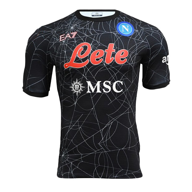
Napoli’s Halloween kit is one that you either love or you hate. The design is reminiscent of 2007’s Spiderman 3, with its spiderwebs on a black background with the sponsor in red. The main reason it’s our least favorite is that it begs the question: What’s the point? Manchester United has never done an Easter kit. Arsenal has never done a Hannukah kit. Even Celtic FC has never made a Saint Patrick’s Day kit.
12. Serie A Third
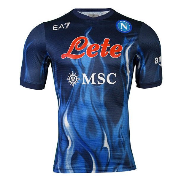
Adding flames to a design can either bring a unique touch of flair or evoke images of Guy Fieri. For Napoli’s Serie A third kit, it’s in the latter category. The blue flames don’t really add anything to the design and just make it look busy. There aren’t any details like contrasting stripes on the sleeve to ground the design so the shirt just feels like it’s floating. Overall, the kit feels like one of those flimsy Under Armour shirts that were super popular back in the early 2000s, but now everyone just thinks are kinda sweaty and gross.
11. Serie A Home
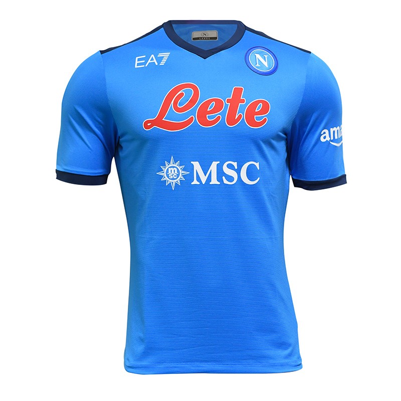
The thing that’s wrong with Napoli’s Serie A home kit is that it’s simply boring. We appreciate that they’re letting the classic sky blue color shine, but with the red Lete and white MSC Cruises logos combined with the dark blue stripes on the sleeves, it just feels scattered, super standard, and uninspiring.
10. Europe Home
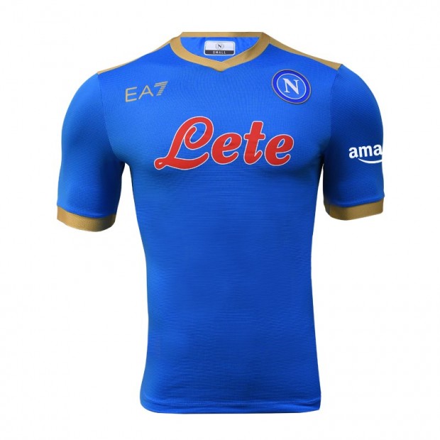
Again, we love that Napoli is sticking to its sky blue roots, but the other colors they’re using with it just aren’t interesting. The red is just a lot of brightness on one shirt and the gold accents, while a step up from the dark blue on the Serie A home, still feel disjointed.
9. Serie A Away
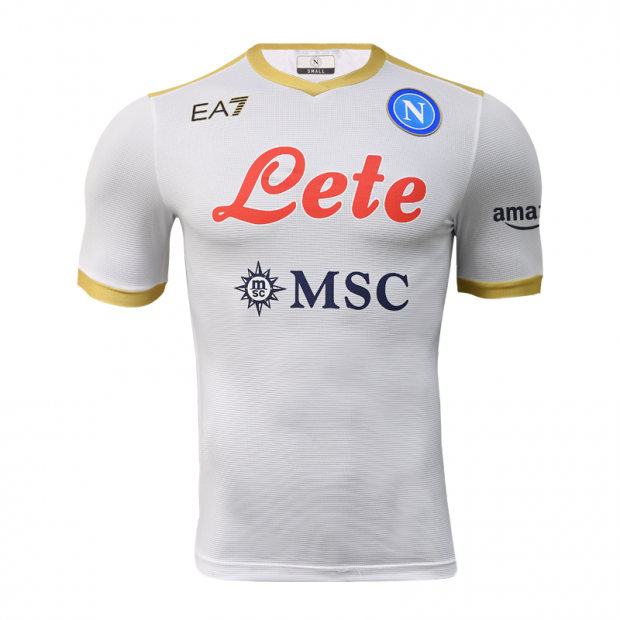
The Partenopei didn’t do much more to inspire with its Serie A away kit. It’s a simple white base with gold accents and a pop of color with the Lete sponsorship in red. It is easier on the eyes than the sky blue and red, but…yawn…next.
8. Europe Away
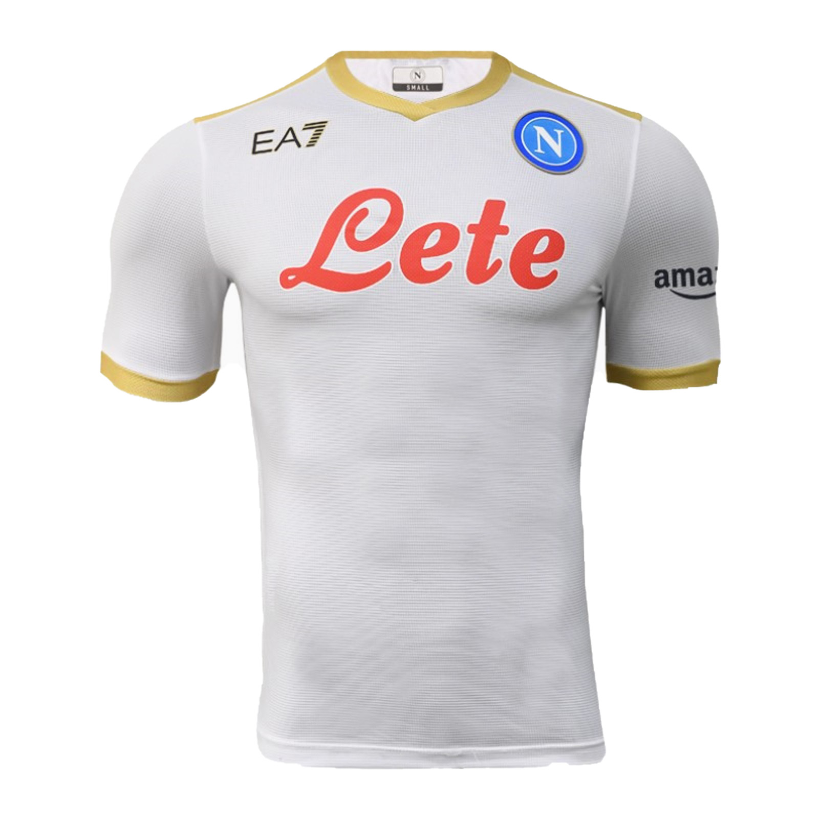
The only thing that gives the Europe away kit a position higher than the Serie A kit is that due to UEFA sponsorship rules, the MSC Cruises logo isn’t on the front. So that lightens the design a bit. But still leaves nothing awe-inspiring.
7. Diego Maradona Sky Blue
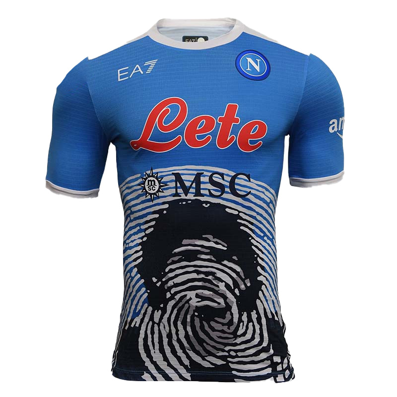
I hate that I keep ragging on Napoli’s signature sky blue color. But my eyes aren’t able to digest it with the bright red Lete logo. Back when Diego Maradona played, the sky blue with the white or black sponsor logos made for a design that simply breathed better. At least the club doesn’t have to do the boxy red logo anymore, but is there some way they can have a conversation with Lete to make these designs better? Anyways, the point of this kit is that the Maradona tribute, featuring a portrait of the Argentinian superstar with a fingerprint design, feels too busy and forced.
6. Europe Fourth
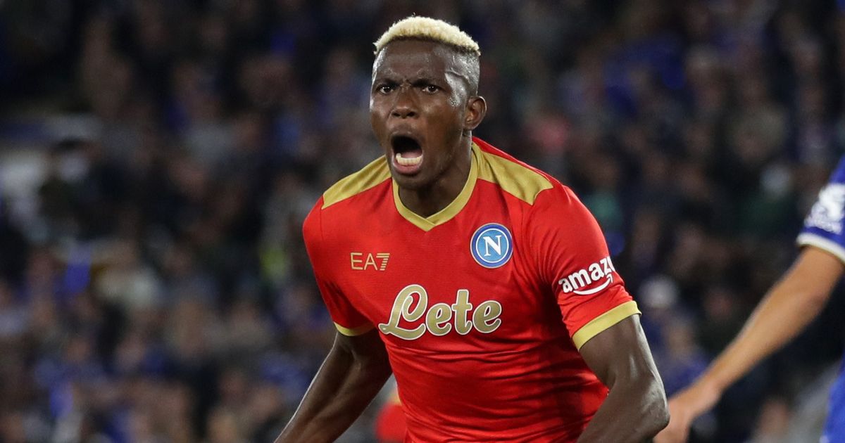
Red has been Napoli’s tertiary color for quite some time now, but this red feels overbearing coupled with the gold accents. Sometimes this color combination works. Even the late great Nipsey Hussle said he broke the Crip tradition by wearing red and it looked really fresh with his gold jewelry. But for our intents and purposes, the color combination doesn’t work here. It feels heavy, not luxurious. And the blue Napoli crest sticks out like a sore thumb.
5. Maradona Dark Blue
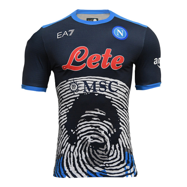
What makes the Maradona dark blue kit better than the sky blue one is the contrast of the blue and red. This was the first of the tribute kits to be released (in November 2021) and was in honor of the first anniversary of Maradona’s death. Since it was the first one, we didn’t have the other colors to compare it to and overall it’s a solid design. Still maybe a bit busy, but an innovative kit nonetheless.
4. Maradona Red
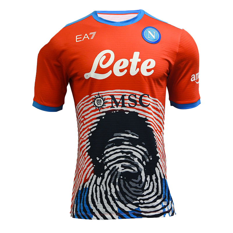
The most recent of the Maradona tribute kits is the red colorway, which was released in March. Napoli didn’t end up wearing it in its match against AC Milan, but the kit is available for pre-order and will probably sell out just like the other three. This design flows nicely with the white Lete logo popping out against the red, but flowing into the fingerprint design. The sky blue accents complement the crest as well.
3. Europe Third
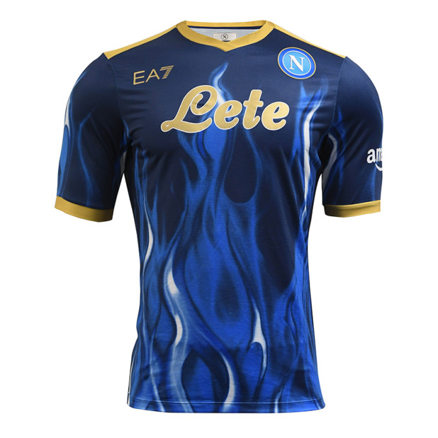
What makes Napoli’s Europe third kit so special? The blue flames done right. This kit has them woven nicely into the blue background with the gold accents, which, unlike the Serie A kit, actually centers the design. The fact that the MSC logo is left off also helps it look sharp. Sometimes flames can come across as tacky in the same vein as racing stripes. But here, with the gold contrast, it looks like a kit for winners.
2. Maradona White
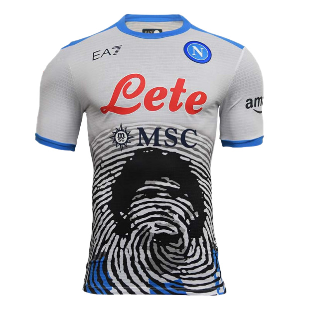
Napoli’s white Maradona tribute kit is the only one that doesn’t look like a crop top. The white base flowing into the portrait design is the freshest look of them all. The MSC Cruises logo actually seems to go with the design, weaving with the fingerprint lines, and doesn’t feel forced. The sky blue accents go perfectly with the Napoli crest to bring everything together.
1. Serie A Fourth
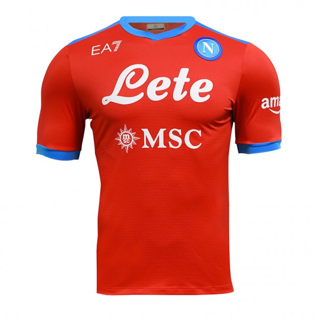
Here, Napoli got the contrast of colors just right. The bright red with the sky blue accents and the white Lete sponsor logo are clean, crisp, and let the design breathe. The MSC Cruises logo doesn’t feel like it was slapped on, but in the same white color as the Lete logo, flows naturally with the rest of the branding. Even the Napoli crest doesn’t feel like an afterthought, but is carefully tied in with the sleeves. Sometimes, you don’t need a fancy background design, just a right balance of colors and placement to have a fresh take on a classic kit. Ottimo lavoro!
Final Verdict
While there are a few stunners and we can applaud Napoli and EA7’s efforts to go all out on kit releases this year, the run of 2021-22 Napoli kits ultimately proves that sometimes, less is more. Focusing on one or two striking designs instead of throwing a dozen ideas at fans makes for a stronger impact, and prevents the kit fatigue that many supporters and collectors alike have experienced with each new drop.


