
A mix of eye catching and daring designs has many excited about the 2022 Canadian Premier League kits from Macron. We go through all eight, giving them a letter grade along the way.
It’s an excellent time for Canadian Premier League fans. The season is right around the corner, and the recently released home kits are spicy. Besides the bespoke designs themselves, another cool thing about these Macron jerseys is that each one is made fully out of recycled plastics, a promising trend among kit manufacturers.
As the resident CPL super-fan at Urban Pitch, I was tasked with rating the new home shirts for this coming season. I promise to be tough but fair (full disclosure, I’m a HFX Wanderers fan).
Pacific FC
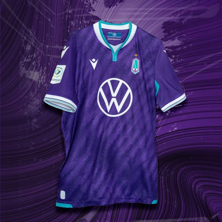
Pacific FC may have my third-favorite kit this year. Sure, the purple they use is quite intense, but the sublimated Douglas fir pattern gives the kit an incredible textured look, and the small, gold, north-star shield above their crest is a beautiful touch that I certainly want to see over the HFX Wanderers’ logo next season.
The only thing I would change about the jersey is that they have different colors under the armpit, which makes it look like they sweat blue Gatorade (I prefer orange Gatorade personally).
Grade: A. This is as close to an A+ as possible without being an A+.
Cavalry FC
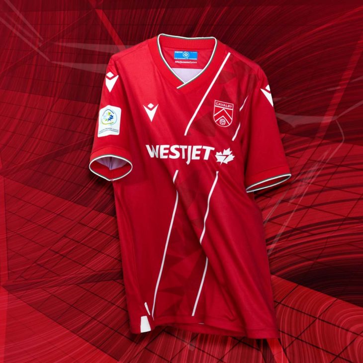
It feels a bit odd that teams are claiming to go back to their historic style when they have only had three iterations of their kits. Yet, Cavalry is talking about going back to their classic “sash” design. I don’t hate the kit, and even though it doesn’t blow me away, I do think it is the most professional looking Cavalry kit yet, and certainly the cleanest kit in their history.
Grade: C+. Certainly not a colossal fail, but definitely not certified fire.
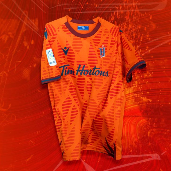
FC Edmonton
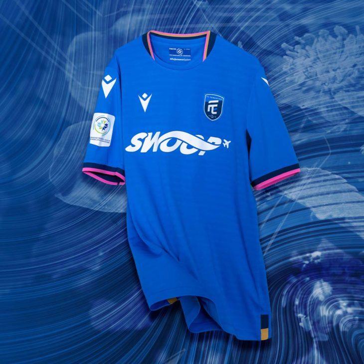
I don’t want to kick a team when it is down, but what is happening here? Pink cuffs? It looks cool, but I have no idea why they are reaching so much to connect it with the city. The bright neck and cuff accents are a nod to the wild rose, Edmonton’s official flower, and if anything it taught me that flowers in nature occurred in hot pink, even in Edmonton, one of the least exotic places on earth.
Grade: D. It is basically the same kit as every year with the addition of hot pink. It is actually quite clean, but I am deducting points because the FC Edmonton kit is basically the same every year.
Valour FC
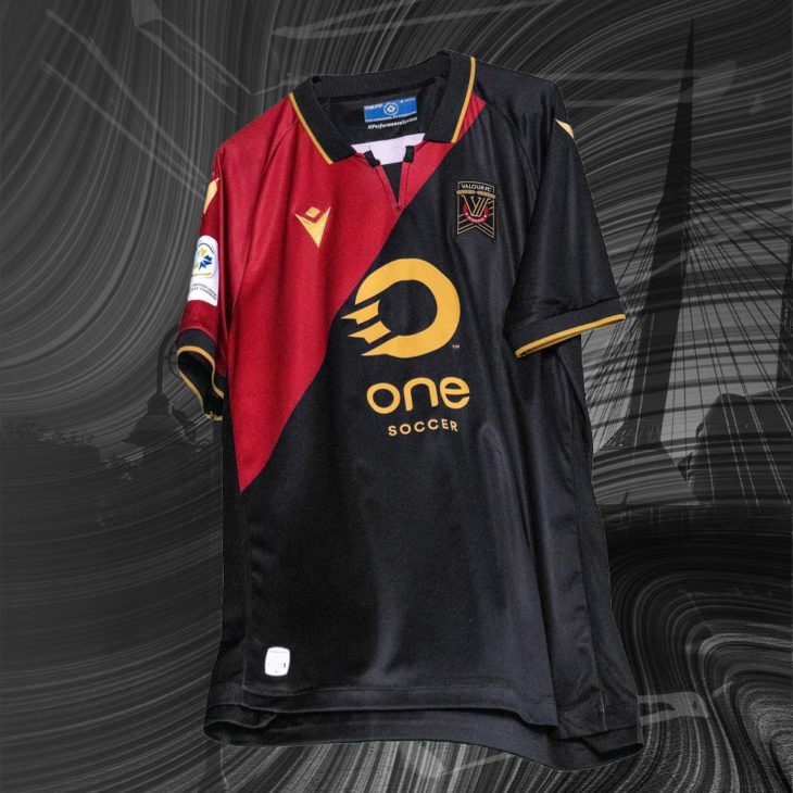
This kit will divide opinion…literally. It has an asymmetrical design with Valour’s signature black and maroon. With the gold accents, it really pops, and has serious potential to be a kit that grabs the eye of fashion friendly fans and non-fans alike. Valour continues to prove that they are willing to push the envelope on design. I’m sure next year’s kit will be just as wild, but probably on the other side of the good/bad spectrum.
Hopefully, the alternate kit being released next week doesn’t bring back the asymmetrical collar.
Grade: A. This jersey goes hard. Maybe it’ll be enough to propel Valour to the playoffs for the first time in their history.
Forge FC
Forge is entering this season in unfamiliar territory, as this will be their first year not being the defending champions. They have also switched up their home kit to something more creative. The “spark” design is meant to represent the sparks that fly when a hammer strikes hot steel. I think it looks more like stained glass, but whichever way you see it, it is visually appealing and more creative than 90% of jerseys from other leagues (*cough MLS cough*).
The Forge kit will also feature the two-time champion patch on the sleeve, which is a nice touch.
Grade: B+. Forge has never really taken risks with their kits. While this isn’t a huge risk, they received a nice reward for doing something different. This kit will look great on the Barton Street Battalion, the club’s supporters’ group.
York United
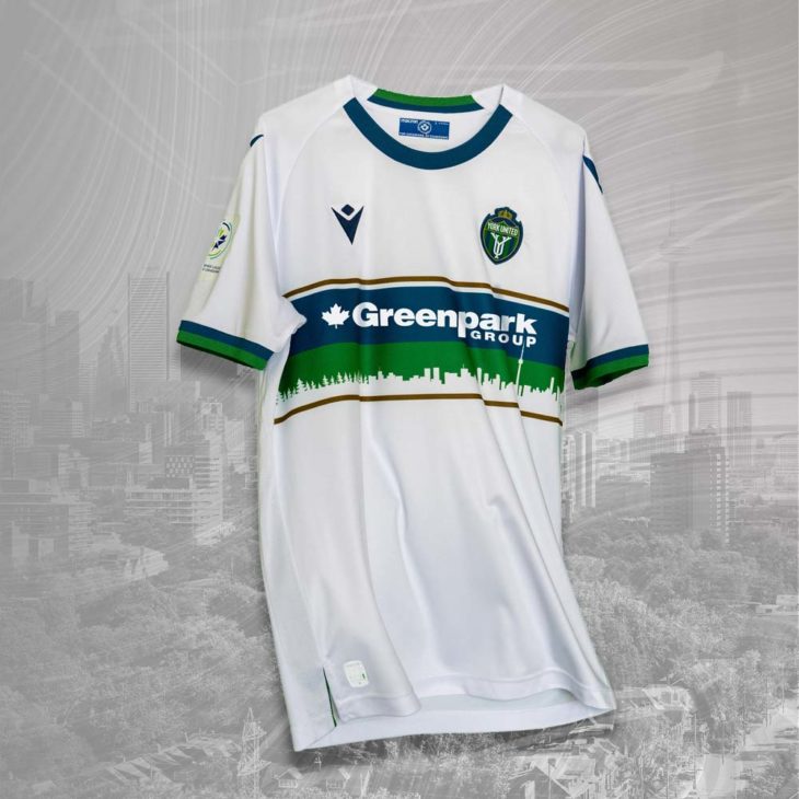
This is an A+ kit. York United’s first two years as Y9 were bad, but their kits have been pure fire since their rebrand. The outline of the skyline and the forest is majestic, the colors are perfectly matched, and their sponsor logo isn’t overwhelming.
Grade: A+. 10/10. I literally cannot come up with anything wrong with this kit.
Atletico Ottawa
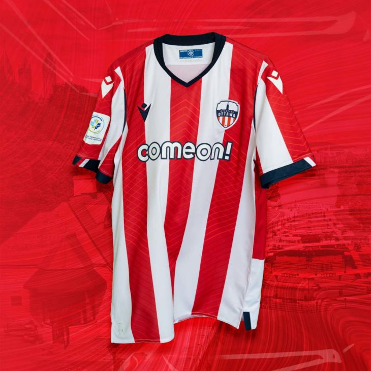
This kit is exactly what you would expect—Atleti stripes, with some small variations. This is basically just an Atletico Madrid shirt, made by Macron, with a Canadian betting sponsor as the logo.
Grade: C. This is middle of the pack. They couldn’t do anything crazy, so they just made something clean and simple.
HFX Wanderers
Every fiber of my fanhood is telling me to give this a 10/10. But, in the spirit of being unbiased, I am going to give it a 10/10. Using the shape of the Wanderers’ crest to give the jersey pattern and texture is incredible, and the color blocking on the shoulders and sleeves makes it stand out from the rest of the crowd.
I intend to buy one of these jerseys.
Grade: A+. 10/10, five stars.
Which Canadian Premier League kit is your favorite?
Kit images via CanPL.ca.


 Fashion on the Pitch")


