
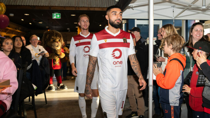
The Canadian Premier League season is about to kick off — which means we got a new set of kits from all eight teams. We take a dive into each new design.
If there’s one area where the Canadian Premier League hasn’t been lacking, it’s in the kit department. We’ve seen some interesting design choices over the league’s five-season history, with many being rooted in important local culture while also being incredibly wearable off the pitch.
This year, each team has continued to build on its identity, and the array of offerings have given the clubs a solid fashion direction. Once again, the kits are produced by Macron, who’s made the kits for the entire league since the opening season.
Now ready to kick off its sixth season, 2024 will be a huge year for the CanPL. The league has already seen two clubs play in the CONCACAF Champions Cup, and things will need to continue to fire on all cylinders if it wants the momentum to keep building.
Kits, while they may seem trivial and superficial, can play a massive role in creating new connections and bonds in each team’s respective city, while also gaining global notoriety through different football fan circles and the internet. Let’s dive into the new releases from each CanPL club.
Atlético Ottawa
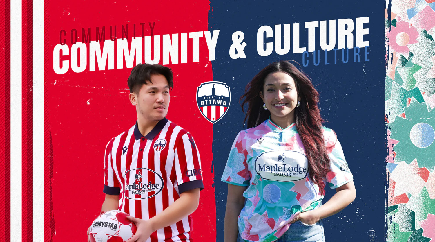
Atlético Ottawa has once again chosen its classic vertical red stripes inherited from parent team Atlético Madrid for its home kit, while opting for a bold and bright pastel-style design inspired by the cultural mosaic and diversity that the city of Ottawa experiences.
If there are to be any critiques, it would be for the home kit. Don’t get me wrong, I love that the club is keeping the same visual identity as its ownership, but I feel like the execution of the sponsor logo could be better. The logo itself is already complicated with a series of words and an intricate symbol.
On the away kit, Ottawa did the right thing, opting for a white background to go with the sponsor logo, which makes the choice for a transparent background on the home shirt more perplexing. It’s nearly impossible to read the logo, and overall it looks pretty sloppy.
Cavalry FC
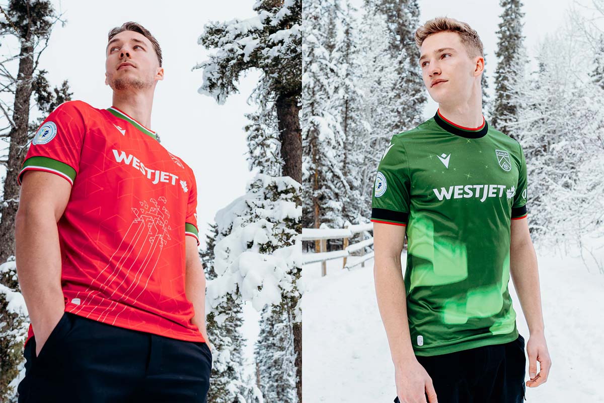
The reigning regular season champions have always had consistent kits, and we get another pair of serviceable designs in 2024. The home shirt continues Cavalry FC’s tradition of using a sash, this time featuring an embossed pattern to symbolize Calgary’s emergence as a tech hub.
Cavalry’s away kit makes a return to forest green after last year’s black kit, and the northern lights-inspired design really accentuates the particular shade of green, which is vastly underutilized in the world of football kits.
Forge FC
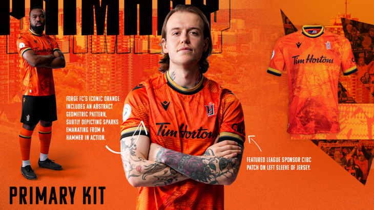
Forge FC is a dynasty. The club has won the league playoffs four out of the five years since the CanPL started. The kits have been equally solid as well. While never anything too flashy, Forge utilizes its color scheme well, and is also one of the few clubs in the league to have a third kit at some point in its existence.
This year, Forge decided to brighten up the home orange and go with a sublimated pattern that tries to evoke the intensity of iron being forged with a hammer.
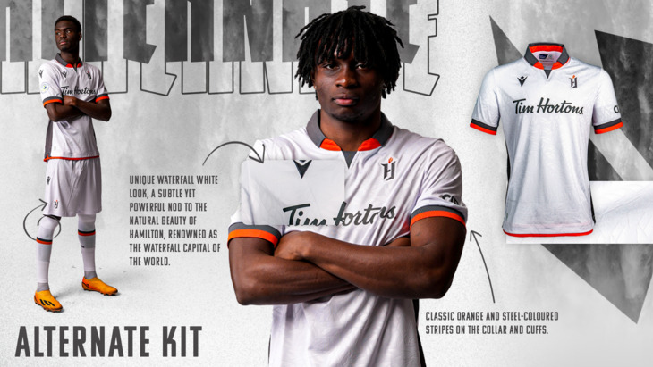
For the away kit, the club went with something completely new, as it is the first time it will have an all-white kit. The shirt uses a similarly subtle pattern as the home, but this time emulating a waterfall, as Hamilton, Ontario, is known as the waterfall capital of the world. Add in some sharp cuffs and sleeves, and you have a super clean kit that is befitting of the typical kings of the league.
HFX Wanderers FC
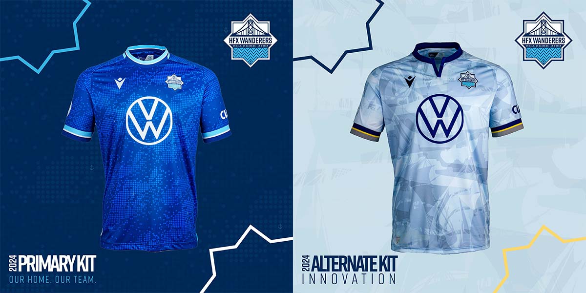
As a die-hard HFX Wanderers fan, I wait with bated breath each year for the kit launches. So far, the team has done well, as the kits have been tied to local values and history while also looking towards the future.
This year’s kits are quite solid, but the beauty is in the details, which might fly over the heads of the uninitiated. For the home kit, there are two symbols. The first is in the pattern, which is made up of an abstract version of a map with small anchor graphics, a nod to Halifax’s nautical history. The second part is a compass rose just below the number on the back of the jersey, which features a slogan around the outside: “Not all those who wander are lost, they’re seeking a place to call home.”
On the away kit, dubbed the “Innovation kit,” we get an ice blue base with striking gold and dark blue accents. The pattern, which is a sublimated collage design of some of the most historic ships to be built in the Halifax Harbour, shows Halifax’s historic and continued industry of building some of the best ships in the world.
Pacific FC
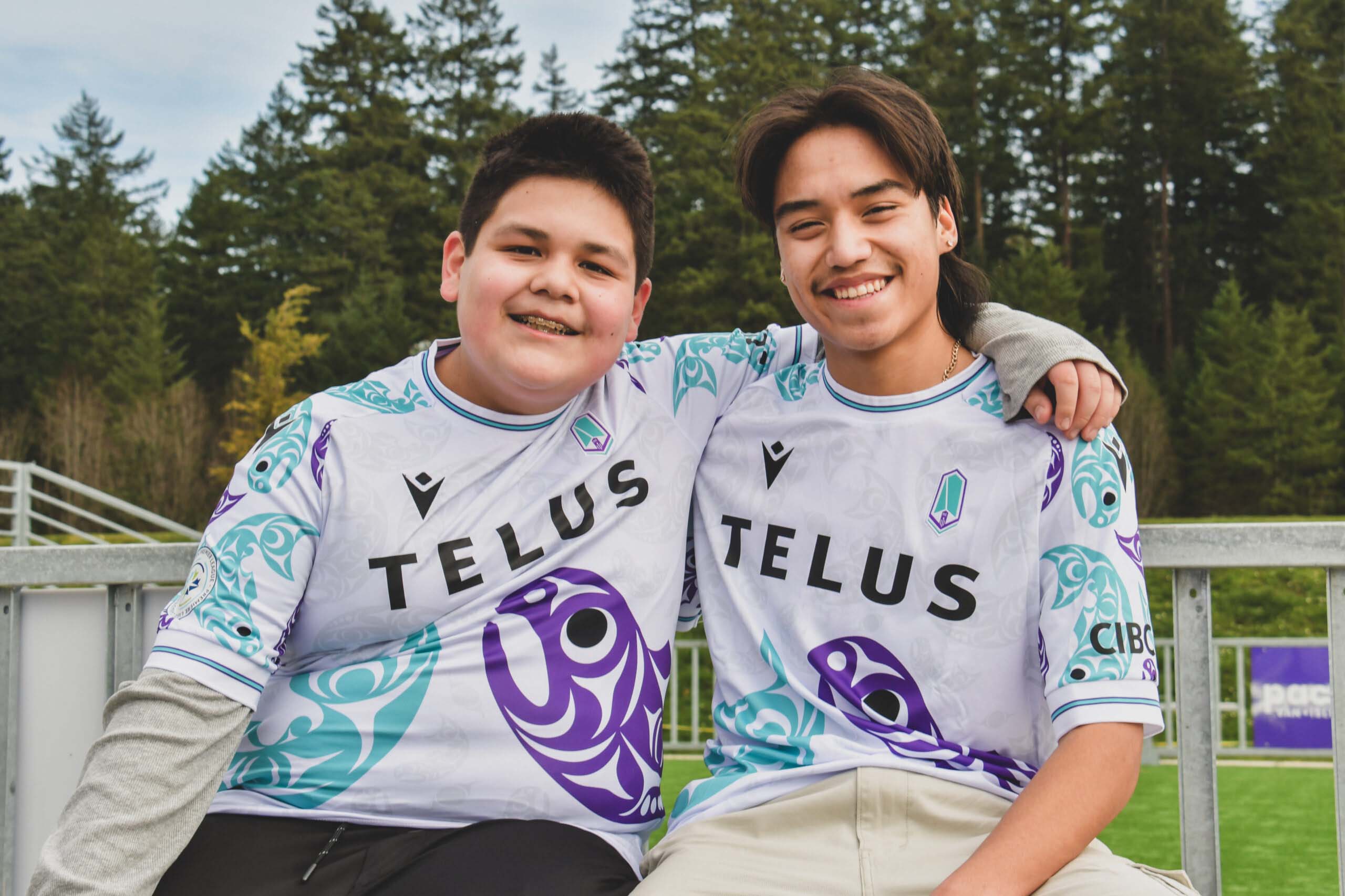
In terms of the home kit, there aren’t many critiques. It is a solid kit with an interesting pattern up close, with bright and bold colors. It will look great on the pitch but might be hard to work into your everyday wardrobe off of the pitch.
The away kit is where Pacific FC typically thrives, and this year is no different. The team has made an effort to use indigenous art on its kits, and the latest design features a graphic that honors the salmon, a highly regarded and incredibly important animal in the indigenous community. Fittingly, it’s been dubbed the “Resilience” kit, as a nod to the upstream-swimming salmon that seemingly find a way to complete their journey no matter the obstacle.
Coast Salish artist Maynard Johnny Jr., who designed the award-winning 2022 Pacific away kit, returned to create this equally stunning shirt for the club.
Vancouver FC
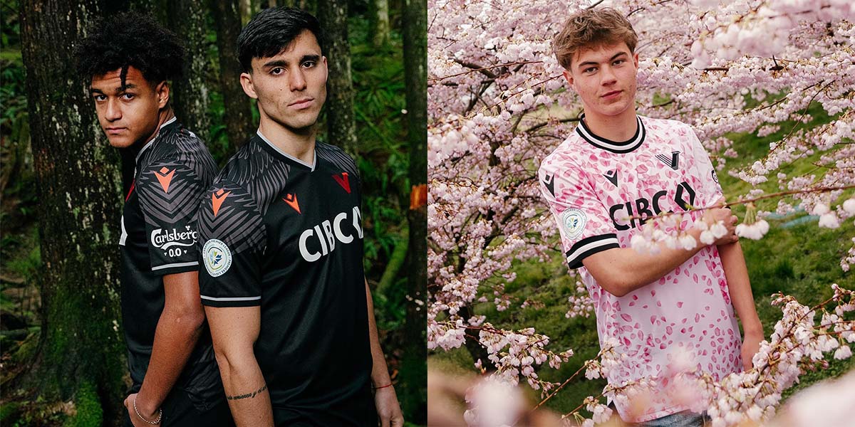
It is hard for me to admit as an HFX Wanderers fan, but Vancouver FC has the best kits in the league and maybe even in all of professional football. Let’s start with the home kit, which features a “feather cape” design on the back to symbolize the club’s first mascot, the bald eagle (yes, we have bald eagles in Canada). This design is nuanced, sharp, and one of the most creative all-black kits you could create. Extra points for choosing such a sharp red for the accents.
Somehow upstaging the fantastic home kit is the cherry blossom-inspired away shirt. Vancouver has approximately 40,000 cherry blossom trees that bloom each year to cover the city in a delicate coating of pink petals. Additionally, this kit contributes to the Pink Shirt Campaign, a project to help raise awareness about bullying in schools, work, home, and online. Each shirt sold will have a portion of its proceeds donated to the campaign as Vancouver FC continues its commitment to building a club that is deeply rooted in the community.
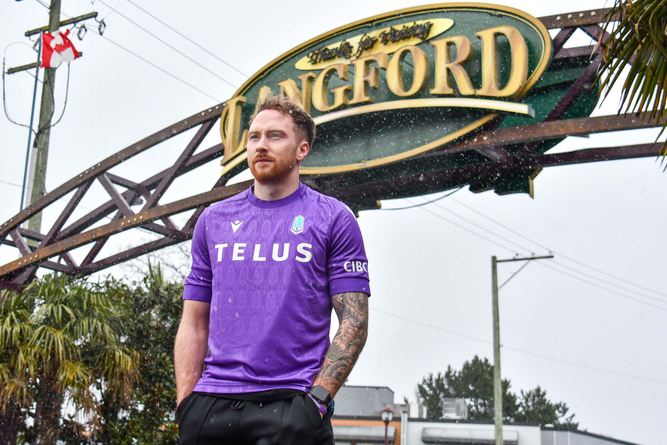
Valour FC
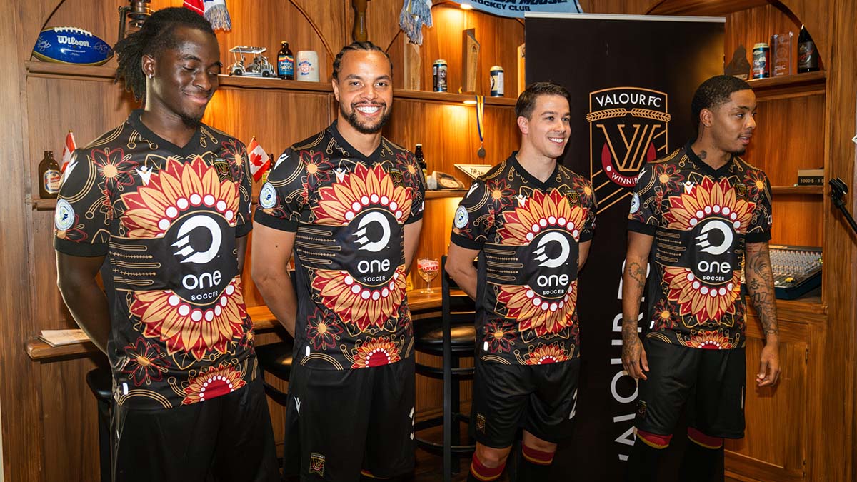
This is a tough spot. Valour FC is a team with one of the smallest fanbases in the league, and the marketing team seems to be as close to non-existent as possible, with limited resources from the ownership group. It also was the last team to announce its kit launch and did so in an underwhelming fashion compared to the rest of the league. Thankfully, the kits stand out enough that they should outperform the past few launches from the Winnipeg-based club.
The home kit is sharp. Inspired by the Winnipeg Fury, a Canadian Soccer League team that won the championship in 1992, Valour will hope that this kit inspires a similar miracle, as many people (including myself) are predicting that the club will finish last this season.
The away kit is where Valour really cooked, as it features an incredible design with a massive sunflower in the center and prairie crocuses dotting the four corners. The kit, much like Pacific FC’s, works to connect the club with the indigenous community. Throughout the kit, there are nods to indigenous art, science, and knowledge.
York United
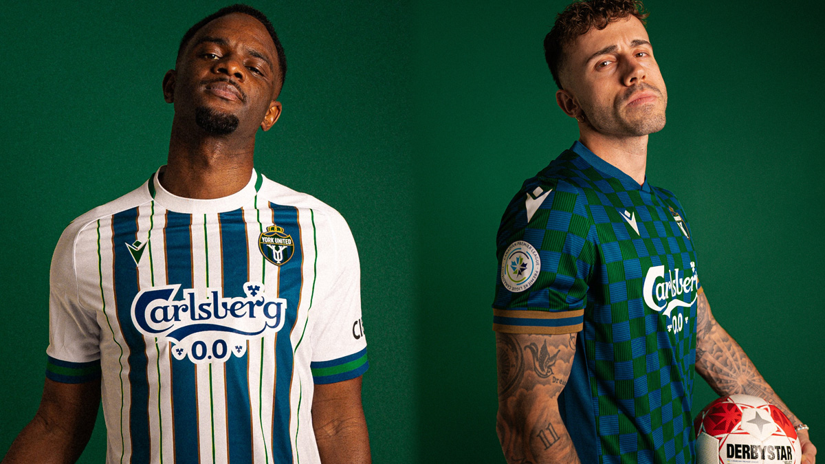
York United has undergone a very solid rebrand. After the first season disaster as York 9 (or Y9 as they were dis-affectionately known), the rebrand places the club into a very fashionable position. A good color scheme set up a myriad of fantastic design options, and York nailed it with two iterations of simple yet timeless aesthetics.
The home kit, with its multitude of stripes, is super sharp, and it was a nice touch to stop the stripes at the sleeves to allow the cuffs to be highlighted.
The away kit, with its dark blue and green checkerboard, is spicy. Dark blue and dark green are underrated, and I feel like this kit is muted yet interesting enough to be genuinely worn as a fashion piece. Size it up a few notches, throw on some baggy light-wash jeans and a pair of Sambas, and you will easily fit in at your local hipster pub. I know that isn’t a great measure of kit design, but this one would be in my closet if I didn’t hold allegiances within the league.
Special shoutout to using that color scheme with a sponsor like Carlsberg, who uses a similar dark green for the color of its bottles. Talk about brand synergy.


