The 2018-19 club season’s impending kickoff can only mean one thing — new kits. We take a look at some of the best, worst, and ugliest kits from some of the world’s biggest teams.
The end of one of the most exciting World Cups in recent memory has left football fans hungry for more. Thankfully, the 2018-19 season is upon us, with most major international leagues starting up in a matter of weeks. In addition to seeing the world’s best players back on the pitch, we’re extremely excited for the slew of new kits that have been unveiled. However, as usual, some are more worth getting hyped over than others. As such, we’ve reviewed them all and prepared a list of the best, worst, and ugliest kits headed in to the ’18-19 season.
The Good
Olympique Marseille Away Kit
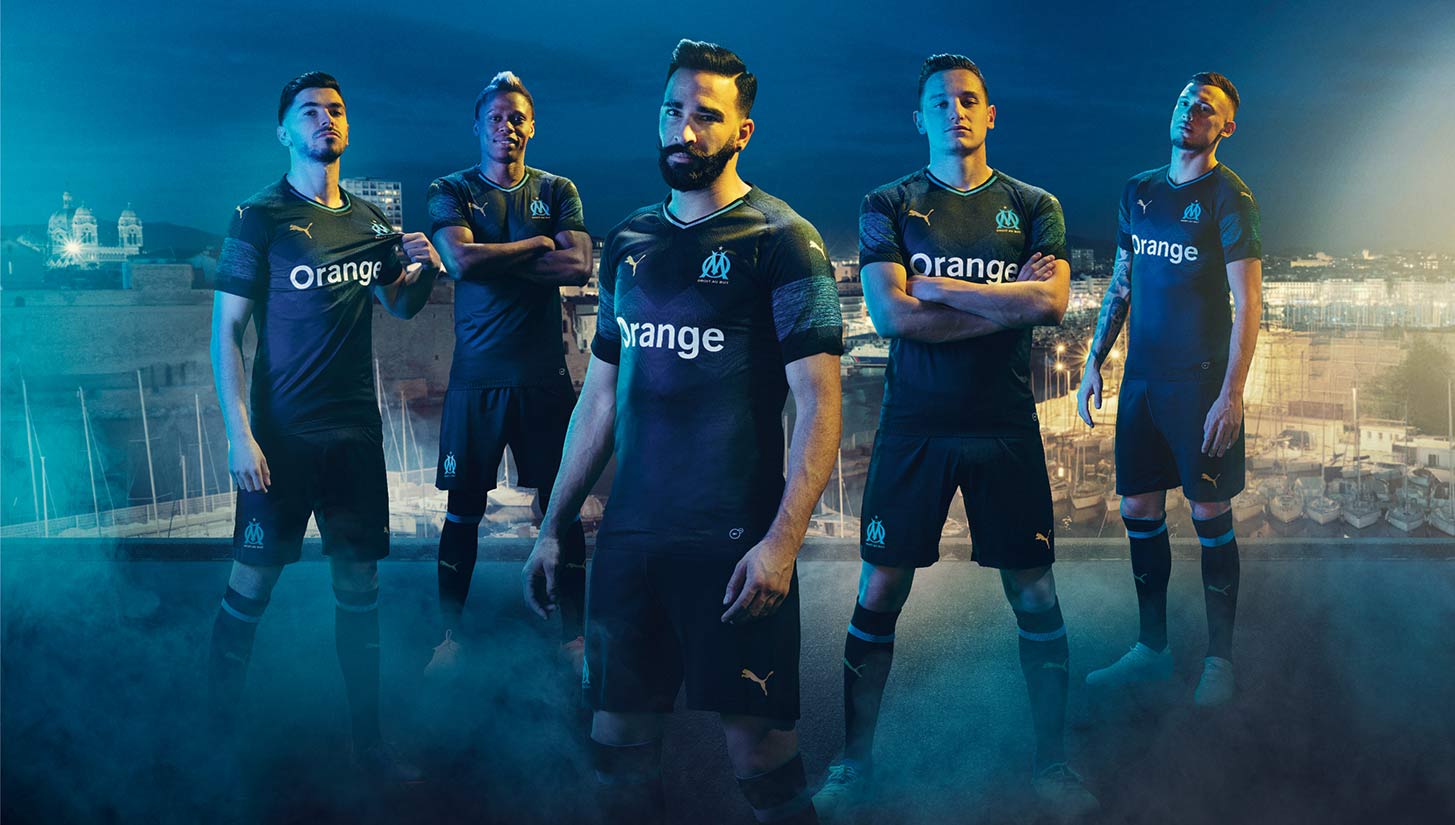
In its first season supplying Marseille’s kits, PUMA has struck gold. The away kit is particularly clean, with the black backdrop serving as a nice complement to the almost watermarked zig-zag pattern across the chest. The blue sleeves are a nice touch as well.
PSG Home Kit
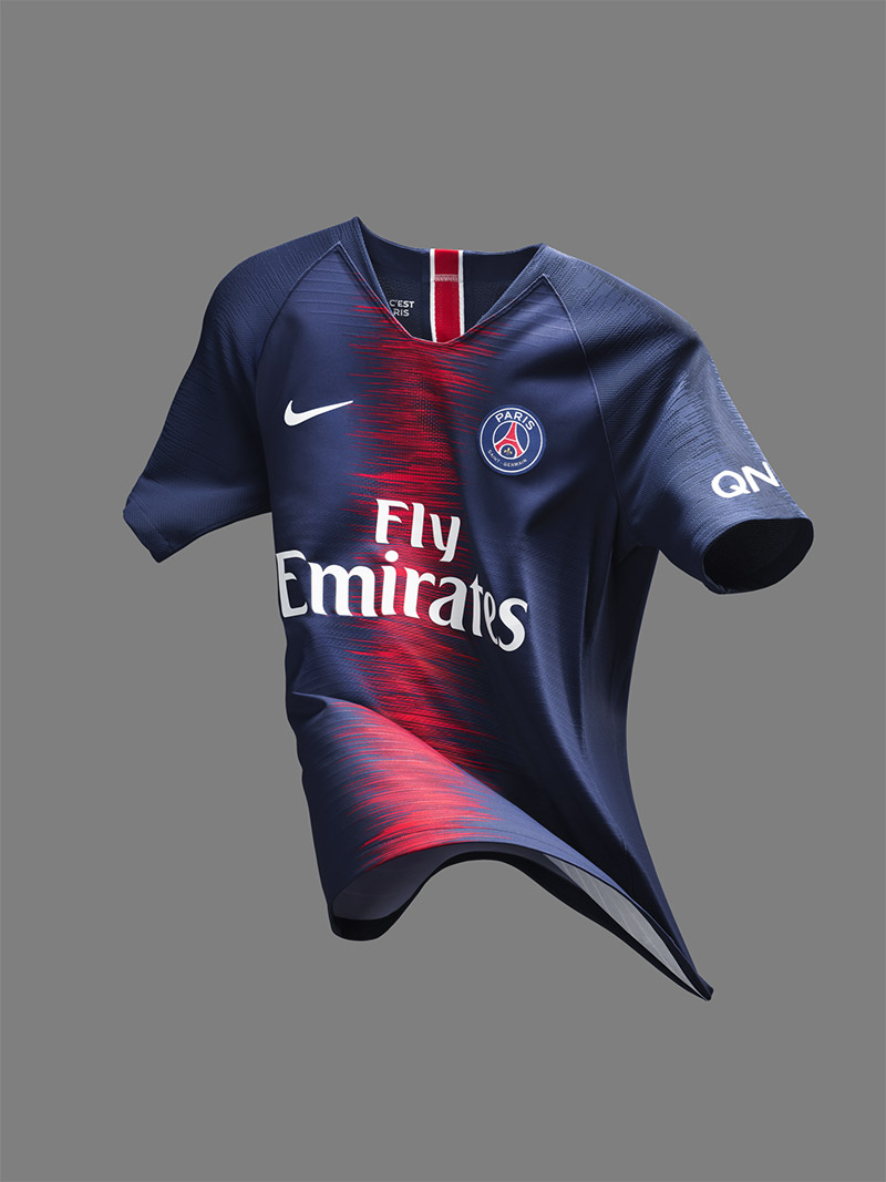
PSG’s newest home kit is a welcomed departure from their traditional jersey, with the classic solid red vertical stripe being replaced by a sound wave-esque line inspired by the buzzing atmosphere of the iconic Parc des Princes stadium. While the change may not be huge, it’s enough to make it look refreshing. Additionally, rumors of an Air Jordan set of kits has the inner hypebeast in us giddy with excitement.
Chelsea Home Kit
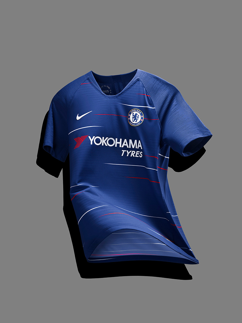
Chelsea’s new home kit generally borrows from the 2018 French World Cup away kit, which is not a problem. Play like a champion on the pitch, look good off it. Hopefully the French team’s style of play carries over to Chelsea this season as well. A big upgrade from last year’s rather plain kits, the ’18-19 home shirt takes inspiration from the beloved ones from the ’80s and ’90s.
Manchester City Home Kit
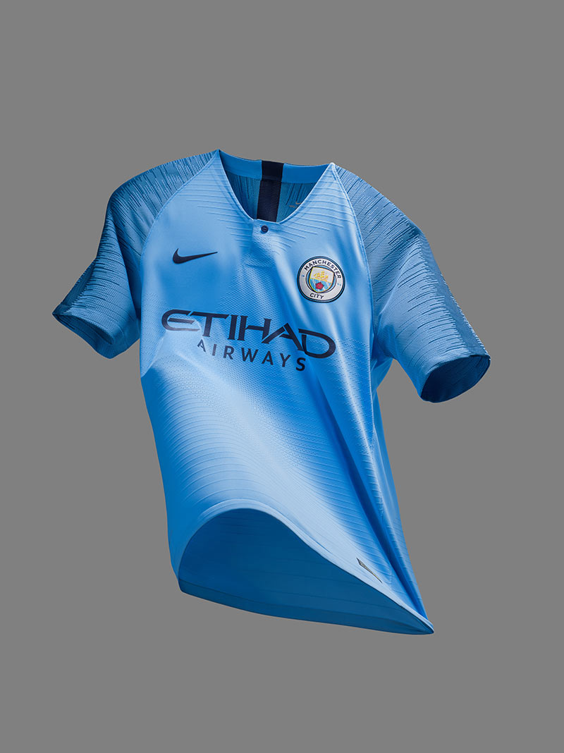
Like Chelsea’s, Manchester City’s home kit also borrows heavily from the 2018 French uniform. The sleeve design is fantastic, and gives fans a twist on another generally traditional jersey.
Blackburn Rovers Home
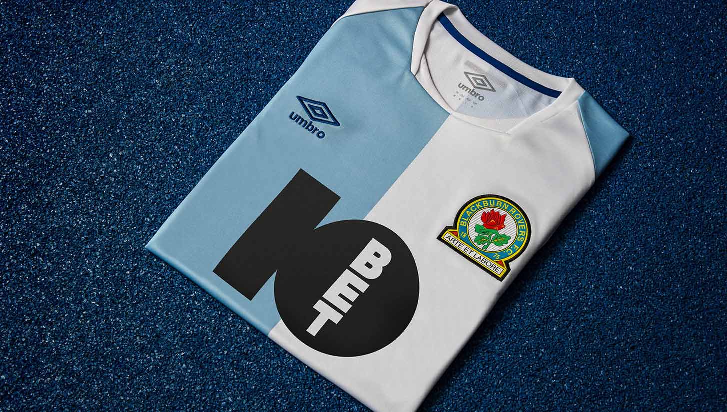
Simple and elegant, Blackburn Rovers’ home kits designed by Umbro are the epitome of the modern football shirt. Light and performance-ready for the pitch, and stylish and fashion-forward off of it. Brilliant.
The Bad
Barcelona Home Kit
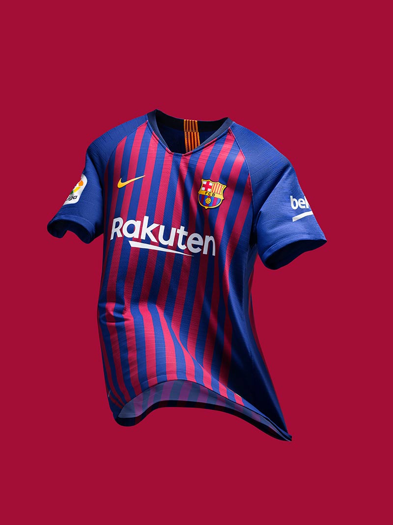
While there isn’t much that’s terrible about Barcelona’s newest home kit, there just doesn’t seem to be anything new. What’s the only difference, the sponsor? That’s not enough to entice fans to purchase the new edition of the kit.
Atletico Madrid Home Kit
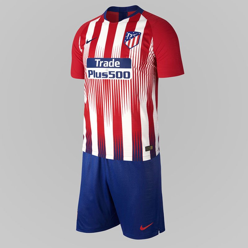
Atletico Madrid at least tried to shake things up with their newest home kit, however it didn’t quite pan out. The smaller stripes emanating from the center of the kit look like ripples on the surface of water.
Juventus Home Kit
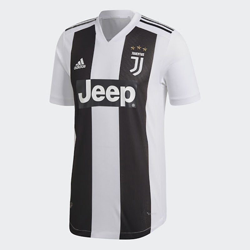
Like Barcelona, Juventus’ new home kit leaves a lot to be desired. There isn’t much changed from last year’s kits, and the few new additions are too negligible to warrant the purchase of a new kit from a fan perspective — unless of course you want a Ronaldo one, in which case 520,000 people did within 24 hours of the superstar’s signing.
The Ugly
AC Milan Away Kit
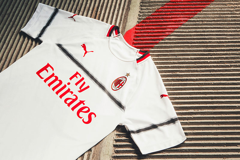
While the home kits are certainly nice, AC Milan’s away kit, in its first year of PUMA production, is absolutely horrendous. A black horizontal line is the only feature of the kit, with the line inexplicably continuing onto the sleeves, which just looks… weird.
Inter Milan Home Kit
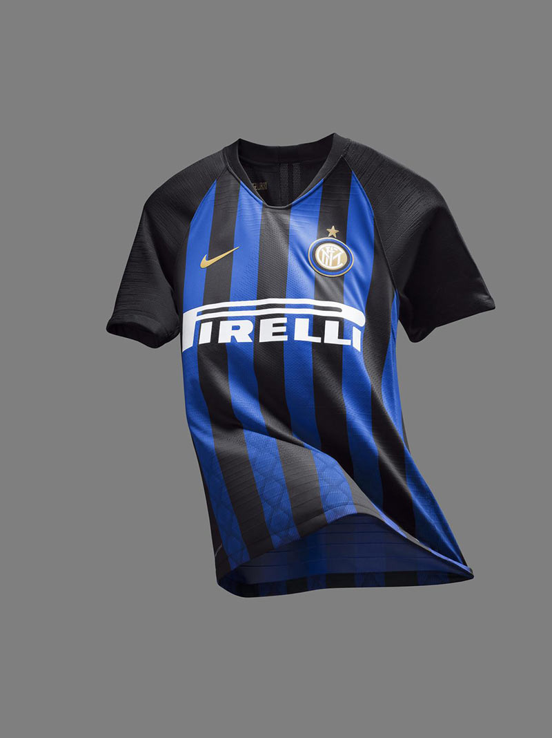
Inter Milan’s home kit for this year is subpar as well, with the bottom half of the jersey overshadowed by a random criss-cross pattern, which fades out halfway up the kit. While Inter has a traditional jersey and is looking to give it a makeover, this isn’t it.
Manchester United Home Kit
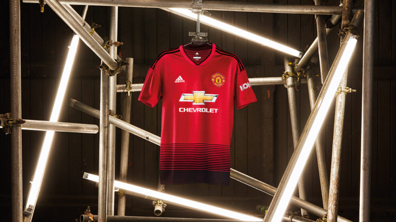
Manchester United’s new home kit is without a doubt one of the biggest eyesores that has dropped this year. The bottom of the jersey is solid black, and then transitions into solid red halfway up the kit. When paired with the team’s black shorts on the pitch, it looks as if the players are wearing their shorts tucked in too high a la Steve Urkel. Not a good look.
Napoli Goalkeeper Shirts
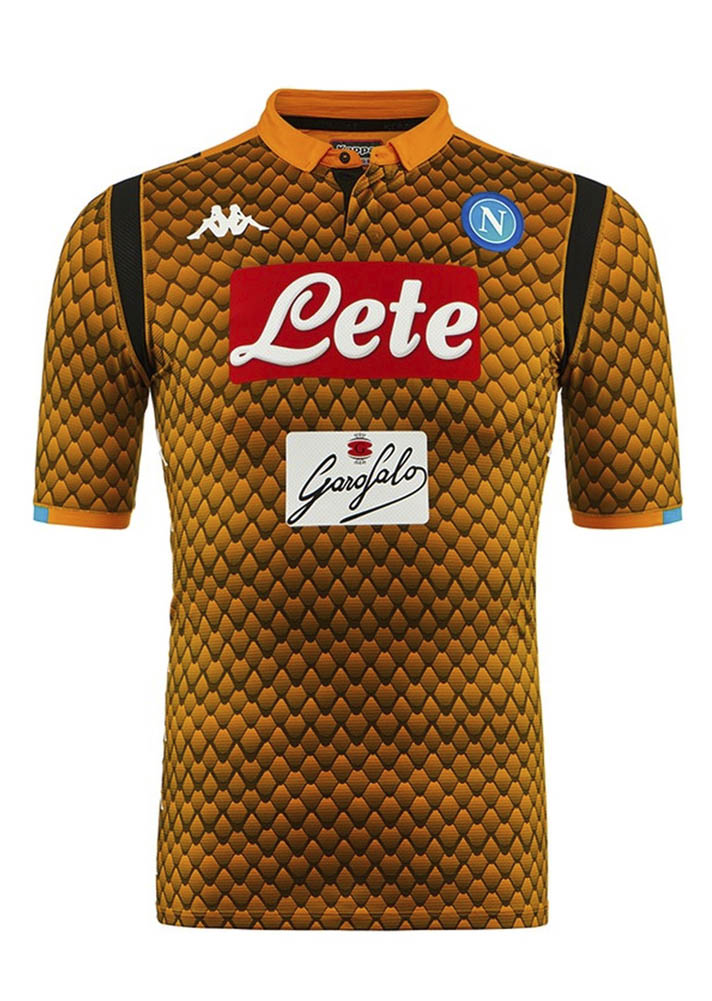 We’re all about taking risks, but it’s important to know that some can result in disaster. That’s the case with Kappa’s experimental goalie shirts for Serie A side Napoli. The 3D snakeskin print is enough to make you dizzy on its own, but the nauseating theme is completed by the ochre colorway. Kudos to you if you have enough swagger to pull this one off.
Which is your favorite/least favorite 2018-19 kit? Drop us a line in the comments below.





You guys have such a bad taste… you do like that terrible PSG kit (Chelsea is also awful) and doesn’t like classic kits like the new Juventus (beautiful), Barcelona and even called Internazionale ugly! My god…