While they certainly look striking from a distance, a closer look at Nike’s 2018-19 third kits will reveal several design features that pay homage to each club’s city. From aerial views to historical references, we take a look at some of our favorite third kits from the Swoosh.
Often more experimental than a home or away kit, a club’s third kit is a wild card, usually completely changing in design from year to year. After releasing a somewhat underwhelming third kit template last season, Nike has stepped its game up for 2018-19, providing each club with a unique jersey that honors the features and history of their respective cities.
While these design cues may not be instantly apparent upon first glance, further examination will clearly bring each cleverly disguised feature to light. From the mythical AS Roma to the icy Chelsea, we take a look at the meanings behind some of our favorite Nike third kits from this season.
FC Barcelona
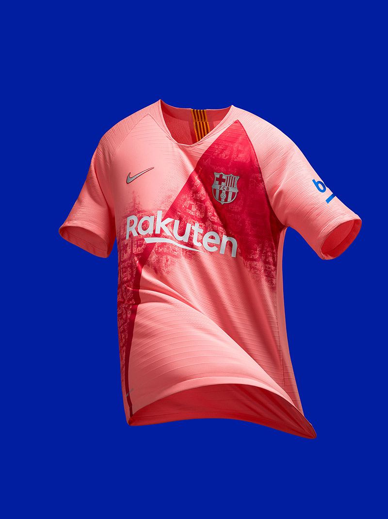
In a stunning red-pink gradient colorway, this is one of the best Barcelona third kits we’ve seen in some time. While it may look like a series of simple squares, the jersey’s pattern is based on an aerial view of the Catalonian city — which if you haven’t seen before, is pretty breathtaking.
Inter Milan
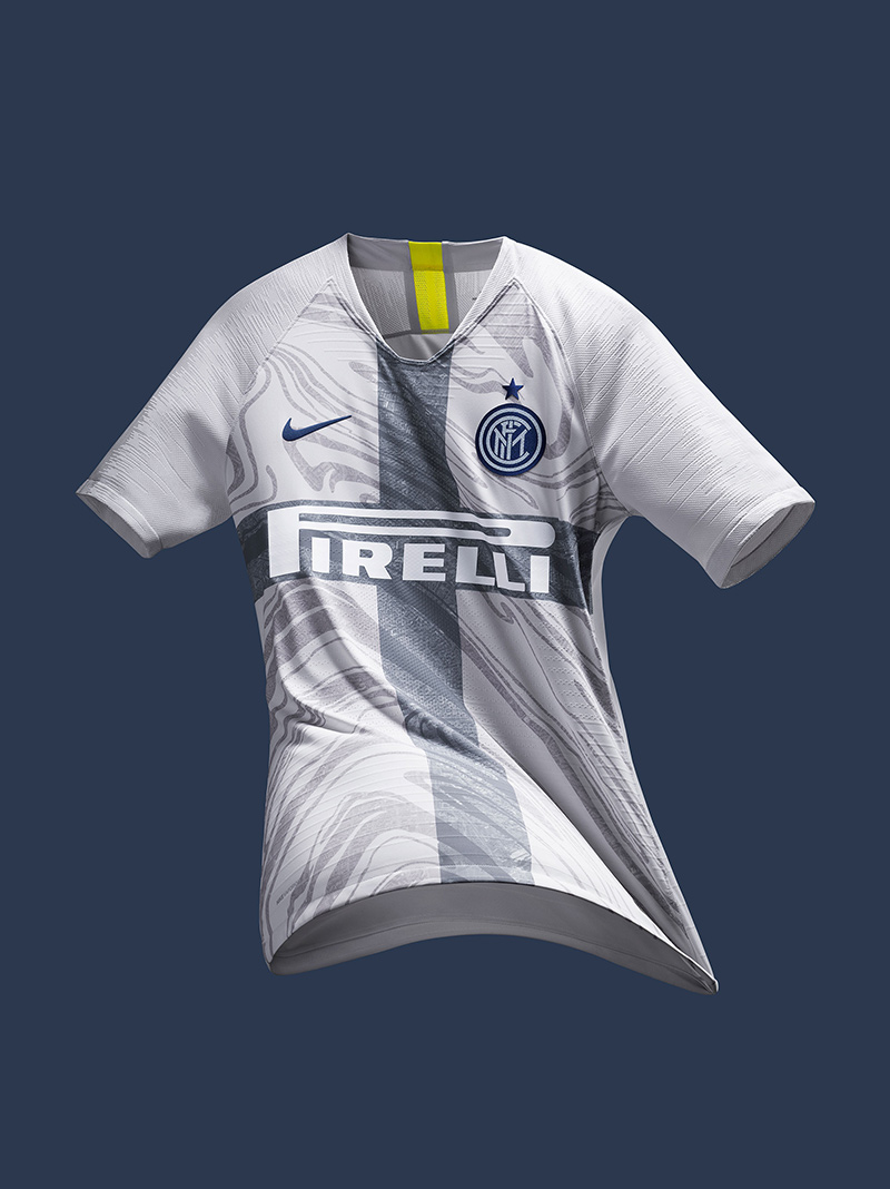
There’s levels to this one. While the Inter Milan third kit’s swirling pattern may be an obvious reference to the marbled floors of iconic landmarks such as the Duomo di Milan Cathedral, a distorted aerial view of the city is hidden within the swirls as well. In addition, the gray cross at the jersey’s center is representative of the Cross of St. George, which is displayed on both the city’s flag and coat of arms.
Chelsea
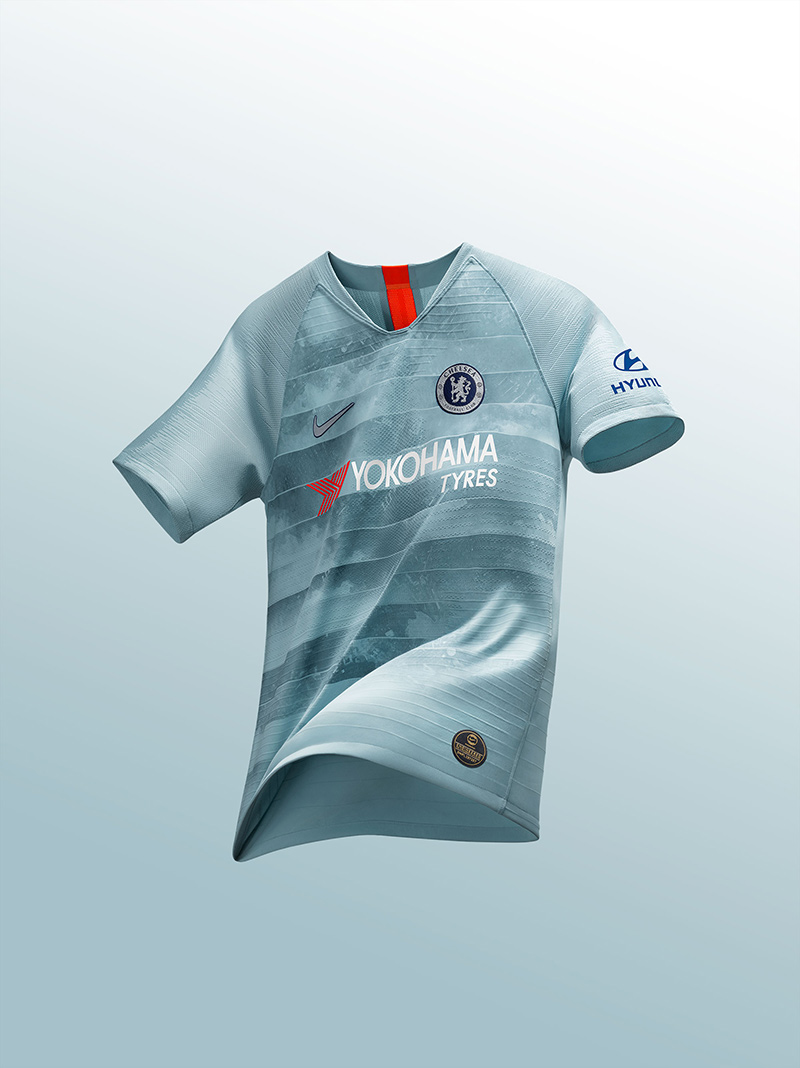
Like the previous two kits, Chelsea’s third kit features an aerial view of its city camouflaged into an ice-like pattern. However, what Chelsea’s kit has that no other does is a NikeConnect badge, which fans can scan on their smartphones to access exclusive products and content. Present on its NBA jerseys, Chelsea is the first football kit to receive NikeConnect treatment.
Tottenham
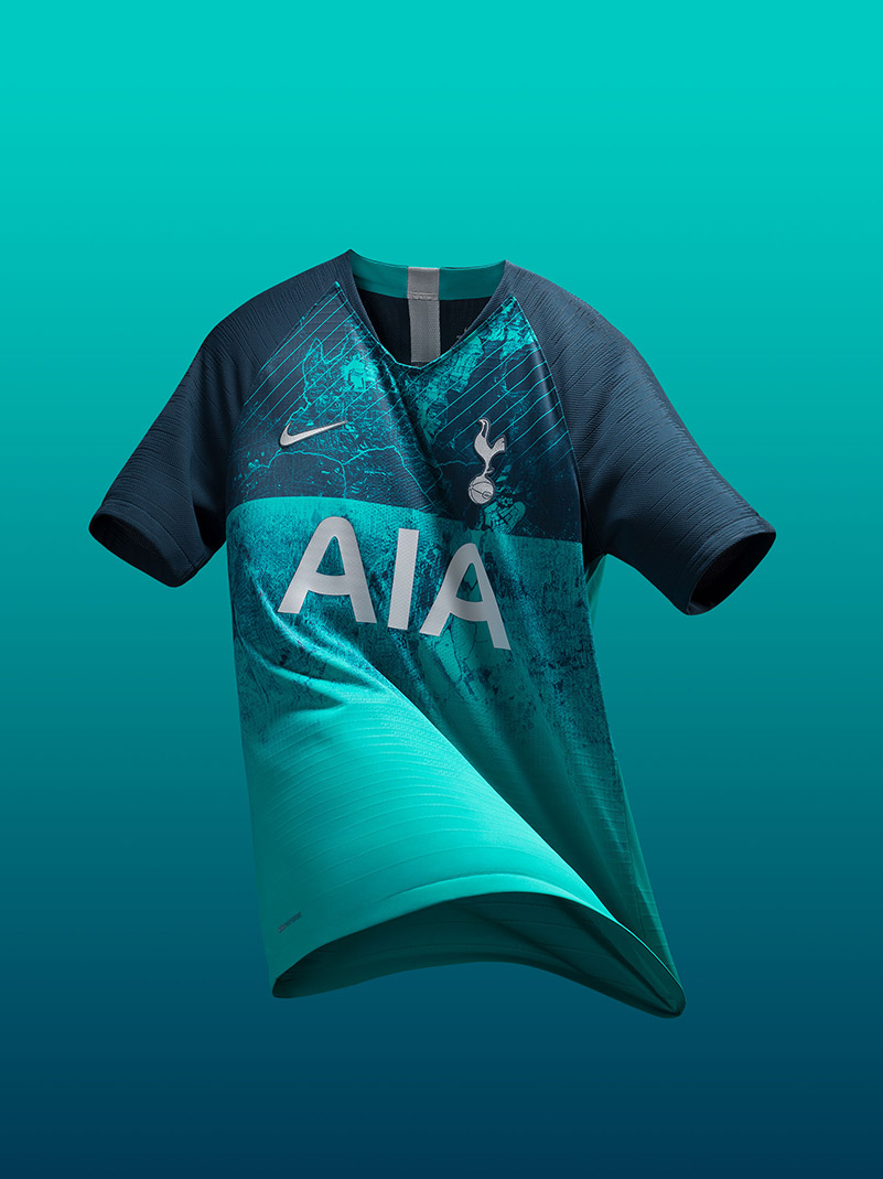
Perhaps the boldest and loudest of Nike’s 2018-19 third kits, Tottenham debuted these striking jerseys in their season opener against Newcastle United. Like Chelsea’s, these kits pay tribute to the city of London, more specifically the Borough of Haringey in which the club is located. Another hidden wink at history is the jersey’s colorway itself, which is based on the logo of Charrington Brewery, which owned part of the land where the team’s new stadium is built.
Atletico Madrid
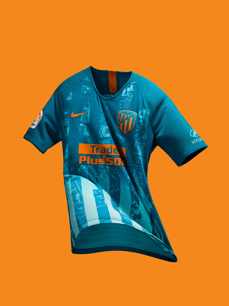
Madrid’s Fountain of Neptune is not only a popular tourist attraction, but it is a central figure in the city’s football culture. Fans gather around it to celebrate big victories, making it a place associated with success and fond memories. Nike has taken these feelings and infused them into Atletico Madrid’s third kits, featuring a two-toned blue inspired by the fountain’s water, and orange highlights inspired by the unwavering Madrid sun. As per usual, an aerial view of the city center is placed within the jersey’s stripes as well.
AS Roma
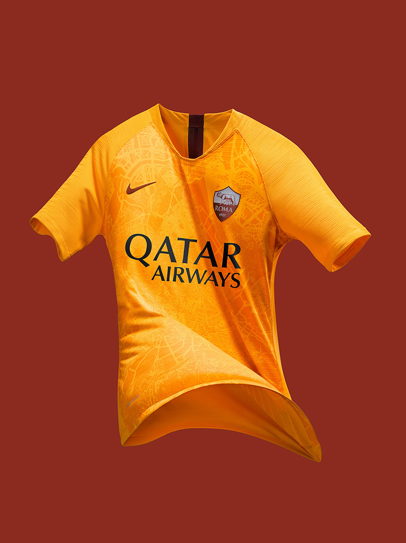
When it comes to historical significance, Rome is in a class of its own. Instead of a satellite aerial image, Roma’s third kit features a map of various significant moments in the city’s history — from the days of the ancient Roman empire to today. Despite the new additions, the kit holds on to the classic simplicity that we have come to love from Roma, making this jersey truly a beauty to behold.
Which 2018-19 Nike third kit is your favorite? Let us know in the comments below.


