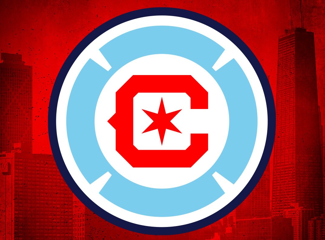
The Chicago Fire officially unveiled a new logo last week, marking the club’s second rebrand in two years. But while the first one went awry, it seems as if the club has hit the mark this time around. We take a look at how the Fire learned from their mistakes, and what it means for a franchise in a tumultuous stretch.
The Chicago Fire did something few sports teams in the United States do — listened to its fans. After a universally panned rebrand in 2019, when the club changed its historic and beloved fire engine crest to an oval-shaped bland one, the front office quickly realized the mistake it made and got to work on creating something that the fans could identify with.
View this post on Instagram
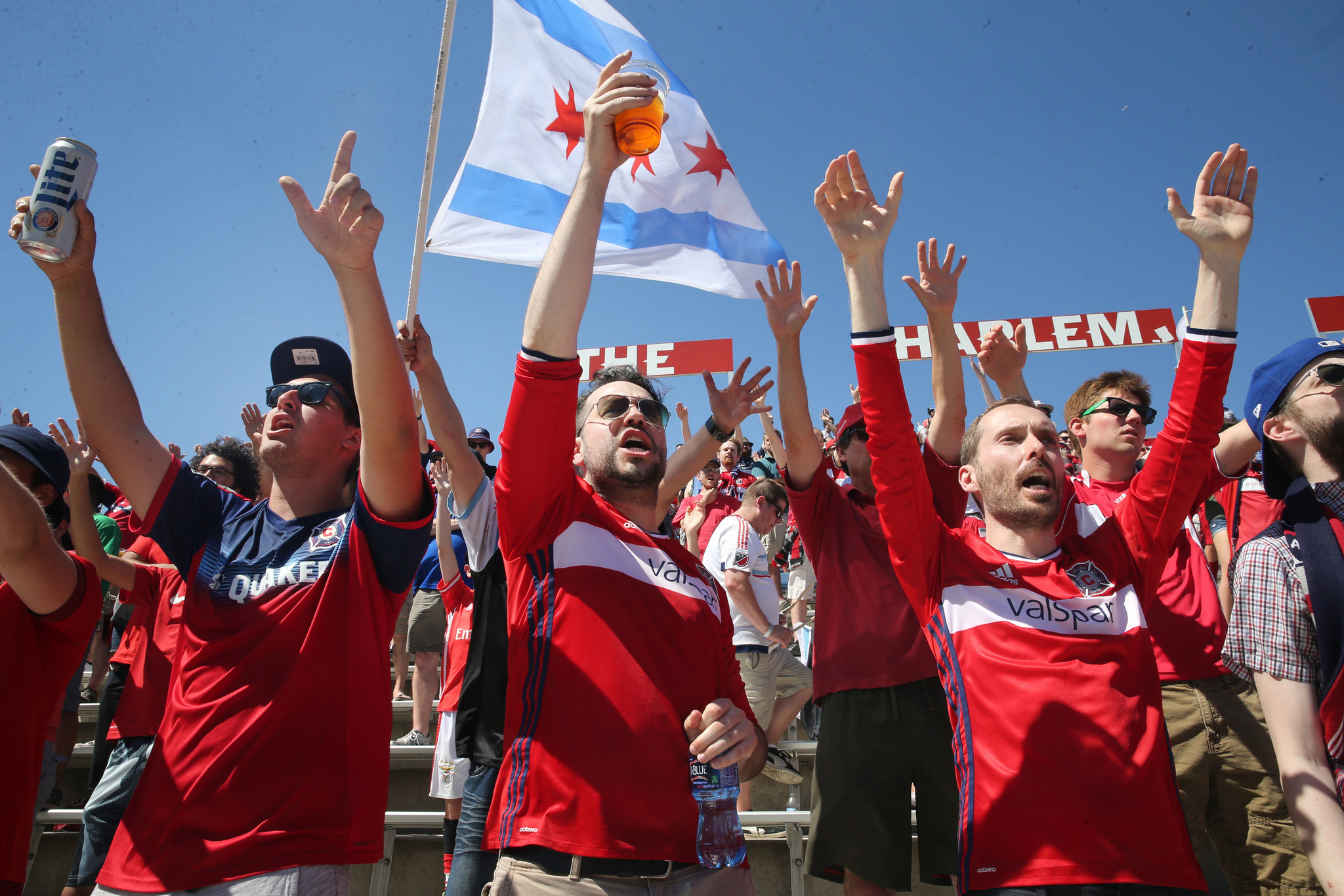
Many Fire fans adored their fire engine crest, which had been part of the club since its inception in 1997. One of the most unique looks in the league, the rebrand to a new crest was something no one really asked for. Yet front office arrogance and MLS’s unfortunate trend to rebrand almost anything led to a decision that felt like a punch in the gut to fans and a hit in the wallet to those same front office decision makers.
The social media bashing was nearly immediate upon the oval crest’s reveal. And while you’d be hard-pressed to find anything that wasn’t criticized on Twitter, few have received the nearly universal vitriol that the 2019 crest did. It was at least nice to see that our country could still unite over something.
Most importantly, the rebrand was disliked by the only people that matter — the few fans that still go to Fire games. The Chicago Fire have a lifetime average attendance of 15,510 fans per game through 2020, and this year are posting their worst season at the gate with an average attendance of 9,052 as of October 13. While the pandemic has surely played a factor, this season’s attendance has been by far the worst in club history. To say that the Fire have become irrelevant is an understatement.
The failed rebrand is far from the only problem the club has faced in recent years. Shortly before the oval crest was revealed, the Fire announced their decision to move out of their soccer-specific SeatGeek Stadium in Brideview and back to Soldier Field, in an effort to be closer to the city and a bigger fanbase. The move has not worked out, and the already dwindling attendance numbers have plummeted even further, made more noticeable by Soldier Field’s 60,000-plus capacity.
All of this coincides with the purchase of the club in 2019 by billionaire Joe Mansueto, and while on paper he has big aspirations for the Fire, that has not yet translated to the field. In 2021 the Fire sit 12th in the East, losing 16 of 29 games, and recently announced the termination of head coach Raphaël Wicky.
New owners buying clubs in dire need of a boost is a pattern the league will continue to see. It happened in Columbus, which to the Fire’s delight quickly became the new worst rebrand in league history, in Houston with the Dynamo, whose quasi-baseball logo rebrand was a bit more successful, and it could happen to Real Salt Lake, who is currently up for sale. While RSL doesn’t need a rebrand when it comes to logos, a brand refresh may not be a bad idea given the club’s recent maligned history.
A Rebrand for a Club in Limbo

Enter the new Fire crest, and this time the club got it right. Working together with supporters, designers, and the community, the new Fire badge is a tribute to the past that still looks towards the future. The Fire enlisted rebrand extraordinaire Matthew Wolff to help with the new crest design, in addition to actually taking the time to listen to its community for feedback. Wolff is famously behind the design of the 2018 Nigeria national team kit, and has also designed crests for the likes of LAFC, Oakland Roots, NJ/NY Gotham FC, and plenty others.
It’s an objective step up from the previous rebrand, and while we get another new color scheme based on the flag of Chicago, the red “C” and surrounding powder blue florian cross are both reminiscent of the original badge. Once again, the Fire have one of the nicest crests in the league.
Unnecessary rebrands have become the norm in MLS, with Club de Foot Montréal perhaps being the best example of rebranding for rebranding’s sake. Still, done correctly, a good rebrand can revitalize a club, as was the case for Sporting Kansas City, and for the Fire brass, this rebrand will hopefully give the club a much-needed uplifting.
Looking Ahead

With a crest in place that fans can get behind and a return to the heart of the city, the rock bottom Fire now have a chance to rebuild their brand. The club at the moment has no coach, everyone on its roster is subject to transfer or trade — even the 3 DPs — so the Fire and their new owner sit on the cusp of literally starting from scratch.
For a fan base that has had to endure an unnecessary rebrand, leaving the stadium that was built for them, and one of the worst seasons in team history, the time is now to return the Fire brand to what it once was — an MLS Cup and Supporter Shield winner that also claimed four U.S. Open Cups.
After all the press releases and all the likes and retweets, now comes the hard part, the only part that matters — can the Chicago Fire use this bit of momentum to get it right where it matters most, on the field?


