As more teams embrace their retro kit heritage, we take a look at seven designs that we’d love to see release in 2022. While it’s unlikely we’ll see any of these make a return, what better time is there to be optimistic than the beginning of a new year?
If 2021 was a fine year for kits, 2022 needs to be even better. And an easy dub for football clubs is to run it back with their vintage drops. While retro and retro-inspired is on the verge of being played out, when done tastefully, there’s nothing that can evoke memories of iconic moments and players like a classic kit design.
With that in mind, we decided to pick a host of non-cliche retro kits that would make for fire comebacks. You’re welcome.
Bayern Munich 1993-95 Away
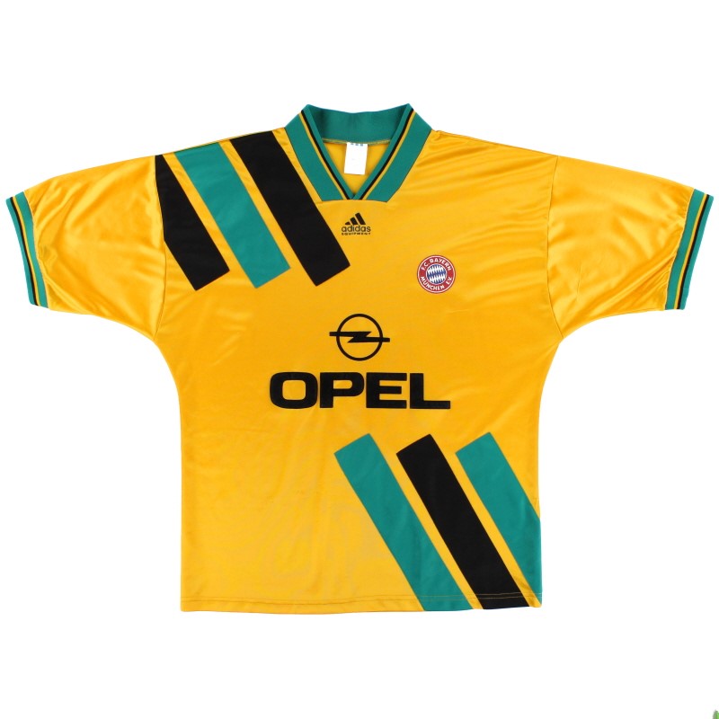
Bayern Munich rocking yellow is enough of a statement for this strip to make a remontada. A tremendous adidas EQT drop, this may be the most slept on offering from the entire early ‘90s collection.
Reminiscent of the iconic Jamaica home shirt from the 1998 World Cup, a certain Lotthar Matthaus used to touch down in this classic on his way to winning the Bundesliga. Like all great shirts, it’s the details on this number that make for chef’s kiss moments galore.
Let’s start with the three stripes on the shirt. The trademark EQT triple sash disconnects in the middle to make room for the sponsor, and the color switch from the top to the bottom is an incredibly nice touch. The current adidas EQT template only has the stripes on the shoulder, and it’s desperately missing the complementary half on the bottom.
The collar is one of the only examples in the history of fashion where V-necks don’t look horrendous. Add to that, the teal accents play surprisingly well with the yellow and black, something we’d go on to see more of with the LA Galaxy just a year after this strip was retired.
The Opel sponsor is a reminder that even when you’re talking football, there is always space to bring up the fact that no one makes cars quite like the Germans.
And that rich Pikachu-esque yellow color never tries to be subtle — even if it is reminiscent of Bayern’s arch rival in Dortmund. With the club still rocking adidas kits, there is no reason why we couldn’t see this drop in 2022. You know you’re copping this if Serge Gnabry and Leroy Sane model this kit drop.
Manchester City 1997-98 Home
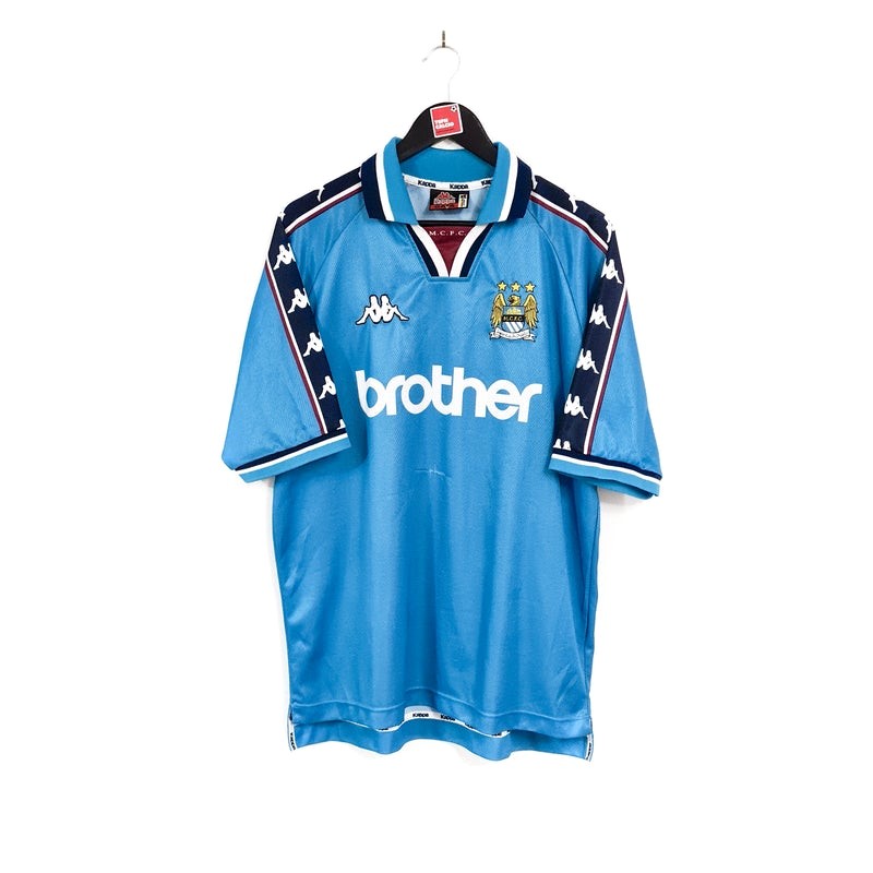
Just look at it and try saying this kit doesn’t need to come back like Manchester City did against QPR. This is the era when Kappa was in its prime, and the Italian brand was cooking up a storm with drops like these.
We have to talk about the logo taping going down both sleeves. Streetwear brands have brought back this particular design choice, especially when it comes to tracksuits, but Kappa was running with this wave in the late ’90s.
The mix of the claret and white across the arms is a subtle touch that catches your eye if you’re a kit connoisseur. And whether or not you’re a fan of the unique neckline doesn’t matter because it screams “Championship ’90s center back,” very on-brand considering that’s where City was rubbing shoulders three decades ago. Or, you could just see it as the closest version of a cravat, but for a football kit.
It’s not like the Brother logo can make a return, but this sponsor is easily the club’s best and most recognizable to those that have always worshipped the best league in the world. And while the old Sky Blues logo is a classic, the latest version is tasteful in its own way which makes a 2022 rerun a must.
Ruben Dias barking orders all game while adorning this number for its 25-year anniversary? You’d love to see it.
And while PUMA may not be too keen on rehashing a design from a rival brand, we’re sure Kappa would be able to mimic this template for one of its clubs…say Venezia FC?
Paris Saint-Germain 1999-2000 Away
If there’s a club that doesn’t need a drip advisor, it’s Paris Saint-Germain. But even the best could do with some advice from time to time.
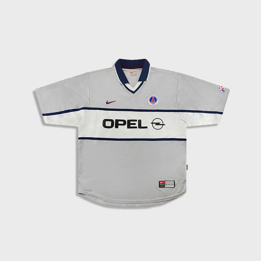
There’s no reason why silver kits should be so rare, and that’s why the Parisians should look into dropping this in the first place, seeing as they specialize in creating their own lanes.
And then there’s the twin navy blue lines across the shirt that make the white element in the center stand out, with the Opel sponsor taking you back to the time when PSG became the kings of kits. For anyone that doesn’t quite understand how synonymous the Opel brand is with the French outfit, do a quick “PSG retro kits” Google search and you’ll see.
The navy blue makes for a very smart collar, and paired with the white V-neck, we get a supremely tidy shirt in the club’s primary colors. The cherry on top is the red piping right inside the collar — an essential color that goes hand in hand with PSG.
The throwback orange Nike Swoosh on the inner collar tag just hones in on the point that it’s always been checks over stripes for Paris’ finest.
As much as we’d want, the vintage textual PSG logo as well as the classic crest cannot make comebacks. But a kit that is minimalism as its finest certainly should. The Ligue 1 heavyweights aren’t scared to make statements, but taking a low-key route with an away kit would be an interesting change for what is the flyest club on the globe.
Arsenal 2005-06 Home
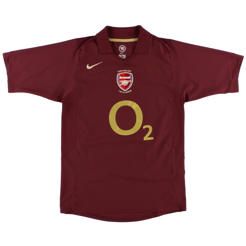
It might scare some that 2005 has entered the realm of retro, but once you get over your newfound sense of mortality, you can then appreciate one of the greatest kit designs of all time.
Untraditional yet also an ode to the club’s roots, Arsenal’s “Redcurrant” kit may very well be the finest in its storied history. A final tribute to Highbury before the club moved to the Emirates, the deep burgundy hue and gold accents are a feast for the eyes. Ditching the usual red and white color scheme was a risk that paid off fabulously for the North Londoners.
To be fair as well, Arsenal are very in touch with what makes them great, with the Hale End posse taking the Premier League by storm. Bukayo Saka and Emile Smith Rowe rocking the Redcurrant kit and doing a synchronized celebration with the fans is football ‘eritage in 2022. (Shoutout Mourinho.)
Get Hector Bellerin to fly back from Spain just to model this kit because…well why not?
The Arsenal U-15s wore a Teamgeist top in a game in 2021. If that’s possible, Saka and Smith Rowe can run it back to the Highbury days when they were young lads themselves, watching Thierry Henry and Robert Pires balling out in burgundy.
Even if it’s just for a game. Make. It. Happen.
Ajax 1996-97 Away
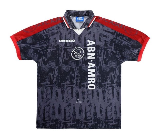
This isn’t just a kit, it’s a piece of art. The illustrations of the club as well as the symbolic imagery related to the Dutch outfit is genuinely breathtaking.
The dark grey color adds a sense of mystery to this number and considering the illustrations on the kit, it almost never tries to catch the eye because there’s so much going on anyway.
The Ajax crest in white not only looks super tasteful, but adds a cracking contrast to the dark tone of the kit. The name of the club written in a tiny, minimalistic font is a subtle, yet neat touch once again.
And the red sleeves are design choices that prove Umbro refused to follow the rules. With everything else going on with the shirt, it’s a miracle that the bright red accents don’t take things too far over the top.
The dark grey print that simply says A.F.C Ajax on both arms is yet another distinct nod to the club, a theme that has been followed throughout the making of this kit.
The collar, much like the kit has illustrations of all kinds that make this one of the most authentic away strips in ages.
Give Sebastian Haller and Antony this drop and a photoshoot ready ASAP.
Porto 1997-99 Away
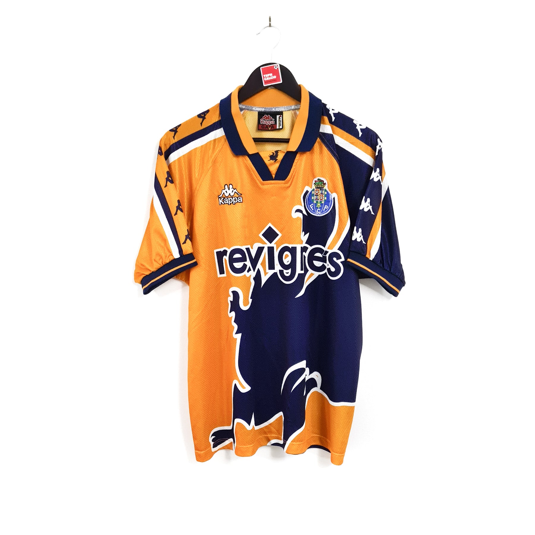
1997 was a good year for Kappa. There’s plenty going on with this strip from FC Porto, but let’s start with the element that is right in your face: the dragon. Porto, nicknamed as Dragões, have always used the creature as a symbol of the fighting spirit of the club as well as the city itself.
Another detail that sets this kit apart are the differently colored sleeves that feature the signature Kappa taping in alternate switched colors as well. An innovative feature that you don’t see too often by today’s design standards.
The Portuguese side are sitting pretty at the top of the league and look dead set to win their 30th Primeira Liga title. Back when the ’97 drop was released, Porto went on to win their fourth league title in a row.
Just drop this for the 25-year anniversary as the fans can rock this kit after potentially lifting another title, dressed for the part from day one.
Borussia Dortmund 1998-2000 Home
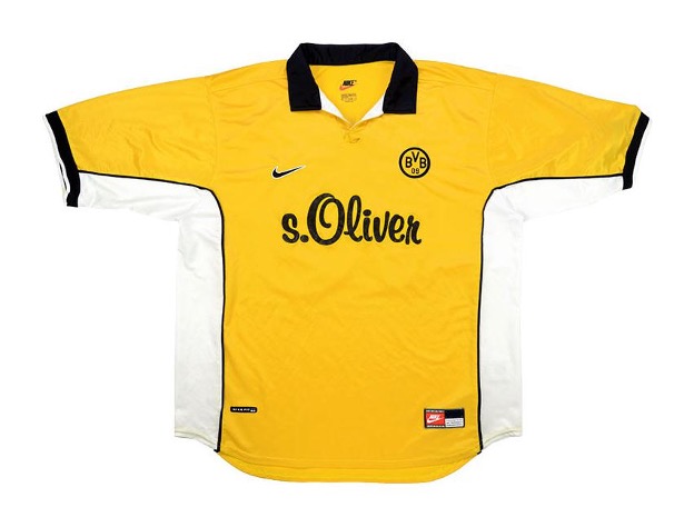
We’ve got to show home kits some love here, and this is one of the cleanest strips in Borussia Dortmund history. The golden yellow color matched with the vintage fabric of this shirt makes it an instant summer vibe.
The black piping across the strip is a feature that tributes the club colors in excellent fashion. There’s a dominant white element to this shirt, which is quite rare for a Der Borussen kit, but it adds that certain something that sets it apart from even the more iconic shirts in the club’s history.
The thick black and white element on both sleeves catches the eye and once again, reiterates the point that home strips are all about the finer details. Go overboard and you’re going against the colors the club stands for; stick with the same old and you’re being awfully boring. Nike found the sweet spot with this one.
Much like the 1997 neon away kit that Dortmund wore as a one-off last season, this home strip needs to be brought back in 2022.


