From new classics to iconic retro beauties, Inter Milan has some fantastic kits in their history. These are the best.
In the Chinese zodiac, 2025 is the year of the snake, and what better way to celebrate than to dive into the best kits of Internazionale Milano. Milan has close ties to the snake thanks to the biscione, which is the symbol of the city and appears as a coiled viper in the Milanese heraldry and across historic iconography and crests throughout various city landmarks. Inter have adopted the symbol as part of their identity as well.
The snake has been prominent in the club’s history for a long time, featuring on kits and crests throughout their existence. And with Inter’s significance in football comes some spectacular kits that fans revere and collectors long to get their paws on. But which kits are the club’s best? Note: it was much harder than you think to narrow down a list. In no particular order…
2009-10 Home

The main reason for including this one is that Inter obviously won the treble this season. But there’s more to this beautiful shirt than the trophies won while wearing it. The simple template and structure is fantastic and timeless. It helps that Diego Milito, Wesley Sneijder, Javier Zanetti, and Samuel Eto’o wore it as well. All in all, a good year for Inter and a great year for kit nerds.
2021-22 Home
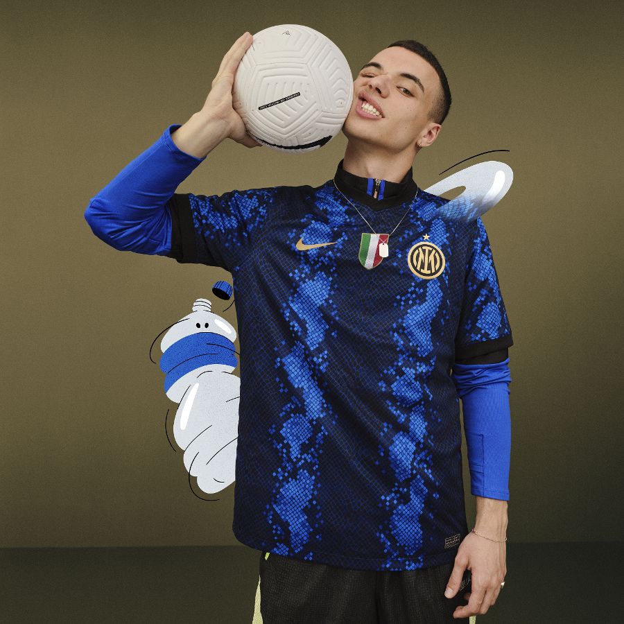
Remember that snake history lesson from earlier? Well, this links nicely. The 2021-22 Inter home kit is centered entirely around a snakeskin aesthetic. Now, it’s not your typical Inter shirt. First off, there are no overt stripes. Instead, we get a darker shade of blue snake scales down the middle. But the shirt itself is lovely, regardless of its atypical style. The cuffs and collar add a hint of the black we’re used to seeing on an Inter shirt and the gold badges finish off the shirt nicely. It’s a daring design, but one that paid off.
2019-20 Third
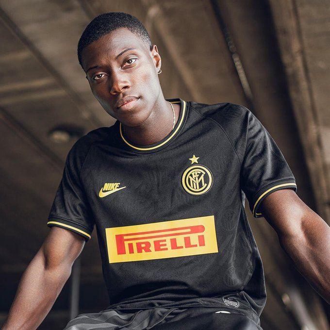
This shirt was beautiful. It celebrated the club’s long-standing and iconic partnership with sponsor Pirelli, and was inspired by the brand’s racing heritage. With a black base and yellow details, it was a nod to the tire company and was complemented by a wider release focused on racing. Whether or not you like the background inspiration or the creative approach, you can’t deny that this shirt is just delightful to look at.
1997-98 Third
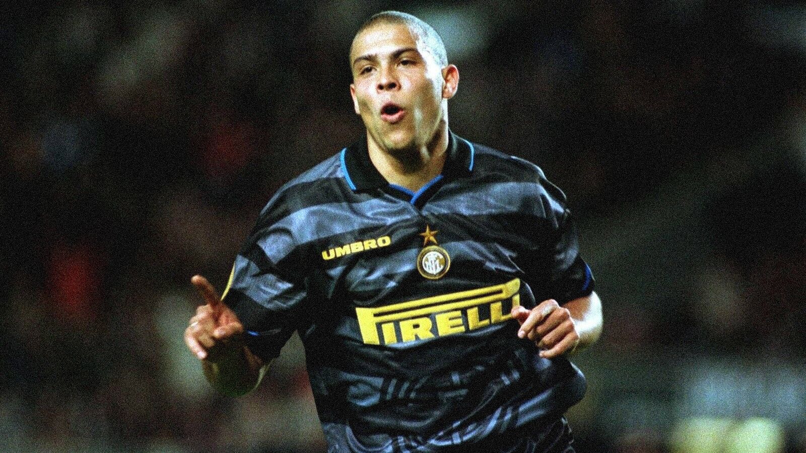
Now we’re getting nostalgic. This third kit is the fan favorite grey hooped shirt worn famously by Ronaldo and Co. It’s one of the most talked about Inter kits and for good reason. Featuring a faint Inter crest on the body, the shirt is cemented in Inter’s history when they won the UEFA Cup after beating Lazio in the final. The Nerazzurri won 3-0 with R9 scoring the third leading to those iconic shots of the Brazilian with the trophy held above his head.
1999-00 Home
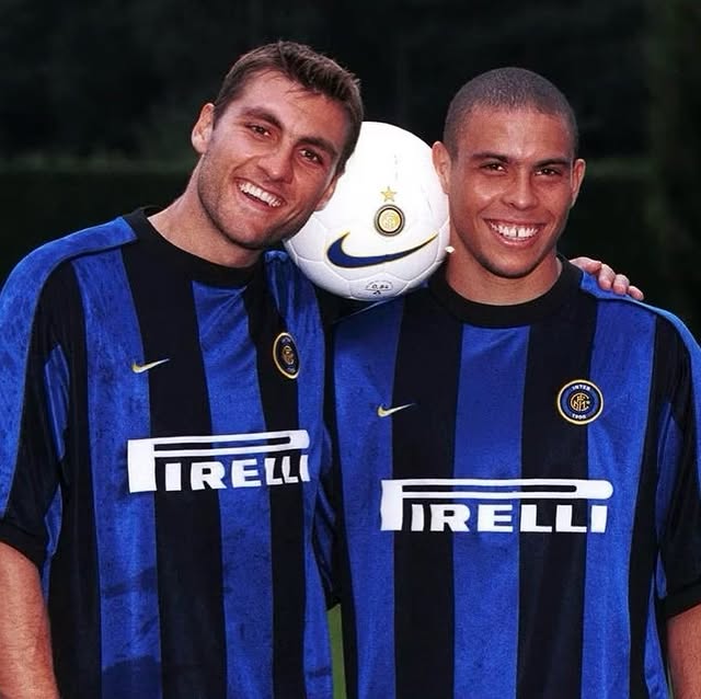
Everyone adores the 1998-00 Nike Brazil kit that featured in the ’98 World Cup final, and this Inter kit uses the same template. Just as nice (if not nicer) and also worn by R9, the baggy fit with simple black and blue stripes has become an iconic look.
1995-96 Away
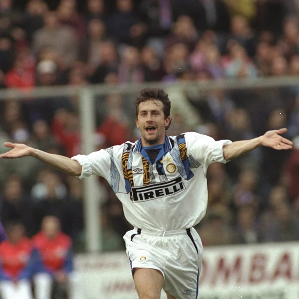
This one is included entirely because I like how bold it was. The shirt features a white base as a lot of Inter away shirts do, but follows a more chaotic path than most others. The Inter crest is fragmented across the chest, offering a very ’90s aesthetic that seems to have aged very well given the longing for nostalgia we all have nowadays. A kit that many unbearable folk would class as a great “festival shirt,” this Inter kit is a hipster’s dream and makes the list on its standout approach.
1993-94 Home
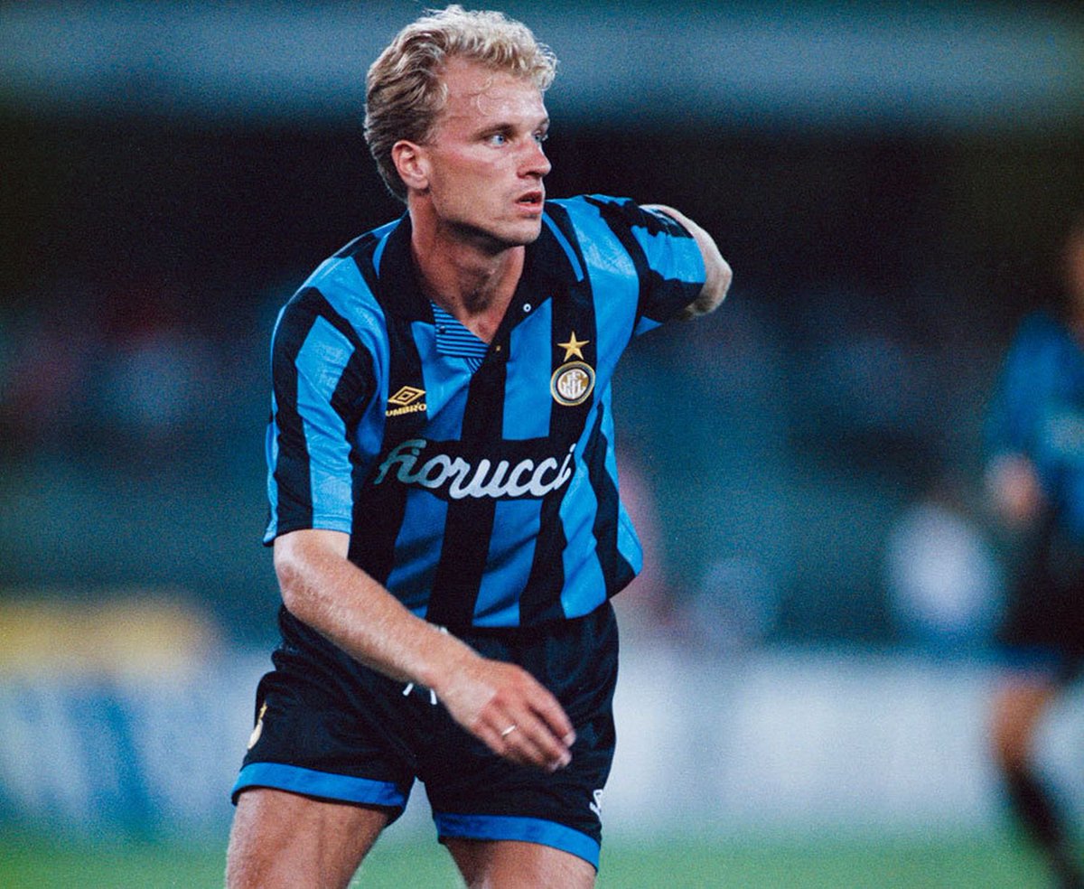
This is just a straight-up classic. Umbro were superb at Inter shirts and this is one of their standout designs. It’s stylish and oozes class. The collar is a really smart addition and the shiny material with a sublimated pattern is wonderful. And when a player as elegant as Dennis Bergkamp is wearing it, it looks even better.
1965-66 Home
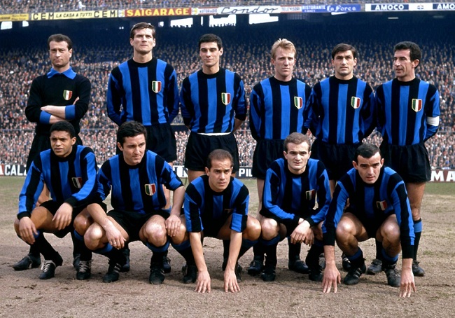
The 1965-66 shirt is probably the most straightforward kit on the list. It’s black and blue stripes on your typical of-the-time cotton base. The reason it makes this list is because it’s the type of shirt that epitomizes Inter. Yes, they had kits like this all through the ’50s and ’60s and I could have included them all. But Inter won their 10th Scudetto this year, securing them their first star (which can be seen on the exact same shirt the following season). Their 20th Scudetto, won last season, earned the club its second star, but to achieve that first one is a huge moment for an Italian club.
1988-89 Home
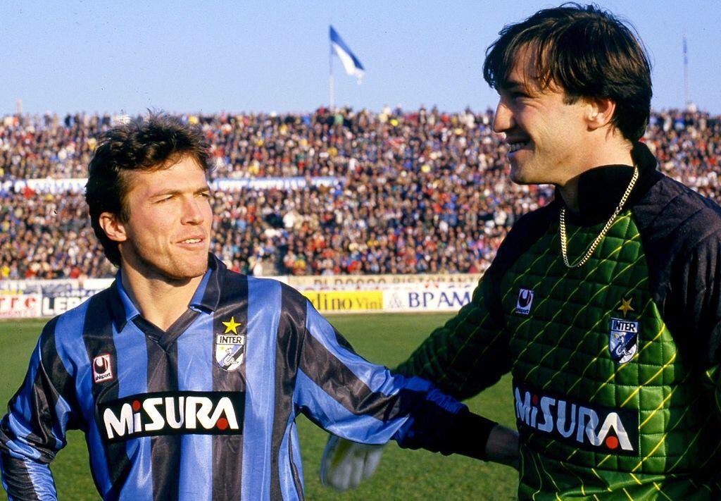
Inter seems to have had this design from 1981 to 1991, just with different manufacturers. Looking at their kit history, the base is the same and the only thing that changes are logos and crests. I could have included the Le Coq Sportif or Mecsport versions, but instead, I’ve opted for the Uhlsport version, as Inter not only won the Scudetto this season, but also used their classic snake crest, which I enjoy. All in all, this kit of the ’80s, regardless of manufacturer or badge, is a wonderful one.
1992-93 Third
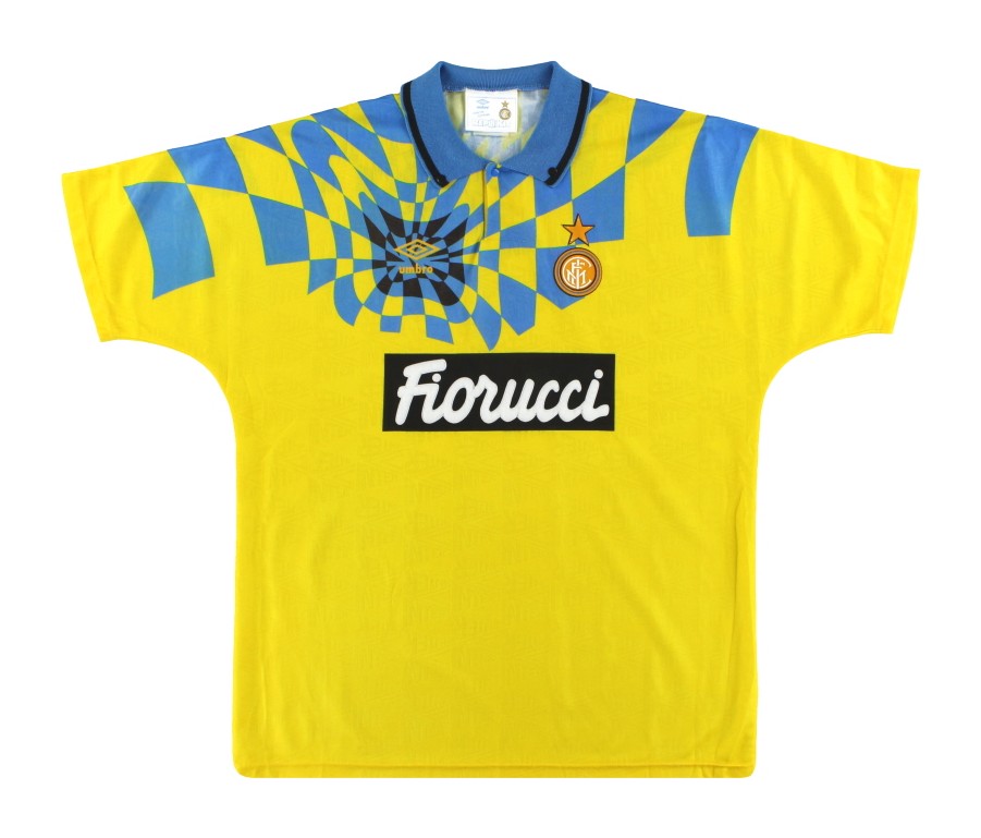
Loud. This kit is a bold choice for Inter but it’s a design gamble that paid off. The bright yellow base may not be everyone’s taste but it certainly is mine. Add in the abstract pattern across the chest combined with the superb collar and the shirt comes together nicely.
1995-96 Goakeeper
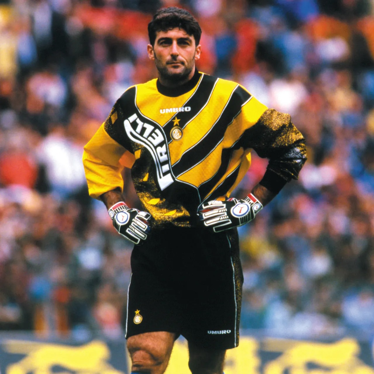
Finally, I had to throw a goalkeeper kit in. It’s the ’90s after all, and that decade was an incredible time for goalkeeper shirts. And if you thought the last kit was loud, try this one on for size. It’s an interesting approach, with a diagonal striped pattern across one shoulder and a design that looks like TV static with added diamonds on the torso. Both are separated by a wavy line that has the Pirelli logo in it. From what I know about brands and their guidelines, it’s pretty crazy to see a logo manipulated like that and used on the final product. The collar and cuffs are spectacular and I’m a sucker for a central badge. The shirt comes in yellow or blue, too. Bellissimo.


