While the world’s biggest clubs race to create dominant rosters of players, another battle looms away from the packed stadiums and bright lights of the pitch. We examine which clubs have marketed themselves to gain a broader audience through the world of fashion, and other clubs that have fell on their face trying to do so.
In modern football, teams are part of two battles — one on the pitch, and a separate one I like to call The Great Football Kit War of the 2000s.
Much like any battle, the side with a clear, innovative vision is the one likely to win. The kit war is one of consistency. After all, these teams are fighting for new fans, and in today’s landscape where the game is consumed in so ways, team identity is paramount.
So who’s winning and who’s losing? The winners have continued to build a reputation for innovating and pursuing excellence on and off of the field. This gives “new money” teams like PSG and Manchester City a distinct advantage over “old money” clubs, as their fans place less importance on history which gives the franchises the ability to create whatever identity they see fit.
The losers, on the other hand, have lost their way as clubs (at least from a fashion perspective). Their direction either does not match their club identity, or it is inconsistent, swaying from boring to intensely overdone on a season-by-season basis.
Let’s take a look at some clubs who have been doing it right compared to those who are just plain lost.
The Winners:
PSG
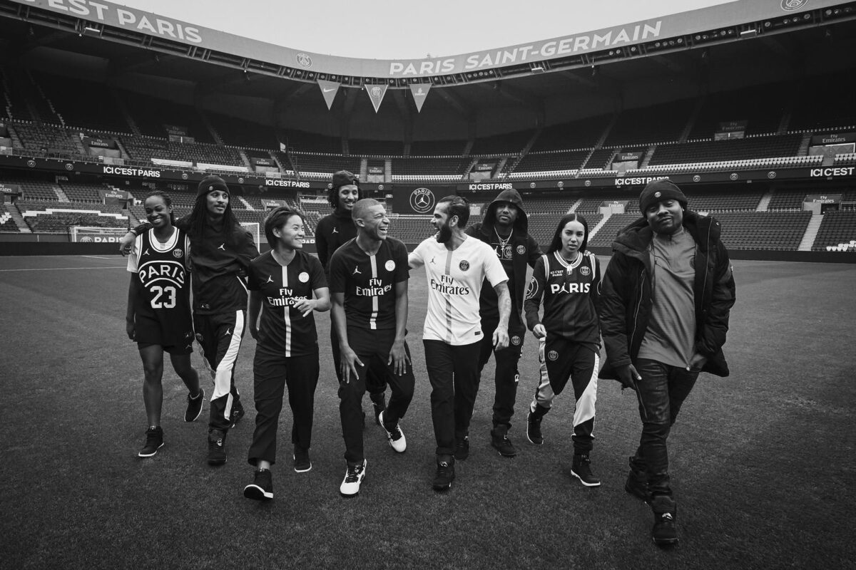
This should be no surprise to anyone that has an interest in the fashion side of football. PSG is the undisputed king of cool in the beautiful game. If the leaked leaked images for this upcoming season’s kits are anything to go by, we are in for some serious Parisian heat.
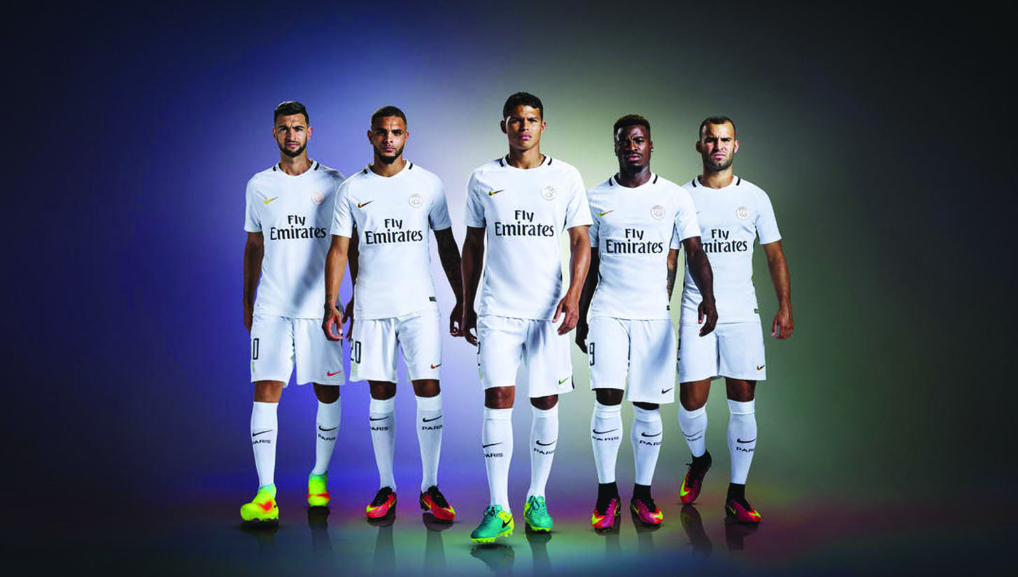
As much as this war is forward-facing, we cannot forget the shirts that laid the foundation for PSG to take this stronghold on the kit community. A personal favorite of mine (I’m lucky enough to have one in my collection) is the 2016-17 third kit. The iridescent details paired with the clean white is a guaranteed head turner.
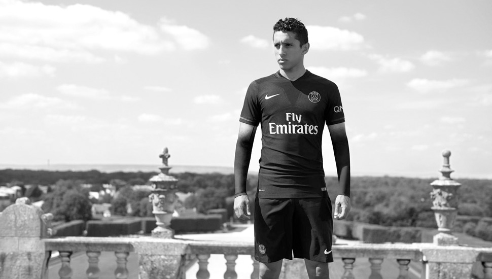
The 2018-2019 Jordan Champions League kit is another groundbreaker for PSG, as it started to bring Jordan Brand onto the football field in a way like never before. Rounding things out in the club’s recent history is the “Dark Light” kit from the 2015-16 season. The all black getup may have been a precursor to the ’18-19 Jordan kits.
These three uniforms are a signifier to the future of PSG. They are ruthless in this war and are working towards dominance on all fronts. Such a clear vision is easy to get behind, and many clubs are trying to follow the same blueprint so that they can build a stronger global brand.
Manchester City
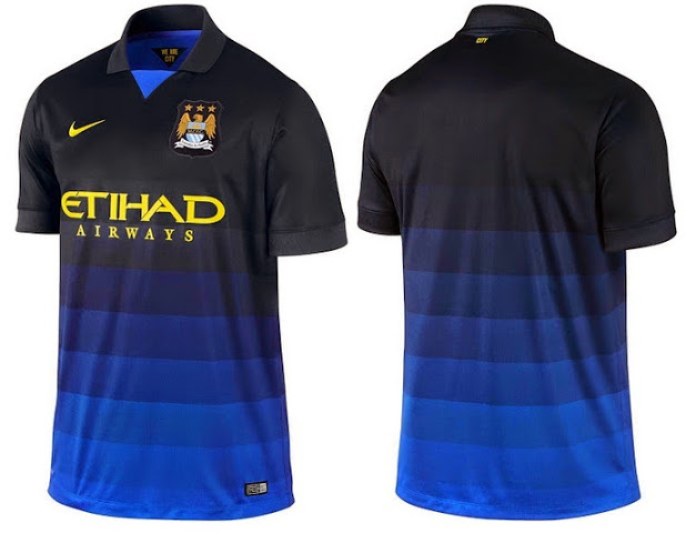
This breaks my heart to say as a Manchester United fan. But in the spirit of objective journalism, I must leave my biases behind. Ever since City transitioned to Nike in 2013 and then PUMA this past season, they’ve released belter after belter. In particular, the 2014-2015 away kit is magical.
For the 2018-19 season the club drew inspiration from its past, returning to color schemes used in some of its most iconic kits. The away uses a neon and bright blue synonymous with the ’98-99 away, and the third kit’s purple has been used several times in the club’s history, most notably in the 1992-93 season.
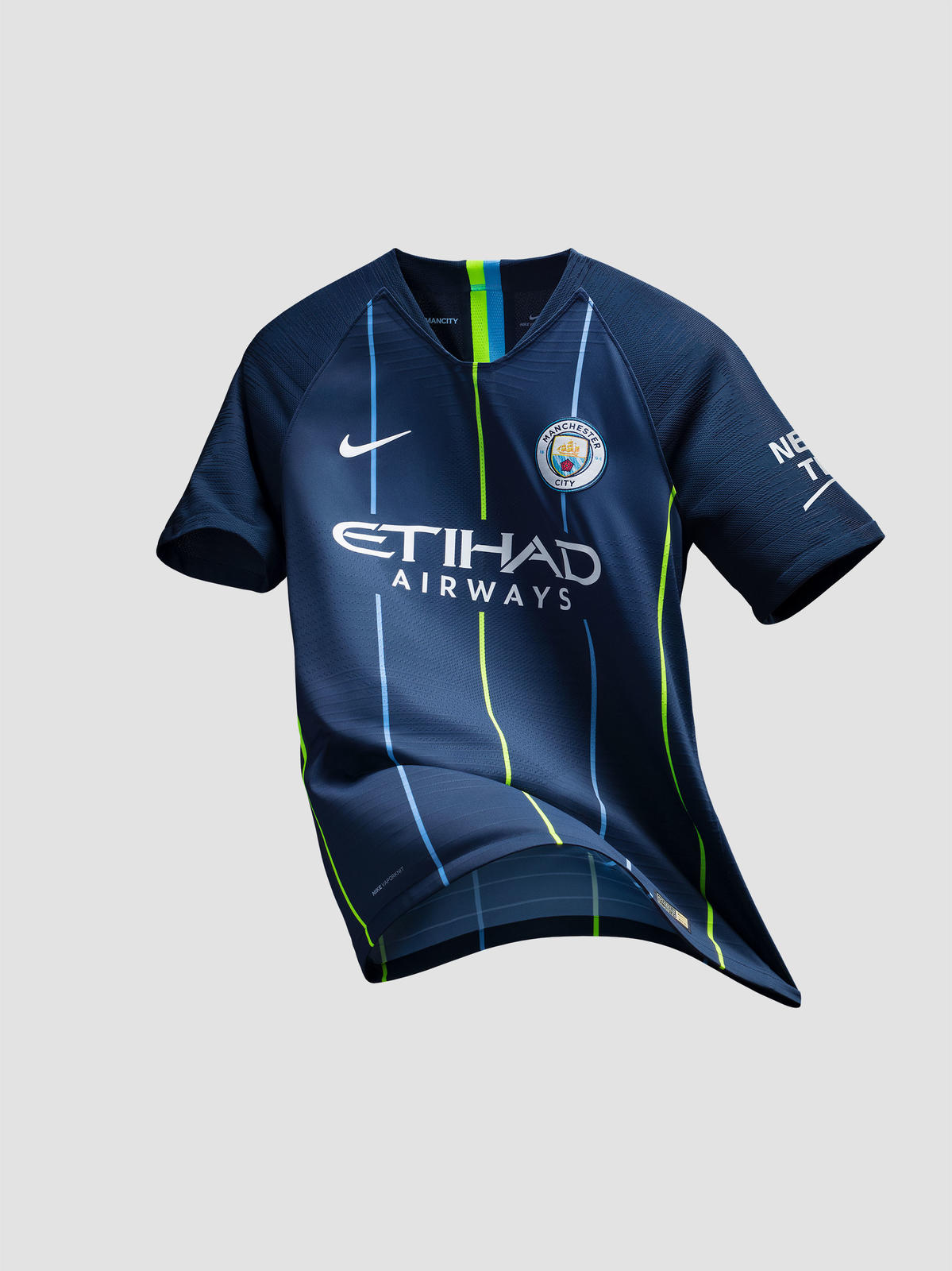
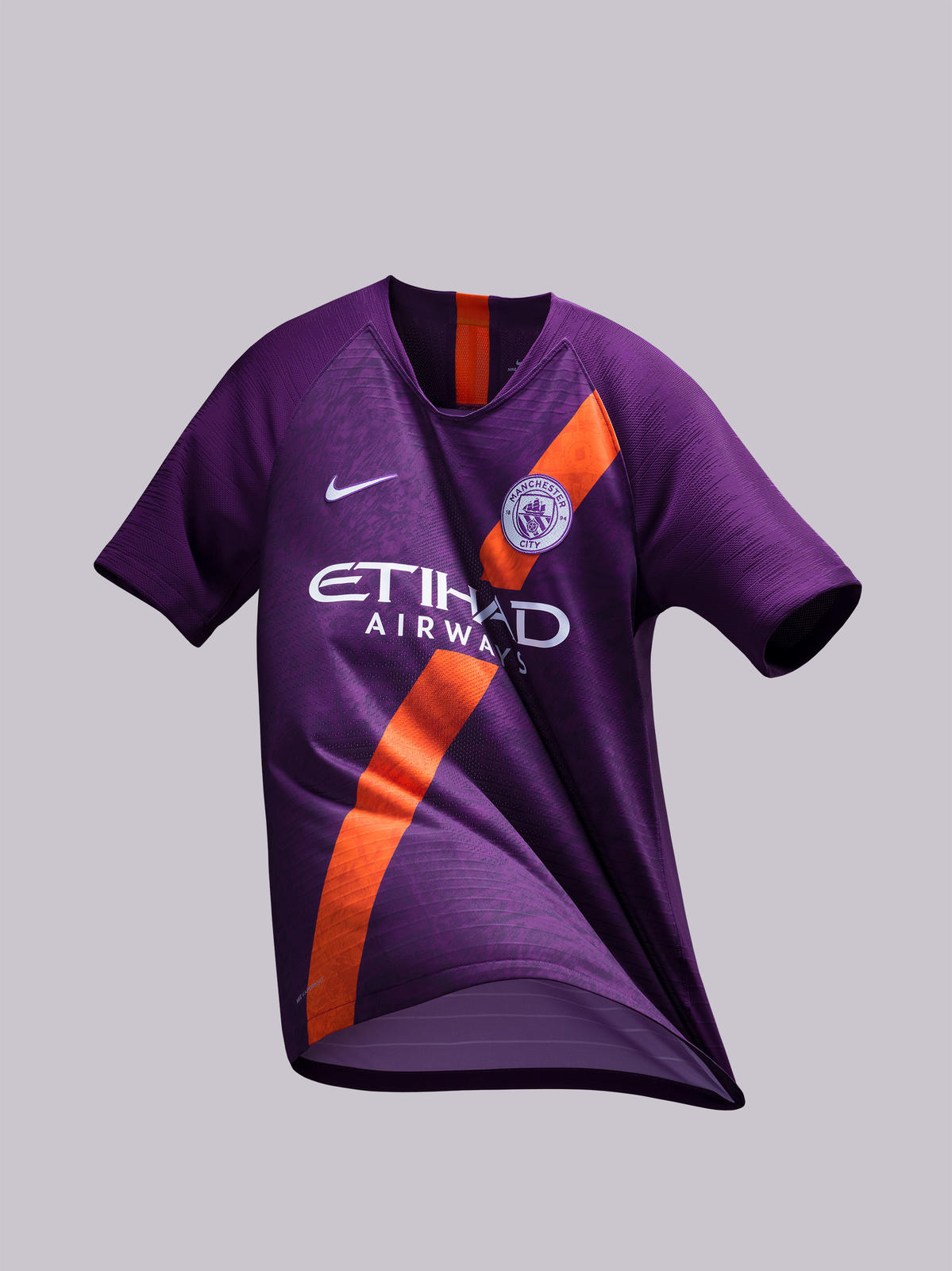
As with PSG, if the leaked images are real, the 2020-21 home kit for Manchester City is an absolute peach. The mosaic graphic is something I haven’t seen before, and it breaks up the trend of teams having basically the same home kit year after year.
City are following the same path as PSG. Each year they keep pushing forward to fortify their off-field brand. As PSG partnered with brands such as BAPE, City collabed with luxury streetwear brand DSQUARED2, as well as taking part in an Amazon documentary series.
Juventus
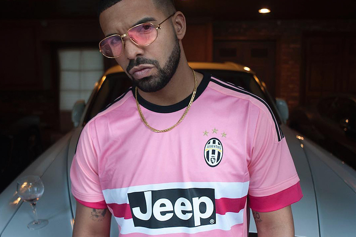
The final winner of The Great Football Kit War of the 2000s is Juventus, which unlike City or PSG, is an “old money” club with tons of history. Juve have been able to create a culture of fashion and innovation without losing their commitment to their legacy. The only photo you need to prove how fashionable their jerseys are is one of the most infamous shots that truly boosted the football kit’s place in the cultural zeitgeist. We’re talking of course, of the Drake pink kit.
That 2015-2016 away shirt is one that has always eluded me, but I have made it a personal mission to get my hands on it one day.
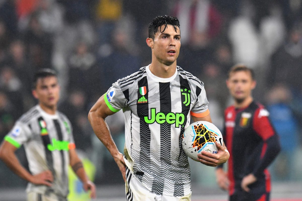
If we move to the present, how can we ignore the Palace x adidas collaboration that was worn on the pitch this season? Those jerseys and the rest of the collection had some serious retro-vibes that certainly resonated with hypebeasts. If it didn’t drive them to become fans of the Old Lady, it at least turned them into passive ambassadors for the club.
Of all the teams with a historic past, Juventus have not lost the very thing that allowed them to be so successful. They still strive to be the best in everything that they do. Innovation is their life, and resting on their laurels is their worst nightmare.
The clubs listed above have gotten where they are through slightly different paths, but they all have one thing that sets them apart. They don’t try to pretend they are anything different than who they are. They are unapologetically themselves. They are cool because they are cool, not because they try to be.
Conversely, the losers of the kit war are those that look backwards to find what made them great, instead of continuing forward with their goal in mind. These teams have the fanbase and the financial resources to right the wrongs of their past, and I hope (for the sake of fashion in football), that they make those changes.
The Losers
Real Madrid
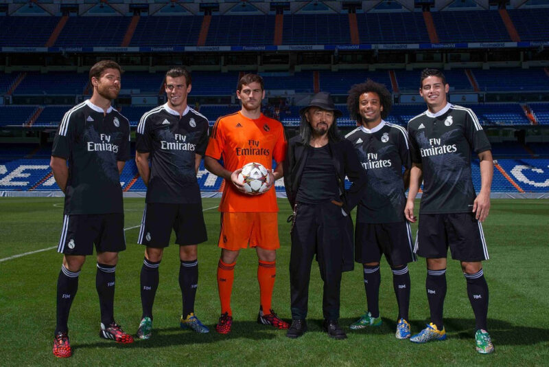
For a club that has won so much, they are losers in the fashion world (except for the time when they collaborated with Yohji Yamamoto).
Their kits are seen around the world due to their immense on-field and financial dominance, but that does not mean they are fashionable.
Real Madrid’s kits appeal to those that enjoy templated and safe designs. Part of this is their commitment to history, which I do not fault them for. However, I believe that they have not pushed for more contemporary, exciting jerseys out of fear that they may upset their stubborn fans (much like I may be doing right now). How does a club the size of Real Madrid get stuck with a generic set of kits year after year?
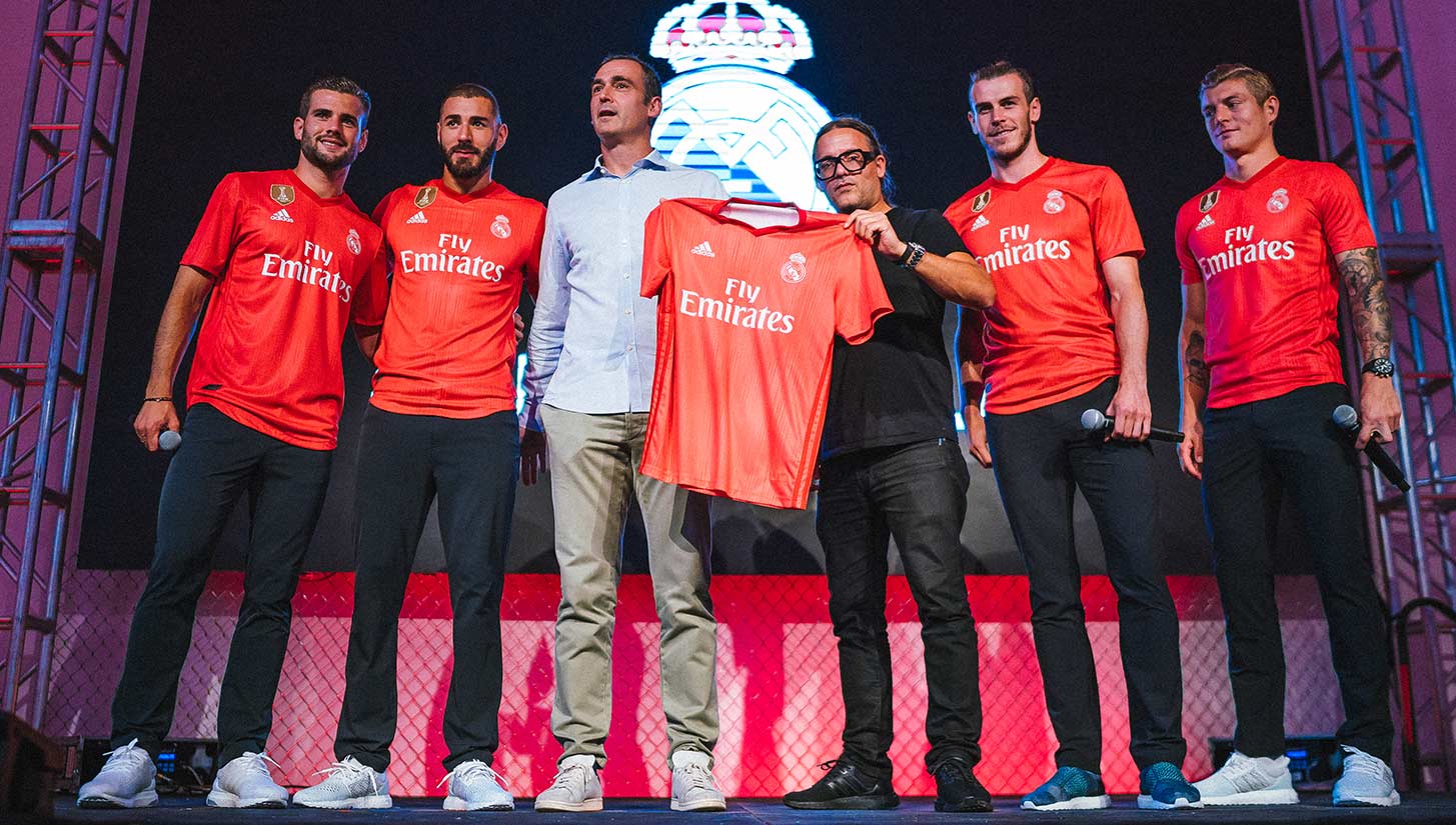
Real Madrid has fallen into the trap of success. While the saying goes “if it ain’t broke don’t fix it,” I have a humble suggestion for the Spanish giants. To truly be the world’s top club, you have to be the best in everything you do. Sure their recent run of dominance, including a UEFA Champions League three-peat, has been impressive, but those days seem to have ended with the departure of Cristiano Ronaldo.
Success does an incredible job of hiding the cracks, but with the club in danger of being knocked out in the UCL round of 16 for the second straight year, their bland and repetitive kits will be receiving more spotlight.
How will Real attract new fans now that Ronaldo has left? Their recent array of jerseys will certainly not catch the eye of the new football fan.
I am not saying to ditch the classic white and gold, but instead that they engage in a more daring approach to their away and third kits. If Madrid cannot keep up their winning ways without Ronaldo, they could lose valuable territory in the world of football.
Manchester United
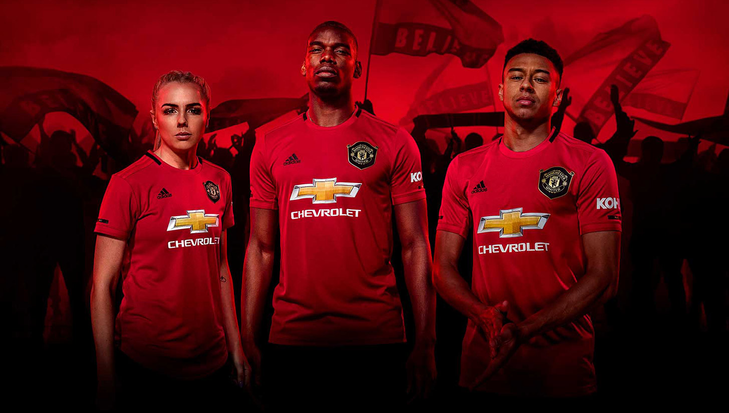
This is a painful entry for me. Manchester United’s kits, much like their results on the pitch, have been volatile ever since the departure of Sir Alex Ferguson.
Ever since the transition from Nike to adidas, their kits have yoyo’d from fall-asleep levels of boring to the type of flashy that sends shivers down my spine — and not in a good way.
Sadly, the days of simple yet interesting kits for United are gone. They have been replaced with shirts that are either easily forgotten or nightmare fuel (with a few exceptions, of course).
Let’s first take a look at their 2019-20 away kit. United has typically been ambitious with their away jerseys — from the iconic green and yellow shirt worn in the Premier League’s inaugural season to the pink kit from last year’s campaign. The execution of these bold ideas have varied from all-time greats to duds, and the ’19-20 shirt is definitely in the latter category.
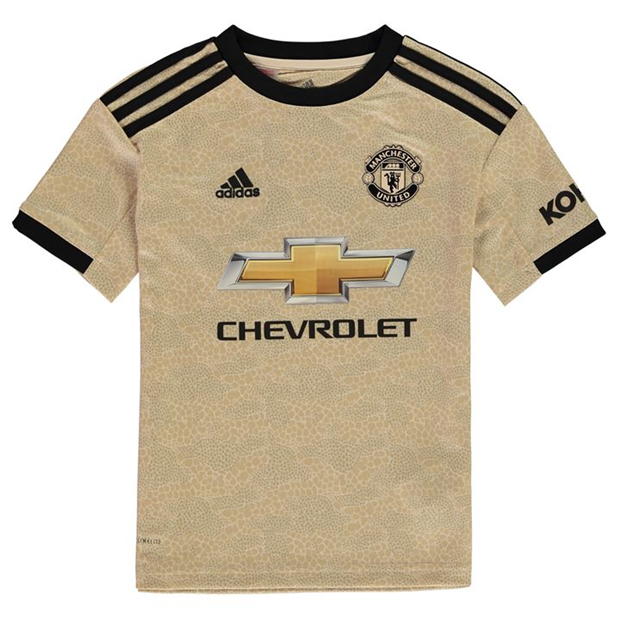
The Red Devils rocked gold back in 2001-02, and it appears as if the club was looking to return to the glory days of years past with this offering. It didn’t work. What looks like a color blindness test mixed with Honeycomb cereal is never a good look.
But while we can at least applaud the effort to take a chance, United have also been bad on the opposite side of the spectrum too. Their 2015-16 away shirt is an example of how one of the world’s most successful football clubs can be as boring as watching paint dry. It’s essentially a white athletic shirt with a Chevrolet logo. Come on.
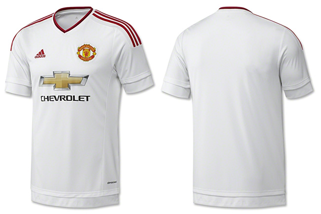
These two kits show a substantial dichotomy. There does not seem to be a direction for Manchester United’s vision. Are they trying to push the envelope or play it safe?
Franchises go through peaks and valleys both on and off the pitch. They may not be able to have full control over their players’ performance, but they can control how they market themselves. If clubs in a valley want to pull themselves out from the bottom of the fashion war, they must adopt a new mentality. Manchester United lost its identity when Sir Alex left, and Real Madrid lost theirs when Cristiano left. Now is the time for them to forge a new one.
PSG and Manchester City are in the final stages of building their empire, and Juventus has continued to fortify theirs. This is what sets these teams apart from the losers — a clear identity and direction in everything that they do.
If I am to leave you with one last thing, in the sports fashion world, have an identity, and act with the values you have fought so hard to ingrain into the culture of the club.


[…] https://urbanpitch.com/the-great-football-kit-war-a-battle-to-create-an-off-pitch-club-identity-in-t… […]