Kit drop season is in full effect. With Europe’s top leagues either starting or about to start, we take a look at some of the best and worst 2022-23 kits — but with a twist this time.
Last weekend, the English Premier League, the German Bundesliga and France’s Ligue 1 all kicked off their 2022-23 seasons. La Liga in Spain and Italy’s Serie A will follow suit next week to round out Europe’s top five. The start of each new season brings not only new faces in new places and shifts in both tactics and (sometimes) balances of power, but also (and perhaps most importantly) new shirts.
This of course means it’s time for our Good, Bad, and Ugly series to return. But this year, we’ve switched things up a bit. In addition to our normal categories (Good: The best shirts of the season; Bad: Good concepts, but poor execution; Ugly: Just plain gross.), we’ve added a few changes:
- Only home shirts were considered. Yeah… I see you judging me, for kicking my feet up and lazily contemplating “only” 98 shirts. To this I say… have at it, my friends! Who knows, maybe I’ll do another one of these for away kits some time.
- A new category, Don’t Ever Change: Here is where we find the timeless classics. These are the shirts that, typically without many frills, embody what we think about when we picture a particular club in action. These shirts, again, so often brilliant in their simplicity, are not only aesthetically beautiful, but also deliver an almost mystical sense of nostalgia.
- We’ve also spread things out to cover the good, bad, ugly, and don’t ever change kits in each of Europe’s top five leagues.
The criteria here, as you might imagine, is pretty subjective. I will, however, do my best to work out the rationale that led to each selection. Let’s get to work, shall we?
English Premier League
The Good: West Ham United
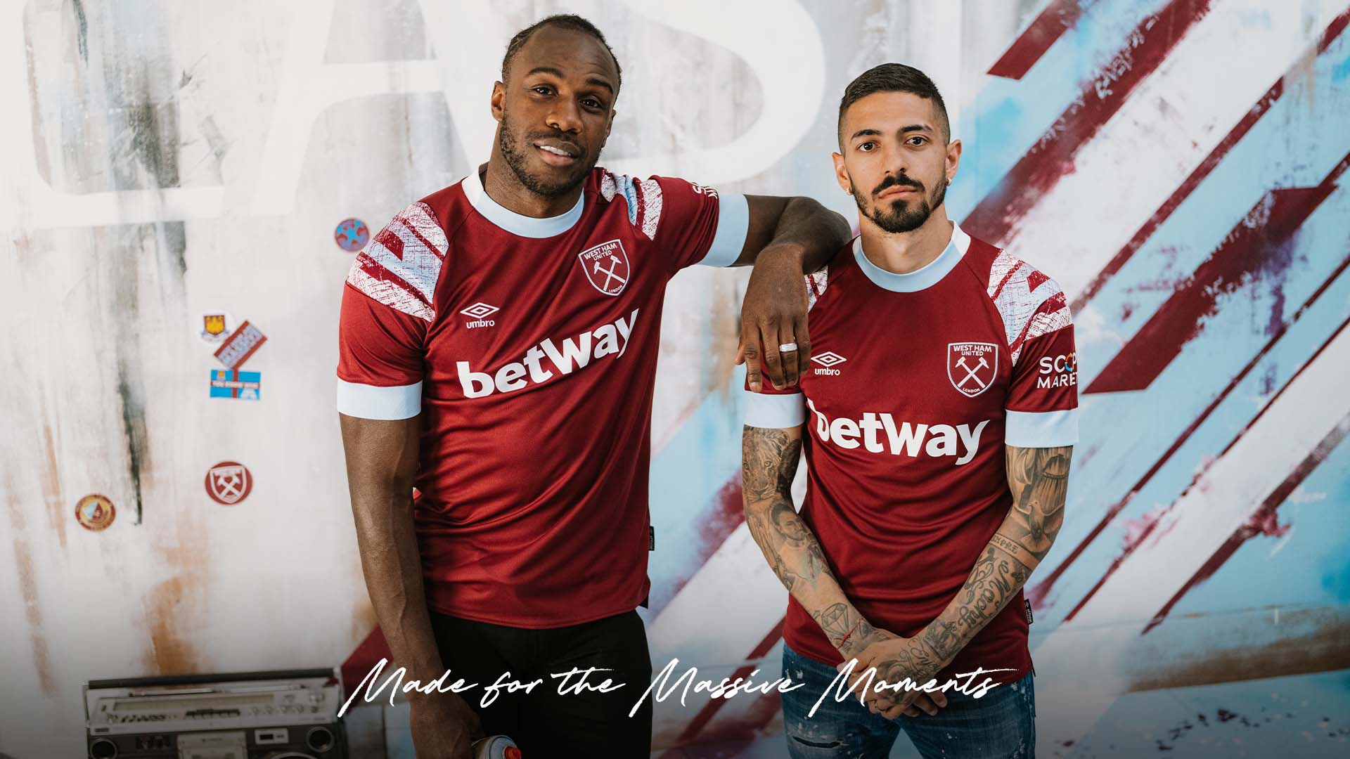
The burgundy, baby blue, and white of West Ham and Aston Villa is one of (maybe the) sharpest color schemes in the Premier League. Any given year, the shirts of each of these two will rank among the better ones in the league.
West Ham get the nod here, for their homage, 30 years on, to the home kit from 1992-93 — the season in which, having missed the first season of the Premier League after getting relegated in 1991–92, the Hammers made their debut in the new-look top flight.
The Bad: Brighton & Hove Albion
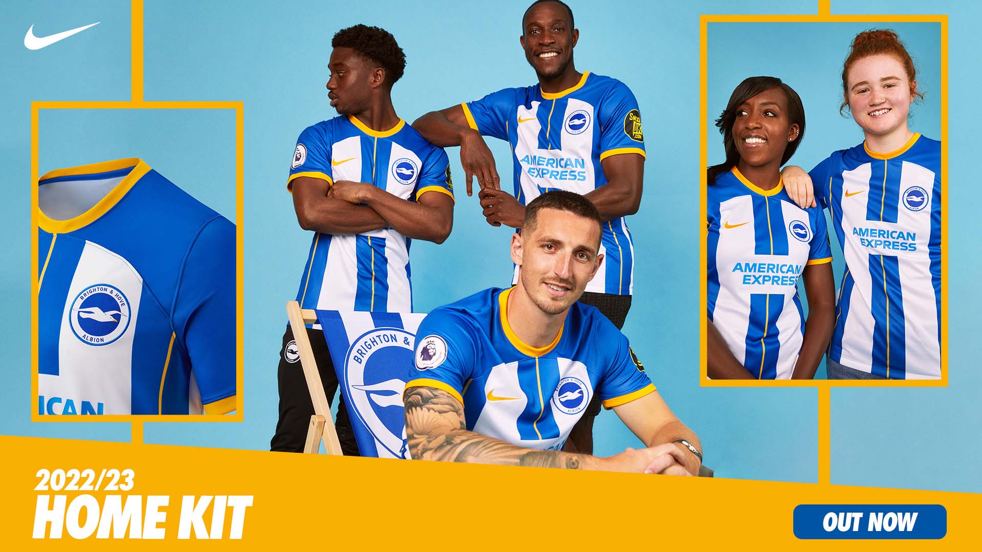
Let me say this to start: Brighton’s classic blue and white color scheme is clean and gorgeous. And the third color integrated into this year’s home kit, the yellow on the collars, cuffs, and the Nike Swoosh, actually blends in quite nicely.
The problem with the shirt is that it’s trying a couple of different things at once, and ultimately misses the mark on all of them. The blue and yellow stripe down the middle of the front would be fine, were it not abruptly interrupted by the American Express logo. Then, on either side of the stripe, are a pair of white panels that are too thick to be considered “stripes,” and themselves end abruptly at the armpits/sides/shoulders, and make the shirt front look like a baseball catcher’s chest protector.
Strictly speaking, you could probably make a case for some other shirt as less appealing than this one, but I don’t know that you can convince me that another 2022-23 Premier League shirt more egregiously underperforms its potential.
The Ugly: Manchester United
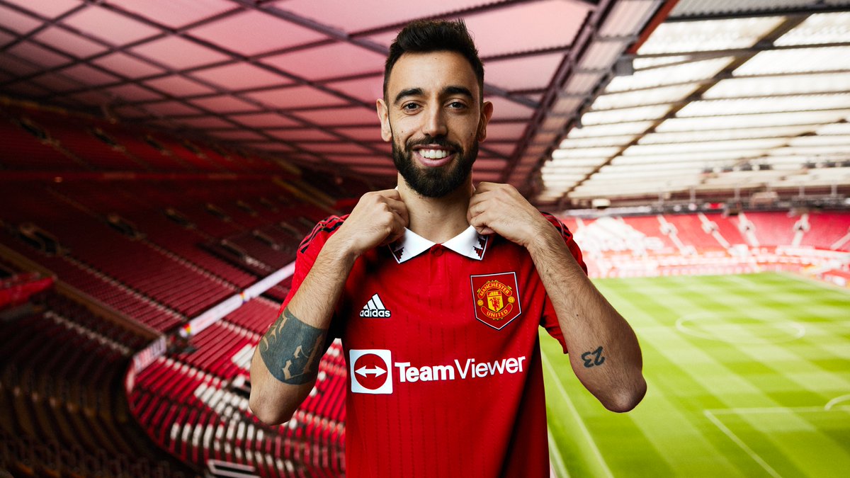
Speaking strictly as an observer (I’m no Manchester United fan), it’s hard not to equate the current state of the club with my assessment of this shirt. I feel like there’s a case to be made that some of what’s wrong with the club pops up in this shirt: an attempt to try to be bold and modern, while retaining a classic, retro feel misses the mark, and what’s left is a boxy “almost.”
From the shark tooth pattern along the collar, to (baseball reference No. 2!) the “home plate” which houses the crest, to the sponsor logo, which, while the correct color and not overly obtrusive (and neither the club’s nor adidas’ fault) has a literal square in the logo, it’s all just too angular. Beyond all of that, for a shirt that’s so committed to a clean red and white theme, the choice of black for the three stripes on the shoulders is a strange one.
It’s not a complete disaster, and there are some decent ideas here, but the execution leaves a good bit to be desired.
Don’t Ever Change: Arsenal, Tottenham, and Newcastle United
There’s a trio of 2022-23 Premier League shirts that, more than any others, through a cleanliness of design, dedication to classic colors, and a resistance of the temptation to try to unnecessarily “spice things up,” would not be out of place at any point in the 130-ish-year history of each club.
Let’s start with the North London rivals.
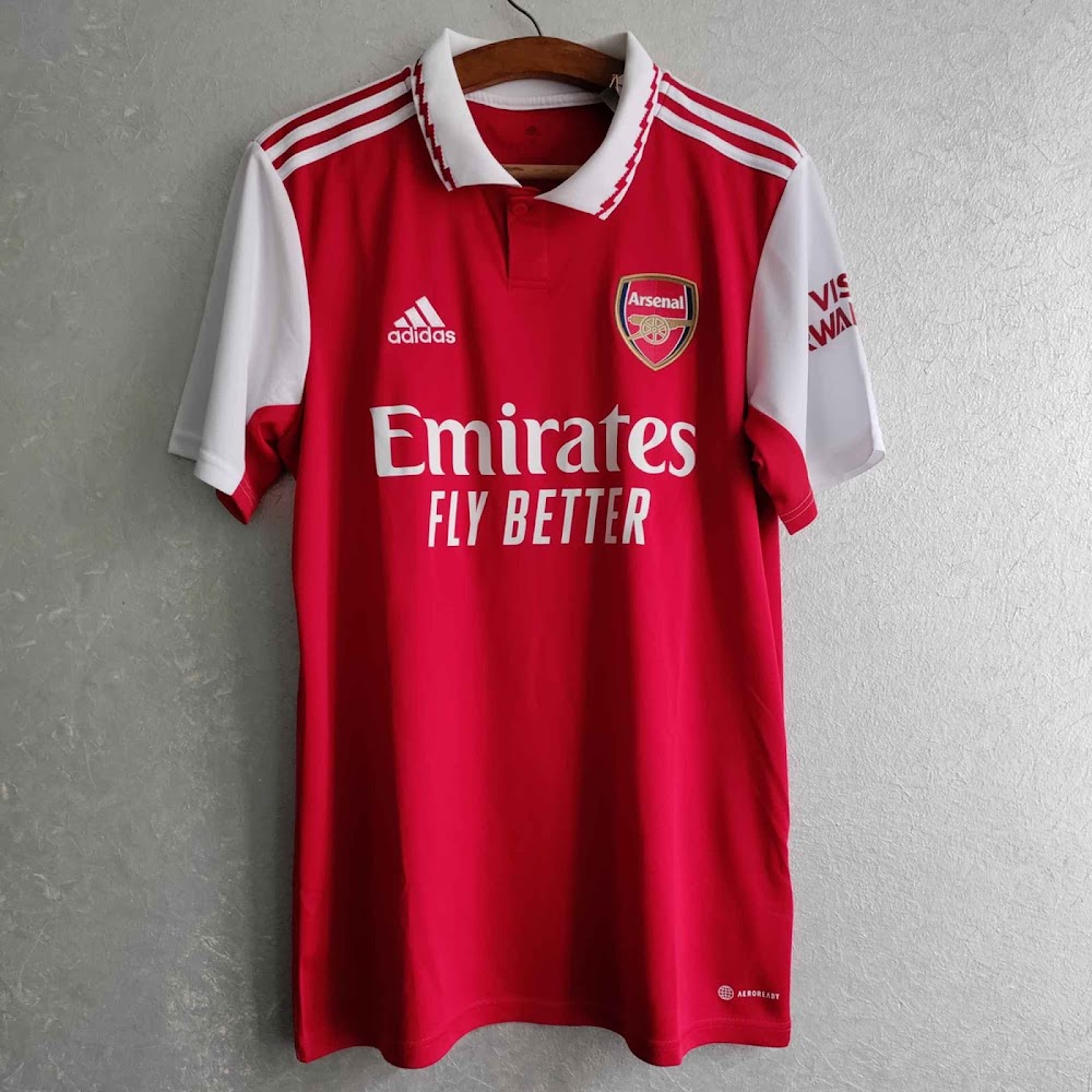
Arsenal have employed a classic color palate, and a crisp, clean design that you could parachute into any era of Gunners football and not cause a stir. This is precisely what Man United were going for.
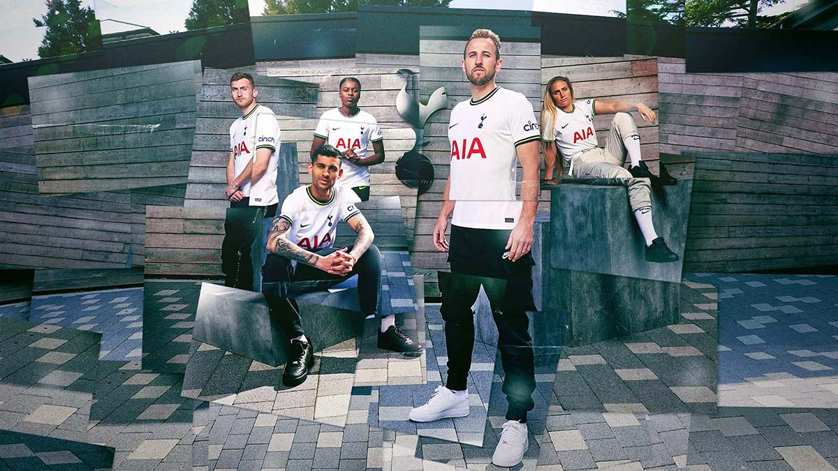
The story is a similar one with Tottenham Hotspur, who’ve gone with a crisp, clean white shirt, with minimal (but perfectly complementary) dark blue accents, and a similarly unintrusive (and, in fact, quite sharp) red front-of-shirt sponsor logo. The neon touch on the collar is the cherry on top of what’s a classic design.
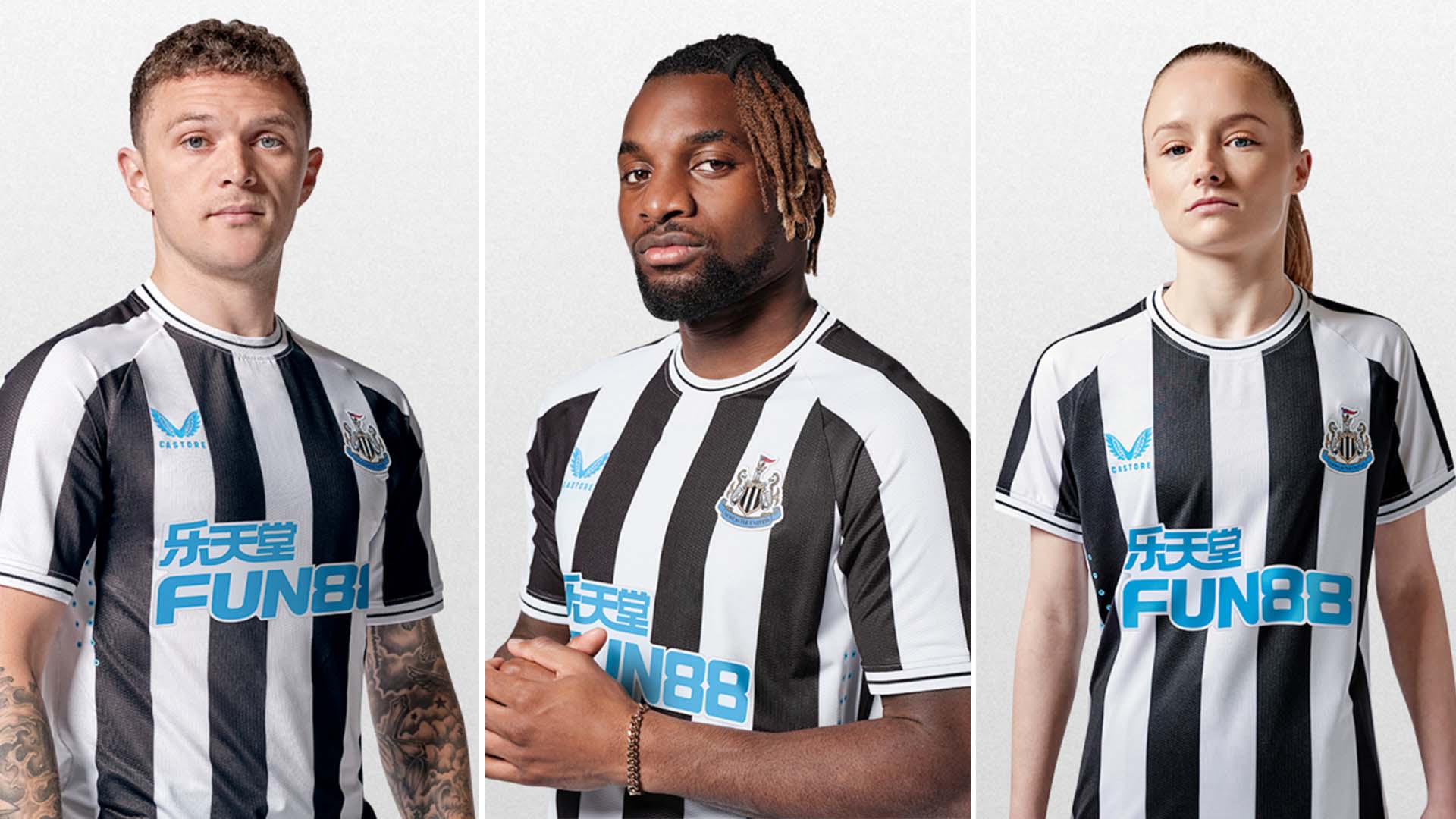
Finally, there’s Newcastle United, who’ll of course be sporting their classic black-and-white stripes. That alone is enough to land them here, but the electric blue logos of the shirt sponsor and shirt manufacturer (Castore) take this shirt to spectacular new heights.
It felt ridiculous to not include Liverpool here, but upon further review, the 2022-23 shirt, while certainly nice, lacks a certain grandeur, and feels a bit like a casual t-shirt.
Bundesliga
The Good: Wolfsburg
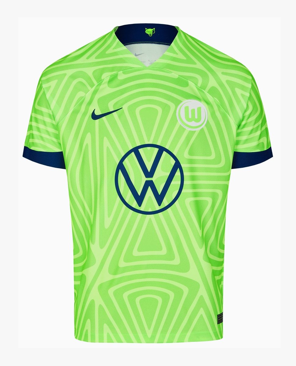
This might be absolute my favorite top flight home shirt from this season. For starters, I’ve always respected Wolfsburg’s commitment to what they call “Sub Lime Green” as its primary color. The decision here to mute that green (only slightly) and adorn it with a cool triangular pattern, without making it feel like they’re hiding from it is also a huge win. The choice to go with a white badge against a light green and white backdrop is an interesting one that works well, as are the perfectly complementary navy blue trims on the cuffs, Swoosh, and Volkswagen logo. Interestingly, VW is one of two corporate owners in the Bundesliga (drug company Bayer, who own Bayer Leverkusen are the other; Red Bull is absolutely not a third), as the club was actually formed in 1945 by workers at one of the company’s factories.
The Bad: RB Leipzig
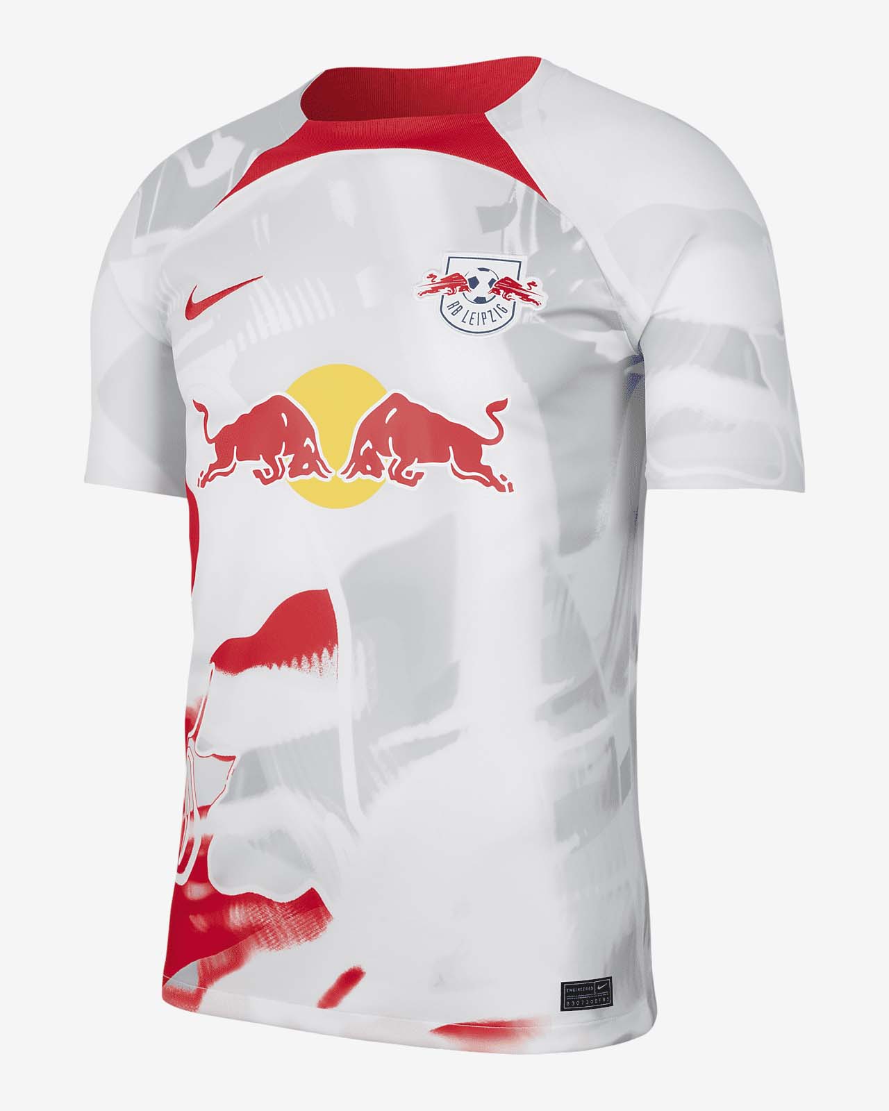
I’ll level with you, I’m not sure what the shirt is even supposed to be. Nike’s 2022-23 template has been extremely hit or miss, and Leipzig’s offering lands in the latter category.
Everything here — from the dual Red Bull logos (strange, since Red Bull definitely doesn’t own this club), to the not-collar red panel at the top of the chest, to the weird gray and red smudges on the white shirt — reeks of tinkering for tinkering’s sake, in the absence of real ideas.
The Ugly: Hoffenheim
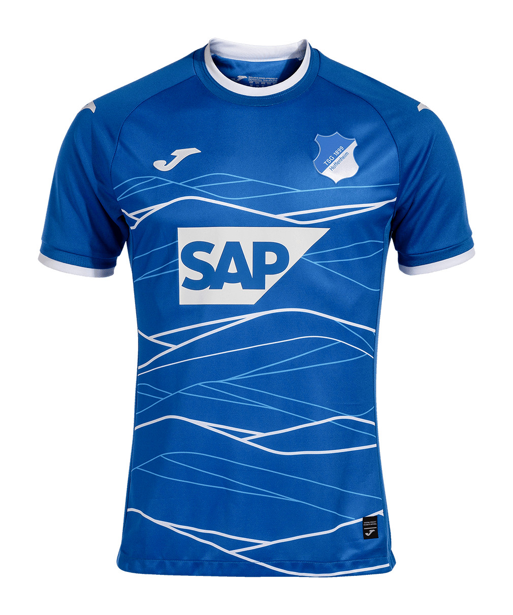
As you may have already figured out (or certainly will as you go through this), I am an absolute sucker for crisp, clean, blue and white designs. Also, an homage to the hilly landscape of the region (Kraichgau) in which the club is located is conceptually really cool.
Unfortunately, on a shirt with SAP as the main sponsor, the white and light blue lines meant to depict that hilly landscape feel more like an effect that you’d see in a TV commercial for enterprise software. Maybe I’m the weirdo here, but I find that a bit off-putting.
Don’t Ever Change: Schalke and Bayern Munich
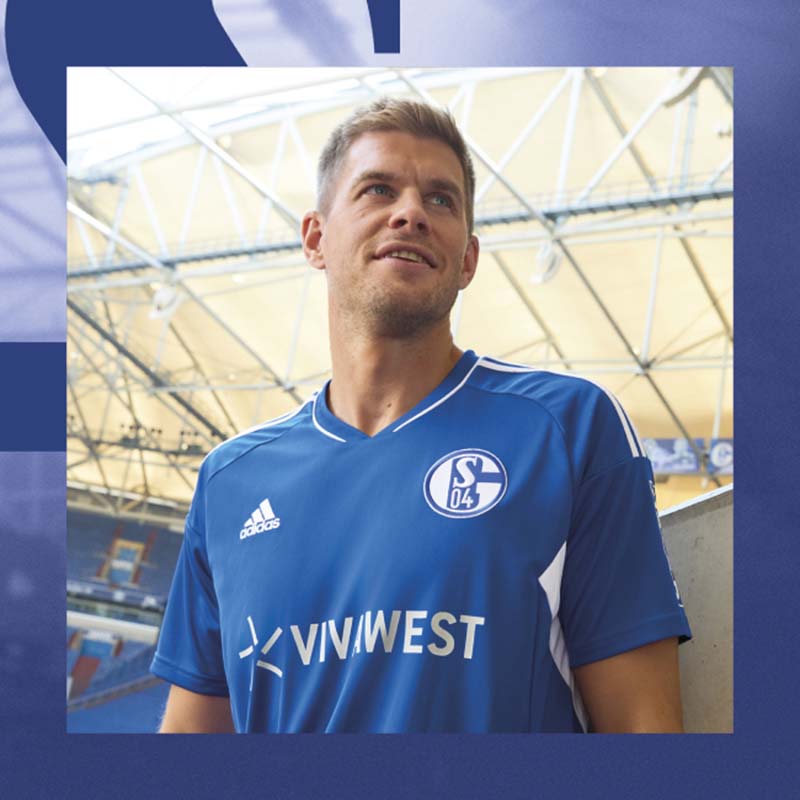
Hey, it’s a simple blue and white shirt! Like I said, I’m going to try not to inundate you with these things, but the heart loves what the heart loves, right?
Schalke have a history of this kind of understatedly sharp design. Love that this consists exclusively of two colors, and the ratio of the dominant blue to the white logos and accent strikes a perfect balance.
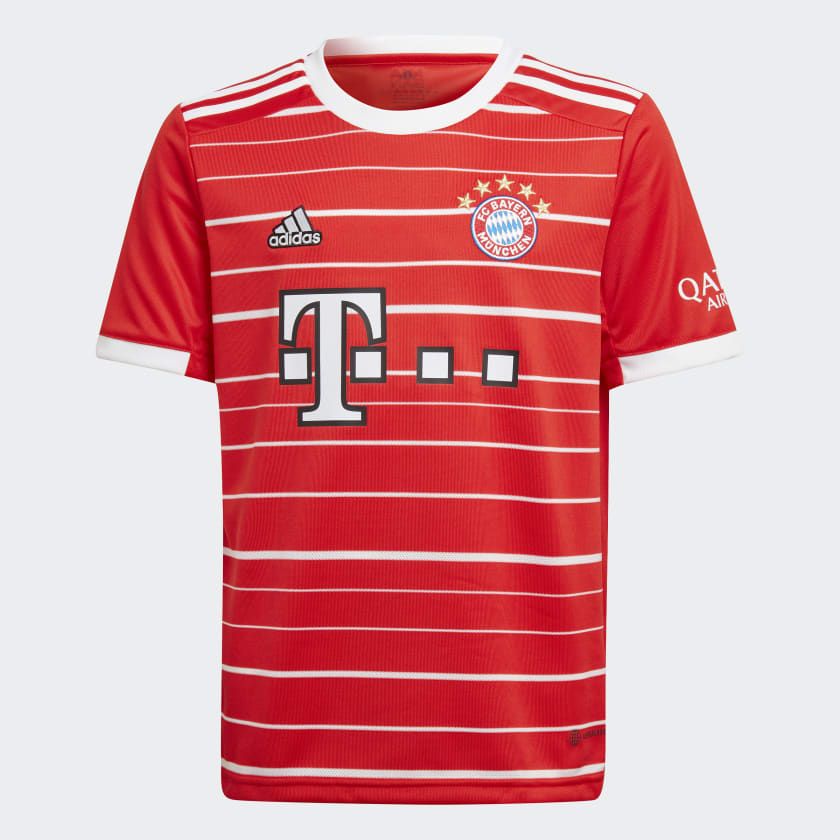
And then, of course, there’s Bayern.
This season’s adidas shirt is a microcosm of the club itself: sharp, simple, classic, well thought out. The colors are all complimentary, nothing is out of place, and, upon closer inspection, the horizontal stripes on the front, which could have been mis-executed, blend beautifully with the logos and the badge. It’s all nicely capped off by five stars commemorating the club’s five European Cup/Champions League wins.
Ligue 1
The Good: Nice
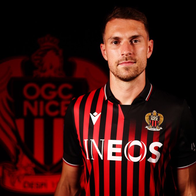
If any shirt is going to bump Wolfsburg’s from the top spot in my personal rankings, it’s going to be this one.
Nice’s 2022-23 home shirt by Macron is doing quite a bit, but, refreshingly, doing it all well. First, while it features the classic red stripes of Nice shirts’ past, the stripes fade out beautifully in the lower left and upper right. This is particularly effective in the upper right, as the fading stripes and the void above them perfectly frame the club crest.
Beyond that, the red, white, and black collar is not too big that it infringes on anything else, and it’s also understated in a way that calls just enough attention to itself, and pairs perfectly with the matching trim on the cuffs.
No notes.
The Bad: Lille
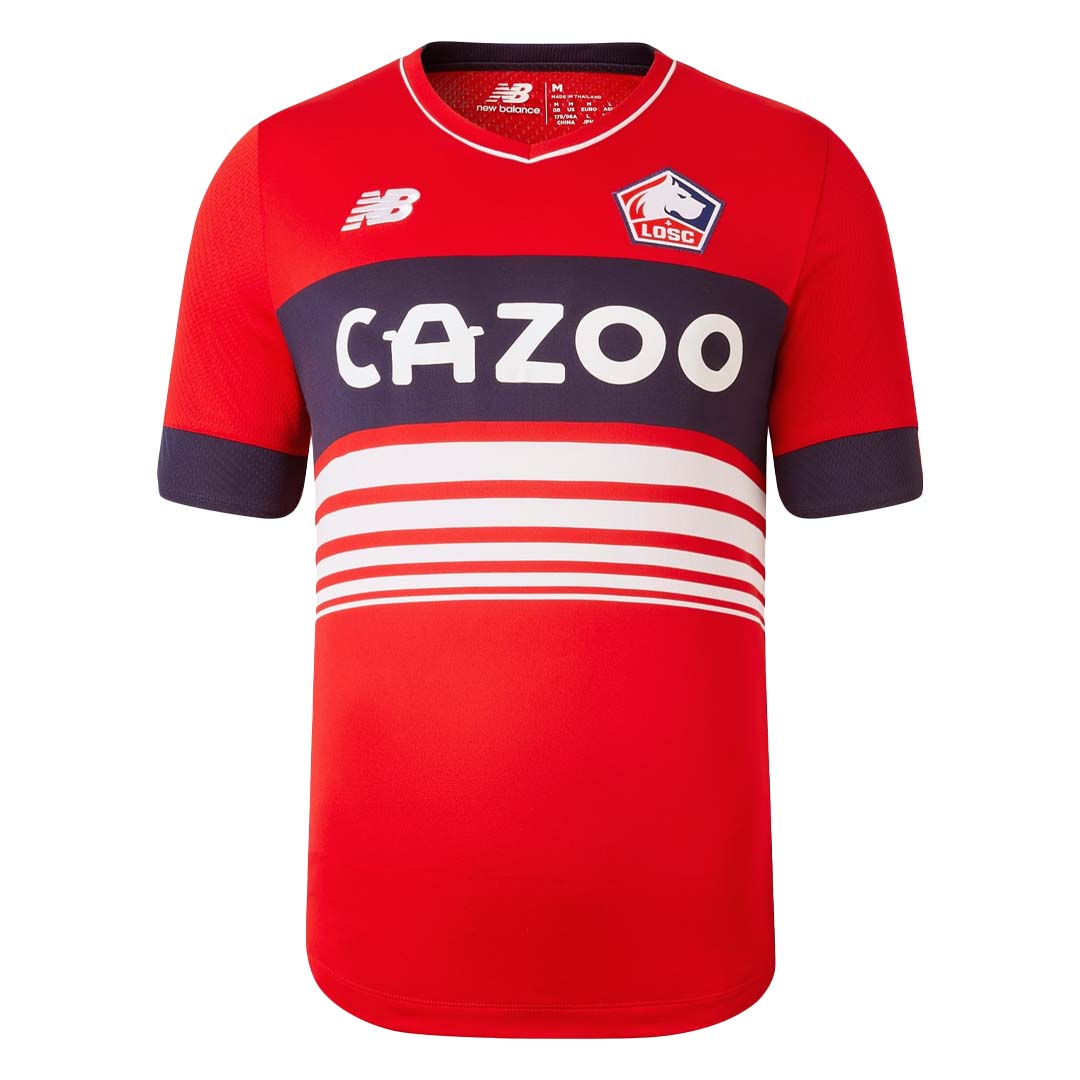
I stared at this shirt for a while, trying to figure out what exactly the aim was here. I remain flummoxed.
On the bright side, sticking to three core colors is a nice aesthetic choice. Also, I personally find the big “Cazoo” across the chest amusing. However…
The thick blue horizontal stripe on the chest, with the gradually smaller, white horizontal stripes below it just doesn’t work. This reminds me more of a way-too-heavy Tommy Hilfiger sweater that I’d absolutely have bought in the late ’90s than a piece of top-tier athletic apparel.
The Ugly: Brest
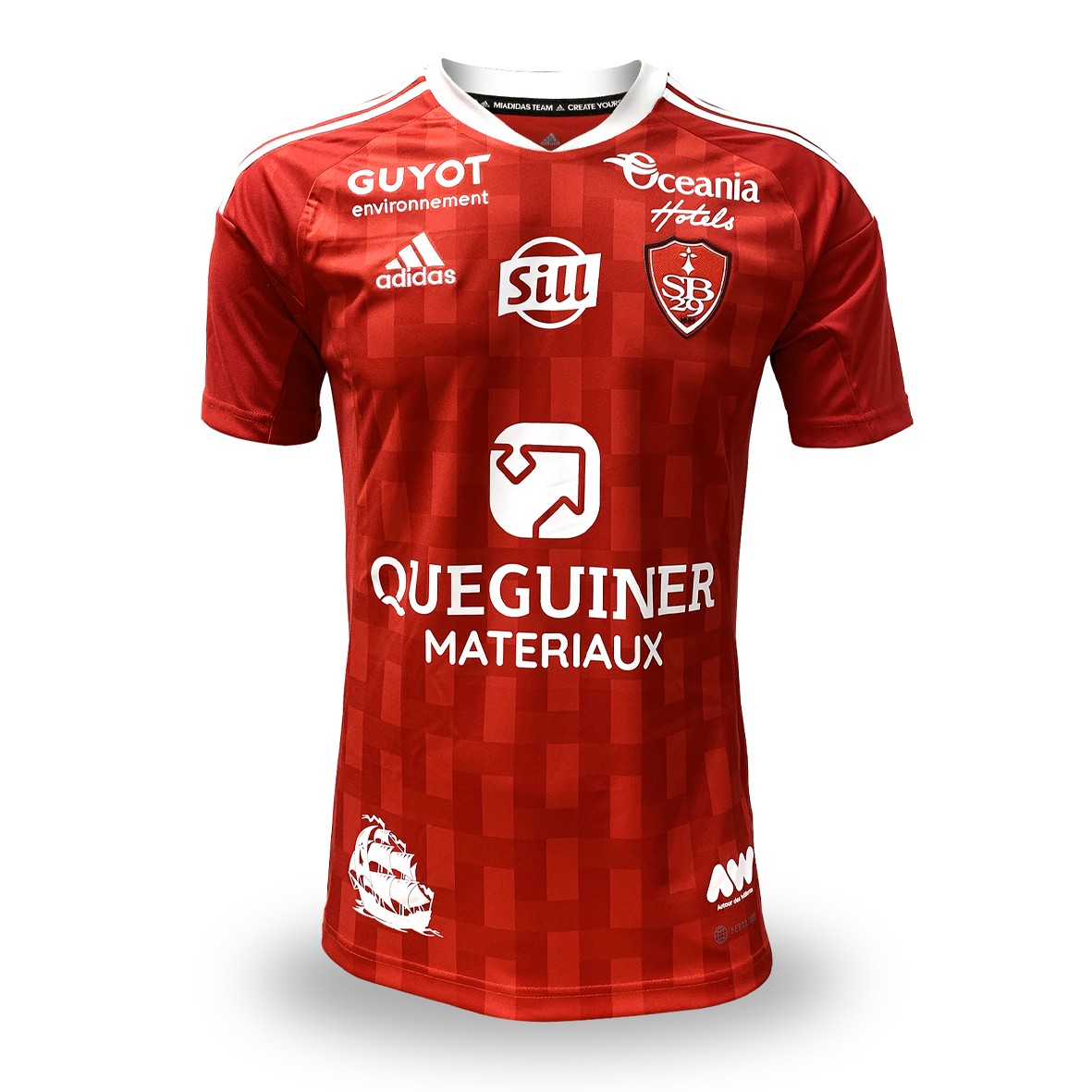
Underneath an avalanche of corporate logos, there’s a spectacular shirt here. The deep, two-toned and patterned red base perfectly complements the club crest, the adidas logo, and the stripes on the shoulders and collar, all of which are white. It’s simply wonderful.
However, on a shirt that’s already got a club crest and a manufacturer’s logo, another six sponsors on the front is a bit much.
I understand that business is business and that everyone’s got to keep the lights on. But I don’t have to like it. This thing looks more like a NASCAR than a football shirt.
Don’t Ever Change: Lyon
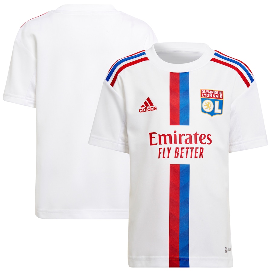
I’ll keep this short. This Lyon shirt makes feel calm and happy inside.
Strange, I know, since I objected to the interruption in the stripe going down the front of the Brighton shirt, but what can I say? I dig this.
The red and blue stripe above and below the sponsor’s logo is really sharp here, as is the contrast between the red adidas logo and club crest, and the color-alternating stripes on the shoulders strike a perfect balance.
La Liga
The Good: Real Valladolid
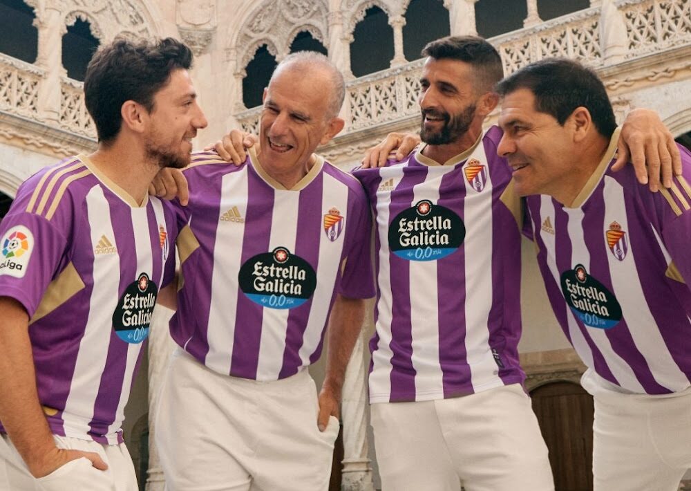
Along with a lush, deep green (more on this in a second), no color is more underutilized in top flight football shirts than purple.
I’m a lifelong Los Angeles Lakers fan who, through marriage, now knows an awful lot of Minnesota Vikings fans — so I know that purple is tough to pair. The thing is, that’s much more of a “walking down the street” problem. In organized sports, where wearing purple or white shorts is completely acceptable, a shirt with crisp, clean purple and white vertical stripes that perfectly frame an intricate club crest that also features purple…you kinda don’t want to stop looking at it.
The Bad: Atlético de Madrid
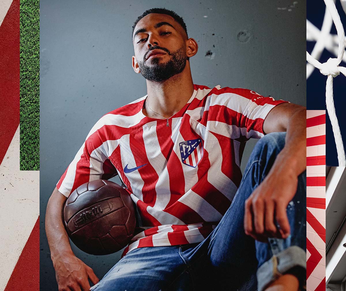
I want to say that I get what Atleti are going for here: a funky twist on the staid, classic red-and-white striped shirt. Okay, fine. I see what went into the decisions that were subsequently made.
What I don’t get is having the desire to tinker with one of the most beautiful, brilliant-in-its-simplicity shirts in European football in the first place.
There’s something deeply disorienting about looking at an Atlético de Madrid shirt and seeing waves. Unless this thing has some sort of a hypnotic effect on opponents, this was a risk that didn’t need to be taken.
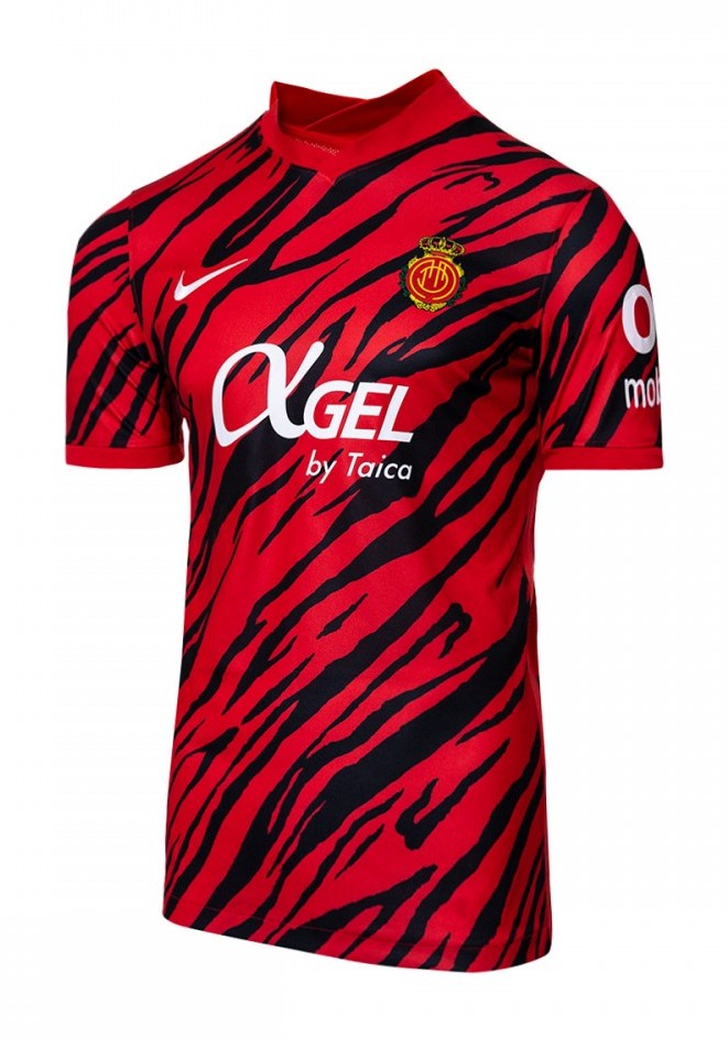
The Ugly: Mallorca
Far be it for me to come out against a club who reminded fans of a home friendly against Napoli thusly:
🇮🇹 ¡Hoy juega el 𝗠𝗮𝗹𝗹𝗼𝗿𝗰𝗮!
🆚 @SSCNapoli
📍 Castel Di Sangro, 20:30h.
🔴 https://t.co/v9BX7FWMQO#NapoliRCDMallorca pic.twitter.com/UF3faFyWPU— Real Mallorca (@RCD_Mallorca) July 31, 2022
… but I simply cannot get on board with Mallorca’s “red tiger stripes” pattern.
Maybe it’s the fact that I’m a (very) latent neat freak and the pattern is too random to me for a sports jersey. Maybe it’s the opposite, and, subconsciously, I viscerally LOVE it, but am resentful of the big white logo in the middle breaking up the beautiful chaos.
Whatever the case, I’ve sat here for a few minutes now, thinking it over. I can’t tell you for sure. What I have accomplished, though, is confirming that it just doesn’t work for me.
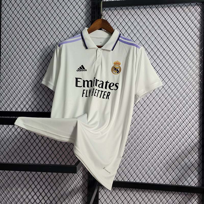
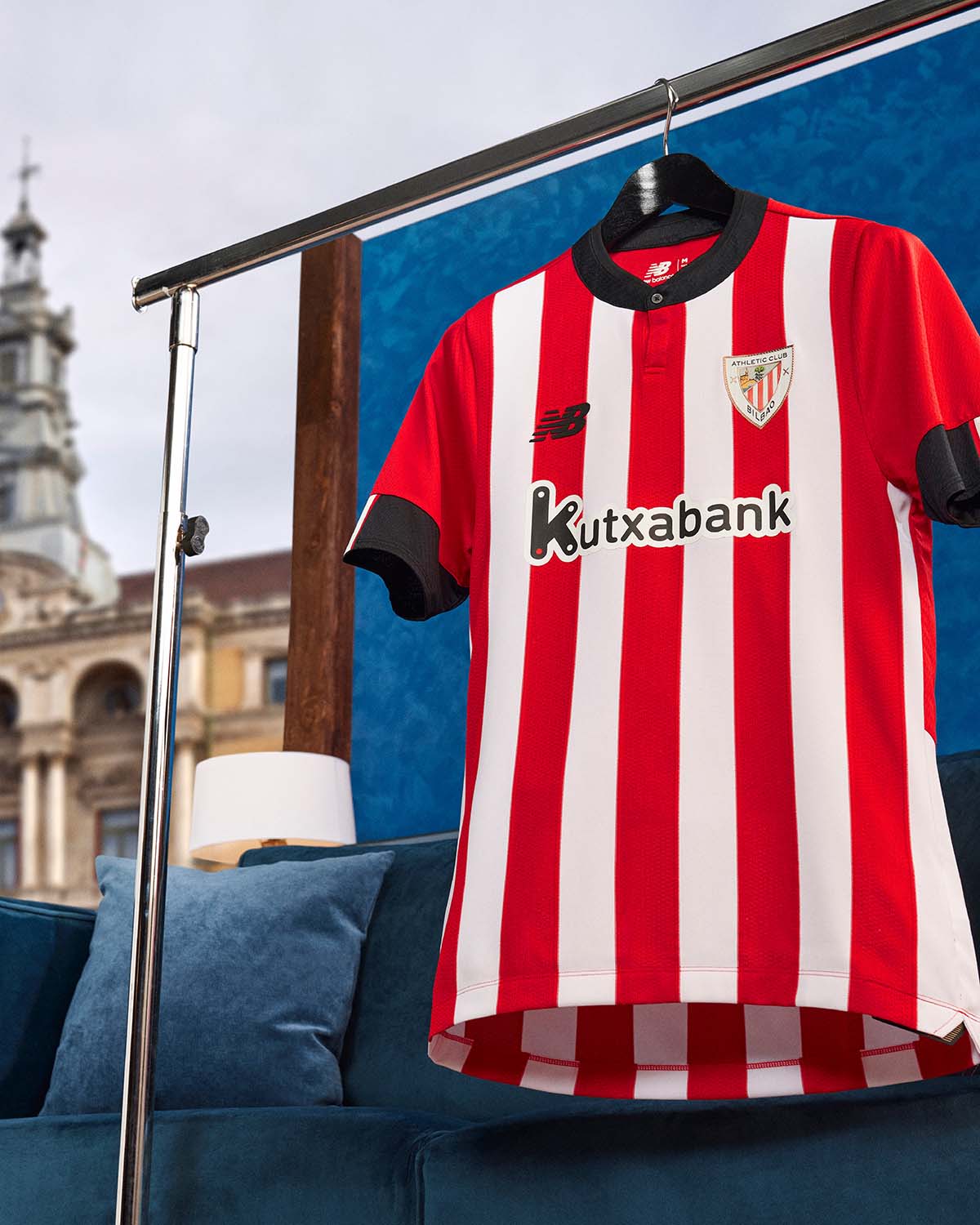
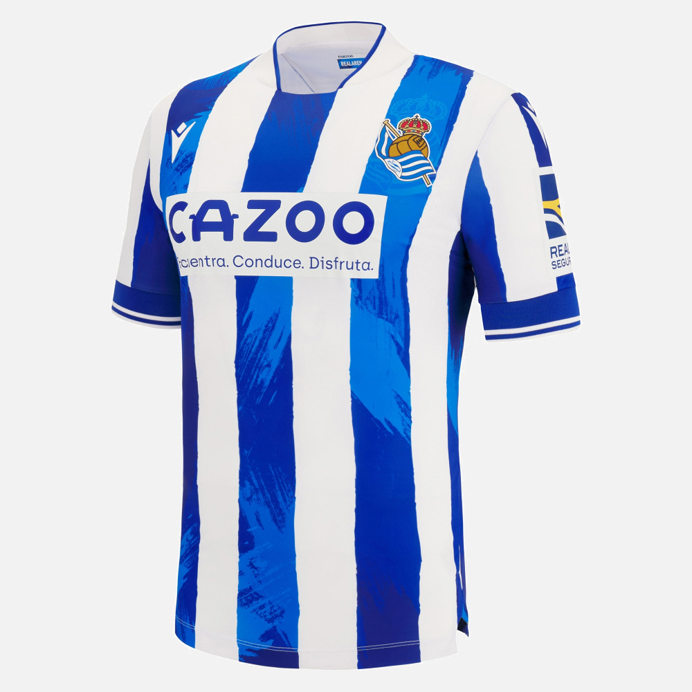
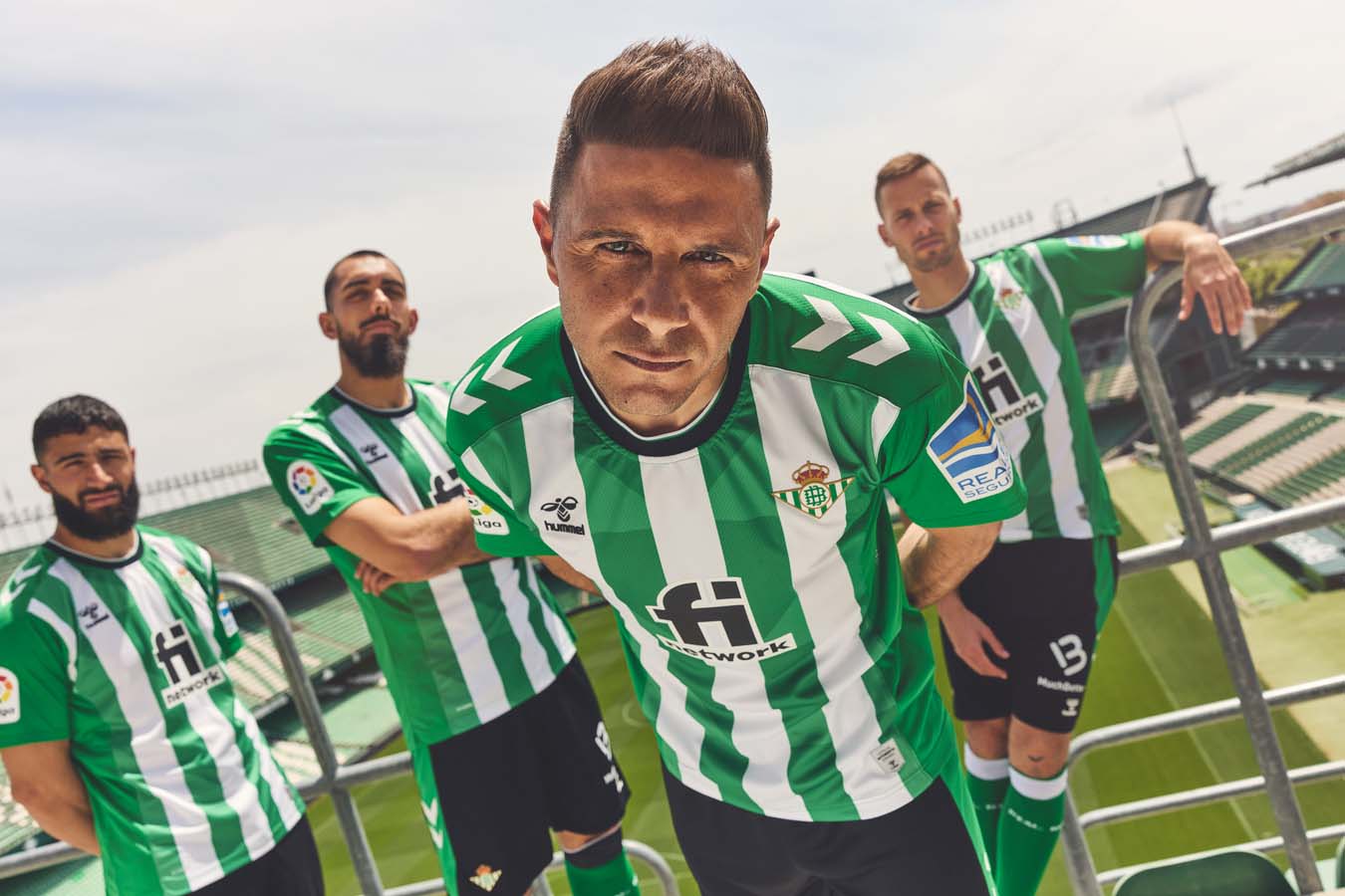
Don’t Ever Change: Real Madrid, Athletic Club Bilbao, Real Sociedad, and Real Betis
Every bit as much as history- and tradition-obsessed as the Premier League and Serie A, La Liga is a trove of home shirts that are crisp, clean and classic in their design. The 2022-23 iterations of four of these shirts are, as they so often are, a credit to the sartorial lineages of the club that’s wearing them.
There is, of course, the classic Blanco of Real Madrid:
The spectacular red, white, and black of Athletic Club de Bilbao:
The…wait for it…blue and white of Real Sociedad (complete with delightful “CAZOO” across the chest):
And, my personal favorite, the lush, deep green of Real Betis:
Serie A
The Good: Napoli
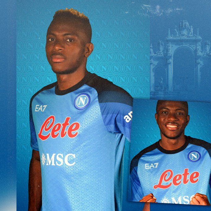
Though they were absolutely going somewhere, I really wasn’t sure where to put Napoli. Now, I’ve traditionally been a fan of the brighter blues in their home shirt, but mulling over this more muted baby blue, with graduated, darker shades around the shoulders, it really is a spectacular effort.
Finishing second by the narrowest of margins is Atalanta, who’s Nerazzuri palate is gorgeous, but is torpedoed by the addition of a second, large sponsor logo near the left shoulder.
C’è un nuovo supereroe nerazzurro in città! 👊🏾
Welcome, @Alookman_! ⚫️🔵There’s a new superhero in #BergAMO! 👊🏾
Welcome, #Lookman! 👋🇳🇬#BenvenutoLookman #GoAtalantaGo pic.twitter.com/zL52JHRcaB— Atalanta B.C. (@Atalanta_BC) August 4, 2022
The Bad: Juventus
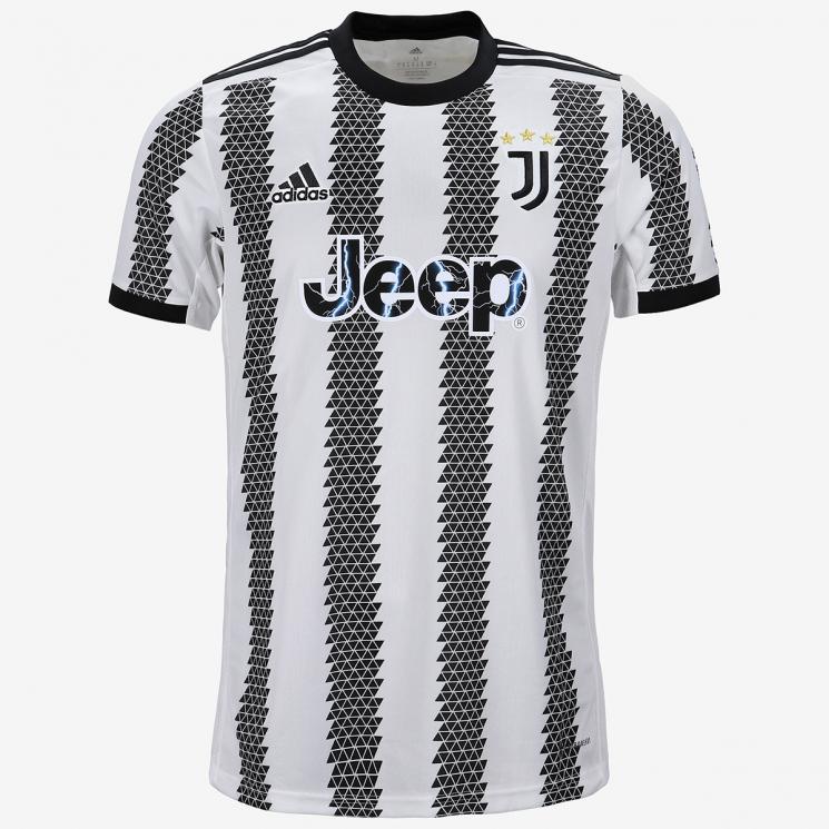
I get it. Your shirt sponsor is Jeep, and the family that’s owned the club forever also owns Fiat, but…
Why, in a competitive setting, as a club that’s famously obsessed with victory above all else, would you opt for stripes that make it look like you just got run over?
Also, that new badge still sucks.
The Ugly: AC Monza
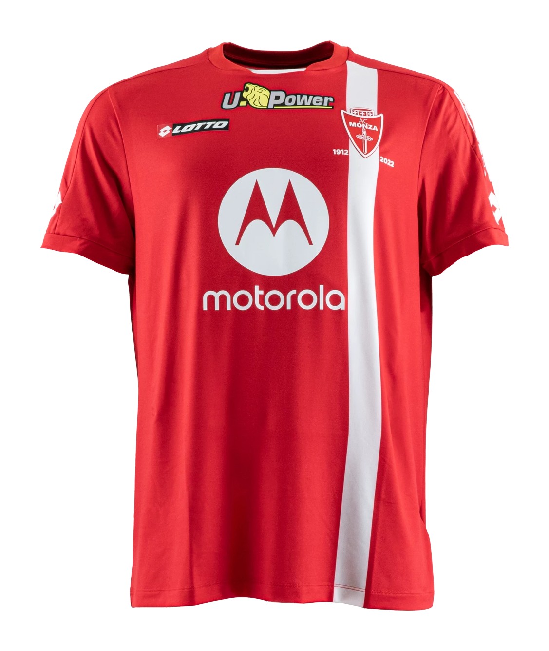
I’m not dumping on Monza simply because they are the club of an odious man. Not entirely, anyway.
Silvio Berlusconi aside, Monza’s 2022-23 home shirt admittedly flirts with glory. Between the thick white stripe (which frames the red and white badge) going down the left, and a white Motorola logo that pops quite nicely against the red shirt backdrop, there’s a lot to work with here.
However, the addition of a second sponsor, safety shoe manufacturer U-Power, does the shirt no favors. This is partly because multiple front-of-shirt sponsors are seldom not awkward, but especially the case since the club could have opted for a lion that is red (like the one in the main logo on the company website), and not yellow.
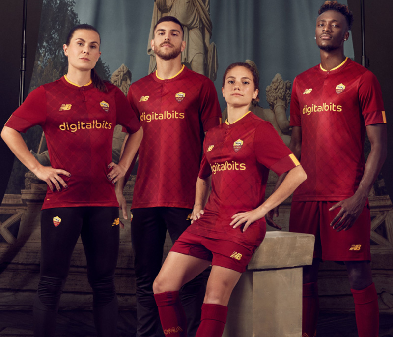
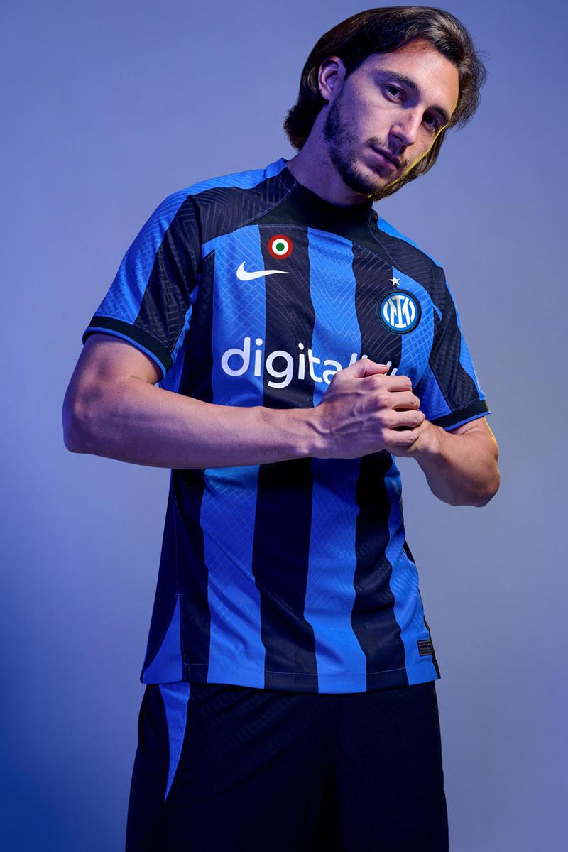
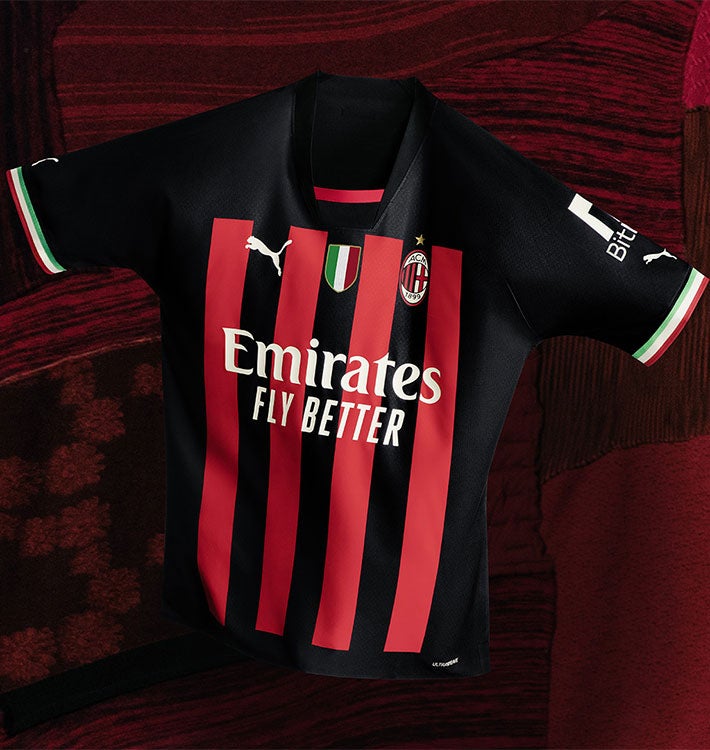
Don’t Ever Change: AS Roma, Inter Milan, AC Milan, and Sampdoria
Italy is another absolute trove of timeless classics. Admittedly, this year Napoli deviated enough from their classic style to have to settle for merely “good” but, heading into the 2022-23 season, a handful of classics are still abound in Italy:
The spectacular wine and gold of AS Roma:
A timeless take on Inter’s Nerazzuri:
An equally classic Rossoneri from AC Milan:
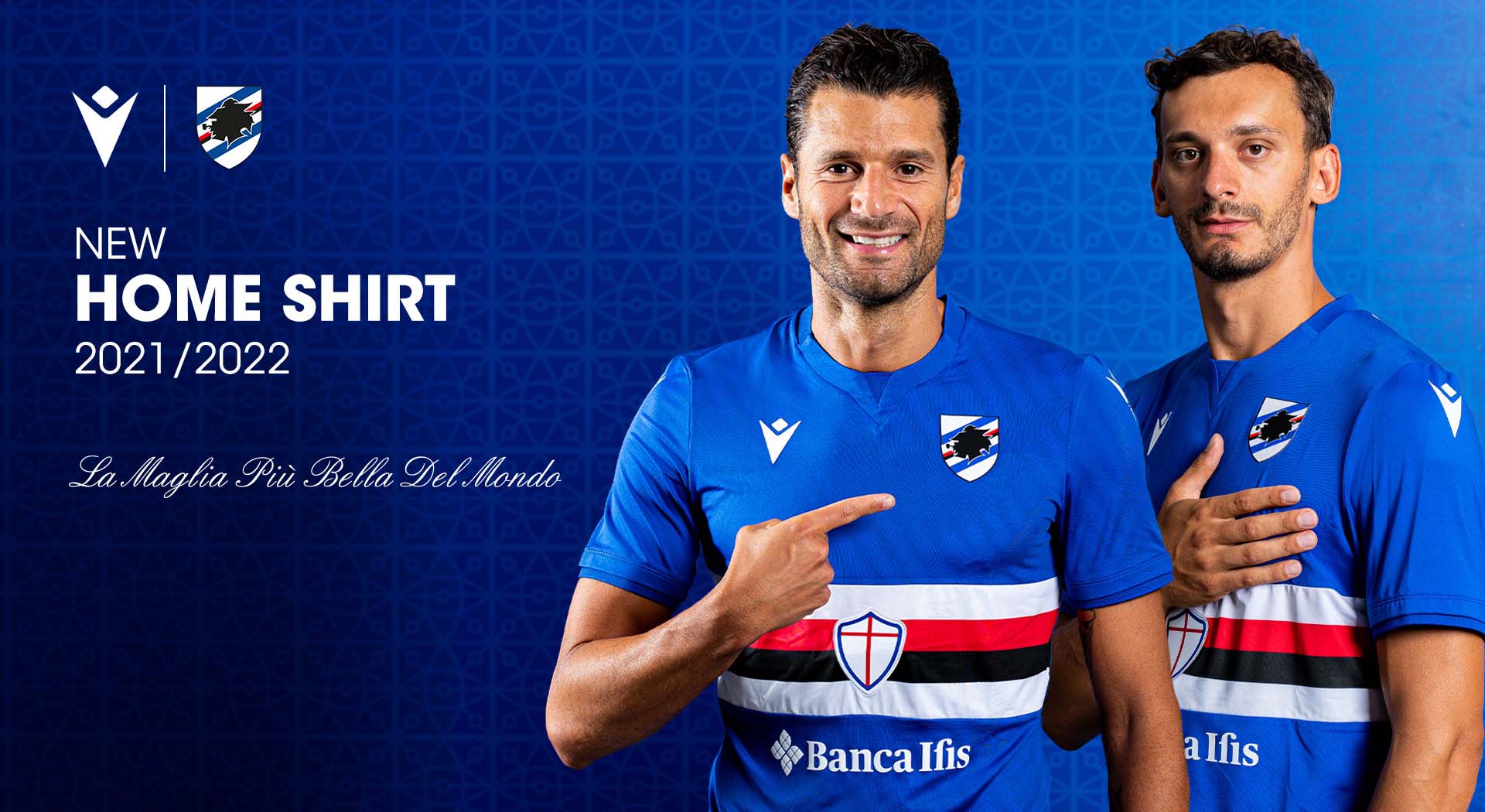
And finally, my personal favorite Italian shirt, this year, and year in, year out, Sampdoria: