Before we fully get into the thick of kit drop season, we take a look back at some of the most underrated English Premier League kits of all time.
Season after season, new Premier League kits come and go. But as they do, they remain ingrained in our memories for a host of reasons — from the sheer look of the strip to what transpired when the players adorned it during a specific campaign.
But there are some that have slipped under the radar for inexplicable reasons. Here are our top five of those very kits.
Newcastle United 1993-1995 Home
Spoiler Alert: This is the only home kit representative on this list.
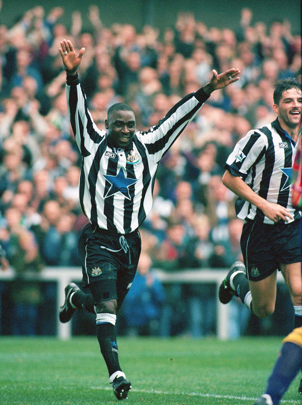
Home shirts tend to stand the test of time anyway, because their releases are almost as keenly awaited as that of a signing. While that may have been the case amongst the Magpies fanbase in 1993, you rarely ever see this kit admired by Premier League fans and kit enthusiasts as the years have gone by.
The centered blue star Newcastle Brown Ale logo is a classic example of an outlandish element that makes retro kits in a league of their own. The fact that it isn’t everyone’s cup of tea is what makes it special.
The collars and the buttons make this shirt one of the cleanest out there. Way too classy for a football jersey and an element that tones down the madness of the giant blue star.
Supplied by Asics, which is surprisingly back in amongst the Gen Z crowd, it makes for a reminder of the fashion zeitgeist during the ’90s as well. The black and white logo is a perfect match for Newcastle’s primary colors. For anyone that wants to throw it back to the early ’90s with this sumptuous release, donning the full-sleeves version is an easy win, as exemplified by Andy Cole.
West Ham United 1999-2001 Away
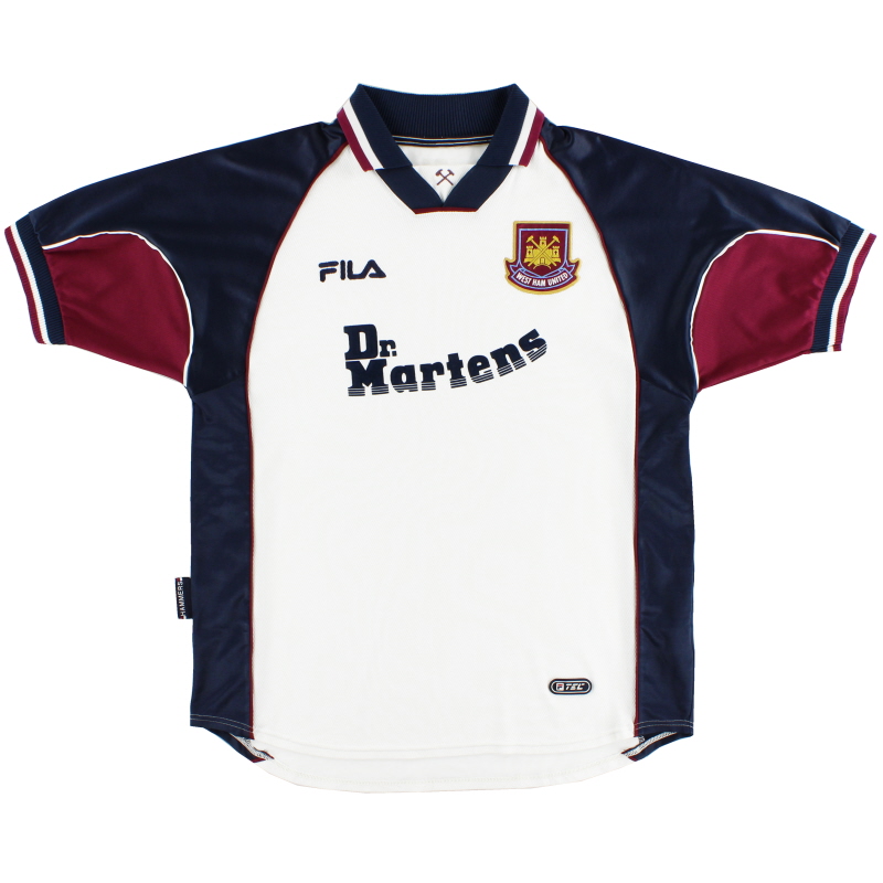
It’s criminal how one rarely ever hears even a whisper of appreciation about this beauty. Perhaps the under appreciation stems from the home rendition of this kit being lauded by many as an iconic Premier League shirt — largely due to Paulo di Canio looking like the legend he is while donning it.
But one facet that certainly stands out about this neat drop is how adeptly it pays homage to the claret and blue, two colors seeped into Hammers heritage. Look at how stunning that collar is for a second. Dominated by the shade of navy blue, the dash of claret makes for one of the classiest collars you’ll see on a football kit.
In a similar vein, the sleeves also pay tribute to the Irons’ rich history in fine fashion. The claret and blue go hand-in-hand once again in a way that sets it apart from the rest. Instead of either color being signified by incorporating a pattern on both sleeves, as is the case most of the time, the significant chunk of both claret and blue makes for a stunning touch.
And aside from this, we have to talk about the Dr. Martens sponsor.
The logo as well as the sponsor itself has the ability to make or break a shirt. Chelsea’s collaboration with Three UK is perhaps the finest example of when a sponsor logo has the ability to make a reasonably looking kit uneasy on the eye.
Fortunately for West Ham in the late ’90s, they simply cannot relate as the Dr. Martens sponsor was an instant hit both then and now.
And to top it all off, the white element in the neckline with the crossed hammers is a subtle, yet poignant tribute to perhaps the club’s most identifiable symbol. There’s so much to love about this kit and yet, it has been disappointingly overlooked over the years.
Manchester United 1996-97 Third
Despite their crosstown rivals associated with sky blue, Manchester United have a habit of creating instant classics with different shades of the color.
For instance, the royal blue away kit from the 2008-09 season was an absolute stunner and a reminder of the days when Cristiano Ronaldo and Wayne Rooney were running riot in tandem.
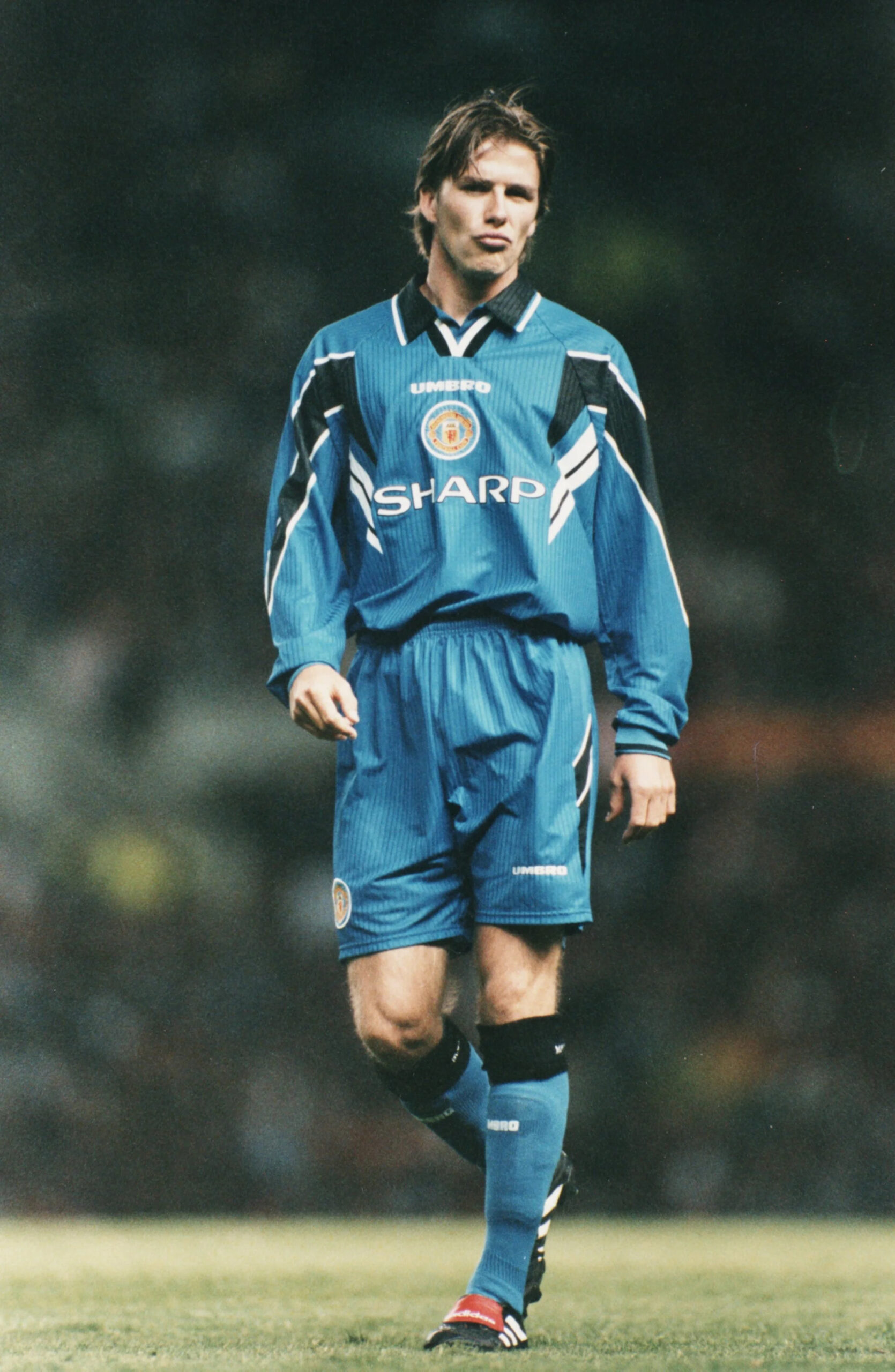
But a blue belter that has gone under the radar for over two decades is the sensational third kit from the 1996-97 campaign. Admittedly, David Beckham could look like a boss with a bin on his head. But that’s certainly far from the case when it comes to this glorious piece of clobber.
The darker shade of blue would perhaps have made for too plain a shirt, which is a cardinal sin when it comes to third kits. Instead, the design team decided to incorporate elements of black and white to add that much-needed pizazz.
And to say it worked would be putting it modestly. That is quite simply the most cracking collar you’re likely to see on this list, which is certainly saying something. The dash of white plays second fiddle to the dominant black in sparkling fashion to create a collar that’s way too classy for a football jersey.
The same strategy is in place on the sleeves, as a black pattern takes center stage, but is highlighted by the subtle, yet key white outline on either side. The United crest right in the center is another reason why retro kits are unmatched, and the circle around it is another distinct touch that cleverly highlights it.
Supplier-sponsor appreciation is going to be a running theme throughout this list and when you have Umbro as well as Sharp on the same kit, that’s an easy win right there.
Considering how massive a brand Manchester United are globally, it comes as a big surprise that this kit has never really got the flowers it deserved.
Arsenal 2007-08 Third
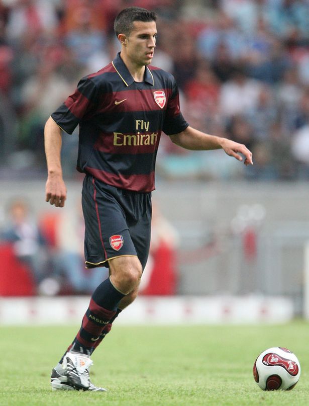
Alright sure, it is slightly strange that an Arsenal kit has made the cut here. After all, they drop a classic almost every season that the entire world gushes over.
But that isn’t the case with this tasteful drop in 2007. Wengerball was still a sight to behold during this era and yet, you rarely spot a Gooner rocking this jersey in the flesh. But let’s break down what makes this piece of clobber one that commands a lot more adoration.
First things first, the color combination is nothing short of sublime.
The claret and maroon may not make a lot of sense in theory, but it goes together perfectly in practice. While third kits tend to be extremely in-your-face because fans expect a pile of randomness, this is as classy as it gets.
And the gold elements on the strip are worth giving the designers a handsome pay raise.
The gold Fly Emirates logo, which is as classy a sponsor logo can get, is in sync with the sexy football Arsenal played during the entirety of the season. Prime Emmanuel Adebayor up top with Cesc Fabregas pulling the strings, beautiful scenes.
And also, glimpse at the gold swoosh that is cleaner than Eduardo’s wand of a left foot.
Lastly, a major takeaway remains that Arsenal need to embrace horizontal stripes because it’s made for a screamer of a kit.
The more you admire this strip, the more it baffles you how it hasn’t been hailed as a legendary drop. It is indisputably right up there amongst one of the most slept on kits in the history of the most box-office league on the planet.
Manchester City 2009-10 Third
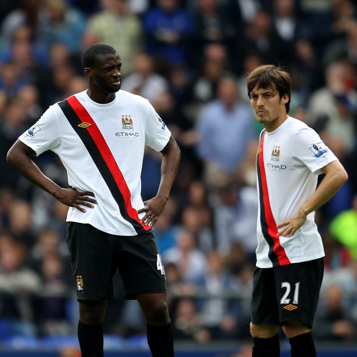
Look at how immaculate this strip is. Now ask yourself whether it gets the credit it deserves. First things first, the red and black sash is one of the greatest design elements you’re likely to see in any Premier League kit across history.
While taking inspiration from the Manchester City kits from the ’70s, this modern-day classic integrates its own twist by slanting the sash from left to right rather than from the right side to the center.
Despite being a stunning, yet divisive element in plain sight, it’s intriguing how a design aspect that is so out there does not take away from how elegant this shirt is.
After all, the plainness of the white base is what helps one accept the sash in the first place. In addition, the contrast between both elements makes me want to log into eBay and cop it right this instant.
Also, the way the Umbro logo meshes in amidst all that’s on display is glorious.
The gold logo should ideally look out of place on the red and black sash but somehow, it adds an element of royalty to this kit that’s fit for kings such as David Silva and Yaya Touré.
To add to this, the gold wings in the old City crest combined with the matching color of the Umbro logo is a splendid touch and is another subtle, yet tasteful element about this kit.
One could go on and on about how unreal this shirt is, but it is blasphemous how it barely gets the props it deserves. To us at Urban Pitch, this banger right here is top two and it’s not two.


