
The league may be second tier in nature, but the EFL Championship has had some top level banger kits throughout its history. We narrow down the five best in the last 30 years — from classic ’90s hits to recent stunners.
It may not be the highest level of play in its country, but the EFL Championship is still one of the most competitive leagues in the world. Premier League clubs tend to do a lot of their summer shopping from the second tier of English football, with famous pickups including James Maddison in 2018 and Fabio Carvalho in 2022, among many others.
The league does quite well in terms of attendance and viewership, but one aspect that tends to go overlooked is its kits. We decided enough is enough and to incite change, handpicked the five greatest Championship kits since 1992.
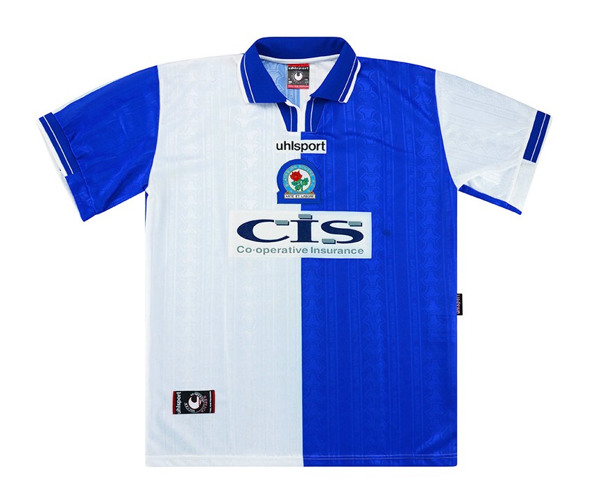
Blackburn Rovers 1999-2000 Home
When it comes to falls from grace, few clubs can match that of Blackburn Rovers. The lasting memories of one of English football’s most historic clubs include a Premier League title win in 1995, which saw Alan Shearer lift his first and only league title, Tim Sherwood being preferred to Zinedine Zidane, and more recently, cult hero Morten Gamst Pedersen.
However, the Rovers have always had a successful track record when it comes to dropping kits. And there aren’t many better examples than the release from the 1999-2000 season where they had dropped to the Championship.
All Blackburn home kits tend to be split by their two primary colors in blue and white, a feature that separates the club’s releases from almost any across in the world, let alone the country. However, this design choice is only accentuated by the collar. The Riversiders didn’t reinvent the wheel with this piece, but if you take a look at their kits from 1996 to 1998 and on several occasions in the future, their color combination is made to look comical due to dodgy button and collar choices.
On the other hand, this strip features a sleek blue collar, which is only elevated by a slight dash of white. A thick and a thin line of white on the collar on either side adds a contrast that one would never realize was crucial without its presence.
The ultimate standout feature of this strip is how the colors have been used to underline the sleeves.
In a majority of cases, designers tend not to pay credence to the sleeves. It’s usually a solid color that matches the rest of the jersey, and that’s that. Here, both blue and white also divide the sleeves, much like in the center of the shirt, which is a unique approach to doing things and it works a treat.
The color-based segmentation happens at the back of the shirt as well, which is an unnoticed, yet one-of-a-kind method that has never quite caught on for some reason.
Blackburn Rovers perhaps have the privilege of having one of the most aesthetically pleasing crests there is, and placing it at the heart of the shirt was always bound to be a hit.
Hull City 2021-22 Away

While some may scoff at this selection as an archetypal case of recency bias, it is anything but that. Instead, Hull City’s away kit from last season is simply an instant classic that deserves its place on this list.
Black kits rarely ever tend to fail, but draping a kit in midnight shades often makes it harder for it to stand out. However, when you execute something to perfection, even an all black kit can shine bright. Let’s break down the ingredients that have made this strip one for the ages.
The charcoal frontal stripes are a work of art and subtly provide a contrast to the blacked out strip in sublime fashion.
While Hull could have chosen a more obvious choice of color to highlight the contrast, such as white, the design team at Umbro made the brave decision of picking charcoal grey, and it’s safe to say that the calculated risk has paid off.
The use of grey is not merely on the center of the shirt as well, as it accentuates the crew neckline along with the sleeve cuffs, giving fans an additional reason to cop one of the most coveted jerseys in Europe last season.
On the shorts as well, the Umbro diamond, the lined pattern, and the use of grey provide a much-needed contrast that works to a tee.
After an overwhelmingly positive response to the shirt last year, Hull City re-released it for this season, barring a change in sponsor. An absolute belter of a strip, which was so nice, Hull had to do it twice.
Manchester City 1999-2000 Home

Despite Manchester City leveling up in each and every facet possible, if there is one area where they were perhaps better in back in the day, it is designing kits. Compare this gem to their ungodly third kit last season and the case makes itself.
On this strip, one feature that instantly stands out is how the design team have utilized a sky blue and white color combination. Most Manchester City kits feature a sky blue shirt and white shorts, which makes the usage of both colors on the shirt itself a unique approach.
The decision is an instant hit, as two light tones in tandem complement each other in sublime fashion. If the color combination has never been a miss with the shirt and shorts, why would it be when used just for the former?
Another feature that tends to be rather rare in City’s home kits is the incorporation of a black collar. However, it especially works wonders with the three colors at play in this kit. Alongside two lighter tones, a darker shade makes it pop.
And in the underside of the collar, the black and white lines are a subtle, yet crucial element that is the one loud feature in an otherwise low-key drop.
While a number of clubs release shirts that try to make a statement, one principle always worth reiterating is that the finer details are what set a home kit’s legacy in stone. Being out there in designing a strip that the fans wait for throughout the summer to represent the club for the entirety of the season is a risk not worth taking.
As with many retro shirts, the crest is centered, which is always a tasteful decision, especially when it is the older iteration of Manchester City’s badge.
Sunderland 1998-99 Away

It wouldn’t be a hot take to suggest that this strip is the greatest Championship kit of all time. To this day, fans of the Black Cats rock this gem, as it remains a one-of-one in the club’s history.
While a majority of away kits tend not to pay homage to the home strip, Sunderland have done so with this drop. After all, the primary white and red colors play such a central role, without taking away from the fact that ultimately, what we’re looking at is an away strip.
The parallel lines at the heart of the shirt instantly catch the eye, but rather than merely being a pleasing pattern, it represents the club. And the design team found a number of ways of doing so across the shirt.
For instance, the red collar also features a white line on either side. Similarly, both cuffs are split between red and white, which caps off three different ways in which Sunderland’s colors have been showcased.
While away kits tend to be on the louder side of things, this shirt strikes the perfect balance between making a statement, but not at the cost of going overboard.
It’s the kind of release that you’d wear out on the golf course and not look out of place. Part of that is due to presence of the glorious Lambton’s sponsor logo. If Liverpool’s Carlsberg era was iconic to some, Sunderland’s Lambton’s days are criminally underrated. Also, the fact that the brand is rather niche, especially to Gen Z, makes it the perfect hipster drop.
If the state of a sponsor logo can be the difference maker between a kit that stands the test of time and one that is ridiculed for years on end, we know which category applies in the north-east English side’s case.
Add the Asics logo to the equation as well, which is as much of a throwback to ’90s football as possible, and this strip really ticks every possible box.
Wolves 2002-03 Home

The idea of beauty lying in the eyes of the beholder is pure malarkey. Especially when there are some creations that are objectively a sight for sore eyes. Wolves’ home kit from the 2002-03 season is one of those.
There’s only one place to start and that is the iconic Doritos sponsor. As legendary sponsors on vintage shirts go, it is virtually impossible to top the Midlands side’s flex from two decades ago.
The color coordination between the Wolves shirt and the classic junk food staple is the secret recipe behind why the sponsor logo is such a smash success.
While the black cuffs are an unsurprising hit, the subtle dash of orange highlights this feature of the shirt. Similarly, the collar features the same pattern and is very easy on the eyes.
The Admiral logo is yet another legendary one, which looks just right on kits from yesteryear.
Some may scoff at attributing credit to a shirt due to its sponsors and logo, but that school of thought is expected from an individual that is not a connoisseur of the football kit.
Think back to Manchester United’s Chevrolet sponsor and the case makes itself on why sponsor logos can make or break a kit.
All in all, this is one hell of a strip that is worth bringing back 20 years later.


