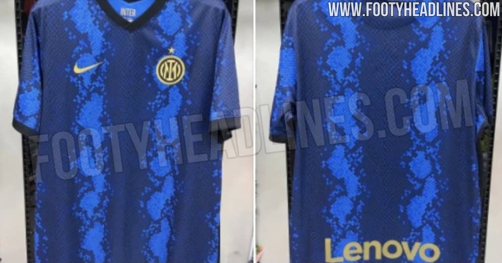
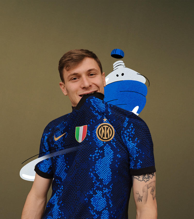
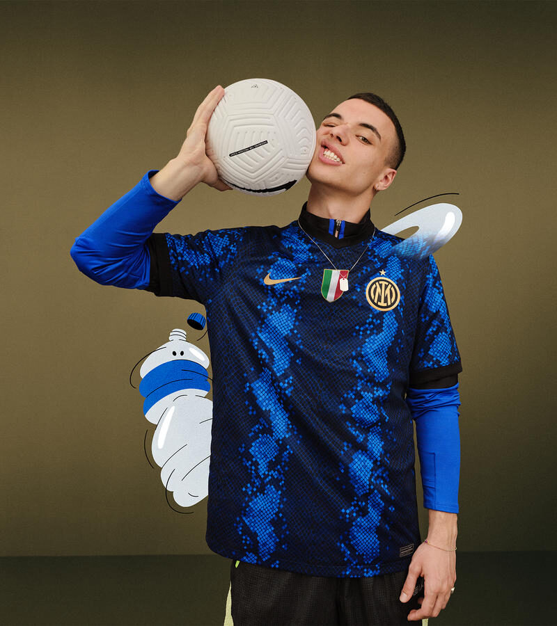
Leaked months ago to some mixed reviews, Inter Milan and Nike have silenced any doubters with the official release of their 2021-22 home kit.
I have been hoodwinked. Bamboozled. Led astray. Run amok. Flat out deceived. I hate to use Stephen A. Smith’s words, but they perfectly explain my complete 180-degree shift on the new Inter Milan home kit. For reasons that we’ll shortly discuss, I was certain it would be an absolute train wreck of a shirt. As loath as I usually am to admit it, I was wrong.

It started with the new crest. Longtime holders of some of the best logos in all of sports, Inter questionably introduced a new one, ditching the classic look for something more simple and cartoonish. After being leaked in January, it was made official in March.
Then came the news that the Pirelli sponsorship was coming to a close. While kit sponsors can be a contentious topic, it’s objectively clear that Inter and Pirelli were an iconic duo that produced some of the best shirts in football during their run together. A new sponsor could be catastrophic, disrupting a habitat that has been living in equilibrium for over a quarter century.

If that wasn’t bad enough, a leaked picture of Inter’s 2021-22 home shirt made its way onto the internet, and it looked a mess. The nera in the neriazzuri appeared all but gone, and a strange snakeskin pattern made the trademark Inter stripes look flat and fragmented. I’m not a betting man, but I would’ve put the house on Inter’s run of fantastic kits ending in 2021.
Thankfully I’m not a degenerate gambler (*Tony Soprano voice*), because Nike officially unveiled the 2021-22 Inter home kit yesterday, and it’s just as good if not better than anything the club has worn in recent memory. In comparison to the leaked photos, the colors are much bolder, providing a deeper contrast between stripes (the black is indeed visible) while also giving us a better look at the details. While I’m still of the opinion that the new crest is a massive downgrade, the scudetto patch in between the crest and Nike swoosh celebrating Inter Milan’s Serie A title is a nice distraction from the eyesore adjacent to it.


As for a sponsor, reports have surfaced that fan interaction site Socios.com will have the coveted spot on the front of the shirt, but details are hard to come by and we don’t know how the logo will fit in with the rest of the design. It certainly will have big shoes to fill after Pirelli’s departure.
It’s important to note that this whole disgust-to-elation process is indicative of one of the issues kit leaks produce. As the craze for football shirts continues across the world, more and more leaked pictures of future kits make their way onto Twitter or sites like Footy Headlines, which either build up their hype or lead to their ridicule. While in many cases these leaks can be pretty reliable, sometimes their low-quality nature fails to illustrate the kit in full. Some previous examples of jerseys that have been let down by their leaks include last year’s Manchester City paisley third kit and coincidentally Manchester United’s 2020-21 “zebra” third kit as well.
While I try to take in these leaks with as much skepticism as possible, the previous blows from Inter — the new crest and lack of Pirelli sponsor — had me convinced way too early that their next jerseys were going to be terrible. But if their home kit signifies anything, it’s that the Inter design team still has it. I’ve learned my lesson, and I won’t be doubting Inter Milan from a kit perspective any time soon.


