To celebrate the club’s 50th anniversary, the Seattle Sounders introduced a set of new logos and colors earlier this week. Urban Pitch resident Sounders fan Kyle Scoble gives his thoughts on the team’s new look.
Over the past decade, the Seattle Sounders have been the most successful MLS club. It’s the only team to have won multiple MLS Cups since 2013, and you can add a Supporters’ Shield, U.S. Open Cup, and CONCACAF Champions League title over that span as well. The Sounders stand alone as the only team with one of each title in the past 10 years.
Yet, even the most successful of sides needs an aesthetic refresh every once in a while, and one of the most recognizable clubs in American soccer got a makeover earlier this week. As always, the reaction to even the announcement of a rebrand was met with mixed reviews from fans both of the Sounders and across the rest of the league. Rebrands are difficult, and some of the missteps in recent years have turned fans cynical.
So you can imagine why us Sounders fans were a bit nervous going into Tuesday’s reveal. Our beloved rave green and eternal blue are no more.
Why Now?
The simplest answer is that in 2024 the Sounders are celebrating their 50th anniversary. But that doesn’t explain why they have gone for a full rebrand over a more simple commemorative logo or patch. For that we need to get into the history of the Sounders and their colors and crests.
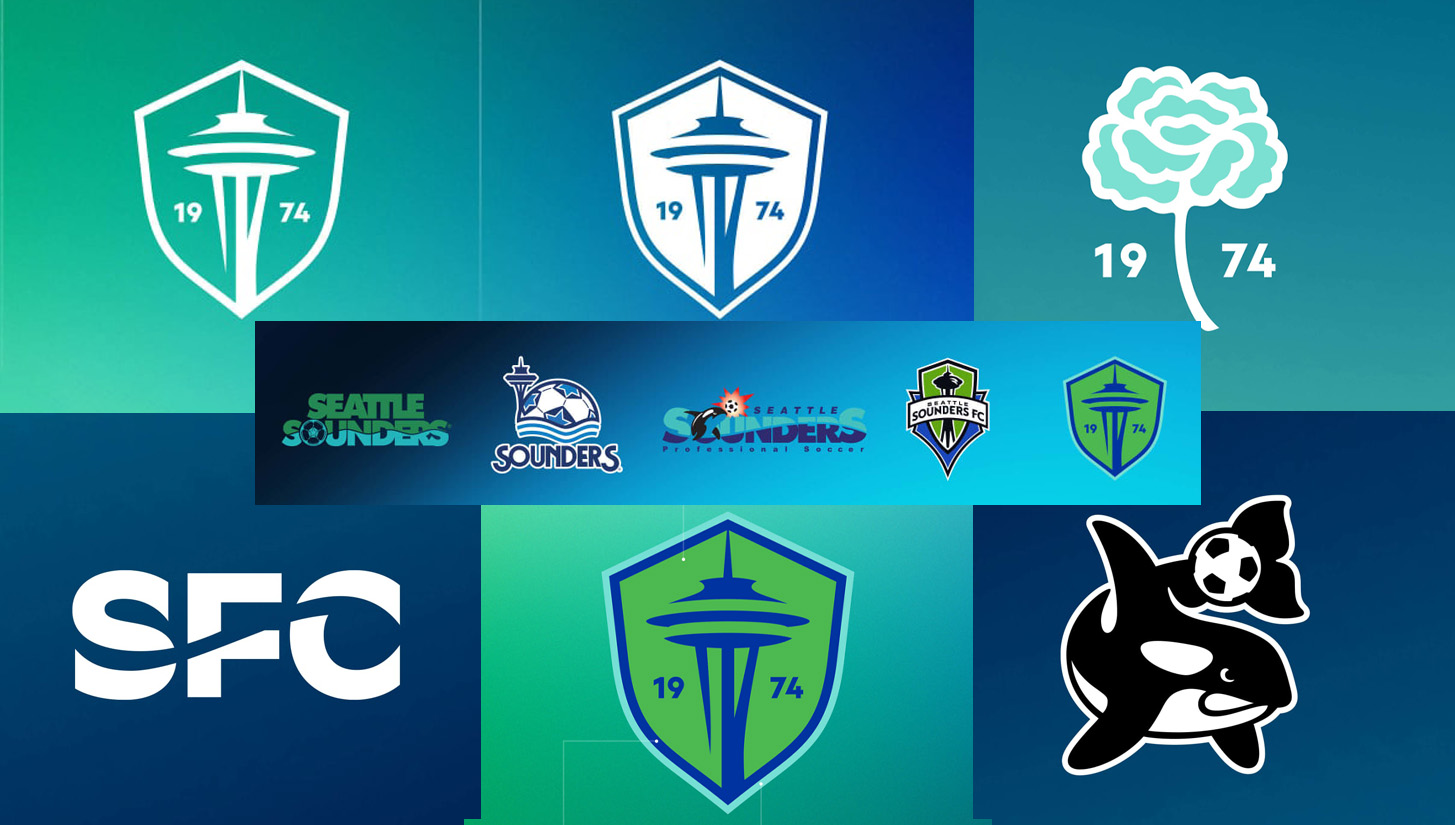
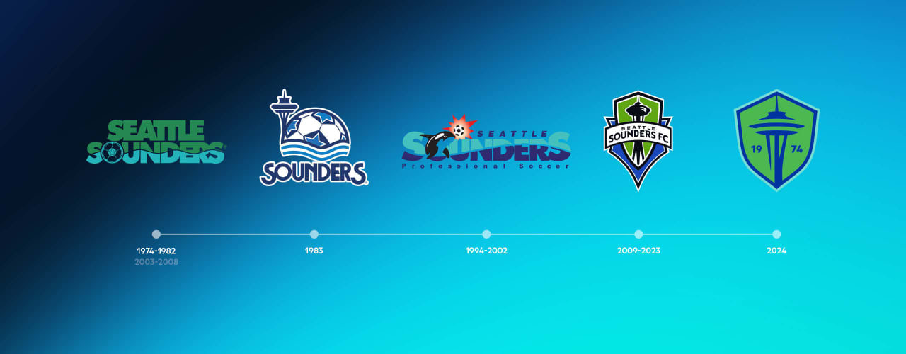
What if I told you that the current Sounders crest isn’t even the best Space Needle crest, or that out of our 50 years, only the 14 in MLS have seen green as our base color? Below is the history of Sounders crest, and you’ll notice a lot of blue prior to 2009.
Which brings up the question: “What is a Sounder?” Well it’s someone from the Puget Sound, the body of water that Seattle is nestled up against. See where I am going here?
The current Sounders crest was stale and showing its age in a bad way. The Sounders’ colors have always been a personal pet peeve — do they not scream youth club with how bright they are?
Honestly, what professional wants to wear that shade of green? It is definitely recognizable, but maybe there is a reason so few pro soccer clubs have bright green as their main color. To be clear it is not a bad crest at all, in fact it is good and one of the better in the league still. But the Sounders aren’t one of the better clubs, they’re the best. Since joining the MLS ranks, the silverware has been free flowing. Eight trophies in 14 years is the most by any club in the league over that span.
When the Sounders joined the league they had more than double the average attendance. Our signings of Clint Dempsey, Nico Lodeiro, and Raul Ruidiaz were league defining. A United States men’s national team star coming back to play in his home country, a Uruguay international that was a starter for Boca Juniors, and the Liga MX league leader in goals over the previous two seasons; bonafide stars in their prime.
Recently it hasn’t been like that. For the first time since joining MLS, the Sounders missed the playoffs in 2022. An early 2023 U.S. Open Cup exit has given the club only one tournament to focus on, and it’s been frustrating for fans. While still third in overall attendance, per game numbers are down and have been slowly declining for a few years.
Additionally, for the past five years, the financial focus of the club has been off-field: our academy and training facility. We’re transitioning as a club from being at the forefront of signing and scouting to being a development club and using our transfers to compliment what we produce in house.
Currently half of the Sounders roster either grew up in Washington or played high school or college in greater Seattle. And we’re still in the top half of the Western Conference and could end up as high as second place if we take care of business. Even that last sentence is a little weird to write given the feeling around the fandom, but it’s the reality of where we are as a club.
Now that we have our academy producing pro level players and our training facility is done, we can put all of the club’s focus back on the field. It’s going to feel different now. It’s going to be kids from Puyallup, Walla Walla, and even my part of the state, Kitsap County. The club is not the same one that entered the league in almost every way possible, and the vast majority of those changes are for the better.
We simply aren’t the new kid showing everyone how it’s done — we’ve been copied twice by Atlanta United and LAFC and that’s good. We’re the savvy veterans now. We’ve been around the block and know what it takes. Anyone can go buy players, but how many clubs develop players without dropping off?
Lastly and definitely least, the Sounders having a blue base means the three Cascadia teams now make up the Cascadia flag’s colors. It doesn’t really mean anything, but damn do I love that.
Grading the Rebrand
This club is a reflection of our community.
This crest is an illustration of our club. pic.twitter.com/cNT4E2InUq— Seattle Sounders FC (@SoundersFC) September 26, 2023
The Sounders did a great job with the reveal videos on social media. Their sleek and cinematic nature suggest they paid a pretty penny for them.
This crest is beautiful, clean, iconic, and timeless. There is no doubt who that crest belongs to, but it still has new life added to it. It’s more minimalist than I would choose, but there are business reasons behind that. Simpler crests are easier for merch, but also easier to collaborate and license out for others to work with. It’s still freaking beautiful. For me, changing to blue as a primary and introducing a new green is the key here.
Yes we are the evergreen state, but our biggest rivals are named after trees and rightfully have green as their base. It was a much needed switch while keeping the green and introducing multiple shades. It even sort of looks like the Puget Sound now. The colorway feels aquatic, and it’s entirely what you want for a fishing port city.
Five decades later, you continue to shape our identity. ❇️ pic.twitter.com/VceC5g4yFs
— Seattle Sounders FC (@SoundersFC) September 26, 2023
Based on hype and rumors I was expecting more of a true rebrand, but this result feels along the lines of a refresh. Sticking with the Space Needle is what does this, it’s the safe move. Not only was it the focal point of the previous badge but it’s recognizable outside of sports. Anyone that has visited or knows a little about the city, knows about the iconic landmark.
![]()
![]()
Equally as good as the Space Needle implementation are the tertiary logos. Before this the Sounders didn’t have a single alternate logo, unlike many other MLS clubs that employ them hats and shirts. Not only did we get them but they are perfect. I mean an angry orca?! This is straight out of our club’s history. Sammy was our mascot for so long, and even on the ’90s logo. The Carnations are a club tradition and the design is super clean. As far as rebrands go this is as good as it gets. None of it is going to be perfect but it’s objectively better and well done.
This is the move of a club that knows who it is and what it wants. It’s trend setting and rebranding to usher in a new era, not because they’re trying to move on from mediocrity or a new ownership group inserting themselves.
The Sounders aren’t big spenders anymore. Instead of buying up big names like Ruidiaz, we are creating our own stars with our young trio of Obed Vargas, Josh Atencio, and Jackson Ragen. Even in a disappointing year, the Sounders are alive for first place in the West and probably are going to host at least one playoff game.
Our standards on the field are matched off of it. We’re the only MLS club that has fans vote on retaining their GM. Getting back into the playoffs and this rebrand are satisfying fans for now, but moving forward the Sounders will operate differently; in their own home for training, with players who grew up in the region, and a new crest on their jersey — but with the same old results.


