
MLS third kits are back! With all four officially revealed, we grade each release based on concept, execution, and overall style.
For the first time since 2021, MLS has rolled out third kits for a select few clubs this season. The parameters that determine which club gets a third kit is mostly a mystery, but the general consensus has been that the league rewards clubs who sell kits above a certain threshold with an alternate kit the following year.
While it would be amazing for every team across the league to get three separate shirts, only four clubs were lucky enough to receive the distinction: Atlanta United, New York Red Bulls, NYCFC, and Toronto FC.
We could complain about the league’s third kit stinginess, but instead let’s just review what we got in 2023.
Atlanta United: 4/10
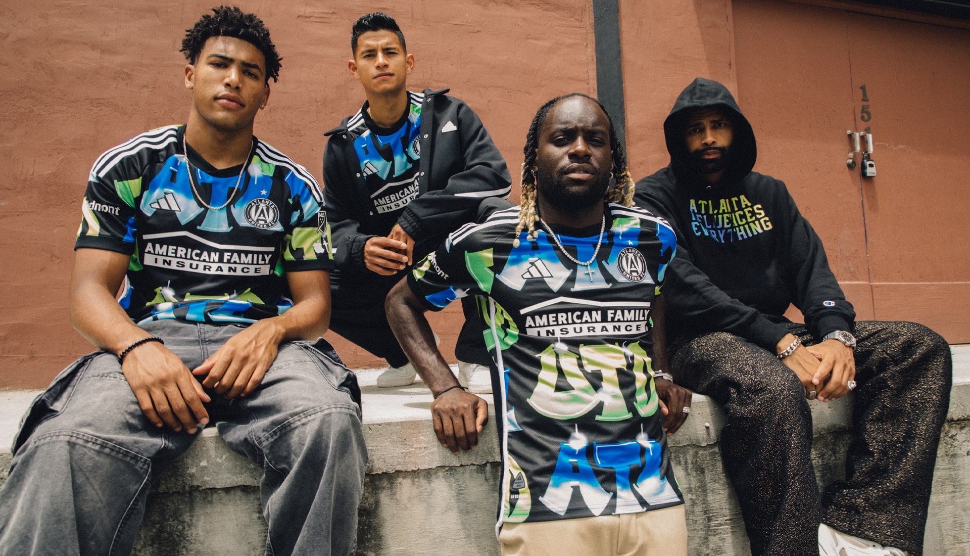
Before I go into why this kit doesn’t work for me, it’s always nice to point out successful design choices. Every shirt has some array of positive traits, and this is definitely a shirt.
The color scheme is interesting, akin to the classic 1996 Outkast album ATLiens. The type design is good as well. That’s pretty much it when it comes to the positives, however.
The main problem is, it looks like a tiled Windows XP-era background. A repeating pattern in this fashion feels quite uninspired. A graffiti style could have been better executed with either changing the scale and orientation of the background design, or just by trying to design it as a piece of teamwear first. Instead they decided on a repeating three letter graphic over a blank background.
This feels a bit too much like a warm up kit, with the blackout patch, white stripes over black backing, and obviously bricked pattern. There’s so much potential in a graffiti themed shirt, and this one doesn’t quite live up to it.
NYCFC: 9/10
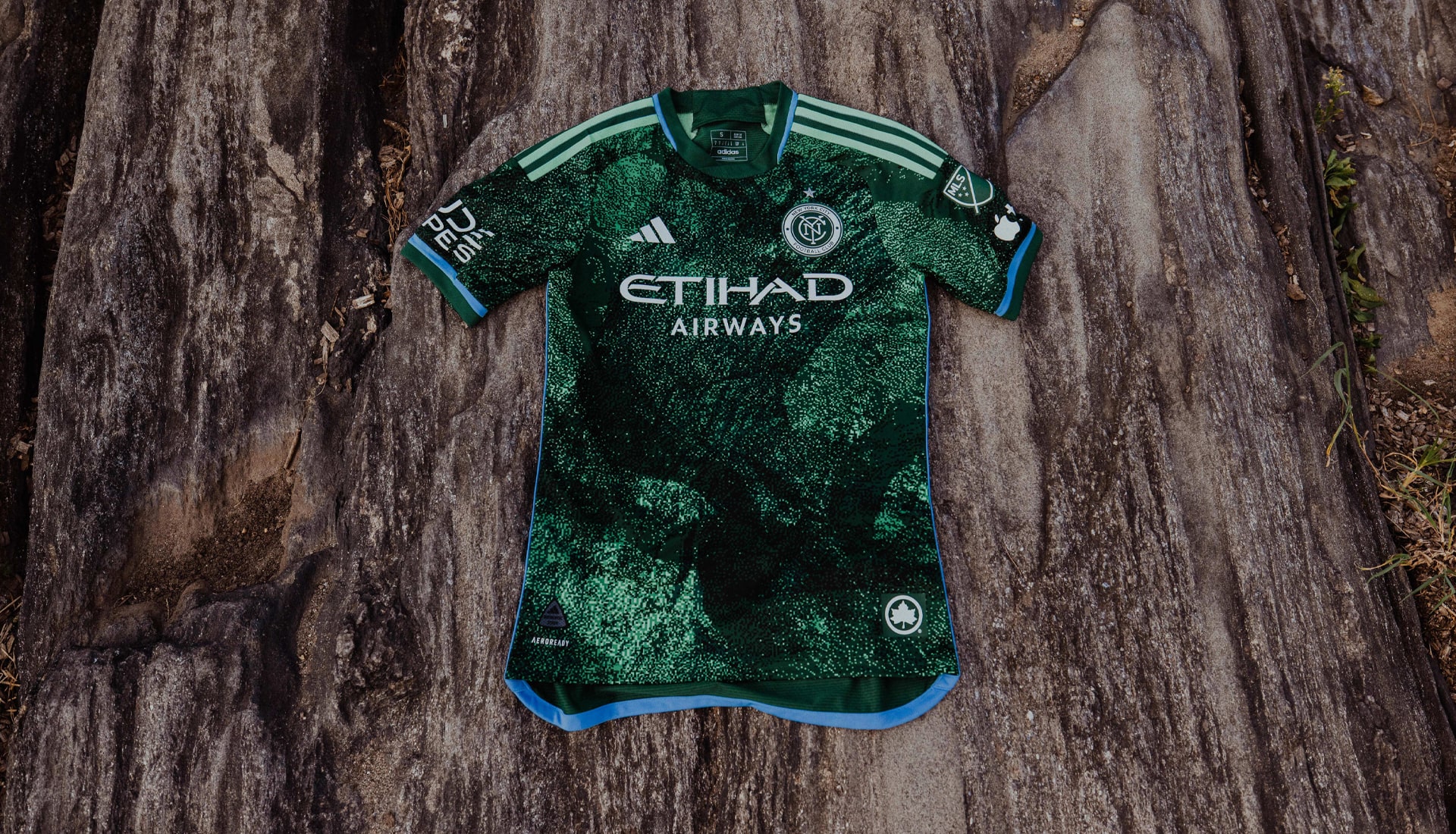
First it was Market with the New York Department of Sanitation release, now NYCFC is collaborating with the Parks Department on the 2023 third kit. I don’t know why these city government institutions are dropping merch collaborations, but they seem to be good at it.
This shirt is lovely in my opinion. The digitized green background uses a surprising lack of colors in the print despite the complex look. Light blue and mint accents also really pull the shirt together, alongside the extra detail on the back collar and jock tag. Light blue and green will forever be a god tier combination.
My only complaint or thought on the design is that they didn’t do enough with the template. I would have liked to see some blue accents on the three stripes, similar to the way NYRB incorporated white on their third strip shoulder stripes. It’s such a unique feature of the new adidas template, yet I don’t know why more clubs don’t incorporate it.
Overall, it’s a banger. Quite a good graphic, says a lot without saying it out loud. NYCFC’s crosstown rival must have gotten an equally good shirt too, right? …Right?
New York Red Bulls: 2/10
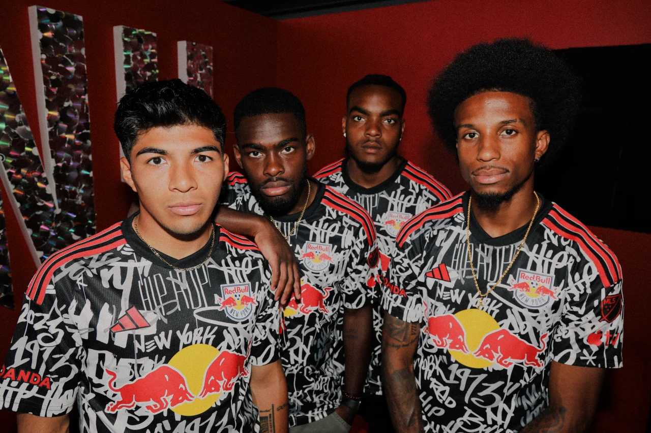
In case you were having a hard time figuring out what the inspiration of this shirt was, NYRB plastered it all over its graphic pattern. Really nice of them to do that.
Again, this shirt represents another concept full of potential that was absolutely fumbled. Sorry if this sounds rude to the design team, but there is no lazier way to design something than to just list phrases and numbers, slapping it on a shirt like a bumper sticker. It’s the “live, laugh, love” art mentality.
To be fair, if you squint and hold your phone away (or just watch them play on TV) the weight of the type on the shirts creates a collaged pattern which is kind of cool. But the effect would have been cooler if the script was lyrics from an iconic New York rapper instead of “hip-hop” simply repeated over and over again. Or, if there just weren’t letters all over the shirt at all.
Toronto FC: 9/10
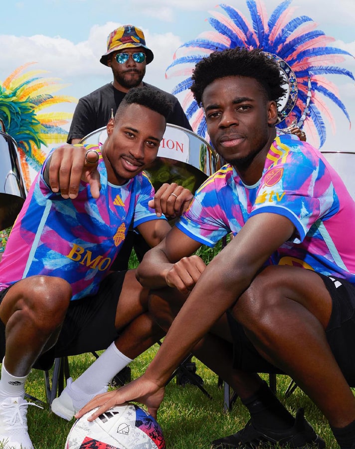
Taking away the fact that TFC plays like shit in these shirts, at least they look good while losing. Toronto has done something that the other MLS third kit releases have not — making a design that works as a proper soccer shirt. The pattern is played off the centered badge position, and the pattern itself (while textured) is designed for adornment. Meaning this is a graphic made for a torso within the structure of a soccer jersey.
This is exactly where Atlanta fumbled the bag, with their presentation being more of a graphic showcase, rather than an actual shirt design.
Despite the brazen color scheme, the design is not too busy. It also did an amazing job representing the Toronto Caribbean festival without having to write it all over the fabric one million times (looking at you NYRB).


