
Featuring bold designs and a radical new Swoosh placement, we rank the latest lineup of Nike third kits for its elite clubs.
The third football shirt gives clubs a little more latitude when it comes to design. If there was a place to “go for it,” it’s here.
Nike certainly has done so with its latest slate of third kits for its elite clubs. Featuring wild patterns, atypical design cues, and most notably, vertical Swoosh logos, the collection has been polarizing amongst fans and kit collectors alike.
Dubbed the “Together We Rise” collection, the double vertical Swoosh on each kit is said to represent the growing nature of women’s football across the globe.
Nike has certainly done plenty to help shine the spotlight on the women’s game over the years, from regularly highlighting its female athletes to increasing visibility around all women’s sports through advertisements and sponsorships. Many of these campaigns have been quite successful, but in this case, connecting women’s sports to a newly positioned logo feels like a reach.
When I first look at the vertical Swooshes, women’s sports are nowhere near the top of my mind, and even when knowing that the design choice is a nod to their rise in popularity, it still doesn’t connect all the way. It feels like marketing gobbledygook that was haphazardly pitched as an afterthought in some executive boardroom.
I know that Nike puts a lot of thought and effort into each new release, especially when it comes to their bigger clubs, and the brand has proven its marketing prowess over the years. But all of that effort is for naught if the execution doesn’t hit, and this concept feels like a miss from the Swoosh.
Nevertheless, there are still plenty of positives to take away from this collection, and some designs are quite nice. Let’s go through all eight and rank them from worst to best.
8. Liverpool
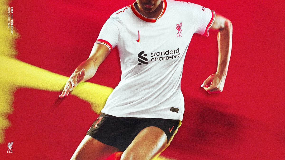
“Rebellious by design” is the tagline Nike assigned to Liverpool’s 2024-25 third kit, but as far as cutting-edge and stick-it-to-the-man aesthetics go, this is awfully pedestrian. Shirts with a blank white base need fantastic details to stand out, and this kit lacks any. The asymmetrical collar looks awkward, and there really isn’t much else going on here. If you forced me to say something nice about this kit, the sleeve cuffs are halfway decent.
7. Chelsea
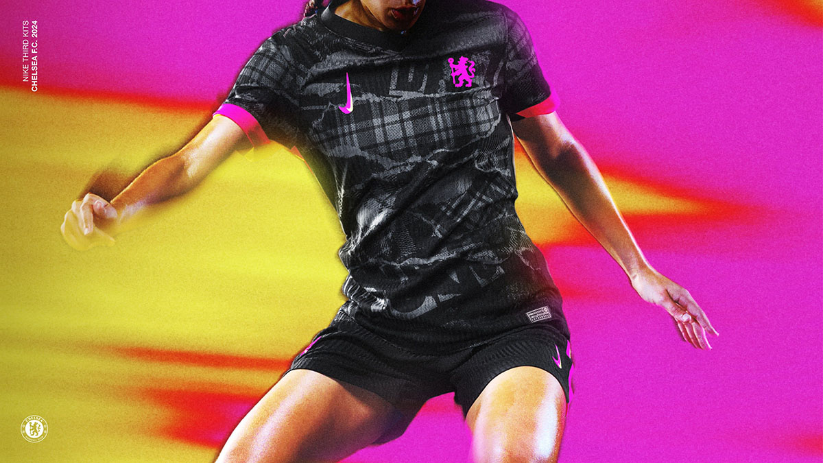
King’s Road may have been a hotbed for the punk scene in the late ‘70s and ‘80s, but that’s far from the case nowadays. This extends to Chelsea FC. What’s punk rock about billion-dollar wage bills? Although if all of the club’s arbitrary spending to create a chaotically designed roster was done as a bit, Todd Boehly might be more punk than any of us.
Regardless, Nike went to West London’s punk roots for inspiration for Chelsea’s latest third kit, which features an abstract tartan pattern and a grungy torn paper aesthetic. Hot pink accents on the crest and sleeve cuffs round out a clunky design that doesn’t quite hit the mark.
6. Atletico Madrid
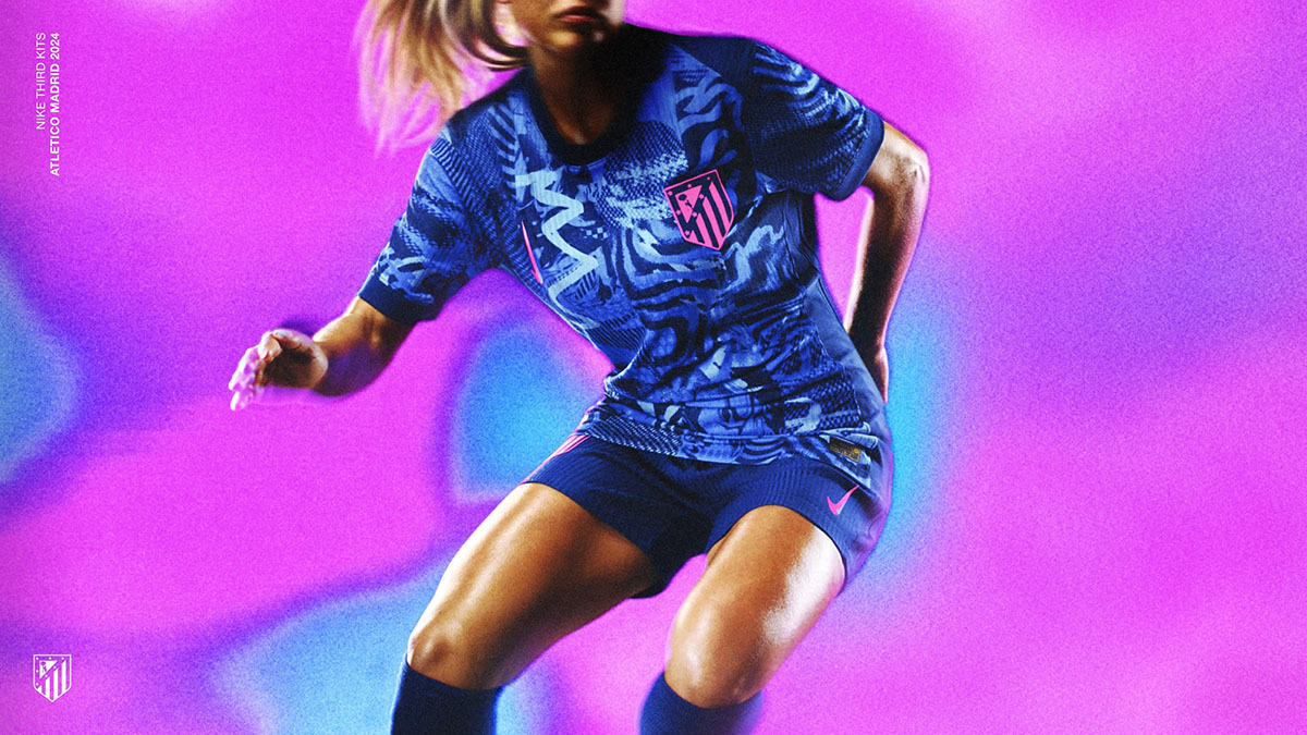
Another loud pattern with pink accents, Atletico Madrid’s new third kit is said to be inspired by the artists of the Spanish capital. What Nike didn’t say is that the design was lifted straight out of a Madrid-based kindergarten finger painting class.
5. Inter Milan
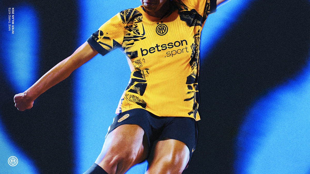
We’re finally getting into the designs that are much more palatable. Inter Milan’s 2024-25 third kit features a bold yellow base with navy accents and a graphic print down the shoulders. Compared to the previous entries on this list, this design is much more measured, and the yellow runway left by the graphic print plays perfectly for a centered crest. The asymmetrical collar is really the only negative about this shirt, which otherwise works pretty nicely.
4. Tottenham
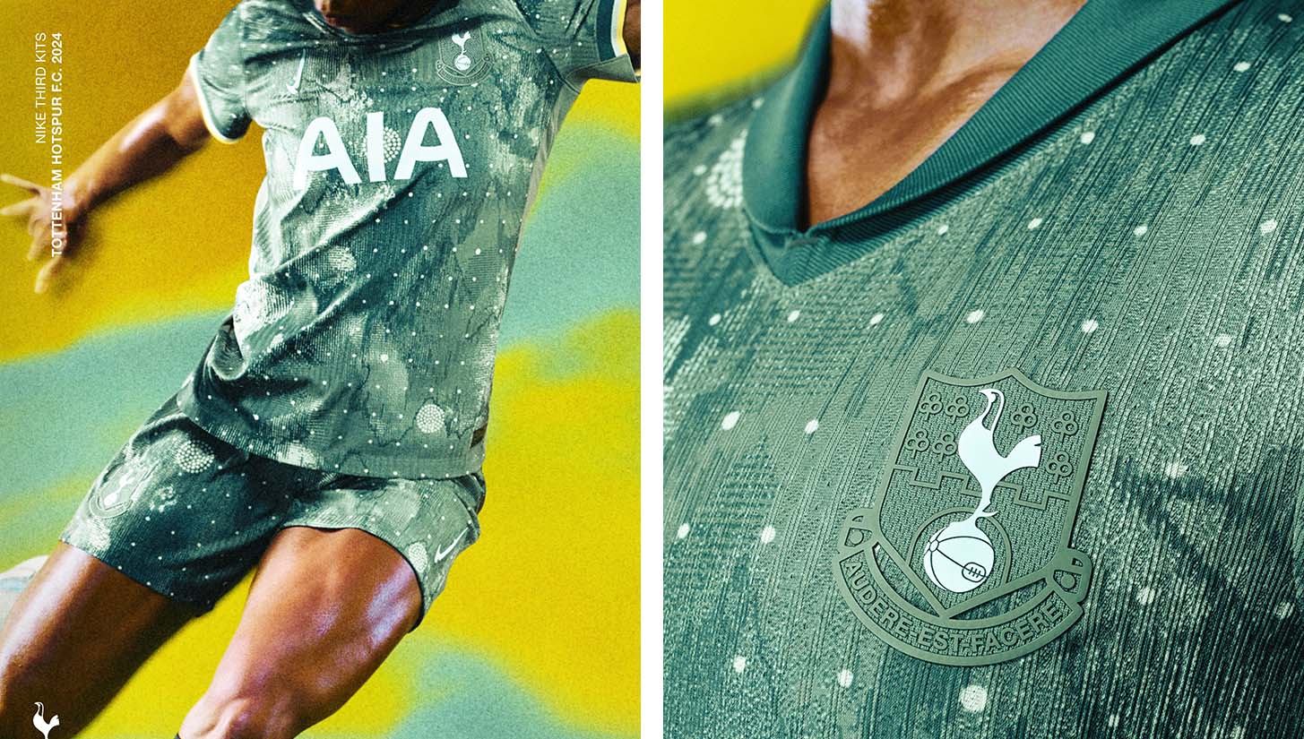
In a sage green hue that’s rarely seen on a football kit, Tottenham’s new third shirt is a hit. Not even a strange half-polo-half-v-neck collar could take away from this design.
3. Club America
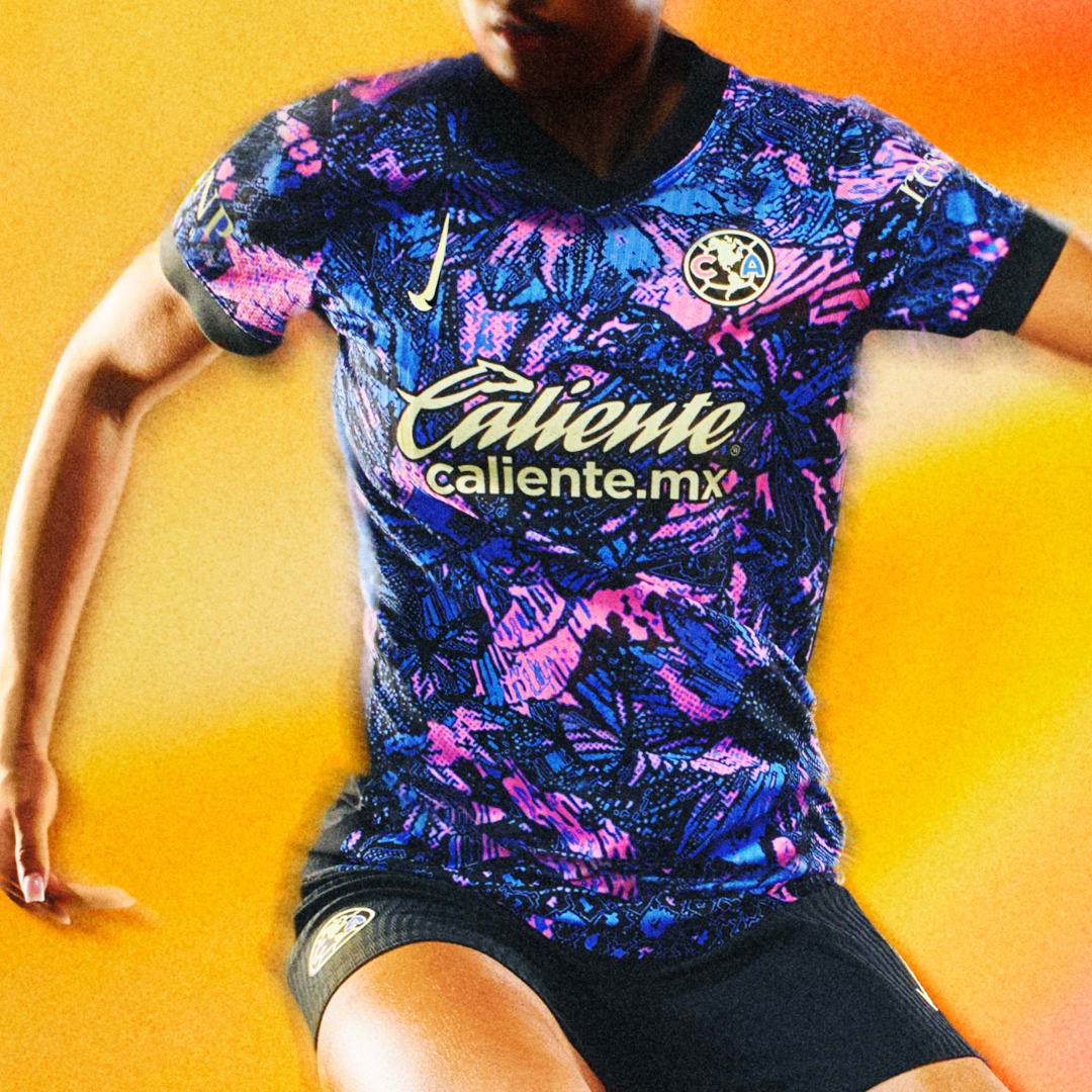
Club America rarely have a dud in their kit closet, and this certainly isn’t one. Far from the only loud design in Nike’s third kit slate, this one is noisy in the best way possible. Bright pops of pink stand out from the royal and navy blue base, and the yellow accents on the logos and sponsor contrast nicely.
Hidden in the busy pattern are symbols of Mexico’s natural wonders. As Nike puts it: “A jaguar symbolizes power, ferocity and courage; a hummingbird is a messenger of joy; a sunflower shows strength and loyalty; an agave plant represents passion and transformation; and butterflies symbolize rebirth.”
2. Pumas
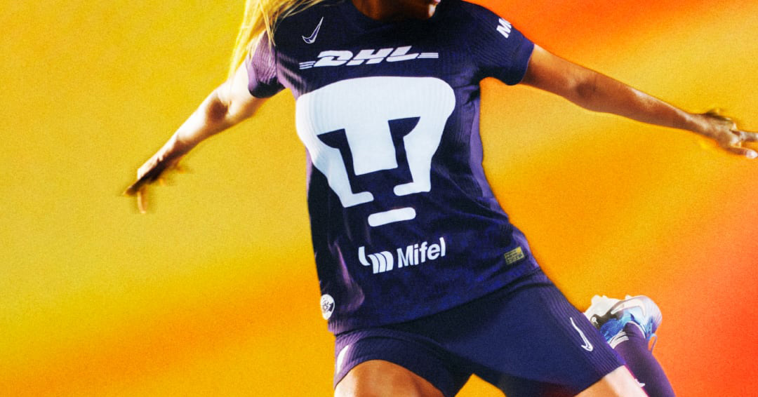
I’m an absolute sucker for a purple kit, and this one is executed almost flawlessly. Pumas’ trademark oversized logo takes front and center stage atop a deep purple base, which is inspired by the flowers of the jacaranda tree that blossom across Mexico City each spring. Gorgeous all around.
1. Corinthians
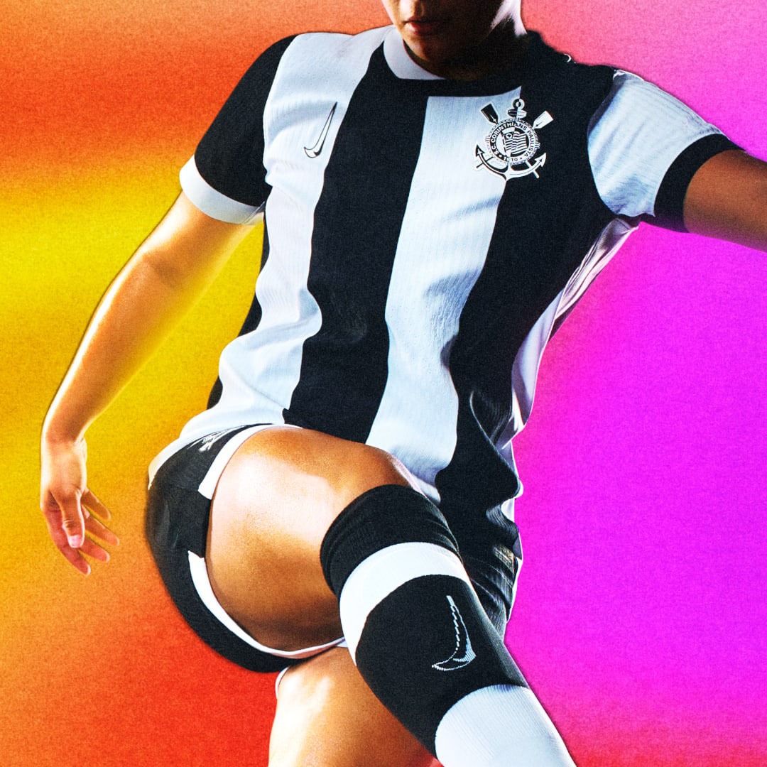
Another club that has put out a nearly unimpeachable body of work over the past few years, Corinthians gets the strongest 2024-25 third kit from Nike. Inspired by the club’s ongoing fight against racism, the simple black and white stripes go incredibly hard, and the vertical Swooshes work the best atop this design.


