
The 2025 NWSL kits are here, and they look fantastic. We grade each new release in our annual NWSL kit report card!
As we prepare for another jam-packed NWSL season, the league and Nike teamed up to release a slate of brand new kits. The league-wide drop builds off of the momentum from last year, which saw the first ever jersey refresh in league history, where every club got a pair of new uniforms.
As pivotal as last year’s kit rollout was, the overall designs were a bit disappointing. Cookie-cutter away shirts were hit and miss (with more misses than hits), and left plenty more to be desired. One year later, and the league got it right.
Every NWSL club save for Bay FC — who received a pair of new looks — got one new kit instead of two, and the lighter workload perhaps allowed for more intricate and bespoke designs. Across the board, this might be the best kit year in league history.
As we do each year, let’s take a look at each new release and give it a grade.
Angel City FC: A-
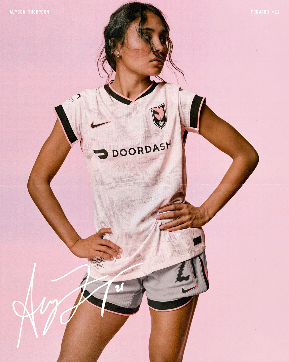
An ode to the city of Los Angeles, Angel City FC gets perhaps the most complex jersey design out of the bunch. Nods to various iconic LA landmarks and staples are embedded atop a cream-colored base, which makes for a tattoo-like design.
It evokes images of the 2023 away kit, which was a superimposed map of the city — only this time around it’s executed much better, and the pink accents on the sleeve cuffs and collar are fantastic. As a matter of personal taste, v-neck jerseys don’t usually do it for me, but even still, this is a very nice shirt.
Bay FC: A+
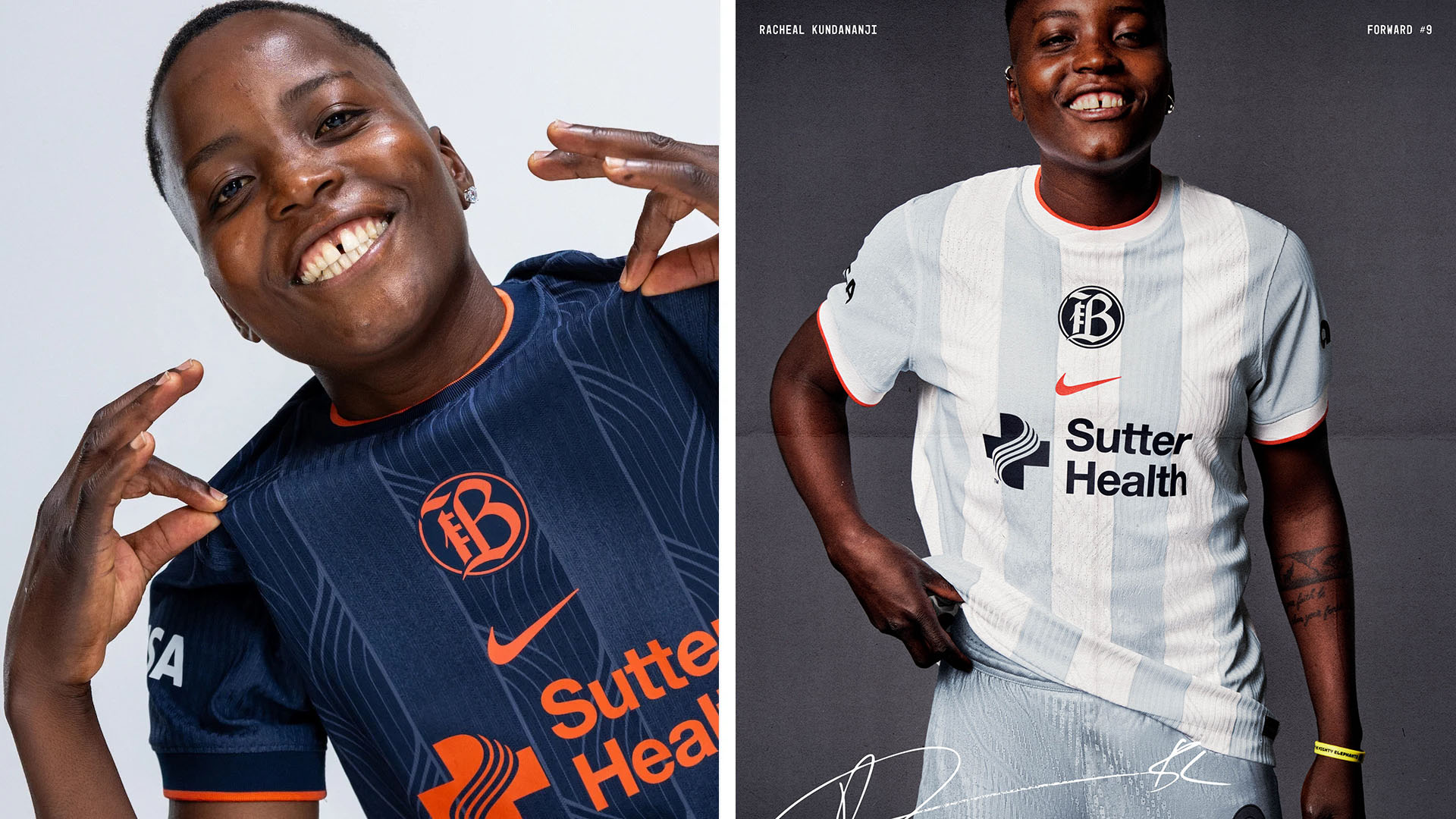
Bay FC is the only NWSL club to receive two new jersey designs, and boy were they needed. Last year’s debut kits were both disappointingly plain, but the club more than makes up for it with its sophomore effort.
Centered crests can be boom-or-bust depending on execution, and Bay FC definitely got it right with this one. It fits in perfectly with the striped design, and the orange Swoosh and accent hits are *chef’s kiss* perfect.
Chicago Stars: A-
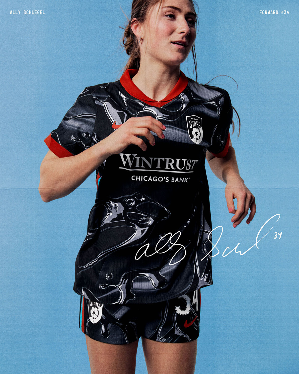
After going through a rebrand and name change, the Chicago Red Stars get a Terminator 2-esque liquid metal design on their 2025 secondary kit. It’s a big swing that connects in a major way. I was a bit dubious about the club’s rebrand, but the jersey does well to introduce a new era in club history.
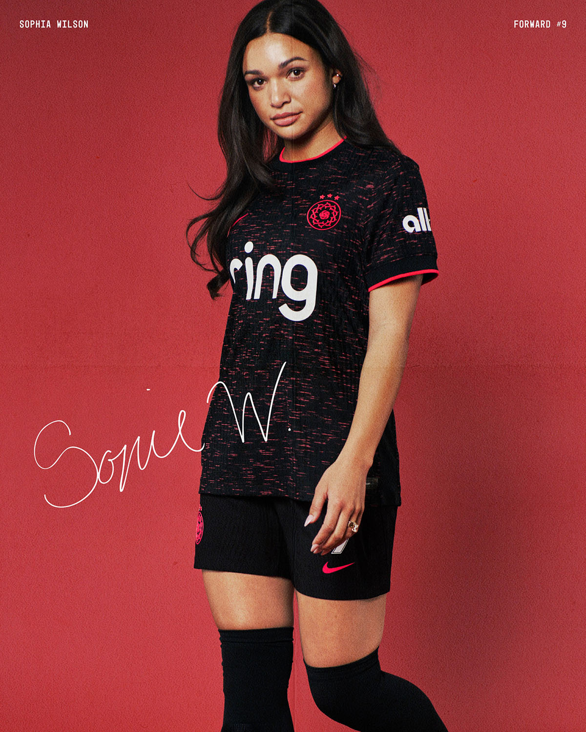
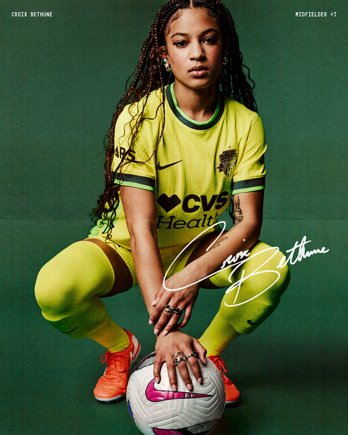
Gotham FC: C
One of the only disappointments in the new slate of NWSL kits, Gotham FC’s 2025 jersey falls victim to the “looks like a warm-up shirt” malaise. The color pattern works well, as Gotham has one of the better color schemes in the league, but the way the sleeves are blocked off feels over-templated. The blackout crest is a nice touch, and the photoshoot the club did to roll out the kit gets bonus points. If only the design were a little better.
Houston Dash: A-
Continuing with their space-themed kits, the Houston Dash go with purple — never a bad idea — on their 2025 secondary kit. Perhaps inspired by their MLS affiliate Houston Dynamo, who dipped their entire 2024 away shirt in purple as a nod to Houston’s rap scene, the Dash get one of the better looks in the league with this “Cosmic Storm” design.
Kansas City Current: B
Last season, the entire NWSL template made for some bland tonal designs. The league has done a great job of upping the more simple designs with subtle patterns and details that can take a kit from plain to popping. That’s the case with Kansas City’s 2025 secondary kit, which is a monochrome teal look that has a map of Kansas City embedded within. The Current crest sits where CPKC Stadium is located, a cool detail that pays tribute to the first-ever stadium built exclusively for a professional women’s sports team.
The color is striking and the team, led by the incomparable Temwa Chawinga, will look to continue its strong form in 2025.
North Carolina Courage: B-
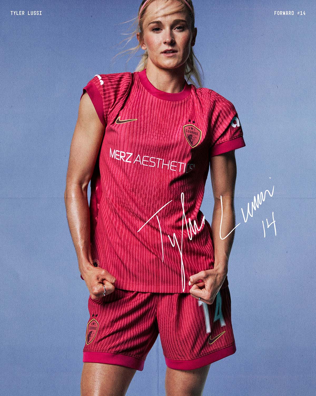
Returning to the all-pink well in 2025, North Carolina Courage get a solid and simple design for 2025. The details on this shirt are limited compared to other NWSL kits, but the “Pride Mark” on the jock tag that has the North Carolina State motto “Esse Quam Videri,” or “to be rather than to seem,” is a nice touch.
Orlando Pride: A
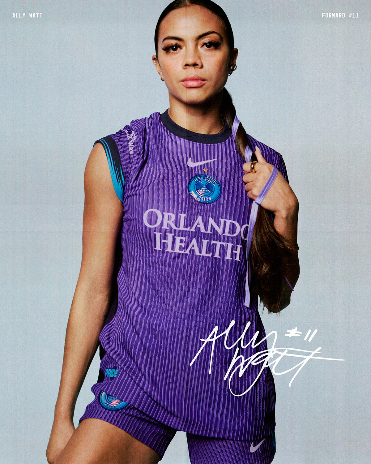
Constantly writing about great jersey designs isn’t as fun as getting to bash some bad ones — but I’d much rather have it this way. Orlando Pride continue their tradition of fantastic jerseys, with a glitchy purple design and a holographic crest showcased front and center.
Celebrating both last year’s double and the club’s 10-year anniversary, this is a triumphant design and one of my favorites from the bunch.
Portland Thorns: C
In 2020, the Portland Thorns received two of the best kits in league history, the black home in particular. Since then, it’s been a slew of duds for the club. The infamous and polarizing “tattoo” 2023 away shirt is about the only thing notable about the club’s uniforms from the past five years. Whether you loved it or hated it, it was at least a swing, something you couldn’t say about the other designs in that span.
In 2025, we get an inoffensive black and red heather design, which is a step up from recent years’ looks, but not by much.
Racing Louisville: B
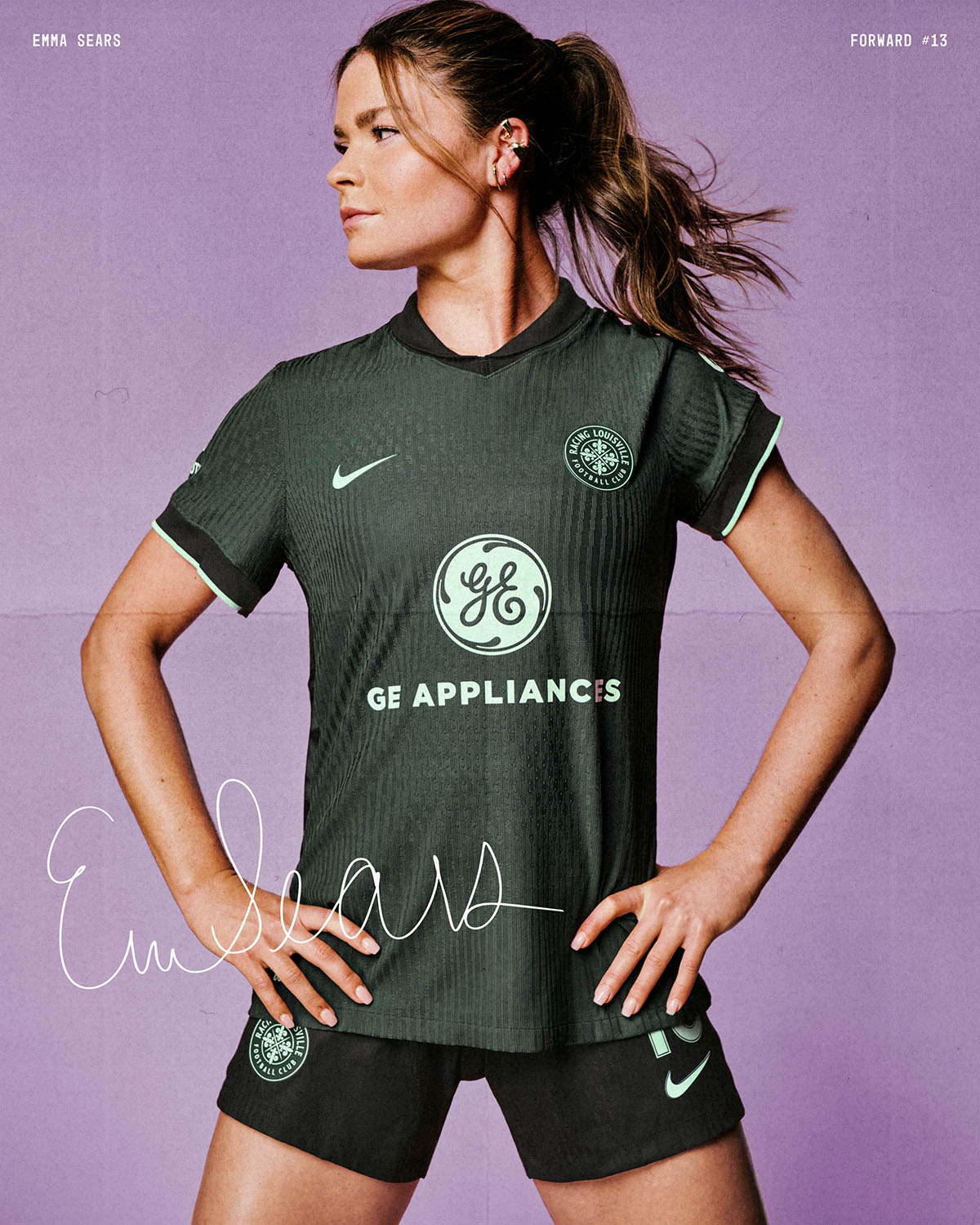
In a vacuum, you could say this is a pretty good, maybe even great design. It has a striking forest green color that you don’t see too often in soccer jerseys, and the lily pattern down the sides is a great detail. However, when you look at Racing Louisville’s (albeit brief) kit history, this one might not even crack the top five.
It certainly is a step up from last year’s plain purple look, and paired with the home shirt, Louisville will be once again one of the better-looking teams in the league.
San Diego Wave FC: B+
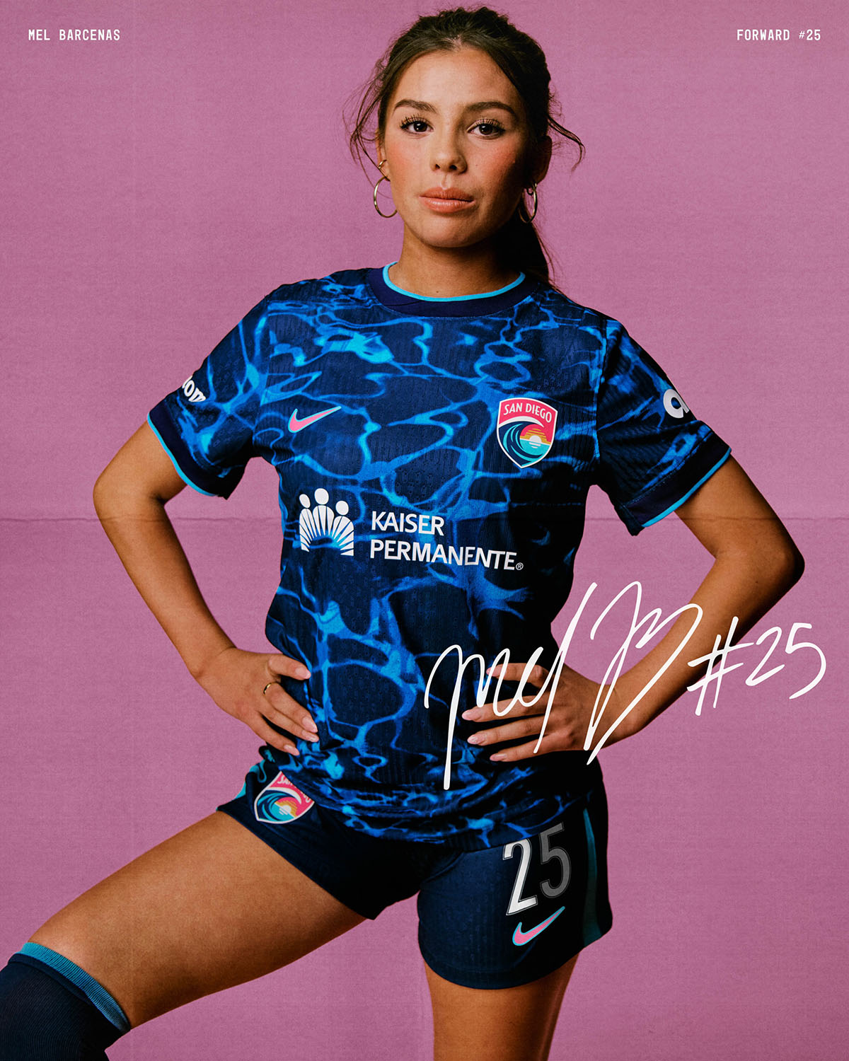
Through their first two seasons, San Diego Wave FC had some of the most disappointing jerseys in the league, especially considering the team’s fantastic logo and color scheme. Last year, the club stepped things up with a set of eye-popping designs, and it continues to build upon that momentum in 2025 with a water-inspired secondary shirt.
Dubbed the “Altamar” kit, which translates to the “high seas,” the shirt leans into the team name and proximity to the ocean for an ahem, tidy, look.
Seattle Reign: B
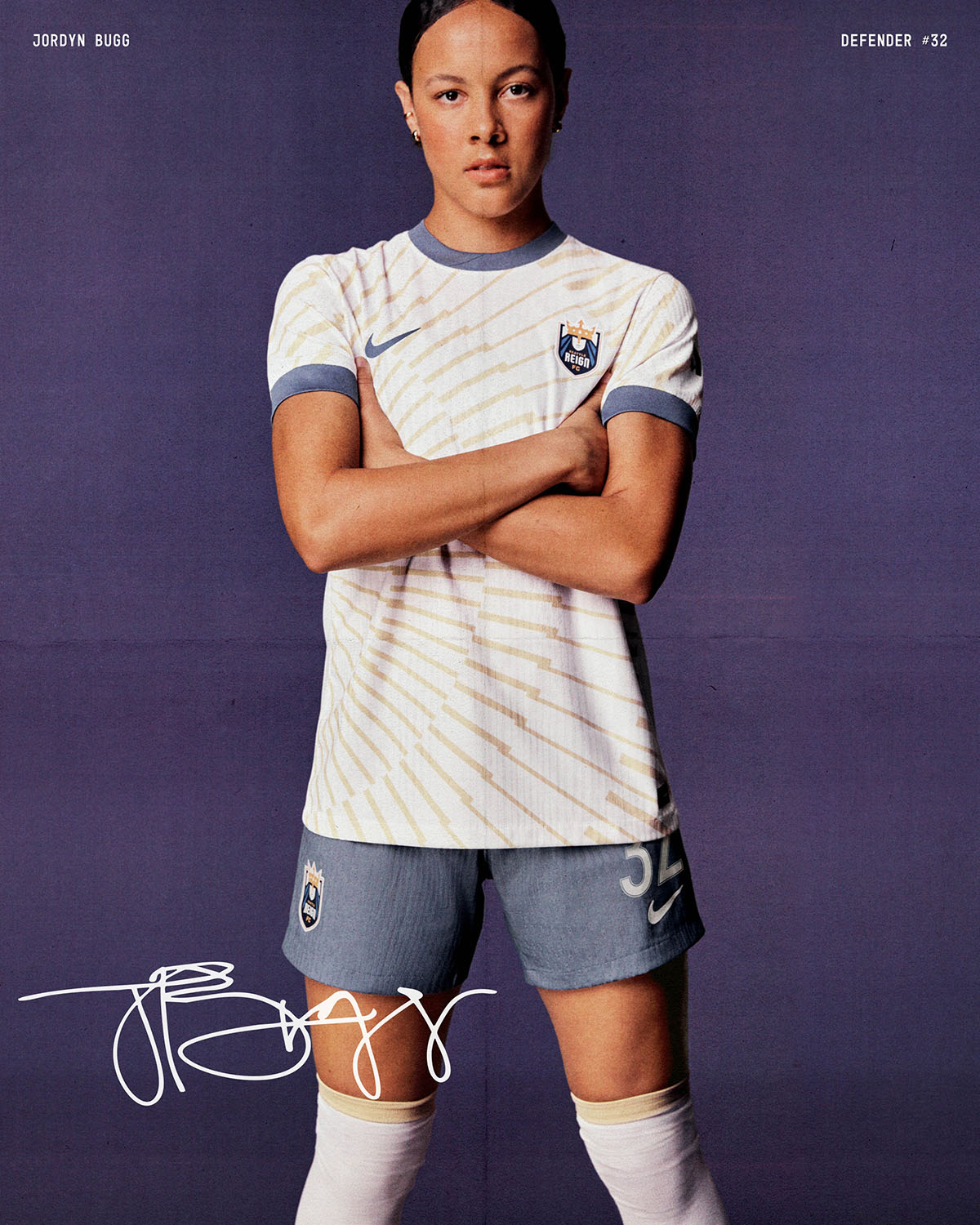
The second year under its new old name, the Seattle Reign introduce an electric secondary kit design, dubbed the “Rise” kit.
Inspired by the jagged edges of the iconic Seattle skyline, this jersey has a fantastic color palette that features a white base, gold details, and slate blue accents on the sleeve cuffs and collar. It’s another solid look in the Reign’s re-branded form.
Utah Royals: B
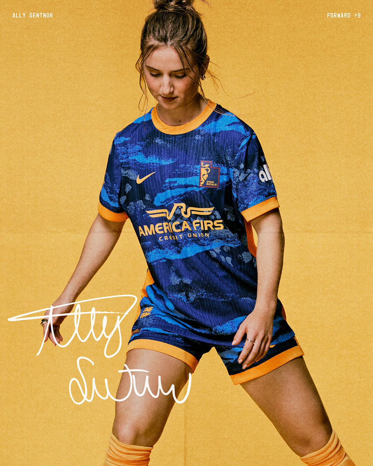
Inspired by Utah’s natural beauty, the Royals’ 2025 secondary kit is a massive step up from last year. The abstract pattern throughout the shirt’s body evokes everything from the Great Salt Lake, to the vast canyons and various mountain ranges located throughout the state.
After a rough start, Utah closed its inaugural season strongly, and will look to continue that momentum into 2025 led by the always dangerous Ally Sentnor.
Washington Spirit: A
I absolutely love the volt direction Washington Spirit have decided to go in. Last year, the club introduced the color seemingly out of nowhere, and in 2025 it has gone back to the well, only with improvements this time around.
Out of all of the 2025 NWSL kit designs, this is the most plain, but with a striking color and accents like this, who needs an intricate design?


