With the 2018 World Cup officially less than three months away, many national team kits have been unveiled so fans can pick up the new gear before the tournament. While the majority of the kit makers played it somewhat safe, there were some hits and misses from the more audacious collections. Let’s check out the good, the bad, and the ugly from the teams which have released kits so far.
The Good
Nigeria
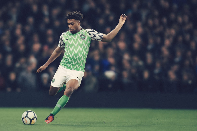
While Nigeria may struggle to get out of a group with the likes of Argentina, Croatia, and fan favorite Iceland, they’ll at least look fly doing it. The Naija collection, created by Nike, is much more than a run-of-the-mill patriotic kit. The design directors researched all of Nigeria’s players to understand their identity not only on the pitch but off it as well, and they found a common upbeat energy and attitude about the country among players known as Naija. Naija permeates many parts of Nigerian culture from sport, to music, and fashion. Nike did an excellent job of visually displaying Naija in the kits and collection, making something Nigerians can wear with pride.
As if that wasn’t enough, Nigeria’s home kits also reference the country’s kits from their first-ever World Cup in 1994. The green torso and white sleeves with eagle wings look fresh in updated form, making it a must cop.
Germany
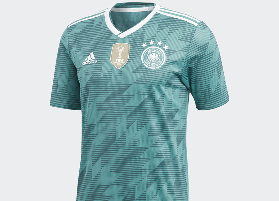
Germany is a traditional powerhouse with traditional kits, and this year is no different. The 2014 World Cup champions will retain their classic white-and-black home kits, but there will be a new simplistic print on the front alluding to Germany’s 1990 World Cup-winning uniforms, which are regarded by many as one of the greatest football kits of all time.
The away kits similarly pay homage to the 1990 World Cup jerseys, bringing back the famous green worn by Germany during their penalty kick triumph over England in the semifinals. Adidas loves to reference kits from the past, and the German kits are perhaps the finest example of that in this cycle.
The Bad
Belgium
Everyone’s dark horse in the 2014 World Cup, expectations are a bit loftier for Belgium this time around. And with loftier expectations on the pitch, come loftier expectations with the kits. Unfortunately for the Red Devils, their 2018 unis don’t quite live up to those standards.
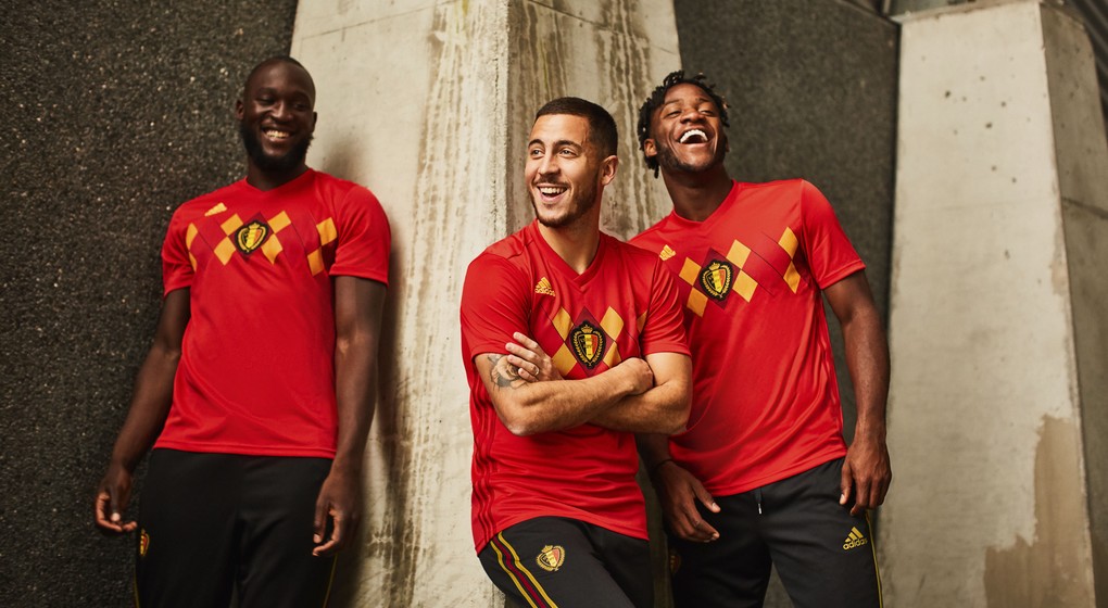
The home kit, which is based on the iconic 1984 kit, features an argyle pattern with Belgium’s colors across the chest on a solid red backdrop. The appeal of the argyle pattern is lost with the placement of the Belgian badge, which appears in the middle of the shirt. It looks like the players are wearing Iron Man’s suit.
Spain
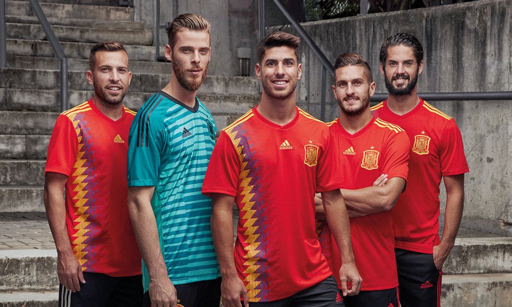
Spain, another traditional powerhouse, also pays homage to a classic kit from the past with their 2018 uniforms, although less successfully than their German adversaries. The Spaniards’ home kit is based on the team’s 1994 jerseys, which featured a black and yellow diamond stripe down the right side of the shirt.
The only problem with this blast from the past is that it doesn’t deviate discernibly from the original 1994 kit. If the play on the pitch is as underwhelming as Adidas’ kit design here, Spain may be headed for yet another early exit. Seriously, the design makes it look like the homage was slapped on at the last second to appease the hipsters.
The Ugly
Iceland
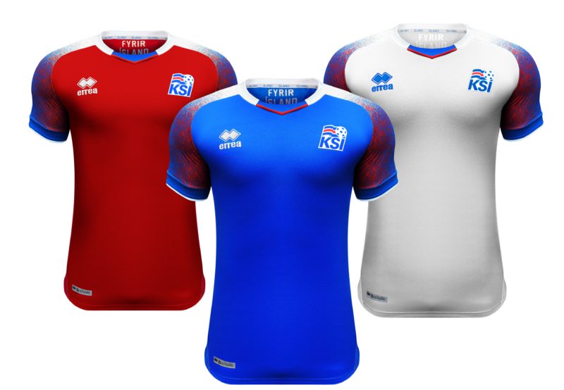
Iceland may be the fan favorite in the 2018 World Cup, but that doesn’t mean their kits will be as well. The blue home kit and the white away kit both contain red on the sleeves, meant to represent the fire that warms the heart of Iceland.
The concept of the idea is brilliant, especially with the blue representing ice melting into water, but the execution leaves more to be desired. A red diagonal stripe or faded red vertical stripe would have accomplished the same goal here, and it would have been much more aesthetically pleasing.
Japan
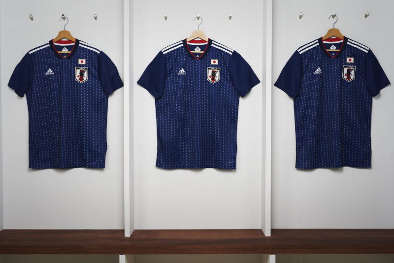
Japan, unlike many other Adidas-sponsored teams in the World Cup, has a unique kit that isn’t based on retro jerseys. Instead, the home kits are inspired by traditional samurai garb. Set on a blue shirt, dashed light blue lines mixed with solid black lines represent the samurai armor.
While the concept is intriguing here, the execution is a little lukewarm. Still, credit to Adidas for going for the home run. But it’s just not as attention-grabbing or deep compared to Nike’s Naija collection.
What are your favorite 2018 World Cup kits? Let us know in the comments, and stay tuned for more World Cup kit coverage!


