Art and the beautiful game have always gone hand in hand — but artists Tristan Eaton and Geoff Gouveia have taken that to a different level, turning futsal pitches into brilliant and breathtaking murals.
Sometimes you approach a piece, and by the end of it, it’s entirely different than what you had intended to unravel. The background research for this story focused on small-sided courts in the United States, but what I found instead were two artists using their abilities to provide a unique, off-the-grid thinking to soccer culture.
Their styles differ, with each holding down their own piece of the pie in the urban art scene. They’re visionaries, and in my opinion, they’ll leave soccer — and sporting culture — in a better place. The following story takes a look at some of the pitches they’ve created for the community, and their opinions on what makes a new wave of artistic courts an essential part of an evolving social fabric.
Tristan Eaton
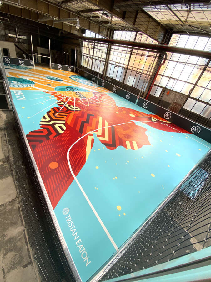
Tristan Eaton is a California-based artist who spent a large part of his career in Brooklyn’s DUMBO neighborhood when the streets were a little colder and barren…before Shake Shack and the five-star hotels dominated the waterfront. Chances are that you’ve seen his work, maybe without realizing it was his. For example, the Audrey Hepburn mural next to Caffe Roma in Manhattan’s Little Italy, the “The Gilded Lady” in the shadow of the Empire State Building, or California’s “Monster Wall.” I wanted to chat about Strassenkickerbase, which is an epic indoor court in partnership with EA Sports’ FIFA.
Urban Pitch: Tristan, who started the conversation about you and a partnership with FIFA?
Tristan Eaton: I’ve been making a living off my art for 25 years, so I’m very lucky to be able to choose which projects I work on. At any given time I’m working on 20 different projects at a time, so I have a team that helps me filter projects out and make sure the project will be the right vehicle for my art.
I try to make wise choices, and I had never done anything like this before, so I loved the challenge. Conversation starts from management and I can say yes or no as to what looks exciting. These days, 75% of the work I’m doing are my own projects that I’m developing from scratch, and the other 25% are collaborative.
Was this typical to your other work — like “Superstrike,” “The Chalice,” and “Dreamland Mickey” — or was there a certain style you were going for given the nature of the court in Germany?
The nature of the court dictated the approach to the design. I wasn’t able to employ a lot of the grayscale rendering that’s typical of my work. I had to approach from a very vectored flat-color perspective, so it’s within those confines I designed the pitch. I had to approach it less like a painting and mural and more like a graphic poster.
I grew up in Britain, from 8 to 16. That gave me a whole different perspective as to what soccer means, and as a kid in London, soccer is a part of the social fabric like nothing else. Whether it’s at school or playing in the park afterwards, it determines social hierarchy, creates bonds, and determines what kind of kid you are. It’s a wild factor within the landscape of being a child. I think that’s typical in all the nations that have soccer on a pedestal. I used to play as a kid being part of my friend group and neighborhood.
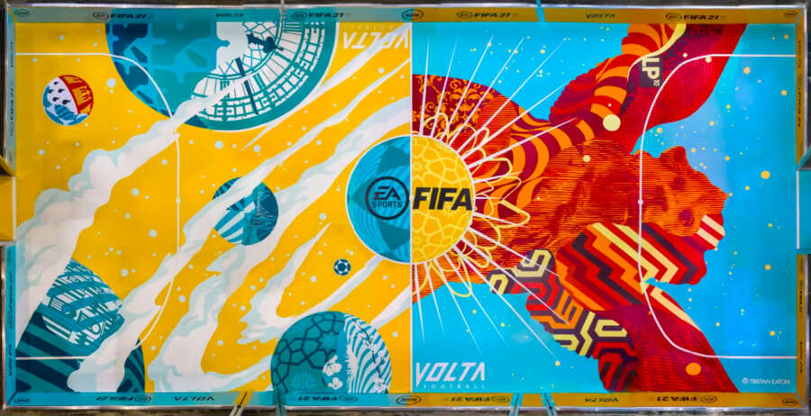
The 5v5 courts dictate a lot!
A whole different ball game. I got into skateboarding, and I got very fortunate being able to collaborate with sports art projects — like for Kobe Bryant, Thierry Henry, the Brooklyn Nets, and the ticket for the Super Bowl in 2020. I welcome that, I feel like any chance to get underground art forms into the zeitgeist is a healthy thing and better for the culture. This opportunity was unique, and it was an honor and new challenge for me.
A more technical question, what’s the nature of the indoor paint, is it just a matter of more layers?
Definitely lots of layers to reduce any kind of translucency of the paint and giving it a good coating helps the longevity. But since we were painting in Germany it’s actually a little difficult from afar because we’re using German paint brands, so it was a little unpredictable, but time will tell if it holds up well.
Geoff Gouveia
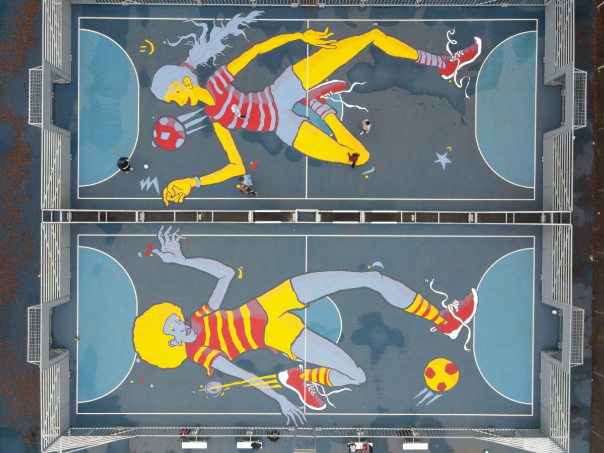
Like Eaton, Geoff Gouveia has worked with FIFA as well, having designed a court for the franchise’s Volta game mode. He’s also done plenty of court murals in real life, and has recently completed a pair of pitches in Rohnert Park, California, in addition to other murals for adidas, Coca-Cola, and LAFC. In Gouveia, I found an artist with an incredible affection towards his local community, who lives to provide connections and build the culture.
Geoff, how does painting on soccer courts suit your skill set?
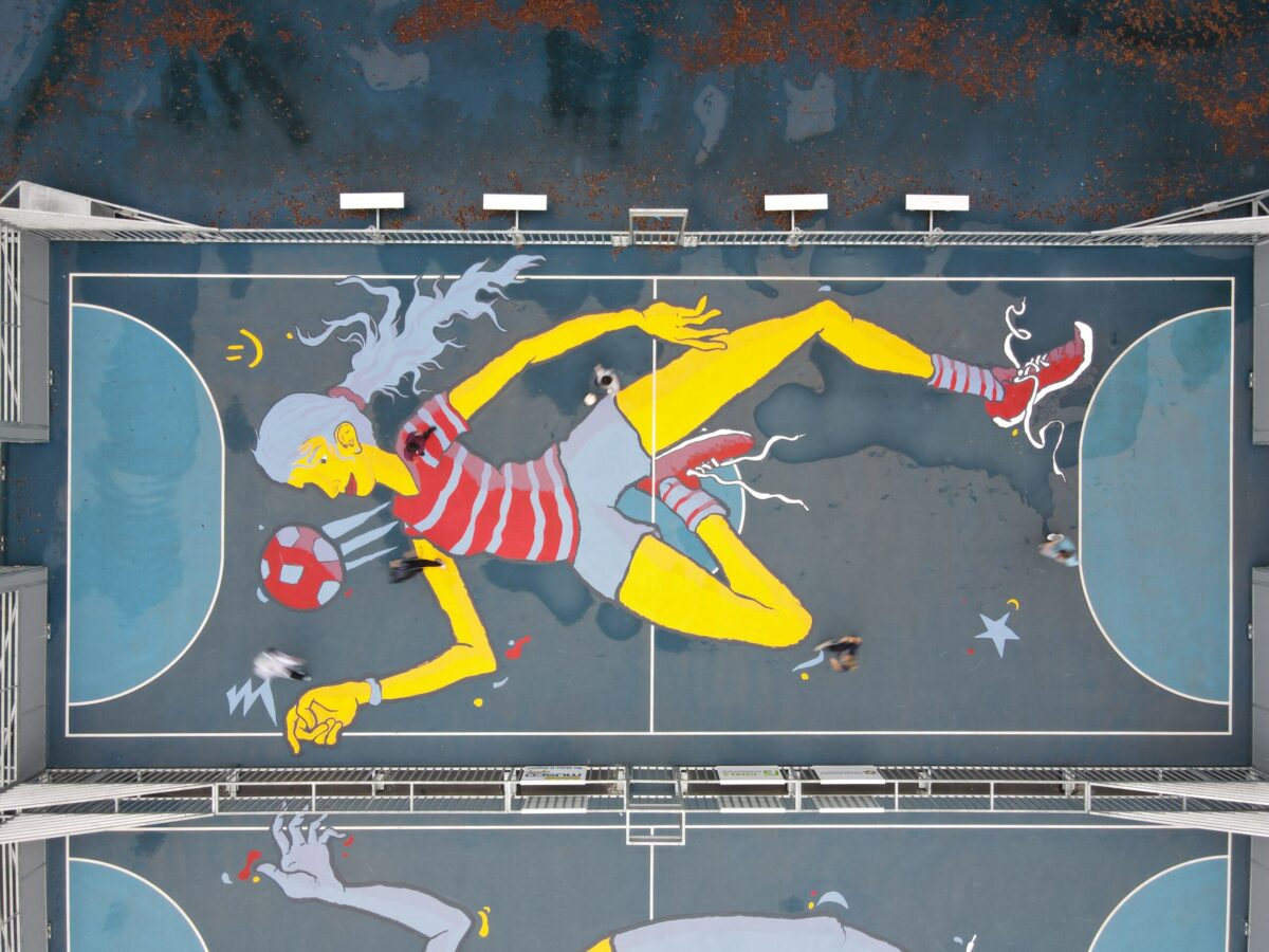
Geoff Gouveia: The skill of being able to scale any image. When it comes to the court, the perspective of what you’re painting is different than almost any other medium. Artists often paint vertically because they’re looking straight at it — that’s how we see the world, always looking forward. So when you’re painting on the ground, that’s magnified. For example, when you’re at the opposition’s six-yard-line, it looks like half court is really far away, but then when you get to it, it looks like the six is really close. Your mind is constantly tricking you, and I can see why a lot of artists would not want to approach it because it’s an optical illusion.
So it’s like you’re in it, rather than looking at it?
When you play the game, you intuitively know where the goal is without having to think too much about it — cut inside or keep taking it down the line. You know where the ball needs to be, but if you stop to think about it, it would just feel weird as to where you’re at on the field. When you’re painting on a court it does help to have those lines…so it felt almost like you’re playing the game while painting.
What does it mean to you to provide the design on a court in an area that may not always have safe outlets for kids and young players?
When I started making art I hated the gallery system. I would go to the gallery and not know what to do with my hands, I just felt out of place. So I was trying to reject that, I wanted my art to be out in the world as a mural where people could interact with it.
As the years have gone on, “interact” became “take a picture in front of it.” I felt that it was kind of hollow. I like the idea of people playing. It kind of destroys the painting, which is awesome in a way. I love that grit and it being used, as opposed to sitting on a wall and looking pretty, with the whole purpose of being used as an Instagram photo. That’s cool — but that’s not why I got into the art space.
This creates a utility for the work, which I think is really rad. Kids just really like it. When you’re standing on a court and a figure is 65 feet tall you can’t tell what the person looks like because you’re not in the air, but kids think it’s cool and it has color. The kids have a really good attitude and I like that aspect.
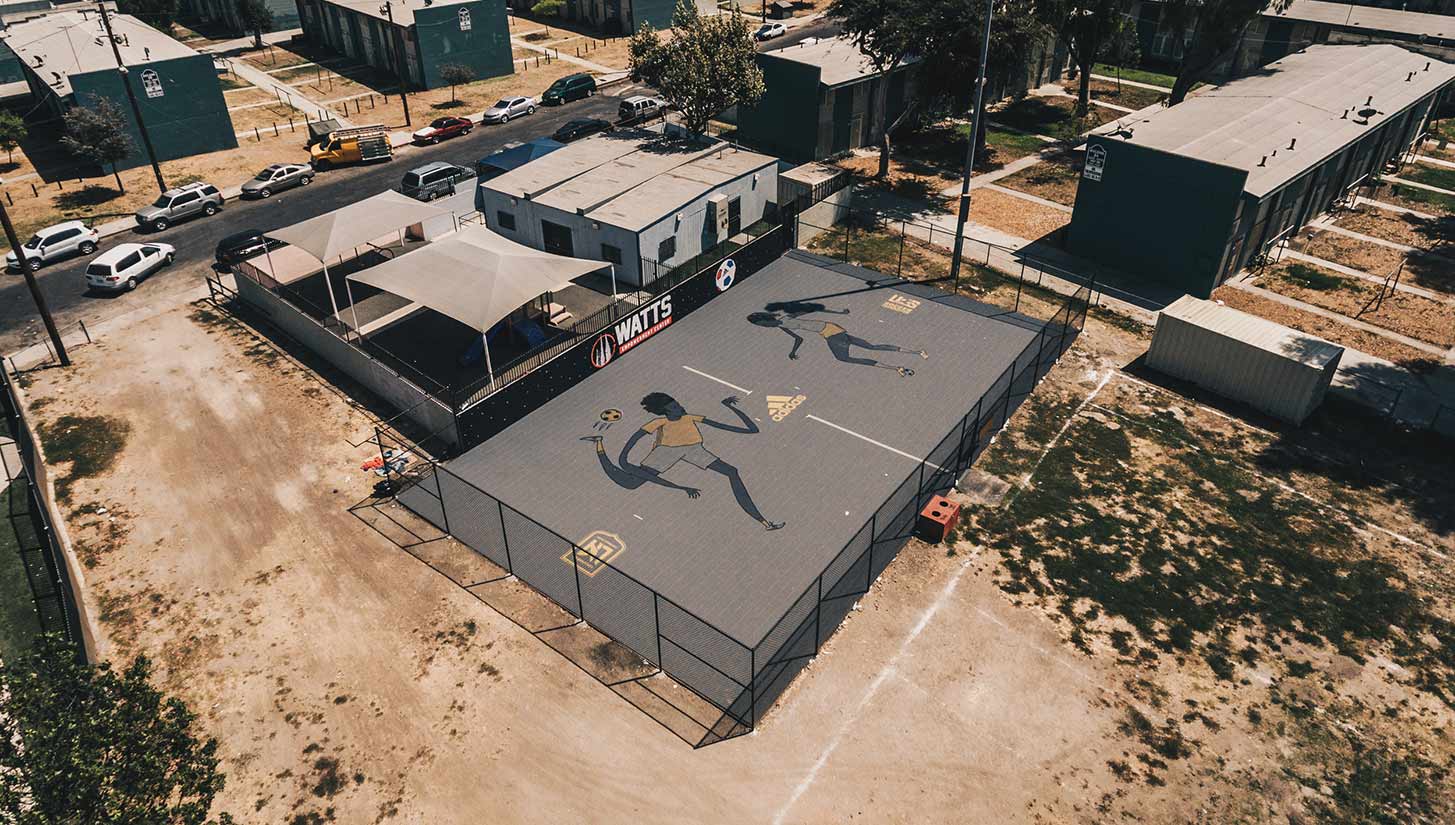
Regarding the court in Watts, you mention on your website that our sport doesn’t act like skating enough. Can you go into that a little bit more?
I think the biggest mistake some of these projects are making is not treating them like skate parks. The skate park is an explosion of creativity. Most kids are wearing graphic tees, sticker culture is very big, and there’s usually graffiti on some level around the skate park. But then the kids are also skating on the things in ways that the people who designed them didn’t anticipate. They’re using the side of the ramp maybe, as opposed to the actual ramp. They’re using the manual pad for grinding — they’re constantly remixing what is possible at a skatepark.
They’re not looking at stairs as stairs, but a place where they could do a trick and show off to their friends. The pitch should be the place you go where you know you’re supposed to belong, and it’s difficult to do that when the pitch doesn’t look like it was designed for you. When other people walk by and don’t get it, that’s OK. Then it creates the ability to have a true community and culture around it — they could say “Yep, that’s exactly for me,” and that’s the vibe I’m trying to create. I’d like to have these all around the United States.
US Soccer Foundation commissions you to help design Watts — it ends up helping an 18-year-old woman Dalila who grew up with domestic violence and overdosed following an anxiety attack. Now she’s in college, grinding at life with major ambitions. How does it make you feel to be a part of that person’s journey?
I think it was really cool to do that, especially with Watts which is in the middle of the Section 8 housing. You see the barbed wire which is pointed inwards as opposed to outwards, so it felt like a prison. During this project I connected with a kid named Gabriel. While we were painting he invited us over for food, and I showed up covered in paint but he was stoked to host me at his house. I love that connection point, and I can see that.
“OK, this pitch is going to be a safe place for this kid.” That’s something that’s close to my heart. I belong to my church and I really believe that Christ calls us to really take care of those sorts of kids. I have a huge passion for that and feel soccer can be a small part of that. I don’t think the pitch is always a safe place like with graffiti, but there’s this weird law of the jungle that usually when you paint a piece it won’t get touched unless someone else can do better.
Even though someone has never met me, they wouldn’t do that. Why not create a positive piece, and in both courts I intentionally painted girls — might as well go against the grain of a star player, and design a regular girl that she can relate to. Carli Lloyd and Cristiano Ronaldo are players you want to emulate, but not necessarily figures kids can relate to.
Follow Geoff Gouveia and Tristan Eaton on Instagram to stay up to date with their latest works.


