Though there’s still some time left before the start of a new season of European football, the rollout of new kits has kept us entertained for the time being. Just as we’ve done for the previous two years, we take a look at the best, worst, and ugliest 2019-20 football kits.
There’s many reasons to believe that football is the greatest sport in the world, with one of them being that we get a new slew of kits before every season. While this might be a cold-hearted capitalistic decision at its center, we’ll save our critique on modern football for another time.
With most European clubs taking to the preseason friendly circuit, it’s already that time again, as most have already unveiled their 2019-20 kits. As we so love to do, let’s take a look at the best and worst of the kit releases so far.
The Good
Inter Milan Away
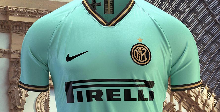
There’s really no other way to describe it — Inter Milan’s new away kit is buttery AF. Haters will see toothpaste, but real fans will harken back to Inter’s 2009-10 treble-winning season, anchored down by Julio Cesar in goal wearing a similarly-colored shirt. Ten years later and the aquamarine shade still goes hard, especially paired with an elegant black-and-gold trim and a Milanese cross paying tribute to the Duomo on the collar. Nike cooked up a kit which celebrates both city and club.
Chelsea Home
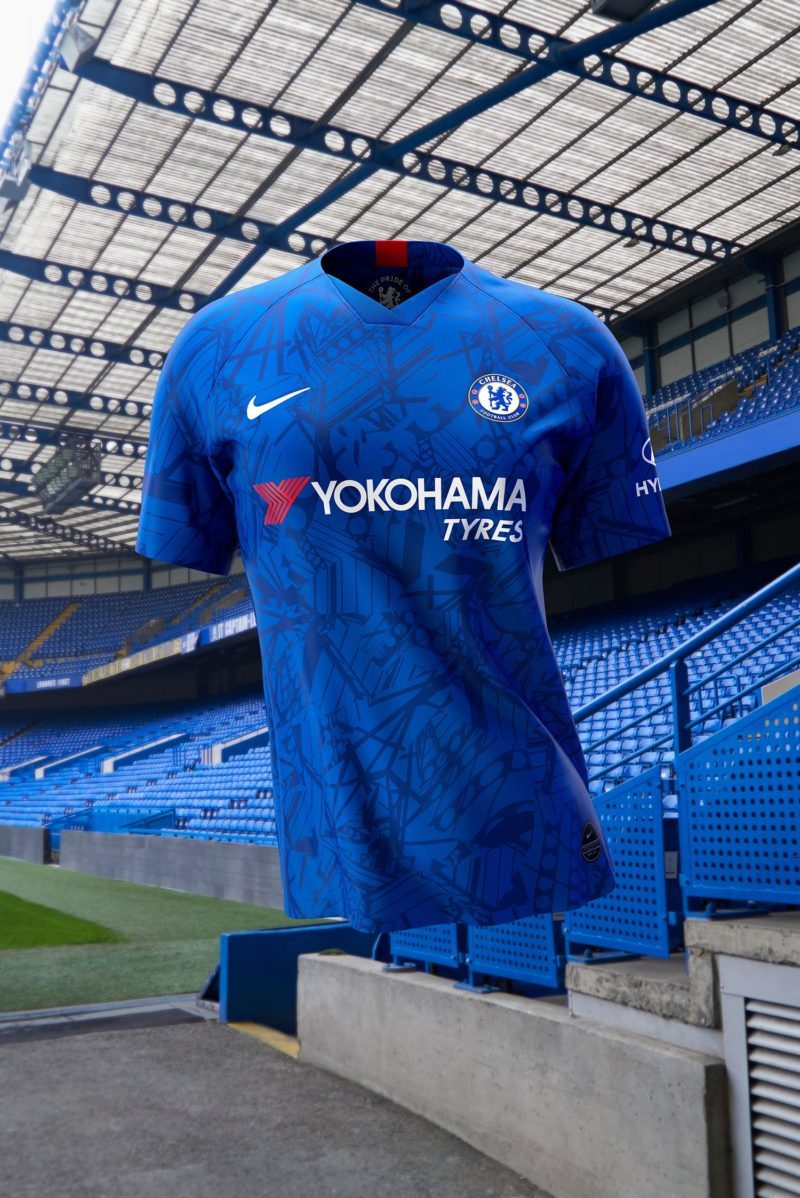
Note to all clubs: If your home ground is over 100 years old, find a way to feature architectural elements of it on your kit. Chelsea, whose home kits have been a solid blue since the dawn of time, traded the plain front for an all-over graphic made up of several different aspects of Stamford Bridge in an abstract design. The result is a Marvel intro-esque watermark, with a lion borrowed from the club crest and the Blues’ “Pride of London” mantra inside the collar acting as the cherry on top of the kit.
Manchester United Home

Another note to all clubs: If you have a history of winning, flaunt it. Manchester United did exactly that with this year’s home kits, which feature time marks on each sleeve commemorating the two last-minute goals by Teddy Sheringham and Ole Gunnar Solskjaer to win the first European treble by a Premier League Club. The aesthetic texture of the kit and the blacked out club crest make it a must-buy.
Roma Home
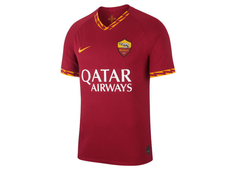
If it ain’t broke, don’t fix it. Roma’s home kits always have an iconic and classic design, and that’s not changing anytime soon. For this year’s edition though, the creative team at Nike paid tribute to Roman mythology by putting lightning bolts on the collar and sleeves in a shoutout to Jupiter, the father and ruler of all gods on Mount Olympus.
Barcelona Away
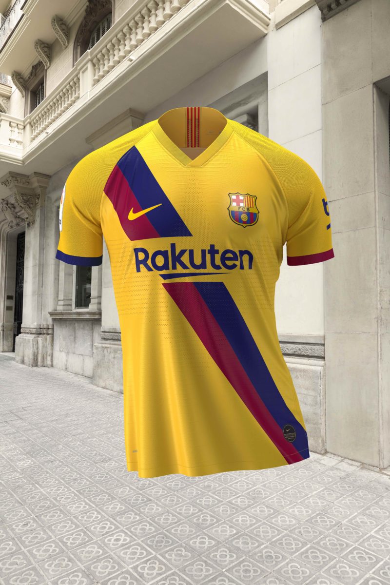
Barcelona’s new away kits might just be some of the sauciest around. The design mirrors the Catalan club’s ’79 away kit in an homage to the team’s youth academy La Masia, founded the same year. The sash running across the kit’s chest consists of the club’s main colors, while the stripes of the Catalan flag appear on the back of the collar.
The Bad
Everton Home
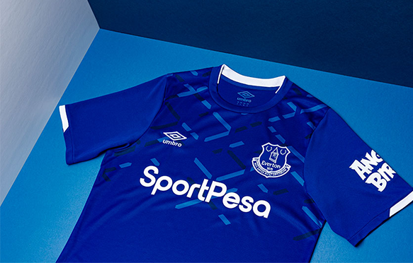
Like Chelsea, Everton’s home kits have a great stadium-based concept this year. Everton’s features a graphic which references the famous criss-cross steel patterns adorning the upper tier of the Bullens Road at the Grand Old Lady at Goodison Park. While the concept is flawless, the execution makes us ask, why stop a third of the way down the kit? Come on Umbro, we know you can do better.
Barcelona Home
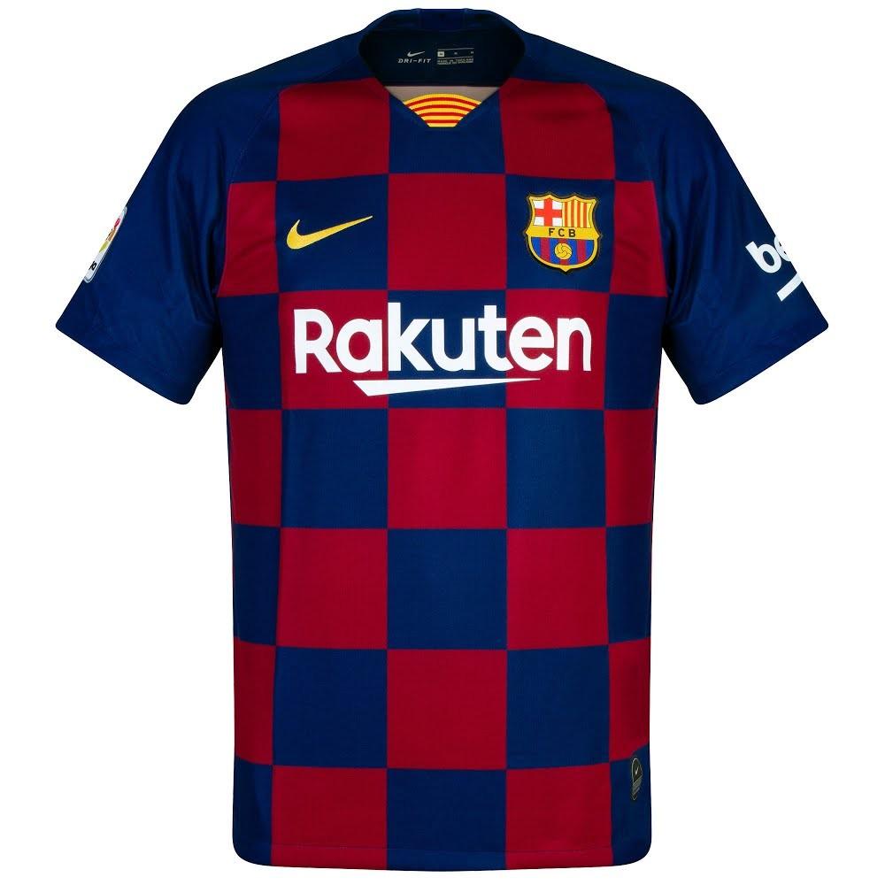
We get what Barcelona is going for here — a home kit without the traditional stripes is bold and daring. We can’t fault the idea of straying from the norm, but the execution is a bit lacking in this case. It looks too cookie-cutter, probably because Nike also makes Croatia’s jerseys. Something closer to last year’s PSG home kits would’ve been a much more interesting deviation from the norm.
Manchester City Home
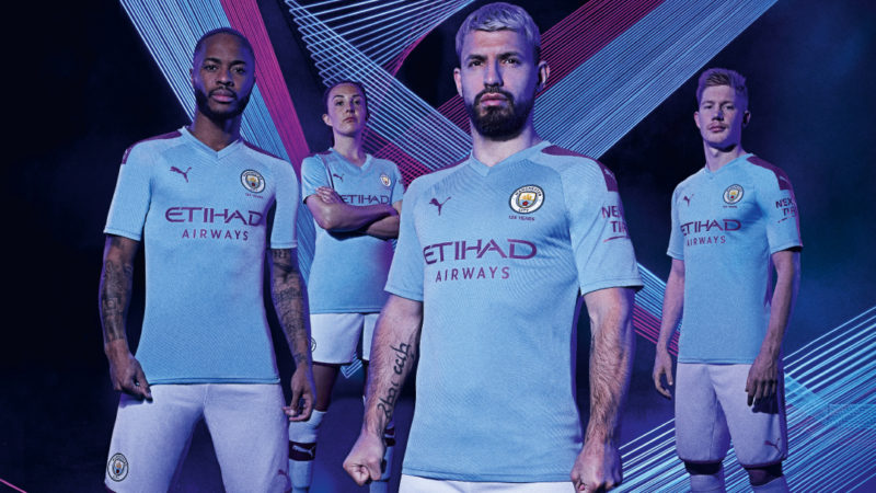
This is the first Manchester City kit produced by PUMA, and it’s underwhelming. The woven jacquard wave pattern running through the kit is a nod to Manchester’s industrial and cultural heritage. While it’s a nice gesture, are we really going to be able to see and appreciate it from a distance? And is it distinct enough to make a splash as the first kit in the partnership with PUMA? Hopefully it goes up from here.
Real Madrid Away
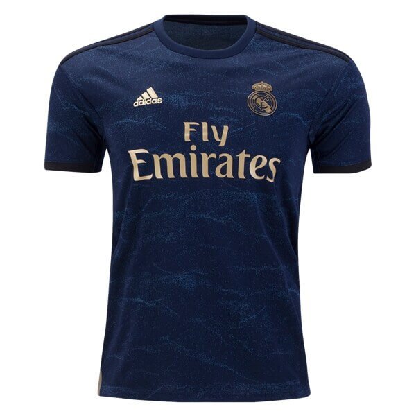
While the simplicity of the Real Madrid away kit is attractive, we’re just not feeling this one. The sublimated sound wave print on the kit refers to the atmosphere generated by fans during the historic La Decima season. Only problem is, the wave print isn’t loud enough for us.
The Ugly
Inter Milan Home
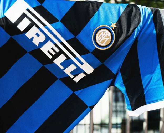
How can one team get their away kit so right, yet their home kit so wrong? Inter’s home threads for the upcoming season contain a section of iconic diagonal stripes, which first appeared on the club’s famous ’89 white away kit. The only problem with that is this is the club’s home kit, and blue-and-black vertical stripes are surrounding the section of diagonal stripes. It’s a little disorienting to look at, similar to one of those 3D illusion pictures from the ’90s.
Valencia Away
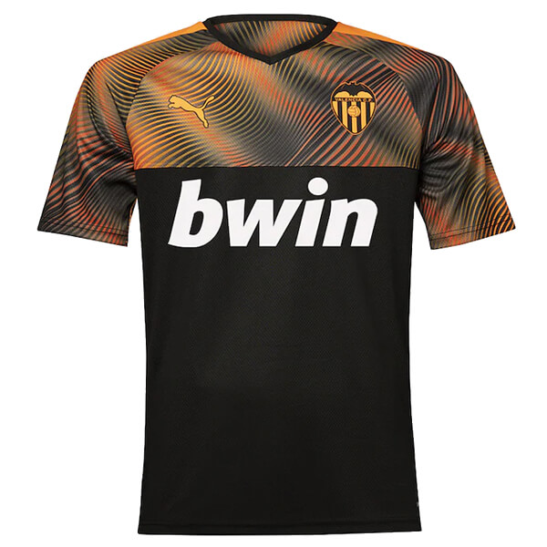
Valencia’s away kit this year suffers the same problem as Everton’s home kit. The top third of the kit has a graphic inspired by Las Fallas, the globally renowned festival of fire and passion. A good concept, but even worse execution than Everton because the bottom two-thirds of the kit is a completely different color. Go big or go home on the graphic.
Roma Away
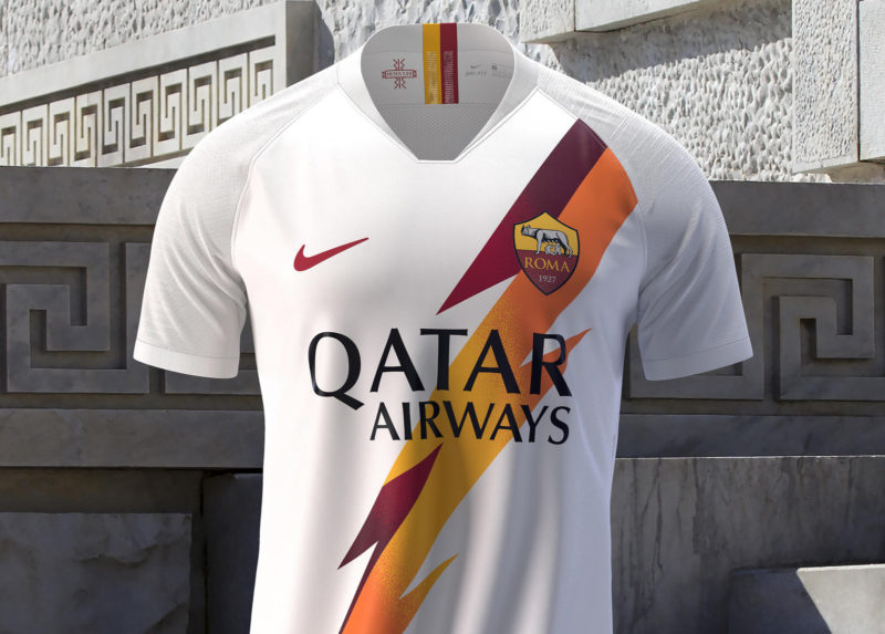
Like Inter except reversed, how can Roma get their home kit so right, yet their away kit so wrong? While the bolts on the sleeves and collar representing the Roman God Jupiter were cool, this just isn’t it fam. It looks like leftover free merch after a failed collab with the Disney flop Bolt. The difference in the home kit and the away kit is subtlety. No self-respecting Roma fan would be caught dead wearing this monstrosity.


