With main kit sponsorships from betting and gambling companies leaving the English Premier League, we take a look at some of the most garish logos to feature on EPL kits in recent years.
In the past decade, shirt sponsors have gotten a lot of attention in football. Prime marketing real estate gives major teams a massive influx of cash flow, with some deals reaching the mid-eight-figure range per season. But, the middling teams are left to try and find the highest bidder regardless of their morality if they want to compete financially with the giants of the world. This has led to a serious influx of betting platforms that are willing to pay large sums to get their logos broadcast across the world.
However, many have started to question the impact that these sponsors have on impressionable fans and, for the more aesthetically discerning fans, the visuals — betting companies tend to have pretty gaudy logos.
For those who have concerns in either matter, it is time to rejoice, as the English Premier League is set to ban betting companies from being the front-of-shirt sponsor for Premier League clubs from 2026.
While we don’t pretend to be the morality police at Urban Pitch, we do take on a volunteer sheriff’s position as Admirals of Aesthetics, so here are some of the ugliest betting shirt sponsorships from the Premier League era.
Wigan Athletic: 2010-2011 Home
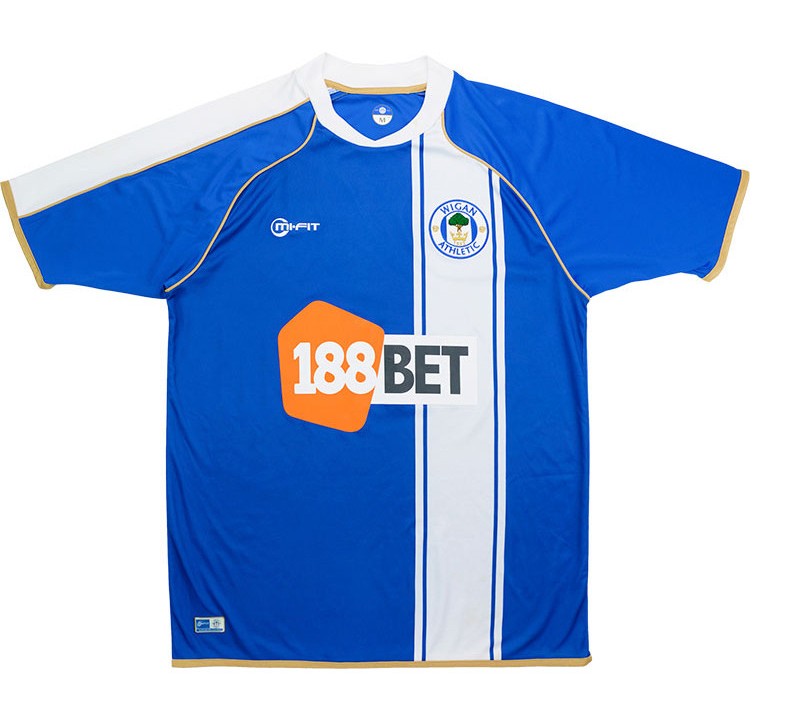
This is a fairly obscure kit from over a decade ago, so if this is your first time laying your eyes on this monstrosity, apologies. I would do anything to go back to my blissfully ignorant life where I had no idea of this kit’s existence.
The odd asymmetrical stripe is somewhat common in world football, but the integration of the betting sponsor is what makes this kit so hard to look at. Firstly, the logo is garish, but more importantly, they used a “taped style” to put it over the asymmetrical stripe. The white block in the “188BET” logo doesn’t match the white of the stripe of the kit, which makes it stand out (and not in a good way) even more. While this kit didn’t get Wigan Athletic relegated, it should have.
Swansea City: 2011-2012 Away
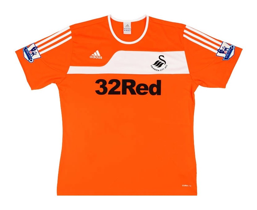
The most shocking thing about this kit isn’t its design, but rather that it was worn for two seasons when it shouldn’t have made it past the first round of cuts in the design process. As was common practice in the football world, Swansea City transferred this kit from the 2011-12 away to the 2012-13 third one season later.
Predominantly pylon orange and white, the shirt sponsor goes with big block letters in black. It would be one thing if Swansea’s logo was black, but it is navy blue, so it also clashes with their logo. While the betting logo isn’t terribly busy, a few simple tweaks (like using a white color fill) would make this jersey a little more tolerable.
Hull City: 2016-2017 Third
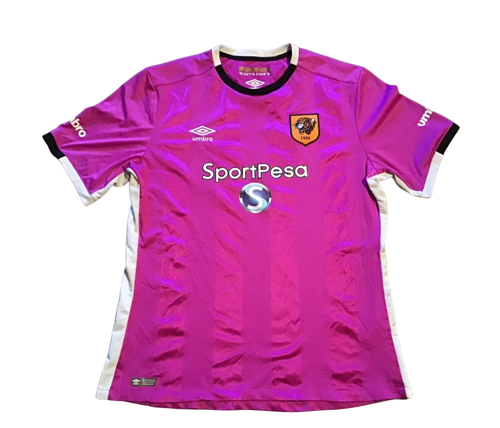
The most painful part of this shirt is that the sponsors’ logo looks like it was copied and pasted from a Word document instead of a proper vector file. And that is saying something considering the wild color choice that clearly has nothing to do with Hull City and their classic orange tiger badge. The only potential saving grace for this kit was that Andrew Robertson and Harry Maguire wore this kit, so at least some decent footballers donned this freakish purple shirt (yes, Maguire used to be good at one point).
Huddersfield Town: 2017-2018
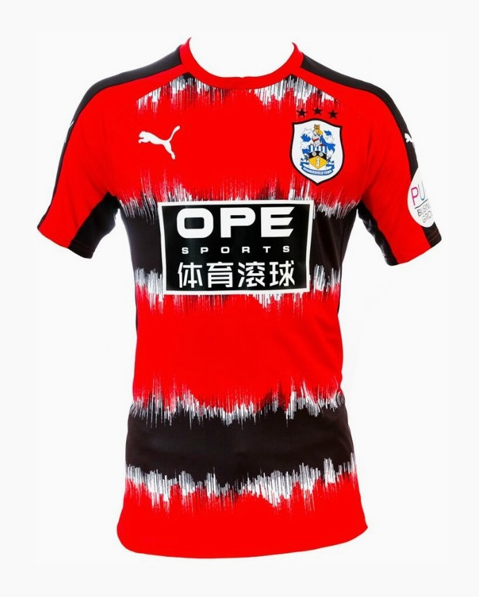
Again, my apologies for bringing this kit back into the forefront of your memory. Sure, it was a PUMA template kit that came in lots of different color combinations, but it is such a horrendous concoction. If we ignore the kit design, we have the sponsor’s logo, which is a basic font and doesn’t really give much information on what it is, in addition to taking up a big block of the jersey. It’s so large that you don’t really notice that the crest is so far up and to the side (near the shoulder) of the kit. Not surprisingly, OPE Sports doesn’t seem to be functioning anymore.
Fulham 2020-21: Away
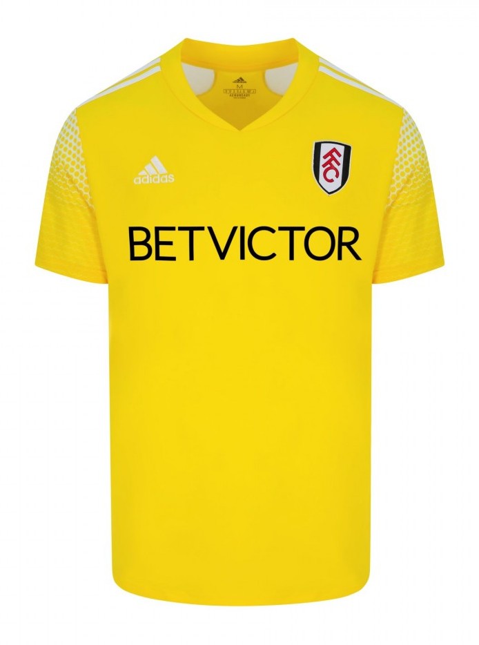
Fulham has never quite had the fashion sense that usually comes with being from London. And this away strip is no different as it pulls straight from the adidas template catalogue. Bright yellow with some white accents on the shoulder does nothing but leave you with a super bright but drab piece of sweat-wicking fabric. Somehow, when we get to the sponsor’s logo, we find something even more uninspired. Plain text that looks like it came from Microsoft Paint (RIP). I don’t want to disparage a graphic designer, but this takes mailing in your job to another level. Thankfully, their design laziness got them relegated after this season.
Wolves: 2021-22 Away
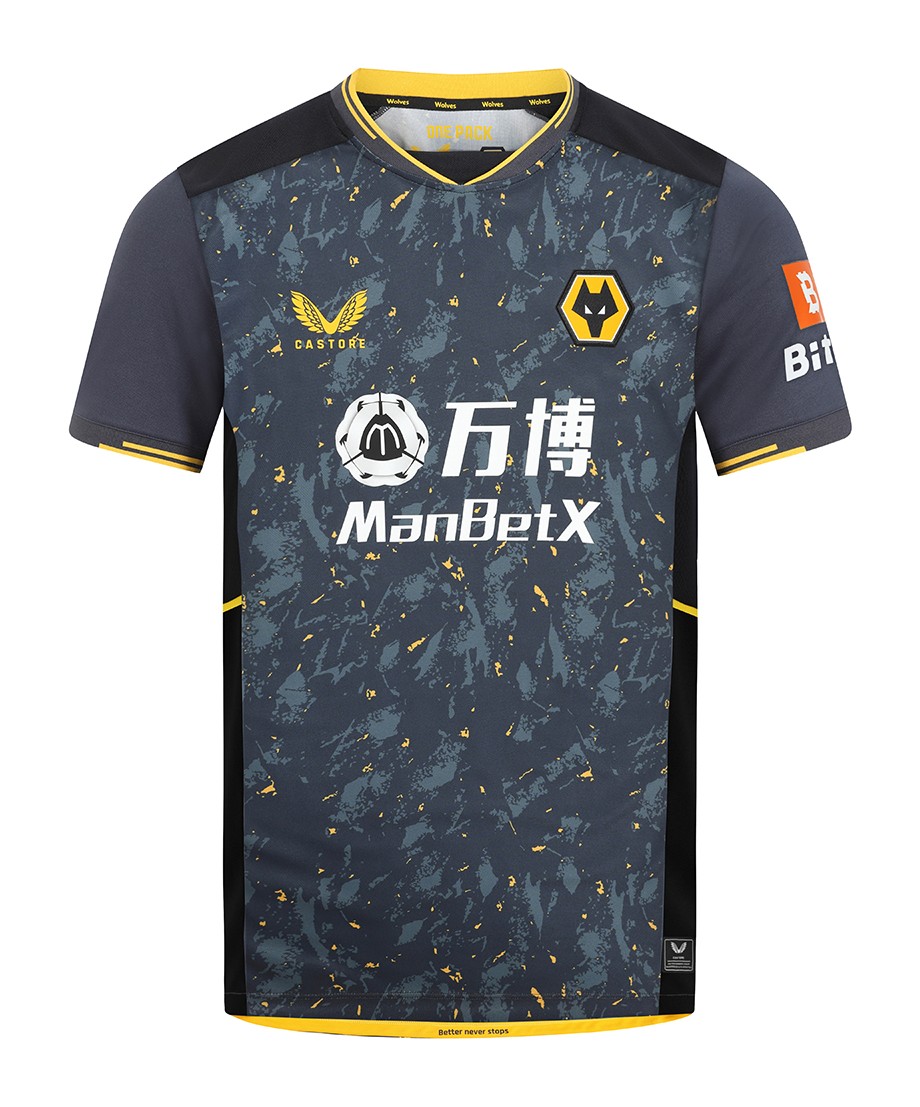 What is that design? Paint splatter? Constellations? Public transport upholstery? Whatever it is, it is quite the busy print and isn’t necessarily soothing to the eyes. Adding to that confusion is a sponsor’s logo that is somehow gendered for betting. “ManBetX,” because what man wants a betting app that isn’t masculine? From a purely aesthetic side, the logo is quite busy, so a taped design where the print of the jersey isn’t intermixed with the design might have actually been better in this case, which is rare. But sadly, it was extremely busy, and I imagine it would’ve been hard to decipher what the sponsor logo actually said when you saw it on pitch and in person.
2026 can’t come soon enough.


