Regardless of your feelings towards football shirt templates, it is undeniable that we’ve seen some of the best on the world’s biggest stage — The World Cup. With the 2022 games approaching, we take a look at some of the best World Cup kit templates of all time.
The football shirt template: not always a welcomed phrase amongst football shirt fans. However, while people are aware of it or not, some of the greatest kits of all time have come from templates.
So what is a template shirt I hear you say? It’s a set design made by a sports brand which can be used by various different clubs. Colors will be swapped out from team to team of course, but the overarching design elements will remain the same. Some famous examples of templates include two of the most celebrated designs of all time — the Germany 1990 and Netherlands 1988 home shirts. Both made by adidas, the former was used by Cork City and Boca Juniors, while the latter was worn by Morocco, Germany, and Russia, in addition to several other club teams.
The negative connotations that kit templates bring are that they can come across as monotonous, dull, and a bit lazy. However, as seen in the aforementioned templates, that’s not always true.
In fact, kit manufacturers often save their best work for the biggest stage of them all — the World Cup. With the 2022 tournament drawing ever-more near, now is a better time than ever to reexamine some of the best World Cup kit templates of all time.
Nike 2018
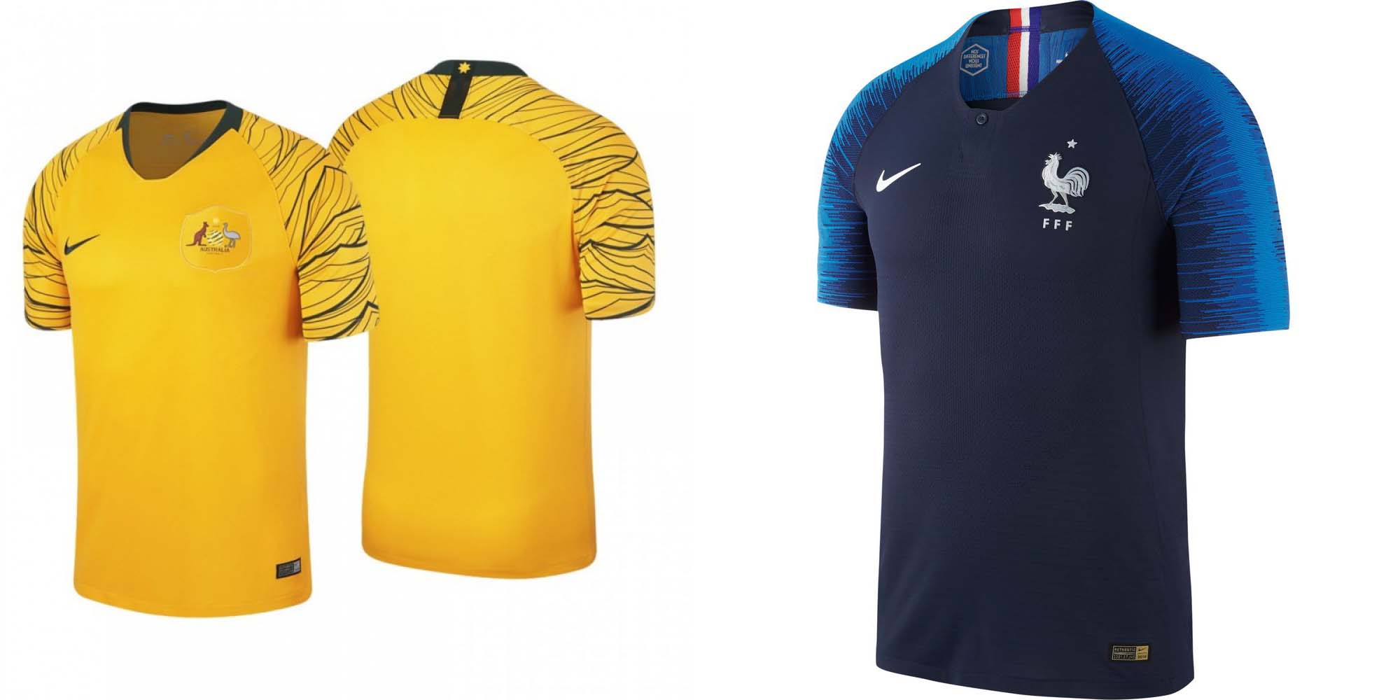
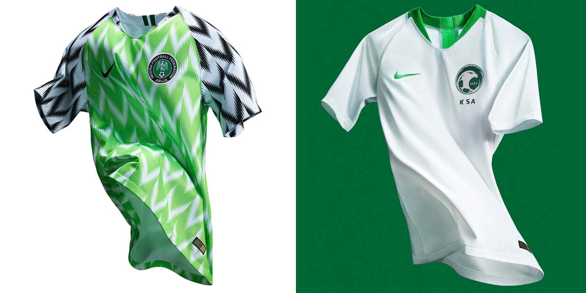
I know I said we’d be looking at some of the best template designs, but I thought we should start with a set that feeds into the bad rap that templates can get. Let’s examine the most recent men’s tournament, still familiar in many minds, the 2018 World Cup in Russia.
Nike is no stranger to a template, and more often than not, The Swoosh is really good at it. The Nike Aeroswift template was used by all Nike teams in this tournament. England, Nigeria, Portugal, South Korea, Croatia, Australia, Brazil, Poland, and France (although with an additional single button collar for eventual French champions) all used this technology.
The cut of the shirt was the same, but some of the teams incorporated patterned graphics into the fray. For example, France and Australia opted for amplified shoulder graphics to enhance their visual prowess. France went for an electric blue design, while Australia went for a dark green geometric graphic that celebrated their heritage, culture, and footballing history. Then of course there was the Nigeria design, which was instantly hailed as a classic thanks to its striking color, unique pattern, and connection to Nigerian culture.
It was a solid set of shirts, but aside from the Nigeria, there is not really one that lives long in the mind. This isn’t an off-the-cuff diss by the way. I know the tireless work and effort that goes into a shirt design. However, these particular templates weren’t at the forefront of my football shirt memory bank. They were just a bit forgettable. So coming up are four designs that should live long in the memory.
adidas 2010
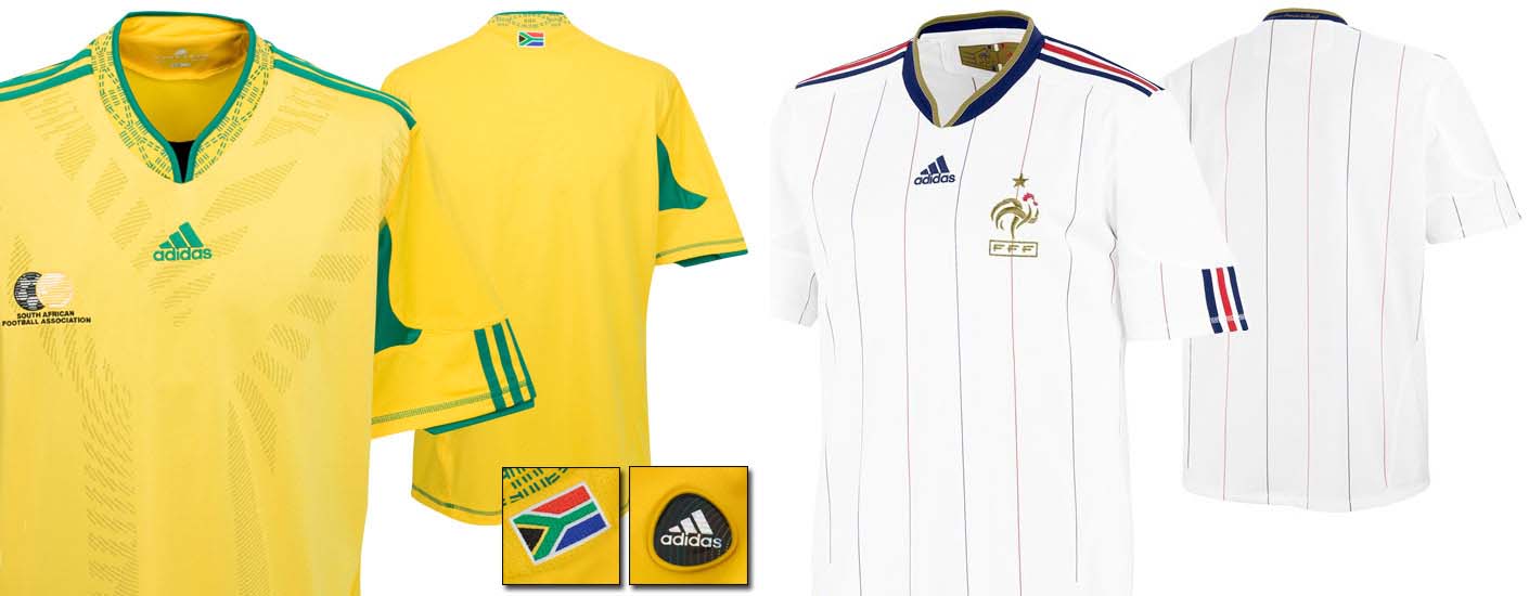
South Africa’s World Cup was known for many things: Vuvuzelas, that intense African heat, and if you’re still sore about it, Lampard’s strike against Germany — it definitely crossed the line.
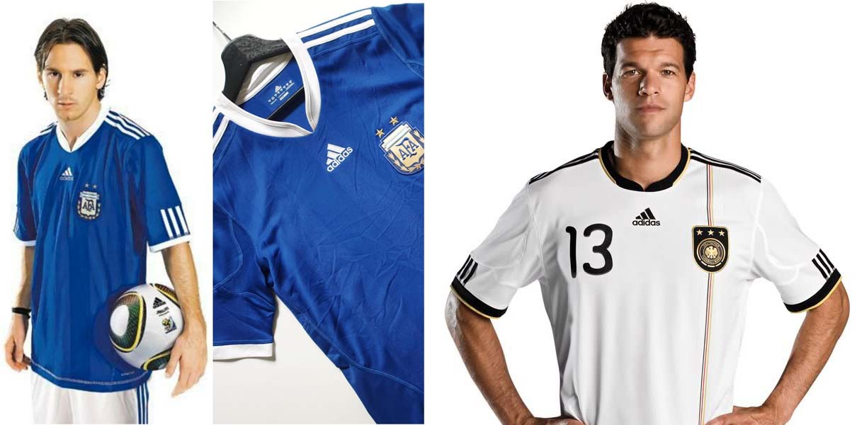
Your mind might not immediately venture to shirt templates, but they were there. Here we’ll be focusing on Germany’s number one sports brand adidas and the “Licensed” range, worn by hosts South Africa, Germany, Spain, Argentina, Nigeria, France, and Mexico. The design’s main pulling power was its unusual collar. Imagine a crewneck, but with a tapered split in the center piece. It was really effective and something I still remember fondly. It had its trademark three stripes running along the shoulders, which separated on the arm to then reemerge and continue onto the sleeve cuff.
Staying on that topic, the sleeves were much longer than other shirts around at that time and certainly other teams in that tournament. In particular, the Germany home shirt was one of the strongest uses of this design.
ABA Sport 1998

This is quite possibly the greatest international shirt of all time. The Mexico ’98 home shirt. I could have just left a photo of all three shirts with no description, as this is one of those designs that requires no explanation. However, that also doesn’t make for a very good article — just like a bad template, you could argue that would be lazy. This design though is galaxies away from laziness.
ABA Sport, a Mexican sportswear brand, is still around today, but it is most famous for this design. I love it when a native brand gets the responsibility to design their nation’s uniform, especially for the grandest stage of them all. This truly is a passion piece. Shall we start with that face looking right at you? It’s hard to ignore and impossible to forget, for all the right reasons. It of course has a tie to Mexican culture, being the sunstone of the Aztec calendar.
While no other club or nation utilized this design, we can still categorize it as a template, as the core pattern was used throughout all three of Mexico’s shirts for the ’98 games. Making up the Mexican flag tricolor, the home utilized green, away white, and third red. There hasn’t been a shirt quite like it since. The sort you wouldn’t necessarily need to see the badge to have an educated guess of which country this was.
adidas 1994
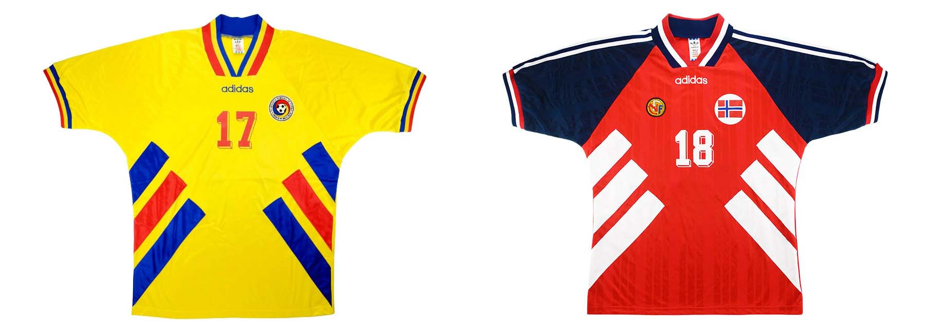
It only makes sense to include adidas on this list again, as it is one of the main contributors to shirt templates, for better and worse. The Three Stripes has shown itself capable of making innovative and striking designs, and such was the case at the 1994 games in the United States.
While the iconic adidas designs that may first come to mind are Germany’s wild home shirt (which was also a template used by the likes of Club America, River Plate, and more) and the ‘denim’ shirts worn by the host nation, let’s take a look at a much more simple, if not sweeter, template design. Worn by Bulgaria, Romania, Sweden, and Norway, this brilliant design donned a three stripe pattern around the waist that was reminiscent of that era’s EQT range.
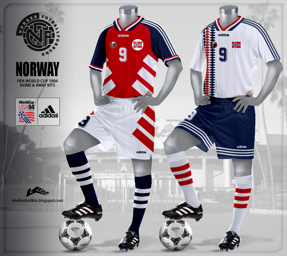
What took this design to the next level, however, was how it looked when paired with the kit’s shorts. Amplifying what adidas was trying to achieve, the three stripe graphic was mirrored onto the side paneling of the shorts. There’s nothing better when a shorts design amplifies that of the shirt.
Hummel 1986
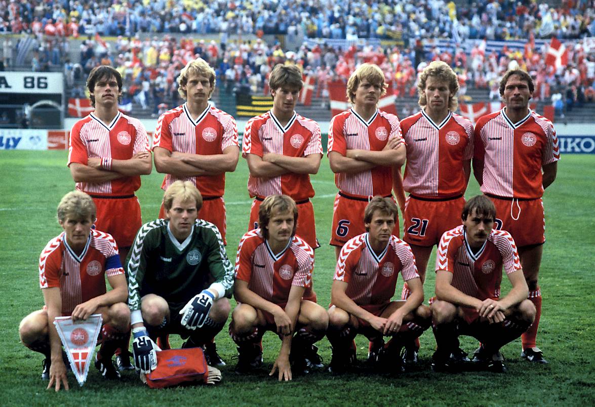
Quite possibly one of the most iconic football shirt templates around. If there were such a thing as a definitive cult classic template, or even a cult classic football shirt, a general consensus of opinion may sway towards the 1986 Denmark home shirt from the Danish giants of kit design, Hummel.
If you were to break down the visual components intricately bit by bit, it might sound a bit busy. Not that busy is necessarily a bad thing by itself, but there’s just something a bit more graceful in simplistic kit design. On the kit, we have a half-and-half pattern, one half block color, and the other pinstripe. Opposing colored sleeves with a multi-chevron shoulder print and a striped v-neck collar add to the general busy-ness of this shirt, and on paper it shouldn’t work. But it does.
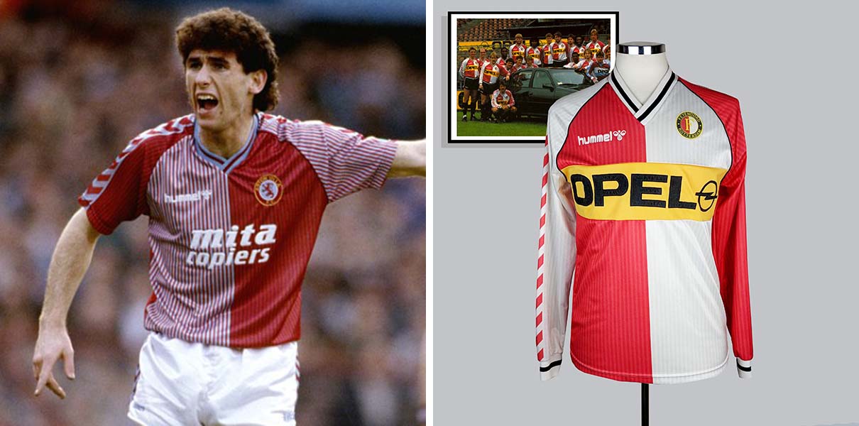
You wouldn’t find this shirt template used by any other nation, however, it was graced domestically by Villa, Southampton, and Coventry, with cameos from Feyenoord, Sporting Clube, and more.
So in closing, a football shirt template isn’t always a bad thing. To paraphrase something I read once: “Soon there won’t be any new music, as all the musical note combinations will one day have been used up.” You create too many new designs, and one day we might not have anything new to look forward to.
Long live template shirts…?




kickass article