
It’s that time of year again — we break down the best and worst 2025 MLS kits.
The stove might’ve been heating up throughout the winter transfer window, but the road to every new MLS season truly starts with kit drops.
Initial leaks that hit the internet were a bit concerning, and had many feeling like the “I hope you’re hungry — for nothing” Nathan Fielder meme. However, as they often are, the leaks were misleading, and as the official reveals rolled out, we saw some strong designs that could even become future classics.
As is typical during this special time of year, let’s break down the good, the bad, and the downright ugly from the new crop of MLS kits.
The Good
Vancouver Whitecaps
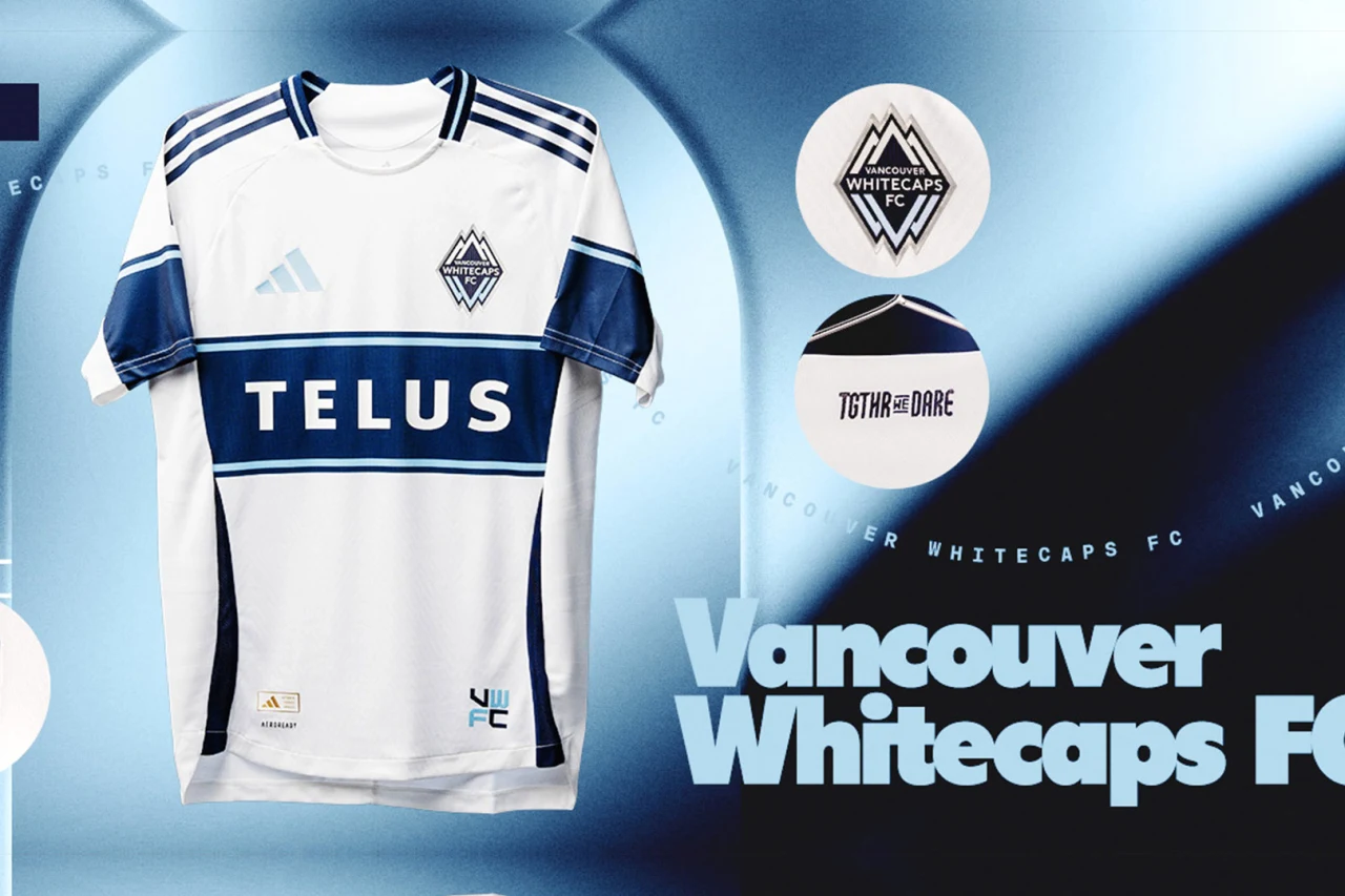
People may rail on Vancouver for staying in familiar design territories, but there’s nothing wrong with going back to a classic. The central hoop has become iconic and unique to the Whitecaps identity, and this new kit elevates it to the next level. Credit also goes to the Canadian side’s release of a fantastic special edition Black History Month Kit, which it will wear in CONCACAF Champions Cup play this season.
Houston Dynamo
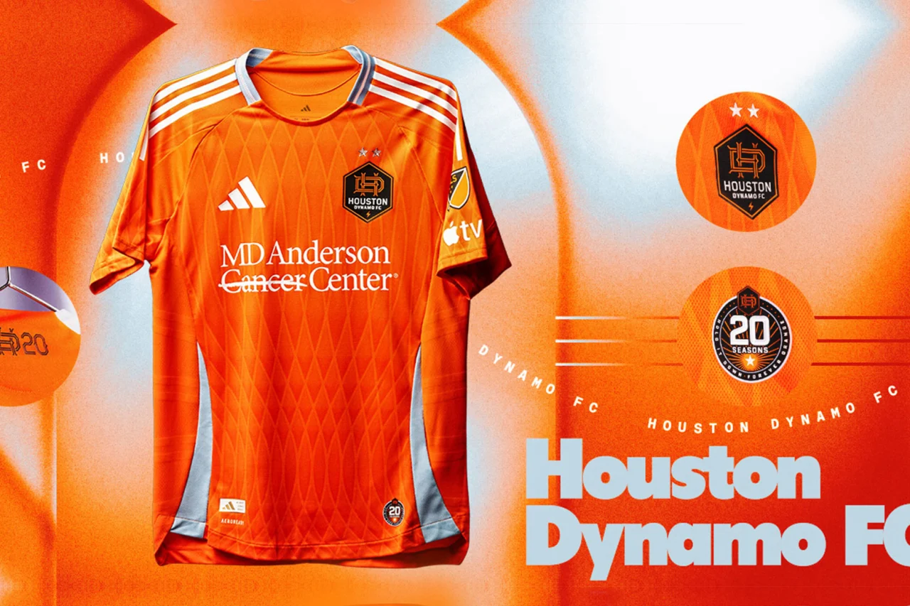
Another design that revisits iconic classics, the Dynamo celebrate 20 seasons with a tribute to past patterns throughout their storied history. The club enlisted legends like Damarcus Beasley, Stu Holden, and Brian Ching for the jersey’s rollout, which was quite well done. The sky blue secondary color is an additional throwback, as the Dynamo for some reason ditched it when they rebranded in 2020. Along with last year’s purple away kit, Houston suddenly has one of the best jersey duos in MLS.
New England Revolution
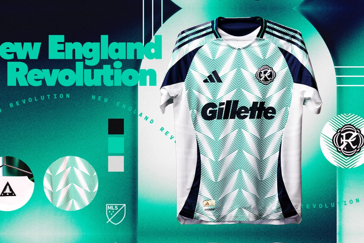
The Revs’ new secondary kit is a departure from the usual blue and red, but this gamble pays off immensely. It’s a nice homage to the flag of New England, featuring a unique chevron pattern reminiscent of those stellar Nigeria kits from 2018.
DC United
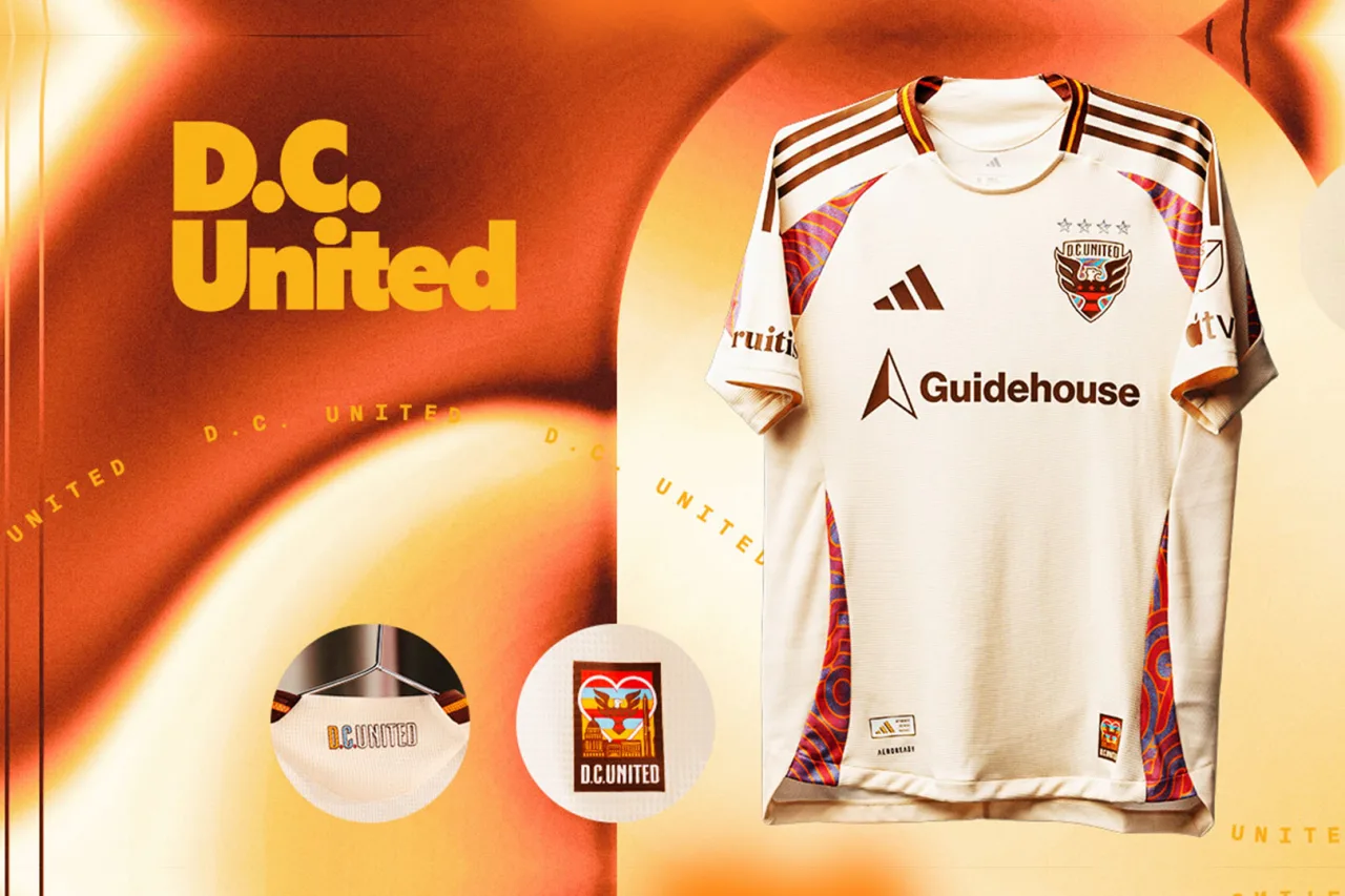
DC United pays tribute to the area’s deep roots as hotbeds of soul and funk music with a fantastic fresh look for the upcoming season. It is simpler compared to some other jerseys on this list, but that side design extending to the crest and overall attention to detail is amazing.
Seattle Sounders
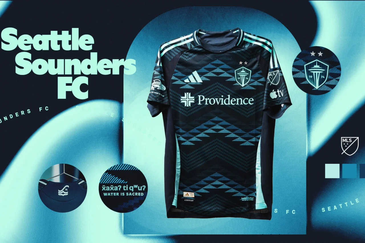
Seattle has swung for the fences in recent years with some insane concepts, and has hit the mark each time (of course Bruce Lee and Jimi Hendrix kits would be sick). The success continues with this new look that is designed by and pays tribute to Native Americans in the Washington area.
Artists from the Puyallup, Muckleshoot, and Suquamish tribes all contributed to the jersey’s design, and further connects the club to its surrounding community and natural landscape. The result is an almost flawlessly executed jersey that will look fantastic in the 2025 FIFA Club World Cup.
Atlanta/Montreal/Miami
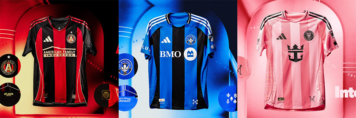
These kits all utilize stripes, and they all pull it off nicely. Atlanta and Montreal are both returning to tried and true looks that pay off greatly, especially for Montreal who have been struggling to solidify a new colorway and identity since the rebrand from Montreal Impact. Going back to the classic black and blue stripes is the best-case scenario for them.
If we’re being honest, Inter Miami could have put a clip art file of a goat on the front of their shirts, and they would still sell out worldwide. Thankfully they went for a nice pink on pink combo, a simple aesthetic that will look very clean in Michelob Ultra and adidas commercials.
The Bad
Columbus Crew
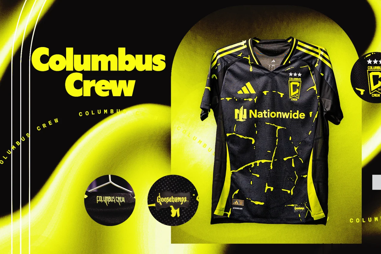
Before we unpack the insanity of this new Columbus kit I will at least give the Crew some credit for being creative and actually trying to tie into their city culture here. Of all the collaborations with other pop culture icons or celebrities that MLS teams have made in the past, this has the be the craziest.
The Crew has teamed up with legendary horror author R.L. Stine to deliver a jersey paying homage to Goosebumps, his most popular book and movie series. Again, I’ll give them credit for not phoning it in, but this is not doing it for me at all. The coloring and slime pattern looks like something Under Armour would have put out in the 2010s. This would’ve been nice as a special release kit but now the Crew are going to be stuck with this for two years, which will almost certainly outlast the novelty of the shirt being glow-in-the-dark.
Orlando City SC
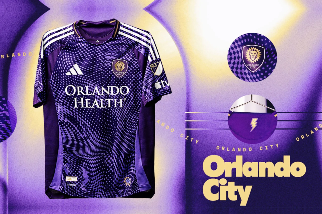
Orlando has had stellar kits for the past few years, but this new home shirt is an unfortunate return to the mean. This isn’t the worst kit in the league, but in comparison to their previous home jersey, which in my opinion is one of the best in MLS history, it just doesn’t offer as much. The pattern, reminiscent of the 2021 Real Salt Lake jersey leaves a lot to be desired.
Colorado Rapids
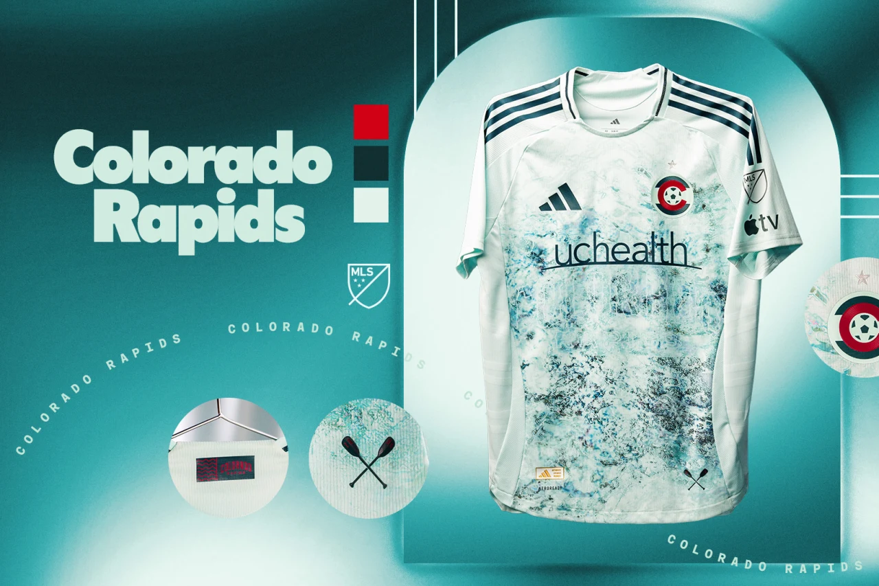
This is a disappointing new edition from Colorado, where the design isn’t necessarily simple, but with this look it feels like it should have been. In concept, a kit that pays homage to the club name is a great idea and could be a unique look. However, the result looks like a kid repeatedly smudging a blue fingerprint over the canvas of the shirt.
The Ugly
FC Dallas
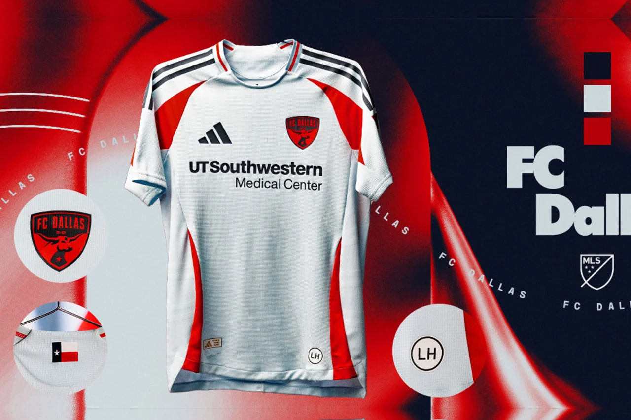
While some of the bad kits at least tried to do something out of the box, this new FC Dallas release doesn’t offer much at all to comment on. According to the press release it is supposed to be a tribute to the original Dallas Burn and the NASL era Dallas Tornado, but it’s unclear where the inspiration is actually implemented. For something called the “Inferno Kit” you would think there would be a little more flair here.
San Diego
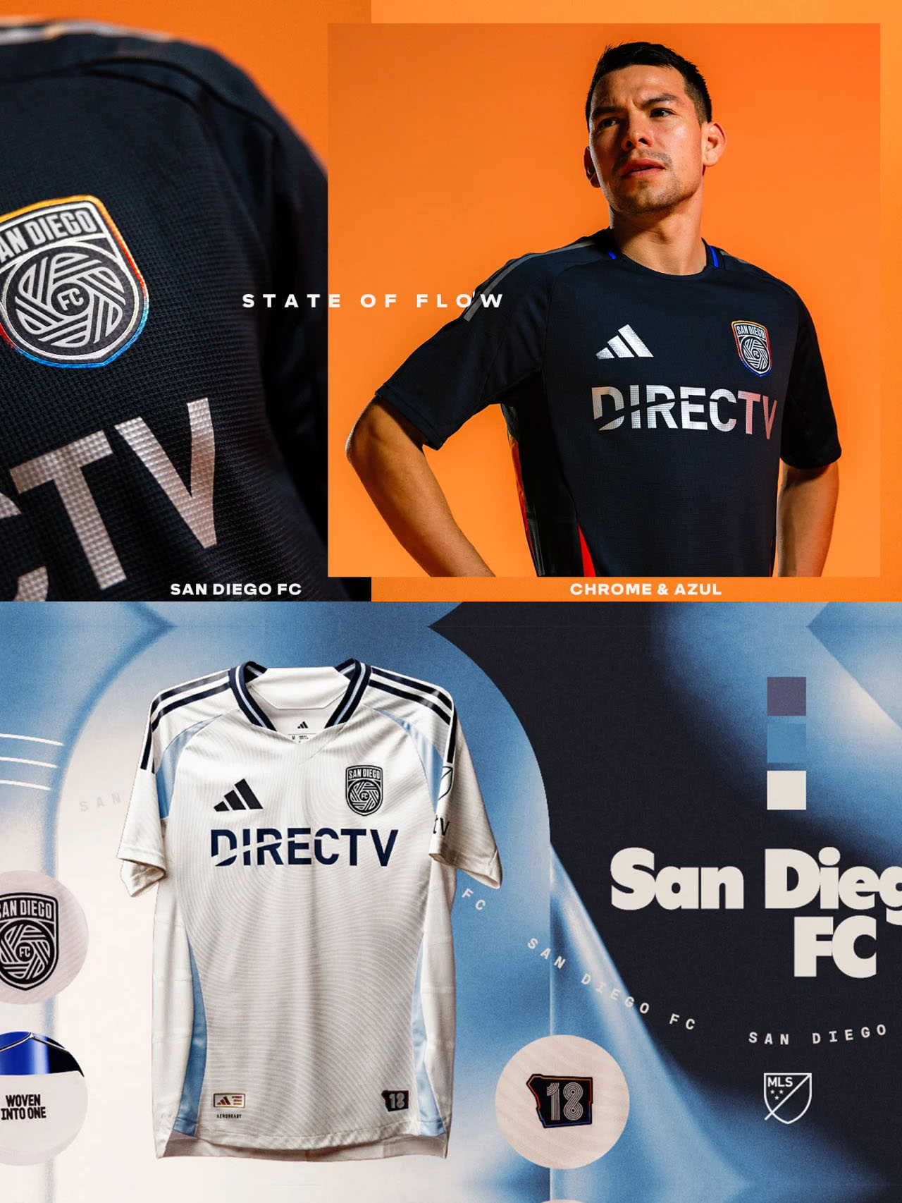
It’s tough sometimes to be a lone supporter of the chrome and azul colorway that has been widely panned by fans since the inception of San Diego FC. I honestly feel like the community work and other designs that the new expansion side has done shows a lot of potential for the future.
Unfortunately, these two inaugural kits provide absolutely nothing for fans to be excited about for the present. The rainbow stripe up the sides of the State of Flow kit are a somewhat interesting use of the new adidas template, but that’s the only noteworthy element about these phoned in, inoffensive designs.
San Jose
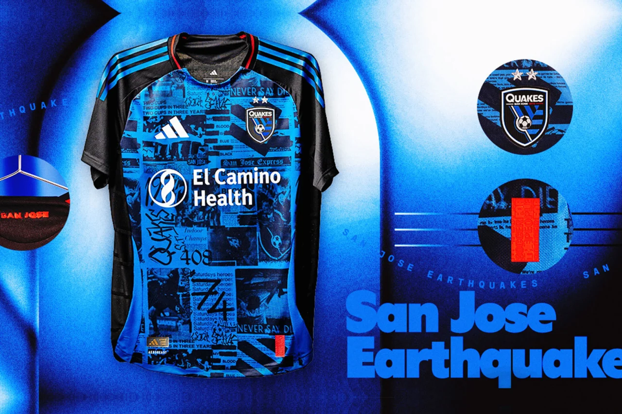
I’ve been going back and forth on this one, and I ultimately landed on ugly for the Earthquakes new punk-inspired primary kit. It’s a unique and bold idea to revamp a staple look in MLS history, but the pattern and lettering on the front of the jersey is a little too camp, even by the standards of American soccer. That being said, the blue, black, and red is used to perfection and I wouldn’t be surprised if Earthquakes fans take to liking this in years to come.


